Melon Meloso SW 9007 by Sherwin Williams
A Cozy Feel with a Modern Edge
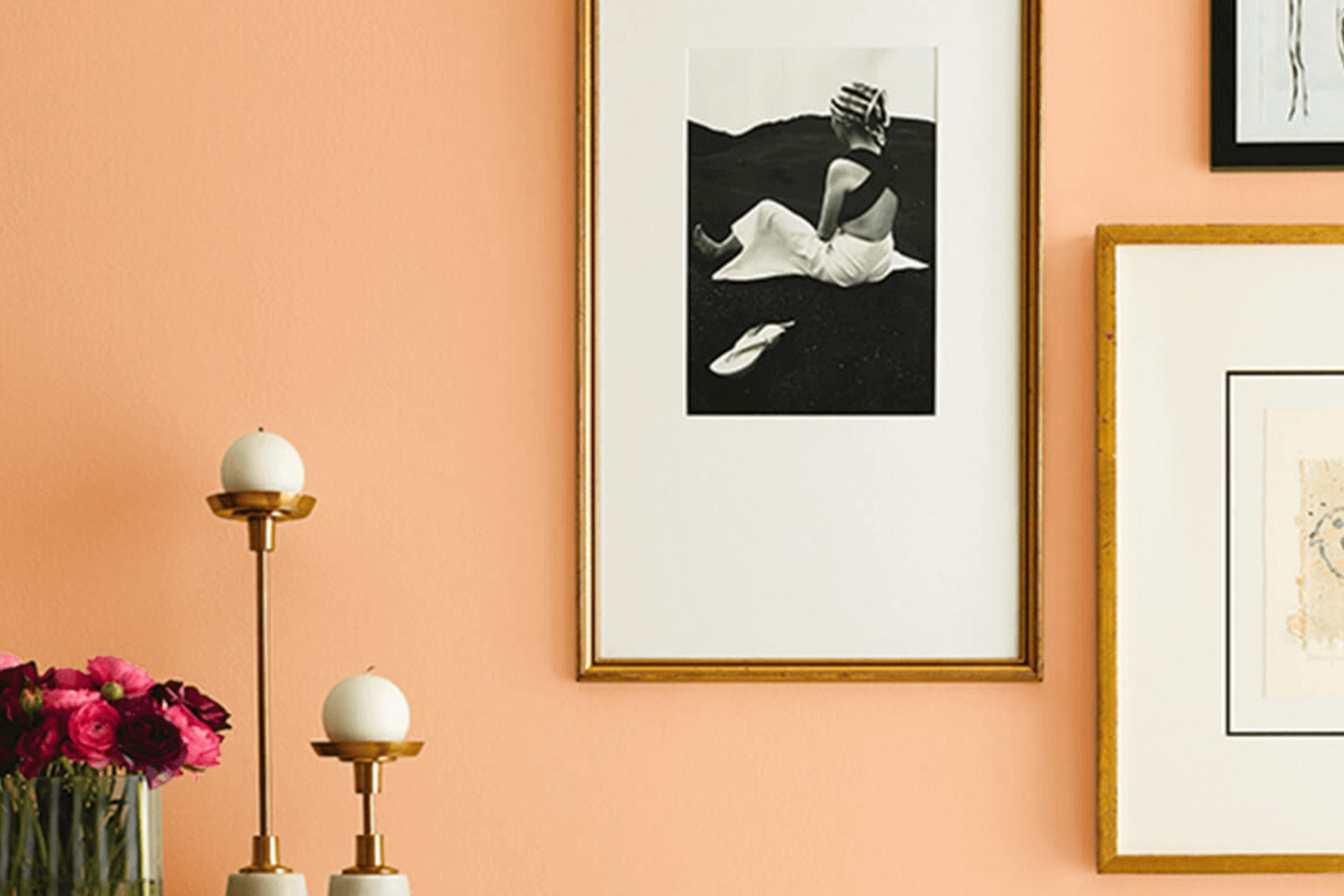
This particular shade is a soft, inviting color that can add a warm touch to any room in your home. It’s kind of like that cozy feeling you get on a sunny morning.
The light hue has a subtle vibrancy that isn’t overwhelming, making it a great choice for creating a relaxing environment.
Using Melon Meloso could be a smart move if you aim to give your living room, bedroom, or even your kitchen a gentle splash of color. It pairs beautifully with both dark and light furnishings, enhancing other elements in your room without overshadowing them.
Plus, it’s a color that works well throughout different seasons, maintaining its charm whether it’s bright and sunny outside or during gloomier, colder days.
So, if you’re ready to freshen up your living space, consider Melon Meloso. It could be just the color you need to breathe new life into your home.
via sherwin-williams.com
What Color Is Melon Meloso SW 9007 by Sherwin Williams?
Melon Meloso SW 9007 by Sherwin Williams is a soft, warm peach tone that radiates coziness and light-heartedness. This charming hue has the ability to add a gentle splash of color to a space while maintaining a soothing atmosphere. With an LRV (Light Reflectance Value) of 67, it reflects a fair amount of light, making it an excellent choice for making smaller rooms appear more spacious and inviting.
Melon Meloso fits perfectly into interior styles that prioritize comfort and simplicity such as Scandinavian, modern minimalism, and coastal interiors.
Its understated vibrancy works well in living rooms, kitchens, and nurseries, offering a refreshing but subtle backdrop that complements neutral and pastel palettes.
When it comes to pairing materials and textures, Melon Meloso blends beautifully with natural wood finishes, from pale birch to rich walnut, enhancing the organic feel of a space. It also pairs well with soft textiles like cotton and linen in whites or muted tones, contributing to a relaxed aesthetic.
For a touch of elegance, incorporate brushed brass or copper accents. Pair Melon Meloso with ceramics and other matte surfaces for a grounded, homely feel. Using this color, you can create a welcoming space with a hint of youthful zest.
housekeepingbay.com
Is Melon Meloso SW 9007 by Sherwin Williams Warm or Cool color?
Melon Meloso SW 9007 by Sherwin Williams is a warm, peachy hue perfect for adding a cozy, inviting vibe to any room in your home. The softness of this color makes it highly versatile, suitable for living areas, kitchens, or bedrooms, blending well with natural light to create a soothing atmosphere.
It pairs beautifully with creamy whites and soft grays, enhancing other décor elements without overpowering them. Additionally, Melon Meloso can serve as a charming backdrop or as an accent wall to add a subtle splash of color.
For those looking to add a gentle warmth to their home while keeping the environment light and airy, this color is an excellent choice. It is particularly effective in spaces that aim for a relaxing, yet cheerful ambiance, contributing to a comfortable living space where homeowners can feel at ease.
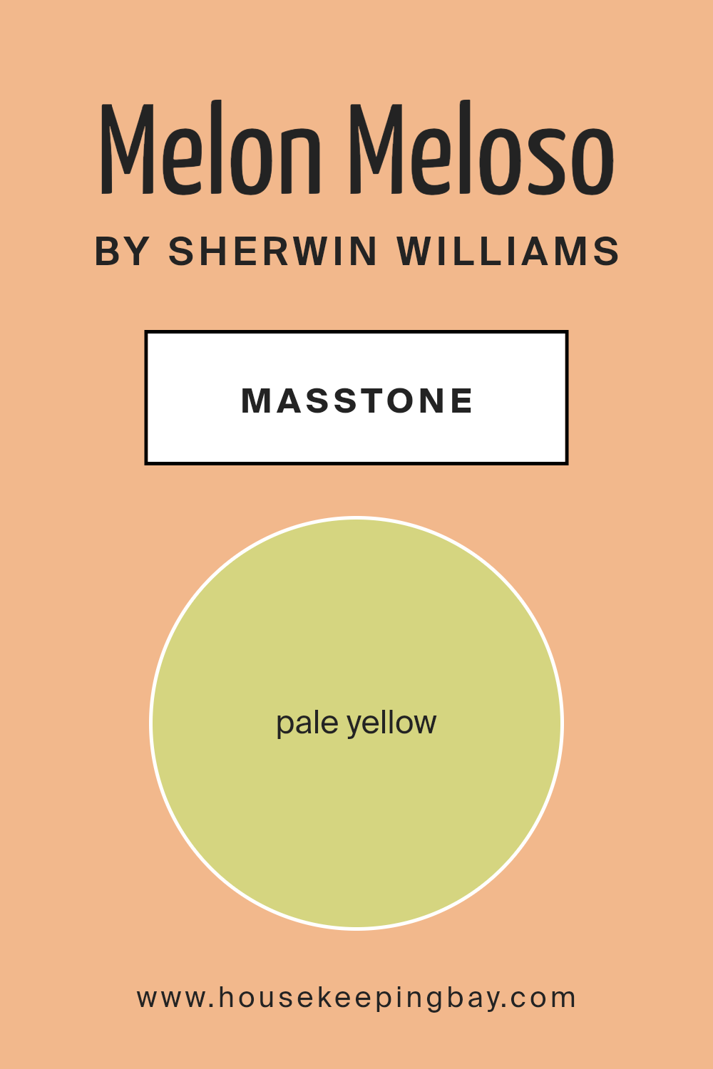
What is the Masstone of the Melon Meloso SW 9007 by Sherwin Williams?
Melon Meloso SW 9007 by Sherwin Williams has a masstone of pale yellow, identified by the color code #D5D580. This light yellow shade brings a soft and soothing atmosphere to any room. Its gentle tone provides a backdrop that can make spaces feel larger and more open, perfect for smaller rooms or areas with limited natural light.
Due to its pale yellow palette, Melon Meloso adds a touch of warmth without overwhelming the space, creating a cozy and inviting environment.
This color works well in various settings, from kitchens and living rooms to bedrooms, as it pairs beautifully with both modern and traditional decor. It complements a wide range of colors, allowing for flexible design choices. Furniture and decorations in bold or dark colors pop against this subtle yellow, while lighter tones blend harmoniously.
Whether looking to create a serene setting or add a hint of cheerfulness, Melon Meloso is a versatile choice that enhances home interiors with its understated elegance.
housekeepingbay.com
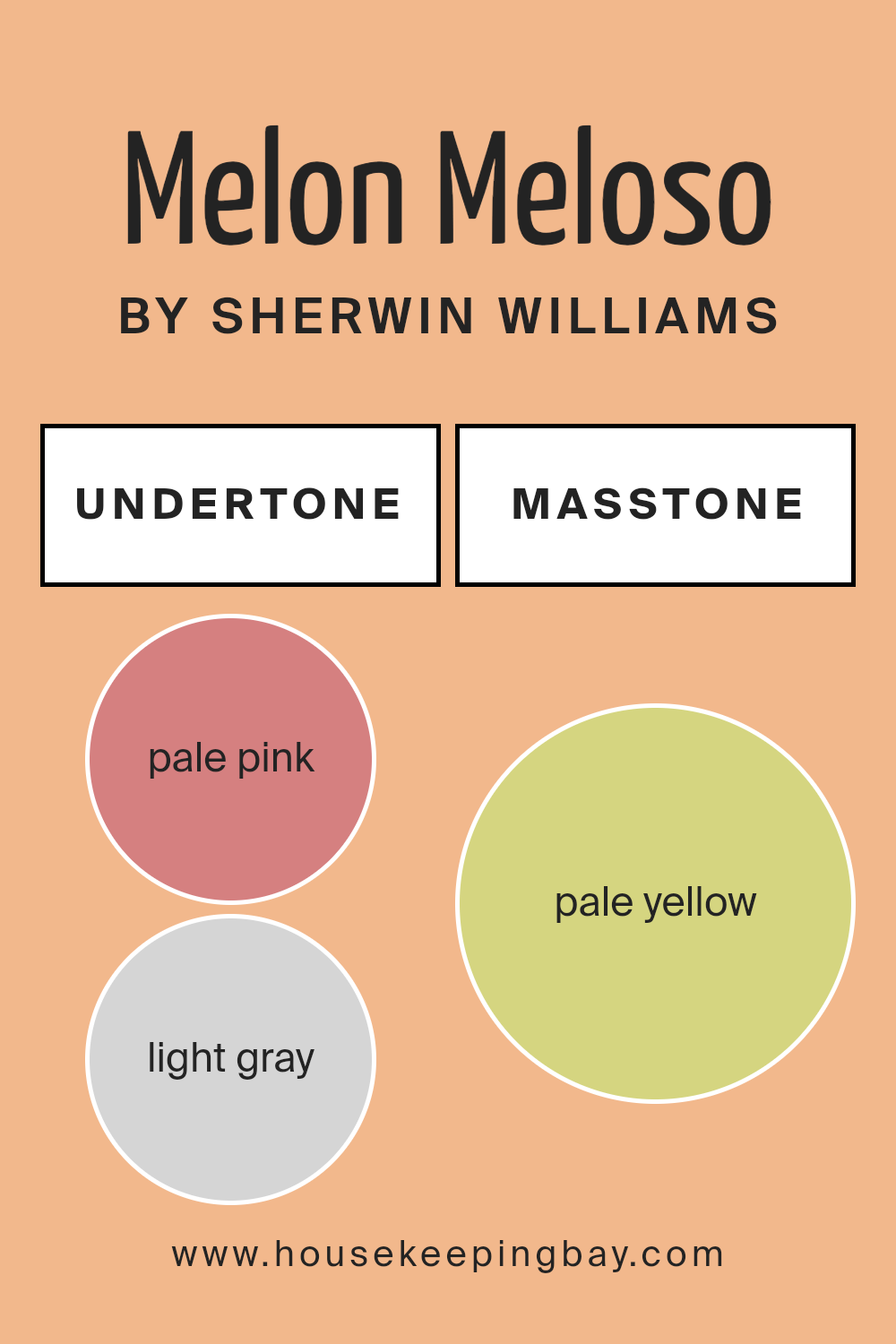
Undertones of Melon Meloso SW 9007 by Sherwin Williams
Melon Meloso SW 9007 by Sherwin Williams is a vibrant color with a variety of undertones that make it versatile and appealing. The presence of pale pink, light gray, light purple, yellow, orange, mint, grey, light blue, lilac, light green, and olive undertones influence how this color appears under different lighting conditions and when paired with other colors.
The undertones in a paint color can subtly change the perception of the color itself. For instance, in natural light, the pale pink and light purple undertones of Melon Meloso might make the walls look slightly more playful and warm, while the light gray and grey undertones could provide a calming, neutral background in a well-lit office or a living area.
In dimmer light, the warmer orange and yellow undertones might become more prominent, giving the room a cozy, inviting feel.
When applied to interior walls, Melon Meloso SW 9007, with its rich mix of undertones, can make rooms feel lively yet balanced. In a bedroom, the mint and light green undertones can promote a soft, restful atmosphere, whereas in a kitchen or dining area, the brighter undertones like yellow and orange can contribute to a cheerful, energetic space.
The versatility of Melon Meloso makes it a smart choice for anyone who wants to add a touch of personality to their interiors with one unified color that can adapt to various decor styles and preferences.
housekeepingbay.com
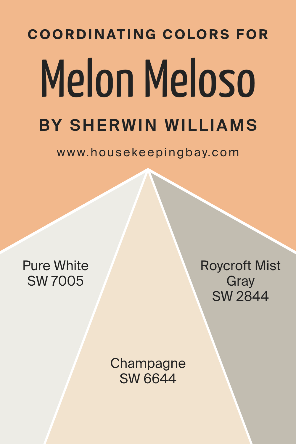
Coordinating Colors of Melon Meloso SW 9007 by Sherwin Williams
Coordinating colors are selected to work harmoniously with a main color, enhancing the overall aesthetic of a space without overpowering it. In the case of Sherwin Williams’ Melon Meloso SW 9007, a vivid and warm paint shade, certain colors have been specifically chosen to coordinate beautifully.
Such colors include SW 7005 – Pure White, SW 6644 – Champagne, and SW 2844 – Roycroft Mist Gray. These coordinating shades help to balance the vibrancy of Melon Meloso with more subdued, complementary colors, providing flexibility in design and decor choices.
Pure White is a clean and refreshing color that offers a crisp contrast to the richer tones of Melon Meloso, making it ideal for trim, ceilings, or even as an accent wall to brighten the room. Champagne is a soft, subtle hue with a slight yellow undertone that harmonizes well with the peachy tones of Melon Meloso, perfect for creating a gentle, cozy ambiance in spaces like bedrooms or living rooms.
Roycroft Mist Gray provides a soothing, neutral backdrop that complements the warmth of Melon Meloso, suitable for larger areas or furniture, helping to ground the color scheme and add a touch of sophistication.
Together, these coordinating colors offer a balanced palette that enhances the beauty and character of the main shade.
You can see recommended paint colors below:
- SW 7005 Pure White
- SW 6644 Champagne
- SW 2844 Roycroft Mist Gray
housekeepingbay.com
How Does Lighting Affect Melon Meloso SW 9007 by Sherwin Williams?
Lighting has a significant impact on how we perceive colors. This influence stems from the color temperature of the light source, which can vary between warm and cool tones. Cooler light can make colors appear sharper, while warmer light often creates a richer look.
The color Melon MelosoSW 9007 by Sherwin Williams is a vibrant yet soft shade that can behave quite differently under various lighting conditions. In natural light, Melon Meloso tends to display its true color — a cheerful and slightly muted coral tone that can brighten up spaces. The quality and angle of natural light, however, will affect how this color is perceived.
In rooms facing north, natural light tends to be cooler and more consistent throughout the day. Here, Melon Meloso might appear slightly more subdued, with its peachy undertones becoming less pronounced. This cooler light can make the color seem more neutral and calm, which might be ideal for creating a soft backdrop in a living area or bedroom.
In south-facing rooms, where light is warmer and more intense, Melon Meloso can become very vibrant, especially during midday when sunlight is brightest. This exposure accentuates the warm undertones of the color, making the room feel lively and energetic. This can be perfect for social areas like the living room or kitchen where a boost of energy is welcomed.
East-facing rooms receive light in the morning when the light is warm and bright. As a result, Melon Meloso will look vibrant and fresh in the morning, providing a warm and inviting atmosphere. As the day progresses and the light decreases, the color will take on a softer appearance.
West-facing rooms, conversely, get the evening light, which is also warm but often more golden due to the setting sun. Melon Meloso will glow warmly in the evening, creating a cozy and welcoming environment, which is ideal for dining rooms or spaces used primarily in the evening.
Artificial lighting, such as LED or incandescent bulbs, can also affect Melon Meloso. Depending on the color temperature of the artificial light (cool vs. warm), the paint can either lean towards a peachier hue under warm light or look more muted under cool lighting.
Understanding these nuances can help in making informed decisions about paint colors in relation to room orientation and lighting conditions, ensuring that Melon MelosoSW 9007 gives the desired effect in any space.
housekeepingbay.com
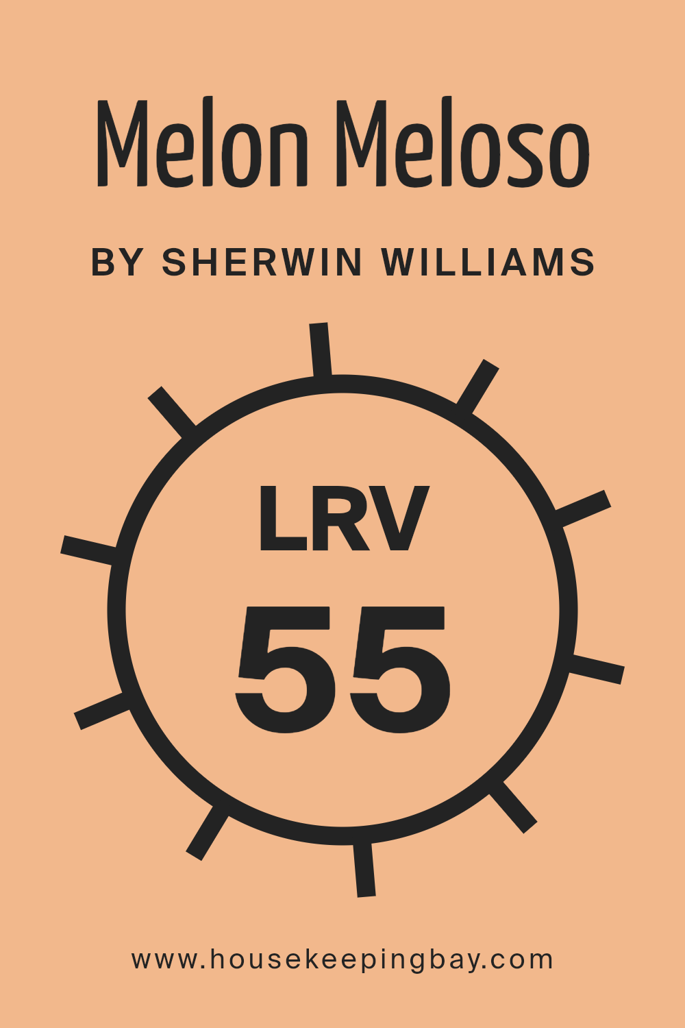
What is the LRV of Melon Meloso SW 9007 by Sherwin Williams?
LRV stands for Light Reflectance Value, which is a measure of the amount of visible and usable light that a color reflects when illuminated by a light source. LRV is scaled from 0 to 100, with 0 being absolute black, absorbing all light, and 100 being pure white, reflecting all light.
LRV is crucial when selecting paint colors as it affects how light or dark a color looks on the walls and how much light it will reflect into the room.
This metric is particularly important in smaller or darker spaces where maximizing light is desirable, or in large, well-lit areas where a lower LRV might be used to make the space feel cozier.
The LRV of Melon Meloso SW 9007 by Sherwin Williams is 55.314, placing it in the mid-range of the scale. This means it neither reflects light excessively nor absorbs too much of it, providing a balanced visual comfort.
In practical terms, a room painted with Melon Meloso will appear moderately bright without overwhelming brightness, making it adaptable to various lighting conditions and suitable for many areas of a home or office.
The color will hold its hue consistently throughout the day, subtly changing in appearance under different lighting conditions, offering a versatile option for design schemes.
housekeepingbay.com
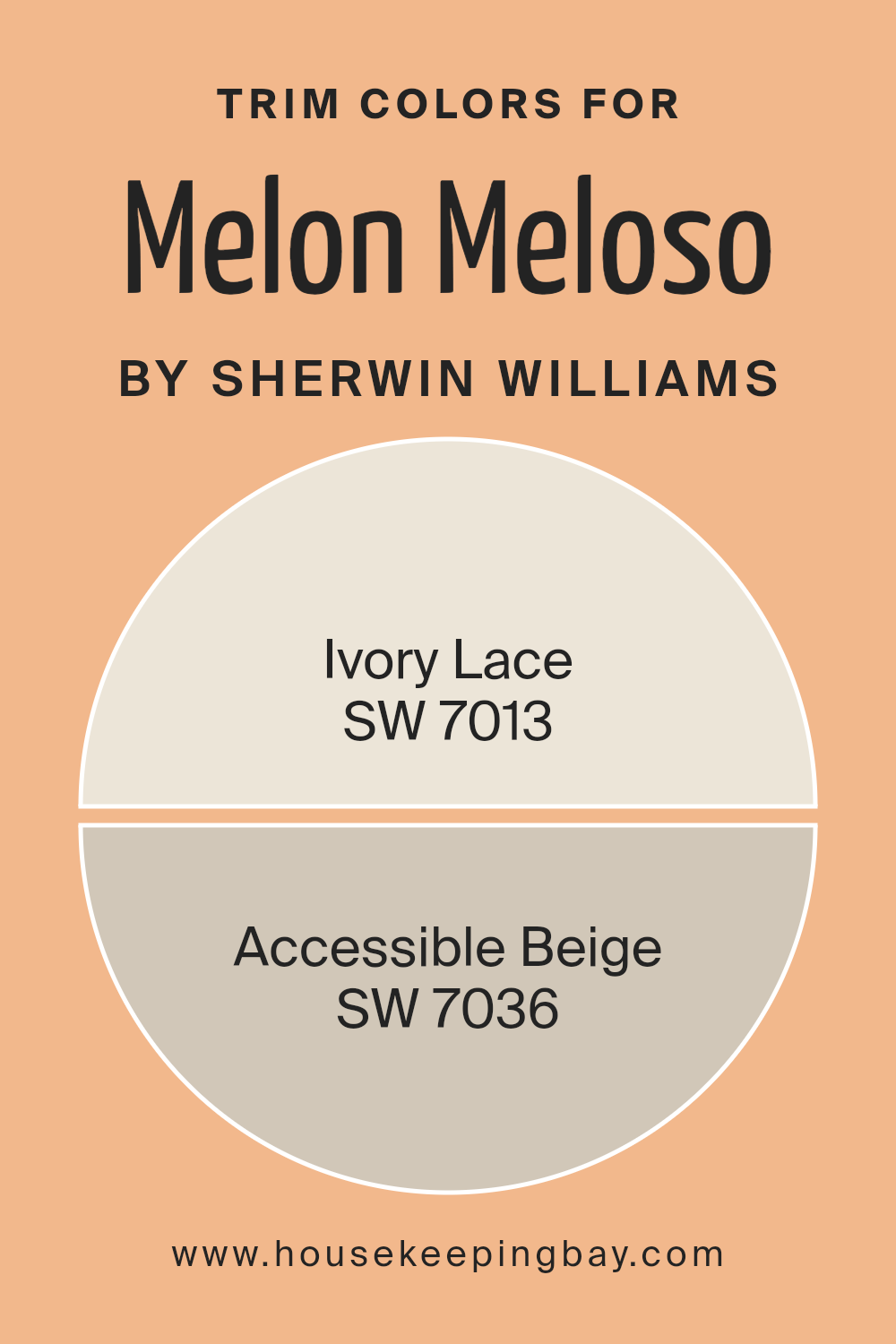
What are the Trim colors of Melon Meloso SW 9007 by Sherwin Williams?
Trim colors are essential design elements used to highlight and define the architectural features of a room, such as door frames, moldings, and window casings. When paired thoughtfully with a wall color like Melon Meloso SW 9007 by Sherwin Williams, the right trim color can enhance the overall aesthetic, create visual depth, or even soften the transitions between different spaces.
The choice of a trim color like SW 7013 – Ivory Lace or SW 7036 – Accessible Beige can either subtly blend with the wall color for a cohesive look or contrast slightly to outline and articulate specific features effectively.
Ivory Lace SW 7013 is a soft off-white color with a warm underlay that offers a gentle and soothing backdrop for the richer hue of Melon Meloso. It’s ideal for creating a seamless look where the intention is not to overpower the primary color but to support and refine it.
Accessible Beige SW 7036, on the other hand, is a warm beige with gray undertones that provides a neutral but contrasting border, which can help in defining the spaces more distinctly without creating a stark contrast.
This color works well in unifying more traditional and contemporary elements within a space, making it versatile and functional.
You can see recommended paint colors below:
- SW 7013 Ivory Lace
- SW 7036 Accessible Beige
housekeepingbay.com
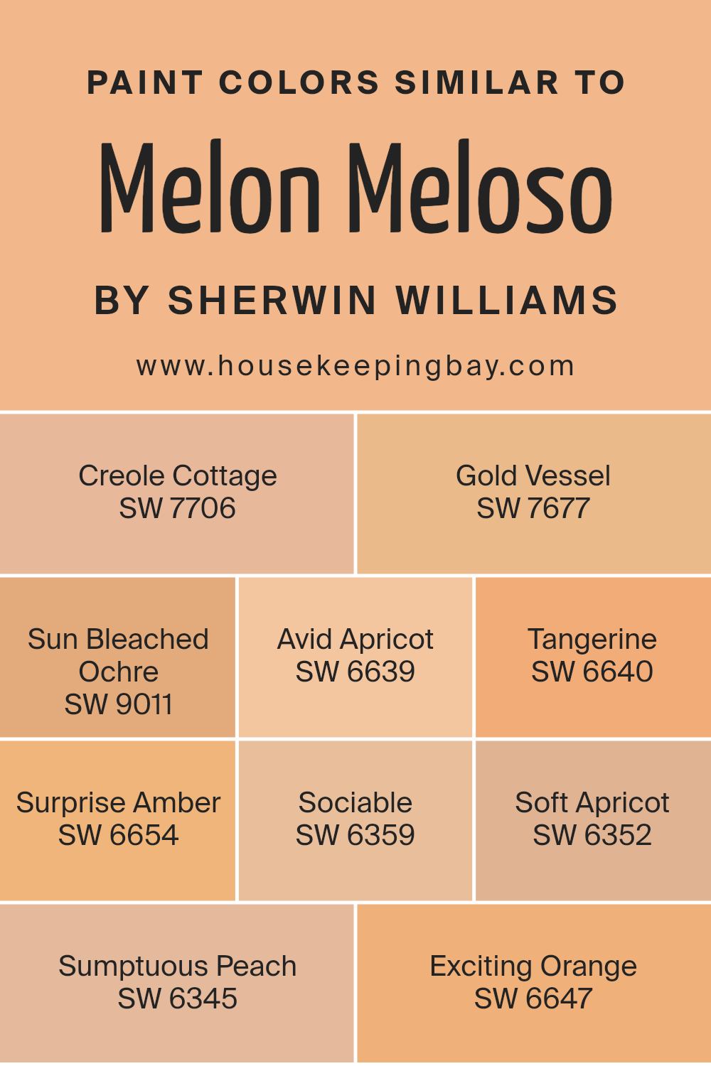
Colors Similar to Melon Meloso SW 9007 by Sherwin Williams
Similar colors are essential in design because they create a harmonious atmosphere and ensure visual continuity. By using colors that resemble each other, such as the various shades related to Melon Meloso SW 9007 by Sherwin Williams, designers can achieve a cohesive look that softly blends from one hue to the next without creating a jarring contrast.
This approach enables smoother transitions in color schemes across different spaces and elements, providing a unified appearance that is pleasing to the eye. Working with similar colors also allows for layering of shades that can add depth and complexity to an area, making it feel well-thought-out and professionally styled.
SW 7706 – Creole Cottage has the warmth of baked clay, offering a cozy and inviting feel ideal for living spaces. SW 7677 – Gold Vessel is shaded like a rich, golden sunset, perfect for infusing a touch of warmth into a room. SW 9011 – Sun Bleached Ochre reminiscences of soft, sunlit sands, making it great for serene environments.
SW 6639 – Avid Apricot takes a lively hue with hints of juicy ripeness, brightening rooms with its cheerful presence. SW 6640 – Tangerine brims with zesty orange energy, sparking a playful vibe. SW 6654 – Surprise Amber is like a late evening glow, rich and deep, suited for relaxing ambient settings.
SW 6359 – Sociable is a soft, muted coral that pairs well with communal areas for a friendly atmosphere. SW 6352 – Soft Apricot exudes a gentle, pastel charm, ideal for peaceful retreats. SW 6345 – Sumptuous Peach offers a lush, fruity splash that rejuvenates a space with its vibrant allure.
Lastly, SW 6647 – Exciting Orange is bold and bright, lending an energizing splash of fun to any area that wishes to stand out.
You can see recommended paint colors below:
- SW 7706 Creole Cottage
- SW 7677 Gold Vessel
- SW 9011 Sun Bleached Ochre
- SW 6639 Avid Apricot
- SW 6640 Tangerine
- SW 6654 Surprise Amber
- SW 6359 Sociable
- SW 6352 Soft Apricot
- SW 6345 Sumptuous Peach
- SW 6647 Exciting Orange
housekeepingbay.com
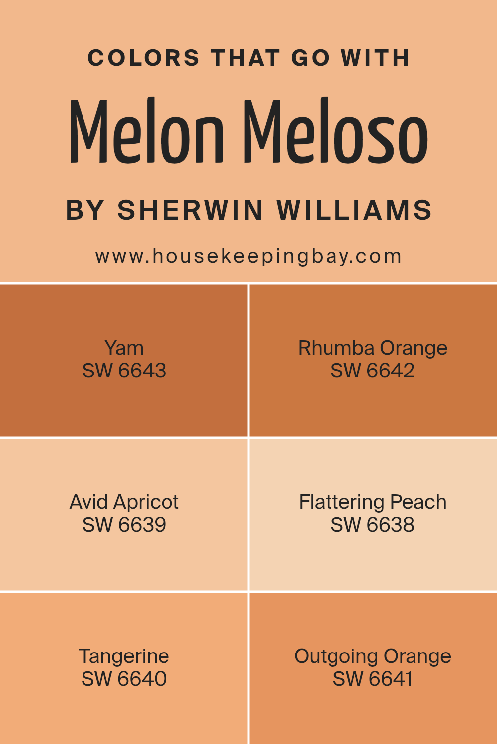
Colors that Go With Melon Meloso SW 9007 by Sherwin Williams
Choosing the right colors to pair with Melon Meloso SW 9007 by Sherwin Williams can significantly impact the look and feel of a room. Matching Melon Meloso with complementary colors can create harmony and enhance the overall aesthetic of a space.
For instance, pairing it with Yam SW 6643, a deep, warm orange that exudes richness and comfort, adds depth and a cozy ambiance to any room. Alternatively, Rhumba Orange SW 6642 is a vibrant, energetic color that infuses spaces with a sense of excitement and liveliness, working well in areas that inspire social interaction and creativity.
Adding Avid Apricot SW 6639, a softer, gentler orange with a soothing quality, can soften the bolder tones of Melon Meloso, ideal for creating a relaxing atmosphere in bedrooms or living areas. Flattering Peach SW 6638, with its gentle and inviting pink-orange hue, brings a light, friendly touch that can brighten spaces and make them feel more welcoming.
Tangerine SW 6640 is a bold, eye-catching shade that provides a striking contrast, making it perfect for accent walls or decor pieces to catch the eye. Lastly, Outgoing Orange SW 6641 offers a cheerful boost to any space, its luminous quality energizing environments that aim for a fun and lively vibe.
Integrating these colors with Melon Meloso can help achieve a variety of looks and moods, from relaxed and cozy to vibrant and energetic, depending on the desired effect.
You can see recommended paint colors below:
- SW 6643 Yam
- SW 6642 Rhumba Orange
- SW 6639 Avid Apricot
- SW 6638 Flattering Peach
- SW 6640 Tangerine
- SW 6641 Outgoing Orange
housekeepingbay.com
How to Use Melon Meloso SW 9007 by Sherwin Williams In Your Home?
Melon Meloso SW 9007 by Sherwin Williams is a vibrant and cheerful paint color. Its warm peach tone adds a soft, inviting touch to any room. This color is excellent for creating a cozy, upbeat atmosphere in living areas and kitchens, where families gather and spend a lot of time.
Painting a feature wall with Melon Meloso can instantly warm up a space and make it more welcoming. This shade is also perfect for bedrooms, where it can help create a soothing yet cheerful environment conducive to relaxation and comfort.
In smaller spaces, such as bathrooms or entryways, Melon Meloso can make the area seem larger and brighter because of its light-reflective qualities. Pairing it with neutral colors like whites or soft greys can maintain balance and prevent the space from feeling overwhelming.
For a refreshing and modern twist, you might consider using this color in combination with navy blues or rich greens in home accessories like cushions, rugs, or curtains to bring a fresh yet harmonious look.
Melon Meloso SW 9007 by Sherwin Williams vs Exciting Orange SW 6647 by Sherwin Williams
Melon Meloso SW 9007 from Sherwin Williams is a soft, muted orange with a peachy tone, giving it a gentle and soothing feel. It tends to bring warmth and lightness to spaces, making it an excellent choice for creating a cozy and welcoming atmosphere.
This color works well in living areas and bedrooms where a calm, nurturing presence is desired.
In contrast, Exciting Orange SW 6647 is a bolder, more vibrant shade of orange. It’s brighter and more energetic, ideal for spaces where you want to inject enthusiasm and vivacity. This color is perfect for accent walls, playrooms, or any area where you want to make a lively statement.
Both colors share an orange base, but their impact and usage can differ significantly due to their intensity and depth. Melon Meloso is more subdued and versatile, while Exciting Orange commands attention and energizes a space.
Choosing between them depends on the mood and function you want for your room.
You can see recommended paint color below:
- SW 6647 Exciting Orange
housekeepingbay.com
Melon Meloso SW 9007 by Sherwin Williams vs Surprise Amber SW 6654 by Sherwin Williams
Melon Meloso SW 9007 by Sherwin Williams is a gentle peach hue that carries a soft, soothing vibe, making it ideal for creating a warm, inviting space in homes. It reflects a subtle brightness that can make a room feel more open and airy without being too overpowering.
On the contrary, Surprise Amber SW 6654 is a bold, energetic orange color that offers a vibrant pop. This shade is perfect for those looking to inject some vitality into their decor. It tends to stand out and can be used to draw attention to specific areas or features in a room.
While Melon Meloso is more subdued and can blend seamlessly with neutral tones, Surprise Amber demands attention and works well with other vivid colors or as a striking contrast against softer shades.
Together, they could complement each other well in a space that aims for both comfort and dynamic accents.
You can see recommended paint color below:
- SW 6654 Surprise Amber
housekeepingbay.com
Melon Meloso SW 9007 by Sherwin Williams vs Sumptuous Peach SW 6345 by Sherwin Williams
Melon Meloso SW 9007 by Sherwin Williams is a gentle peachy-pink hue, conveying a soft, welcoming feel. It’s ideal for creating a soothing atmosphere in spaces meant for relaxation, like bedrooms or living rooms. This color pairs well with light neutrals or earthy tones, giving a room a fresh and airy look.
Sumptuous Peach SW 6345, also by Sherwin Williams, is a richer, deeper peach color with a vibrant, warm presence. It tends to make spaces feel cozy and inviting, perfect for areas where you want more energy and warmth, like kitchens or dining areas. When used in decor, this color works well with dark greens, blues, or even grays for a balanced, lively vibe.
Both colors share a peach base, but Melon Meloso is softer and lighter, promoting calmness and light. Sumptuous Peach, with its stronger, brighter tone, injects more warmth and vitality into a space. Depending on your room’s purpose and desired feel, each color offers unique advantages.
You can see recommended paint color below:
- SW 6345 Sumptuous Peach
housekeepingbay.com
Melon Meloso SW 9007 by Sherwin Williams vs Creole Cottage SW 7706 by Sherwin Williams
Melon Meloso SW 9007 by Sherwin Williams is a warm, soft coral shade that carries an inviting, gentle vibe to any space. This color is light and airy, making it perfect for creating a cozy, cheerful ambiance in rooms like living rooms, kitchens, or nurseries. It pairs beautifully with neutral tones and soft pastels, enhancing a space without overwhelming it with too much intensity.
In contrast, Creole Cottage SW 7706 by Sherwin Williams is a deep terracotta color. This shade is rich and earthy, providing a more grounded feeling. It works well in areas that benefit from a robust, natural tone, such as dining rooms or entryways. Because of its depth, Creole Cottage pairs well with stark contrasts like crisp whites or dark, moody hues, adding a sense of warmth and character.
Both colors offer unique qualities: Melon Meloso adds softness and lightness, while Creole Cottage offers depth and warmth, making them suitable for different interior moods and styles.
You can see recommended paint color below:
- SW 7706 Creole Cottage
housekeepingbay.com
Melon Meloso SW 9007 by Sherwin Williams vs Gold Vessel SW 7677 by Sherwin Williams
Melon Meloso SW 9007 by Sherwin Williams is a warm, inviting peach color that adds a soft and cozy ambiance to any room. It’s gentle and soothing, perfect for creating a relaxing atmosphere in spaces like living rooms or bedrooms. The lightness of Melon Meloso makes it an excellent choice for smaller rooms, as it can make them appear more spacious and airy.
Gold Vessel SW 7677, however, is a rich, deep mustard yellow. This color is bolder and makes a strong statement when used in interior decorating. It works well in spaces that benefit from a touch of drama or warmth, such as dining areas or entryways.
The intensity of Gold Vessel is great for pairing with dark woods or other strong accent colors, giving a room a more grounded feeling.
Both colors bring warmth to a space but in unique ways, with Melon Meloso providing a lighter touch and Gold Vessel offering a deeper hue. Choose between them based on the desired impact and size of the room.
You can see recommended paint color below:
- SW 7677 Gold Vessel
housekeepingbay.com
Melon Meloso SW 9007 by Sherwin Williams vs Tangerine SW 6640 by Sherwin Williams
Melon Meloso SW 9007 by Sherwin Williams is a soft, gentle shade that closely resembles the light, delicate tones of a ripe melon. It offers a subtle touch of warmth, making it perfect for creating a cozy and inviting atmosphere in any room. This color pairs well with neutral and earthy tones, enhancing a space without overwhelming it with boldness.
In contrast, Tangerine SW 6640, also by Sherwin Williams, is a vibrant, energetic orange. It’s much bolder and more vivid compared to Melon Meloso. Tangerine commands attention and can inject life and enthusiasm into a space.
It’s ideal for areas where you want to add a splash of energy or highlight a particular feature.
These two colors serve different purposes in home decor.
Melon Meloso soothes and softens, while Tangerine energizes and excites, offering flexibility depending on the feeling you wish to achieve in your space.
You can see recommended paint color below:
- SW 6640 Tangerine
housekeepingbay.com
Melon Meloso SW 9007 by Sherwin Williams vs Avid Apricot SW 6639 by Sherwin Williams
Melon Meloso SW 9007 from Sherwin Williams presents a soft, gentle pink hue that imparts a fresh and soothing atmosphere. This color lightens up spaces with its understated warmth, making it ideal for creating a calming, inviting environment in places such as living rooms or bedrooms. The lightness of Melon Meloso adds a sense of airiness and space, which can be particularly beneficial in smaller rooms or areas with limited natural light.
Avid Apricot SW 6639, also by Sherwin Williams, leans more towards a vibrant orange tone, offering a lively and energetic vibe. This color can instantly add a cheerful pop to any space, perfect for areas where creativity and activity buzz, like kitchens or dining areas. Avid Apricot has the strength to stimulate and invigorate, making it a great choice for accent walls or decor items to brighten up a room.
In comparing, Melon Meloso provides a tranquil, light feel, while Avid Apricot brings more intensity and energy, suitable for more dynamic spaces. The choice between them depends largely on the mood you wish to create within your space.
You can see recommended paint color below:
- SW 6639 Avid Apricot
housekeepingbay.com
Melon Meloso SW 9007 by Sherwin Williams vs Sociable SW 6359 by Sherwin Williams
Melon Meloso SW 9007 by Sherwin Williams is a soft, peachy hue that brings a gentle warmth to any space. It has a soothing and cozy vibe, making it excellent for relaxation areas like living rooms or bedrooms. This color meshes well with natural elements and muted tones, creating a calming atmosphere.
Sociable SW 6359, also by Sherwin Williams, is a vibrant, energetic coral shade that injects a lively burst of color into a space. It’s more intense and playful than Melon Meloso, making it a great choice for spaces where activity and interaction occur, such as kitchens or dining areas.
It pairs well with bright whites and greys, which can help balance its vibrancy.
Both colors are suitable for adding personality to your spaces but cater to different moods and settings. Melon Meloso suits serene environments, while Sociable fits into dynamic, social settings.
You can see recommended paint color below:
- SW 6359 Sociable
housekeepingbay.com
Melon Meloso SW 9007 by Sherwin Williams vs Soft Apricot SW 6352 by Sherwin Williams
Melon Meloso SW 9007 by Sherwin Williams is a gentle, pastel peach shade that evokes a sense of calm and softness in a space. It can smoothly blend with neutral and warm color palettes, creating an inviting atmosphere. This color is perfect for those looking to add a subtle touch of warmth to their rooms without overwhelming the senses.
Soft Apricot SW 6352, however, is a bit richer and deeper than Melon Meloso. It leans towards a more vibrant apricot hue, which can inject a more lively and cheerful energy into a space. Ideal for spaces where a bit of personality is desired, it pairs well with both light and dark accents, offering a versatile option for decorating.
While both colors share a warm undertone, Melon Meloso is softer and more muted, making it ideal for peaceful, serene environments. Soft Apricot, with its brighter and more pronounced tones, is excellent for spaces meant to be more dynamic and energetic.
You can see recommended paint color below:
- SW 6352 Soft Apricot
housekeepingbay.com
Melon Meloso SW 9007 by Sherwin Williams vs Sun Bleached Ochre SW 9011 by Sherwin Williams
Melon Meloso SW 9007 and Sun Bleached Ochre SW 9011, both from Sherwin Williams, offer distinct vibes for room settings. Melon Meloso is a bright, creamy color, leaning towards a soft orange, which provides a cheerful and inviting atmosphere. This color is perfect for spaces where you want to add a sense of warmth and brightness, such as living rooms or kitchens.
In contrast, Sun Bleached Ochre SW 9011 has a muted, earthy tone, resembling a faded yellow with hints of brown. It evokes a natural, calming feel, suitable for creating a relaxed environment. It works well in bedrooms or study rooms where a subdued atmosphere helps in maintaining focus and calmness.
Both colors are versatile but serve different purposes based on the mood you wish to set. Melon Meloso brightens a space, whereas Sun Bleached Ochre sets a more understated, soothing tone.
You can see recommended paint color below:
- SW 9011 Sun Bleached Ochre
housekeepingbay.com
When I used this color in a study, it appeared amazingly vibrant in the mornings and soothingly gentle in the evening under artificial lighting. It pairs beautifully with natural wood finishes, creams, and even blues, making it versatile for various decor styles—from modern to rustic.
What’s more, its adaptability extends beyond just walls; it looks equally charming on cabinets or as an accent feature.
Utility-wise, similar to many Sherwin Williams paints, Melon Meloso offers good coverage, making the painting process less laborious and more cost-effective, since fewer coats are often required to achieve a professional look.
For anyone considering a refreshing yet calm vibe for their home, SW 9007 Melon Meloso stands out as a reliable and picturesque choice that promises to infuse your living space with warmth and charm.
I find it an excellent pick especially for areas where a calm yet inviting atmosphere is desired.
housekeepingbay.com
Ever wished paint sampling was as easy as sticking a sticker? Guess what? Now it is! Discover Samplize's unique Peel & Stick samples. Get started now and say goodbye to the old messy way!
Get paint samples


