Marine SW 9659 by Sherwin Williams
Find Your Fresh Take on Blue
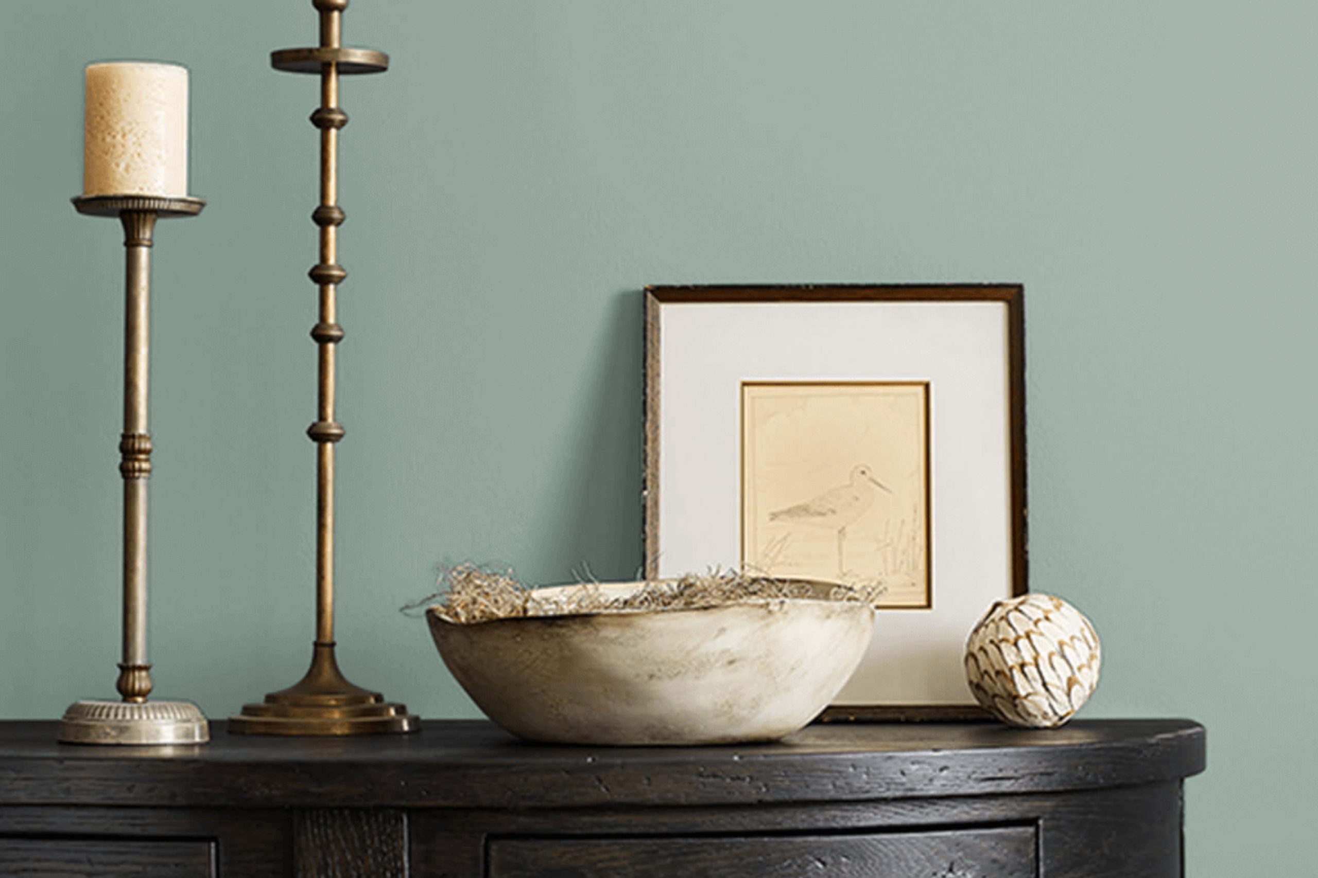
Imagine the serene and soothing effect of a color that reflects the deep, calm waters of the ocean. This serene shade offers a unique blend of blue and green hues, providing a peaceful backdrop for any room in your home.
Whether you’re planning to refresh your living room, bedroom, or even your bathroom, Marine creates a tranquil atmosphere, making your space a comforting escape from the everyday hustle and bustle.
This color is not only soothing but also adapts well to different lighting conditions, shifting gracefully from a vibrant aquamarine to a deeper, more introspective sea green as the day progresses. Combining it with various decors, from modern to rustic, is straightforward, allowing you to maintain a contemporary feel without compromising warmth and comfort.
So, if you’re ready to give your home a fresh, soothing update, consider SW 9659 Marine. It’s a straightforward choice that can have a significant impact, enhancing the overall feel of your home while providing a beautiful and refreshing aesthetic.
via sherwin-williams.com
What Color Is Marine SW 9659 by Sherwin Williams?
MarineSW 9659 by Sherwin Williams is a vibrant and rich blue shade that brings the essence of the deep ocean into any space. This color has a lively yet soothing presence, making it perfect for creating a serene and engaging atmosphere.
MarineSW 9659 fits beautifully in various interior styles, especially in coastal, modern, and contemporary designs. Its deep blue tones help to create a focal point in a room, whether applied on all walls or just one as an accent.
This color also works well in Scandinavian themes where it pairs impressively with minimalist and functional aesthetics.
When it comes to materials, MarineSW 9659 complements natural wood tones from light oak to darker walnut, enhancing the organic look of a space. It also pairs well with metallic finishes such as brushed nickel and chrome, adding a sleek, modern touch.
For textures, consider soft, plush fabrics like velvet or linen to balance the boldness of the color with softness, creating a cozy yet sophisticated environment.
This shade can also harmonize well with leather furniture, adding a luxurious and timeless feel to the decor. Incorporating elements like glass and ceramic in lighter tones can help to balance the intensity of MarineSW 9659, ensuring the space feels open and bright.
housekeepingbay.com
Is Marine SW 9659 by Sherwin Williams Warm or Cool color?
MarineSW 9659 by Sherwin Williams is a rich, deep blue hue that brings a sense of calm and sophistication to any room. This color draws its inspiration from the ocean depths, radiating a strong but serene energy that can make spaces feel more refined and focused.
Perfect for use in bedrooms or bathrooms, it can create a restful environment, aiding in relaxation and de-stressing after a long day.
In living areas or dining rooms, MarineSW 9659 works well as an accent wall, providing a beautiful backdrop that highlights décor and furniture. The deep blue can also help smaller spaces appear larger by adding depth to the room’s aesthetic.
Additionally, this color pairs excellently with light neutrals like whites and grays, which help to balance its intensity. For those looking to add a touch of nature, wooden elements or greenery contrast nicely against the blue, creating an inviting, organic feel.
Overall, MarineSW 9659 offers versatility in home design, allowing for a sophisticated yet comfortable atmosphere.
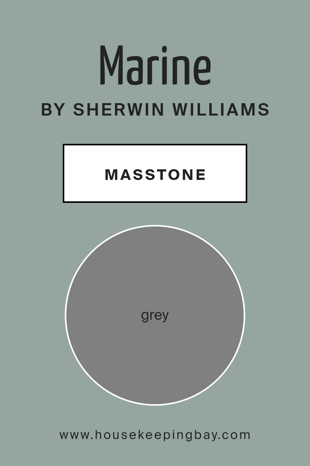
What is the Masstone of the Marine SW 9659 by Sherwin Williams?
MarineSW 9659 by Sherwin Williams has a masstone of grey, coded as #808080. This middle shade of grey is very versatile, making it an excellent choice for home interiors. It’s a balanced color that doesn’t lean too dark or too light, which means it can work well in various lighting conditions.
Grey is known for its ability to blend with other colors, making MarineSW 9659 a great base for any color scheme in a home. It can pair nicely with bold colors for a dynamic contrast or with soft tones for a more soothing atmosphere.
In homes, this shade of grey adds a subtle, modern touch without overpowering the space. It’s especially useful in areas where you want to achieve a timeless look. Grey walls can make colorful furniture or art pieces stand out, providing a neutral backdrop that highlights other design elements. Grey also tends to give spaces a clean and orderly feel, which can make rooms appear more spacious and organized.
housekeepingbay.com
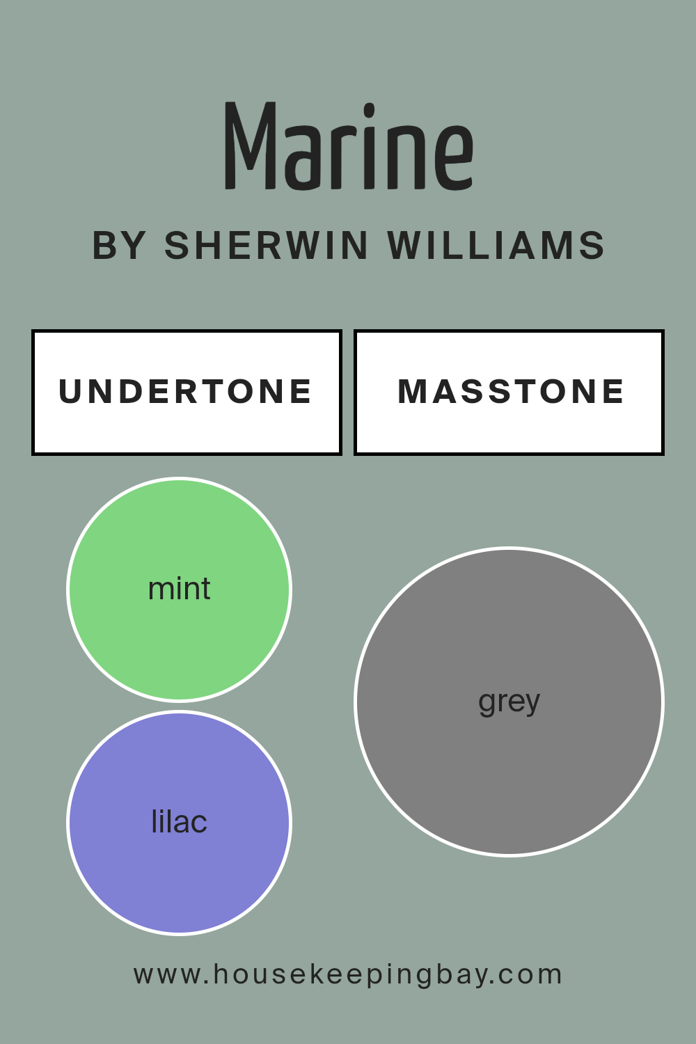
Undertones of Marine SW 9659 by Sherwin Williams
MarineSW 9659 by Sherwin Williams is a versatile paint color rich with varied undertones that influence its overall appearance and the atmosphere it creates in a room. Undertones are subtle hues that are integrated into the main color, affecting how it looks under different lighting conditions and when paired with other colors.
For MarineSW 9659, these undertones range from cooler shades like mint, lilac, and light blue, to warmer tones such as pale pink and pale yellow.
When applied to interior walls, the presence of these undertones can subtly alter the perceived temperature and mood of a space. Cooler undertones like light blue and light purple might make a room feel more calm and refreshing, ideal for bedrooms or bathrooms where a soothing effect is desired. On the other hand, warmer tones like pale yellow and light turquoise can make a space feel more welcoming and energized, suitable for living rooms or kitchens.
The versatility of MarineSW 9659, enriched by its complex undertones, allows it to adapt uniquely to various decors and themes. In natural light, lighter undertones like light gray may become more prominent, giving the room a brighter feel.
Conversely, in dimmer lighting, darker undertones such as dark turquoise might emerge, providing a more grounded sensation.
Considering the broad spectrum of undertones — including unusual ones like olive, navy, and fuchsia — this color can complement a wide array of furnishing colors and materials.
This makes MarineSW 9659 a practical choice for anyone looking to create specific or varied atmospheres in their home through paint.
housekeepingbay.com
How Does Lighting Affect Marine SW 9659 by Sherwin Williams?
Lighting is crucial in determining how colors appear in various environments. The way light interacts with paint can change the perception of its color. For instance, MarineSW 9659 by Sherwin Williams is a distinct shade that reacts uniquely under different lighting conditions.
Artificial Light: In rooms lit by artificial sources, like incandescent bulbs or LED lights, MarineSW 9659 leans towards a richer and deeper tone. Halogen bulbs, closely imitating natural sunlight, tend to bring out the vibrant essence of this color, making it appear more dynamic.
Florescent lighting, however, can cast a bluish tint, which might shift the color to appear slightly cooler than intended.
Natural Light: Natural sunlight reveals the truest form of MarineSW 9659. As the quality and angle of natural light change throughout the day, so too does this color.
Morning light tends to be gentler, making the color appear soft and subtle. As the sun reaches its peak, the intensity increases, bringing a bright and energetic feel to the color.
In the late afternoon, when the sun casts a warmer glow, the paint takes on a cozy and warm appearance.
Room Orientation:
– North-Faced Rooms: These rooms receive less direct sunlight, often resulting in a cooler, shadowy light. MarineSW 9659 may appear more muted and subdued in such rooms, potentially leaning slightly towards a grayish tone.
– South-Faced Rooms:With abundant sunlight, south-faced rooms show MarineSW 9659 at its brightest and most true-to-color. The vibrant qualities of the paint are enhanced, making the room feel lively and colorful.
– East-Faced Rooms:Morning light in east-facing rooms can make MarineSW 9659 look very inviting and fresh. As the light fades, the color might lose some of its brightness but still maintains a pleasant hue.
– West-Faced Rooms: Evening light in these rooms brings warmth, which can amplify the deeper tones in MarineSW 9659, providing a rich and appealing look as the sun sets.
Understanding how light affects color can greatly assist in making informed decisions about paint in various settings, ensuring that MarineSW 9659 is used to its best advantage.
housekeepingbay.com
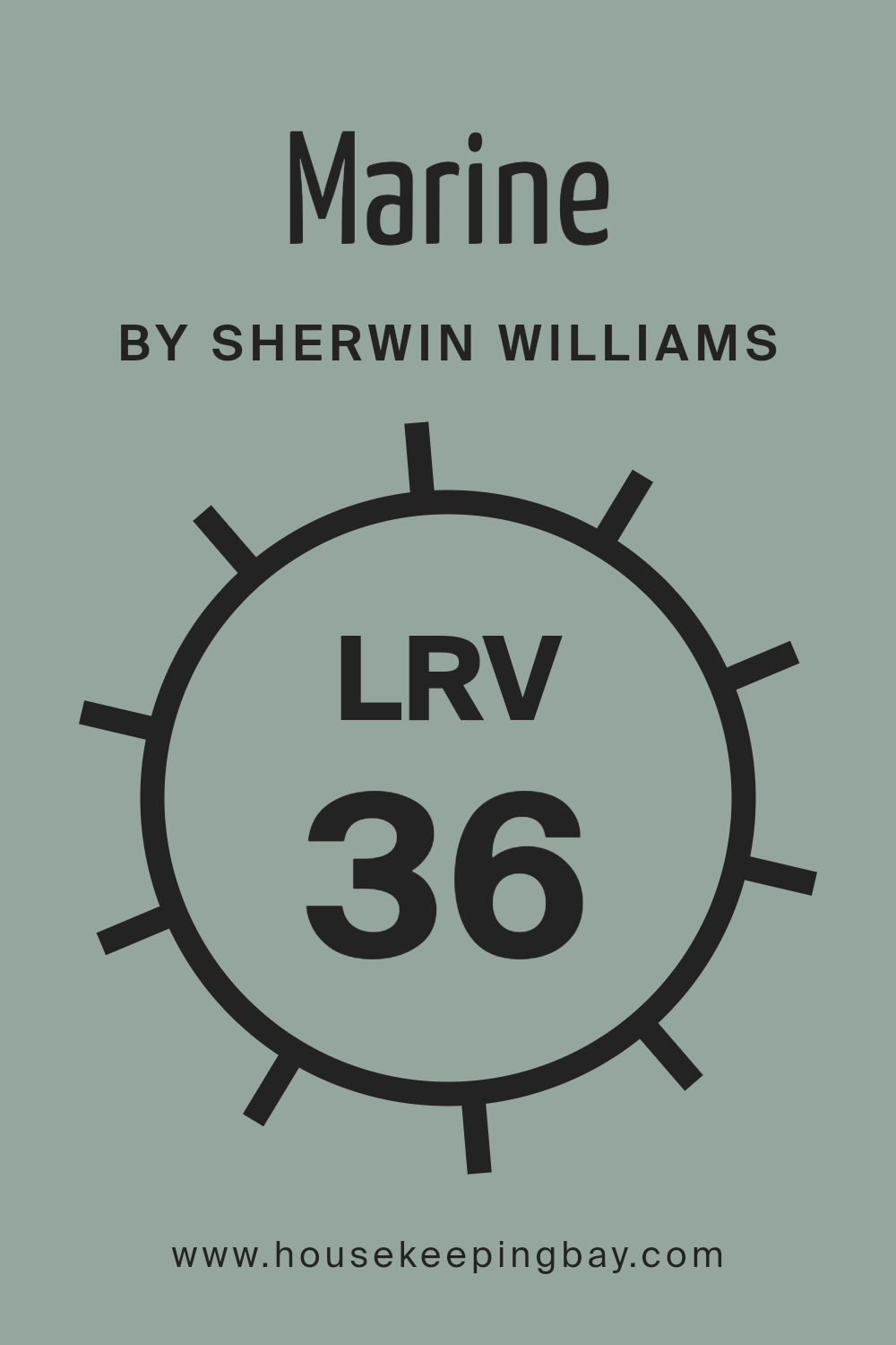
What is the LRV of Marine SW 9659 by Sherwin Williams?
LRV stands for Light Reflectance Value, which is a measure of the amount of visible and usable light that reflects from or absorbs into a painted surface. The LRV scale ranges from 0, which is completely black and absorbs all light, to 100, which is pure white and reflects all light.
The LRV of a color can significantly influence the appearance and feel of a room. For instance, colors with a higher LRV make a room look brighter and bigger because they reflect more light. On the other hand, colors with a lower LRV can make a space feel smaller and dimmer because they absorb more light.
The LRV of MarineSW 9659 by Sherwin Williams is 35.959, placing it in the medium range of the LRV scale. This means it will have a moderating effect in terms of light reflection and absorption. This particular shade of color won’t brighten a room as much as a higher LRV color would, but it also won’t darken a space like a color with a much lower LRV.
MarineSW 9659 might be a suitable choice for those wanting a balance between warmth and depth without making the room feel too enclosed or shaded. Its medium LRV provides versatility in terms of design and use in various lighting conditions, making it adaptable for many spaces.
housekeepingbay.com
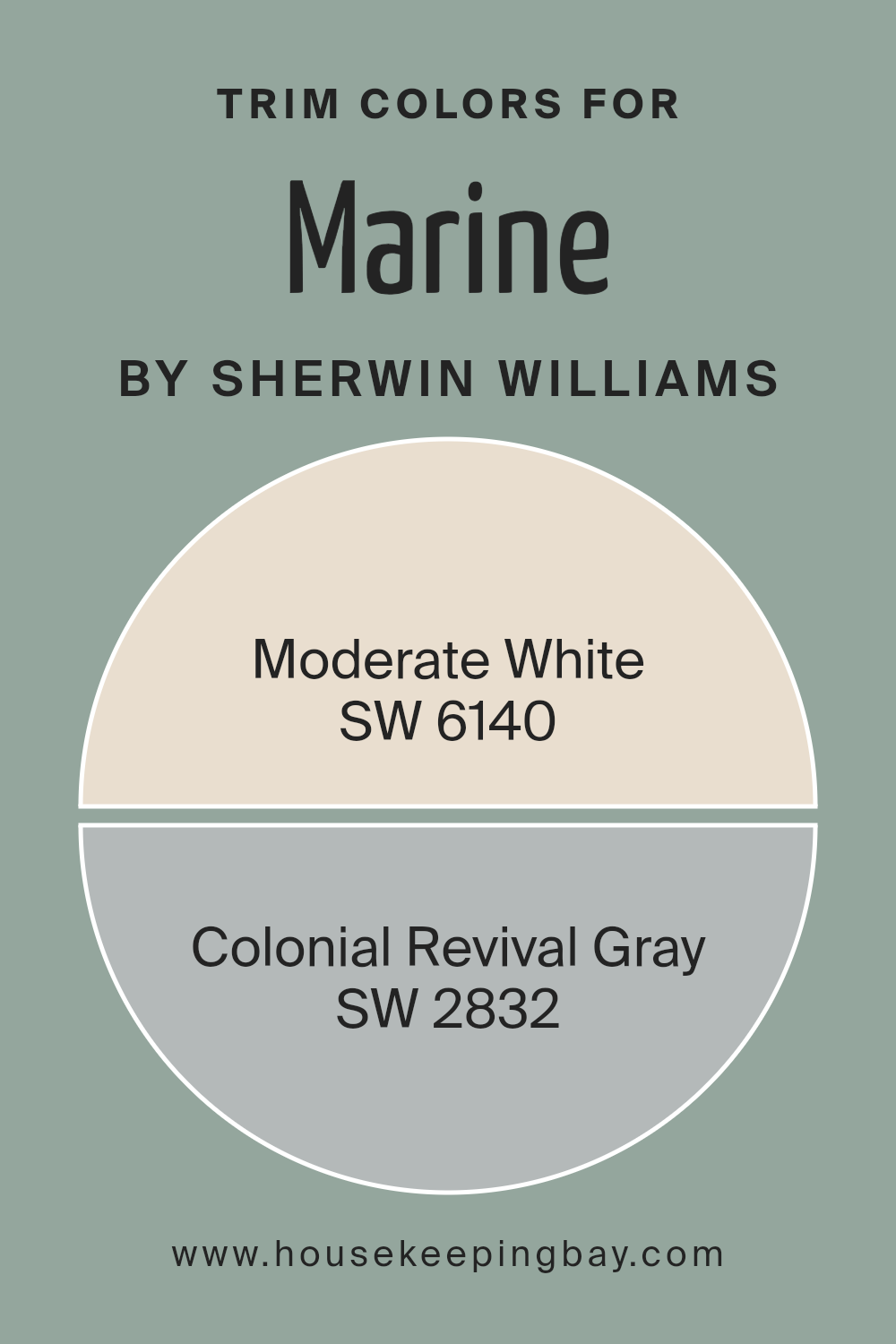
What are the Trim colors of Marine SW 9659 by Sherwin Williams?
Trim colors are specifically chosen hues that contrast with or complement the main color of a space, utilized for highlighting architectural details and creating a defined, polished look. In the case of MarineSW 9659 by Sherwin Williams, appropriate trim colors can accentuate its deep marine shade, enhancing the overall aesthetic without overwhelming the primary color.
SW 6140 – Moderate White and SW 2832 – Colonial Revival Gray serve as excellent choices for this purpose, both offering subtle yet distinct tonal variations that can outline features crisply against the rich backdrop of MarineSW 9659.
SW 6140 – Moderate White is a gentle, soft white with warm undertones that can effectively soften the intense depth of MarineSW 9659, lending a soothing, clean boundary that integrates smoothly with various decor styles.
On the other hand, SW 2832 – Colonial Revival Gray provides a light, unassuming gray shade that contrasts slightly more with MarineSW 9659, giving a hint of traditional elegance and a slightly more pronounced definition to spaces, which helps in distinguishing and highlighting architectural features like moldings and door frames.
Together, these trim colors offer versatile options that can enhance the appearance of the primary color while maintaining a cohesive and appealing design theme.
You can see recommended paint colors below:
housekeepingbay.com
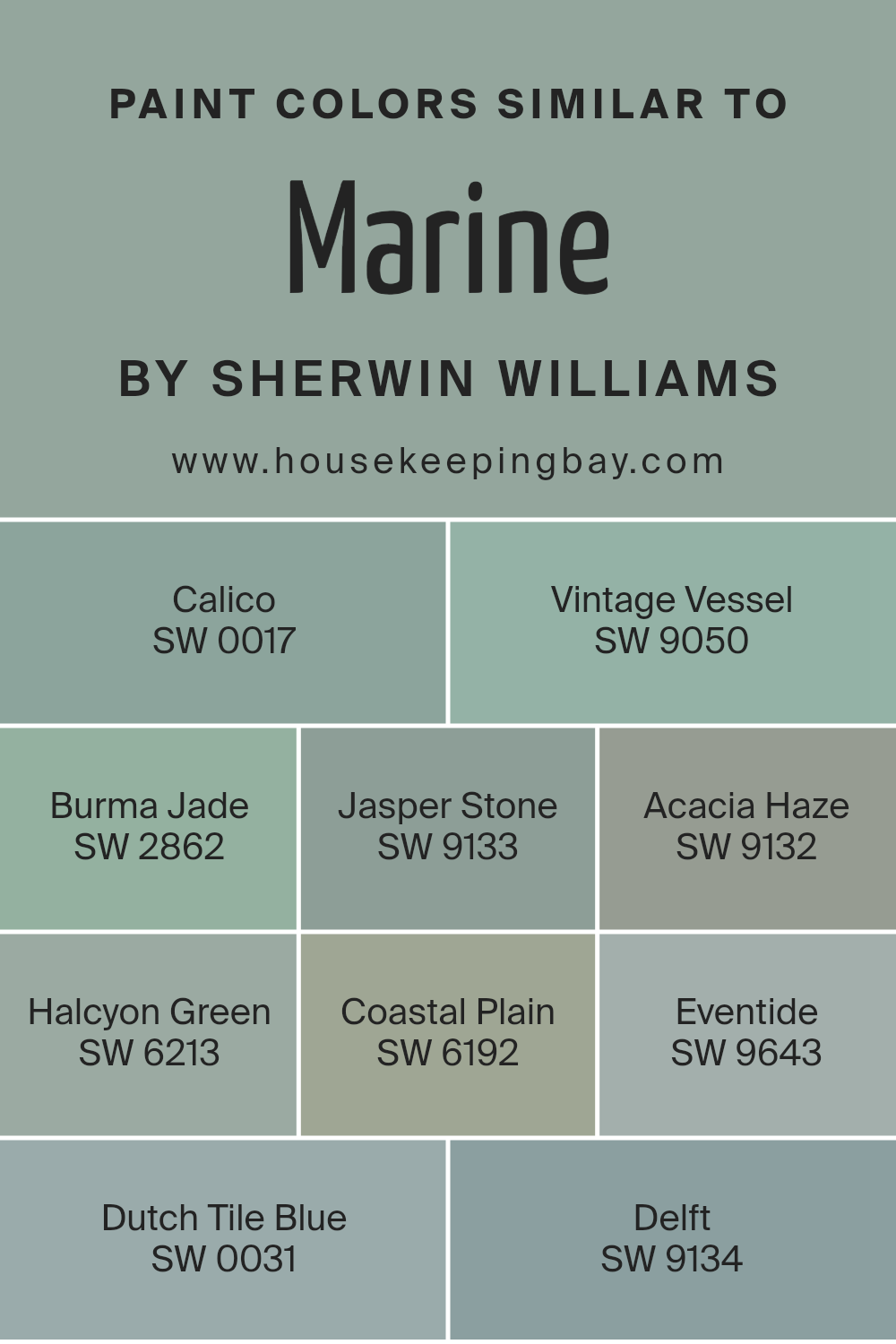
Colors Similar to Marine SW 9659 by Sherwin Williams
Similar colors play a crucial role in design by creating harmony and balance, giving spaces a cohesive look. When colors like the hues related to MarineSW 9659 by Sherwin Williams are used together, they have a subtle variation that can enrich the visual experience without overwhelming the senses.
For instance, colors such as SW 0017 – Calico and SW 9050 – Vintage Vessel share a muted, soft presence which can soothe the eyes, making them ideal for relaxed spaces. They blend well without creating stark contrasts, perfect for layering and adding depth.
Furthermore, shades like SW 2862 – Burma Jade and SW 9133 – Jasper Stone give a hint of earthy undertones, which can warm up a space while keeping the overall palette unified. For cooling effects, hues such as SW 9132 – Acacia Haze and SW 6213 – Halcyon Green offer gentle greenish touches that bring a sense of freshness into rooms.
SW 6192 – Coastal Plain and SW 9643 – Eventide provide deeper greens and blues, great for accentuating areas without straying from a harmonious palette. Lastly, variations such as SW 0031 – Dutch Tile Blue and SW 9134 – Delft introduce a more defined but still related blue tone, which can serve to highlight features without disrupting the serene flow created by the color similarity.
These similar colors can have a significant impact, subtly enhancing a space while maintaining a smooth visual flow.
You can see recommended paint colors below:
- SW 0017 Calico
- SW 9050 Vintage Vessel
- SW 2862 Burma Jade
- SW 9133 Jasper Stone
- SW 9132 Acacia Haze
- SW 6213 Halcyon Green
- SW 6192 Coastal Plain
- SW 9643 Eventide
- SW 0031 Dutch Tile Blue
- SW 9134 Delft
housekeepingbay.com
How to Use Marine SW 9659 by Sherwin Williams In Your Home?
Marine SW 9659 by Sherwin Williams is a versatile paint color that brings a sense of calm and sophistication to any room. Its deep blue hue mimics the ocean, making it a perfect choice for creating a serene atmosphere in your home. This color works well in bathrooms and bedrooms, where its soothing qualities can enhance relaxation. You can also use it in a home office for a focused, yet peaceful vibe.
Additionally, Marine SW 9659 pairs beautifully with neutral tones such as whites and grays, allowing it to fit seamlessly into most color schemes. Consider using this color for a feature wall to add a pop of color, or paint cabinetry or furniture for a fresh, modern look.
Whether you’re updating a single room or refreshing your entire home, Marine SW 9659 provides a stylish, refined backdrop that complements a wide range of décor styles.
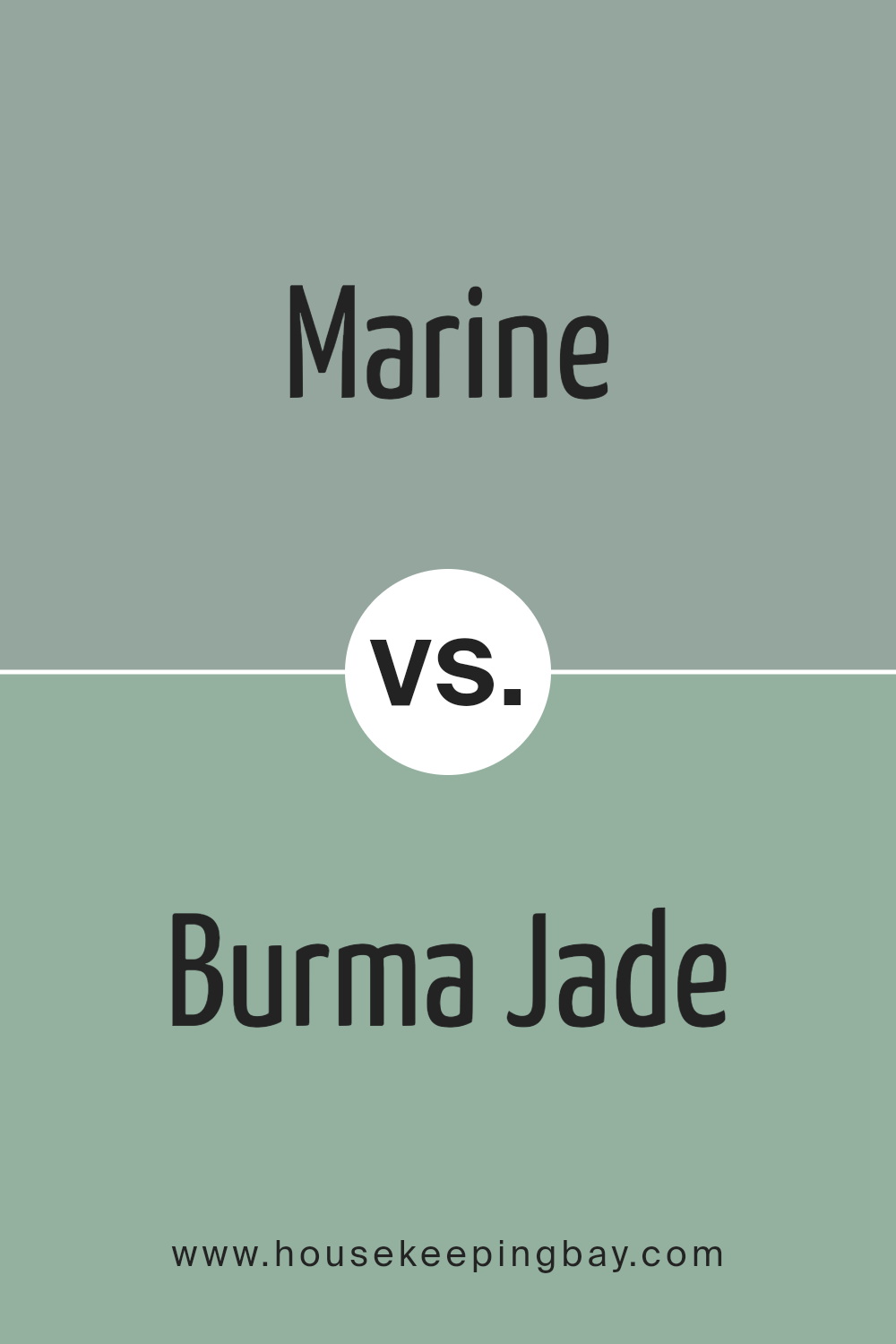
Marine SW 9659 by Sherwin Williams vs Burma Jade SW 2862 by Sherwin Williams
Marine SW 9659 by Sherwin Williams is a deep, rich blue that mirrors the depths of the ocean. This color exudes a strong presence and can anchor a space with its boldness. It pairs well with lighter tones and metallic accents, offering a classic look that feels both refined and cozy.
In contrast, Burma Jade SW 2862 leans towards a vibrant, fresh green, reminiscent of lush tropical foliage. This shade is lively and brings a burst of energy to any room. It is an excellent choice for spaces that benefit from a touch of nature’s vibrancy, providing a lively yet soothing atmosphere.
Both colors, Marine and Burma Jade, have distinct personalities. Marine tends to create a more formal, sophisticated vibe, while Burma Jade is upbeat and refreshing. Depending on the mood you want to set, each color offers unique possibilities for creating welcoming and personalized spaces.
You can see recommended paint color below:
- SW 2862 Burma Jade
housekeepingbay.com
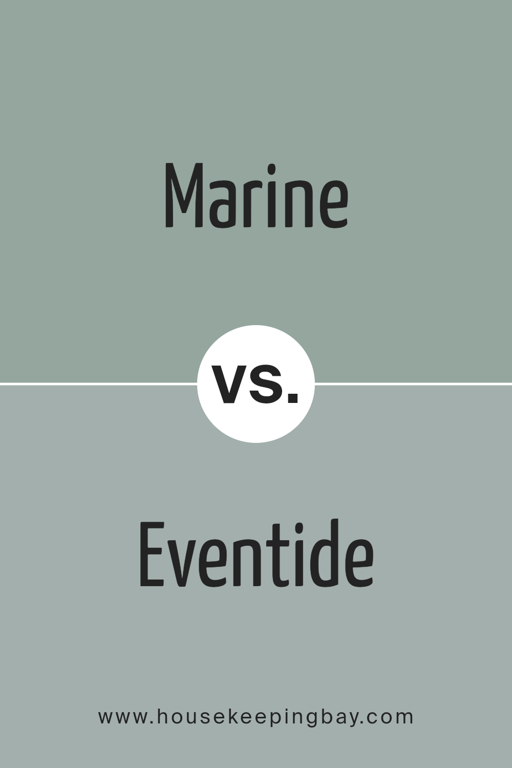
Marine SW 9659 by Sherwin Williams vs Eventide SW 9643 by Sherwin Williams
Marine SW 9659 by Sherwin Williams is a deep, rich blue with a vibrant intensity that can add a sense of depth and sophistication to any space. This color resembles the deep ocean and has a strong presence, making it ideal for an accent wall or for rooms where a bold statement is desired.
Contrarily, Eventide SW 9643 is also from Sherwin Williams but features a lighter and softer blue. This shade mimics the calm and soothing tones of the twilight sky, lending a serene and peaceful feel to interiors. It works beautifully in bedrooms or living areas where a relaxed atmosphere is preferred.
Though both colors share a blue base, Marine is more vivid and bold, whereas Eventide offers a gentler, calming vibe. Their uses can vary depending on the mood one wishes to create in a room, with Marine being more dramatic and Eventide more soothing.
You can see recommended paint color below:
housekeepingbay.com
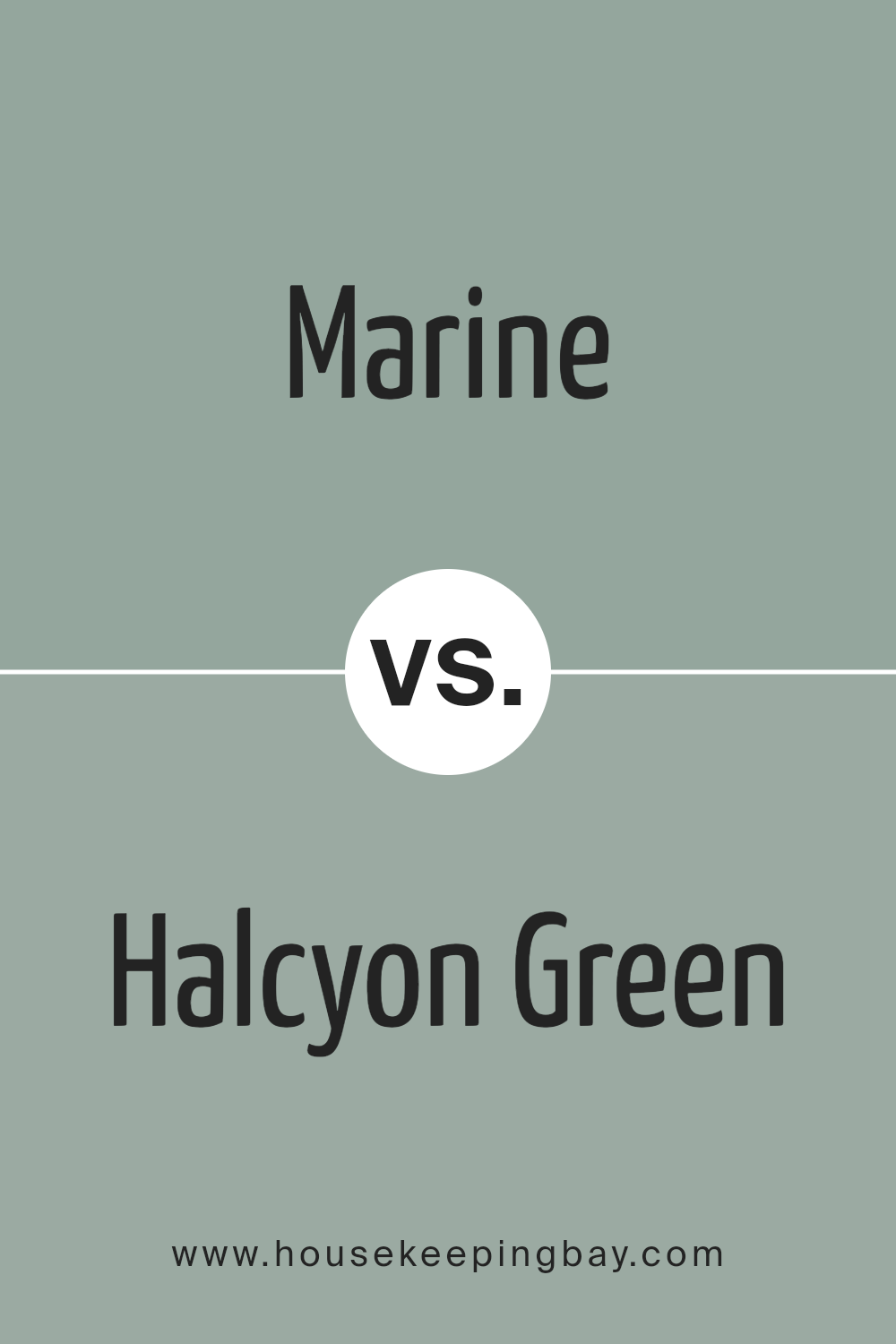
Marine SW 9659 by Sherwin Williams vs Halcyon Green SW 6213 by Sherwin Williams
Marine SW 9659 by Sherwin Williams is a deep blue color that gives off the feel of the ocean at dusk. It’s bold and can enhance spaces that need a strong, soothing atmosphere. This color works well in areas that benefit from a calm, focused vibe, like studies or reading nooks.
Halcyon Green SW 6213, also by Sherwin Williams, is a lighter, muted green with soft gray undertones. It offers a serene and gentle ambiance, ideal for bedrooms or bathrooms where a relaxed environment is preferred. This color complements spaces with a lot of natural light, adding a fresh and airy feel.
While both colors promote a peaceful setting, Marine SW 9659 is richer and more pronounced, suitable for adding drama and depth. In contrast, Halcyon Green SW 6213 is perfect for lighter, more refreshing themes. Each color works best depending on the mood one wishes to achieve in the room.
You can see recommended paint color below:
housekeepingbay.com
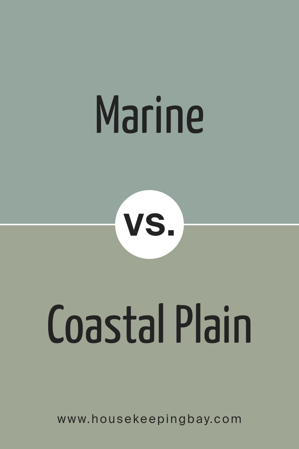
Marine SW 9659 by Sherwin Williams vs Coastal Plain SW 6192 by Sherwin Williams
Marine SW 9659 by Sherwin Williams is a deep, nautical blue that vividly represents its namesake, conveying the depth and vastness of the ocean. It brings a strong, bold presence to any space, making it ideal for accent walls or artistic areas in a home where a pop of color is desired. Its intensity is perfect for creating a focal point in a room.
In contrast, Coastal Plain SW 6192 is a softer, muted green with a hint of earthiness. It reflects the calmness of coastal landscapes and is versatile enough to be used in various settings, from kitchens to bedrooms. This color promotes a soothing atmosphere, making it excellent for spaces meant for relaxation.
Both Marine and Coastal Plain offer unique vibes; Marine adds drama and depth, while Coastal Plain provides a serene, grounding effect. Whether used together or separately, these colors can define spaces beautifully, each contributing uniquely to the overall ambience of a home.
You can see recommended paint color below:
housekeepingbay.com
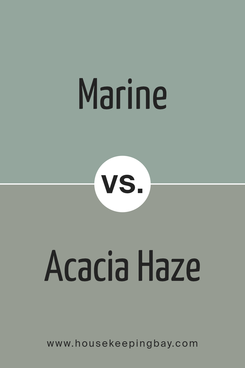
Marine SW 9659 by Sherwin Williams vs Acacia Haze SW 9132 by Sherwin Williams
Marine SW 9659 by Sherwin Williams is a deep, rich blue that closely resembles the color of the sea. It offers a bold and calming presence, making it perfect for areas where you want to create a sense of serenity and focus. This color works well in spaces like studies or bedrooms, where the deep blue can help to foster an environment for relaxation and deep thought.
Acacia Haze SW 9132, also by Sherwin Williams, is a softer green with subtle gray undertones. It projects a soothing and natural feel, ideal for spaces used for rejuvenation, such as bathrooms or quiet reading nooks. Its muted tone blends seamlessly with natural materials, like wood and stone, enhancing the organic aesthetic of a room.
While both colors provide a tranquil atmosphere, Marine SW 9659 invokes a more dramatic and concentrated mood due to its darker, oceanic hues. Acacia Haze SW 9132, with its understated green, offers a lighter, more airy feel, suitable for creating a restful environment.
You can see recommended paint color below:
housekeepingbay.com
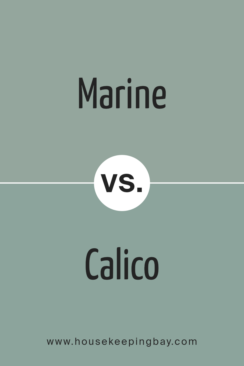
Marine SW 9659 by Sherwin Williams vs Calico SW 0017 by Sherwin Williams
Marine SW 9659 by Sherwin Williams is a deep, rich blue that brings to mind the vastness of a serene ocean. This color has a bold presence, perfect for making a striking statement in any space. It can visually shrink a room due to its intensity, but it also creates a cozy and inviting atmosphere, particularly suited for rooms designed for relaxation or focus.
In contrast, Calico SW 0017 is a much softer shade, a creamy off-white with just a hint of warmth. This color is highly versatile and provides a light, airy feel to interiors. It’s excellent for spaces where you want to enhance brightness and give an illusion of more space.
Calico acts as a neutral backdrop that can complement a wide range of decor styles and other colors.
Together, Marine and Calico could work well if looking to balance a bold color with a neutral one, creating a dynamic yet harmonious space. Each has its specific use, where Marine commands attention and Calico provides a subtle foundation.
You can see recommended paint color below:
- SW 0017 Calico
housekeepingbay.com
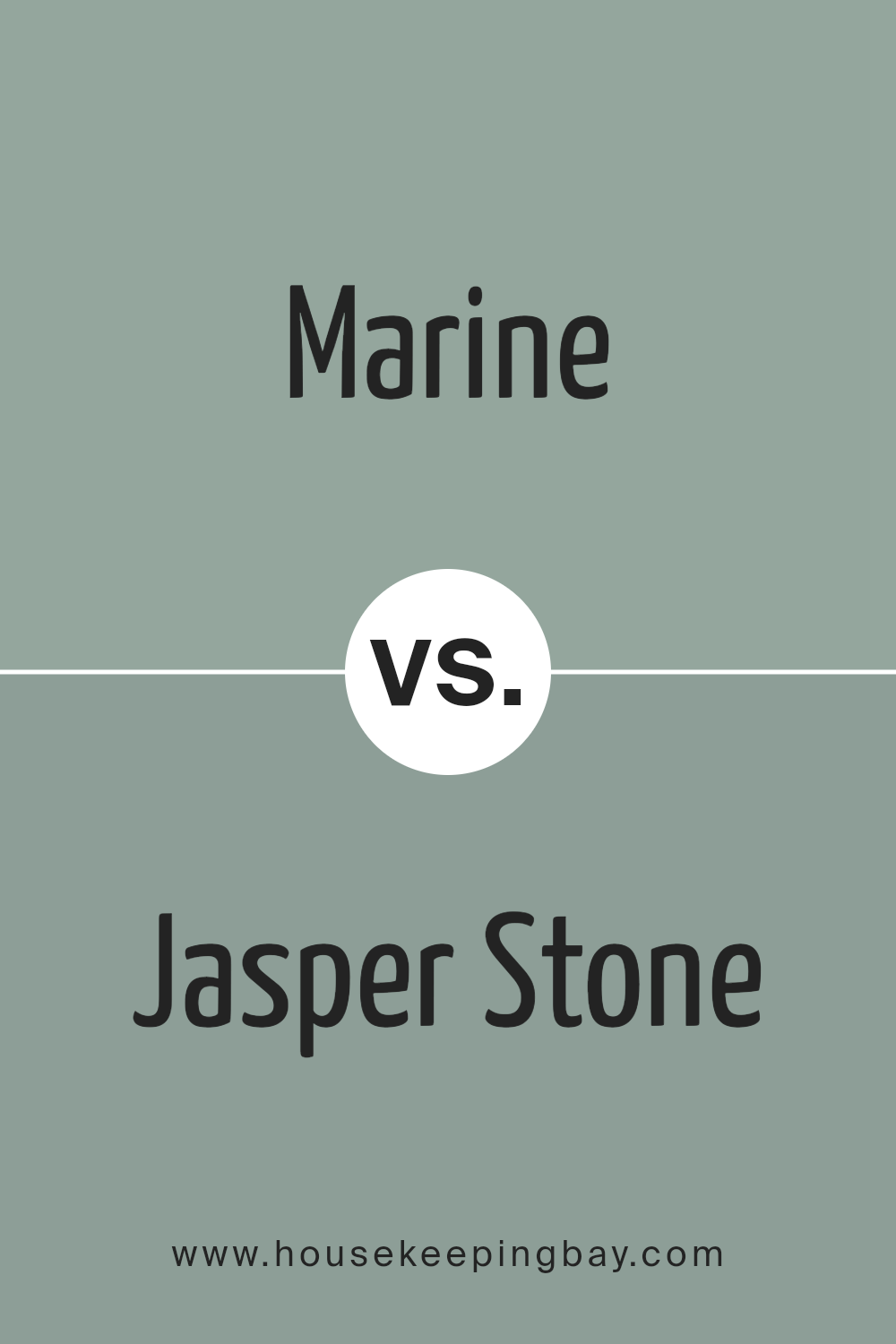
Marine SW 9659 by Sherwin Williams vs Jasper Stone SW 9133 by Sherwin Williams
Marine SW 9659 by Sherwin Williams is a deep, rich blue shade that closely resembles the color of the ocean. It brings a sense of depth and calm to any space, ideal for creating a serene environment. Its vibrancy can make a strong statement when used on walls or as an accent in a room.
Jasper Stone SW 9133, also by Sherwin Williams, presents a green tone with earthy, natural qualities. This color is milder and more subtle compared to Marine. Jasper Stone works well in spaces where you want to add a touch of nature and a grounding atmosphere without overwhelming the area with too bright a color.
Both colors offer unique aesthetic qualities and can dramatically influence the mood and style of a room. While Marine leans toward a bold, dynamic feel, Jasper Stone offers a more understated and soothing vibe. Depending on the desired ambience and other elements in a room, either color could be an excellent choice.
You can see recommended paint color below:
- SW 9133 Jasper Stone
housekeepingbay.com
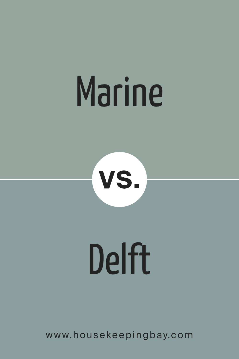
Marine SW 9659 by Sherwin Williams vs Delft SW 9134 by Sherwin Williams
Marine SW 9659 by Sherwin Williams is a rich, deep blue with a strong presence, much like the depths of the ocean. It conveys a bold and authoritative feel, perfect for adding a statement or accentuating spaces that benefit from a dramatic touch. Marine’s intensity works well in areas used for relaxation or concentration, like studies or bedrooms.
In contrast, Delft SW 9134 also by Sherwin Williams, is a lighter, softer blue. It has a calming, gentle quality that mimics the serene vibe of the historic Dutch pottery after which it is named. This color is ideal for creating a peaceful atmosphere in spaces intended for rest or light activity, such as bathrooms or nurseries.
While both shades are rooted in blue, Marine is darker and more saturated, making it more striking, whereas Delft offers a quieter, more subdued aesthetic. Both colors provide distinct vibes and can successfully define the mood of a room depending on the desired impact.
You can see recommended paint color below:
- SW 9134 Delft
housekeepingbay.com
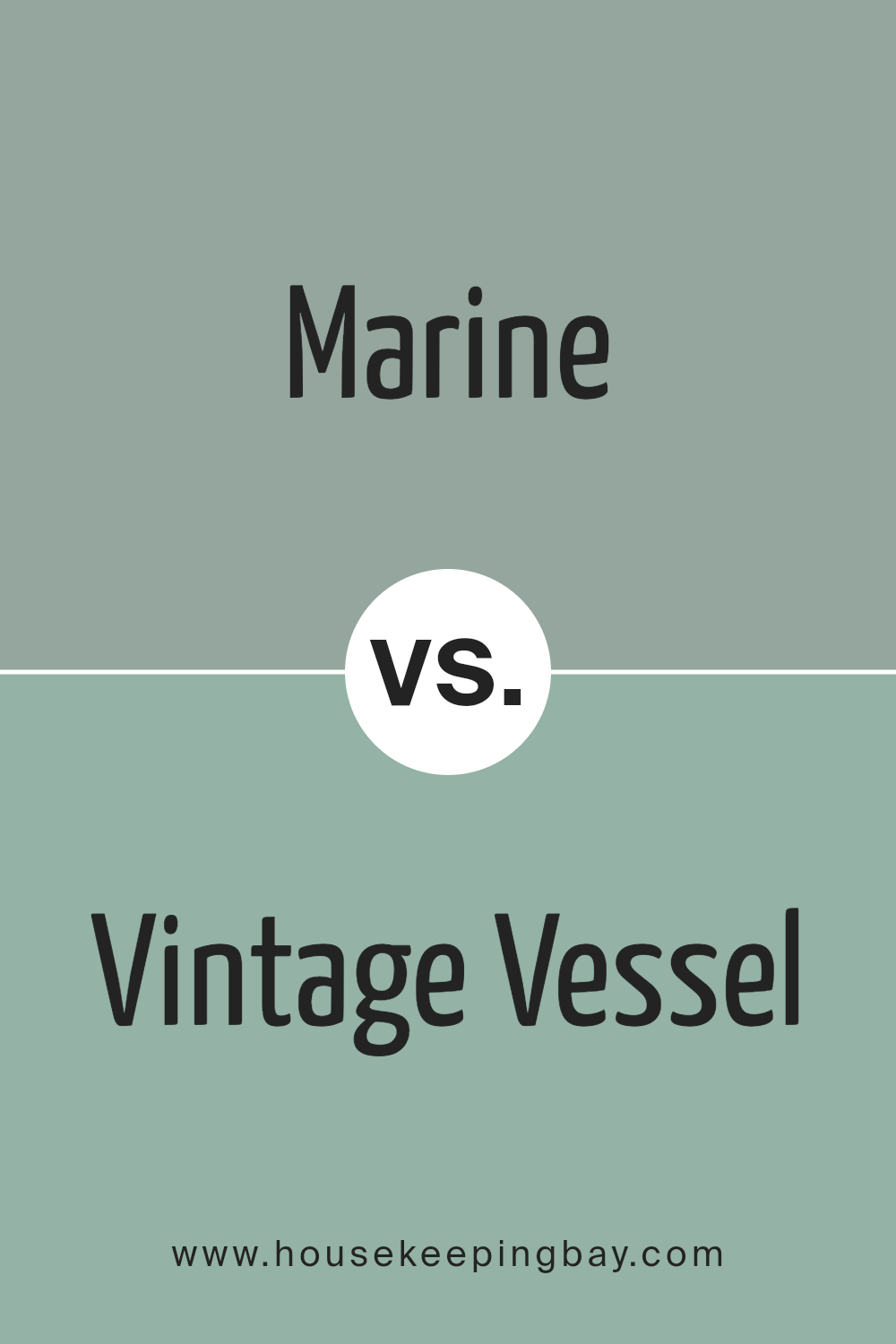
Marine SW 9659 by Sherwin Williams vs Vintage Vessel SW 9050 by Sherwin Williams
Marine SW 9659 by Sherwin Williams is a robust, deep blue color that vividly brings to mind the depths of the ocean. This shade is bold and strong, making it ideal for creating a striking statement in a space. It suits areas like living rooms or bedrooms where a touch of drama and sophistication is desired.
In contrast, Vintage Vessel SW 9050 presents a gentler, more muted tone. This color leans towards a grayish-blue, reminiscent of a weathered ship, providing a softer, more relaxed vibe. It is versatile, fitting well in various settings such as kitchens, bathrooms, or offices where a calm, soothing atmosphere is beneficial.
While both colors share a connection through their blue hues, they serve different aesthetic purposes. Marine is more dramatic and attention-grabbing, whereas Vintage Vessel offers a subtle, calming presence. This makes each color unique in how it contributes to the mood and style of a room.
You can see recommended paint color below:
- SW 9050 Vintage Vessel
housekeepingbay.com
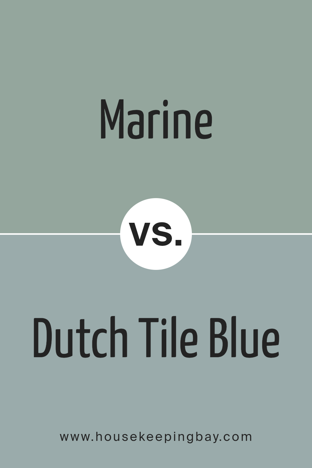
Marine SW 9659 by Sherwin Williams vs Dutch Tile Blue SW 0031 by Sherwin Williams
Marine SW 9659 by Sherwin Williams is a deep, vibrant blue with a hint of green that creates a rich and sophisticated ambiance. It suggests a sense of calmness and professionalism, making it well suited for spaces where focus and serenity are needed, such as studies or bedrooms.
Dutch Tile Blue SW 0031, also by Sherwin Williams, is a softer, lighter blue with a more serene and traditional vibe. This color recalls the peacefulness of Dutch pottery and has a calming effect. It’s ideal for bathrooms, kitchens, or any area where a light, soothing touch is desired.
While both colors belong to the blue family, Marine SW 9659 has a more intense, bold presence compared to the gentler and airier feeling of Dutch Tile Blue SW 0031. Depending on your room’s purpose and the atmosphere you want to create, either shade can add a beautiful, distinct character to the space.
You can see recommended paint color below:
- SW 0031 Dutch Tile Blue
housekeepingbay.com
Finally, the quality of the paint aligns with Sherwin Williams’ reputation for durable, long-lasting finishes, ensuring that the beauty of SW 9659 Marine endures. Perfect for anyone looking to add a touch of sophistication and calm to their environment, this paint color is worth considering.
Whether updating a single room or redecorating an entire home, SW 9659 Marine stands out as a smart, tasteful selection.
housekeepingbay.com
Ever wished paint sampling was as easy as sticking a sticker? Guess what? Now it is! Discover Samplize's unique Peel & Stick samples. Get started now and say goodbye to the old messy way!
Get paint samples


