Humble Gold SW 6380 by Sherwin Williams
Bring Warmth and Cheer to Any Space
Humble Gold (SW 6380) by Sherwin-Williams is a color that brings warmth and comfort to any space. Imagine a shade that captures the essence of a golden sunrise or the subtle glow of autumn leaves. This is a hue that doesn’t shout, but rather softly whispers elegance and charm. It doesn’t overwhelm a room but instead gently lends it a cozy and welcoming atmosphere.
Think about a color that adds a sense of balance and harmony. Humble Gold is just that. Whether on the walls of your living room, bedroom, or even kitchen, it offers a wonderful blend of warmth and richness without overpowering the eye.
It sits somewhere between a soft yellow and a gentle orange, making it a great choice for various styles, from traditional to modern.
Pairing well with both light and dark accents, Humble Gold provides the flexibility to experiment with your decor. Its warm undertones can highlight wood finishes or act as a backdrop for more vibrant textiles and accessories.
For those who appreciate simplicity with a touch of sophistication, this color can turn any room into an inviting and cozy sanctuary.
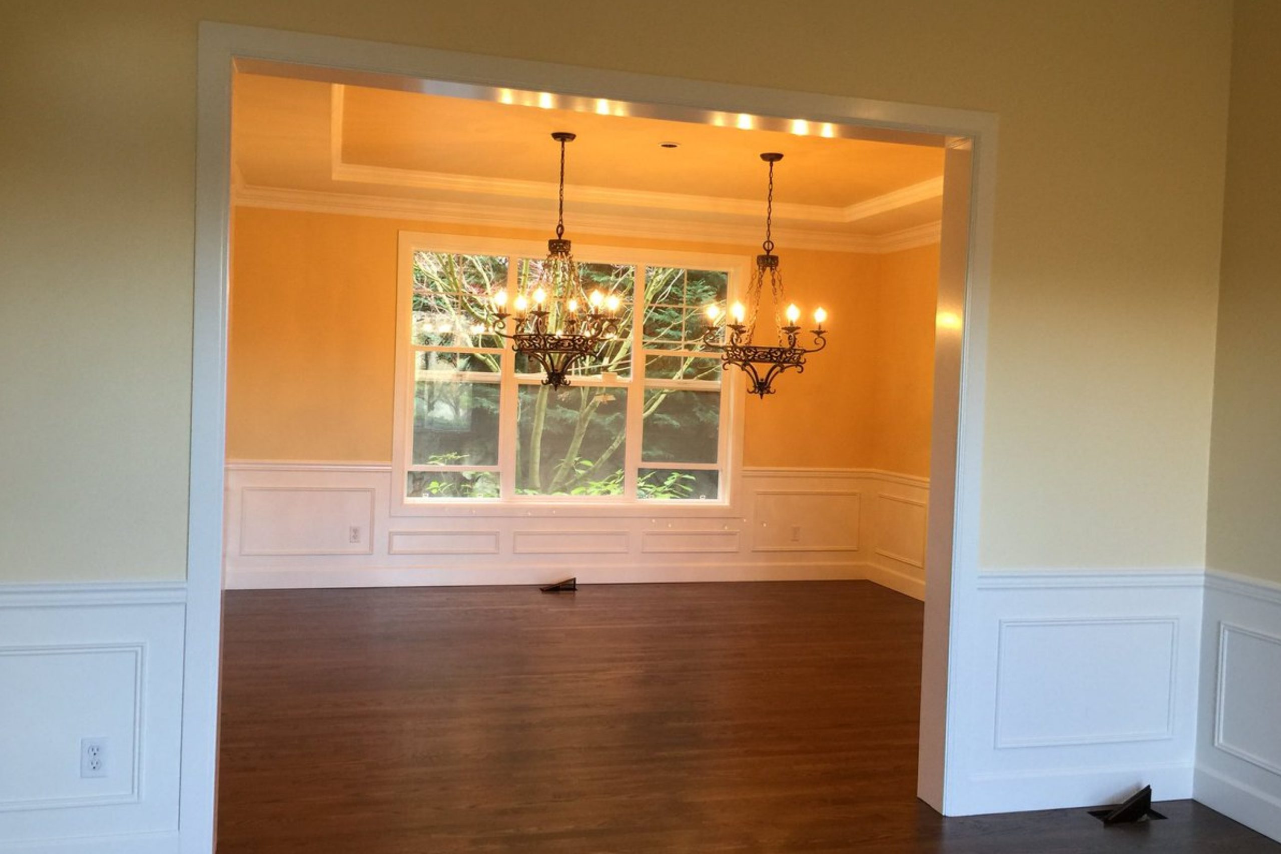
via X by @brushnrollpaint
What Color Is Humble Gold SW 6380 by Sherwin Williams?
Table of Contents
Humble Gold SW 6380 by Sherwin Williams is a warm, inviting color that adds comfort and cheerfulness to any space. It’s a golden yellow with earthy undertones, like sunshine on a peaceful day. This shade brings warmth without overwhelming, making it suitable for many interiors.
Humble Gold works beautifully in rustic and farmhouse styles, where its warm nature complements natural wood and stone. In a bohemian setting, it pairs well with woven textures and vibrant patterns.
The color is excellent for traditional spaces, bringing a cozy and welcoming feel to living rooms or dining areas. It also works in eclectic spaces, adding a lively backdrop to diverse decor elements.
When considering materials, Humble Gold pairs well with warm woods such as oak and walnut, which highlight its golden undertones. It also complements metals like bronze or brass, enhancing a sense of elegance. For fabrics, think of natural and textured materials—linens, cottons, and even velvet add depth to a room with this color.
Consider pairing it with plush textures like wool throws or soft upholstery for additional comfort.
With Humble Gold, a space feels both lively and comforting, perfect for making friends and family feel right at home.
housekeepingbay.com
Is Humble Gold SW 6380 by Sherwin Williams Warm or Cool color?
Humble Gold SW 6380 by Sherwin Williams brings warmth and comfort to any room. This rich, golden hue has a cozy, inviting quality that makes spaces feel welcoming and friendly. Its warm undertone works well in areas where people gather, like living rooms or dining rooms, making them feel bright yet relaxing.
Humble Gold has the versatility to complement different styles. It pairs beautifully with earth tones, wood, and natural materials, enhancing its warm, organic feel. This makes it perfect for homes seeking a more traditional or rustic charm.
In modern interiors, it can add a touch of cheerfulness and sophistication when combined with sleek, neutral colors.
The color also adapts to different lighting conditions. In natural light, it radiates a sunny glow, while in artificial lighting, it maintains a soft warmth. Humble Gold’s ability to blend and enhance its surroundings makes it a smart choice for creating inviting and harmonious spaces.
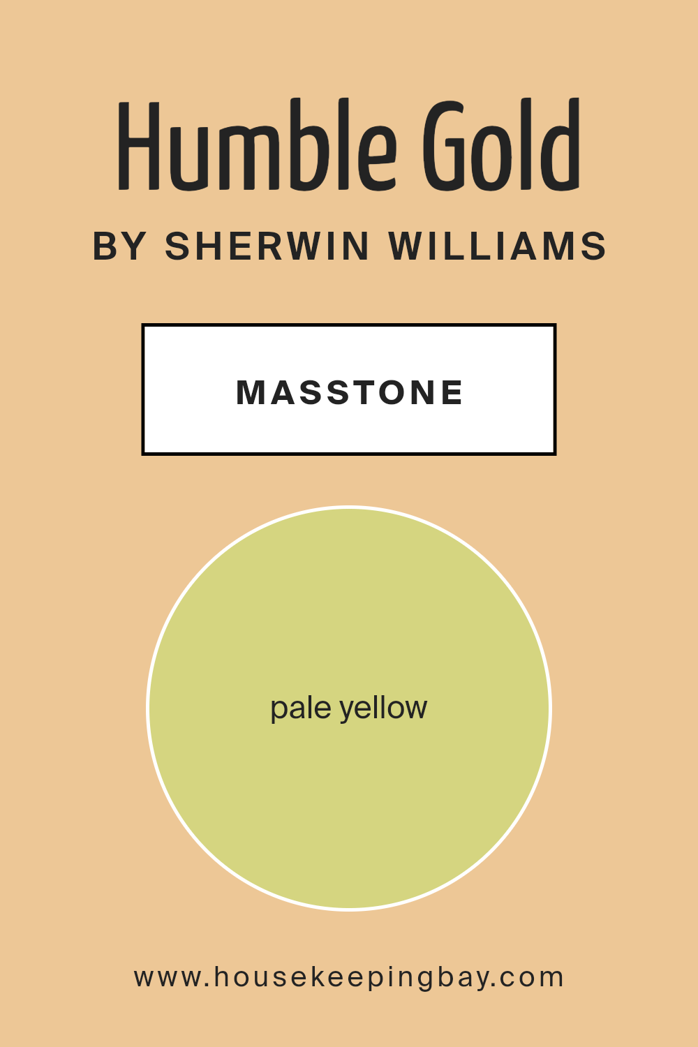
What is the Masstone of the Humble Gold SW 6380 by Sherwin Williams?
Humble Gold SW 6380 by Sherwin Williams is a pale yellow shade with a masstone of #D5D580, bringing warmth and light to homes. This color lifts any room, making spaces feel inviting and cheerful. Its subtlety allows it to act as a versatile backdrop, enhancing the overall atmosphere without overpowering other design elements. Pale yellow can brighten darker areas of a home, especially rooms lacking natural light.
Humble Gold works well in living rooms, kitchens, and hallways, creating a welcoming aura. It pairs nicely with both neutral colors and bold accents, offering flexibility when decorating.
The soft yet sunny tone of this shade adds a sense of coziness, making spaces look more spacious and open. When combined with white trim or furniture, Humble Gold delivers a fresh and clean aesthetic. Its gentle glow adds a touch of elegance that can help make any home feel warm and comfortable.
housekeepingbay.com
Undertones of Humble Gold SW 6380 by Sherwin Williams
Humble Gold SW 6380 by Sherwin Williams carries a rich tapestry of undertones that deeply influence how we perceive this color. The primary body of Humble Gold shows off a warm, inviting yellow hue. But when you look closer, you will notice subtle hints of other colors woven in.
Undertones play a significant role in how colors appear in different lighting and against other hues. The light gray and deeper gray undertones present in Humble Gold offer a grounding effect, bringing neutrality and balance.
Meanwhile, touches of pale pink and light purple add a soft, romantic feel, infusing warmth and subtle depth. This combination can impart a gentle, inviting atmosphere to a room.
The lively yellow and lighter green hints bring a sense of cheerfulness and energy, which can make a space feel open and welcoming.
Elements of orange add vibrancy and a pop of excitement to the mix. At the same time, tones of mint, light blue, and lilac create a refreshing, serene ambiance, ideal for relaxing environments. The presence of olive completes the palette, adding a hint of earthiness that complements natural settings.
Overall, these undertones finesse Humble Gold’s personality on walls, making it adaptable yet dynamic, suitable for various interior styles and moods.

housekeepingbay.com
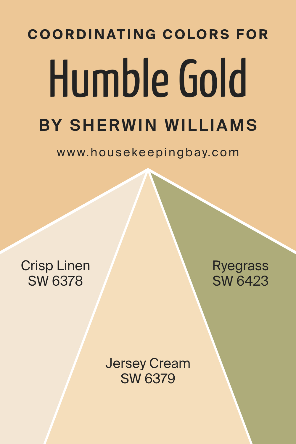
Coordinating Colors of Humble Gold SW 6380 by Sherwin Williams
Coordinating colors are hues that complement each other and work together to create a pleasing visual balance. They are chosen based on their ability to harmonize without clashing, offering a cohesive look to any setting.
When you look at Humble Gold SW 6380 by Sherwin Williams, you’ll notice it pairs beautifully with its coordinating colors: SW 6378 Crisp Linen, SW 6379 Jersey Cream, and SW 6423 Ryegrass.
Each of these colors enhances the warm, inviting nature of Humble Gold, providing a versatile palette for any room.
Crisp Linen is a soft, light beige that exudes a sense of airiness and freshness, acting as a perfect neutral backdrop.
Meanwhile, Jersey Cream offers a gentle yellow hue that adds warmth and coziness, mirroring the golden tones of Humble Gold.
Ryegrass brings in a touch of nature with its earthy green, creating a subtle contrast that adds depth without overwhelming the space.
Together, these colors work in harmony, allowing Humble Gold to shine while offering a balanced and inviting atmosphere. This combination results in a well-rounded and inviting environment, perfect for living rooms, bedrooms, and open spaces.
You can see recommended paint colors below:
- SW 6378 Crisp Linen
- SW 6379 Jersey Cream
- SW 6423 Ryegrass
housekeepingbay.com
How Does Lighting Affect Humble Gold SW 6380 by Sherwin Williams?
Lighting can change how colors look in a room. The intensity and type of light affect the way we see colors, making them appear warmer, cooler, brighter, or duller. Let’s take the color Humble Gold SW 6380 by Sherwin Williams as an example. This paint is a warm, golden hue that can shift based on the lighting conditions in a room.
In natural light, Humble Gold takes on a vibrant and inviting appearance. The color may appear brighter and more cheerful as natural light changes throughout the day. In artificial light, the color can look different depending on the type of bulbs used.
Warm white bulbs can enhance the golden tones, while cool white bulbs might make the color appear slightly muted or reduce its warmth.
When you paint a north-facing room with Humble Gold, you’ll notice that the color may seem a bit cooler and possibly less bright due to less direct sunlight. These rooms often get a soft, diffused light, which can bring out more muted, subtle shades within the color.
In a south-facing room, Humble Gold can appear more warm and intense. These rooms receive plenty of sunlight throughout the day, brightening the color and making it glow. The consistent light can bring out the full richness of the golden hue.
East-facing rooms get bright morning light, which can enhance the warmth of Humble Gold during the morning hours. However, as the light diminishes in the afternoon, the color might appear softer and slightly cooler.
West-facing rooms experience the opposite effect; the light is softer in the morning and becomes more intense and warm in the late afternoon and early evening. Here, Humble Gold may start the day looking subdued but will become vibrant as the sun sets.
In summary, Humble Gold SW 6380 can change in different lighting, bringing either a soft, cozy feeling or a bright, welcoming atmosphere based on the sun’s position and bulb types used.
housekeepingbay.com
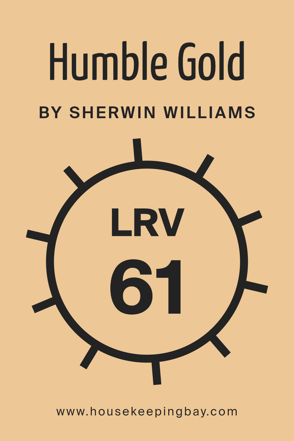
What is the LRV of Humble Gold SW 6380 by Sherwin Williams?
Light Reflectance Value (LRV) is a measure used to determine how much light a color reflects or absorbs. It is expressed as a percentage ranging from 0 to 100, with 0 being absolute black, reflecting no light, and 100 being pure white, reflecting all light. The higher the LRV, the more light a color will reflect.
This is important when choosing paint colors for a space because it affects how bright or dark a room might feel.
For example, a color with a high LRV will reflect more light and make a room feel brighter and more open. Conversely, a lower LRV means more light is absorbed, which can make a space feel cozier or more intimate.
Humble Gold SW 6380 by Sherwin Williams has an LRV of 61.31. This means it reflects a good amount of light, allowing it to brighten a space without being overpoweringly bright.
Its LRV makes it versatile for different rooms, working well in both well-lit areas and those with less natural light. In a room with lots of natural light, Humble Gold can appear warm and cheerful. In spaces with less light, the color maintains a pleasant warmth without causing the room to feel gloomy. Its balanced light reflection ensures the room feels inviting, making it a popular choice for those looking to add a touch of warmth and brightness.
housekeepingbay.com
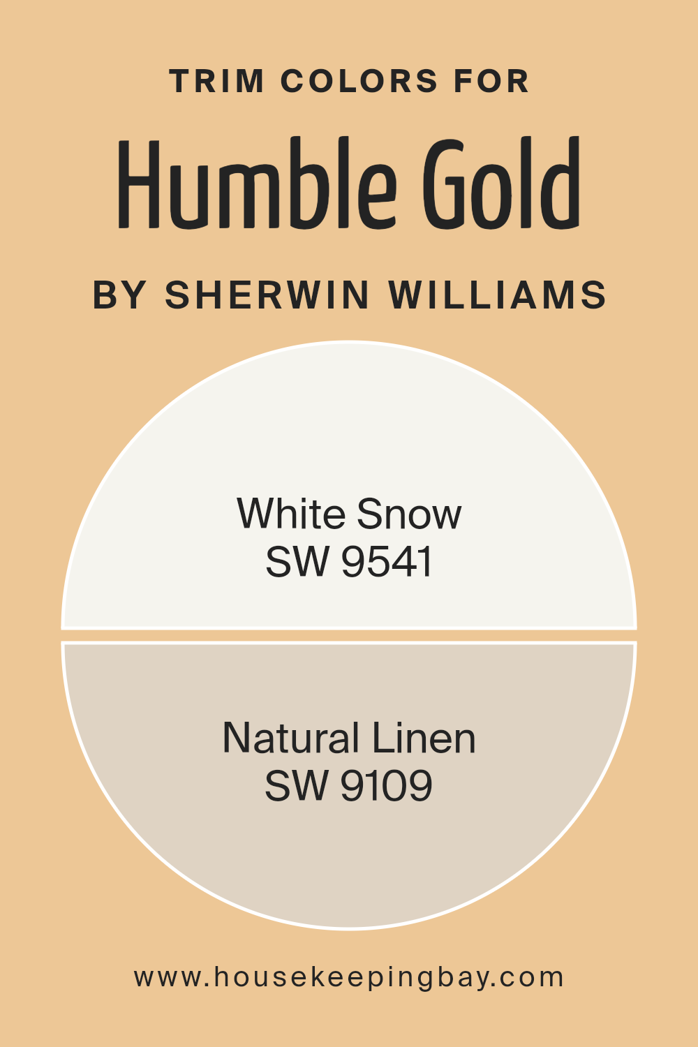
What are the Trim colors of Humble Gold SW 6380 by Sherwin Williams?
Trim colors are the hues used on the edges and outlines of walls, windows, doors, and other details in a space. They serve to highlight architectural details and create a defined visual contrast with the main wall color.
In the case of Humble Gold SW 6380 by Sherwin Williams, choosing the right trim color is crucial to enhance its warm, golden tones without overpowering the room. White Snow SW 9541 is an excellent choice for trim because its clean and crisp shade offers a bright and refreshing contrast.
This subtle brightness draws attention to the natural beauty of Humble Gold while giving the space a neat and polished look.
Similarly, Natural Linen SW 9109 is a wonderful trim option, providing warmth and an understated elegance that complements Humble Gold.
Natural Linen’s soft, beige tint has just enough tone to blend seamlessly with warmer hues.
It doesn’t clash, instead creating a gentle transition from wall to trim that is visually soothing.
Highlighting the architectural details with either of these trim colors balances the overall aesthetic and ensures that Humble Gold stands out as a welcoming and cozy primary color.
You can see recommended paint colors below:
housekeepingbay.com
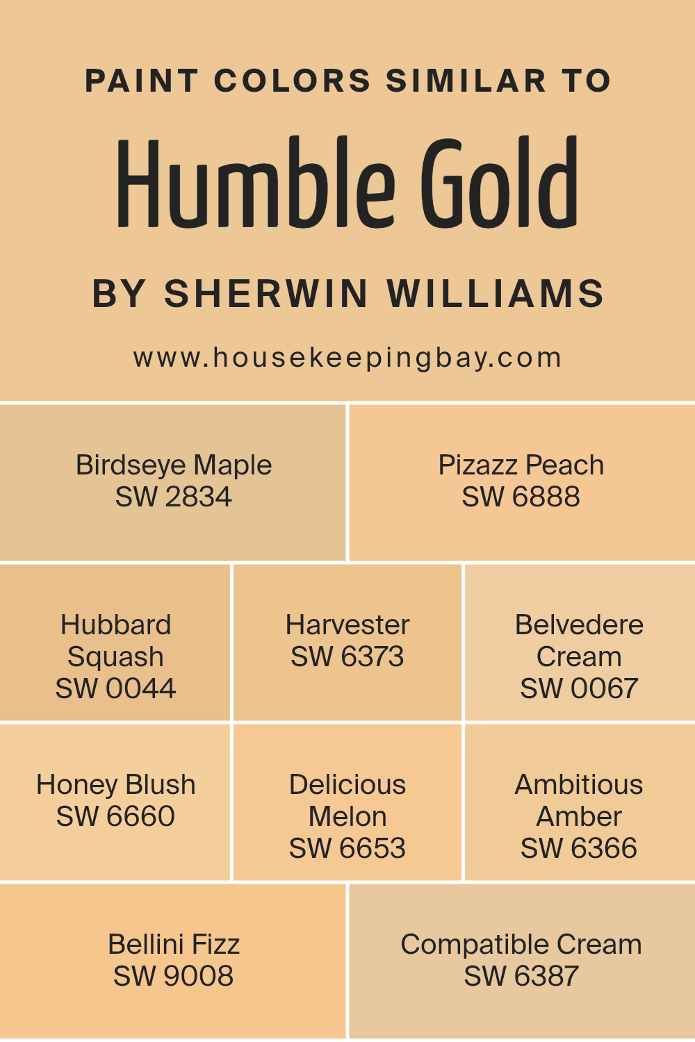
Colors Similar to Humble Gold SW 6380 by Sherwin Williams
Similar colors play an important role in design and decoration because they create harmony and cohesion within a space. These colors, when used together, support a unified look that is soothing to the eye. Humble Gold by Sherwin Williams has some lovely related tones that can enhance any room.
For example, SW 2834 – Birdseye Maple brings a warm, inviting light brown that pairs nicely with gold hues.
SW 6888 – Pizazz Peach offers a lively pop of peach that adds a hint of playful energy. Another perfect match, SW 0044 – Hubbard Squash, delivers an earthy and comforting yellow-orange, reminiscent of autumn days. SW 6373 – Harvester stands as a golden wheat shade that radiates warmth.
Meanwhile, SW 0067 – Belvedere Cream presents a gentle cream that balances brighter colors with its subtlety.
SW 6660 – Honey Blush introduces a soft, warm pink that adds a gentle sweetness. SW 6653 – Delicious Melon delivers a cheerful, uplifting orange, bringing life to any setting. Ambitious Amber, or SW 6366, shines as a bold, rich amber that makes a statement while staying harmonious with other warm tones.
SW 9008 – Bellini Fizz offers a fresh, light peach, perfect for creating an airy feel.
Lastly, SW 6387 – Compatible Cream adds a soft, creamy yellow to the mix, offering a pleasing backdrop or accent. These colors collectively work together to create a space filled with warmth and comfort, blending seamlessly to form an aesthetically pleasing environment.
You can see recommended paint colors below:
- SW 2834 Birdseye Maple
- SW 6888 Pizazz Peach
- SW 0044 Hubbard Squash
- SW 6373 Harvester
- SW 0067 Belvedere Cream
- SW 6660 Honey Blush
- SW 6653 Delicious Melon
- SW 6366 Ambitious Amber
- SW 9008 Bellini Fizz
- SW 6387 Compatible Cream
housekeepingbay.com
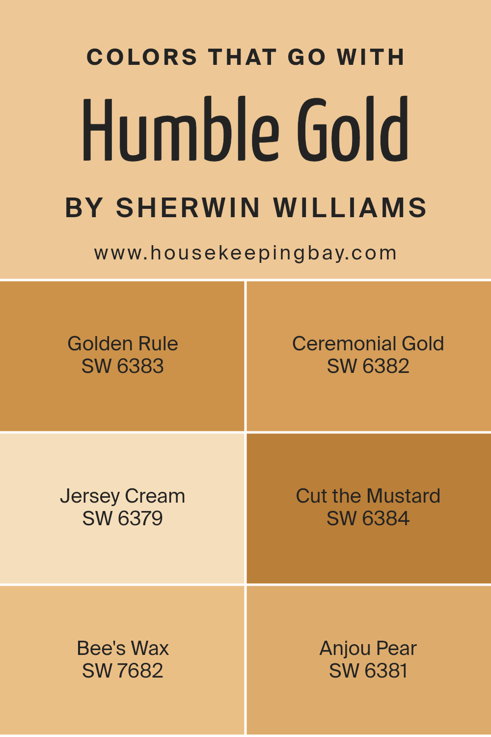
Colors that Go With Humble Gold SW 6380 by Sherwin Williams
Choosing colors that complement Humble Gold SW 6380 by Sherwin Williams can greatly enhance a space. Humble Gold is a warm, inviting color with depth, so pairing it with complementary shades adds harmony and balance to a room.
Golden Rule SW 6383 has a slightly deeper tone, creating a cozy, enriched feeling when used together. Ceremonial Gold SW 6382 offers a more subtle contrast with its soothing and slightly muted tone, ideal for bringing out the warmth in Humble Gold.
Jersey Cream SW 6379, with its soft neutrality, can lighten up a space, providing a bright and airy touch. Meanwhile, Cut the Mustard SW 6384 stands out with its bolder, more daring yellow, creating a lively and cheerful accent.
Bee’s Wax SW 7682 offers a subtle, honey-like hue that partners well with Humble Gold, adding depth and richness without overwhelming the senses.
Anjou Pear SW 6381, with its slightly greenish undertone, introduces a hint of freshness and nature, creating a vibrant yet balanced palette.
These colors together form a cohesive theme, each supporting the others to create a warm, inviting space.
Whether used for walls, accents, or furnishings, they work in unison to create a welcoming atmosphere. The combination of these shades ensures that each room feels both lively and comfortable.
You can see recommended paint colors below:
- SW 6383 Golden Rule
- SW 6382 Ceremonial Gold
- SW 6379 Jersey Cream
- SW 6384 Cut the Mustard
- SW 7682 Bee’s Wax
- SW 6381 Anjou Pear
housekeepingbay.com
How to Use Humble Gold SW 6380 by Sherwin Williams In Your Home?
Humble Gold SW 6380 by Sherwin Williams offers a warm and inviting yellow hue with earthy undertones. It works wonderfully in creating a cozy feel, making it ideal for living rooms or kitchens. Its rich, golden tones add warmth and comfort to any space.
In a living room, Humble Gold can complement wood furnishings, enhancing their natural beauty. When paired with soft whites or creams, it creates a balanced and welcoming atmosphere.
In the kitchen, Humble Gold can make the room feel more inviting, encouraging family gatherings and shared meals. It’s also a great choice for accent walls, bringing brightness to darker spaces without overwhelming the room. In bedrooms, using this color can promote a sense of comfort, especially when paired with warm, soft lighting.
Humble Gold adapts beautifully to both modern and traditional decor styles, providing versatility for anyone looking to refresh their home’s color palette.
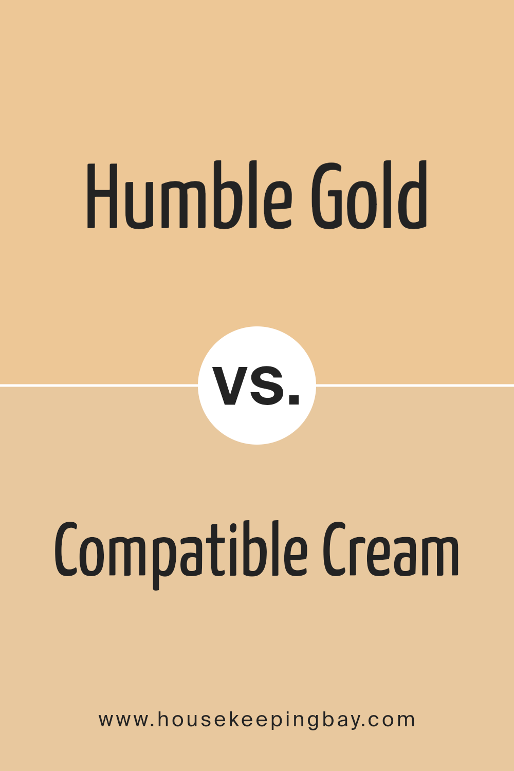
Humble Gold SW 6380 by Sherwin Williams vs Compatible Cream SW 6387 by Sherwin Williams
Humble Gold SW 6380 and Compatible Cream SW 6387, both by Sherwin Williams, offer warm, inviting tones but differ in intensity and impact. Humble Gold presents a deeper, richer shade with golden undertones, creating a cozy, comforting atmosphere. Its bold presence makes it a great choice for accent walls or spaces needing warmth and depth.
In contrast, Compatible Cream exudes a softer, more subtle vibe. Its lighter, creamier appearance contributes to a calming, open feeling in a room. This color complements a variety of styles, adding a gentle, understated elegance without overwhelming the space.
Together, these colors harmonize well. Humble Gold adds bold highlights, while Compatible Cream balances with soothing neutrality. Depending on your desired aesthetic, you can use Humble Gold to bring in striking accents. Meanwhile, let Compatible Cream provide a serene background, allowing each room to feel both cozy and welcoming.
You can see recommended paint color below:
housekeepingbay.com
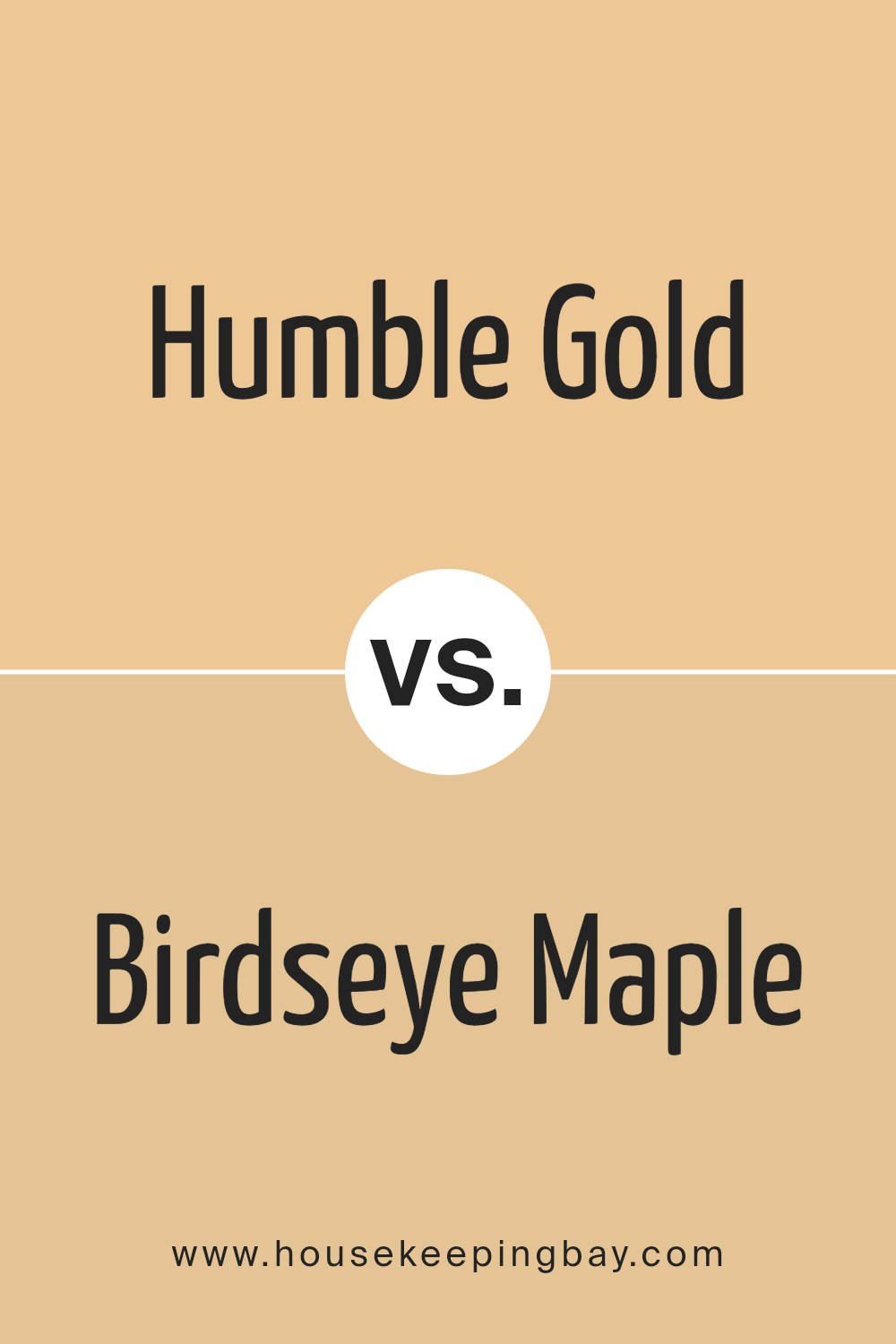
Humble Gold SW 6380 by Sherwin Williams vs Birdseye Maple SW 2834 by Sherwin Williams
Humble Gold SW 6380 by Sherwin Williams offers a warm, inviting yellow. It has a soft, earthy undertone that makes spaces feel cozy and comfortable. This color brings a sense of warmth that can brighten a room without overwhelming it, creating an inviting atmosphere perfect for social areas like living rooms or kitchens.
Birdseye Maple SW 2834 by Sherwin Williams, however, provides a different mood. It comes with a creamy beige tone reminiscent of natural wood.
This color feels calm and serene, making it suitable for spaces where you seek relaxation, such as bedrooms or reading nooks. Its neutrality allows it to pair well with other colors and various decorating styles.
Together, Humble Gold and Birdseye Maple create a harmonious balance. Humble Gold adds warmth and a touch of sunshine, while Birdseye Maple offers a soothing backdrop. These colors complement each other well, enhancing any room’s ambiance.
You can see recommended paint color below:
- SW 2834 Birdseye Maple
housekeepingbay.com
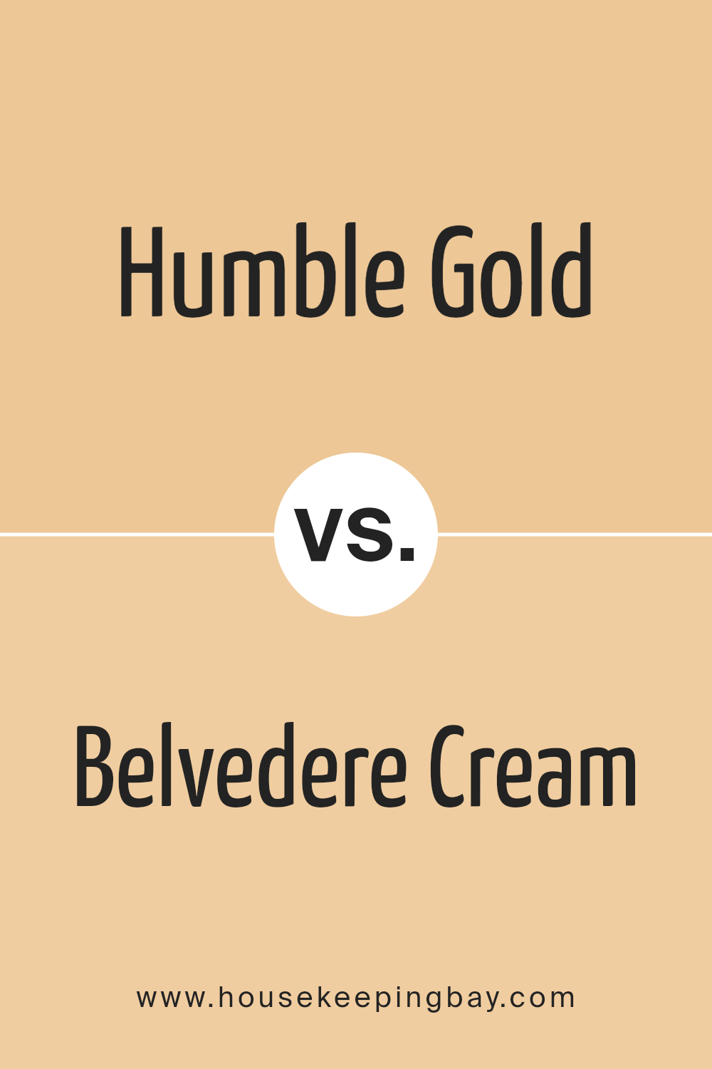
Humble Gold SW 6380 by Sherwin Williams vs Belvedere Cream SW 0067 by Sherwin Williams
Humble Gold SW 6380 and Belvedere Cream SW 0067, both by Sherwin Williams, offer unique qualities that can enhance a space in their own ways. Humble Gold is a warm, rich tone with a hint of mustard, creating a cozy and inviting atmosphere. It brings a sense of comfort and warmth, making it ideal for living rooms or any space where a cozy ambiance is desired.
Belvedere Cream, in contrast, is a softer, more muted shade. Its light, creamy tone provides a gentle and airy feel, reminiscent of classic elegance. This makes it perfect for spaces where a serene, clean look is preferred, such as bedrooms or bathrooms.
While Humble Gold creates a bold and warm environment, Belvedere Cream offers a subtle and understated elegance. Both colors work well individually or can complement one another to create a balanced, harmonious space depending on the mood you wish to achieve.
You can see recommended paint color below:
- SW 0067 Belvedere Cream
housekeepingbay.com
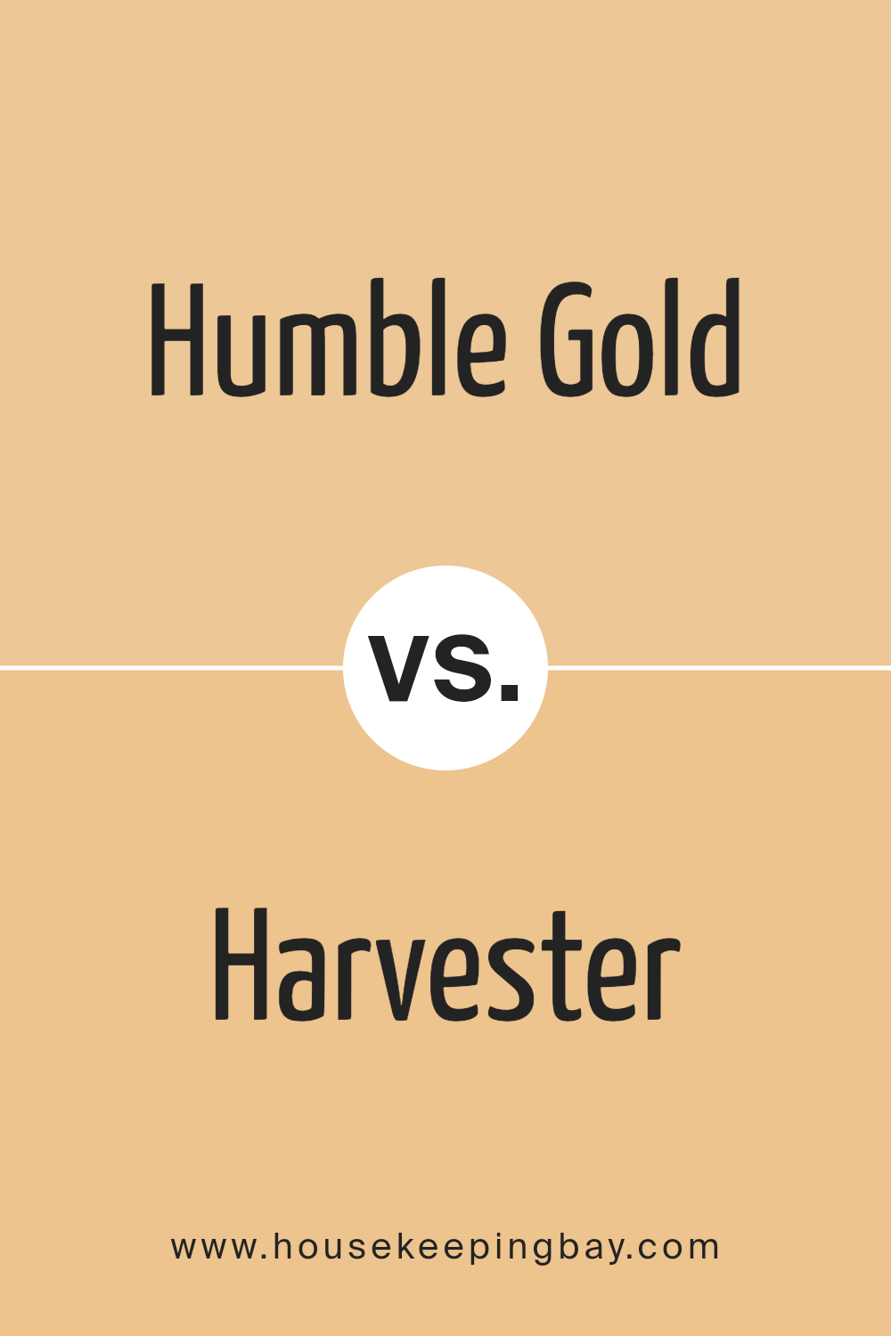
Humble Gold SW 6380 by Sherwin Williams vs Harvester SW 6373 by Sherwin Williams
Humble Gold SW 6380 and Harvester SW 6373 by Sherwin Williams are both warm colors, but each offers a unique feel. Humble Gold is a deep, rich shade resembling the mellow glow of mature wheat under bright sunlight. It has a certain warmth and elegance that adds a touch of sophistication to any room.
In contrast, Harvester is a lighter, more subtle hue that feels like the soft, gentle tone of freshly harvested grains. It is less intense and has a more modest brightness, making it a bit more versatile for various spaces. Harvester exudes a cozy, inviting feel, ideal for creating a welcoming atmosphere.
While Humble Gold can create an impression of luxury and warmth, Harvester leans more toward a gentle and comforting ambiance. Both colors are great choices, but the selection might depend on the desired mood and intensity for the space being designed.
You can see recommended paint color below:
- SW 6373 Harvester
housekeepingbay.com
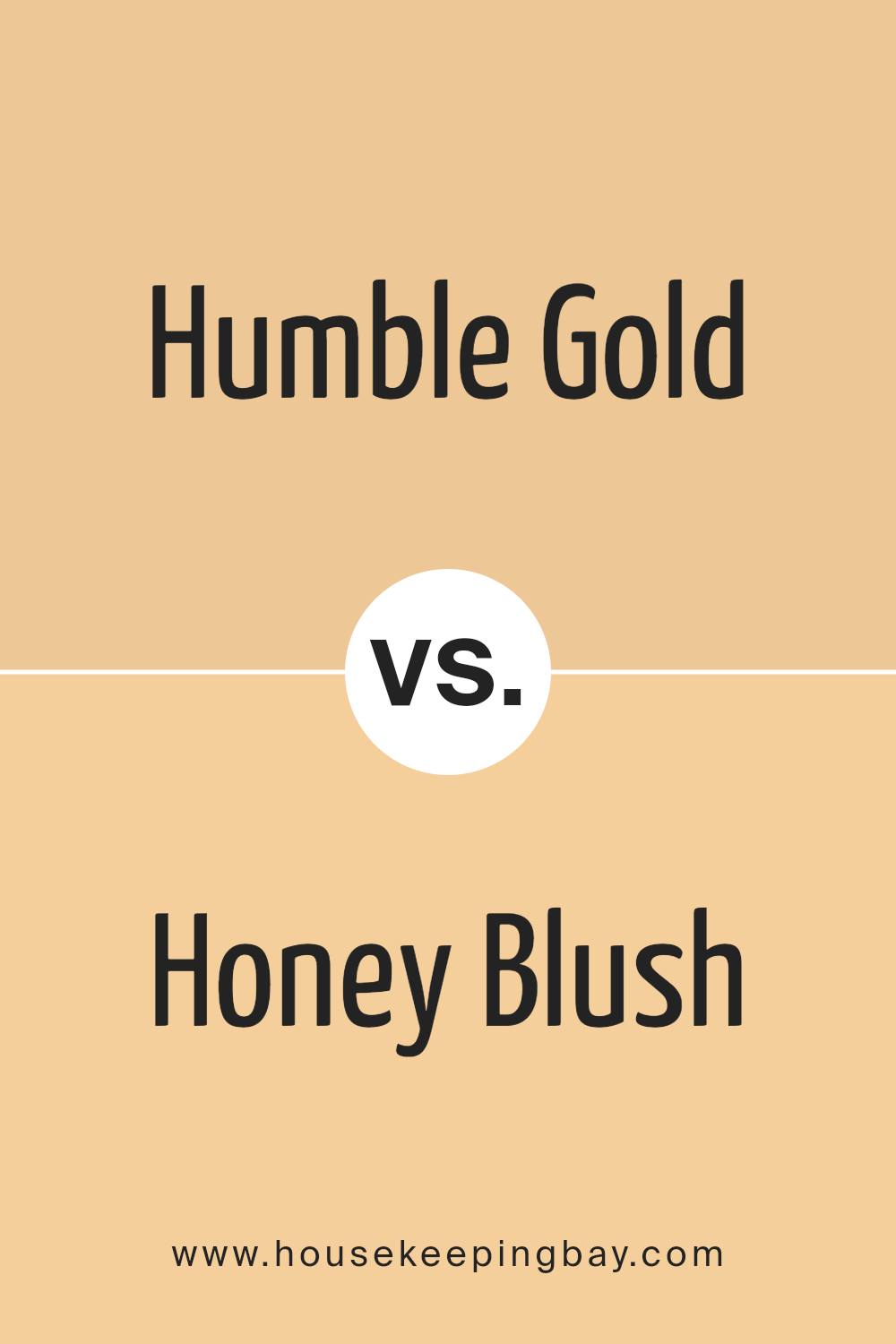
Humble Gold SW 6380 by Sherwin Williams vs Honey Blush SW 6660 by Sherwin Williams
Humble Gold SW 6380 and Honey Blush SW 6660, both by Sherwin Williams, share warm, inviting vibes but exhibit key differences. Humble Gold presents a muted, earthy tone. It resembles late afternoon sunlight—gentle and comforting, making it suitable for cozy spaces. It leans slightly towards muted yellow, blending harmoniously with natural elements and neutral tones.
Honey Blush, in contrast, carries more vibrancy. This rich amber color exudes warmth and energy, reminiscent of a sunlit field or the glow of sunset. Its slightly richer hue can invigorate a space, making it ideal for lively areas or accent walls.
While both enhance warmth, Humble Gold offers calmness, whereas Honey Blush injects cheerful brightness. Both colors work well with creams, whites, and earthy shades, but their energy levels set them apart. Humble Gold provides subtlety, whereas Honey Blush radiates enthusiasm, allowing versatile use based on desired mood.
You can see recommended paint color below:
- SW 6660 Honey Blush
housekeepingbay.com
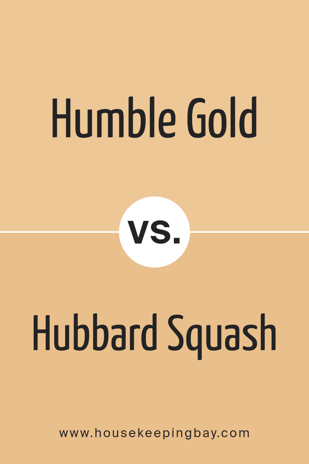
Humble Gold SW 6380 by Sherwin Williams vs Hubbard Squash SW 0044 by Sherwin Williams
Humble Gold SW 6380 and Hubbard Squash SW 0044 by Sherwin Williams are two beautiful shades of yellow, each bringing a distinct feel to your space. Humble Gold is a warm, muted yellow, radiating a grounded and cozy atmosphere. It has a subtle richness that feels calming and welcoming, suitable for living rooms or dining areas where you want a touch of elegance without being overpowering.
Hubbard Squash, however, is brighter and more vibrant. It has an energetic quality that adds cheerfulness and warmth to a room. This color can enliven a space like a kitchen or a playroom, making it feel lively and inviting.
While Humble Gold offers a more subdued and mellow presence, perfect for creating an understated elegance, Hubbard Squash provides a burst of brightness. Both colors bring warmth but cater to different moods: Humble Gold for calm and relaxation, Hubbard Squash for energy and joy.
You can see recommended paint color below:
- SW 0044 Hubbard Squash
housekeepingbay.com
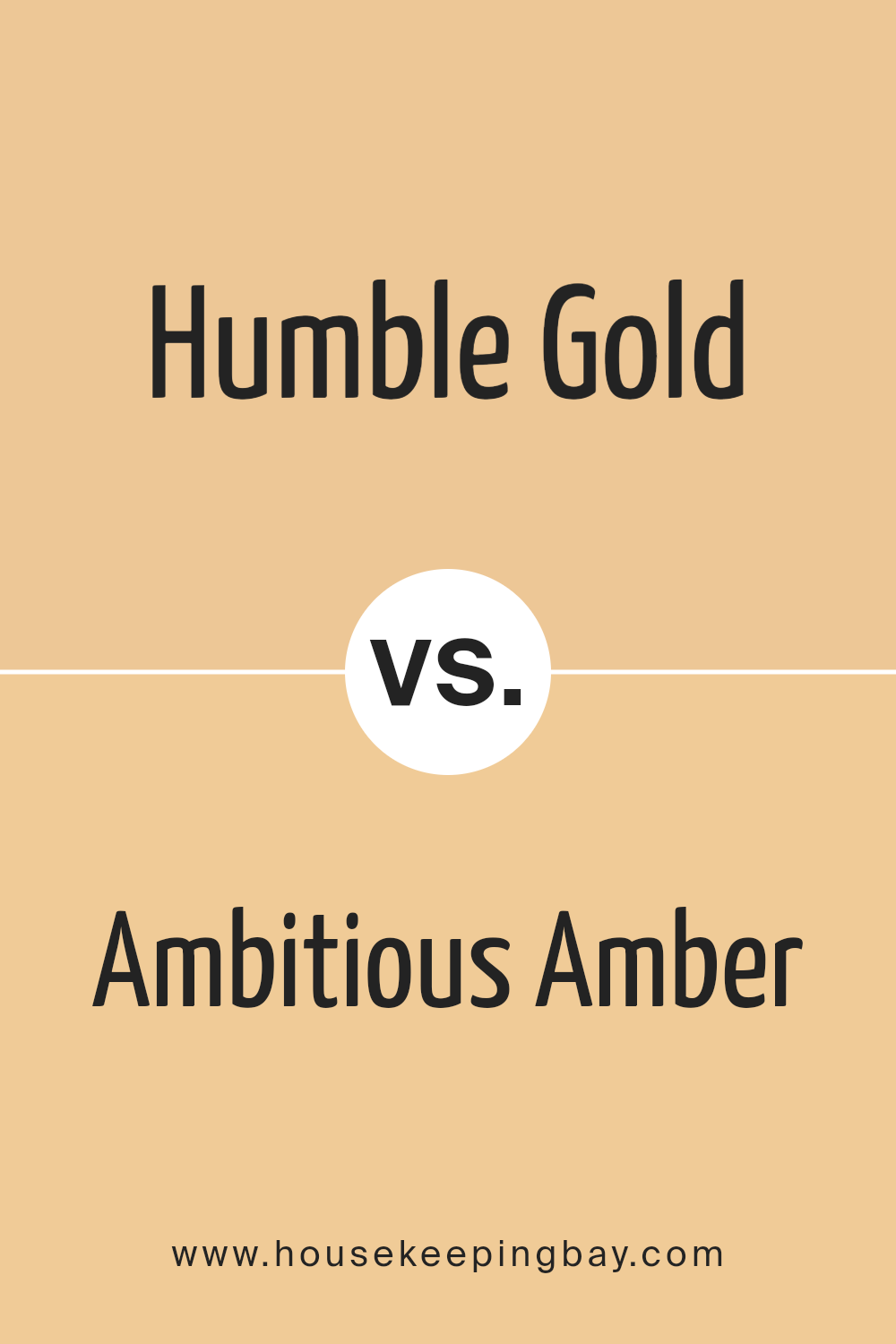
Humble Gold SW 6380 by Sherwin Williams vs Ambitious Amber SW 6366 by Sherwin Williams
Humble Gold SW 6380 and Ambitious Amber SW 6366 by Sherwin Williams are both warm, rich colors, but they each offer a unique vibe. Humble Gold is a softer, muted yellow with a touch of brown. It feels cozy and inviting, perfect for creating a comfortable atmosphere in living spaces or bedrooms.
Ambitious Amber, on the other hand, is a brighter, more vibrant orange-yellow. It radiates energy and enthusiasm, making it a great choice for areas where you want to inspire creativity or conversation, like a kitchen or a playroom.
While both colors have a warm undertone, Humble Gold leans towards a more traditional, subtle look, while Ambitious Amber stands out with its bold presence. Pair them with neutral accents or earthy tones to highlight their warmth. Choosing between them depends on whether you prefer the calmness of Humble Gold or the spirited feel of Ambitious Amber.
You can see recommended paint color below:
- SW 6366 Ambitious Amber
housekeepingbay.com
Humble Gold SW 6380 by Sherwin Williams vs Pizazz Peach SW 6888 by Sherwin Williams
Humble Gold (SW 6380) and Pizazz Peach (SW 6888) from Sherwin Williams bring unique feelings to any room. Humble Gold is a warm, rich shade that feels cozy and inviting. It resembles the glow of late afternoon sunlight, offering comfort and ease. This color works well in living areas or bedrooms, adding a touch of warmth wherever applied.
Pizazz Peach, however, is lively and energetic. This vibrant hue has a cheerful vibe, much like a sunny, fresh peach. It adds a burst of optimism and creativity to spaces, making it perfect for playrooms or kitchens. With its bright, friendly feel, Pizazz Peach can also be a fun accent.
Both colors have strong personalities, yet they contrast beautifully. Humble Gold’s warmth and Pizazz Peach’s cheeriness work in harmony to create spaces that feel both welcoming and lively, showing their suitability for different moods and settings.
You can see recommended paint color below:
- SW 6888 Pizazz Peach
housekeepingbay.com
Humble Gold SW 6380 by Sherwin Williams vs Bellini Fizz SW 9008 by Sherwin Williams
Humble Gold SW 6380 by Sherwin Williams exudes warmth and sophistication. Its rich, golden hue creates a cozy atmosphere in any room. Ideal for living spaces and dining areas, Humble Gold adds a touch of elegance while retaining a welcoming feel. This color works well with neutral shades, enhancing their depth and creating harmony.
In contrast, Bellini Fizz SW 9008 presents a lighter, more vibrant palette. With its soft peachy tone, Bellini Fizz infuses spaces with energy, perfect for kitchens or children’s rooms. Its cheerful nature pairs wonderfully with creamy whites or light grays, providing a youthful vibe.
While Humble Gold offers richness and warmth, Bellini Fizz delights with its airy, lively character. Both colors bring personality to interiors, yet their distinct qualities serve different purposes. Humble Gold suits traditional, warm settings, whereas Bellini Fizz adds zest and liveliness, brightening contemporary spaces.
You can see recommended paint color below:
- SW 9008 Bellini Fizz
housekeepingbay.com
Humble Gold SW 6380 by Sherwin Williams vs Delicious Melon SW 6653 by Sherwin Williams
Humble Gold SW 6380 and Delicious Melon SW 6653, both by Sherwin-Williams, lend warm tones, yet they deliver distinct vibes. Humble Gold presents a rich, golden hue, radiating earthy warmth. It resonates with a timeless charm, perfect for creating cozy, inviting spaces. This color pairs well with neutral tones or deeper greens and browns, giving a grounded feel.
Delicious Melon, however, offers a lighter, more playful aesthetic. It has a bright, coral-tinged pink tone that can energize a room. This color works well in lively spaces like kitchens or playrooms, bringing a sense of cheer.
While both colors add warmth, Humble Gold is more subdued and classic, suitable for traditional settings. Delicious Melon is vibrant and modern, best for areas where a pop of fun is desired. Choosing between them depends on whether you seek subtle elegance or lively energy in your space.
You can see recommended paint color below:
- SW 6653 Delicious Melon
housekeepingbay.com
I’ve had the pleasure of getting to know SW 6380 Humble Gold by Sherwin Williams, and I must say, this paint color has its own charm. It offers a warm, inviting feeling that can enrich any room. Its golden hues provide a comforting glow, making spaces feel cozier and more welcoming. Whether used in a living room, bedroom, or kitchen, this shade brings a sense of warmth and cheer.
I appreciate how Humble Gold can complement a range of styles. It pairs beautifully with both neutral tones and bolder colors, allowing for versatile design options. Its warmth balances well with cool blues and greens if you’re looking to create contrast.
On the other hand, it blends seamlessly with other earth-toned shades for a more subdued look.
Humble Gold works well in rooms with natural light, as it enhances the cozy glow of the sunlight. Yet, it remains lively even in dim lighting, always adding a hint of brightness to the surroundings. This adaptability makes it a favorable choice for many different spaces.
Overall, SW 6380 Humble Gold stands out for its warmth and versatility. It helps create a welcoming atmosphere that’s both comforting and lively, making it a delightful choice for enhancing any room.
housekeepingbay.com
Ever wished paint sampling was as easy as sticking a sticker? Guess what? Now it is! Discover Samplize's unique Peel & Stick samples. Get started now and say goodbye to the old messy way!
Get paint samples


