Hamilton Blue HC-191 by Benjamin Moore
A Splash of Serenity - Unveiling a Classic Shade
Imagine stepping into a room that feels like a breath of fresh air, where the walls invite you to relax and just be. That’s the magic HC-191 Hamilton Blue by Benjamin Moore brings into any space. This unique shade of blue has a touch of calmness and a sprinkle of joy, making it perfect for anyone looking to add a splash of color to their home without overwhelming it.
Choosing the right paint color can feel daunting at times, but with HC-191 Hamilton Blue, you’re making a choice that’s both bold and understated. Whether you’re looking to transform your living room into a serene retreat or give your bedroom a calming vibe, this color has got you covered. Plus, it pairs beautifully with a wide range of decor, from modern to rustic, making it incredibly versatile.
You don’t need to be a design expert to see why Hamilton Blue is a favorite among homeowners. Its distinctive but accessible appeal makes it a go-to for anyone wanting to refresh their space. So, if you’re ready to give your home a makeover that feels both inviting and stylish, HC-191 Hamilton Blue by Benjamin Moore could be the perfect start.
by Benjamin Moore
What Color Is Hamilton Blue HC-191 by Benjamin Moore?
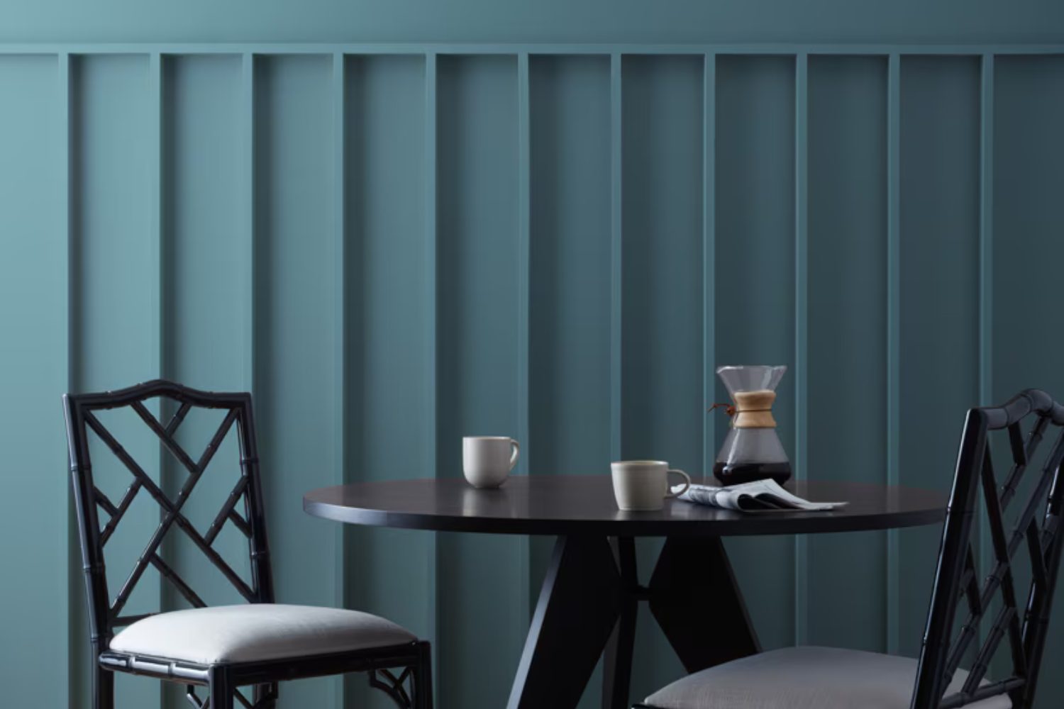
Hamilton Blue HC-191 by Benjamin Moore is a unique and lively color that brings a fresh breath of character to any room. This shade belongs to a palette that draws from nature, offering a vibrant yet deeply soothing tone. Its special quality lies in its balanced mix of blue and green, creating a hue that can both energize and calm a space.
This inviting color works best in interior styles that aim for a refreshing and cozy atmosphere. Think about coastal or nautical themes, where its marine-inspired vibe can make spaces feel like a serene seaside retreat. It also fits seamlessly into a country or rustic setting, adding a touch of brightness without overwhelming the room’s natural charm.
For a more modern approach, Hamilton Blue can serve as an eye-catching accent wall or as lively decor pieces within minimalist designs, providing a pop of color that draws the eye without dominating the space.
Hamilton Blue pairs wonderfully with natural materials and textures. Wood, whether light oak or dark walnut, complements its depth and brings out its earthy undertones. Linen and cotton textiles in neutral colors (such as white, beige, or soft gray) help maintain the room’s airy feel, while jute or sisal rugs add a rustic touch that aligns with the color’s natural appeal. Metal accents, particularly in brushed nickel or polished chrome, can offer a sleek contrast to Hamilton Blue’s organic vibe, rounding out a space that feels both grounded and inspired.

housekeepingbay.com
Is Hamilton Blue HC-191 by Benjamin Moore Warm or Cool color?
Hamilton Blue HC-191 by Benjamin Moore is a rich, striking color that brings energy and depth to any space. It’s a shade that stands out, making a bold statement whether used on a home’s exterior or as an accent color inside. This unique blue has a timeless appeal, fitting well with both modern and traditional decor. Its versatility allows it to blend seamlessly with a variety of styles and furnishings, making it a go-to choice for designers and homeowners looking to add a touch of sophistication.
In homes, Hamilton Blue can transform an ordinary room into a stunning space with its vibrant hue. If you’re looking to create a focal point or simply add some personality, this color does the job. It works beautifully in living rooms, kitchens, and bedrooms, complementing natural light and making spaces feel more alive and inviting. However, it’s important to balance this strong color with softer tones or neutrals to avoid overwhelming the room. Using Hamilton Blue thoughtfully can elevate your home’s aesthetic and create an environment you’ll love.
What is the Masstone of the Hamilton Blue HC-191 by Benjamin Moore?
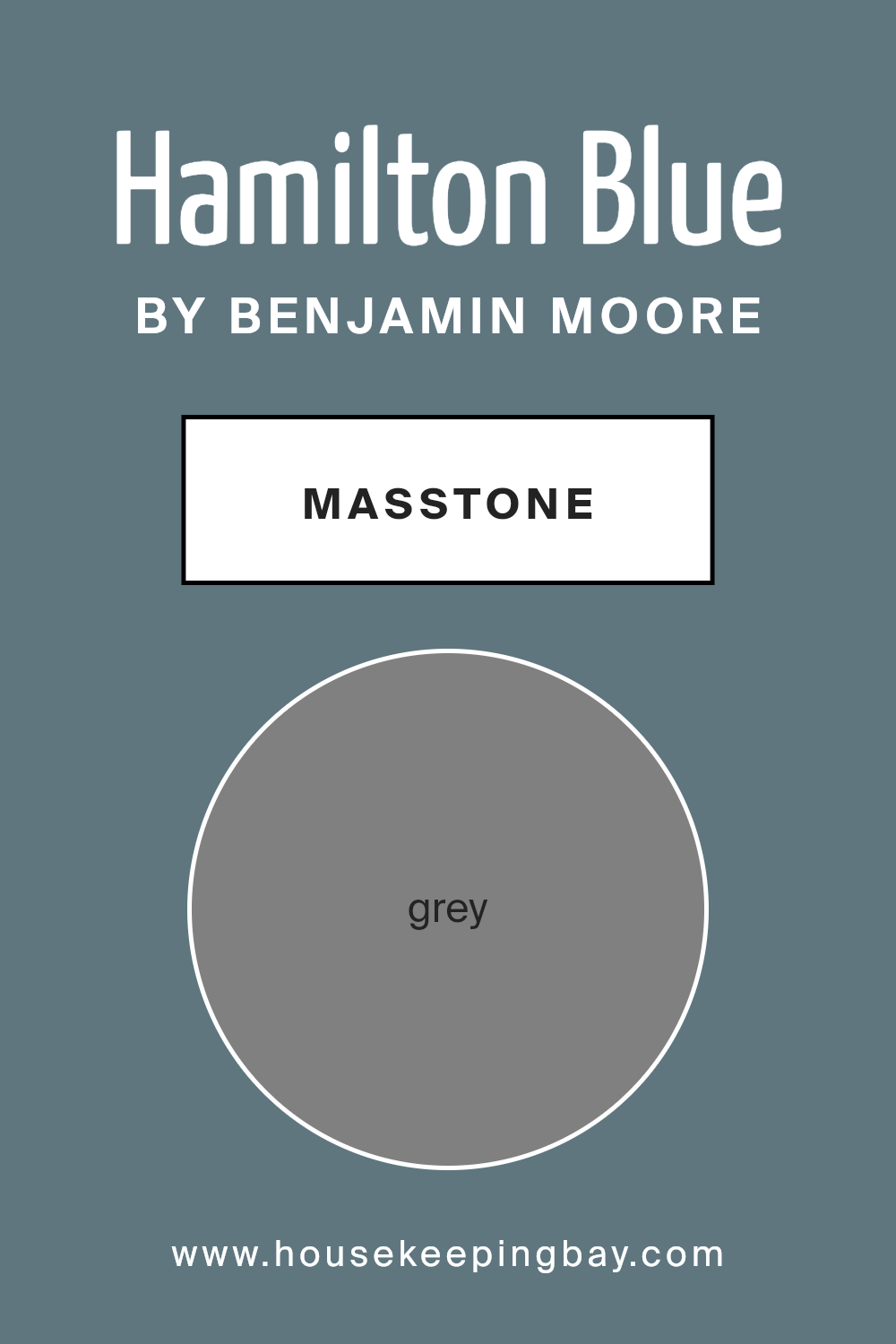
Hamilton Blue HC-191 by Benjamin Moore is a unique color that might surprise you. While its name suggests a blue hue, its masstone, or the color you see when the paint is applied thickly, actually looks more like a classic Grey (#808080). This interesting twist means that Hamilton Blue can fit into many homes in ways you might not expect from a typical blue paint.
Grey is a super flexible color. It works well with almost any style or theme you have in your home, from modern and sleek to cozy and traditional. Because of this, Hamilton Blue can blend seamlessly into many rooms, adding a touch of sophistication without overpowering the space. It can also serve as a neutral backdrop, allowing your furniture, artwork, or colorful accents to stand out. Whether you’re painting your living room, bedroom, or even your kitchen, Hamilton Blue’s grey masstone offers a soft, yet distinct, base that complements various decorations and furniture styles, making it a versatile choice for your home makeover.
housekeepingbay.com
Undertones of Hamilton Blue HC-191 by Benjamin Moore
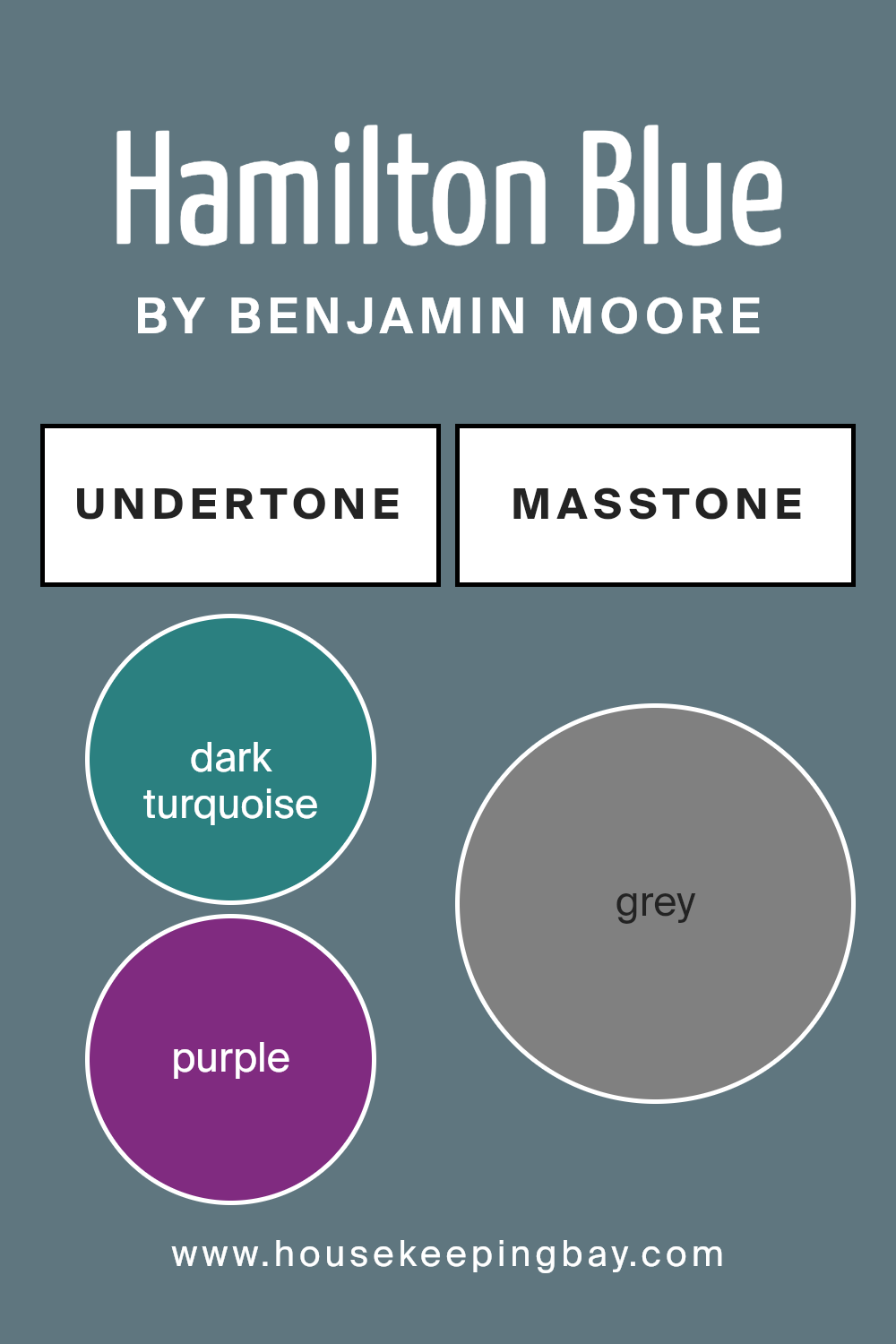
Hamilton Blue HC-191 by Benjamin Moore is a complex color with a variety of undertones that influence how it looks on interior walls. Essentially, undertones are subtle colors that lie beneath the surface of the main color. They can significantly impact the way we perceive the overall hue under different lighting conditions and when paired with various furnishings and decorations.
Hamilton Blue HC-191, despite its primary blue shade, harbors multiple undertones ranging from dark turquoise, navy, and dark blue to softer shades like mint, light turquoise, and light blue. These cool undertones give the color a calm and refreshing feel, making it ideal for creating a serene environment. On the other hand, it also contains warmer tones like olive, brown, and orange, which can add a cozy and welcoming touch to a room.
When Hamilton Blue HC-191 is applied to interior walls, its undertones play a key role in defining the room’s mood and style. In rooms with ample natural light, its green and turquoise undertones might become more pronounced, evoking a vibrant, aquatic feel. In spaces with less light or during the evening, warmer undertones might stand out, offering a more subdued and intimate ambiance.
Moreover, the presence of grey, violet, and lilac undertones adds a layer of sophistication and depth, allowing this color to adapt fluidly to various decor themes, from modern and minimalistic to traditional and eclectic. The undertones of Hamilton Blue HC-191 ensure it remains a versatile choice, capable of elevating any space by adding richness and character without overwhelming the senses. This makes it a favorite among those looking to create spaces that feel both inviting and stylish.
housekeepingbay.com
Coordinating Colors of Hamilton Blue HC-191 by Benjamin Moore
Coordinating colors are hues that work in harmony with a primary color, enhancing the overall aesthetic of a space without overwhelming it. These complementary shades are selected based on their position on the color wheel or their tonal similarities, ensuring they create a balanced look. When working with a specific color like Hamilton Blue HC-191 by Benjamin Moore, choosing coordinating colors such as OC-52 – Gray Owl, HC-170 – Stonington Gray, OC-68 – Distant Gray, and OC-65 – Chantilly Lace can transform a room into a cohesive and soothing retreat.
Gray Owl OC-52 is a soft, warm gray that brings a sense of calm and tranquility to any space, making it ideal for creating a gentle contrast with the bolder Hamilton Blue. Stonington Gray HC-170, on the other hand, is a cooler gray that offers a sharper contrast, adding a touch of sophistication and depth.
Distant Gray OC-68 is a very light, almost ethereal gray that acts as a neutral backdrop, allowing Hamilton Blue to truly stand out. Lastly, Chantilly Lace OC-65 is a crisp, clean white that provides a fresh, bright compliment to the more saturated Hamilton Blue, ensuring the space feels open and airy. Together, these colors work in harmony to enhance the beauty and character of Hamilton Blue, creating a visually appealing and balanced space.
You can see recommended paint colors below:
- OC-52 Gray Owl
- HC-170 Stonington Gray
- OC-68 Distant Gray
- OC-65 Chantilly Lace

housekeepingbay.com
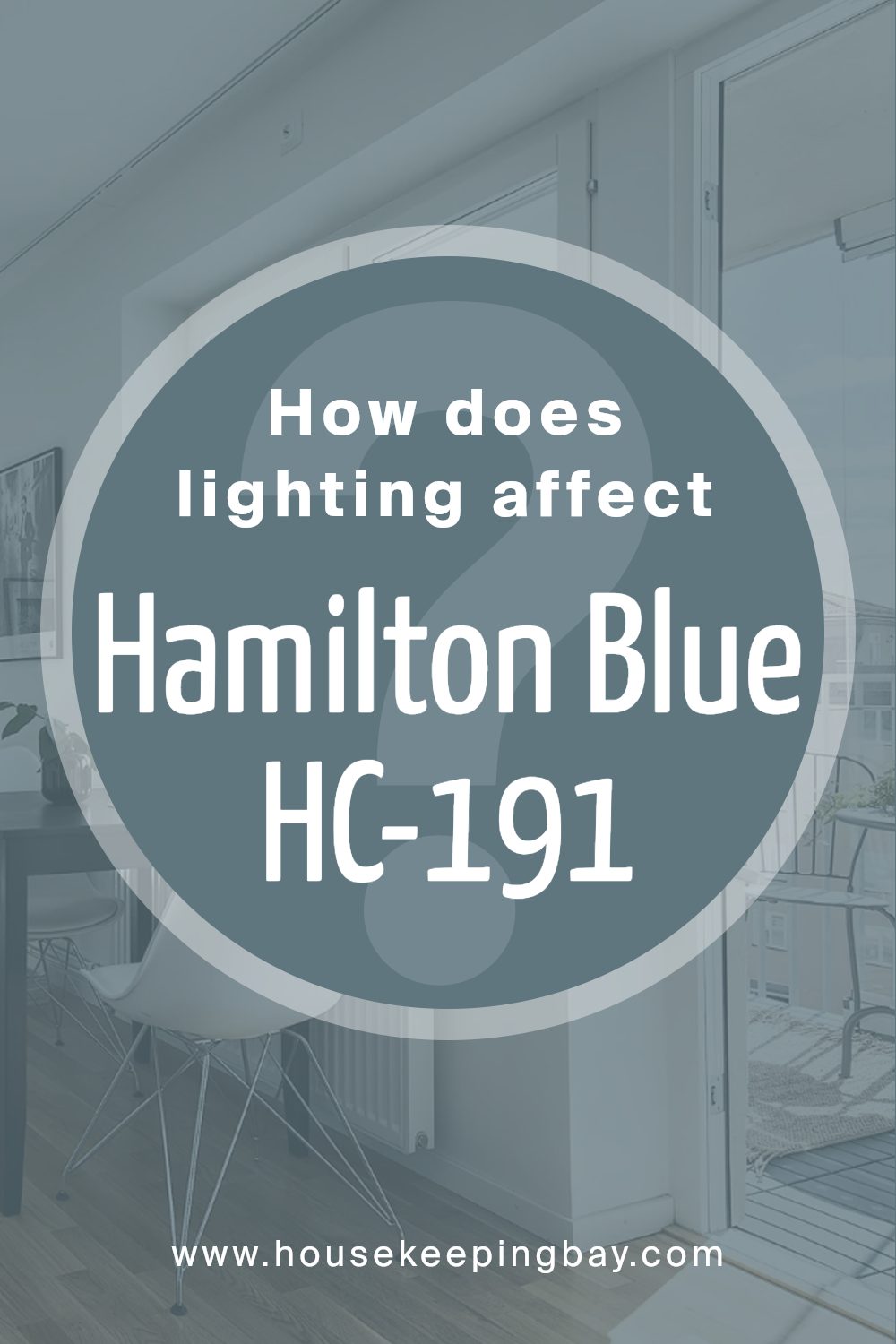
How Does Lighting Affect Hamilton Blue HC-191 by Benjamin Moore?
Lighting plays a massive role in how we perceive colors. Different types of light can make the same color look different. This concept is crucial when considering painting a room or choosing colors for a design project. For example, Benjamin Moore’s Hamilton Blue HC-191 can appear differently under various lighting conditions.
In artificial light, such as LED or fluorescent lighting, Hamilton Blue HC-191 can look more vibrant. Artificial lighting tends to enhance the blue tones, making the color pop more than it would in natural light. The intensity of the artificial light can also affect how bright or muted the color appears. Stronger light sources can make Hamilton Blue look more lively, while dimmer lights can make it appear softer and more subdued.
Under natural light, the appearance of Hamilton Blue HC-191 can change throughout the day. Natural light, especially sunlight, reveals the truest form of the color. In the morning and late afternoon, when the sunlight is softer, Hamilton Blue can appear more muted and gentle. At noon, when the sun is brightest, the color can look more vivid and dynamic.
The direction your room faces also affects how Hamilton Blue will look:
- North-faced rooms receive less direct sunlight, making colors appear cooler. In such rooms, Hamilton Blue might seem slightly more subdued and could lean towards a cooler, slightly grayish tone.
- South-faced rooms are bathed in warm sunlight for most of the day, making colors appear brighter and warmer. In these rooms, Hamilton Blue will come alive, looking vibrant and cheerful.
- East-faced rooms get bright morning light, which is warm and yellow. Here, Hamilton Blue will look bright and welcoming in the morning but may appear cooler and more muted as the day progresses.
- West-faced rooms receive intense afternoon sunlight, making colors look warmer. In the afternoon, Hamilton Blue in these rooms will look particularly vivid and full, capturing the warm glow of the setting sun.
In summary, lighting conditions dramatically influence how we perceive the color Hamilton Blue HC-191 by Benjamin Moore. Whether it’s natural or artificial light, or the orientation of the room, each plays a significant role in the color’s appearance, turning it from bold and vibrant to soft and subdued.
housekeepingbay.com
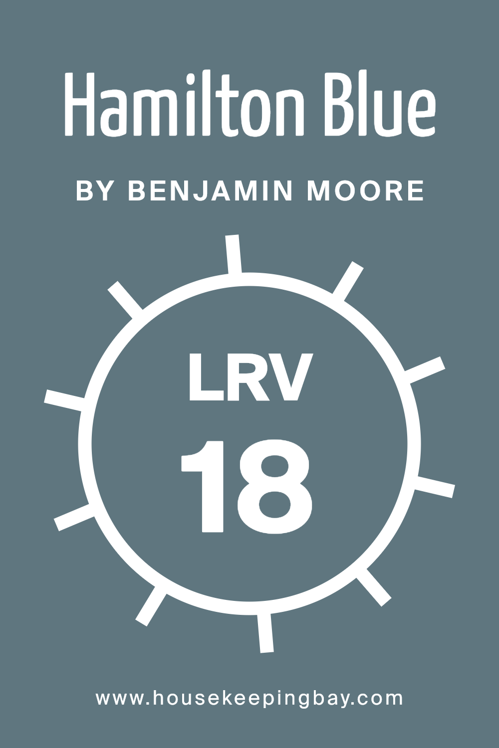
What is the LRV of Hamilton Blue HC-191 by Benjamin Moore?
LRV stands for Light Reflectance Value, which is a measure used to describe the percentage of light a paint color reflects or absorbs when it’s applied to a wall. This value ranges from 0 to 100, with 0 being completely black, absorbing all light, and 100 being pure white, reflecting all light back. Understanding the LRV of a paint color can help you understand how light or dark a color will look once it’s on your walls. It’s important because the amount of natural and artificial light in a room can significantly change how a color appears. If a room gets a lot of sunlight, a color with a high LRV will appear much lighter, while low LRV colors can make the room feel more enclosed and cozy.
For Hamilton Blue HC-191 by Benjamin Moore, which has an LRV of 18.25, this means it’s on the darker side of the spectrum, absorbing more light than it reflects. This can make a room painted in Hamilton Blue feel more intimate and grounded, giving the space a sense of richness and depth. However, this also means it might make a small room feel even smaller or darker, especially if the space doesn’t receive a lot of natural light. When using colors with a lower LRV like Hamilton Blue, it’s a good idea to consider your room’s lighting conditions and think about how the color will interact with the space to create the desired atmosphere.
housekeepingbay.com
What are the Trim colors of Hamilton Blue HC-191 by Benjamin Moore?
Trim colors refer to the shades used for the detailing work in a room or on a house’s exterior, such as door frames, window casings, skirtings, and crown moldings. These colors are pivotal in defining and accentuating the architectural features of a space, adding depth, character, and a cohesive look to the overall design. Particularly for a color like Hamilton Blue HC-191 by Benjamin Moore, which carries a distinctive and vibrant personality, selecting the right trim colors is crucial. The trim colors act as a frame, enhancing the main hue’s presence and ensuring it stands out without overwhelming the space.
AF-20 Mascarpone and OC-72 Pink Damask are exemplary choices as trim colors for Hamilton Blue HC-191. AF-20 Mascarpone is a creamy, almost buttery white with a warm undertone that brings out the richness of Hamilton Blue without causing a stark contrast, promoting a smooth and harmonious transition between the wall color and the trim. On the other hand, OC-72 Pink Damask offers a subtle hint of pink, a soft and gentle color that can add a touch of elegance and warmth, ensuring the blue pops in a sophisticated manner. These colors not only complement but elevate the appearance of Hamilton Blue HC-191, making the space feel well-composed and pleasing to the eye.
You can see recommended paint colors below:
- AF-20 Mascarpone
- OC-72 Pink Damask

housekeepingbay.com
How to Use Hamilton Blue HC-191 by Benjamin Moore In Your Home?
Hamilton Blue HC-191 by Benjamin Moore is a beautiful, deep blue paint that can bring a sense of calm and sophistication to any room in your home. It’s part of the Historical Collection, known for colors that have stood the test of time. This particular blue can make a strong statement whether you decide to use it on a feature wall, as an accent, or to cover an entire room.
Imagine your living room or bedroom adorned with this rich, soothing blue; it can turn the space into a cozy retreat where you feel relaxed and at peace after a long day. In the kitchen, Hamilton Blue cabinets can add a burst of color and character, pairing well with natural wood or metallic finishes for a modern yet timeless look. For those looking to add visual interest without overwhelming a space, consider using it on a piece of furniture or the inside of a closet for a surprising pop of color. This versatile shade works well in many settings, offering a perfect backdrop for art, and complements both traditional and contemporary decor.
Conclusion
In wrapping up our thoughts on HC-191 Hamilton Blue by Benjamin Moore, it’s clear why this color has gained such a widespread appeal. You’ll find that this unique shade of blue offers a delightful balance of warmth and serenity, making it a top choice for anyone looking to refresh their space with a touch of elegance and comfort.
Adopting Hamilton Blue into your home means you’re choosing a color that’s versatile enough to fit a variety of settings and styles, from cozy living rooms to serene bedrooms and even lively kitchens. Its deep yet bright hue has the power to transform any room into a more inviting and stylish space without overwhelming it.
Plus, given Benjamin Moore’s reputation for quality, you can trust Hamilton Blue to not only look beautiful but also stand up well over time. Whether you’re aiming for a bold statement wall or subtle accents throughout your home, Hamilton Blue offers a harmonious blend of sophistication and playfulness that can truly elevate your decorating game. So, if you’re on the hunt for a color that brings both charm and calmness to your interiors, HC-191 Hamilton Blue by Benjamin Moore should definitely be on your radar.

housekeepingbay.com
Ever wished paint sampling was as easy as sticking a sticker? Guess what? Now it is! Discover Samplize's unique Peel & Stick samples. Get started now and say goodbye to the old messy way!
Get paint samples


