Green Glaze SW 7128 by Sherwin Williams
A Fresh Hue for Stylish Spaces
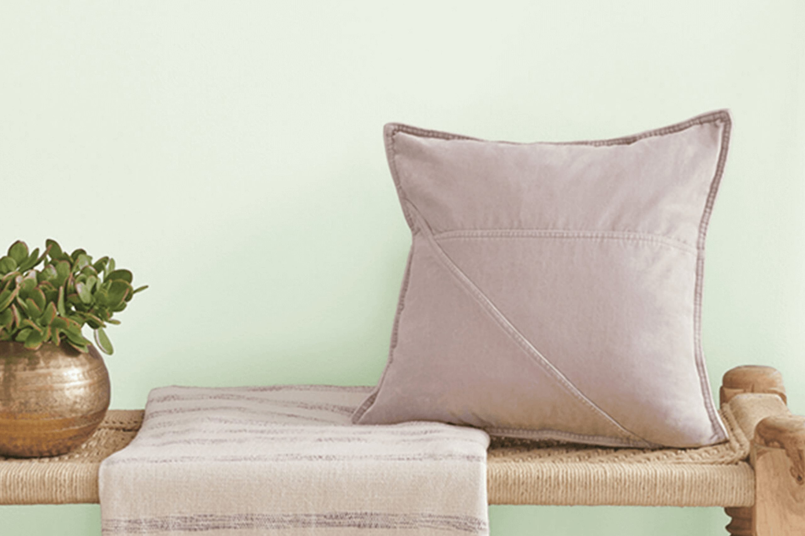
There’s something special about Green Glaze SW 7128 by Sherwin Williams. It’s a shade that captures the soothing essence of nature with a touch of elegance. When you use this color in your space, it brings a fresh and calming vibe that’s hard to overlook. Think of gentle green leaves or a soft early morning mist over a garden.
Green Glaze is perfect for those who appreciate the balance between warmth and coolness. It’s not too bold yet not too subdued, making it adaptable for any room.
Whether you’re planning to use it for your living room walls, your kitchen cabinets, or even an accent piece, it has the ability to bring a sense of peace and comfort.
This color pairs beautifully with neutrals like beige and cream, but it also complements deeper tones like navy or charcoal. You have plenty of options to create a space that feels both unique and inviting.
Let Green Glaze SW 7128 be your choice for creating an environment that feels comforting and refreshing. It’s more than just a color—it’s an experience that speaks to harmony and balance in your home.
via sherwin-williams.com
What Color Is Green Glaze SW 7128 by Sherwin Williams?
Green Glaze SW 7128 by Sherwin Williams is a soft, refreshing shade that brings a touch of nature indoors. This gentle green is calming and inviting, making it an ideal choice for creating a serene atmosphere in any room. Its subtlety allows it to adapt well to different lighting, maintaining a consistent and pleasant hue throughout the day.
Green Glaze fits effortlessly into several interior styles. In a modern or minimalist setting, it adds a hint of color without overwhelming the space. It also works beautifully in traditional and farmhouse styles, offering a fresh contrast to wood and natural elements.
Pair this color with materials like light oak or maple for an airy, open feel. Green Glaze also complements soft, textured fabrics such as linen or cotton, enhancing comfort and warmth. For accents, consider brass or gold fixtures that bring out the richness of the green.
Incorporate natural textures like wicker, rattan, or jute to underline the color’s earthy influences. Green Glaze harmonizes well with neutral tones like beige, cream, or soft grays, providing a balanced backdrop.
Its versatility and soothing presence make Green Glaze a wonderful choice for living rooms, bedrooms, and dining areas.
housekeepingbay.com
Is Green Glaze SW 7128 by Sherwin Williams Warm or Cool color?
Green Glaze SW 7128 by Sherwin Williams is a soothing soft green with gentle undertones. This color brings a natural and fresh feel to any room. It’s versatile, making it a great choice for various styles – from modern to traditional settings.
In a living room, Green Glaze can create a calm and inviting atmosphere, perfect for relaxation or gathering with family. When used in a kitchen, it can provide a subtle pop of color without being overwhelming, complementing both wooden and white cabinets beautifully.
For bedrooms, this shade adds a peaceful vibe, ideal for resting and unwinding after a long day. Paired with neutral colors like beige or soft whites, it fosters a harmonious setting. Additionally, Green Glaze works well as an accent color, providing balance and interest without being too bold. It is a timeless choice that helps spaces feel welcoming and serene, adding just the right touch of nature indoors.
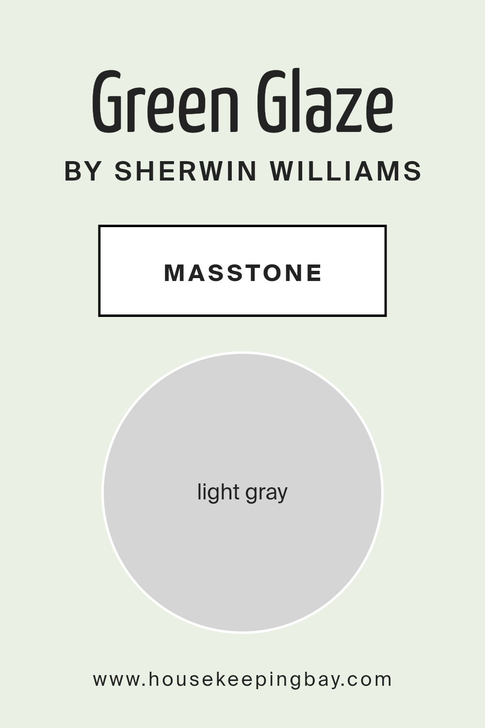
What is the Masstone of the Green Glaze SW 7128 by Sherwin Williams?
Green Glaze SW 7128 by Sherwin Williams is a color that combines a light, refreshing green with hints of gray. Its masstone, a soft light gray (#D5D5D5), provides a subtle backdrop that influences how the color appears in different settings.
In homes, this light gray undertone helps balance the green, making it a versatile choice for various spaces. When applied in rooms with plenty of natural light, Green Glaze can appear slightly warmer, offering a soothing atmosphere.
In darker areas, the gray undertone becomes more prominent, giving a cooler, calming effect.
This color can complement both contemporary and traditional decor, adding a subtle touch of nature without overpowering the space.
It pairs well with neutral tones like beige, cream, and soft whites, enhancing the room’s overall feel. Green Glaze SW 7128 allows homeowners to introduce a gentle, natural hue that adapts to their home’s existing style.
housekeepingbay.com
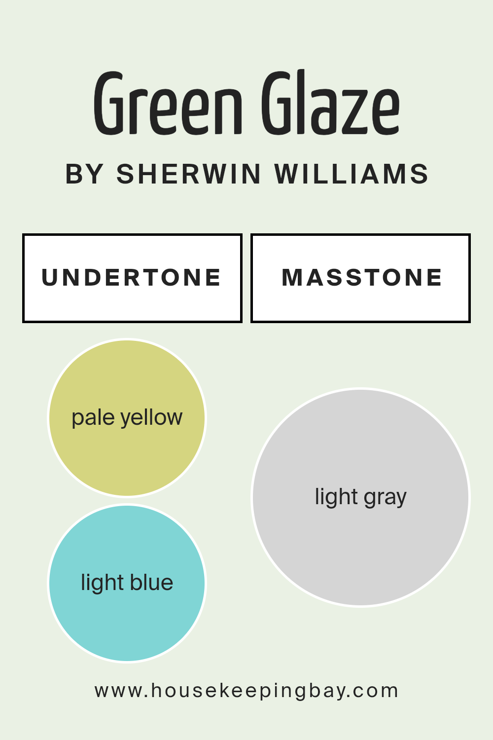
Undertones of Green Glaze SW 7128 by Sherwin Williams
Green Glaze SW 7128 by Sherwin Williams is a complex and intriguing color. Its primary shade appears as a soft green, but its undertones bring more to the table. Undertones are subtle hints of other colors that affect our perception. They can make a color look warmer, cooler, or even change its intensity based on lighting and surroundings. In Green Glaze, we find pale yellow, light blue, light purple, mint, pale pink, lilac, and grey undertones.
Yellow adds warmth and a sunny feel, while blue and mint provide a cool, fresh touch. Lilac and light purple promote a sense of calm and elegance. Pale pink introduces a gentle, sweet aspect, and grey offers a neutral balance.
On interior walls, these undertones can significantly influence mood and atmosphere. In bright light, the yellow and mint may stand out, creating a cheerful and invigorating space. In dimmer areas, the lilac and grey might become more pronounced, lending a serene and restful vibe. This versatility makes Green Glaze an excellent choice for various rooms, seamlessly adapting to different energies.
Whether in a living room, bedroom, or kitchen, its diverse undertones can help set the desired tone and mood for the space.
housekeepingbay.com
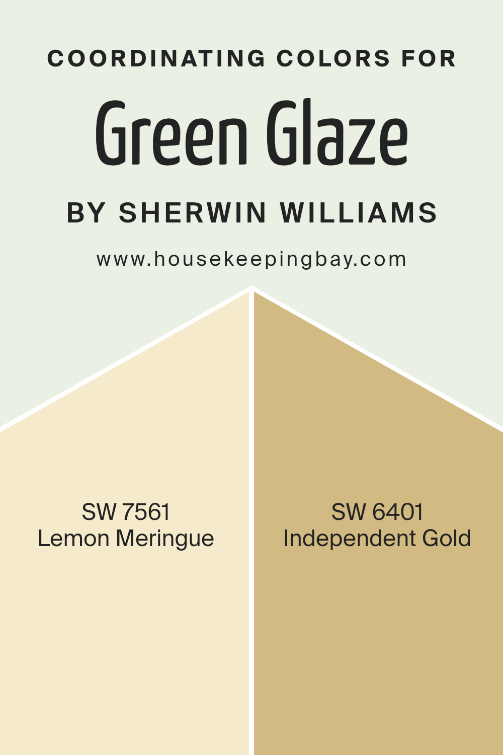
Coordinating Colors of Green Glaze SW 7128 by Sherwin Williams
Coordinating colors are hues that work well together, creating a visually pleasing and harmonious look. When choosing paint colors for a room, it’s important to consider how different shades will interact in the space. A balanced color palette can enhance the overall mood and appeal of a room.
In the world of interior design, coordinating colors often complement or contrast with a primary color. For Sherwin Williams’ Green Glaze SW 7128, two excellent coordinating colors include SW 7561 Lemon Meringue and SW 6401 Independent Gold.
Lemon Meringue is a soft, buttery yellow that brings warmth and light to any space. It’s a gentle, uplifting shade that can brighten the room and pairs beautifully with the more subtle tones of Green Glaze. On the other hand, Independent Gold adds a touch of elegance and richness.
This deeper, more saturated gold color provides contrast to Green Glaze, creating a sophisticated and inviting environment.
Together, these colors create a balanced palette that feels welcoming and stylish. When used correctly, they can make any room feel thoughtfully designed and comfortably cohesive.
You can see recommended paint colors below:
- SW 7561 Lemon Meringue
- SW 6401 Independent Gold
housekeepingbay.com
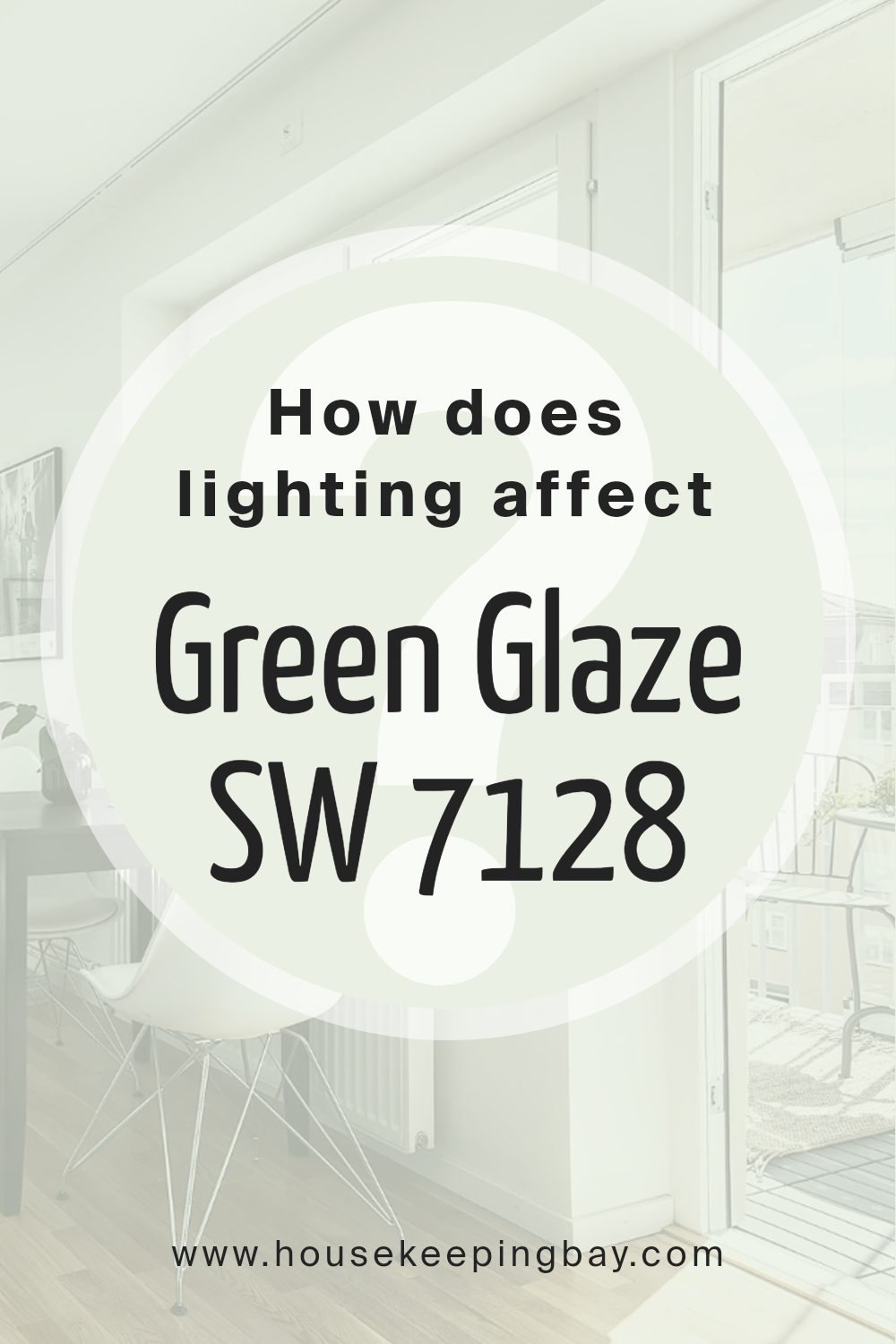
How Does Lighting Affect Green Glaze SW 7128 by Sherwin Williams?
Lighting plays a crucial role in how we perceive colors. It affects the appearance of paint colors on walls in unique ways. Green Glaze SW 7128 by Sherwin Williams exemplifies this effect. This light green color can change appearance depending on the type of light it receives.
In natural light, Green Glaze can look different throughout the day. For instance, in north-facing rooms, the light tends to be cooler and more constant, giving Green Glaze a more muted and slightly cooler hue.
North-facing light doesn’t change much during the day, so you can expect the color to look consistent but slightly dim.
In south-facing rooms, the light is warmer and more intense, especially during midday. Here, Green Glaze can appear brighter and more vibrant. Sunlight fills the room with a warm glow, which can make this shade of green look cheerful and lively.
East-facing rooms receive direct morning sunlight, which is warm and soft, giving Green Glaze a warm and fresh appearance at the start of the day. By the afternoon and evening, as the sun moves away, the color might look softer and cooler.
In west-facing rooms, the light is softer in the morning, but becomes golden and intense in the late afternoon and evening.
This can cause Green Glaze to shift from a softer green during the day to a more lively shade as the sun sets. The warmer light at the end of the day enhances the color’s warmth and depth.
Artificial light further affects Green Glaze. Under warm incandescent lighting, the color appears warmer and can take on a cozy tone.
Under cooler LED lights, it might look crisper and slightly bluer. Fluorescent lighting, with its bluish tone, can make Green Glaze look cooler and less vibrant.
Thus, the type of lighting used in a room can significantly influence this paint color’s final appearance.
housekeepingbay.com
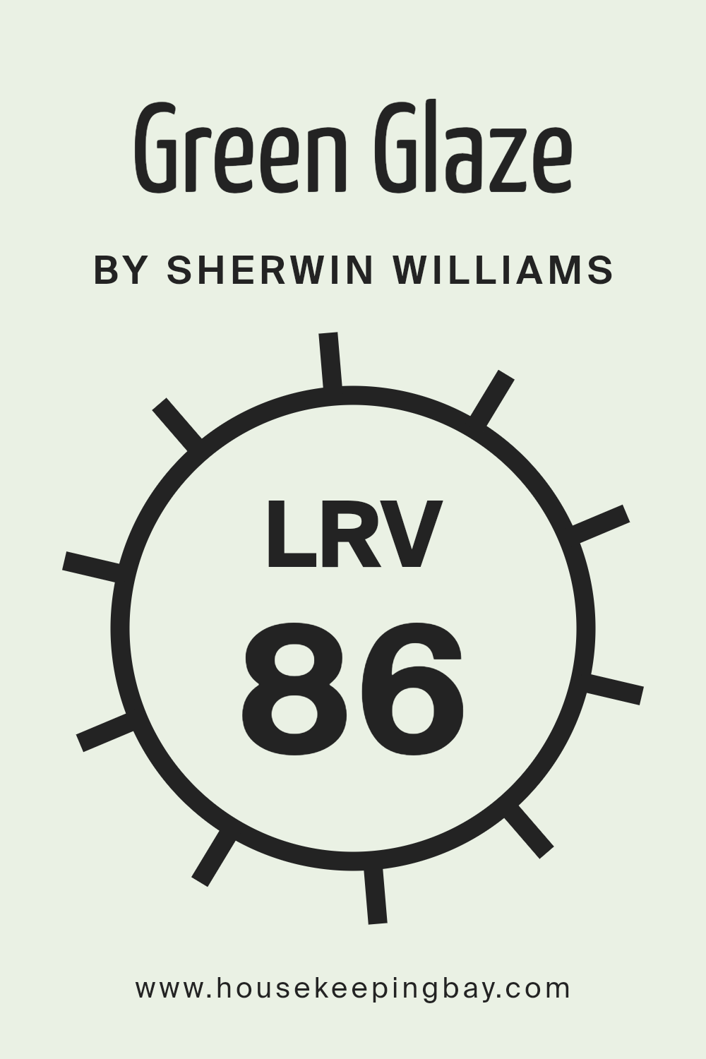
What is the LRV of Green Glaze SW 7128 by Sherwin Williams?
LRV stands for Light Reflectance Value, which is a measure of how much light a color reflects. The scale goes from 0 to 100, where 0 is the darkest black, reflecting no light, and 100 is the brightest white, reflecting all the light. So when you look at a paint color’s LRV, you’re looking at how much light the paint will bounce back into the room.
Colors with higher LRV numbers, like Green Glaze SW 7128 with its LRV of 86.02, reflect a lot of light, making spaces seem brighter and more open. This is why understanding LRV is important when choosing paint colors; it helps you predict how your walls will look under different lighting conditions.
For Green Glaze SW 7128, an LRV of 86.02 means it’s a color that reflects a significant amount of light. This makes it an excellent choice for small or dimly lit rooms, as it can make them feel more spacious and airy. In well-lit spaces, it will enhance the room’s brightness, giving it a fresh and lively atmosphere.
Because it reflects so much light, this color can also highlight textures and details in your decor.
When using a color with such a high LRV, consider how it will interact with other colors in your space, as it can sometimes make darker tones seem even more pronounced by contrast.
housekeepingbay.com
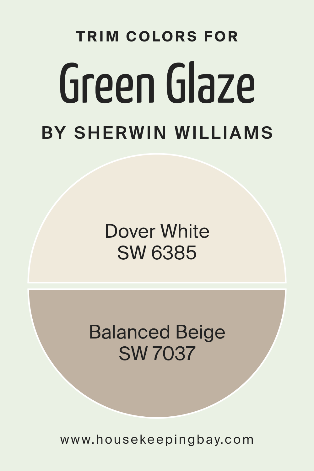
What are the Trim colors of Green Glaze SW 7128 by Sherwin Williams?
Trim colors are shades used to paint the edges or borders of a room, such as the baseboards, door frames, and window trims. They play an essential role in defining the space and enhancing the main wall color. For a paint like Sherwin-Williams Green Glaze SW 7128, choosing the right trim colors is crucial because they help highlight and complement the main wall color, allowing it to shine.
Green Glaze is a soft green shade that brings a gentle, nature-inspired feel to any space. Pairing it with the right trim colors can bring balance and make the entire room feel cohesive and inviting.
Dover White SW 6385 is a warm, creamy white that adds a touch of softness and brightness, making it an excellent choice for trim when used with Green Glaze. This color brings warmth without being too stark or cold. On the other hand, Balanced Beige SW 7037 is a neutral beige that offers a calm, grounding effect.
With its subtle taupe undertones, it can work beautifully as a trim color to add depth and contrast.
These trim colors can enhance the overall palette, allowing Green Glaze to maintain its natural freshness while creating a polished and harmonious look throughout the space.
You can see recommended paint colors below:
housekeepingbay.com
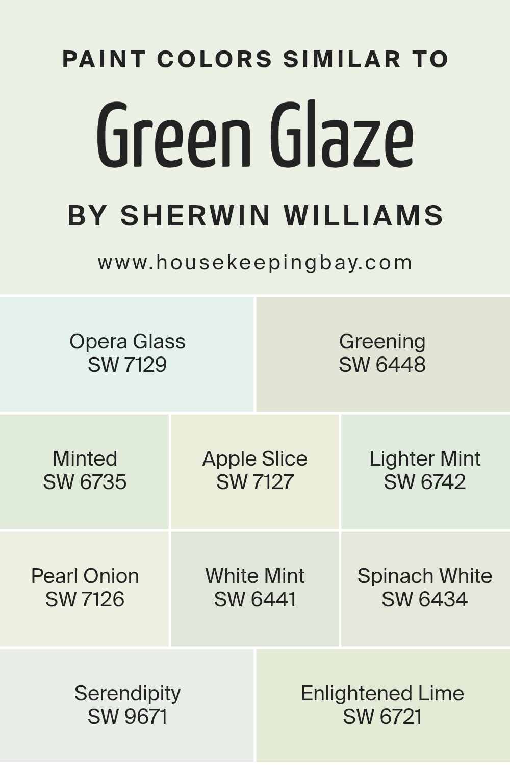
Colors Similar to Green Glaze SW 7128 by Sherwin Williams
Similar colors play a crucial role in creating harmony and unity in design, art, and interior spaces. These colors are like different shades from the same family, gently shifting from one to another, allowing for a smooth visual flow. By using similar colors, you can create a calming and cohesive look that is pleasing to the eye.
For example, Sherwin Williams’ Green Glaze SW 7128 is beautifully complemented by shades like SW 7129 – Opera Glass, which offers a gentle whisper of green, and SW 6448 – Greening, a more vivid and lush tone that brings vibrancy.
SW 6735 – Minted provides a fresh and lively touch, while SW 7127 – Apple Slice offers a crisp, refreshing feel. SW 6742 – Lighter Mint introduces a subtle elegance, much like SW 7126 – Pearl Onion, which carries a soft, muted presence. SW 6441 – White Mint adds a hint of brightness, creating an airy quality.
Continuing the theme, SW 6434 – Spinach White combines a soft green with a touch of warmth.
Finally, SW 9671 – Serendipity and SW 6721 – Enlightened Lime bring in light and cheerful notes, creating a sense of balance and harmony throughout. By working with these colors, you can craft spaces that feel unified and inviting.
You can see recommended paint colors below:
- SW 7129 Opera Glass
- SW 6448 Greening
- SW 6735 Minted
- SW 7127 Apple Slice
- SW 6742 Lighter Mint
- SW 7126 Pearl Onion
- SW 6441 White Mint
- SW 6434 Spinach White
- SW 9671 Serendipity
- SW 6721 Enlightened Lime
housekeepingbay.com
How to Use Green Glaze SW 7128 by Sherwin Williams In Your Home?
Green Glaze SW 7128 by Sherwin Williams is a soft, soothing shade of green that brings a natural feel to any space. This color works well in many areas of the home, adding a touch of nature indoors. It pairs nicely with neutral colors like beige, cream, or soft whites.
In the living room, Green Glaze offers a calm background that complements wooden furniture and leafy plants. It also works in the bedroom, providing a peaceful atmosphere that helps create a restful environment.
For the kitchen, Green Glaze can add a fresh look when used on walls or cabinets.
Bathrooms benefit from this shade too, offering a spa-like feel when paired with white tiles or fixtures. Green Glaze can even be a good choice for a home office, encouraging focus and ease. Overall, this color helps create spaces that feel welcoming and comforting in any part of the home.
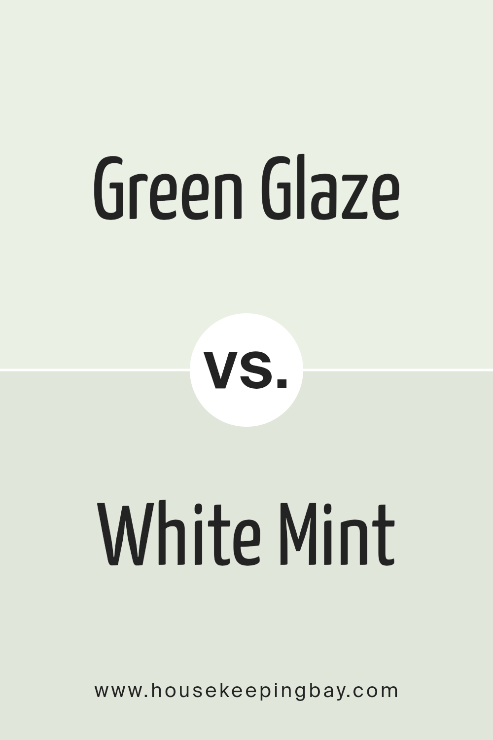
Green Glaze SW 7128 by Sherwin Williams vs White Mint SW 6441 by Sherwin Williams
Green Glaze SW 7128 by Sherwin Williams is a soft, muted shade of green that brings a sense of calm and nature into a space. It has a gentle presence, offering warmth and a soothing impression, making it perfect for creating an inviting atmosphere.
White Mint SW 6441 by Sherwin Williams, as the name suggests, is a light and fresh minty color. It is brighter and more vibrant than Green Glaze. White Mint gives spaces a cheerful and lively feel, with its clean tone adding airiness and a sense of freshness.
When comparing these two, Green Glaze is more subdued and earthy, lending itself well to spaces meant for relaxation and comfort. White Mint, with its brighter appearance, works well in areas where you want to inject a bit of energy and lightness. While both colors have green undertones, Green Glaze is more grounded, whereas White Mint is uplifting and makes rooms feel more open.
You can see recommended paint color below:
- SW 6441 White Mint
housekeepingbay.com
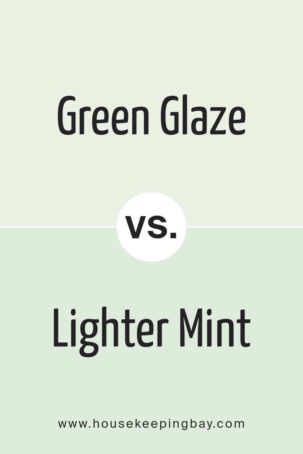
Green Glaze SW 7128 by Sherwin Williams vs Lighter Mint SW 6742 by Sherwin Williams
Green Glaze SW 7128 by Sherwin Williams and Lighter Mint SW 6742 each bring unique qualities to a space. Green Glaze is a warm, earthy green with a touch of yellow, offering a cozy and natural feel. It’s perfect for creating a grounded and inviting atmosphere in living rooms or kitchens. Its warmth helps rooms feel welcoming and comfortable, making it ideal for spaces where people gather.
Lighter Mint SW 6742, conversely, is a soft, pastel green with a hint of blue, giving it a cooler, airy look. This color works well in bathrooms, bedrooms, or any area where a fresh and calming ambiance is desired. Lighter Mint’s soothing nature can make small spaces feel larger and more open.
Ultimately, choosing between these colors depends on the desired mood and function of your space. Green Glaze is warm and earthy, whereas Lighter Mint provides a refreshing and gentle touch.
You can see recommended paint color below:
- SW 6742 Lighter Mint
housekeepingbay.com
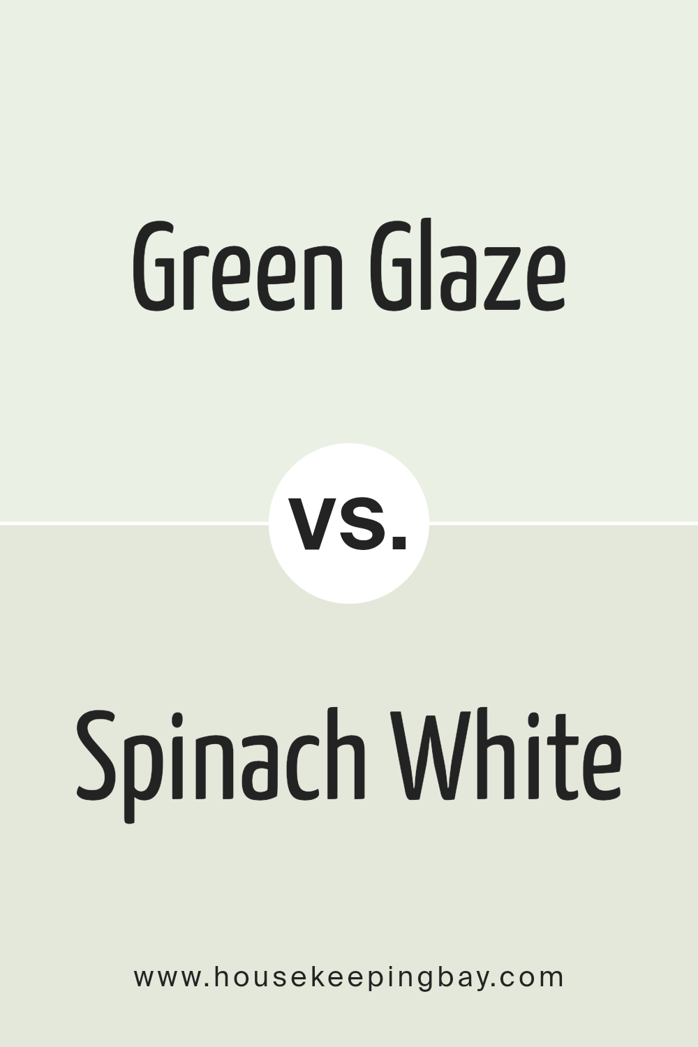
Green Glaze SW 7128 by Sherwin Williams vs Spinach White SW 6434 by Sherwin Williams
Green Glaze SW 7128 by Sherwin Williams and Spinach White SW 6434 by Sherwin Williams both belong to the green family but present distinct personalities. Green Glaze is a vibrant, lively hue with a warm undertone. It brings energy and brightness to spaces, offering a cheerful and refreshing ambiance. It’s well-suited for areas where you want to add a pop of color without overwhelming the senses.
Spinach White, in contrast, has a more subtle, muted appearance. It’s a softer, gentler green with a whisper of gray, providing a serene and calming atmosphere.
This color works wonders in spaces designed for relaxation, such as bedrooms or meditation rooms, where a peaceful vibe is desired.
While both colors share a green base, Green Glaze leans towards spontaneity and liveliness, ideal for active environments.
Spinach White suggests a quieter, more understated elegance, perfect for those seeking a tranquil and balanced setting.
You can see recommended paint color below:
- SW 6434 Spinach White
housekeepingbay.com
Green Glaze SW 7128 by Sherwin Williams vs Apple Slice SW 7127 by Sherwin Williams
Sure, let’s compare Green Glaze SW 7128 and Apple Slice SW 7127 by Sherwin Williams. Green Glaze is a soft, pastel shade of green with subtle yellow undertones, giving it a warm and inviting feel. This color can make spaces feel fresh and lively. It pairs well with natural elements and neutral tones, making it versatile for various settings.
Apple Slice is a slightly paler shade, leaning more toward a light, muted green. It has a crisp and clean quality that makes it an excellent choice for creating airy and open spaces. This color works well with whites and lighter woods, adding a refreshing touch without overwhelming a room.
Both colors belong to the same family, yet they have unique characteristics. Green Glaze adds warmth, making it cozy, while Apple Slice brings a light and refreshing feel, ideal for bright, open areas. Both can enhance spaces, giving them a sense of freshness and calm.
You can see recommended paint color below:
- SW 7127 Apple Slice
housekeepingbay.com
Green Glaze SW 7128 by Sherwin Williams vs Serendipity SW 9671 by Sherwin Williams
Green Glaze SW 7128 by Sherwin Williams is a soft, muted green with a hint of warmth. It often feels cozy and welcoming, which makes it a great choice for living spaces or areas where relaxation is key. Its subtle undertone gives it versatility, making it pair well with neutrals for a balanced look.
Serendipity SW 9671, conversely, is a brighter, more pastel green with a fresh and lively vibe. It has a light and airy quality that can make spaces feel open and energetic. This shade works well in environments where you want to add a touch of cheerfulness and positivity.
Both colors bring nature indoors, but while Green Glaze leans towards a comfortable, calming effect, Serendipity introduces a playful, uplifting atmosphere. Choosing between them depends on the mood you wish to create.
You can see recommended paint color below:
- SW 9671 Serendipity
housekeepingbay.com
Green Glaze SW 7128 by Sherwin Williams vs Opera Glass SW 7129 by Sherwin Williams
Green Glaze SW 7128 and Opera Glass SW 7129 by Sherwin Williams are gentle, calming hues that add a natural feel to spaces. Green Glaze is a soft, muted green that creates a serene environment. It has a hint of warmth, making rooms feel cozy yet fresh. This color works well in living areas, bedrooms, or anywhere you want a touch of nature without being overpowering.
Opera Glass is slightly cooler with a blue undertone. It is a light, airy shade that can make spaces feel open and peaceful. This color is suitable for bathrooms, kitchens, or any place you want a crisp, clean look.
When comparing these colors, Green Glaze offers warmth and a classic feel, while Opera Glass provides a fresh, crisp vibe. Both are versatile and can complement a wide range of furniture and decor styles, making them great choices for any project.
You can see recommended paint color below:
- SW 7129 Opera Glass
housekeepingbay.com
Green Glaze SW 7128 by Sherwin Williams vs Enlightened Lime SW 6721 by Sherwin Williams
Green Glaze SW 7128 offers a calm and soothing shade of green. It’s versatile, fitting well in both classic and modern settings. Its muted tone makes it a great choice for living rooms or bedrooms, creating a relaxed atmosphere. Enlightened Lime SW 6721, however, brings a brighter, more energetic vibe.
This lively lime green can add a splash of rejuvenating zest to any space, perfect for accent walls or playful areas such as kitchens and kids’ rooms.
Green Glaze has a more subdued and elegant presence, lending itself well to spaces where you want softer, restful vibes.
Enlightened Lime stands out more, making it excellent for areas where you want energy and liveliness.
Both colors share a green base, but their different tones can set entirely different moods, highlighting the flexibility of green in interior design while offering varied expressions depending on the desired feel of a space.
You can see recommended paint color below:
- SW 6721 Enlightened Lime
housekeepingbay.com
Green Glaze SW 7128 by Sherwin Williams vs Greening SW 6448 by Sherwin Williams
Green Glaze SW 7128 and Greening SW 6448 are both shades from Sherwin Williams, but they bring different vibes to a space. Green Glaze is a soft, understated green with warm undertones, making it ideal for creating a calm and inviting atmosphere. Its muted tone means it can easily pair with neutrals or other pastel shades, providing a gentle backdrop without overpowering a room.
Greening SW 6448, however, is a much more vibrant and rich color. It leans towards a deeper green, almost carrying hints of nature within its hue. This color can energize a space and make a bold statement, working well as an accent or feature wall.
While Green Glaze offers subtlety, Greening brings boldness, with its stronger presence commanding attention. Both colors can enhance a room, but the choice between them depends on whether you desire a soothing space or one full of vividness and life.
You can see recommended paint color below:
- SW 6448 Greening
housekeepingbay.com
Green Glaze SW 7128 by Sherwin Williams vs Minted SW 6735 by Sherwin Williams
Green Glaze SW 7128 and Minted SW 6735 by Sherwin Williams offer unique characteristics for any space. Green Glaze embodies a soft, muted shade of green, with subtle yellow undertones, creating a warm, inviting environment. It’s an excellent choice for areas needing a touch of lightness without overpowering. This color can make a room feel cozy and welcoming.
Minted SW 6735, features a fresher, brighter green with more prominent blue undertones. It brings a crisp, energetic feel to a room, making it well-suited for spaces that benefit from a hint of vibrancy. This lively green introduces a breath of fresh air, perfect for modern settings.
Both of these colors have distinct qualities; Green Glaze leans softer and more calming, while Minted provides a zestful, lively touch. Choosing between them involves considering the atmosphere you want to create—peaceful and warm or fresh and lively.
You can see recommended paint color below:
- SW 6735 Minted
housekeepingbay.com
Green Glaze SW 7128 by Sherwin Williams vs Pearl Onion SW 7126 by Sherwin Williams
Green Glaze SW 7128 by Sherwin Williams offers a soft, muted green that feels fresh and relaxing. It’s a color reminiscent of a gentle spring breeze, bringing a sense of calm and nature into a space. Its earthy tone works well in living areas or bedrooms, where a connection to the outdoors is desired.
Pearl Onion SW 7126, while related in the color family, presents a lighter option with more emphasis on subtlety and versatility. This color, closer to an off-white with a hint of warmth, provides a bright and airy atmosphere. It’s ideal for spaces that need to feel open and clean, like kitchens or bathrooms.
Both colors can work together nicely; Green Glaze adds depth and interest, while Pearl Onion offers lightness and balance. When used together in a room, they create a harmonious and inviting environment that’s both peaceful and refreshing.
You can see recommended paint color below:
- SW 7126 Pearl Onion
housekeepingbay.com
Conclusion
It’s clear that Green Glaze offers a unique balance, effortlessly blending the calm of nature with a subtle modern touch.
This color seems to fit well in many different spaces, offering harmony and a gentle energy that is neither overwhelming nor dull.
I find its soft yet invigorating shade works perfectly for creating environments that feel fresh and inviting. Whether used in a living room for a soothing atmosphere or in a workspace to promote creativity, Green Glaze just seems to have a way of enhancing the space without overpowering it.
For those seeking a middle ground between bold and boring, this color provides a satisfying answer. It maintains a presence and personality, which I think could help personalize any room, aligning well with various styles and tastes.
Overall, with Green Glaze, any room could feel more balanced, more in tune with nature, and simply more pleasant to spend time in. It’s a color that I believe inspires a sense of calmness and balance, making it a thoughtful choice for any interior design project.

housekeepingbay.com
Ever wished paint sampling was as easy as sticking a sticker? Guess what? Now it is! Discover Samplize's unique Peel & Stick samples. Get started now and say goodbye to the old messy way!
Get paint samples


