Golden Hills 262 by Benjamin Moore
A Warm Embrace by Sunlit Shades
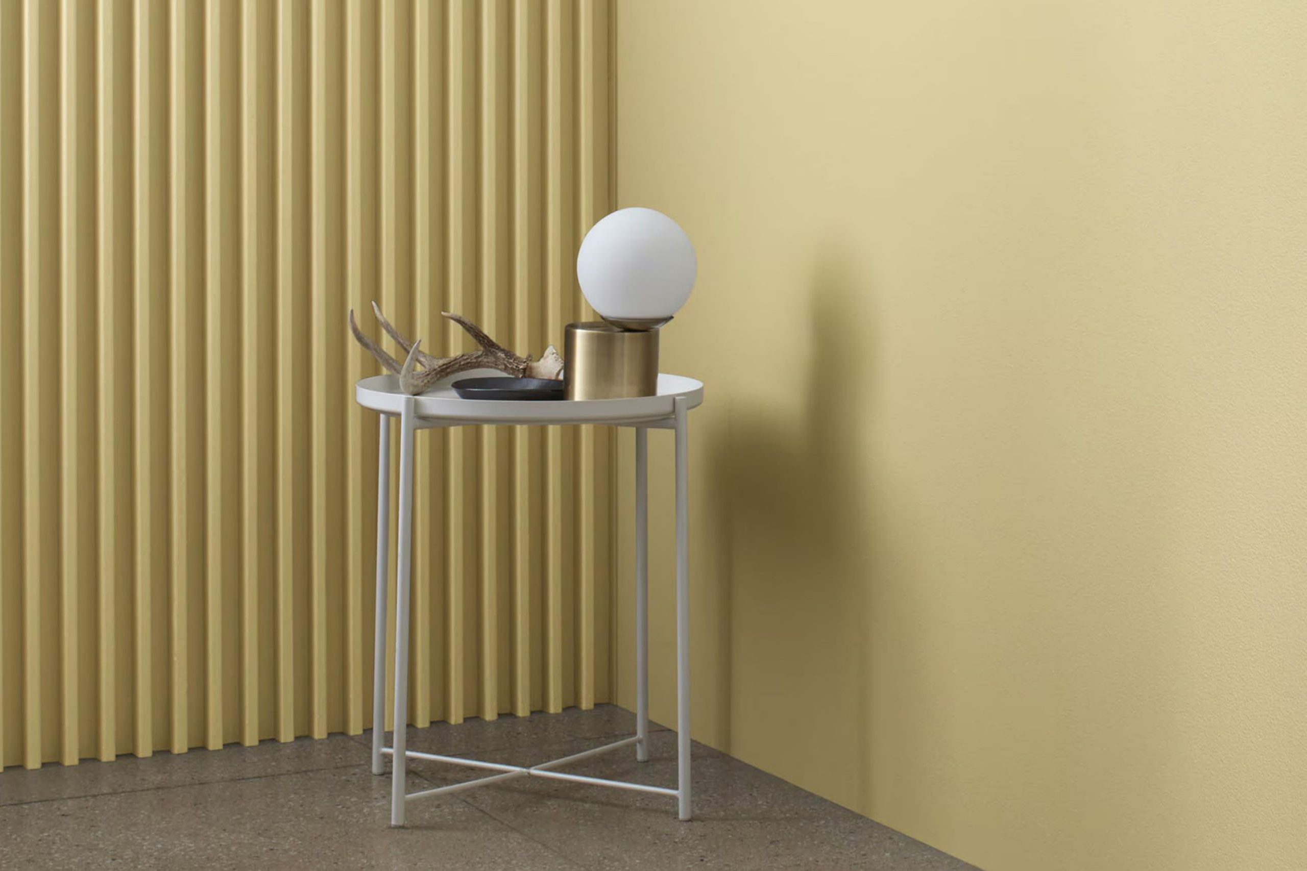
Choosing the right paint color for your space can feel overwhelming, but finding a shade that adds the right touch of warmth and cheerfulness is key. Benjamin Moore’s 262 Golden Hills is a fantastic option if you’re aiming to brighten up your room without it feeling too bold or overpowering. This paint color has a subtle, sunny vibe that makes any room feel more welcoming and cheerful.
Golden Hills works perfectly in spaces that get a lot of natural light, enhancing the room’s natural brightness, but it’s also flexible enough to uplift areas that aren’t blessed with a lot of sunlight. It pairs well with a wide range of decor styles and can be a smooth backdrop for both modern and traditional furnishings.
So, whether you’re looking to refresh your living room, bedroom, or even the kitchen, Golden Hills offers a fresh, warm hue that can help make your space feel more inviting and comfortable. It’s a great choice for anyone looking to enhance their home with a sense of warmth and subtle energy.
via benjaminmoore.com
What Color Is Golden Hills 262 by Benjamin Moore?
Table of Contents
Golden Hills 262 by Benjamin Moore is a warm, inviting shade of yellow with a subtle hint of mustard. This rich hue has the cheerful brightness of traditional yellows but with a depth that makes it more versatile and sophisticated. It’s a fantastic choice for adding a cozy, welcoming atmosphere to any room.
This color works exceptionally well in interior styles that emphasize comfort and warmth, such as country, rustic, and traditional designs. It also complements Scandinavian and modern interiors when used as an accent to provide a pop of warmth without overwhelming the typically neutral palette of these spaces.
When pairing materials with Golden Hills 262, consider natural wood, which harmonizes beautifully with this shade. The natural grains and tones of wood, especially in lighter finishes like oak or maple, create a balanced, earthy vibe. Fabrics like linen or cotton in neutral tones also pair well, adding to the soft, airy feel of the space. For a bit of texture, incorporate elements like woven baskets or rustic pottery, which enhance the earthy quality of the color.
For metals, opt for brushed nickel or warm brass to keep the overall look gentle and inviting. These combinations ensure that spaces painted with Golden Hills 262 feel both comfortable and stylish, creating a room that’s as welcoming as it is appealing.
housekeepingbay.com
Is Golden Hills 262 by Benjamin Moore Warm or Cool color?
Golden Hills262 by Benjamin Moore is a warm and inviting paint color perfect for adding a cozy touch to any home. This shade, with its subtle yellow tones, radiates a soft, sunny feel that can brighten up spaces.
It works exceptionally well in living areas and kitchens where it adds a cheerful ambiance without overwhelming the senses. Golden Hills262 is versatile and pairs beautifully with natural materials like wood and stone, enhancing their textures and colors. It also complements both traditional and modern decor, making it a practical choice for any room.
When used in smaller spaces, this color can make them appear more open and airy, while in larger rooms, it creates a welcoming atmosphere. This paint color’s gentle warmth helps create a comfortable, inviting environment where families feel at home and relaxed.
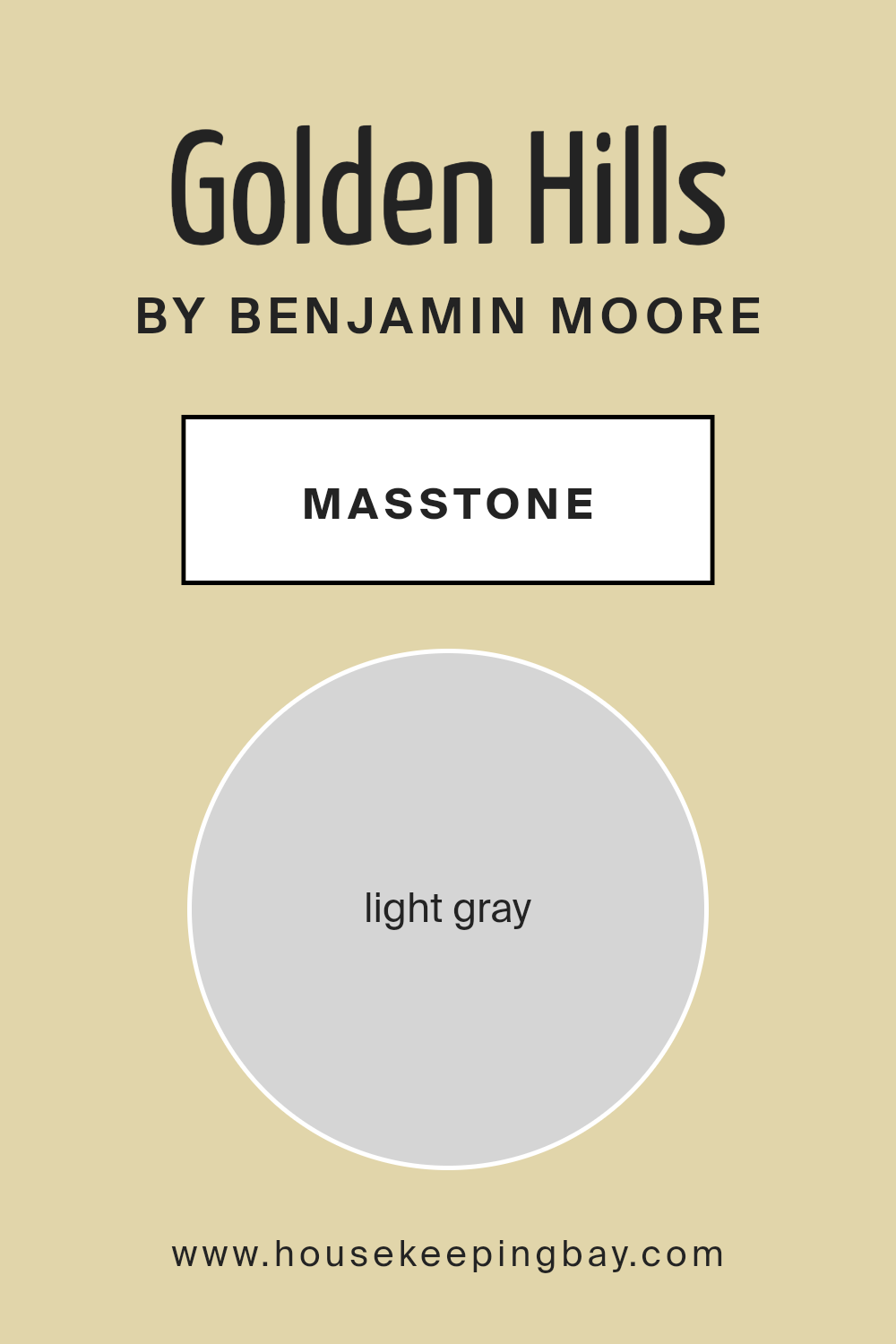
What is the Masstone of the Golden Hills 262 by Benjamin Moore?
Golden Hills262 by Benjamin Moore has a masstone of light gray, specifically color code #D5D5D5. This soft, neutral shade provides a versatile backdrop for any room in a home. Its light gray tone is subtle enough to work well with many other colors, making it easy to integrate into existing designs or to build a new color scheme around.
When used on walls, Golden Hills262 brings a sense of calm and understatement. It doesn’t overpower spaces but rather complements the furnishings and accessories, highlighting them without competing for attention. This characteristic makes it especially useful in smaller rooms where a lighter color can make the space feel larger and more open.
The neutrality of Golden Hills262 is also ideal for art lovers. It serves as a gentle background that doesn’t clash with artworks of various colors and styles. Overall, Golden Hills262 is a practical and appealing choice for creating pleasant, stylish home environments.
housekeepingbay.com
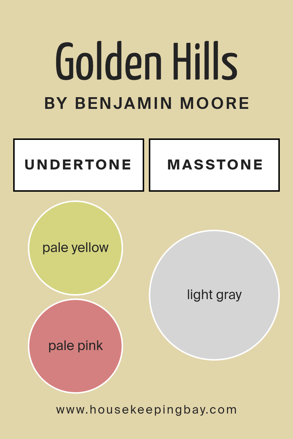
Undertones of Golden Hills 262 by Benjamin Moore
Golden Hills262 by Benjamin Moore is a unique paint color that appears differently depending on the lighting and surroundings due to its range of undertones. The color has a mix of pale yellow, pale pink, light purple, mint, light blue, gray, and lilac undertones. Each undertone adds a subtle dimension to the overall appearance of the paint.
Understanding undertones is important in choosing paint colors because they can influence how colors look once applied to the walls. For example, pale yellow undertones can make a room feel warmer, while light blue undertones might give a cooler feel.
When Golden Hills262 is used on interior walls, these undertones can have a significant impact on the room’s atmosphere. In natural light, the pale yellow and mint undertones might make the space feel brighter and more inviting. Artificial lighting, particularly warmer bulbs, may highlight the pale pink and light purple tones, adding a soft cozy feel to the room.
Additionally, the presence of gray undertones in Golden Hills262 helps balance the brightness of the more vivid undertones, ensuring the color remains sophisticated and not overpowering. This makes Golden Hills262 versatile for many spaces, adapting subtly to changes in decoration and light.
housekeepingbay.com
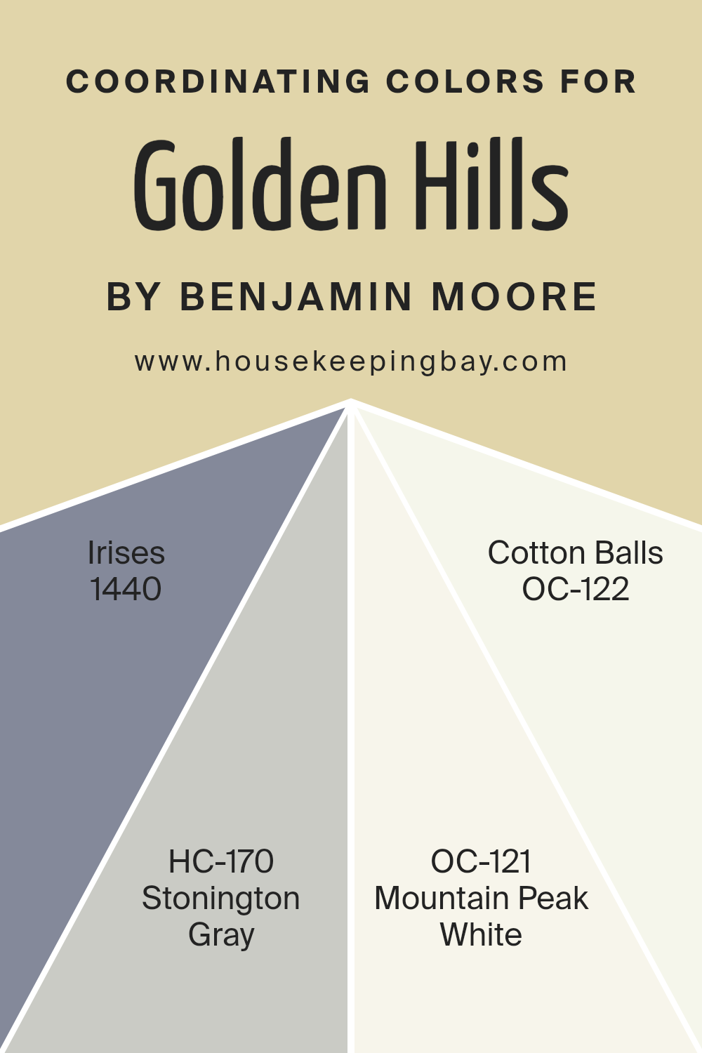
Coordinating Colors of Golden Hills 262 by Benjamin Moore
Coordinating colors are shades that complement each other harmoniously when used together in a given space. When selecting coordinating colors, such as those accompanying Golden Hills 262 by Benjamin Moore, it is essential to consider how these hues will interact with each other. For instance, colors like 1440 – Irises and HC-170 – Stonington Gray offer balance by presenting contrasting yet pleasing aesthetic qualities that enhance the primary paint color.
The shade 1440 – Irises by Benjamin Moore is a deep, vibrant blue-violet reminiscent of the flower it’s named after; it adds a rich depth when paired with lighter, neutral tones. HC-170 – Stonington Gray, on the other hand, is a soft, muted gray with a hint of blue undertones, making it versatile for serene themes or as a backdrop for bolder colors.
OC-121 – Mountain Peak White offers a crisp, clean look that can help brighten spaces and create a sense of airiness. Finally, OC-122 – Cotton Balls is a slightly off-white color that provides a gentle warmth to the surroundings, perfect for a cozy and inviting atmosphere.
You can see recommended paint colors below:
- 1440 Irises
- HC-170 Stonington Gray
- OC-121 Mountain Peak White
- OC-122 Cotton Balls
housekeepingbay.com
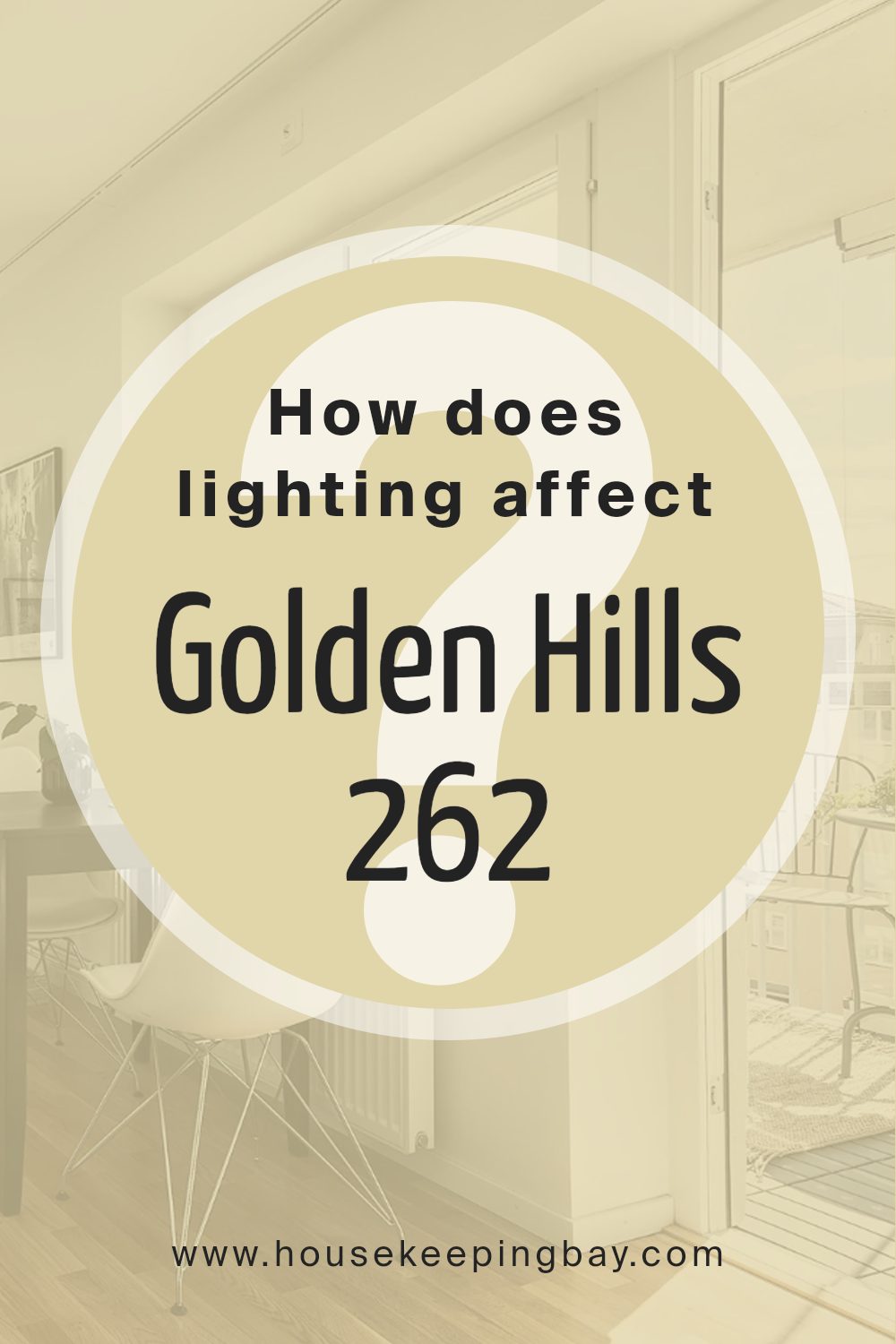
How Does Lighting Affect Golden Hills 262 by Benjamin Moore?
Lighting plays a critical role in perceiving colors, as it can significantly alter how a color looks in different environments. Different light sources, whether natural or artificial, can affect the appearance of paint colors on your walls, such as Golden Hills 262 by Benjamin Moore.
In artificial light, Golden Hills 262 might appear warmer or richer, depending on the type of light bulb used. Incandescent bulbs, which emit a yellowish light, can enhance the yellow tones in Golden Hills 262, making it look cozier and more vibrant. On the other hand, LED or fluorescent lighting, which tends to be cooler, might make the color appear slightly muted, pulling out more of its subtle green or beige undertones.
In natural light, the appearance of Golden Hills 262 can change throughout the day. The quality of natural light varies with the direction of the room’s windows. In north-faced rooms, light tends to be cooler and more consistent throughout the day. Here, Golden Hills 262 may look more subdued, with its beige tones becoming more pronounced, giving a calm and soft effect.
South-faced rooms receive the most intense light, especially in the middle of the day, which can make Golden Hills 262 look brighter and more vibrant, enhancing its warm golden hues.
East-faced rooms get the most light in the morning when the sun rises. In these rooms, Golden Hills 262 will appear warm and welcoming in the morning, becoming gradually softer as the day progresses. West-faced rooms receive the evening light, which can make Golden Hills 262 glow with a rich, warm tone in the afternoons and evenings, perfect for creating a cozy atmosphere.
Overall, the effect of lighting on the color Golden Hills 262 by Benjamin Moore shows just how much surroundings and lighting can change the perception of color.
housekeepingbay.com
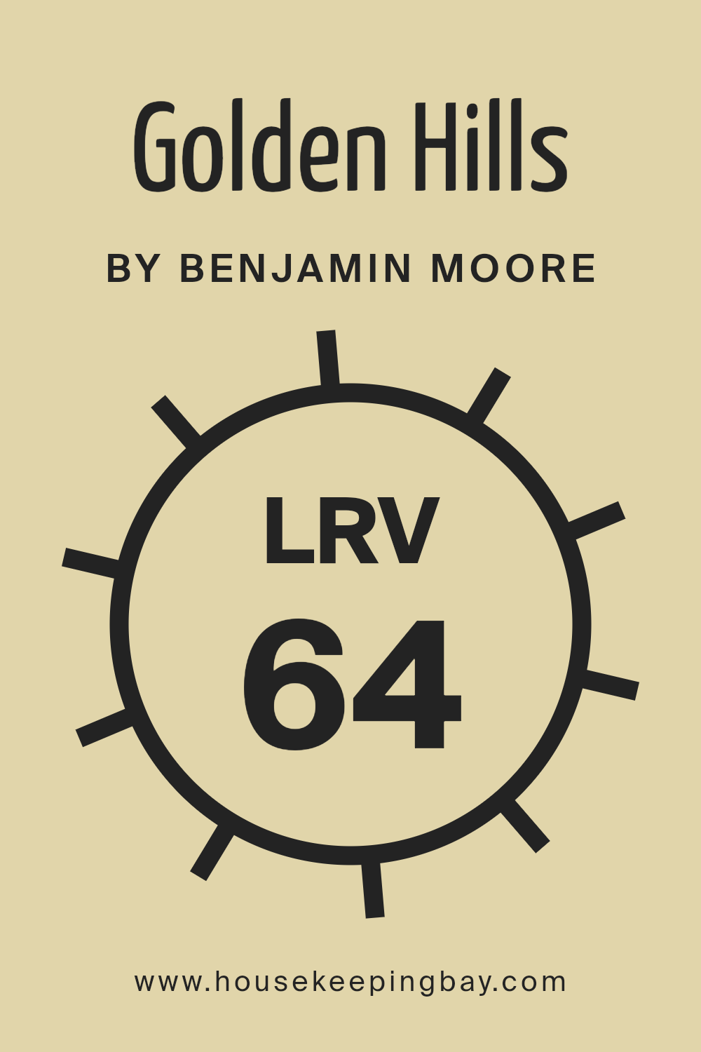
What is the LRV of Golden Hills 262 by Benjamin Moore?
LRV stands for Light Reflectance Value, a measure indicating how much light a paint color reflects back into a room versus absorbing it. Calculated on a scale from 0 to 100, a lower LRV means the color absorbs more light and appears darker, while a higher LRV means the color reflects more light, making the room feel brighter and more open.
This value helps in selecting colors that will work best in your specific environment, taking into consideration the size of the room and its lighting conditions. For the color Golden Hills 262 by Benjamin Moore with an LRV of 63.82, this means it is a fairly light color but not too bright.
It will reflect a good amount of light without being overpowering, making it a versatile choice for spaces that might not have a lot of natural light. This LRV is ideal for creating a calm and inviting atmosphere without making the space feel too stark or cold, as some higher LRV colors can.
housekeepingbay.com
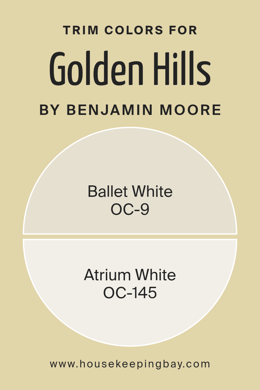
What are the Trim colors of Golden Hills 262 by Benjamin Moore?
Trim colors are accent colors applied to moldings, door frames, window frames, and other architectural features in a room, contrasting with the primary wall color to create defined, sharp lines that can enhance the overall aesthetic. Golden Hills262 by Benjamin Moore, a notably rich and dynamic shade, pairs beautifully with trim colors to provide a sophisticated balance.
Utilizing colors like OC-9 Ballet White and OC-145 Atrium White as trim offers a way to frame and subtly highlight the deeper tones of Golden Hills262, adding a layer of visual interest and completeness to the space.
OC-9 Ballet White is a soft and creamy white, offering a gentle contrast that allows the deeper tones of Golden Hills262 to stand out without overwhelming the senses. This color is versatile and understated, making it an excellent choice for creating a smooth transition between colors in a room.
OC-145 Atrium White, on the other hand, is a crisp, clear white with a slightly more pronounced brightness, which can effectively illuminate darker hues, giving the room a fresh, airy feel while complementing the richness of Golden Hills262.
You can see recommended paint colors below:
- OC-9 Ballet White
- OC-145 Atrium White
housekeepingbay.com
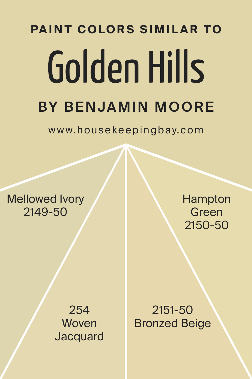
Colors Similar to Golden Hills 262 by Benjamin Moore
Similar colors create a harmonious and soothing palette, offering a gentle flow from one shade to another. This subtly graded spectrum lets individual elements in a room connect seamlessly, providing a cohesive visual experience that is easy on the eye and enhances the overall ambiance.
When colors, such as those similar to Golden Hills 262 by Benjamin Moore, are used together, they complement each other, allowing for a design that feels balanced and well put-together. Decor styles using similar colors build a solid color foundation, enabling accent pieces or contrasting colors to stand out more vividly against a serene backdrop.
Among the similar colors to Golden Hills 262 is Mellowed Ivory 2149-50, a soft, warm cream that offers a comforting and gentle tone perfect for creating a light and airy feel in any space. Woven Jacquard 254 provides a subtle hint of beige with an underlying warmth, making it ideal for areas that seek a touch of understated elegance.
Bronzed Beige 2151-50 presents a richer, more earthy hue that resembles the warm colors of nature, lending a welcoming and calming influence to its surroundings. Finally, Hampton Green 2150-50 introduces a muted green, infusing a touch of natural colors to the array without overwhelming the senses. This palette creates a delicate, inviting space, perfect for anyone looking to achieve a soft and serene home environment.
You can see recommended paint colors below:
- 2149-50 Mellowed Ivory
- 254 Woven Jacquard
- 2151-50 Bronzed Beige
- 2150-50 Hampton Green
housekeepingbay.com
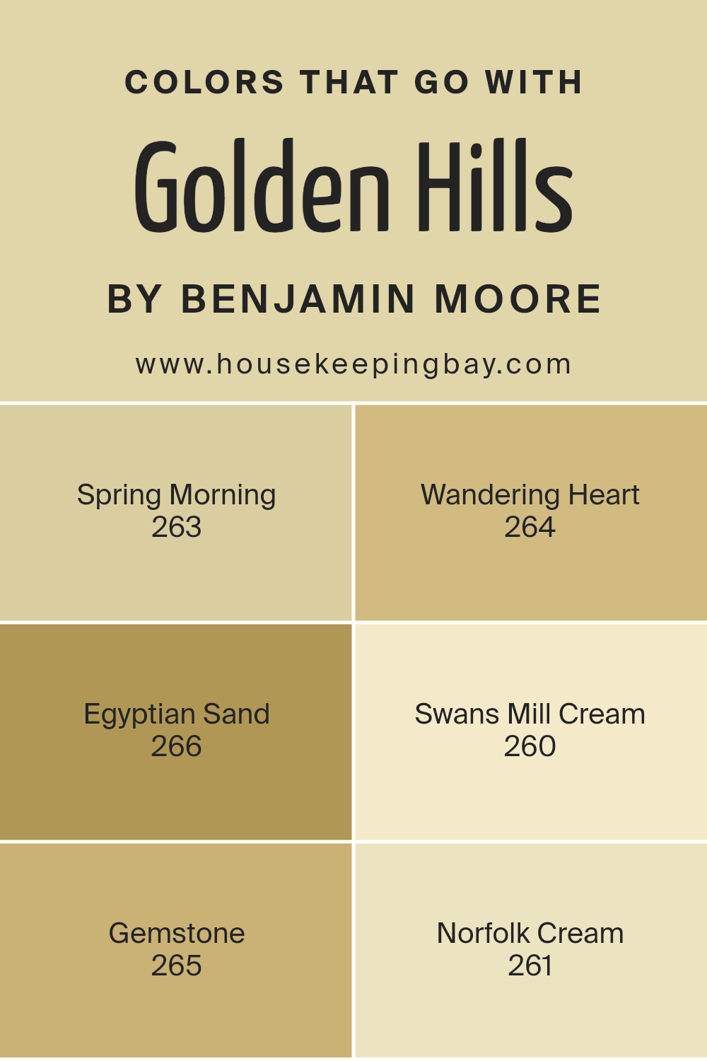
Colors that Go With Golden Hills 262 by Benjamin Moore
Choosing the right colors to complement Golden Hills 262 by Benjamin Moore is vital for creating a harmonious and appealing aesthetic in any space. Colors like Spring Morning 263 and Wandering Heart 264 offer beautiful contrasts that enhance the depth and character of a room.
Spring Morning is a fresh, light green that breathes life into any area, making it feel vibrant and inviting. Wandering Heart, on the other hand, adds a touch of subdued mauve, providing a soft, soothing background that balances well with the warmth of Golden Hills.
Further enriching this palette, Egyptian Sand 266 and Swans Mill Cream 260 lend themselves to a more subtle, muted approach. Egyptian Sand is a soft beige that offers a gentle complement to brighter or bolder colors, ensuring that the decor never feels overwhelming. Swans Mill Cream is a pale, creamy hue that brings a light and airy quality to the space, giving a sense of calm and comfort. Additionally, Gemstone 265 and Norfolk Cream 261 introduce a splash of color while maintaining an elegant simplicity.
Gemstone is a deeper, rich purple that adds sophistication and depth, whereas Norfolk Cream presents a muted yellow, perfect for adding a touch of warmth without overpowering the room’s overall aesthetic. These color choices create a diverse yet cohesive look that enhances the visual pleasure and functionality of any area decorated with Golden Hills.
You can see recommended paint colors below:
- 263 Spring Morning
- 264 Wandering Heart
- 266 Egyptian Sand
- 260 Swans Mill Cream
- 265 Gemstone
- 261 Norfolk Cream
housekeepingbay.com
How to Use Golden Hills 262 by Benjamin Moore In Your Home?
Golden Hills 262 by Benjamin Moore is a warm and gentle yellow paint color that can add a cheerful touch to any room in your house. Its soft hue is perfect for creating a welcoming atmosphere in common areas like the living room and kitchen, but it’s also subtle enough for bedrooms, where you want a calm, soothing vibe.
One way to use Golden Hills 262 is by painting all the walls of a smaller room, helping to make the space look larger and brighter. It pairs nicely with white trim and ceilings for a clean and classic look.
For a more modern twist, you could use it as an accent wall and pair it with cool grays or rich blues to add contrast and interest to the room. Additionally, this color works well in a variety of lighting conditions, making it a versatile choice for your home. Golden Hills 262 can help achieve an inviting and comfortable space without being too bold or overwhelming.
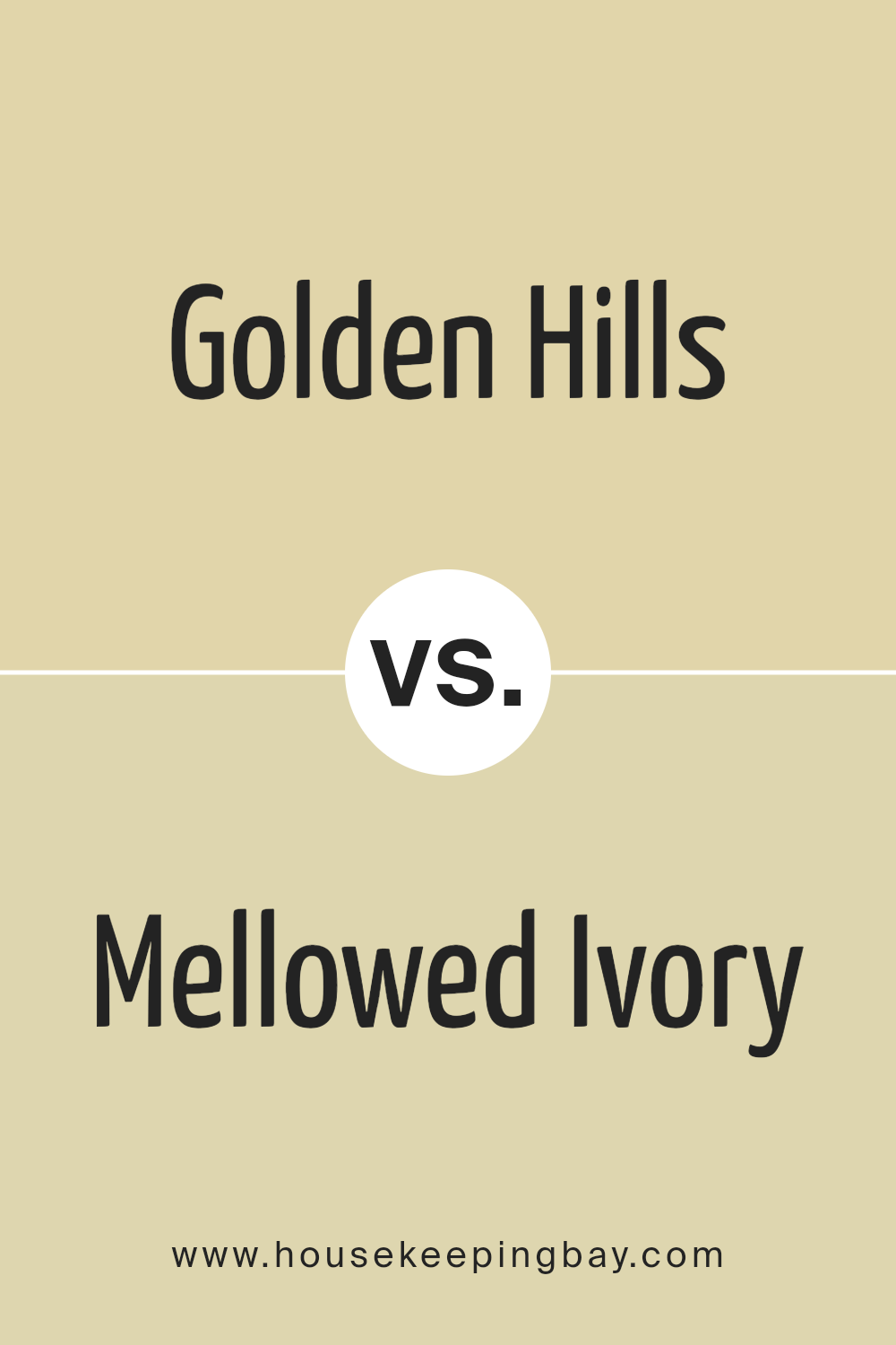
Golden Hills 262 by Benjamin Moore vs Mellowed Ivory 2149-50 by Benjamin Moore
Golden Hills 262 by Benjamin Moore and Mellowed Ivory 2149-50 also by Benjamin Moore are two distinctive colors that can set different moods in a space. Golden Hills 262 is a rich, deep shade of yellow with a subtle, earthen tone, giving it a warm and cozy feel that’s perfect for creating an inviting atmosphere. It works particularly well in living spaces where a touch of warmth can make the room feel more homelike and welcoming.
In contrast, Mellowed Ivory 2149-50 is a much lighter shade of yellow with hints of beige, making it softer and more neutral. This color is ideal for spaces that aim for a calm and gentle ambiance. It’s particularly effective in areas that get plenty of natural light, as the color can help enhance the space’s brightness and openness.
Both colors offer their unique charm and can be used effectively depending on the mood and style you aim to achieve in your room.
You can see recommended paint color below:
- 2149-50 Mellowed Ivory
housekeepingbay.com
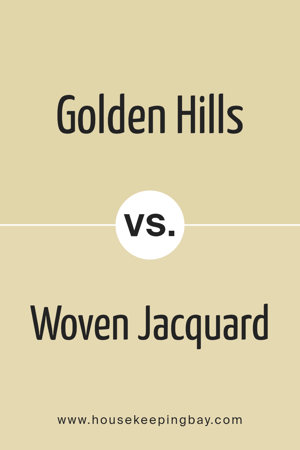
Golden Hills 262 by Benjamin Moore vs Woven Jacquard 254 by Benjamin Moore
Golden Hills 262 by Benjamin Moore is a warm beige with a soothing, creamy tone. It gives off a cozy, inviting feel, making it ideal for spaces where you want a calm and welcoming atmosphere. This color pairs well with darker colors and natural elements to create a balanced look.
Woven Jacquard 254, also by Benjamin Moore, is slightly darker than Golden Hills. It shares a similar warmth but carries a richer, deeper tone. The depth of Woven Jacquard 254 introduces a sophisticated touch, suitable for areas where a bit of elegance is desired. It stands out more prominently against white trim or furniture.
Both colors offer warmth, but Golden Hills 262 leans towards a lighter, airier feel. Woven Jacquard 254, while also warm, offers more depth and a sense of refined luxury. Depending on the mood you want to set in your room, either color could be a perfect choice.
You can see recommended paint color below:
- 254 Woven Jacquard
housekeepingbay.com
Golden Hills 262 by Benjamin Moore vs Bronzed Beige 2151-50 by Benjamin Moore
Golden Hills 262 by Benjamin Moore is a warm, muted gold color that brings a cozy and comforting vibe to any space. It has a subtle yellow undertone that can help make a room feel welcoming and cheerful. This color is particularly suitable for living rooms and kitchens where a homey atmosphere is desired.
In contrast, Bronzed Beige 2151-50 by Benjamin Moore leans more towards a soft, neutral beige with a hint of bronze, giving it a richer and slightly more sophisticated feel. This shade is versatile and can work well in both bright and dimly lit rooms, adding a touch of understated elegance without overpowering other design elements.
Both colors can enhance a room’s aesthetics, but Golden Hills 262 injects a bit more warmth due to its golden tones, whereas Bronzed Beige 2151-50 offers a neutral backdrop that pairs well with a variety of decor styles, providing a more refined look.
You can see recommended paint color below:
- 2151-50 Bronzed Beige
housekeepingbay.com
Golden Hills 262 by Benjamin Moore vs Hampton Green 2150-50 by Benjamin Moore
Golden Hills 262 by Benjamin Moore is a warm, light yellow with a subtle brightness that gives your space a cozy, inviting feel. It reflects light well, making it a great choice for smaller rooms or areas with limited natural light. This color pairs nicely with dark woods and traditional décor, enhancing the overall warmth of the environment.
Hampton Green 2150-50, also by Benjamin Moore, offers a fresh, light green hue that feels airy and soothing. It’s perfect for creating a calm, restful atmosphere in places like bedrooms or bathrooms. This color works well with white trim and modern furnishings, lending a clean and refreshing vibe to any space.
When comparing the two, Golden Hills adds warmth and a sunny disposition, ideal for social spaces or darker rooms needing a cheer-up. In contrast, Hampton Green brings coolness and a sense of serene, making it better suited for spaces where relaxation is key. Both colors provide a different mood and could potentially complement each other in a home with diverse room uses and themes.
You can see recommended paint color below:
- 2150-50 Hampton Green
housekeepingbay.com
Conclusion
As I reflect on the insights provided about 262 Golden Hills by Benjamin Moore, I find that the color truly offers a unique versatility that makes it perfect for various spaces and styles. This warm, inviting shade not only enriches the ambience of a room but also provides a sophisticated backdrop that enhances existing decor and architecture. Ideal for those seeking a subtle yet impactful change, 262 Golden Hills can effectively warm up colder spaces or make small rooms appear larger and more welcoming.
I’ve learned that its adaptability extends from personal homes to professional spaces, making it a reliable choice for anyone looking to refresh their environment. For homeowners, selecting this shade means committing to a timeless aesthetic that won’t require frequent updates. From a practical standpoint, its ability to hide imperfections and maintain a clean look with minimal upkeep is incredibly appealing.
Overall, 262 Golden Hills by Benjamin Moore is more than just a paint color; it is a smart investment in the aesthetic and functional value of any space. Whether you are renovating an old room or starting a new project, incorporating this color could be a wise and beautiful choice. I’m convinced that anyone choosing this shade will appreciate its gentle warmth and the positive atmosphere it brings to every corner it touches.
housekeepingbay.com
