Stonington Gray HC-170 by Benjamin Moore
Classic Beauty in a Cool, Calm Shade
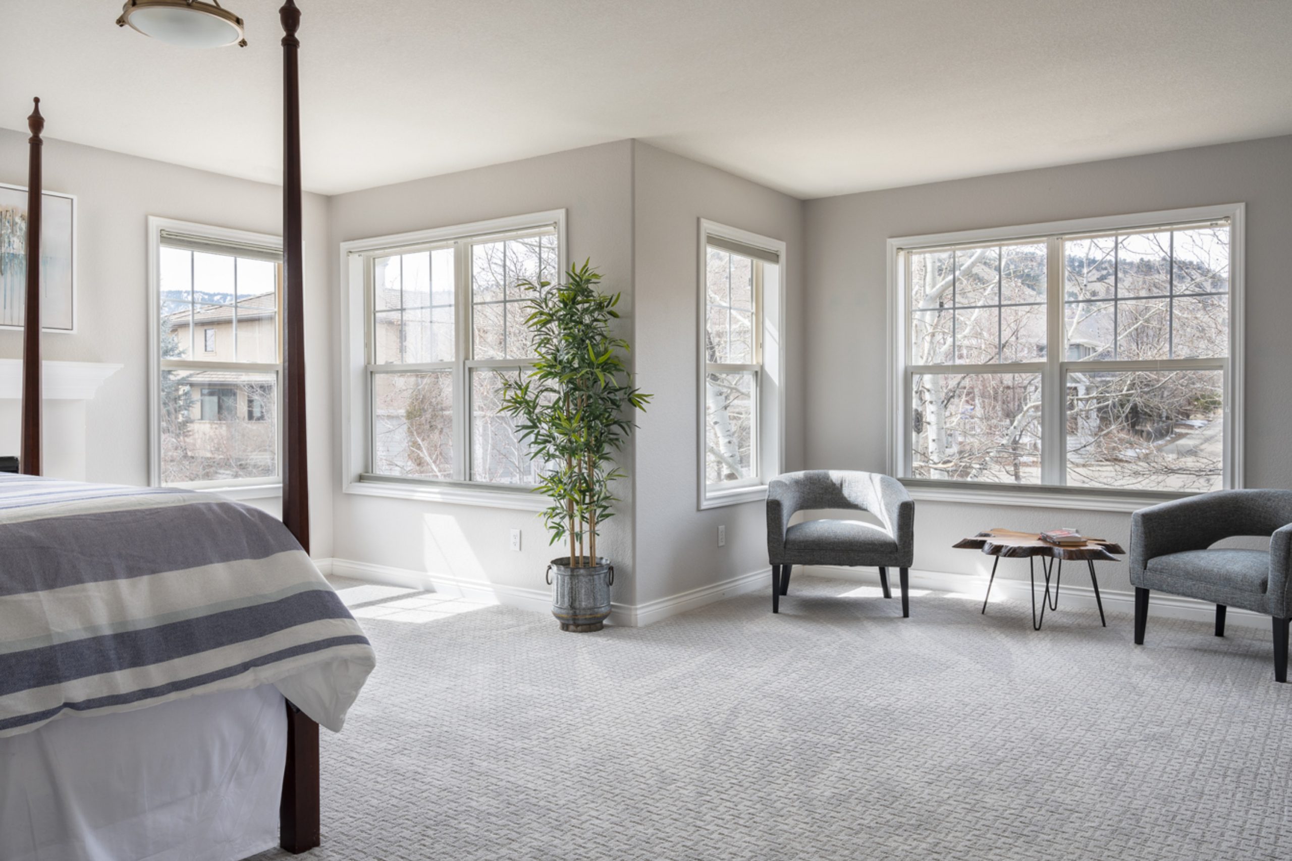
Stonington Gray (HC-170) by Benjamin Moore is a go-to paint color when you’re aiming for something that’s both classic and modern. It’s a soft, neutral gray that manages to feel warm without losing its clean, crisp quality. One reason I think it’s so popular is how well it works in various spaces and lighting conditions.
When you use Stonington Gray in your home, you notice how it complements a wide range of other colors. Whether you have bold furniture or more muted decor, it blends seamlessly while adding a touch of sophistication.
It’s perfect for living rooms, bedrooms, and even kitchens, adapting to different styles with ease.
Light affects Stonington Gray significantly; it can appear slightly different throughout the day, providing a dynamic aesthetic in your rooms. In bright sunlight, it seems lighter and more cheerful, with some blue undertones.
In dimmer or artificial light, it takes on a cozy, more muted appearance, offering a comforting, serene backdrop.
Stonington Gray isn’t just a neutral; it’s a foundational color that can help pull together the look of your whole home. It’s easy to see why it remains a favorite choice for those who prefer understated elegance. If you’ve been considering a fresh coat of paint, Stonington Gray might be the perfect fit.
via thecolorconcierge.com
What Color Is Stonington Gray HC-170 by Benjamin Moore?
Stonington Gray HC-170 by Benjamin Moore stands as a timeless neutral gray with just the right balance. Neither too warm nor too cool, this shade fits harmoniously in various settings, making it a versatile choice for interiors. Its subtle undertone gives it depth, ensuring it doesn’t feel flat or dull.
In interior design, Stonington Gray finds its place in modern, minimalist, and traditional styles alike. Its calm and sophisticated vibe complements spaces seeking a peaceful atmosphere, such as living rooms, bedrooms, and kitchens.
This gray works exceptionally well in coastal styles, where it can reflect the softness of sea breezes, yet also fits into urban settings, bringing an elegant touch to city apartments.
Pairing Stonington Gray with materials like white marble or quartz brings out its refined nature. Wood textures, whether light oak or dark walnut, contrast beautifully with this gray, adding warmth and character. Metallic accents, such as brushed nickel or aged brass, highlight its understated elegance.
Soft textiles like linen or cotton in neutral or pastel shades layer nicely, creating a cozy, inviting feel. Stonington Gray offers a versatile backdrop, allowing furniture and decorative elements to pop without competing for attention.
housekeepingbay.com
Is Stonington Gray HC-170 by Benjamin Moore Warm or Cool color?
Stonington Gray HC-170 by Benjamin Moore is a popular paint choice for homes. It is a subtle gray with blue undertones, giving rooms a calm and welcoming feel. In living spaces, Stonington Gray creates a neutral backdrop that allows other design elements, like furniture and artwork, to stand out.
This shade of gray works well in any room, from the kitchen to the living room, because it blends easily with different colors and styles.
In bedrooms, Stonington Gray can create a restful atmosphere, promoting relaxation. Its versatility makes it suitable for both modern and traditional interiors. This color pairs nicely with white trim, adding a touch of elegance and cleanliness to the space. It can also harmonize with darker colors, like navy or charcoal, for a bold contrast.
Overall, Stonington Gray offers a balanced, sophisticated look, making it a great choice for anyone looking to enhance their home’s aesthetic.
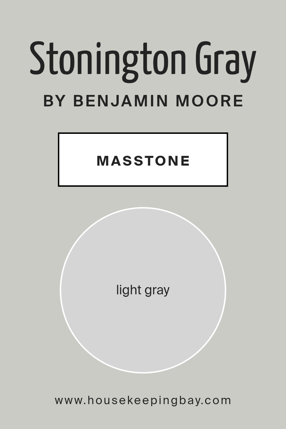
What is the Masstone of the Stonington Gray HC-170 by Benjamin Moore?
Stonington Gray HC-170 by Benjamin Moore is a pleasant light gray shade. Its masstone, or main color, is represented by a soft light gray (#D5D5D5). This color provides a neutral backdrop in homes that feels fresh and modern.
Because of its light tone, Stonington Gray works well in various spaces, reflecting natural light and creating a sense of openness. The shade adapts to the lighting in a room, sometimes appearing cooler in areas with less lighting and warmer when sunshine hits it.
This quality helps to create cozy or airy environments, depending on how it’s used. For people looking for a versatile wall color, Stonington Gray proves highly adaptable. It pairs beautifully with many other colors, allowing homeowners to play with different accents through furniture, artwork, or other decor pieces. Overall, its soft and neutral tone makes it a safe yet stylish choice for any room.
housekeepingbay.com
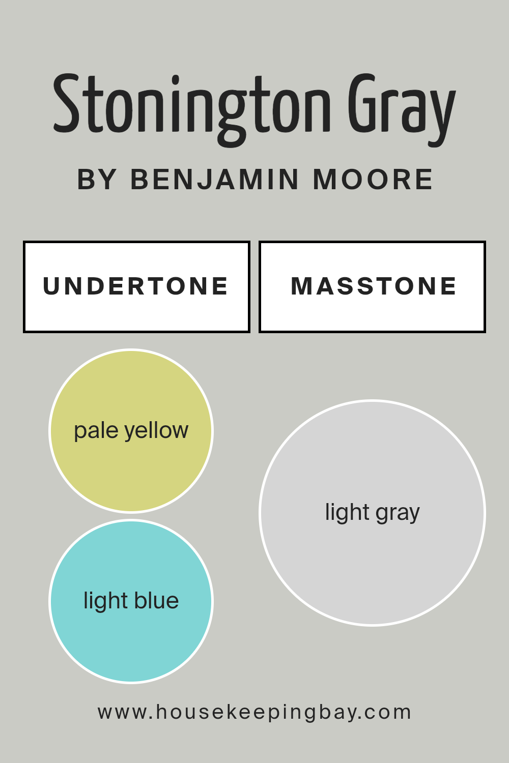
Undertones of Stonington Gray HC-170 by Benjamin Moore
Stonington Gray HC-170 by Benjamin Moore is a popular paint color, known for its versatile nature and subtle undertones. This gray hue carries a blend of undertones that can subtly shift its appearance depending on the lighting and surrounding colors. It contains notes of pale yellow, light blue, light purple, mint, pale pink, lilac, and a touch of neutral gray.
These undertones influence our perception of Stonington Gray. For instance, under warm lighting, pale yellow might become more noticeable, giving the gray a warmer vibe. In cooler lighting, the blue or lilac undertones can stand out, lending the color a cooler, more calming effect.
The neutral gray undertone keeps it balanced, allowing the color to fit into various color schemes seamlessly.
In interior spaces, these undertones play with natural and artificial light to create subtle shifts throughout the day. Pale pink and mint undertones can make the color feel fresh and inviting in rooms with plenty of natural light. Conversely, in shaded areas, the gray can appear more muted, with the blue and purple hints providing a serene backdrop.
This makes Stonington Gray an excellent choice for creating a neutral, yet dynamic atmosphere in living rooms, bedrooms, or open spaces.
housekeepingbay.com
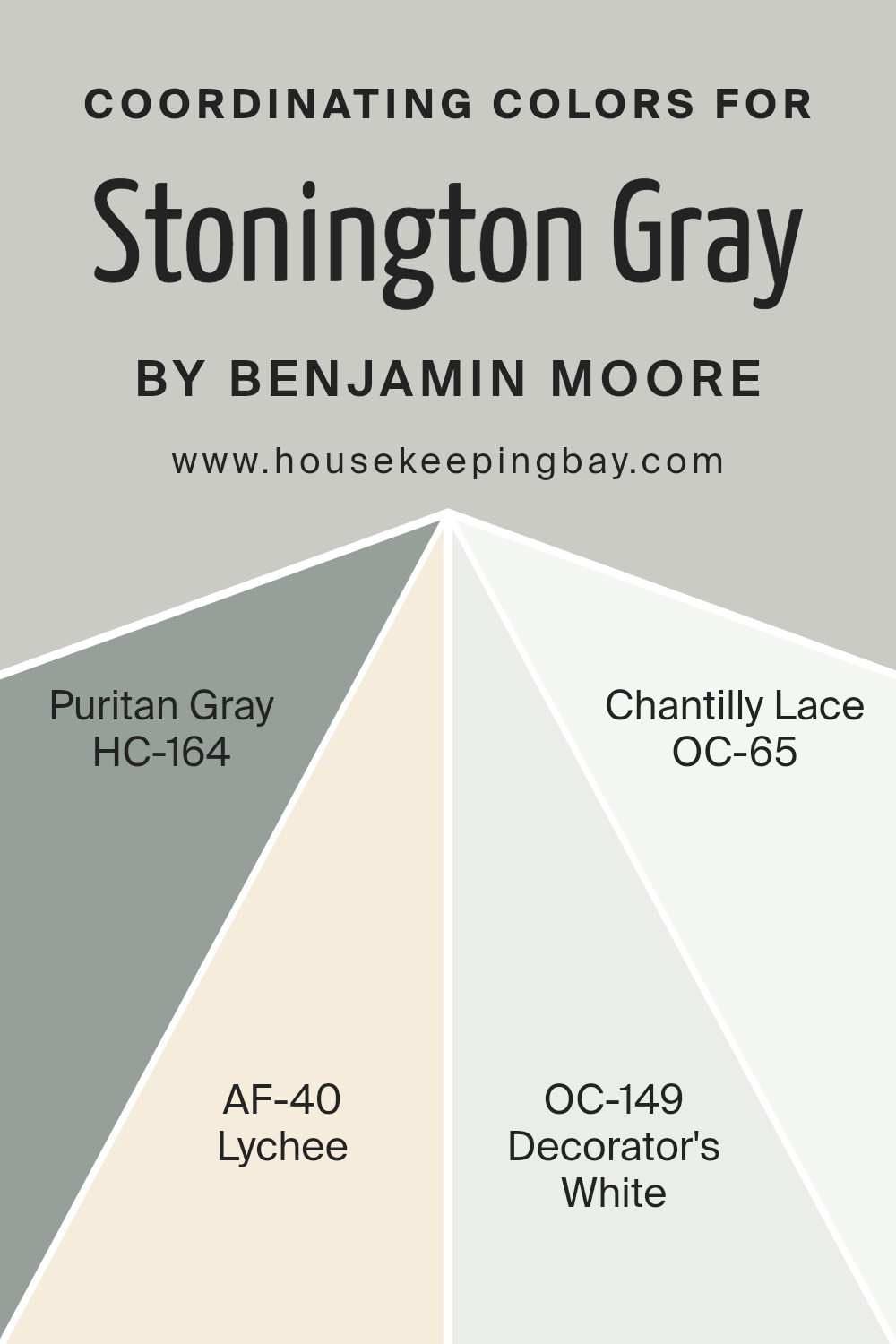
Coordinating Colors of Stonington Gray HC-170 by Benjamin Moore
Coordinating colors are those that harmonize well together, creating a pleasing aesthetic when used in the same space. They can complement or contrast with the main color to highlight certain design features. Stonington Gray HC-170 by Benjamin Moore is a versatile gray with a subtle warmth, making it an excellent base for various color combinations.
When selecting coordinating colors for Stonington Gray, it’s helpful to choose hues that either enhance its subtle tones or provide interesting contrast.
One coordinating option is HC-164, Puritan Gray, which features a slightly deeper hue, offering a rich, balanced look. AF-40, known as Lychee, introduces a soft, muted warmth that adds a gentle and welcoming element to any space.
For a crisp and clean contrast, OC-149, Decorator’s White, provides a bright and fresh edge, perfect for trim or accents. Meanwhile, OC-65, Chantilly Lace, is a classic, crisp white that delivers an airy, pure quality, allowing Stonington Gray to stand out beautifully.
Together, these colors work to create a harmonious and inviting environment, each contributing its unique character while maintaining balance and cohesion.
You can see recommended paint colors below:
- HC-164 Puritan Gray
- AF-40 Lychee
- OC-149 Decorator’s White
- OC-65 Chantilly Lace
housekeepingbay.com
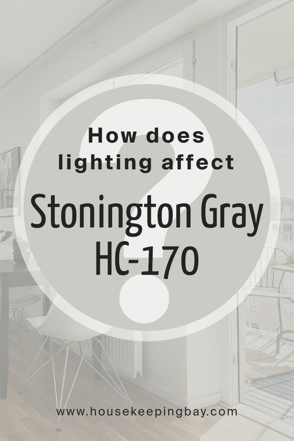
How Does Lighting Affect Stonington Gray HC-170 by Benjamin Moore?
Lighting plays a crucial role in how we perceive color. Different types of light sources can change the way colors appear, making them seem warmer or cooler. For example, natural light, which changes throughout the day, can cause colors on a wall to look different in the morning compared to the afternoon. Meanwhile, artificial light, like incandescent or LED bulbs, has its own effect on colors.
Let’s delve into how the Stonington Gray HC-170 by Benjamin Moore behaves under these lighting conditions. In natural light, this gray can shift subtly in tone. In artificial light, the effect depends heavily on the bulb used.
Incandescent bulbs, which have a warmer tone, might give Stonington Gray a bit more warmth, making it appear as a warmer gray. On the other hand, LED bulbs, especially those with a cooler, bluish tint, might enhance its cooler, more steely undertones.
In north-facing rooms, where the natural light is indirect and typically cooler, Stonington Gray may look a bit more blue or stark. This effect can make the room feel cooler, so complementing it with warm lighting or accents helps balance the atmosphere.
In south-facing rooms, where there’s a good amount of warm and direct sunlight, Stonington Gray becomes softer and lighter. This type of lighting will bring out the warmer undertones of the color, making it feel more balanced and inviting.
East-facing rooms, with morning light, will give Stonington Gray a fresh, crisp look in the early part of the day. As the day progresses, it may take on a slightly cooler tone.
West-facing rooms, which catch the warm, golden light of the setting sun, will make Stonington Gray appear warmer and cozier in the late afternoon and evening, providing a nice balance to its gray base. Hence, Stonington Gray is versatile but will react distinctively in each room based on its orientation.
housekeepingbay.com
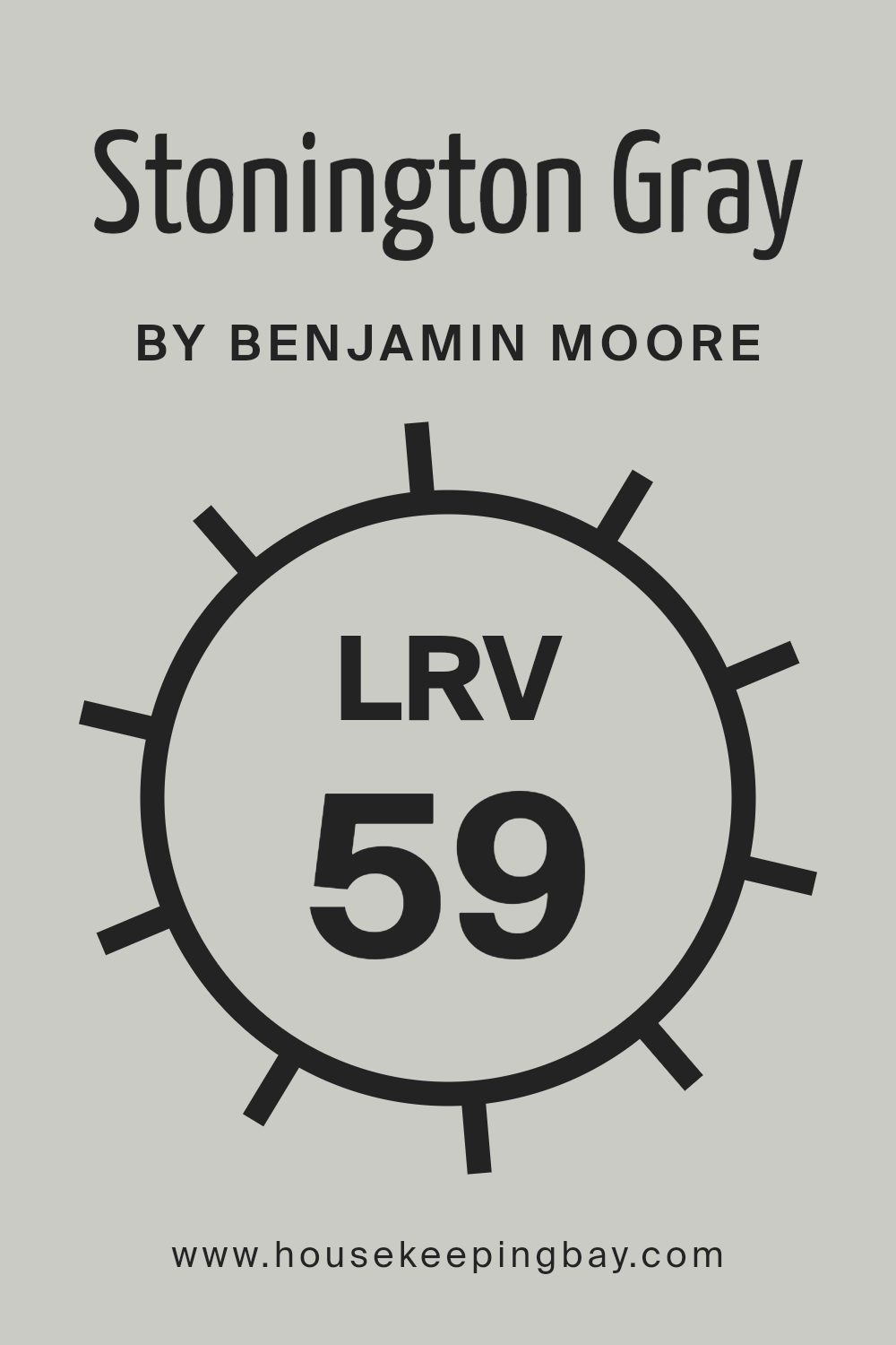
What is the LRV of Stonington Gray HC-170 by Benjamin Moore?
Light Reflectance Value, or LRV, is a crucial piece of information when selecting paint colors. It measures the percentage of light a color reflects. An LRV close to 100 means the color reflects lots of light and is very light, while an LRV of 0 means it absorbs all light and is very dark.
This scale helps understand how light or dark a color will appear on walls. Generally, lighter colors can make a room feel more spacious and brighter because they bounce more light around. Meanwhile, darker colors absorb more light, giving a cozy, intimate feel to the space.
Stonington Gray HC-170 by Benjamin Moore has an LRV of 59.36, which makes it a bit on the lighter side on the scale. This means it reflects a good amount of light, helping spaces feel more open and airy without being too bright. It’s a versatile shade that can work well in various rooms, gently reflecting light to enhance the overall ambiance without overpowering the space.
Its ability to reflect a fair amount of light also means it can adapt well to both well-lit and dimmer rooms, maintaining its gray tone without shifting drastically in color under different lighting conditions.
housekeepingbay.com
What are the Trim colors of Stonington Gray HC-170 by Benjamin Moore?
Trim colors are the shades used for detailing around the edges and borders of a room, such as baseboards, window frames, and moldings. They play a crucial role in highlighting the main wall color and adding depth to a space. When using Stonington Gray HC-170, a sophisticated shade with blue undertones, selecting the right trim color is essential to emphasize its elegance.
Stonington Gray is known for its versatility, which means the trim color you choose can make a significant difference in the room’s overall feel. Using a contrasting or complementary trim color can define architectural features and create crisp, clean lines that give a polished look to a space.
When paired with Stonington Gray, Distant Gray OC-68 creates a subtle contrast. Distant Gray is a soft white with a hint of gray, adding a touch of warmth without overwhelming the main hue. Super White OC-152, on the other hand, offers a sharp, clean option. It is a bright white that enhances the clarity of Stonington Gray, providing a crisp, modern finish.
These trim colors not only frame Stonington Gray perfectly but also allow the main wall color to remain the star while adding their own touch of elegance and style.
You can see recommended paint colors below:
- OC-68 Distant Gray
- OC-152 Super White

housekeepingbay.com
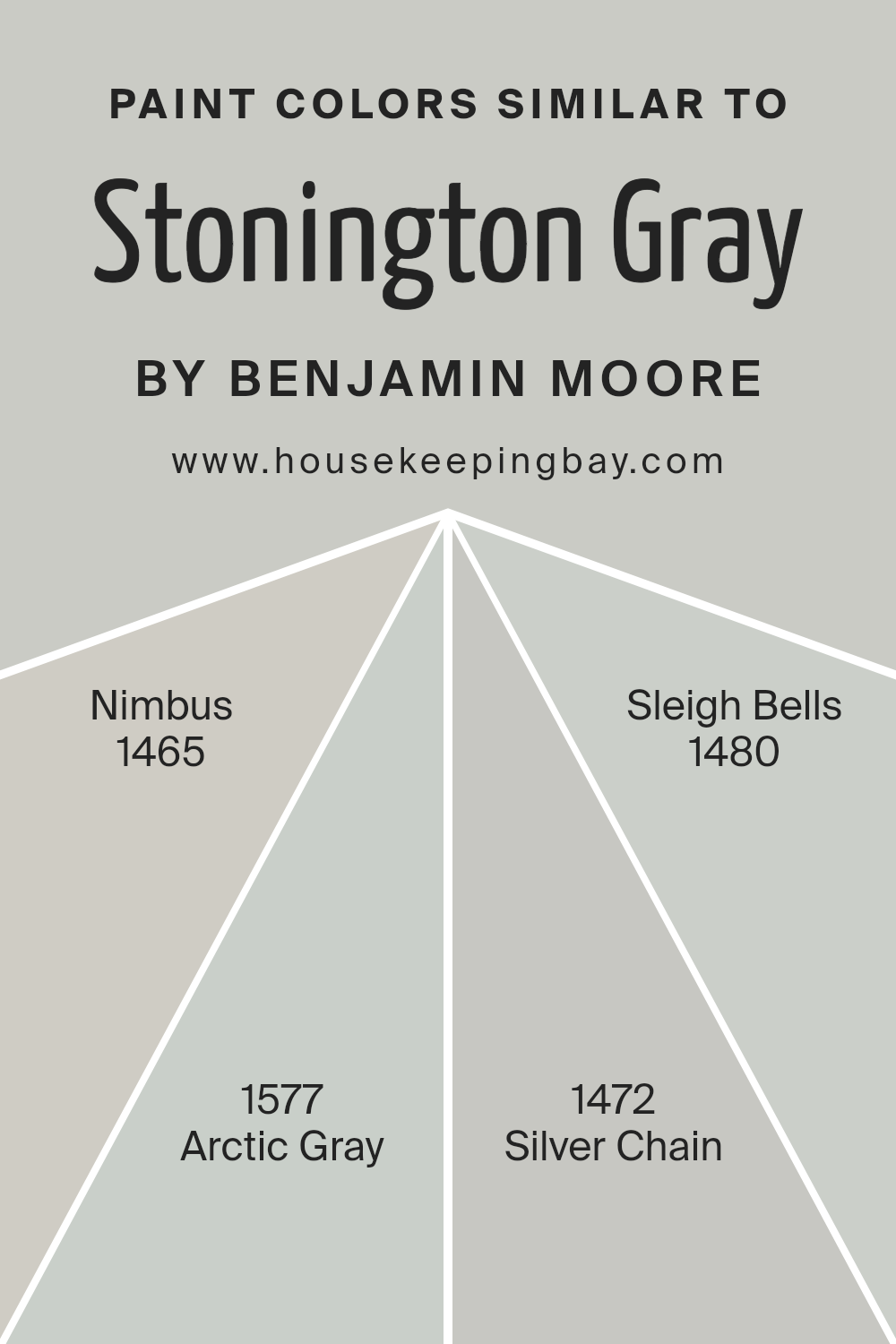
Colors Similar to Stonington Gray HC-170 by Benjamin Moore
Stonington Gray HC-170 by Benjamin Moore is a widely loved color due to its versatility and subtle sophistication. Similar colors play an important role by providing harmony and smooth transitions between spaces. Utilizing colors like Nimbus 1465, Arctic Gray 1577, Silver Chain 1472, and Sleigh Bells 1480 can enhance the feel of a room by bringing a sense of unity without monotony.
These colors work well together because they share similar tones, ensuring a cohesive palette throughout your home. They create a balanced look as they share underlying hues that are soothing, modern, and adaptable to various styles.
Nimbus 1465 is a soft gray with warm undertones, making spaces feel welcoming yet elegant. Arctic Gray 1577 leans slightly cooler, offering a fresh and airy touch that maintains a clean atmosphere. Meanwhile, Silver Chain 1472 brings subtle depth with its medium gray shade that pairs beautifully with both light and dark accents.
Sleigh Bells 1480 rounds out the group with its muted gray that exudes subtle sophistication. By combining these colors with Stonington Gray, you achieve a seamless and stylish blend that elevates the attractiveness and flow of any space.
You can see recommended paint colors below:
- 1465 Nimbus
- 1577 Arctic Gray
- 1472 Silver Chain
- 1480 Sleigh Bells
housekeepingbay.com
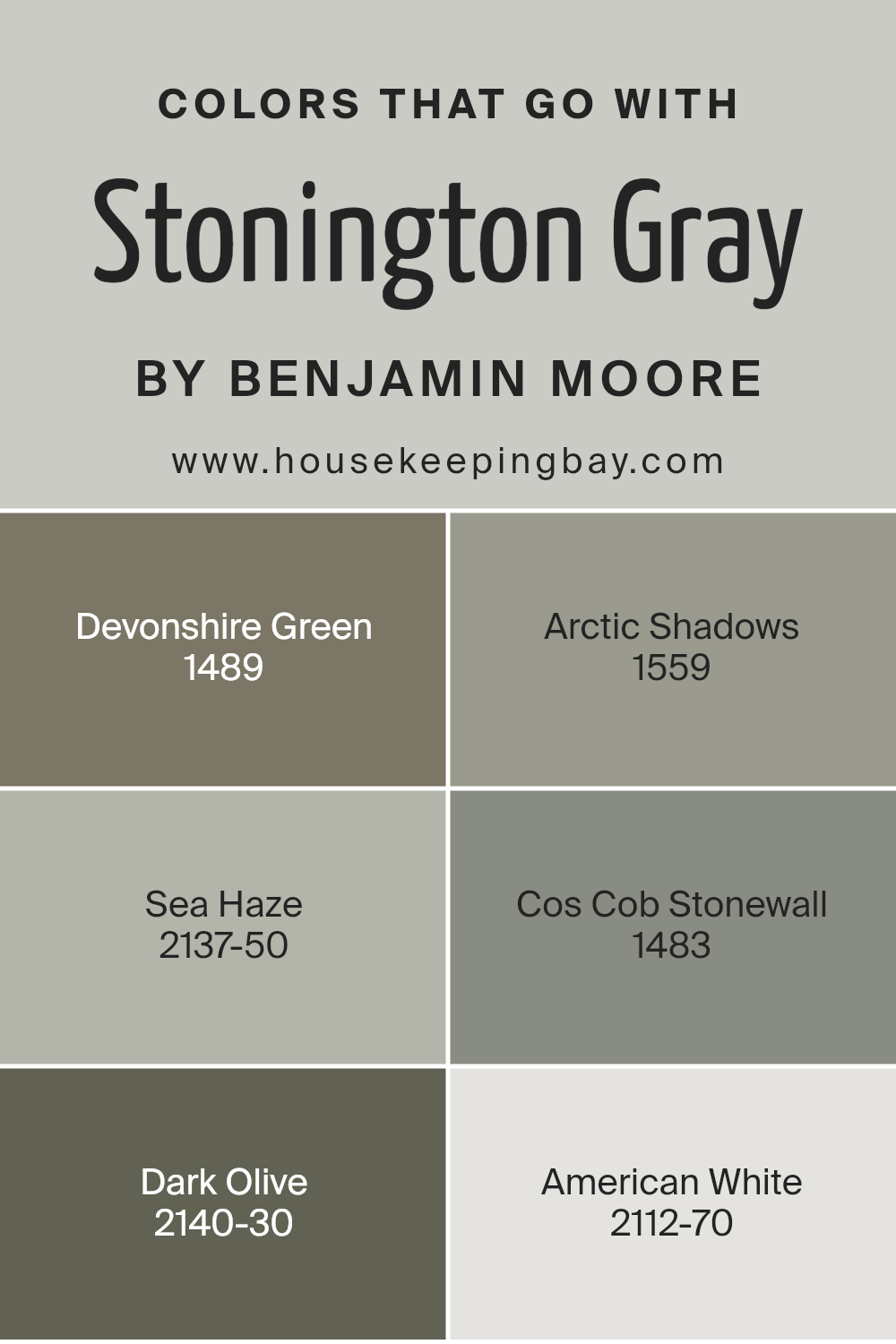
Colors that Go With Stonington Gray HC-170 by Benjamin Moore
Choosing colors that complement Stonington Gray HC-170 by Benjamin Moore is important because it brings balance and harmony to a space. Stonington Gray is a versatile neutral that works well with various shades. Adding colors like Devonshire Green 1489, a soft, muted green, can create a calm and inviting atmosphere, while Arctic Shadows 1559, a deep gray with blue undertones, adds depth and sophistication.
Sea Haze 2137-50, a gentle, misty gray, blends seamlessly with Stonington Gray, providing a peaceful backdrop for any room.
For a touch of warmth, Cos Cob Stonewall 1483, a cozy olive-toned gray, complements the neutral base and adds earthiness. Dark Olive 2140-30, a rich and bold green, offers a striking contrast and can be used to create focal points in a design. American White 2112-70, a soft off-white, provides a crisp and clean look when paired with Stonington Gray, brightening up the space while maintaining a soothing balance.
Together, these colors work with Stonington Gray to create a cohesive, stylish, and comfortable environment in any home setting.
You can see recommended paint colors below:
- 1489 Devonshire Green
- 1559 Arctic Shadows
- 2137-50 Sea Haze
- 1483 Cos Cob Stonewall
- 2140-30 Dark Olive
- 2112-70 American White
housekeepingbay.com
How to Use Stonington Gray HC-170 by Benjamin Moore In Your Home?
Stonington Gray HC-170 by Benjamin Moore is a versatile paint color that can enhance many spaces in a home. This shade of gray offers a perfect balance between warmth and coolness, making it suitable for any room. It works wonderfully in living rooms, providing a neutral backdrop that allows furniture and decor to shine.
In bedrooms, it creates a calming atmosphere, perfect for relaxation. Stonington Gray also complements kitchens, giving a clean and modern look. You can pair it with white trim for a crisp contrast or combine it with darker accents for a more dramatic effect.
This gray is flexible enough to suit both traditional and contemporary styles. Its soft hue also pairs well with a variety of colors, like blues or soft pinks, for added interest. Overall, Stonington Gray is an excellent choice for those seeking a dependable and elegant paint color for their interiors.
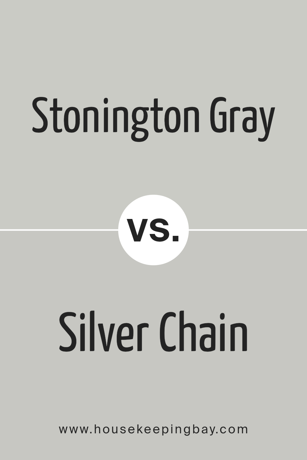
Stonington Gray HC-170 by Benjamin Moore vs Silver Chain 1472 by Benjamin Moore
Stonington Gray HC-170 by Benjamin Moore presents a soft, versatile gray with a neutral undertone. It adapts to various lighting conditions, making it a popular choice for different spaces. The color offers a comfortable and classic feel that suits both traditional and modern interiors.
Silver Chain 1472 by Benjamin Moore, however, leans cooler with a hint of blue undertone. This makes it appear more refreshing and crisp compared to Stonington Gray. Silver Chain can bring a sense of spaciousness to a room, making it ideal for smaller spaces areas that need a bit more light.
While both colors belong to the gray family, Stonington Gray provides a more neutral backdrop, whereas Silver Chain adds a cool, airy vibe. Choosing between the two depends on the desired atmosphere and existing elements in a space, but both colors offer a timeless, sophisticated touch.
You can see recommended paint color below:
- 1472 Silver Chain
housekeepingbay.com
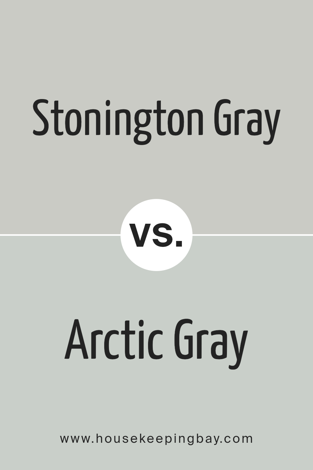
Stonington Gray HC-170 by Benjamin Moore vs Arctic Gray 1577 by Benjamin Moore
Stonington Gray HC-170 by Benjamin Moore offers a timeless, soft gray tone with a hint of blue, providing a balanced and versatile color suitable for nearly any room or style. Its subtle depth creates a calming backdrop while pairing well with both bold and neutral accents.
Arctic Gray 1577, also by Benjamin Moore, shares cool undertones but leans slightly more into blue, offering a crisper and lighter feel. This color can brighten up spaces, giving them an airy vibe, and matches beautifully with whites and complementary blues, enhancing its fresh appearance.
While Stonington Gray enhances warmth with its balanced undertone, Arctic Gray thrives in creating a light, refreshing atmosphere. Both colors suit modern and classic decor but create different moods. Stonington fits cozy, serene environments, ensuring comfort, while Arctic lends to openness and brightness, making spaces feel more spacious and lively without overwhelming. Both colors promise elegance and versatility.
You can see recommended paint color below:
- 1577 Arctic Gray
housekeepingbay.com
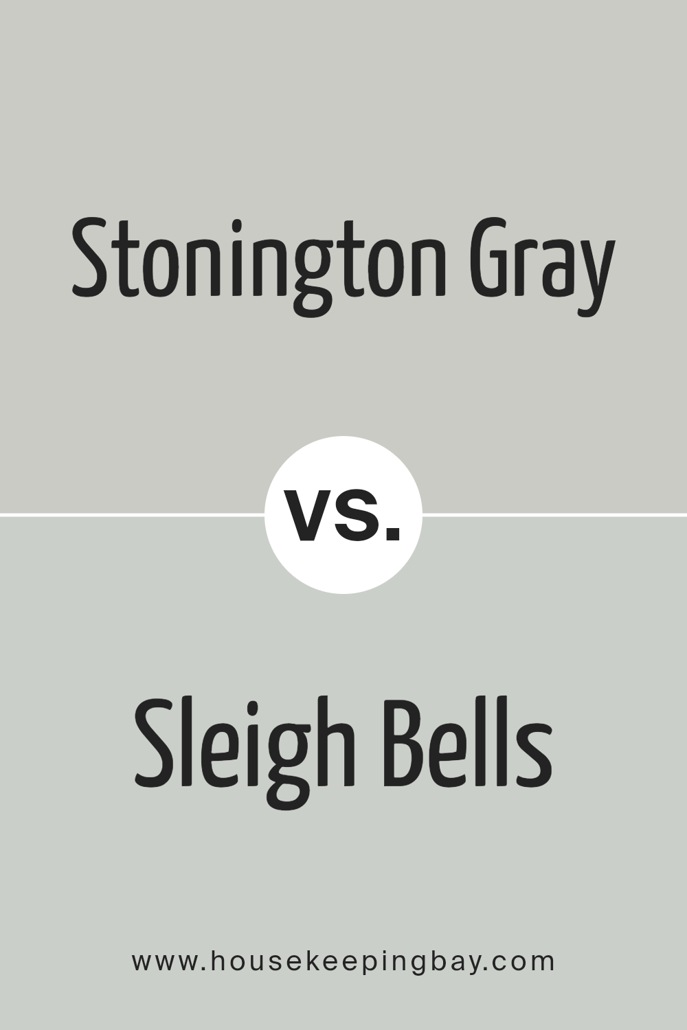
Stonington Gray HC-170 by Benjamin Moore vs Sleigh Bells 1480 by Benjamin Moore
Stonington Gray HC-170 and Sleigh Bells 1480, both by Benjamin Moore, offer unique shades of gray. Stonington Gray is a cool, neutral gray with blue undertones, making it versatile for different settings. It works well in both natural and artificial light, maintaining its subtle elegance. This color provides a subdued backdrop, allowing other elements in the room to stand out.
Sleigh Bells 1480, in contrast, leans towards a softer, warmer gray with faint beige undertones. It creates a cozy, inviting atmosphere, making spaces feel warm and comfortable. This shade complements rooms with warm lighting, enhancing its gentle character.
When choosing between them, consider the overall feel of the space. Stonington Gray suits modern, crisp designs with a cooler palette, while Sleigh Bells fits traditional or cozy settings with warmth. Both colors provide subtlety but offer different vibes, allowing you to tailor the ambiance of a room to your preference.
You can see recommended paint color below:
- 1480 Sleigh Bells
housekeepingbay.com
Stonington Gray HC-170 by Benjamin Moore vs Nimbus 1465 by Benjamin Moore
Stonington Gray HC-170 by Benjamin Moore is a classic gray with a subtle, cool undertone. It provides a crisp, clean look, making it a popular choice for a neutral wall color. The shade has a subtle sophistication, fitting both modern and traditional spaces.
It often works well with bright white trim, giving a fresh, airy feel to any room.
Nimbus 1465 by Benjamin Moore is also a gray but tends to be a bit warmer than Stonington Gray. It offers a soft, soothing appearance that can create a welcoming atmosphere. Nimbus often complements natural materials like wood and stone, giving a balanced and harmonious vibe.
Both colors are versatile, setting a backdrop for various design elements. While Stonington Gray feels slightly more formal due to its coolness, Nimbus gives off an inviting warmth. Choosing between them depends on whether a cooler or warmer gray suits your space’s mood better.
You can see recommended paint color below:
- 1465 Nimbus
housekeepingbay.com
Conclusion
As someone who appreciates a neutral palette, I found this shade of gray to be remarkably adaptable to different lighting and environments. It offers a perfect balance, neither too warm nor too cool, making it suitable for various rooms in the house.
In my experience, Stonington Gray works well in both traditional and modern settings. It provides a crisp backdrop, allowing furniture and decorative elements to stand out more vividly. What I really like about it is how it complements other colors, whether they are bold or subtle.
Pairing it with whites and deeper grays can give a room a clean, cohesive look, and it also harmonizes beautifully with blues and greens.
I’ve noticed that Stonington Gray contributes a calming and soothing atmosphere, making spaces feel open and airy. It’s a great choice for creating a serene environment without overwhelming the senses. Whether you’re considering a new color for the living room, bedroom, or office, Stonington Gray is a reliable choice that can suit varied styles and tastes.
I found it to be a dependable color that enhances the overall feel of a space while maintaining a refined simplicity.
housekeepingbay.com
Ever wished paint sampling was as easy as sticking a sticker? Guess what? Now it is! Discover Samplize's unique Peel & Stick samples. Get started now and say goodbye to the old messy way!
Get paint samples


