Glass Slipper 1632 by Benjamin Moore
Graceful Beauty in Every Shade
Let me introduce you to a color that might just fit the bill: 1632 Glass Slipper by Benjamin Moore. Picture a soft, airy blue that exudes a calming presence, ideal for creating a serene and inviting space. Glass Slipper can bring a touch of elegance and simplicity to any room.
Imagine walking into a living room where the walls are painted in a gentle hue that seems to change with the light throughout the day. In the morning, it can appear crisp and fresh, while in the evening, it softens into something warm and peaceful.
It’s a color that adapts, allowing you to adjust your space according to your mood and the look you wish to achieve.
With 1632 Glass Slipper, you’re not just adding color. You are also setting the tone for a room that feels like a soothing retreat from the hectic pace of daily life. Whether you want to refresh a bedroom, kitchen, or study, this shade promises to be your ally in crafting a comforting haven.
Let’s explore how this particular blue can be the touch of magic your home needs.
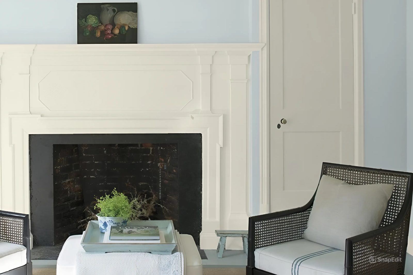
via clairejefford.com
What Color Is Glass Slipper 1632 by Benjamin Moore?
Glass Slipper 1632 by Benjamin Moore is a soft, airy blue with a hint of gray. This color evokes a sense of sky-like openness and quiet elegance. Its cool undertone offers a calm backdrop without overwhelming the senses.
Glass Slipper’s versatility allows it to complement various interior styles, fitting seamlessly into both traditional and modern spaces. In coastal or cottage settings, this hue creates a fresh and breezy atmosphere, perfect for living rooms, bedrooms, or bathrooms.
Pair Glass Slipper with light, natural woods such as oak or pine for a warm contrast. Metals like brushed nickel and chrome offer a sleek touch, enhancing the color’s subtle sophistication. Textures such as linen or cotton in upholstery and window treatments may evoke a welcoming, relaxed feel.
For a cozy, harmonious space, combine Glass Slipper with soft grays, creamy whites, or muted pastels. These combinations work well in creating serene nurseries or reading nooks.
In contemporary interiors, use Glass Slipper alongside sharp blacks or deep charcoals for a striking contrast.
Overall, Glass Slipper 1632 offers a timeless, adaptable color choice with many possibilities. It brings a soothing charm to any room, ideal for those seeking a light, versatile palette.
housekeepingbay.com
Is Glass Slipper 1632 by Benjamin Moore Warm or Cool color?
Glass Slipper 1632 by Benjamin Moore is a soft, light blue with a touch of gray. This color brings a calm, airy feel to any room. It works well in spaces where you want a peaceful atmosphere, like bedrooms or living rooms. The gentle hue can make small rooms feel larger and more open.
With natural light, Glass Slipper takes on a bright and cheerful tone, while in dimmer spaces, it turns more muted and soothing.
This shade pairs nicely with neutral colors like whites, beiges, and grays, allowing for versatile decor choices. You can add pops of color through accessories like pillows and artwork. The overall effect of using Glass Slipper is a clean, fresh, and inviting space, making it a popular choice for many homeowners. Whether on walls or as an accent, this color adds a touch of elegance and harmony without overwhelming the senses.
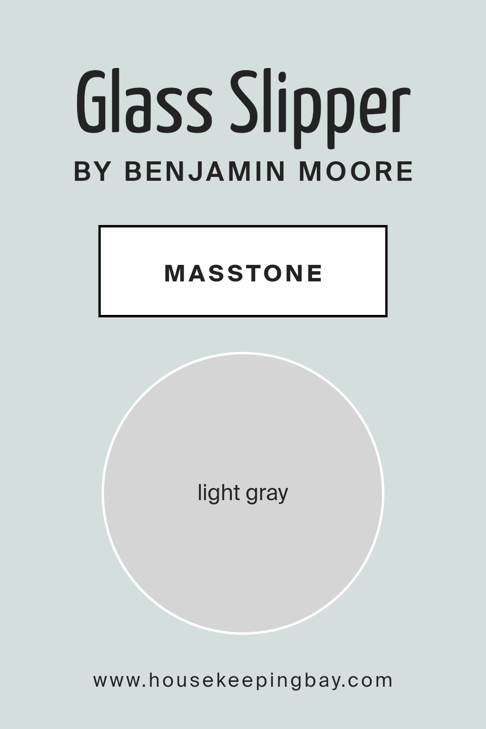
What is the Masstone of the Glass Slipper 1632 by Benjamin Moore?
Glass Slipper 1632 by Benjamin Moore is a light gray color, coded as #D5D5D5. This soft gray is very versatile and complements a variety of interior styles. Its gentle hue makes it suitable for almost any room in your house. Glass Slipper can brighten up small spaces, making them look larger and more open. It gives a calm, neutral background that’s easy on the eyes, creating a peaceful atmosphere.
This shade is perfect for those who prefer understated elegance. In living rooms, it pairs well with both modern and traditional furniture. In kitchens, it provides a clean look, making the space feel fresh and welcoming.
Bedroom walls painted in this color can give a restful and soothing vibe, ideal for relaxation.
The adaptability of Glass Slipper means it works with many other colors. You can combine it with bold accents for contrast or use it with other neutrals for a cohesive look. It’s a subtle choice that never overwhelms but always adds a touch of sophistication to any room.
housekeepingbay.com
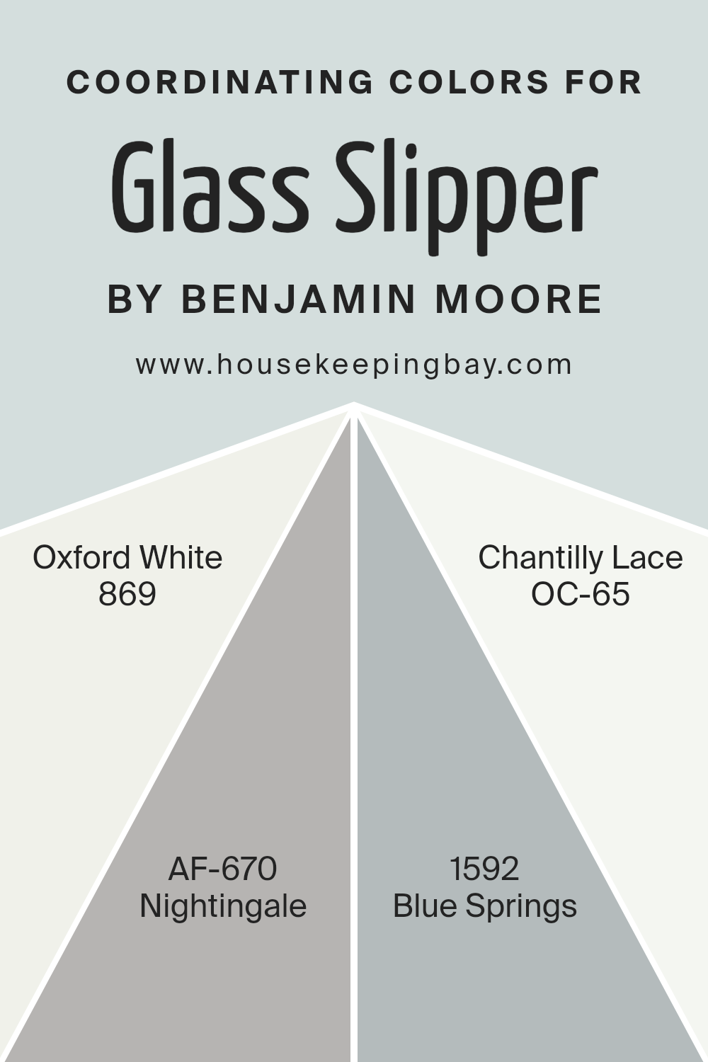
Coordinating Colors of Glass Slipper 1632 by Benjamin Moore
Coordinating colors play an important role in creating a harmonious and balanced look in any space. They are colors that pair well with a chosen main color, enhancing and complementing its tones. For Glass Slipper 1632 by Benjamin Moore, coordinating colors include Oxford White 869, Nightingale AF-670, Blue Springs 1592, and Chantilly Lace OC-65.
When these colors come together, they create a balanced and soothing atmosphere. Oxford White is a clean and crisp white that brings brightness and freshness to the space. It’s perfect for trim or ceilings, adding a bright backdrop that lets other colors pop.
Nightingale is a soft, muted gray with a subtle warmth, providing a gentle contrast without feeling overwhelming. It’s a wonderful choice for creating an understated elegance in a room. Blue Springs is a calm and peaceful blue that evokes a sense of calmness, making it perfect for bedrooms or bathrooms.
Lastly, Chantilly Lace is a bright white with a hint of warmth, versatile enough to work in any room. It reflects light beautifully, making spaces feel airy and open.
Together, these colors create an inviting and harmonious environment, enhancing the beauty of Glass Slipper while maintaining a soothing and cohesive look.
You can see recommended paint colors below:
- 869 Oxford White
- AF-670 Nightingale
- 1592 Blue Springs
- OC-65 Chantilly Lace
housekeepingbay.com
How Does Lighting Affect Glass Slipper 1632 by Benjamin Moore?
Lighting plays a significant role in how we perceive colors in any space. Different light sources can change the appearance of a color, making it seem warmer, cooler, or even altering its intensity.
A color like Glass Slipper 1632 by Benjamin Moore, a soft and muted blue, can have varied looks depending on the lighting conditions.
In natural light, the direction of the room’s exposure affects Glass Slipper 1632’s appearance:
- 1. North-Facing Rooms: These rooms receive cooler and more consistent natural light. Glass Slipper 1632 may lean more gray in such spaces, maintaining its soft and calm characteristics but appearing cooler and a bit more subdued.
- 2. South-Facing Rooms: These spaces get warm, bright light most of the day. Here, Glass Slipper 1632 can appear warmer and slightly more vibrant, as the ample sunlight enhances its blue undertones, giving the room a more airy and cheerful feel.
- 3. East-Facing Rooms: Mornings bring bright, warm sunlight, making Glass Slipper 1632 appear fresh and bright. By afternoon, as light softens, the color may take on a cooler tone. This shifting light throughout the day offers a dynamic visual experience.
- 4. West-Facing Rooms: Afternoon and evening light in these rooms is warm and golden. During this time, Glass Slipper 1632 can seem richer and warmer, as the golden light enhances its subtle undertones. In mornings, the color will look cooler.
Under artificial light, the bulb type has an effect. Incandescent and warm LEDs highlight warmer elements in the color, making Glass Slipper 1632 feel cozier. Cool LEDs and fluorescents, on the other hand, can accentuate its blue tones, giving it a crisper and more neutral appearance.
Understanding these nuances helps in choosing the right placement and light bulbs to achieve the desired effect.
housekeepingbay.com
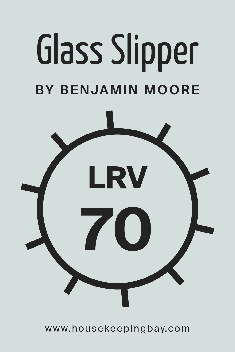
What is the LRV of Glass Slipper 1632 by Benjamin Moore?
LRV stands for Light Reflectance Value. This value tells you how much light a paint color will reflect. It’s measured on a scale from 0 to 100, where 0 means the color absorbs all the light (like black), and 100 means it reflects all the light (like pure white).
A higher LRV means a color is lighter and will reflect more light back into the room, making the space feel more open and bright. Conversely, colors with lower LRV will absorb more light, which can make a room feel smaller and cozier.
Knowing the LRV of a paint color helps you predict how it will look in different lighting conditions and spaces. This can be useful when choosing paint colors for areas with limited natural light.
For Glass Slipper 1632 by Benjamin Moore, which has an LRV of 70.2, this means it is a fairly light color. This specific LRV indicates that it will reflect a good amount of light, enhancing the brightness of a room without being too stark.
Glass Slipper 1632 is likely to open up spaces and make them feel airy and fresh. Its ability to reflect light well makes it an excellent choice for rooms that need a little light boost, such as basements or hallways.
However, it’s worth noting that its effect can change depending on the time of day and artificial lighting in the room.
During the day, it might appear brighter and more vibrant, while in the evening, it could take on a softer, more muted tone.
housekeepingbay.com
What are the Trim colors of Glass Slipper 1632 by Benjamin Moore?
Trim colors are the shades used for parts of a room like baseboards, moldings, and doors, contrasting or complementing the walls. For the light and airy Glass Slipper 1632 from Benjamin Moore, choosing the right trim color can define the room’s character.
Utilizing a well-chosen trim color can add depth, make a room look more refined, and highlight architectural details. Calm (OC-22) and Chantilly Lace (OC-65) are perfect for this purpose, as they bring out the best in both traditional and modern settings.
They subtly complete the style, ensuring that the room appears harmonious without being overly dramatic.
Calm (OC-22) is a gentle, understated light gray with warm undertones, providing a soothing balance. Its delicate nature creates a subtle contrast against Glass Slipper, adding warmth and a sense of consistency to the overall aesthetic.
Chantilly Lace (OC-65), on the other hand, is a crisp, clean white that is pure and bright. It reflects light beautifully and creates a sharp, distinct boundary between the walls and trim.
Both provide a polished look, with Calm offering warmth and Chantilly Lace bringing clarity, ensuring they both enhance the appeal of Glass Slipper.
You can see recommended paint colors below:
- OC-22 Calm
- OC-65 Chantilly Lace

housekeepingbay.com
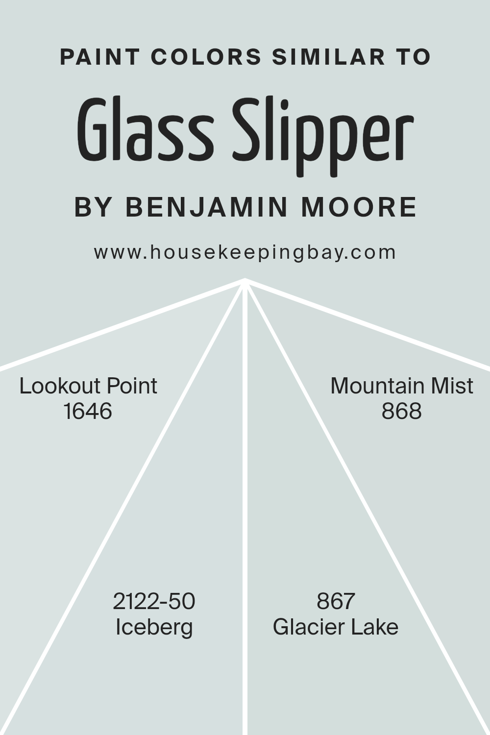
Colors Similar to Glass Slipper 1632 by Benjamin Moore
Colors that are close in tones can create harmony and balance in a space, making such hues highly valuable in design. Glass Slipper 1632 by Benjamin Moore is a light, airy shade that offers a sense of freshness and calmness. Similar colors like Lookout Point 1646, Iceberg 2122-50, Glacier Lake 867, and Mountain Mist 868 work well together because they share a similar cool undertone.
This subtle coordination ensures the colors blend seamlessly, providing a soothing and cohesive aesthetic. Using colors that complement each other in this way helps maintain a serene and welcoming ambiance without overwhelming the senses.
These soft shades invite comfort and relaxation, making them perfect for spaces meant to be peaceful retreats.
Lookout Point 1646 is a gentle blue reminiscent of a clear sky, offering a crisp and clean feel to any area. Iceberg 2122-50 provides a delicate hint of blue that is both fresh and timeless.
Glacier Lake 867 carries a serene blue-green tint, mimicking tranquil waters, while Mountain Mist 868 brings a touch of gray, grounding the palette with a subtle elegance.
Together, these colors create a harmonious environment, echoing the tranquility of nature without overtaking the space. Their synergy helps craft an atmosphere where peace and style coexist.
You can see recommended paint colors below:
- 1646 Lookout Point
- 2122-50 Iceberg
- 867 Glacier Lake
- 868 Mountain Mist
housekeepingbay.com
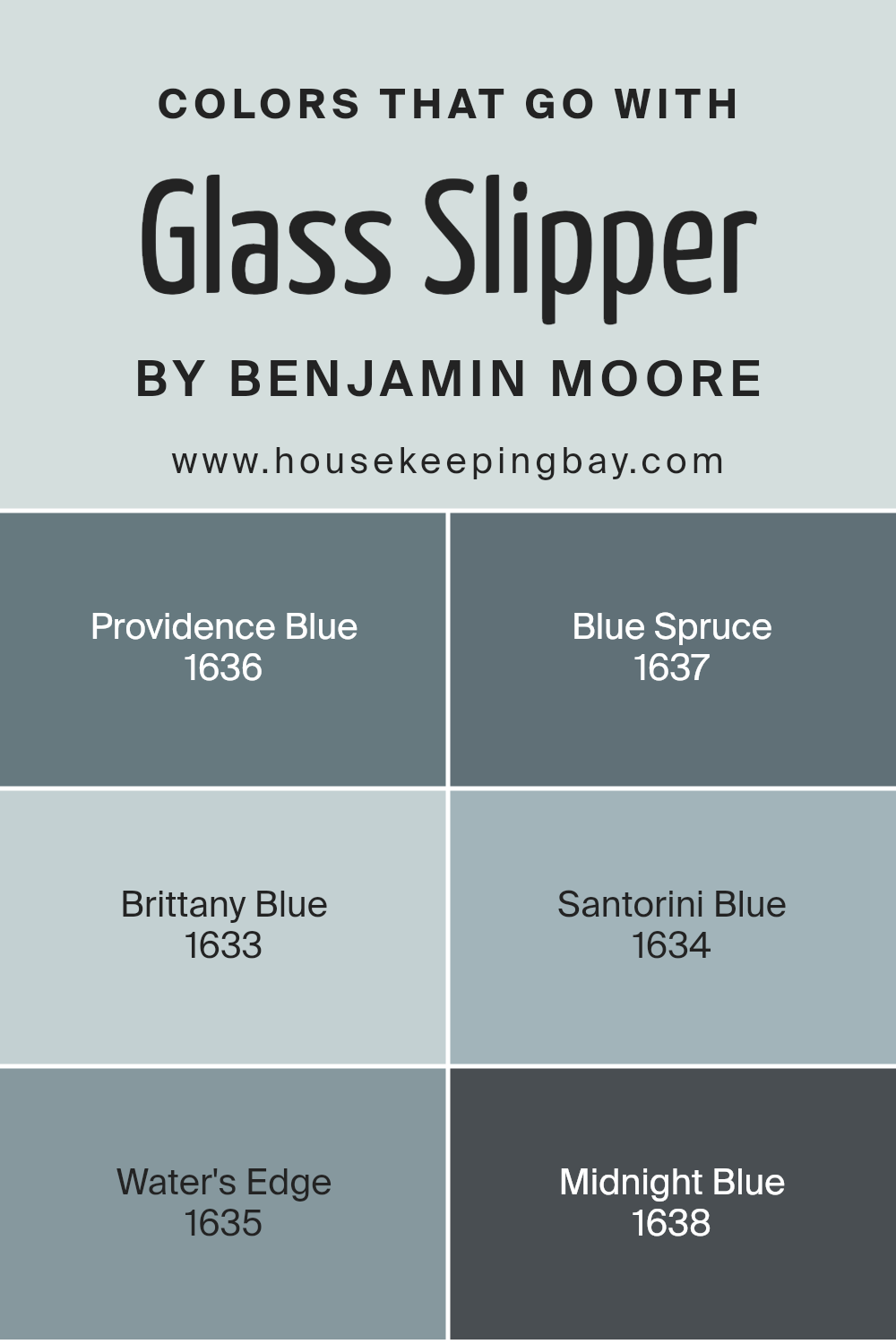
Colors that Go With Glass Slipper 1632 by Benjamin Moore
When you pair colors with Glass Slipper 1632 by Benjamin Moore, it’s like creating a beautiful and harmonious space. These combinations make rooms feel well-coordinated and inviting. Each color adds its unique touch to Glass Slipper’s soft and muted blue.
Providence Blue 1636 is a deep, rich shade that brings a cozy and classic feel. Partnered with Glass Slipper, it adds depth to any room, providing balance. Blue Spruce 1637, on the other hand, offers a subtle hint of green, invoking a sense of calm. It pairs nicely, lending a serene and natural atmosphere.
Brittany Blue 1633 brightens spaces with its cheerful yet soft presence. It complements Glass Slipper perfectly by adding a hint of playfulness without overwhelming. Santorini Blue 1634 reminds one of the clarity of the ocean, bringing a fresh and crisp energy when used alongside Glass Slipper.
Water’s Edge 1635 is another friend to Glass Slipper, lending a more relaxed vibe with its light and gentle hue. Finally, Midnight Blue 1638 provides a dramatic contrast, making Glass Slipper appear even softer and more delicate.
By selecting these colors alongside Glass Slipper, each room gains character and harmony, creating an effortless and pleasing look.
You can see recommended paint colors below:
- 1636 Providence Blue
- 1637 Blue Spruce
- 1633 Brittany Blue
- 1634 Santorini Blue
- 1635 Water’s Edge
- 1638 Midnight Blue
housekeepingbay.com
How to Use Glass Slipper 1632 by Benjamin Moore In Your Home?
Glass Slipper 1632 by Benjamin Moore is a soft, light blue paint color that brings a sense of calm and openness to any space. Its subtle shade makes it a versatile choice for various rooms in the home. In living rooms, it can create an airy feel when paired with white or neutral furniture.
For bedrooms, this color offers a serene atmosphere, promoting relaxation and restful sleep. It pairs well with soft grays or pale yellows, adding depth without overwhelming the senses.
In kitchens, Glass Slipper can refresh the look, especially when combined with white cabinets or light wood finishes. Bathrooms benefit from its clean, fresh hue, giving a sense of cleanliness and space. This color also complements other pastel shades, allowing for gentle contrasts and harmonies.
When applied in hallways or smaller areas, it can give an illusion of spaciousness, making homes feel larger and more inviting without the need for bold choices.
Glass Slipper 1632 by Benjamin Moore vs Glacier Lake 867 by Benjamin Moore
Glass Slipper 1632 by Benjamin Moore is a soft, subtle blue-green color. It brings a light, airy feel to spaces, giving them an open and fresh atmosphere. This color has a gentle quality, making it perfect for creating a soothing environment in any room. Its pale tones can make spaces look larger and more inviting.
Glacier Lake 867 by Benjamin Moore, however, presents a slightly cooler and deeper blue. This color evokes a sense of calmness and stability. With a stronger blue presence, Glacier Lake provides a touch of elegance and sophistication.
It suits spaces where a more defined color statement is desired, offering a balanced and peaceful ambiance.
Both colors share a calmness, yet Glass Slipper tends to brighten up spaces with its lighter touch, while Glacier Lake provides a slightly bolder presence. They work beautifully in different settings, depending on whether you want a light, airy space or a room with a bit more depth and definition.
You can see recommended paint color below:
- 867 Glacier Lake
housekeepingbay.com
Glass Slipper 1632 by Benjamin Moore vs Mountain Mist 868 by Benjamin Moore
“Glass Slipper 1632” by Benjamin Moore is a light, airy blue with a hint of green, giving spaces a crisp and refreshing feel. It’s perfect for someone looking to bring a touch of the outdoors inside, creating an uplifting and serene atmosphere. It’s versatile enough to pair with almost any decor, adding a gentle pop of color without overwhelming a room.
“Mountain Mist 868,” also by Benjamin Moore, leans more towards a muted gray with subtle green undertones. This color offers a more grounded and calming presence, ideal for creating a soothing environment.
It’s a sophisticated choice that pairs well with other neutrals, providing a harmonious backdrop for various styles.
While “Glass Slipper” brings in brightness and cheerfulness, “Mountain Mist” offers depth and sophistication. Both colors connect with nature but cater to different moods. Where one invites energy, the other gently softens the room, providing distinct yet complementary vibes.
You can see recommended paint color below:
- 868 Mountain Mist
housekeepingbay.com
Glass Slipper 1632 by Benjamin Moore vs Iceberg 2122-50 by Benjamin Moore
The color Glass Slipper 1632 by Benjamin Moore is a light, airy blue with a hint of green. It evokes a fresh, cool feeling reminiscent of a clear sky or the gentle hue of sea glass. This color is subtle and soothing, making it ideal for spaces where you want a calm and serene atmosphere, like bedrooms or bathrooms.
In contrast, Iceberg 2122-50 by Benjamin Moore is a pale, cool blue with a slight touch of gray. It feels clean and modern, with a crisp quality that brings to mind images of ice and snow. This color can make rooms feel larger and more open, suited for living rooms or kitchens where you want a fresh, inviting feel.
Both colors share a cool tone but differ in their undertones; Glass Slipper leans greenish, giving warmth, while Iceberg’s gray tint adds sleekness. Together, they offer versatile choices for different moods.
You can see recommended paint color below:
- 2122-50 Iceberg

housekeepingbay.com
Glass Slipper 1632 by Benjamin Moore vs Lookout Point 1646 by Benjamin Moore
Glass Slipper 1632 and Lookout Point 1646, both by Benjamin Moore, offer distinct moods and effects for your spaces. Glass Slipper, a soft, light blue with a hint of gray, creates an airy and serene atmosphere. Its gentle hue makes rooms feel open and calm, perfect for areas where you want to add a touch of elegance without overwhelming the space.
Lookout Point 1646, in contrast, is a deeper, more vibrant blue. Its rich tone adds sophistication and depth, making it ideal for a bold statement. This color can enhance a room’s dimensions, creating cozy yet dynamic spaces.
Both colors capture different aspects of blue, with Glass Slipper leaning towards subtlety and Lookout Point bringing in more intensity. While Glass Slipper works well in spaces aiming for light, Lookout Point suits rooms desiring a touch of dramatic flair. Either choice can enhance your interiors, each in its unique way.
You can see recommended paint color below:
- 1646 Lookout Point
housekeepingbay.com
Conclusion
After exploring the nuances of the paint color 1632 Glass Slipper by Benjamin Moore, I find it to be a unique hue that bridges the gap between traditional and contemporary aesthetics. Its soft, muted tones offer a calming presence, making it an ideal choice for spaces that seek serenity and understated elegance.
I appreciate how this particular shade adapts to different lighting conditions, enhancing its versatility. In natural light, it seems to bring out a gentle, soothing vibe that can open up any room, making it appear larger and more inviting.
It’s a color that doesn’t overpower but complements its surroundings, allowing other design elements to shine.
When considering a paint color for various rooms, I value those that offer flexibility, and Glass Slipper fits this criterion well. Whether it’s enhancing a bedroom, creating a tranquil living area, or offering a fresh look in a work space, this shade seems to fit seamlessly.
In essence, 1632 Glass Slipper is more than just a color; it’s a subtle way to bring harmony and sophistication into a living space, proving that sometimes simplicity holds the most profound impact.
I find it a delightful choice for anyone who appreciates a gentle and inviting atmosphere.
housekeepingbay.com
Ever wished paint sampling was as easy as sticking a sticker? Guess what? Now it is! Discover Samplize's unique Peel & Stick samples. Get started now and say goodbye to the old messy way!
Get paint samples


