Fading Rose SW 6296 by Sherwin Williams
Bring Soft Warmth to Your Space
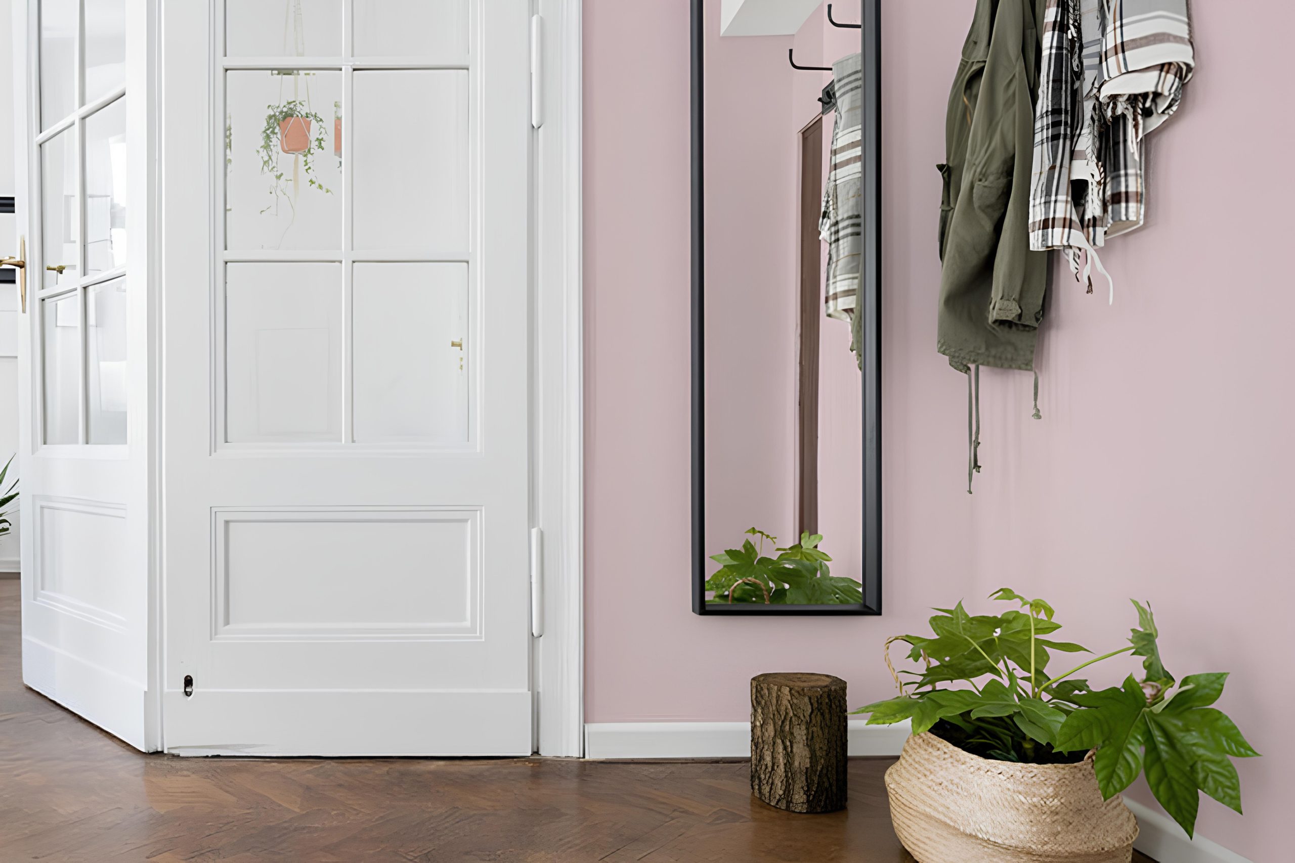
Think about the color that gently whispers elegance and warmth into your space. SW 6296 Fading Rose by Sherwin Williams offers precisely that. This delicate, soft pink shade provides a balanced mix of subtlety and sophistication, perfect for adding a touch of charm to any room.
When you incorporate Fading Rose into your home, you’ll find it’s a wonderful choice for creating an inviting atmosphere. Its muted tones aren’t overwhelming, allowing it to blend seamlessly with a variety of other colors and styles.
Whether you’re updating a bedroom, living room, or even a cozy reading nook, this shade provides a gentle backdrop that enhances the comfort and style of the room.
Consider pairing it with neutral shades or light grays to create a relaxing environment. Accentuate the space with layers of texture and complementary furnishings to bring out the best in Fading Rose. You’ll appreciate how this color can set a peaceful, welcoming tone, making your home feel like a serene retreat from the busy world outside.
Give Fading Rose a try and notice how it can subtly enhance the mood and aesthetic of your space, providing an elegant touch that feels both timeless and modern.
via sherwin-williams.com
What Color Is Fading Rose SW 6296 by Sherwin Williams?
Table of Contents
Fading Rose SW 6296 by Sherwin Williams is a soft, muted pink with warm undertones. This color brings a gentle and cozy feel to any space. The subtle blush tone can create a soothing atmosphere, perfect for living rooms, bedrooms, or nurseries. It works well in a variety of interior styles, including shabby chic, cottage, and even modern settings when paired with the right elements.
In a shabby chic setting, Fading Rose adds charm and softness. Pair it with distressed woods and vintage furniture for an inviting look. For a cottage feel, mix it with soft whites, creams, and floral fabrics to enhance its cozy appeal. In a modern room, it makes an interesting contrast when combined with sleek lines and minimalist decor.
This shade pairs beautifully with materials like light woods, brushed metals, and natural fibers. The soft pink tone complements textures such as linen, plush velvet, or cotton, adding depth and warmth. Accents like woven baskets or rattan furniture can also harmonize with this color, giving an organic touch.
Overall, Fading Rose brings a gentle warmth and a sense of calm to interiors, making it an excellent choice for creating inviting and comfortable spaces.
housekeepingbay.com
Is Fading Rose SW 6296 by Sherwin Williams Warm or Cool color?
Fading Rose SW 6296 by Sherwin Williams is a soft and muted color that brings warmth and coziness to any room. This shade has a gentle mix of pink with subtle brown undertones, making it perfect for creating a calm and inviting atmosphere in the home. When used on walls, Fading Rose adds a touch of elegance and sophistication, making spaces feel more welcoming.
In living rooms, this color can make areas feel snug and comfortable, ideal for relaxation. When paired with neutrals like beige or soft grays, it creates a soothing palette. In bedrooms, Fading Rose can promote a sense of peacefulness, ideal for unwinding at the end of the day.
Natural light enhances its warmth, while low light settings offer a more intimate ambiance. Adding this color to furniture or decor creates gentle accents. Overall, Fading Rose is versatile, promoting a pleasant and cozy feel in homes.
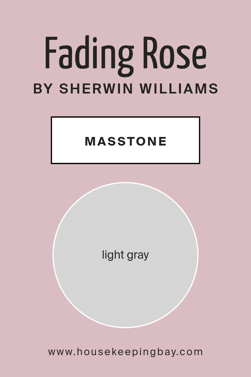
What is the Masstone of the Fading Rose SW 6296 by Sherwin Williams?
Fading Rose SW 6296 by Sherwin Williams is a gentle, muted pink with a hint of gray. Its masstone, light gray (#D5D5D5), softens the color, making it a versatile choice for various rooms. This gray tone helps create a calming effect, making spaces feel cozy and welcoming.
Fading Rose works well in living rooms and bedrooms, providing a gentle backdrop that complements both contemporary and traditional furniture styles.
The light gray in the masstone allows this pink shade to pair beautifully with other neutral colors, like beige or soft whites, enhancing a room’s elegance without overwhelming it. It brightens up the space, making rooms feel more open and airy. This color is ideal for anyone looking to add a touch of warmth and softness to their home without using bold or vibrant hues.
Fading Rose offers a subtle sophistication that is easy to live with every day.
housekeepingbay.com
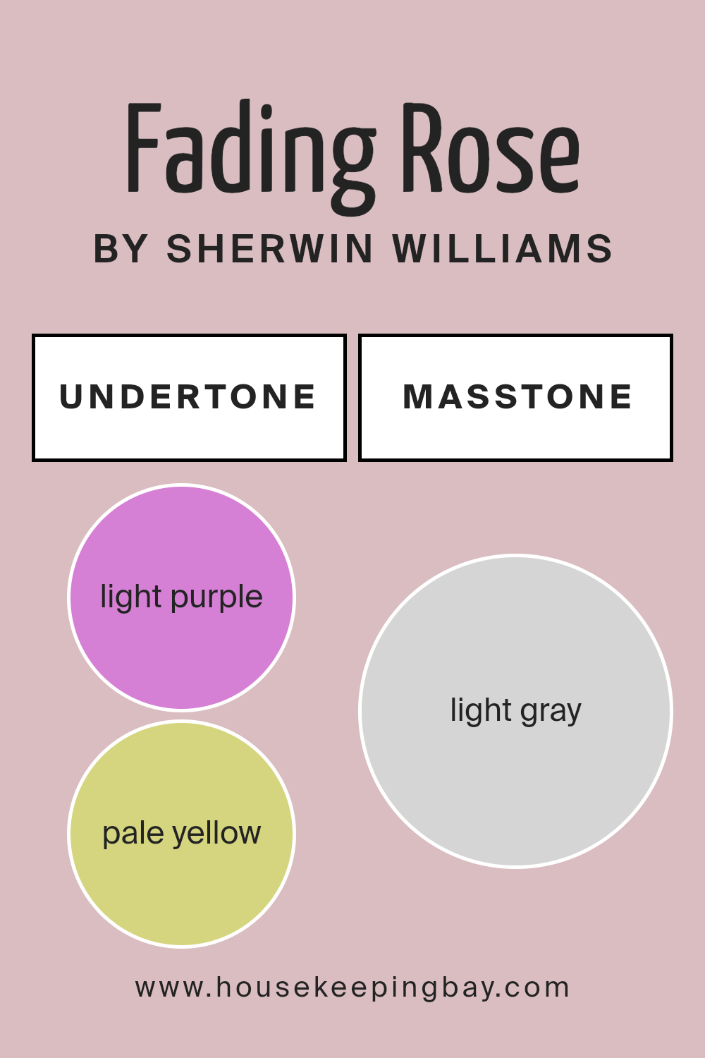
Undertones of Fading Rose SW 6296 by Sherwin Williams
Fading Rose SW 6296 by Sherwin Williams possesses a blend of subtle undertones that influence its appearance. This color can change based on lighting and other surrounding colors due to its undertones. The main undertones include light purple, pale yellow, pale pink, light blue, lilac, mint, and grey.
Undertones are like hidden colors mixed into the main color. They can affect how we perceive the color in different environments. For instance, a paint might look pink in one room, but in another room with different lighting or surrounding colors, it might appear more purple or blue.
For Fading Rose SW 6296, interior walls can appear different throughout the day as natural light shifts. The light purple and lilac undertones add a hint of freshness and calm, while the pale pink and pale yellow bring warmth and coziness. Light blue and mint undertones offer coolness and serenity, balancing the warmth. The grey undertone gives it a neutral stability that keeps it from appearing too vibrant.
In a room with warm lighting, Fading Rose may feel warmer and more inviting. Under cool lighting, it might seem more relaxed with its blue and mint undertones. This versatile nature makes it suitable for various spaces, offering subtle changes throughout the day.
housekeepingbay.com
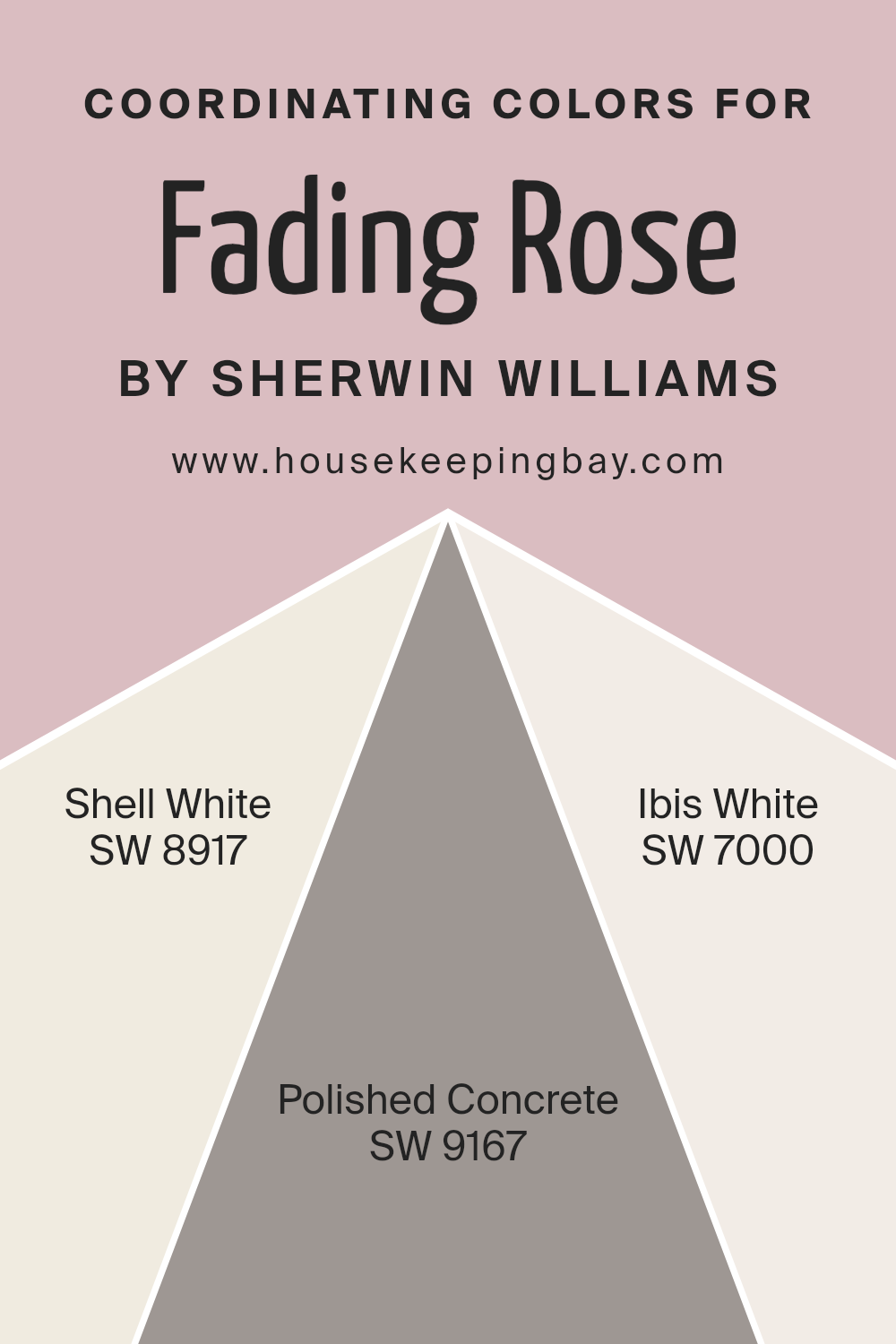
Coordinating Colors of Fading Rose SW 6296 by Sherwin Williams
Coordinating colors are hues that complement each other within a space, creating a sense of balance and visual flow. When you pair coordinating colors with something like Fading Rose (SW 6296) by Sherwin Williams, you enhance the overall aesthetic by ensuring a harmonious palette. Fading Rose, a soft pink, pairs well with a variety of colors, but a few stand out for their ability to foster a cohesive look.
Shell White (SW 8917) is a warm, creamy hue that offers a gentle backdrop, lightening a room without overpowering the main color. Polished Concrete (SW 9167) provides an elegant gray tone, bringing a modern touch that anchors the space and adds depth.
Ibis White (SW 7000) presents a crisp and clean white, which highlights Fading Rose’s gentle pink, ensuring it remains the focal point while adding brightness.
Together, these colors complement Fading Rose beautifully, offering a mixture of warmth, sophistication, and freshness.
They work together to craft a seamless and inviting atmosphere, making rooms feel balanced and thoughtfully designed.
You can see recommended paint colors below:
- SW 8917 Shell White
- SW 9167 Polished Concrete
- SW 7000 Ibis White
housekeepingbay.com
How Does Lighting Affect Fading Rose SW 6296 by Sherwin Williams?
Lighting plays a crucial role in how we perceive colors. The color Fading Rose SW 6296 by Sherwin Williams can look quite different under various lighting conditions. Let’s explore how lighting impacts this particular color.
In natural light, Fading Rose might appear soft and warm. Its subtle pinkish hue gets a gentle and soothing vibe when sunlight hits it, especially during the golden hours of early morning or late afternoon.
Under artificial light, this same color can either warm up or cool down, depending on the bulb used. Warm white bulbs enhance its cozy tones, while cool white bulbs can give it a slightly cooler appearance.
In north-facing rooms, the light is often more indirect and cooler. This can make Fading Rose seem a bit muted. The color might look more subdued, with its pink tones leaning toward a subtle grayish-pink.
South-facing rooms benefit from having the most consistent natural light throughout the day. In these rooms, Fading Rose comes to life, showing its true warmth and richness. The balanced light ensures the color remains steady, allowing its warm undertones to shine.
East-facing rooms get a lot of bright, warm light in the morning. In these rooms, Fading Rose appears at its warmest, with its hues glowing as the morning sun illuminates the space. By the afternoon, however, the room might feel cooler, and the color may appear softer.
West-facing rooms catch the end-of-day light, which can be warm and golden. Fading Rose may seem richer and more vibrant in late afternoon and evening, as the setting sun casts long shadows and highlights.
By understanding how lighting impacts the color, you can make informed choices for your specific room orientation, ensuring Fading Rose looks its best. Lighting considerations are key in interior design, significantly affecting the mood and atmosphere of any space.
housekeepingbay.com
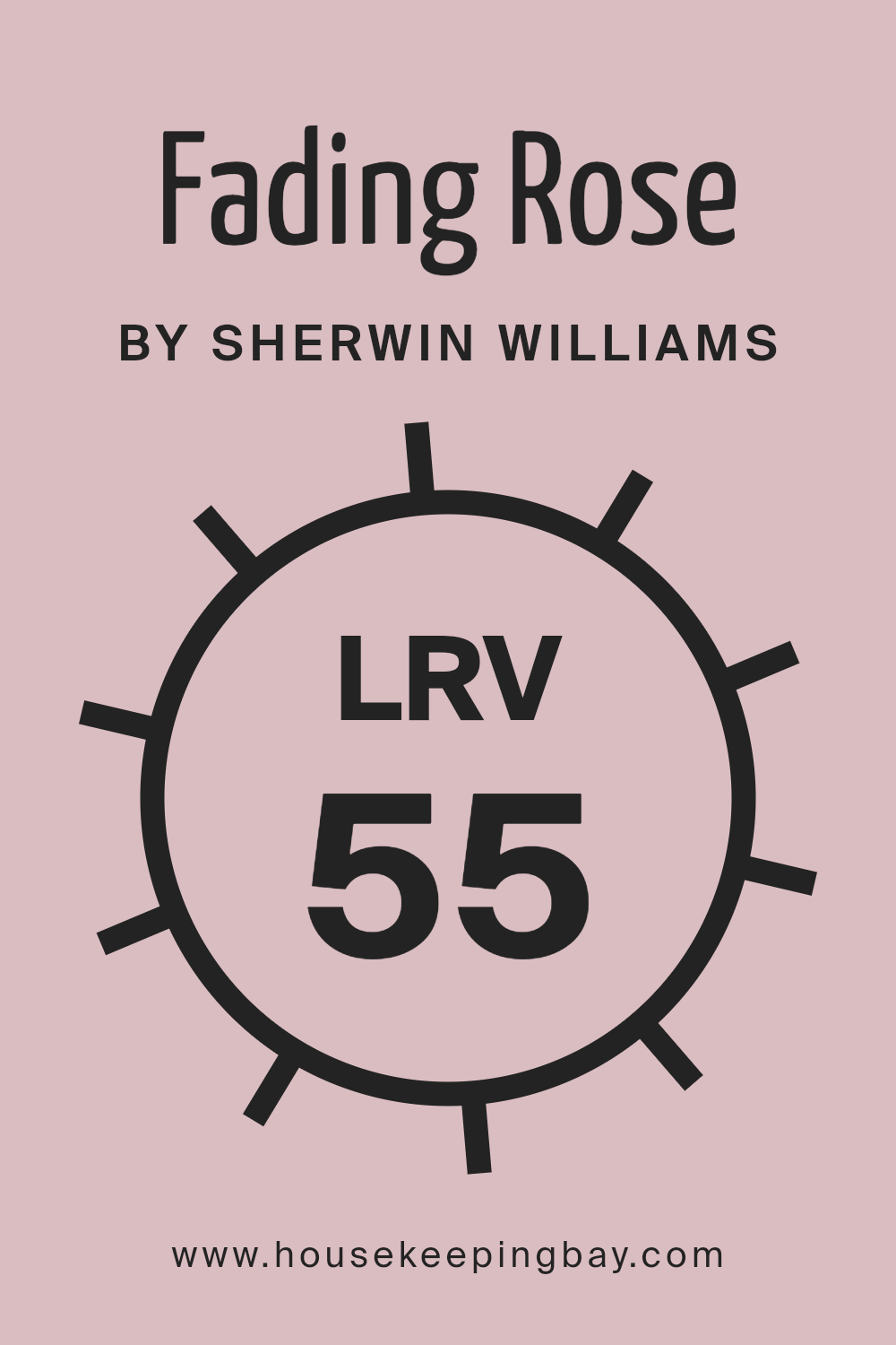
What is the LRV of Fading Rose SW 6296 by Sherwin Williams?
Light Reflectance Value, or LRV, measures the amount of light a color reflects. On a scale from 0 to 100, 0 represents black, which absorbs all light, and 100 represents white, which reflects all light. Colors with higher LRV numbers reflect more light, making spaces feel brighter. This is particularly helpful in rooms that lack natural light, as lighter colors can make a room appear more open and airy. Conversely, colors with low LRV absorb more light, creating a cozy, more intimate feel.
For Fading Rose SW 6296 by Sherwin Williams, with an LRV of 55.164, it means this color is in the medium range. It reflects a decent amount of light without making spaces look too washed out. This pinkish color balances light reflection, making it versatile for different rooms.
It won’t overpower a space, nor will it make a room feel dark. In spaces with good lighting, it can add warmth and softness to the walls, letting the room glow with a gentle ambiance. In dimmer rooms, it can lend a subtle touch of color without feeling too heavy.
housekeepingbay.com
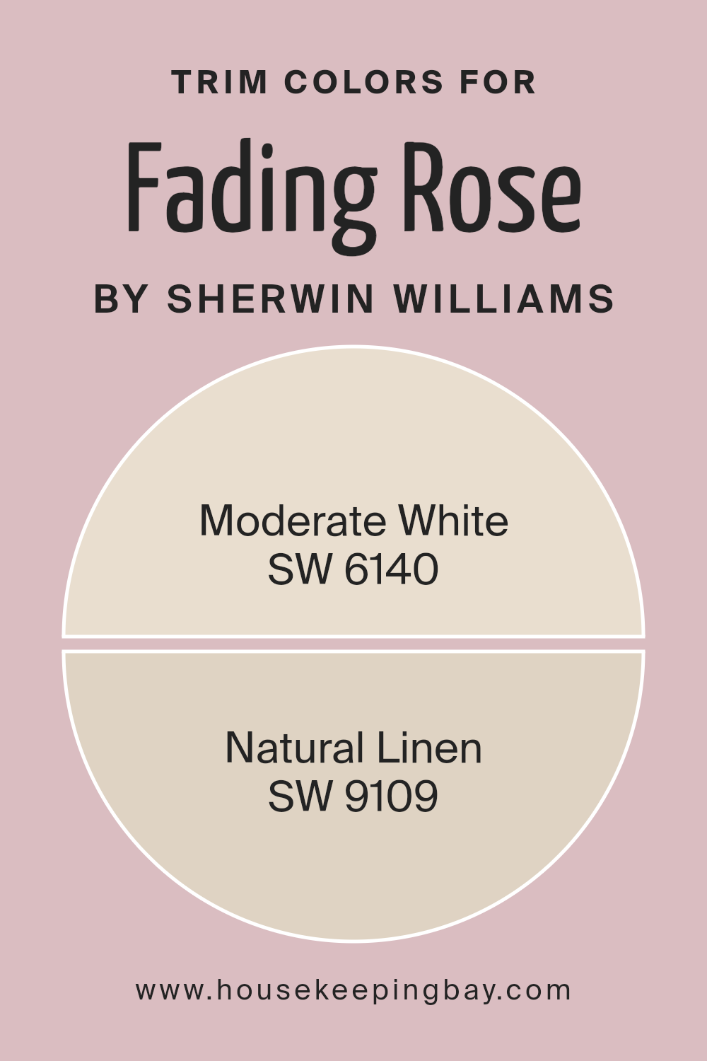
What are the Trim colors of Fading Rose SW 6296 by Sherwin Williams?
Trim colors refer to the shades used on the moldings, door frames, and other architectural features to create contrast or cohesion with the room’s primary color. Using the right trim color with Fading Rose SW 6296 by Sherwin-Williams can enhance the overall look and feel of a space, emphasizing its features and bringing balance to the color scheme.
When paired with Fading Rose, which possesses a soft, muted yet rich tone, choosing appropriate trim colors is important. These trims help to contour the walls and add definition to a room, allowing Fading Rose to not only stand out but also harmonize with other design elements in the space.
Moderate White SW 6140 serves as a warm, creamy off-white that works seamlessly as a trim color with Fading Rose. It brings a gentle brightness without clashing, offering a clean and classic look that complements the deep, dusty pink tones of Fading Rose.
Natural Linen SW 9109, on the other hand, carries an understated neutral tone that echoes the warmth of Fading Rose while grounding the space.
This soft beige tone effortlessly blends with Fading Rose to provide a cozy, inviting atmosphere. Both Moderate White and Natural Linen give depth and richness to a room painted with Fading Rose, creating a balanced and visually appealing environment.
You can see recommended paint colors below:
housekeepingbay.com
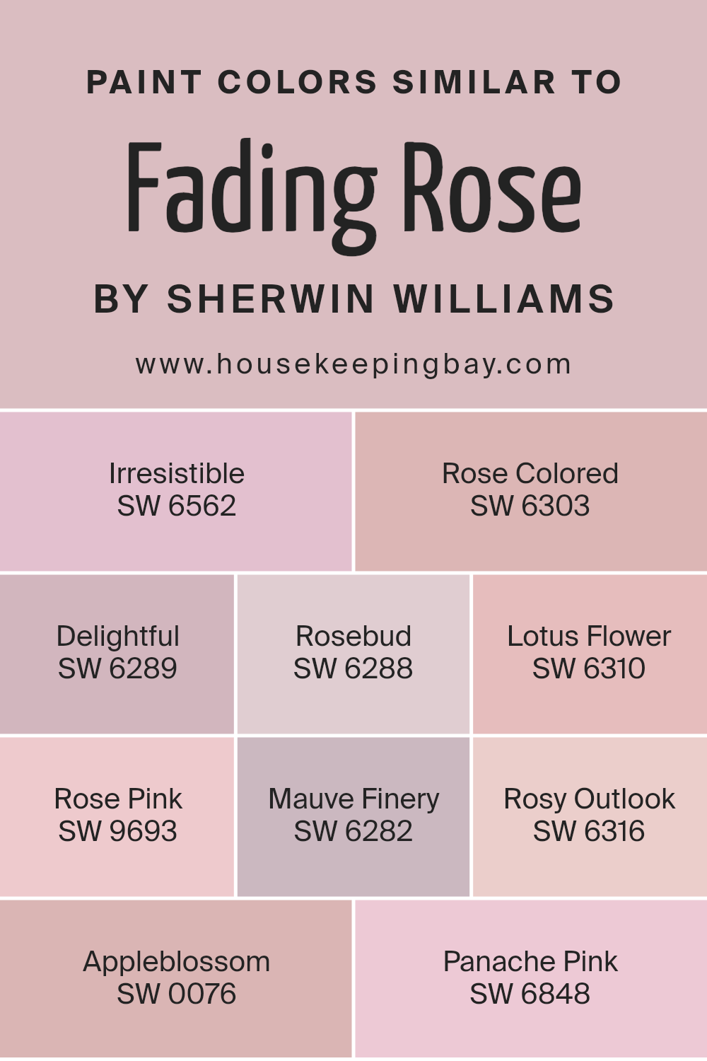
Colors Similar to Fading Rose SW 6296 by Sherwin Williams
Similar colors play an important role in design and decoration. They create a sense of harmony and balance, making spaces feel cohesive. Fading Rose SW 6296 by Sherwin Williams is a lovely, soft pink that exudes warmth and tenderness. Colors like SW 6562 – Irresistible, a rich and warm plum, bring out the deeper tones in Fading Rose, offering a sense of depth.
SW 6303 – Rose Colored shares a fresh, vibrant quality that’s slightly brighter but still complementary. SW 6289 – Delightful offers a soft, gentle pink hue, contributing to a feeling of calm. SW 6288 – Rosebud, with its cheerful quality, brings a touch of brightness without overpowering.
On a slightly lighter note, SW 6310 – Lotus Flower has a gentle softness, perfect for adding a peaceful touch. SW 9693 – Rose Pink introduces a classic pastel element that’s both soothing and elegant. Adding a hint of sophistication, SW 6282 – Mauve Finery presents a delicate mauve that perfectly rounds off the palette.
SW 6316 – Rosy Outlook brings optimism with its fresh, mid-tone pink. SW 0076 – Appleblossom, being slightly creamier, lends warmth that can balance brighter tones, while SW 6848 – Panache Pink adds a subtle flair with its soft, sweet presence.
Together, these colors create a palette that is both inviting and visually pleasing, enhancing any space with their nuanced connections.
You can see recommended paint colors below:
- SW 6562 Irresistible
- SW 6303 Rose Colored
- SW 6289 Delightful
- SW 6288 Rosebud
- SW 6310 Lotus Flower
- SW 9693 Rose Pink
- SW 6282 Mauve Finery
- SW 6316 Rosy Outlook
- SW 0076 Appleblossom
- SW 6848 Panache Pink
housekeepingbay.com
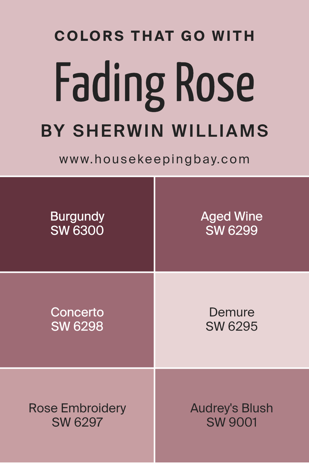
Colors that Go With Fading Rose SW 6296 by Sherwin Williams
Colors that match Fading Rose SW 6296 by Sherwin Williams are essential in creating a harmonious look in any space. They ensure the room feels well-planned and visually balanced. One such color, Burgundy SW 6300, is a deep, rich hue that can add warmth and elegance.
Aged Wine SW 6299 offers a similar deep tone with a softer edge, introducing a subtle hint of rustic charm. Concerto SW 6298 provides a darker, muted undertone, bridging the gap between deeper shades and the pale softness of Fading Rose.
Demure SW 6295 complements Fading Rose with its light, gentle nature, creating a calm and inviting atmosphere. Rose Embroidery SW 6297 brings a bit more depth and complexity, with undertones that echo Fading Rose but in a slightly bolder fashion. Audrey’s Blush SW 9001 rounds out the selection with its delicate, airy presence, lightening the palette while maintaining its cohesive look.
Together, these colors enhance the beauty of Fading Rose and adapt to various styles, whether traditional or modern, classic or contemporary. When used thoughtfully, these shades intertwine seamlessly, ensuring the space feels both inviting and thoughtfully curated.
You can see recommended paint colors below:
- SW 6300 Burgundy
- SW 6299 Aged Wine
- SW 6298 Concerto
- SW 6295 Demure
- SW 6297 Rose Embroidery
- SW 9001 Audrey’s Blush
housekeepingbay.com
How to Use Fading Rose SW 6296 by Sherwin Williams In Your Home?
Fading Rose SW 6296 by Sherwin Williams offers a soft, warm pink tone that can bring a sense of comfort and charm to a home. This color suits bedrooms well, where it creates a cozy, inviting atmosphere. In the living room, it pairs nicely with neutral furniture, adding a touch of warmth without overpowering the space.
It can also work in a nursery, providing a gentle backdrop that feels nurturing and peaceful.
When combined with white or light gray accents, Fading Rose can bring a modern yet classic look to kitchens or dining areas. For an elegant touch, use gold or brass accents to complement this shade, adding a layer of refinement. This color brings a gentle vibrance without overwhelming other design elements, making it versatile for many spaces within a home.
It works well in areas where a soft, welcoming ambiance is desired.
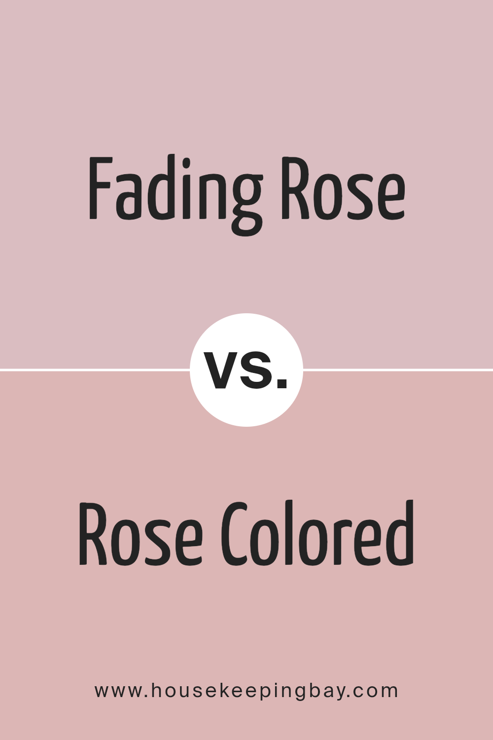
Fading Rose SW 6296 by Sherwin Williams vs Rose Colored SW 6303 by Sherwin Williams
Fading Rose SW 6296 and Rose Colored SW 6303 by Sherwin Williams share a common rose hue but convey different feelings. Fading Rose SW 6296 offers a soft, muted pink with a touch of gray. It feels gentle and understated, perfect for creating a calm, relaxing space. This color works well in bedrooms or living areas where a peaceful atmosphere is desired.
In contrast, Rose Colored SW 6303 is a more vibrant and cheerful shade of pink. It carries a lively and energetic vibe, which can add warmth and brightness to any room. This color is great for spaces where a lively or inviting atmosphere is preferred, such as kitchens or playrooms.
Both colors maintain a sense of warmth through their pink tones, but Fading Rose tends toward subtlety, while Rose Colored brings a more lively presence. They each suit different moods and purposes, allowing for distinct design choices in a home.
You can see recommended paint color below:
- SW 6303 Rose Colored
housekeepingbay.com
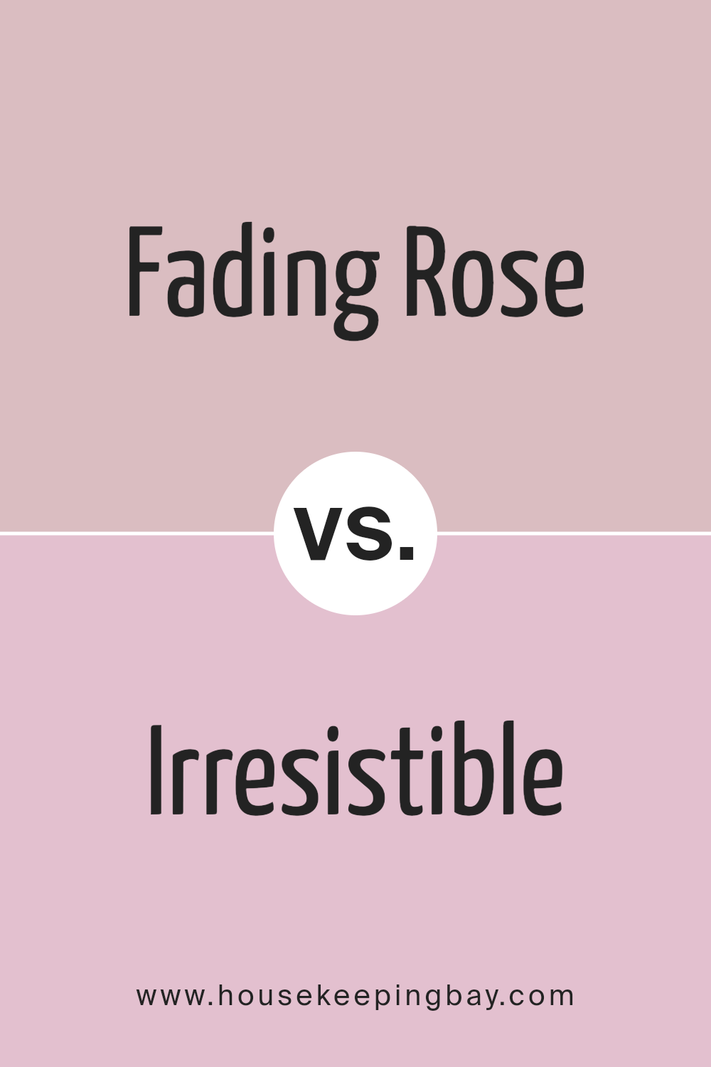
Fading Rose SW 6296 by Sherwin Williams vs Irresistible SW 6562 by Sherwin Williams
Fading Rose SW 6296 and Irresistible SW 6562 are two distinct colors by Sherwin Williams, each bringing its character to decor. Fading Rose is a soft, muted pink with a warm undertone. It evokes a gentle, comforting feeling, making it ideal for spaces seeking a soothing look. Its subtlety allows it to blend effortlessly with neutral palettes, adding a touch of warmth without overwhelming the room.
Irresistible SW 6562 offers a richer, more vibrant pink. This lively shade packs energy and stands out as a statement color. It’s perfect for accent walls or areas where you want to inject a dose of excitement and personality.
The vivid nature of Irresistible gives it a playful edge compared to the calm demeanor of Fading Rose.
When choosing between them, think about the mood you wish to create in your space. Fading Rose whispers soft elegance, while Irresistible confidently pops with boldness.
You can see recommended paint color below:
- SW 6562 Irresistible
housekeepingbay.com
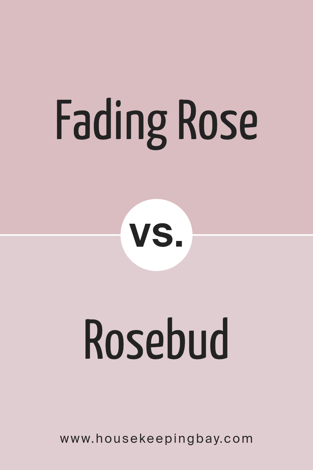
Fading Rose SW 6296 by Sherwin Williams vs Rosebud SW 6288 by Sherwin Williams
Fading Rose SW 6296 is a muted, dusty pink that exudes a soft and gentle vibe. It’s a color that brings a sense of calm and subtle elegance to a space, making it versatile for both contemporary and traditional interiors. Its subdued tone allows it to act as a neutral backdrop, enhancing other design elements without overpowering them.
Rosebud SW 6288, however, is a brighter, more vibrant pink. This shade adds energy and warmth to a room, making it feel lively and cheerful. It’s perfect for accent walls or decor pieces that need to stand out. While Rosebud injects vitality into a room, Fading Rose quietly complements and soothes.
Both colors, though different in intensity, share a rosy base that connects them. Their unique qualities make them suitable for different moods and purposes in interior design, allowing varied expressions of style and personality.
You can see recommended paint color below:
- SW 6288 Rosebud
housekeepingbay.com
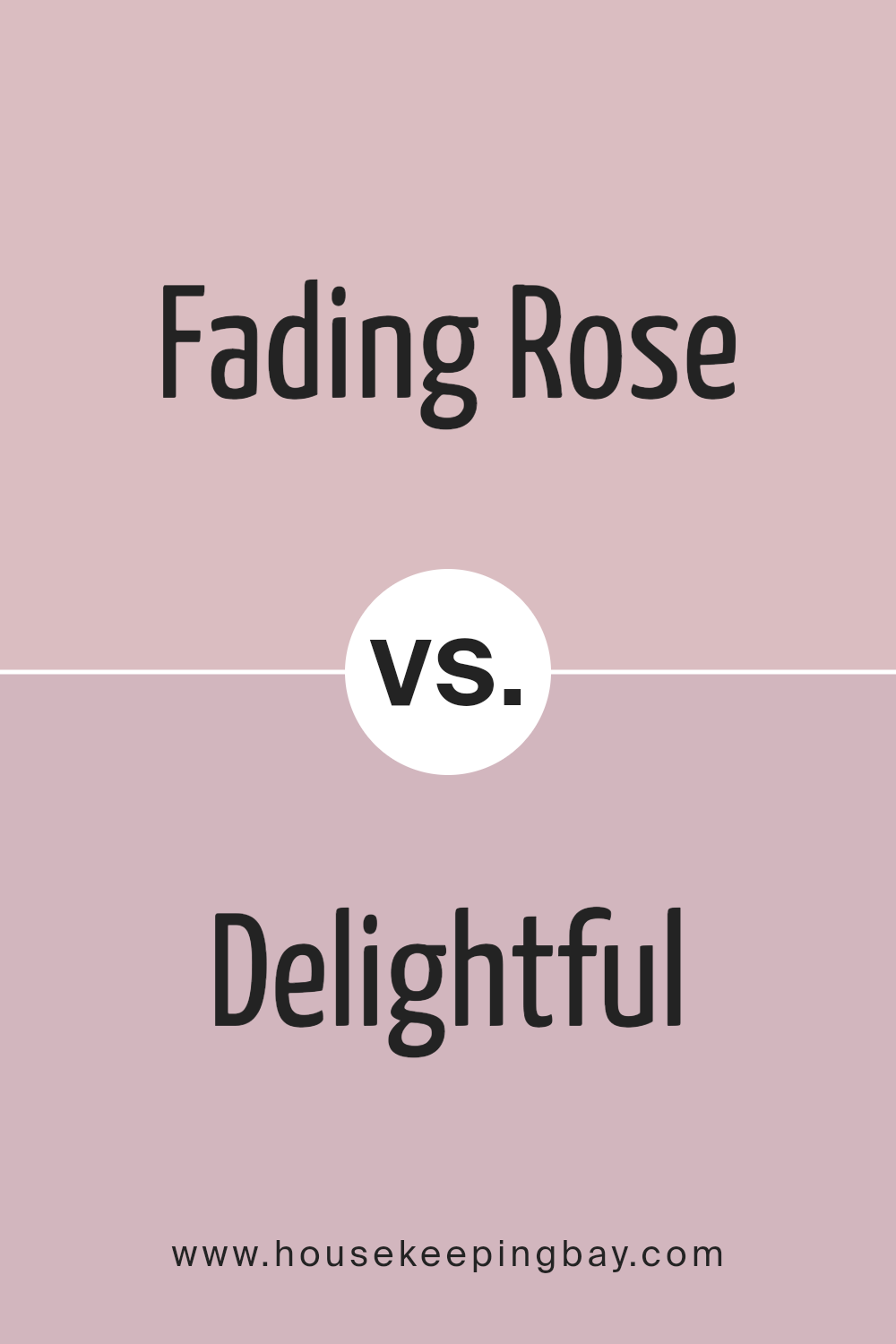
Fading Rose SW 6296 by Sherwin Williams vs Delightful SW 6289 by Sherwin Williams
Fading Rose SW 6296 by Sherwin Williams offers a soft, muted pink hue reminiscent of delicate petals. It feels gentle and warm, infusing spaces with a subtle elegance that doesn’t overwhelm. It’s a comforting choice, suitable for bedrooms or living areas, where relaxation is key.
Delightful SW 6289, in contrast, brings a brighter, more vibrant light purple tone. This color adds energy and playfulness, making it suitable for spaces that benefit from a lively touch. It works well in creative spaces or children’s rooms, where its cheerful appearance encourages imagination.
While Fading Rose creates a serene environment with its understated presence, Delightful excites with a more dynamic atmosphere. Fading Rose harmonizes with neutrals and softer palettes, while Delightful complements bolder colors and adds a fun pop to décor. Each color carries a distinct personality, lending a unique character to any space.
You can see recommended paint color below:
- SW 6289 Delightful
housekeepingbay.com
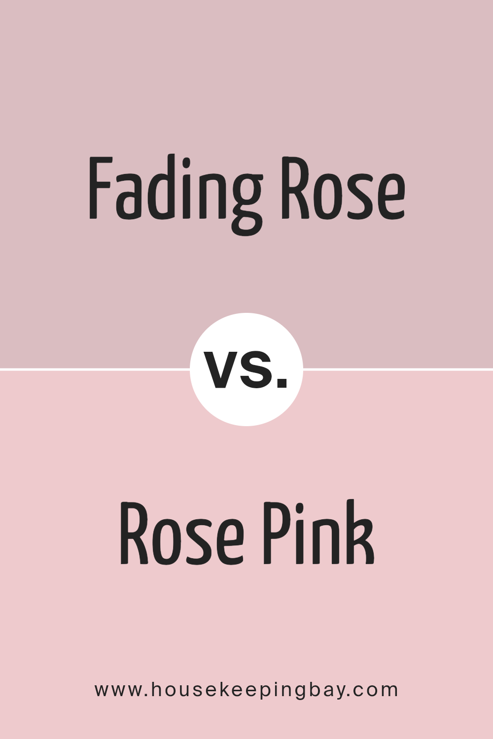
Fading Rose SW 6296 by Sherwin Williams vs Rose Pink SW 9693 by Sherwin Williams
Fading Rose SW 6296 and Rose Pink SW 9693 by Sherwin Williams both offer warm, inviting tones, yet they convey distinct moods. Fading Rose SW 6296 presents a more muted, soft shade of pink, leaning towards a gentle, understated appearance. It has a subtle, vintage charm that can create a cozy, soothing atmosphere, making it ideal for spaces aiming for a calm and relaxed feel.
In contrast, Rose Pink SW 9693 appears brighter and more vibrant. This color brings a youthful, lively energy, perfect for adding a cheerful and fresh touch to any room. It can fill a space with warmth and positivity, making it suitable for areas that benefit from an energetic and uplifting vibe, like a child’s room or a creative workspace.
Both colors can be versatile in their own ways, with Fading Rose lending itself well to traditional or vintage-inspired interiors, while Rose Pink works great in modern and playful settings.
You can see recommended paint color below:
- SW 9693 Rose Pink
housekeepingbay.com
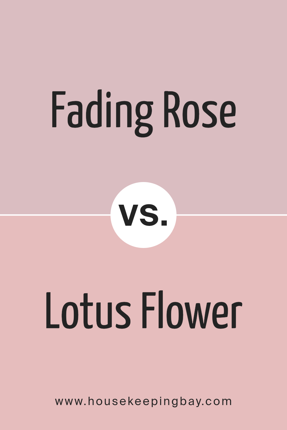
Fading Rose SW 6296 by Sherwin Williams vs Lotus Flower SW 6310 by Sherwin Williams
Fading Rose SW 6296 and Lotus Flower SW 6310 by Sherwin Williams both fall within the soft pink color family, yet each brings a unique feel to a space. Fading Rose is a gentle, muted shade with hints of gray, giving it a more subdued and mature appearance. It often evokes a sense of calm and refinement, making it versatile for various settings, from bedrooms to living rooms. This color tends to create a cozy, welcoming atmosphere.
Lotus Flower, however, carries a more vibrant and lively quality. With its brighter pink tone, Lotus Flower adds cheerfulness and warmth. It can be an excellent choice for spaces where you wish to infuse energy and playfulness, like a child’s room or a creative studio.
Though both colors share a pink base, Fading Rose leans towards sophistication, while Lotus Flower radiates with joy and vibrancy, offering distinct moods to enhance your room.
You can see recommended paint color below:
- SW 6310 Lotus Flower
housekeepingbay.com
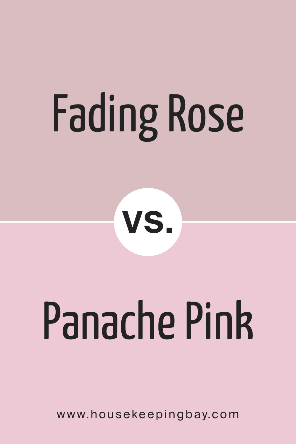
Fading Rose SW 6296 by Sherwin Williams vs Panache Pink SW 6848 by Sherwin Williams
Fading Rose SW 6296 and Panache Pink SW 6848 by Sherwin Williams offer distinct pink hues that bring warmth and charm to spaces. Fading Rose has a soft, muted tone, exuding a gentle and soothing atmosphere. It leans towards a dusty pink, making it a versatile choice for creating a calm and inviting ambiance. This color pairs well with neutral shades, enhancing its understated elegance.
Panache Pink, however, comes with more vibrancy and energy. It’s a bright, lively pink that adds a cheerful and playful touch to any room. This color is perfect for those looking to make a bolder statement. It works beautifully in spaces where you want to add a pop of color and catch the eye.
While Fading Rose feels serene and subtle, Panache Pink brings excitement and vigor. Both colors have their unique appeal, suitable for varying moods and styles in home decor.
You can see recommended paint color below:
- SW 6848 Panache Pink
housekeepingbay.com
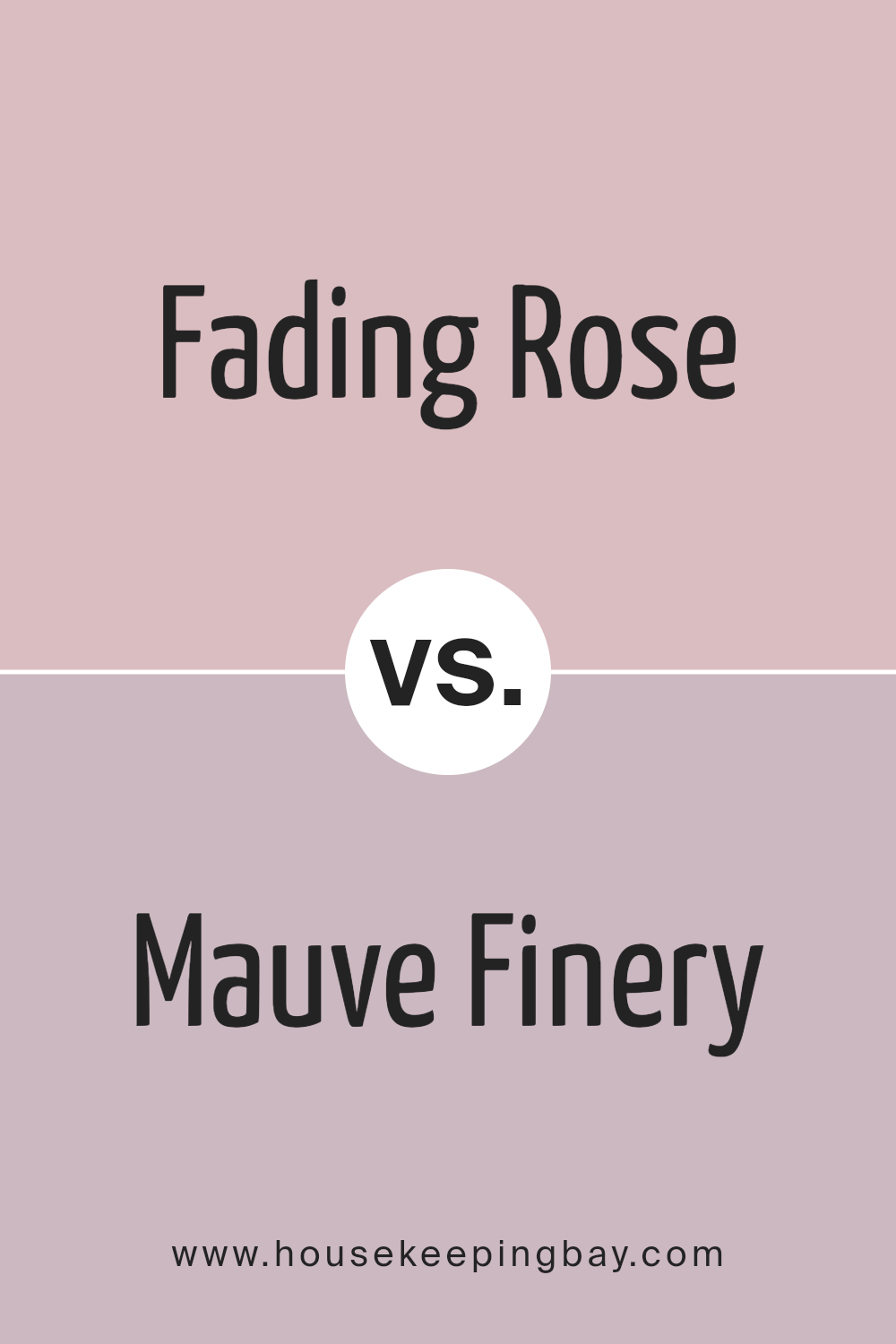
Fading Rose SW 6296 by Sherwin Williams vs Mauve Finery SW 6282 by Sherwin Williams
Fading Rose SW 6296 and Mauve Finery SW 6282 are two colors by Sherwin Williams that offer unique vibes. Fading Rose is a soft blend of pink and beige, creating a warm and inviting feel. It carries a gentle, romantic tone, perfect for adding warmth and comfort to spaces like living rooms or bedrooms. This color can make a room feel cozy and nurturing, with its soft, muted quality.
Mauve Finery SW 6282, on the other hand, leans more towards a violet hue, offering a cooler, more sophisticated look. This shade adds a touch of elegance and depth, suitable for areas where a more refined atmosphere is desired, such as dining rooms or studies. It provides a sense of calm and relaxation, with its subtle purple undertone.
Both colors offer unique aesthetic qualities, with Fading Rose delivering warmth and Mauve Finery providing a subtle, regal touch.
You can see recommended paint color below:
housekeepingbay.com
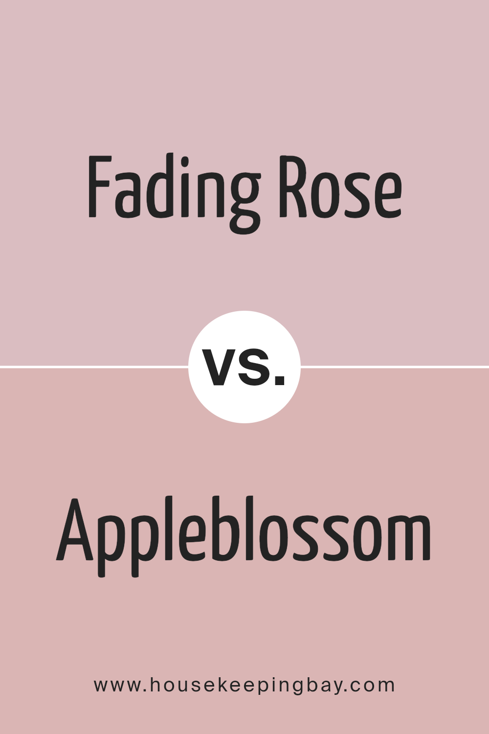
Fading Rose SW 6296 by Sherwin Williams vs Appleblossom SW 0076 by Sherwin Williams
Fading Rose SW 6296 and Appleblossom SW 0076, both by Sherwin Williams, offer unique vibes for spaces. Fading Rose presents a soft, muted pink. It gives off a gentle, calming aura, ideal for creating soothing atmospheres. Often seen in bedrooms or reading nooks, this color promotes a sense of peace due to its subtle hue.
Appleblossom, however, leans toward a warm, slightly peachy tone. This color holds more warmth, bringing a cozy, inviting feel to spaces. Perfect for living rooms or dining areas, Appleblossom encourages social interaction and friendly vibes.
Side by side, Fading Rose has a calmer, more subdued character, while Appleblossom radiates a warmer, friendlier presence. Both colors suit different needs: Fading Rose for quiet, restful spaces and Appleblossom for areas needing warmth and energy. Selecting between the two depends on the desired mood and purpose of the room.
You can see recommended paint color below:
- SW 0076 Appleblossom
housekeepingbay.com
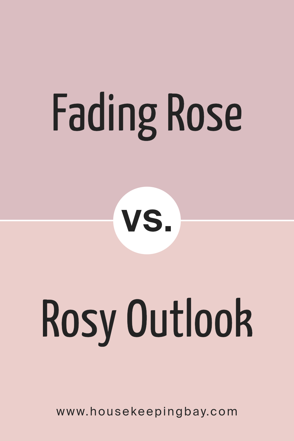
Fading Rose SW 6296 by Sherwin Williams vs Rosy Outlook SW 6316 by Sherwin Williams
Fading Rose SW 6296 and Rosy Outlook SW 6316, both by Sherwin Williams, provide soothing and warm palettes, yet each color holds its unique charm. Fading Rose offers a muted, dusty pink tone that evokes a sense of vintage elegance. It works well in spaces aiming for a gentle, nostalgic ambiance. Its understated presence makes it versatile for pairing with both bold and neutral accents.
Rosy Outlook, by contrast, brings a brighter, livelier pink. This color injects energy and optimism into a room, ideal for creating cheerful and inviting settings. It easily becomes the focal point in a space, setting a happy mood.
While Fading Rose tends to lean towards a subtle sophistication, making it perfect for cozy nooks or serene bedrooms, Rosy Outlook is about infusing life and light, suitable for spaces needing a more vibrant and uplifting touch.
Both colors brighten spaces but in their unique styles.
You can see recommended paint color below:
- SW 6316 Rosy Outlook
housekeepingbay.com
Conclusion
I find this color exudes a gentle warmth that instills comfort and coziness in any room. With its soft, muted undertones, Fading Rose creates an inviting atmosphere, making spaces feel welcoming and serene. I appreciate how it complements various design styles, from classic to contemporary, providing versatility in any setting.
The subtle pink hue is not overpowering; it delicately enhances the ambiance of a space without overwhelming it. It brings a touch of elegance and sophistication, allowing other decor elements to shine while maintaining its charming presence.
I can see how this shade would be a great choice for bedrooms or living rooms, where creating a relaxing environment is crucial.
In addition, Fading Rose pairs well with a range of colors, offering numerous opportunities for creativity in coordinating accents and furnishings. Whether it is matched with neutrals or bolder shades, it integrates seamlessly, offering a cohesive look.
Overall, SW 6296 Fading Rose embodies a blend of charm and subtlety, making it a wonderful choice for those aiming to add warmth and style to their spaces. This color truly enhances the mood of any room, offering a perfect balance between understated beauty and welcoming comfort.

housekeepingbay.com
Ever wished paint sampling was as easy as sticking a sticker? Guess what? Now it is! Discover Samplize's unique Peel & Stick samples. Get started now and say goodbye to the old messy way!
Get paint samples


