Espresso Bark CSP-390 by Benjamin Moore
A Warm and Welcoming Hue for Any Space
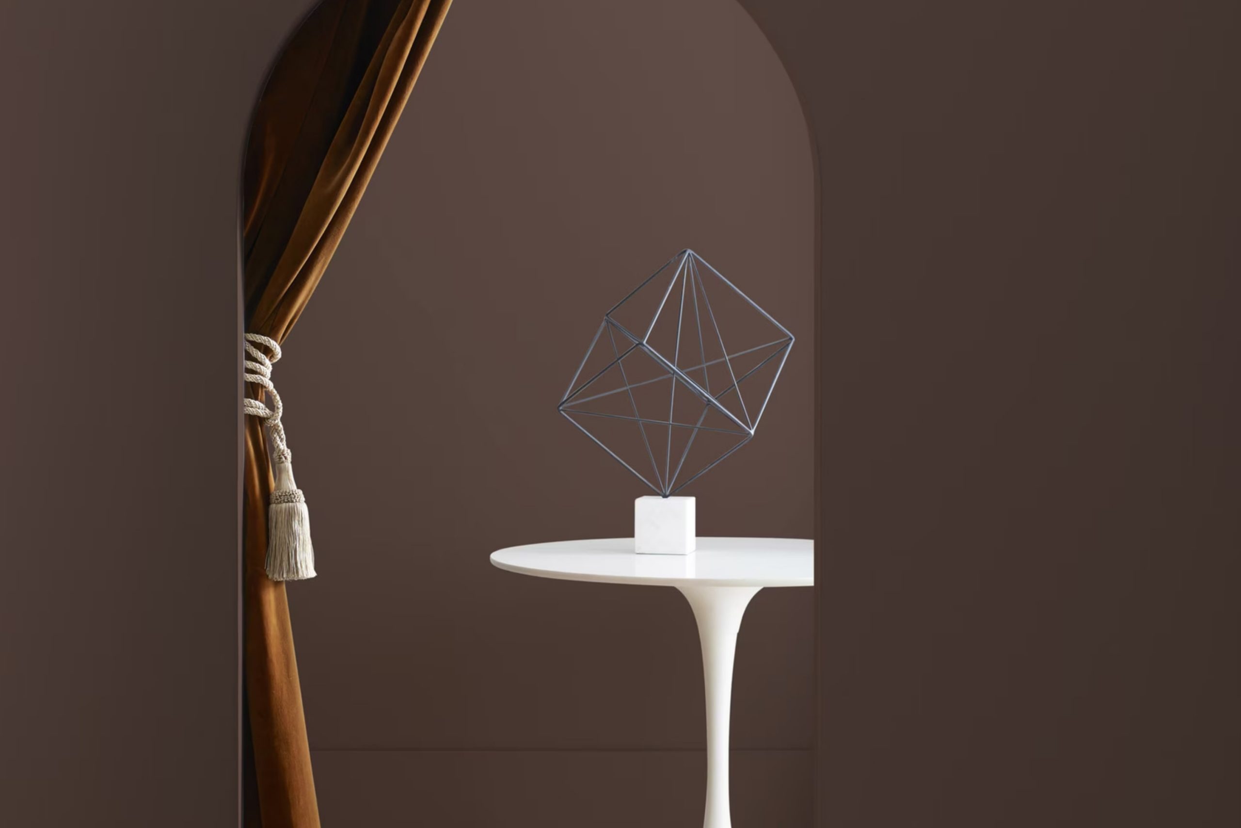
When you think about the perfect rich brown for your home, CSP-390 Espresso Bark by Benjamin Moore might just be the answer. It’s a deep, warm color that brings a sense of coziness to any space. Picture the comforting shade of your favorite espresso drink, and you’ll have a good idea of its visual effect.
Espresso Bark is wonderfully adaptable, working well in a variety of settings. Whether you’re aiming for a modern look or a more traditional style, this color complements different decors with ease.
It adds a touch of sophistication without being overwhelming. You can use it on an accent wall to create depth in a room or cover a larger area for a bolder statement.
If you’ve been wanting to add a bit of richness and depth to your home, consider giving it a try. It pairs beautifully with lighter shades and textures, allowing for creativity in design choices.
Whether you’re freshening up a living room, dining area, or even a study, the warmth of Espresso Bark can turn an ordinary space into a welcoming retreat.
via benjaminmoore.com
What Color Is Espresso Bark CSP-390 by Benjamin Moore?
Table of Contents
Espresso Bark CSP-390 by Benjamin Moore is a deep, rich brown that exudes warmth and sophistication. This earthy tone resembles the color of dark espresso beans, providing a sense of comfort and coziness in any space. It’s a versatile color that works well across various interior design styles.
In traditional settings, Espresso Bark adds depth and elegance. It pairs beautifully with classic wood furnishings, like mahogany or walnut, creating a timeless environment. For contemporary spaces, this color can ground a room filled with sleek, modern furniture. It contrasts well with lighter colors, such as creamy whites or soft grays, creating balance and interest.
Espresso Bark fits perfectly in rustic interiors, blending effortlessly with natural elements like stone, leather, and distressed wood. It enhances the warm, welcoming atmosphere typical of these spaces.
For a more industrial look, pair Espresso Bark with metal accents and concrete textures. Its rich tone complements exposed pipes and brick walls, adding warmth to the often stark and cool industrial palette.
In terms of materials, Espresso Bark works well with textiles like plush velvets and soft wools, which enhance the cozy feeling. It also pairs nicely with metallics, like brushed brass or copper, which add a touch of luxury.
housekeepingbay.com
Is Espresso Bark CSP-390 by Benjamin Moore Warm or Cool color?
Espresso Bark (CSP-390) by Benjamin Moore is a deep, rich brown paint. This color, inspired by the earthy tones of natural espresso, adds a sense of coziness and warmth to any home interior. When used on walls, it creates an inviting space that feels grounded and secure. It’s perfect for living rooms or dens where a snug atmosphere is desired.
This dark brown can also work well in dining rooms, lending a sophisticated air that enhances mealtime gatherings.
Espresso Bark pairs well with lighter colors, creating a balanced and harmonious look. For instance, it complements white trim or light-colored furniture, adding a touch of contrast without being overwhelming. Moreover, it highlights textures effortlessly, making it an excellent backdrop for wood furnishings or leather accents.
It works well with both traditional and modern styles, offering versatility and timeless appeal. Overall, Espresso Bark brings depth and comfort, making home spaces more welcoming and stylish.
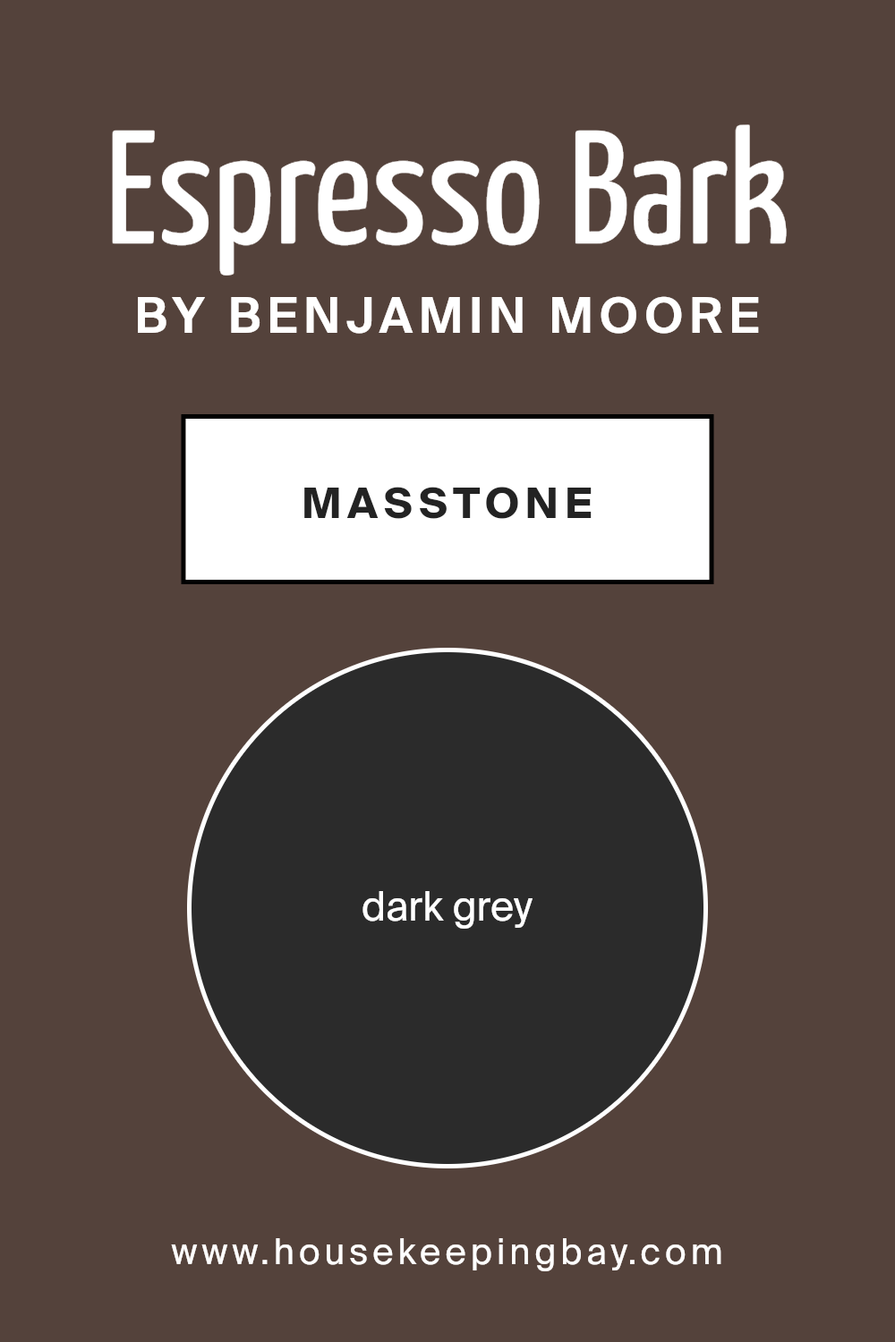
What is the Masstone of the Espresso Bark CSP-390 by Benjamin Moore?
Espresso Bark CSP-390 by Benjamin Moore is a deep, dark grey color, perfect for creating a bold look in your home. Its rich hue lends an air of sophistication, making it suitable for various settings. Dark grey, like this one, adds depth and can act as a neutral backdrop, allowing other design elements to stand out.
In living rooms or bedrooms, it creates a cozy, intimate atmosphere. When used in a study or library, it sets a serious, focused mood that helps with concentration.
This color pairs well with lighter accents, such as whites or creams, for a balanced effect that prevents the space from feeling too dark. Accessories in metallic tones or vibrant colors can add a bit of contrast, bringing out the richness of the grey. Espresso Bark is versatile and works with modern or classic styles, making it a great choice for those looking to update their interiors.
housekeepingbay.com
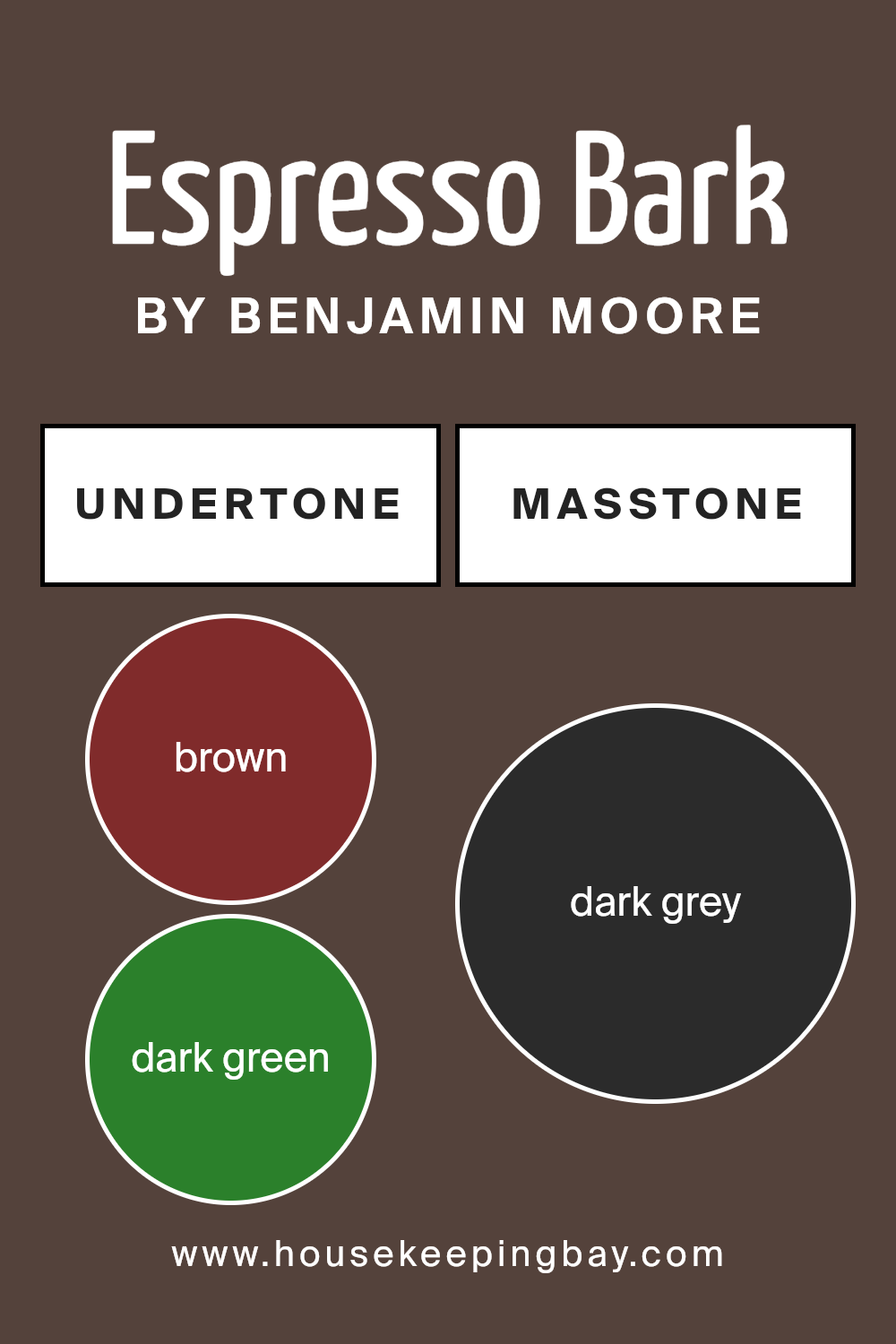
Undertones of Espresso Bark CSP-390 by Benjamin Moore
Espresso Bark CSP-390 by Benjamin Moore is a rich and complex color that carries multiple undertones, each contributing to the overall perception of the hue. This particular shade includes undertones of brown, dark green, olive, navy, purple, dark turquoise, and grey. These undertones can significantly alter how we perceive the color, depending on the lighting and surrounding decor.
Undertones are subtle hints of color that appear beneath the main color. They become more noticeable when viewed under different lighting or next to other colors. In Espresso Bark CSP-390, the brown undertone adds warmth and earthiness, making it feel grounded and comforting.
The dark green and olive bring a natural element, adding a touch of the outdoors and promoting a sense of calm. The navy and purple undertones introduce depth, making the color appear more sophisticated and luxurious. Dark turquoise and grey add a modern edge, lending a slightly cool and balanced vibe.
When used on interior walls, these undertones create a dynamic effect. In bright light, the color might lean towards its navy or purple side, giving a dramatic and elegant feel.
In dimmer settings, the brown and green become more prominent, offering warmth and coziness. Overall, Espresso Bark evokes a versatile and multi-dimensional atmosphere, making spaces feel both inviting and stylish.
housekeepingbay.com
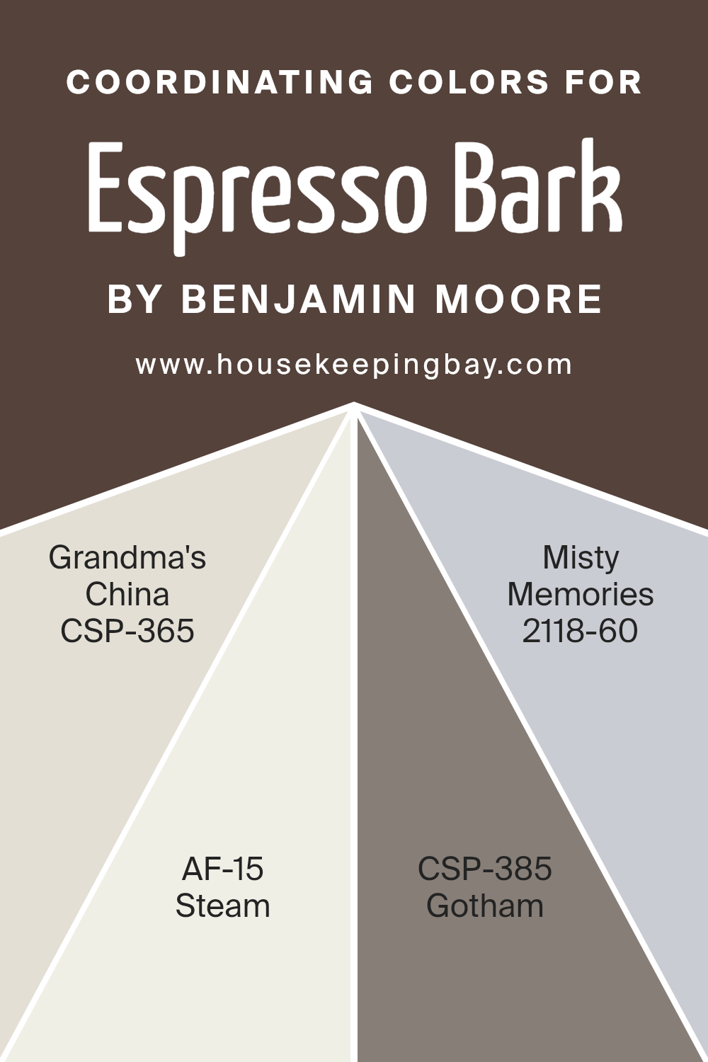
Coordinating Colors of Espresso Bark CSP-390 by Benjamin Moore
Coordinating colors are hues that go well together, creating a balanced and visually appealing look. They work by complementing each other, either through contrast or similarity in tone, to enhance the overall aesthetic of a space.
When working with Espresso Bark CSP-390 by Benjamin Moore, it’s important to choose colors that harmonize with its rich, deep brown shade. This approach results in a cohesive design that feels well-planned and harmonious.
One excellent coordinating color is Grandma’s China CSP-365. It is a lovely soft blue, offering a gentle contrast to Espresso Bark’s darker hue.
AF-15, known as Steam, is a delicate off-white with a hint of warmth, perfect for bringing lightness and softening the intensity of the darker brown.
Gotham CSP-385 is a sophisticated mid-tone gray that provides a modern and muted backdrop. Finally, Misty Memories 2118-60 is a light gray with a whisper of lavender, adding a subtle touch of color while keeping the mood calm. Together, these colors create an atmosphere that feels inviting and well-balanced, perfect for any interior where you want a timeless and well-coordinated look.
You can see recommended paint colors below:
- CSP-365 Grandma’s China
- AF-15 Steam
- CSP-385 Gotham
- 2118-60 Misty Memories
housekeepingbay.com
How Does Lighting Affect Espresso Bark CSP-390 by Benjamin Moore?
Lighting plays a crucial role in how we see colors. The type and direction of light can change the appearance of a color in a room. Let’s look at the specifics of how the color Espresso Bark CSP-390 by Benjamin Moore behaves under different lighting conditions.
Espresso Bark is a rich, deep brown with warm undertones. Under artificial lighting, such as LED or incandescent bulbs, this color can appear warmer due to the yellow tones in these lights. It might take on a cozy, inviting feel, perfect for creating a comfortable atmosphere in living rooms or bedrooms.
However, in cooler artificial lighting, like fluorescent lights, the color could look slightly duller or less vibrant.
Natural light varies during the day and with the direction it comes from. In north-facing rooms, which receive less direct sunlight, colors often appear cooler and muted.
Espresso Bark in such a room might look a bit more subdued, highlighting its deep, earthy qualities without too much warmth.
In contrast, south-facing rooms get an abundance of natural light throughout the day. This light tends to be warm and bright, which can enhance the warmth in Espresso Bark, making it seem richer and more inviting. The color can look more vibrant and lively in these conditions.
East-facing rooms receive bright, cool light in the morning. This early light might make Espresso Bark appear slightly cooler and less intense at the start of the day, while as the day progresses, and the light softens, the color might warm up.
West-facing rooms have the opposite effect. They get softer, more intense light in the afternoon. In these rooms, Espresso Bark can start the day appearing soft and deepen to a rich, comforting shade as the afternoon light hits, enhancing its warm, chocolatey tones.
Understanding these effects can help you choose the right lighting and room orientation for your chosen color palette.
housekeepingbay.com
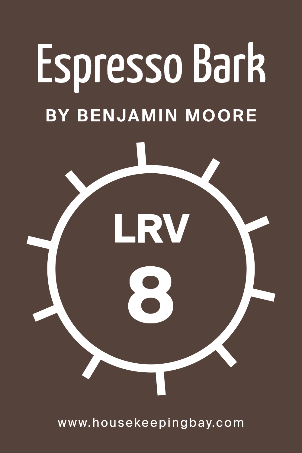
What is the LRV of Espresso Bark CSP-390 by Benjamin Moore?
LRV, or Light Reflectance Value, measures the amount of light a color reflects. It’s a number between 0 and 100, where 0 means the color reflects no light at all (pure black) and 100 means it reflects all light (pure white). In simpler terms, LRV tells us how light or dark a color will appear when applied to a surface.
A lower LRV means the color is darker and absorbs more light, while a higher LRV means the color is lighter and reflects more light back into the room. This value is crucial in helping you understand how a color will look in different lighting conditions, whether it’s natural daylight or artificial lighting.
Espresso Bark CSP-390 by Benjamin Moore has an LRV of 8.18, meaning it’s a dark, rich color. With its low LRV, this shade will absorb a lot of light, making it ideal for creating a cozy, intimate atmosphere in a room.
Instead of bouncing light around, it will make the space feel warmer and more enveloping.
This color is perfect for rooms that can handle deeper tones, such as a study or living room where a sense of comfort is desired.
Because it doesn’t reflect much light, Espresso Bark won’t seem overwhelming or too bright, even in brightly lit spaces. However, in dimly lit rooms, it can make the space feel even darker, so it’s important to consider the amount of natural light a room receives when choosing this color.
housekeepingbay.com
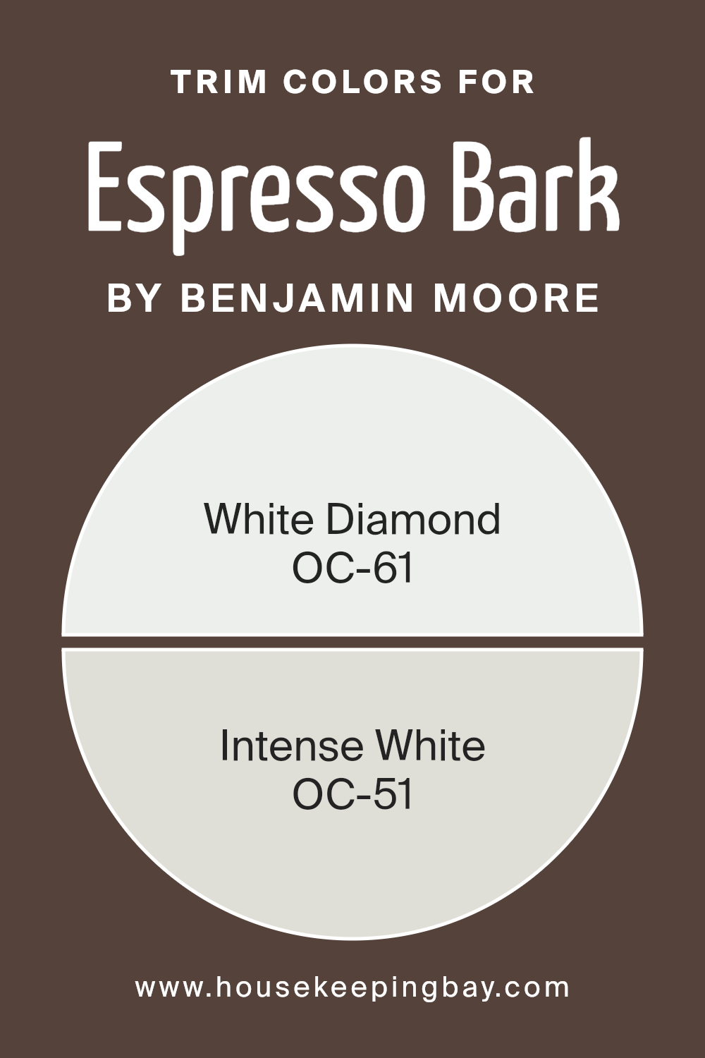
What are the Trim colors of Espresso Bark CSP-390 by Benjamin Moore?
Trim colors are the shades used on the edges and borders of a room, such as moldings, baseboards, and door frames. They play a crucial role in accentuating the main wall color and providing a clean, polished look to the overall design.
For a rich and deep color like Espresso Bark CSP-390 by Benjamin Moore, trim colors help to outline and enhance the strong hues, offering balance and contrast.
White trim provides a crisp, clean edge that can brighten the space and highlight the depth of the dark wall color. Using a well-chosen trim color enhances the wall color, completing the room’s look with sophistication and style.
White Diamond OC-61, a delicate, pale white, has a slight cool undertone, which creates a fresh, subtle contrast against the robust Espresso Bark.
It adds brightness without overpowering the depth of the main color. Intense White OC-51 offers a soft, muted tone with an off-white quality, bringing warmth and softness alongside the richness of Espresso Bark. Together, these trim colors offer different moods, with White Diamond providing crispness and Intense White adding a gentler touch, both emphasizing Espresso Bark’s deep elegance.
You can see recommended paint colors below:
- OC-61 White Diamond
- OC-51 Intense White
housekeepingbay.com
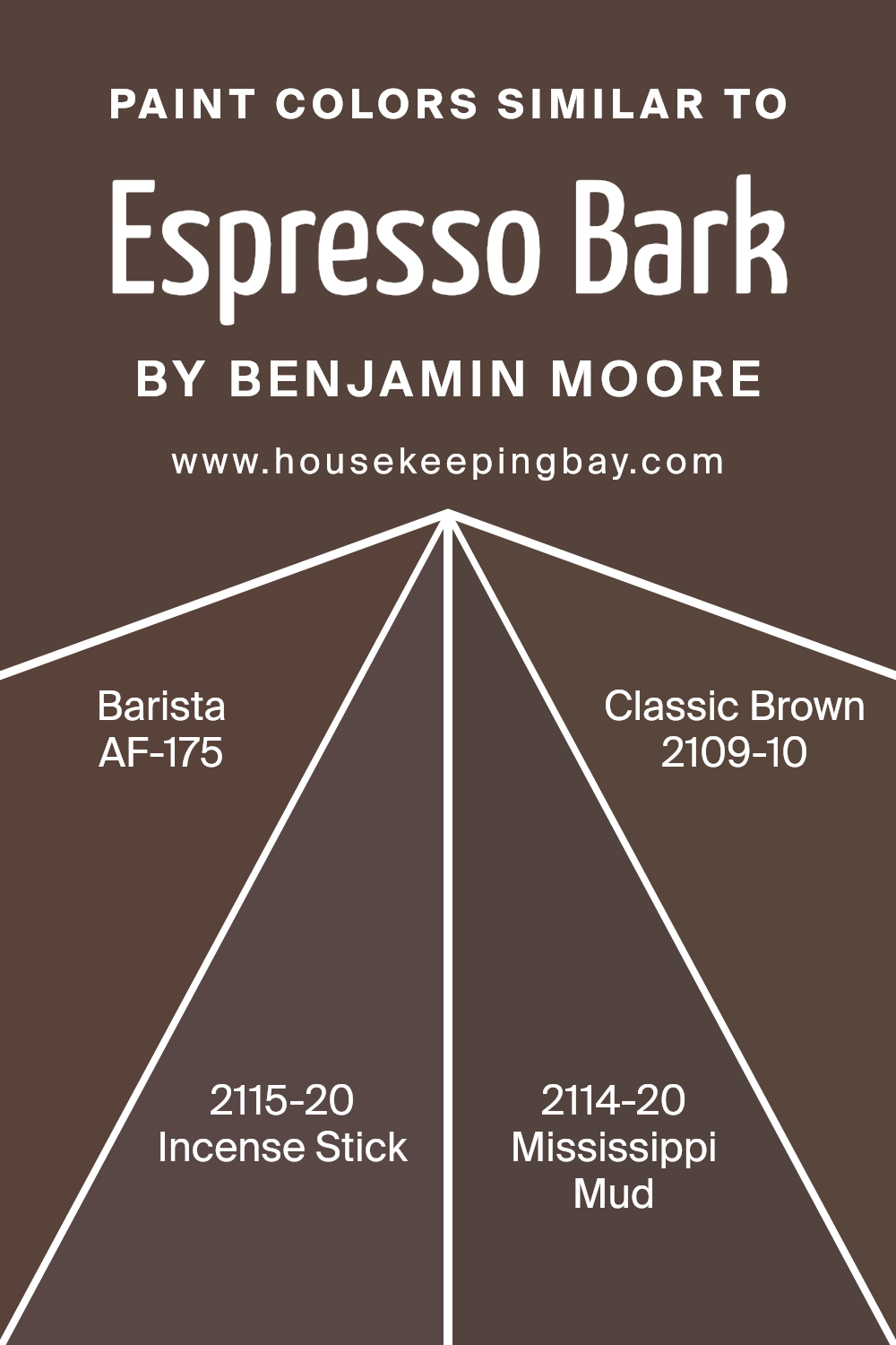
Colors Similar to Espresso Bark CSP-390 by Benjamin Moore
Similar colors offer a harmonious and cohesive look, making them perfect for creating a consistent and soothing environment. In the Benjamin Moore palette, Espresso Bark CSP-390 is a rich, deep brown, and its similar colors complement and enhance this hue.
AF-175, Barista, is a warm and inviting shade, reminiscent of freshly brewed coffee, bringing a cozy and rich feel to any room. This color has a calming presence, making spaces feel grounded and balanced.
2115-20, Incense Stick, adds a touch of mystery and depth. Its dark, earthy tone can create an intimate setting, inviting relaxation. 2114-20, Mississippi Mud, is a softer brown with subtle undertones of gray. This hue is versatile, adapting to various design schemes and adding warmth.
Lastly, 2109-10, Classic Brown, is a timeless color choice. Its deep, saturated tones provide solidity and a touch of sophistication to interiors.
Together, these colors create a palette that is both comforting and elegant, allowing spaces to feel cohesive and well-thought-out.
Using similar colors in design can seamlessly blend elements of a space, making everything feel like part of a whole while adding depth and richness to the visual experience.
You can see recommended paint colors below:
- AF-175 Barista
- 2115-20 Incense Stick
- 2114-20 Mississippi Mud
- 2109-10 Classic Brown
housekeepingbay.com
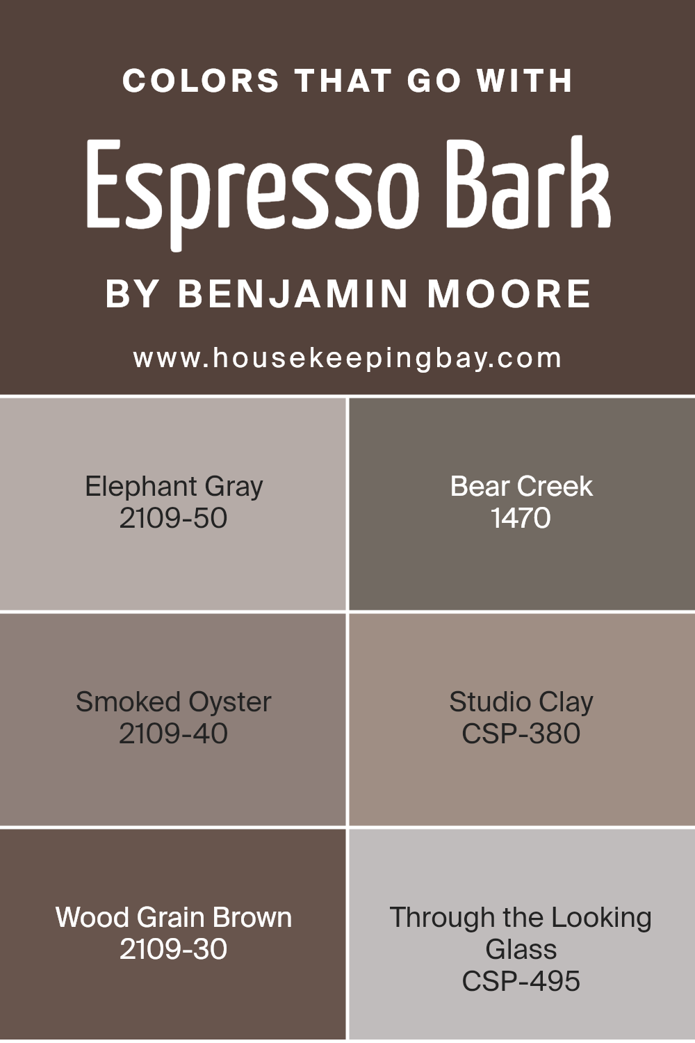
Colors that Go With Espresso Bark CSP-390 by Benjamin Moore
Choosing colors that complement Espresso Bark CSP-390 by Benjamin Moore is important as they help create a harmonious environment and enhance the mood of a space. Elephant Gray 2109-50, with its soft and muted tones, brings a calming balance, making it perfect for pairing with the rich, dark espresso shade.
Bear Creek 1470, with its earthy brown hues, adds warmth and depth, enhancing the cozy feel of your room. Smoked Oyster 2109-40, a soft plum-gray, introduces a hint of sophisticated elegance and style, bringing a subtle contrast that enriches the overall palette.
Studio Clay CSP-380 offers a subtle, grounded tone that works well with Espresso Bark, lending an inviting and comforting atmosphere. Wood Grain Brown 2109-30 delivers a sense of richness, drawing out the warm undertones in Espresso Bark and creating a unified look.
Through the Looking Glass CSP-495 provides a light, ethereal quality with its cool blue shades, which can offer a refreshing counterpoint to the darker espresso tones, bringing in a breath of fresh style.
Altogether, these colors create a balanced and visually appealing design, ensuring your space feels both stylish and comfortable.
You can see recommended paint colors below:
- 2109-50 Elephant Gray
- 1470 Bear Creek
- 2109-40 Smoked Oyster
- CSP-380 Studio Clay
- 2109-30 Wood Grain Brown
- CSP-495 Through the Looking Glass
housekeepingbay.com
How to Use Espresso Bark CSP-390 by Benjamin Moore In Your Home?
Espresso Bark CSP-390 by Benjamin Moore is a rich, deep brown paint that adds warmth and depth to any room. This color can work beautifully in various spaces within a home. In a living room, it creates a cozy and inviting atmosphere, making it ideal for gatherings with friends and family. Pair it with lighter furniture to balance the richness of the paint, ensuring the room feels both open and comfortable.
In a bedroom, Espresso Bark provides a sense of intimacy and relaxation. Use it on an accent wall to add character and make the space feel more personal. It works well with soft linens and metallic or wooden accents.
For kitchens or dining areas, Espresso Bark can lend a touch of elegance. Consider using it on cabinetry or a feature wall to create a sophisticated look. The color pairs nicely with neutral tones, such as whites and creams, or with complementary hues like deep reds or greens.
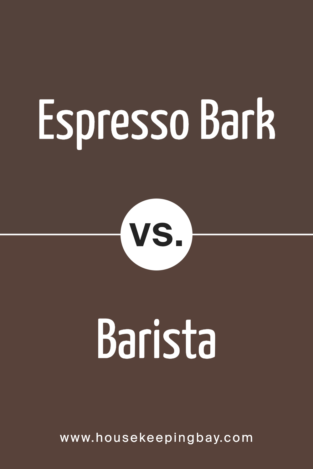
Espresso Bark CSP-390 by Benjamin Moore vs Barista AF-175 by Benjamin Moore
Espresso Bark CSP-390 and Barista AF-175, both by Benjamin Moore, are rich, earthy colors with distinct qualities. Espresso Bark is a deep, dark brown, reminiscent of coffee beans or dark chocolate. It exudes warmth and a sense of coziness, perfect for creating an intimate atmosphere in a room. Its rich tone makes it ideal for accent walls or furniture, bringing depth without overwhelming.
Barista AF-175, while also a brown shade, is slightly lighter and warmer compared. It has a hint of softness that gives a more inviting and approachable feel. This color works well in spaces where a welcoming vibe is desired, complementing various design styles easily.
Together, both colors can be part of a cohesive color scheme, with Espresso Bark providing depth and Barista adding warmth. Whether used separately or in combination, their rich brown tones create sophisticated, natural spaces.
You can see recommended paint color below:
- AF-175 Barista
housekeepingbay.com
Espresso Bark CSP-390 by Benjamin Moore vs Incense Stick 2115-20 by Benjamin Moore
Espresso Bark CSP-390 by Benjamin Moore is a deep, rich brown with subtle warmth. It evokes the look of dark espresso beans, providing a sense of coziness and grounding. This color works well for creating a sophisticated, intimate atmosphere, suitable for living rooms or libraries where you want a warm and inviting space.
Incense Stick 2115-20 by Benjamin Moore, though also a brown, carries a different character. It leans more towards a mid-tone brown with a hint of taupe, making it seem lighter and softer. This hue can introduce comfort and earthiness to a room while keeping it airy and bright.
Both colors offer unique personalities; Espresso Bark feels classic and elegant, while Incense Stick offers a calming simplicity. Pairing them can create dynamic contrast, with the deeper shade adding depth and the lighter tone bringing balance, suitable for diverse design styles in any room needing warmth and charm.
You can see recommended paint color below:
- 2115-20 Incense Stick

housekeepingbay.com
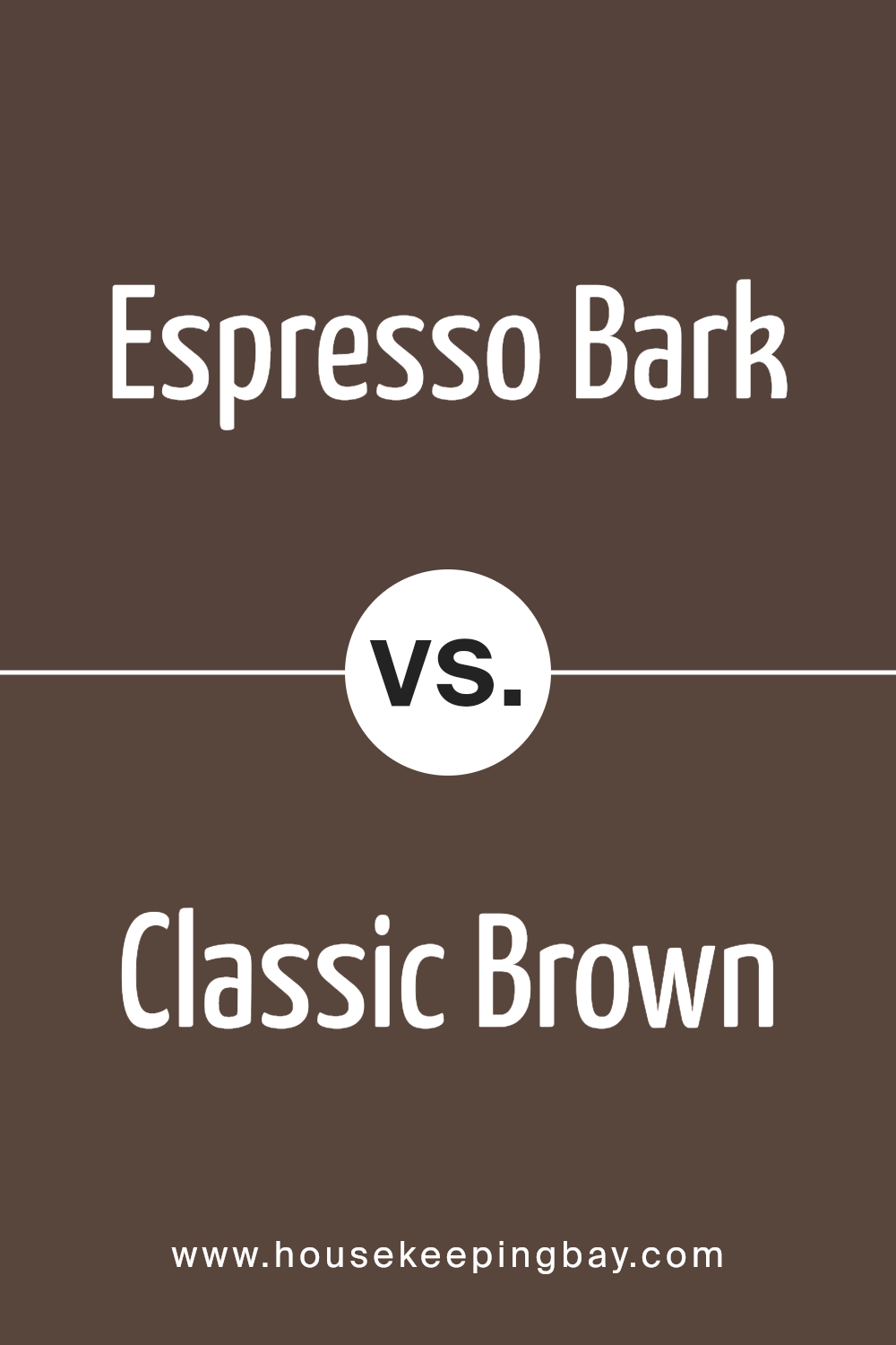
Espresso Bark CSP-390 by Benjamin Moore vs Classic Brown 2109-10 by Benjamin Moore
Espresso Bark CSP-390 and Classic Brown 2109-10 by Benjamin Moore both offer rich, deep brown tones, but they differ slightly in their undertones and overall vibe. Espresso Bark is a very dark brown with subtle warm undertones, giving it a cozy and inviting feel. It’s a shade that can add sophistication to any space, making it perfect for accent walls or furniture pieces where you want a touch of elegance.
Classic Brown, meanwhile, is also a deep brown but tends to lean slightly more towards a traditional chocolate brown. This color has a timeless quality, making it versatile for various styles, from classic to modern. It feels grounded and stable, easy to coordinate with a wide range of other colors.
While both shades are dark and luxurious, Espresso Bark has a touch more warmth, whereas Classic Brown offers a classic, more traditional depth. They both bring a sense of richness to a room without overwhelming it.
You can see recommended paint color below:
- 2109-10 Classic Brown
housekeepingbay.com
Espresso Bark CSP-390 by Benjamin Moore vs Mississippi Mud 2114-20 by Benjamin Moore
Espresso Bark CSP-390 and Mississippi Mud 2114-20 by Benjamin Moore offer rich, deep shades, perfect for creating warmth in a room. Espresso Bark CSP-390 is a deep, dark brown with a hint of warmth, resembling the rich color of dark coffee. It adds a sophisticated, elegant touch to any space and works well for accent walls or furniture.
Mississippi Mud 2114-20, meanwhile, is also a dark brown but leans more towards earthy tones. It has a muted, softer appearance compared to the richness of Espresso Bark. Mississippi Mud seems more grounded, providing a cozy, inviting feel to interiors.
While both colors evoke a sense of coziness and depth, Espresso Bark brings a more luxurious vibe with its darker, more intense tone, whereas Mississippi Mud offers a comfortable, earth-like warmth, making it feel homier. Both can add character and charm to a room, depending on the desired mood.
You can see recommended paint color below:
- 2114-20 Mississippi Mud
housekeepingbay.com
Conclusion
CSP-390 Espresso Bark by Benjamin Moore is a rich and sophisticated paint color that adds warmth and depth to any space. I appreciate its ability to create an inviting atmosphere, making it a great choice for living rooms, dining areas, or even an accent wall in a bedroom.
Its deep brown shade provides a neutral foundation that pairs well with a variety of other colors, allowing for flexibility in interior design.
I find that Espresso Bark brings a sense of coziness and elegance to rooms. It works harmoniously with both modern and traditional decor styles, offering a versatile option for homeowners looking to enhance their interiors.
The color’s deep tones can also serve to highlight architectural features, bringing attention to details often overlooked.
This color is more than just a backdrop; it can stand out on its own. Whether accented with lighter hues for a balanced look or combined with bold colors for a dramatic effect, it offers plenty of opportunities for creativity. I also appreciate its durability, as it maintains its richness over time.
In my opinion, CSP-390 Espresso Bark by Benjamin Moore not only beautifies spaces but also contributes to the overall mood and feel of a room. It’s a choice that leaves a lasting impression, whether used in small touches or as the primary color throughout an area.
housekeepingbay.com
Ever wished paint sampling was as easy as sticking a sticker? Guess what? Now it is! Discover Samplize's unique Peel & Stick samples. Get started now and say goodbye to the old messy way!
Get paint samples


