18 Dusty Rose Paint Color Trendy in 2025
Why Dusty Rose Is Everywhere Again this Year
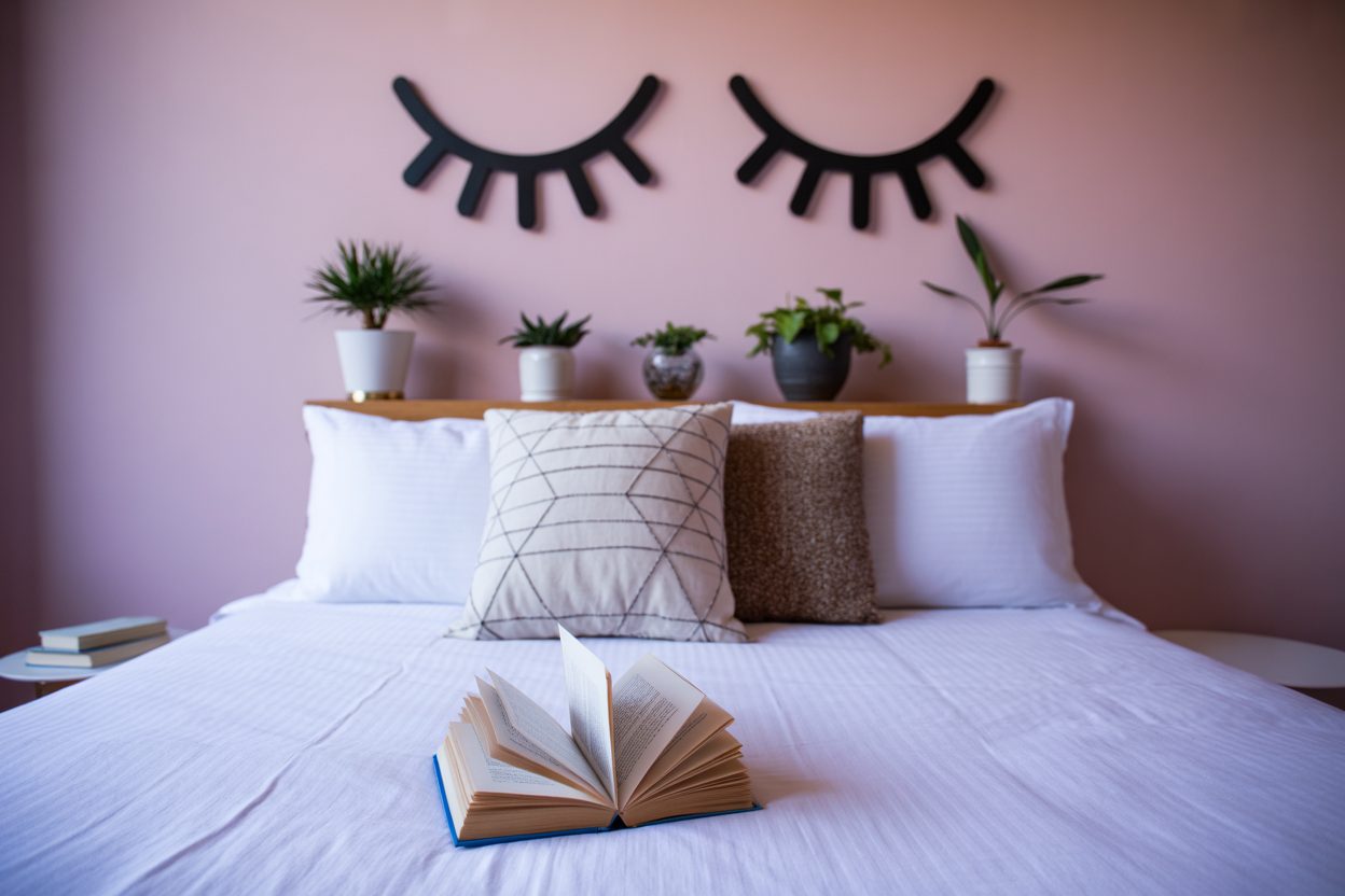
There’s something really comforting about dusty rose. It’s soft but not babyish, warm without being too sweet, and somehow feels both modern and classic. This year, I’ve seen a huge shift in what clients are asking for. Beige and gray had their time. Now? People want more warmth. More calm. More feeling. Dusty rose delivers all of that.
I’ve always loved this color for the way it brings a room together. It plays well with natural light and works across so many styles—boho, traditional, even modern minimalist. I think in 2025, we’re all craving a bit more softness in our lives. We want rooms that feel gentle and grounded. Dusty rose helps create that.
In one recent project, I used it in a family room that had big windows and natural oak floors. The result? Cozy without being dark. Stylish without trying too hard. It’s the kind of shade that makes people say, “Wow, I wouldn’t have thought of that, but I love it.”
Color trend reports back this up. According to Sherwin-Williams’ 2025 Colormix Forecast, muted reds and grounded pinks are making a big comeback because of how emotionally soothing they feel in everyday spaces.
I’m not surprised. Dusty rose doesn’t shout. It just makes everything feel a little more at home.
What Makes a Good Dusty Rose?
When I’m picking a dusty rose, I don’t just look for a pink shade. I look for a feeling.
A good dusty rose has a muted tone. Not bright, not bubblegum. It usually has a mix of brown, gray, or even mauve undertones that keep it grounded. That’s what makes it different from a blush or a fuchsia. It feels mature and calm—never sugary.
housekeepingbay.com
The Feeling It Brings
Clients tell me the same thing again and again when we try this color: “It just feels warm and safe.” That’s the power of a well-balanced dusty rose. It brings warmth without being loud. It also has this quiet kind of charm that makes rooms feel put together but still relaxed.
Materials That Love Dusty Rose
Here’s where this color really shines—when paired with natural textures. Think:
- Light woods like oak or maple
- Linen and cotton textiles
- Creamy off-white trim
- Brass or matte black fixtures
It also looks amazing with terracotta, leather, and even velvet if you want to add a bit of texture.
One thing I always look out for is the lighting in a room. A dusty rose can shift from grayish to warm depending on whether you have north-facing light or south-facing. I’ll go deeper into that in the next section, but just know—testing in your room is key.
How I Choose Dusty Rose Shades for Homes
Choosing the right dusty rose isn’t about just picking a paint chip. It’s about how that color lives in a room. I always look at three main things before recommending any paint: light, undertone, and purpose.
1. Lighting Tells the Truth
Dusty rose can change completely based on your light. In rooms with cool, northern light, it can turn too gray or even purple. In warm, southern light, it might read peachy. That’s why I always test paint on more than one wall, at different times of day.
My tip: Paint a few swatches at least 2 feet wide and live with them for 2 days. Morning and evening light will tell you the full story.
2. Watch the Undertones
Some dusty rose colors lean brown, which makes them cozier. Others have a purple base, which adds coolness. I personally lean toward brown-based tones in homes where I want a really soft, lived-in feeling. These work well with beige and wood floors. Purple undertones can feel more modern but might clash with warm finishes.
One color I love for its perfect balance? Farrow & Ball’s “Cinder Rose”. It’s muted but not muddy.
3. Know the Mood You Want
Are we going for peaceful? Romantic? Earthy? Dusty rose can play all those roles if you pick the right version. For example:
- Soft rose beige works in bedrooms.
- Deeper mauve-rose looks amazing in a powder room with brass accents.
- Warm pink-gray is perfect for nurseries without being babyish.
I also ask clients how long they want to keep the color. Dusty rose has staying power, but I always think ahead. Will it still feel good in five years? If the answer is yes, we’ve got a winner.
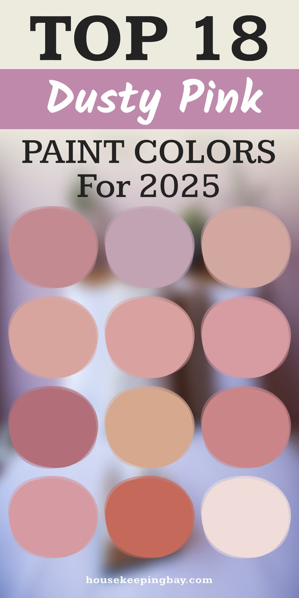
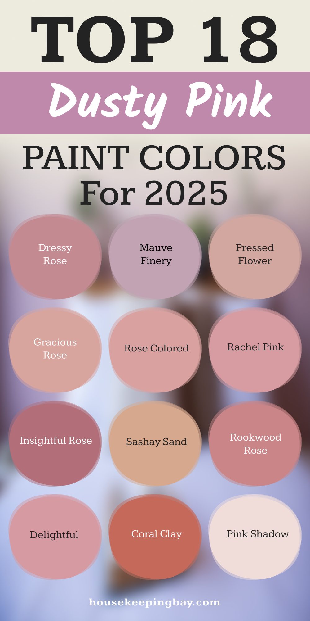
18 Dusty Rose Paint Colors Trending in 2025
Dusty rose is having a major moment in 2025, and Sherwin-Williams offers some of the most beautiful shades in this category. Here are 18 of my top picks, along with how I like to use them in real homes.
Sherwin-Williams Dusty Rose Favorites
Dressy Rose SW 6024
Dressy Rose is a soft, muted pink that brings a gentle warmth to any room. I often use it in bedrooms or reading nooks to create a cozy, inviting atmosphere. It pairs beautifully with creamy whites and light wood tones.
Mauve Finery SW 6282
Mauve Finery offers a subtle mauve hue that adds a touch of elegance without overwhelming the space. It’s perfect for living rooms or dining areas where you want a hint of color that’s still sophisticated.
Pressed Flower SW 6304
Pressed Flower is a delicate pink with a hint of gray, making it versatile for various design styles. I love using it in nurseries or bathrooms to add a soft, calming effect.
Gracious Rose SW 6317
Gracious Rose is a refined shade that works well in formal spaces like dining rooms or home offices. Its understated elegance complements traditional furnishings and gold accents.
Rose Colored SW 6303
Rose Colored is a classic dusty rose that brings a timeless charm to any room. It’s ideal for accent walls or even kitchen cabinetry when paired with neutral countertops.
Rachel Pink SW 6026
Rachel Pink is a cheerful yet subdued pink that adds a friendly touch to spaces like entryways or mudrooms. It pairs nicely with darker wood finishes.
Insightful Rose SW 6023
Insightful Rose offers a deeper, more saturated dusty rose tone. I find it works wonderfully in cozy spaces like dens or libraries, especially when combined with rich textures like velvet or leather.
Sashay Sand SW 6051
Sashay Sand leans towards a sandy pink, making it a great choice for coastal-inspired interiors. It’s lovely in sunrooms or spaces with plenty of natural light.
Mexican Sand SW 7519
Mexican Sand is a warm, earthy pink that brings a grounded feel to any room. I often use it in open-concept living areas to create a cohesive, welcoming environment.
Delightful SW 6288
Delightful is a vibrant dusty rose that adds energy without being overpowering. It’s perfect for accent pieces like painted furniture or statement walls in creative spaces.
Townhouse Tan SW 7712
Townhouse Tan has a rosy undertone that makes it more dynamic than a typical tan. I like to use it in transitional spaces like hallways or stairwells to add subtle interest.
Pink Shadow SW 0070
Pink Shadow is a pale, whispery pink that works well in minimalist designs. It’s ideal for ceilings or trim when you want a hint of color without drawing too much attention.
Coral Clay SW 9005
Coral Clay brings a warm, coral-infused pink to the palette. It’s excellent for kitchens or dining areas where you want to stimulate appetite and conversation.
Rookwood Rose SW 0034
Rookwood Rose offers a historic, vintage-inspired dusty rose. I love using it in older homes to highlight architectural details like moldings or wainscoting.
Jazz Age Coral SW 0058
Jazz Age Coral is a bold, lively pink that makes a statement. It’s great for front doors or accent walls where you want to add a pop of color.
Coral Rose SW 9004
Coral Rose is a soft coral-pink that brings warmth and charm. It’s lovely in bedrooms or bathrooms, especially when paired with white or cream accents.
Reddened Earth SW 6053
Reddened Earth leans towards a terracotta pink, offering a rustic, earthy feel. I often use it in spaces with lots of natural materials like wood and stone.
Rose Embroidery SW 6297
Rose Embroidery is a rich, deep dusty rose that adds drama and sophistication. It’s perfect for formal living rooms or dining areas with luxurious fabrics and finishes.
These 18 shades showcase the versatility and beauty of dusty rose in 2025. Whether you’re looking to create a cozy retreat or a vibrant gathering space, there’s a Sherwin-Williams dusty rose hue to match your vision.
housekeepingbay.com
Where to Use Dusty Rose Paint at Home
Dusty rose can do a lot. But it’s not a “one-size-fits-every-wall” color. I always think about how a room is used before putting this color on the walls.
Here’s how I decide where it works best—and where to be a little cautious.
Where It Works Best
Bedrooms
This is my favorite room for dusty rose. It creates a warm, calm feeling that helps you relax at night. Colors like Dressy Rose or Mauve Finery are soft enough to feel peaceful but still add personality.
Living Rooms
If you want your living room to feel inviting but not boring, dusty rose is a strong pick. I often use Rose Colored or Mexican Sand with cream sofas and wood coffee tables for a cozy but stylish look.
Bathrooms
In small bathrooms or powder rooms, dusty rose adds warmth and elegance. Try Pressed Flower or Rose Embroidery with white tiles and brass fixtures.
Nurseries
Skip the bright pink. A soft dusty rose like Pink Shadow or Rachel Pink is sweet but calm, and it will age well as your baby grows.
Accent Walls or Furniture
Dusty rose isn’t just for full walls. I love it on:
- Interior doors (especially Jazz Age Coral)
- Kitchen islands (Coral Clay looks amazing!)
- Built-in shelves (Insightful Rose adds depth)
When to Be Careful
I usually avoid dusty rose in rooms with very cool, blue light, like north-facing basements. It can start to look gray or muddy. Also, if your home has a lot of red tones in the floors or countertops, the pink in dusty rose might clash. Always test before painting the whole room.
Pairing Dusty Rose with Other Colors
Getting the right color combo is everything. Dusty rose can go in a few different directions, depending on what mood you want. Here are some of my favorite pairings:
Neutrals That Always Work
- Cream or warm white — This softens the look and makes the room feel open.
- Greige — Adds just enough contrast without clashing.
- Charcoal gray — Sharpens the pink, great for a modern edge.
Deep, Rich Tones
- Navy blue — This combo is bold but balanced. I’ve used it in offices and dens.
- Forest green — Brings a natural, earthy calm.
- Black accents — Use in hardware, frames, or lighting to add structure.
Metallics and Materials
- Brushed brass or matte gold — Adds warmth and elegance.
- Natural wood — Lighter woods keep it soft; darker woods add contrast.
- Rattan or wicker — Brings in a casual, lived-in vibe.
When I work with dusty rose, I’m always thinking about the big picture—not just the paint but the textures, the light, and how people move through the room.
What’s Fueling the Comeback
There’s a reason we’re seeing dusty rose pop up everywhere. According to a 2025 trend report by WGSN and Coloro, softer pinks are part of a bigger move toward calm and wellness in design. People want their homes to feel like a break from everything outside.
“We’re seeing a shift toward colors that comfort, and pinks with brown or gray tones feel especially grounding.”
And it’s not just about feeling good—it’s about design lasting longer. Bright trends come and go. Dusty rose sticks around because it works in both traditional and modern spaces.
Before You Pick Up the Paint Brush
Here’s my quick checklist before committing to any shade of dusty rose:
- Test swatches in morning and evening light
- Look at it next to your floors and large furniture
- Pick the right sheen — eggshell for walls, satin or semi-gloss for trim
- Try one wall first before painting everything
Don’t skip this step—it can save you from a lot of “why doesn’t it look like the sample?” moments.
My Final Thoughts
Dusty rose isn’t just a trend. It’s a feeling. And in 2025, it’s clear that we’re all craving a bit more softness and warmth in our homes.
Out of all the shades I shared, my personal favorite right now is Mauve Finery. It’s soft but not sleepy. Elegant but still livable. If you’re unsure, try it on a small wall or a piece of furniture and see how it feels.
Homes should feel like a hug. Dusty rose helps do that.
housekeepingbay.com
