Dusty Cornflower CSP-605 by Benjamin Moore
A Calm Color for Contemporary Homes
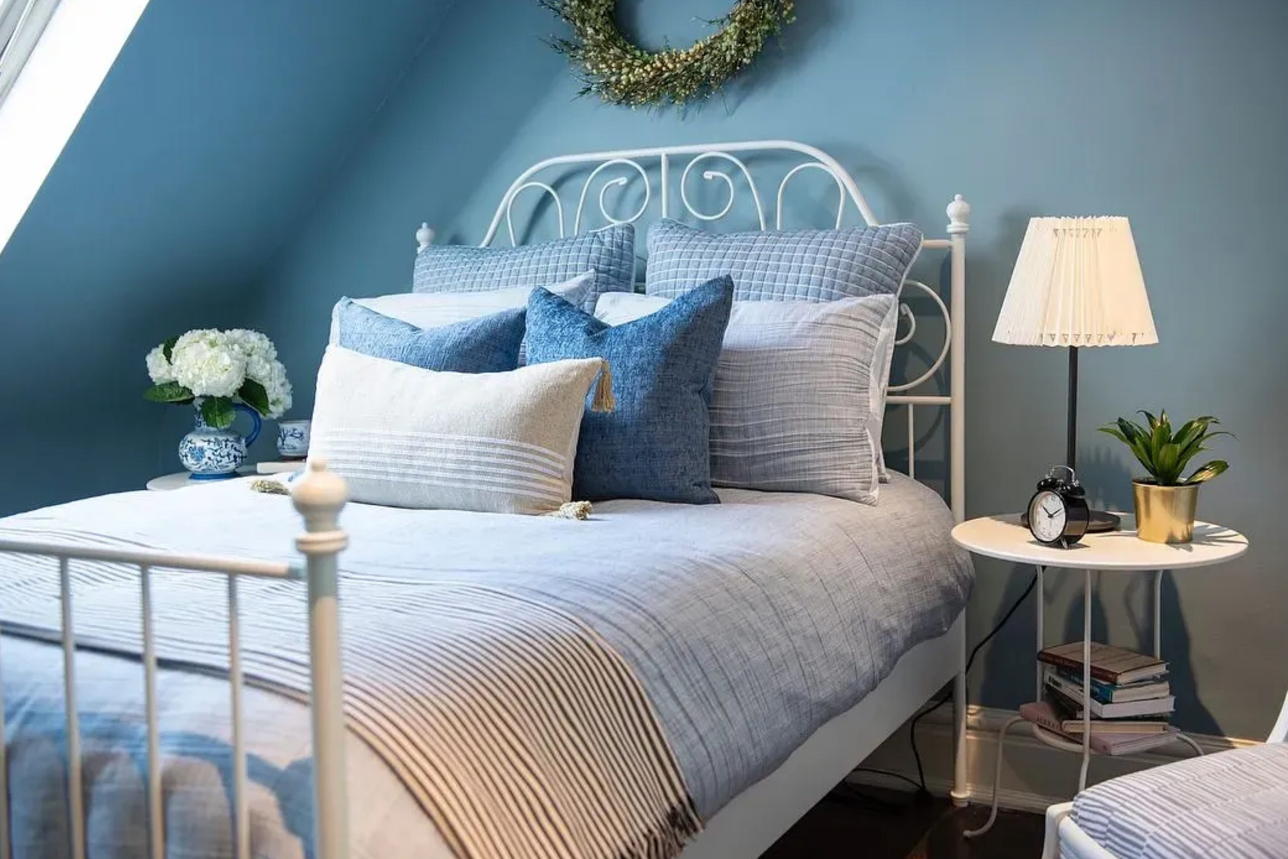
Choosing the right paint color can change the mood of any space in your home. One option to consider is CSP-605 Dusty Cornflower by Benjamin Moore. Imagine a shade that brings a calm and soft feel to your walls, combining the soothing qualities of blue with a hint of gray. This gentle mix creates a peaceful background, perfect for a bedroom, living room, or even a cozy reading nook.
You might appreciate how Dusty Cornflower pairs well with both warm and cool colors, making it easy to blend with your existing decor. Whether you have modern furnishings or vintage treasures, this shade can help tie everything together harmoniously.
Think of Dusty Cornflower as a subtle yet effective way to add a touch of elegance to any room. It’s not too bold to overwhelm the space, nor too bland to go unnoticed. This color provides an ideal balance, giving you a versatile backdrop that’s timeless and easy to live with.
With a serene hue like Dusty Cornflower in your palette, you’ll create a welcoming and comfortable atmosphere in no time.
via plan-home.com
What Color Is Dusty Cornflower CSP-605 by Benjamin Moore?
Dusty Cornflower CSP-605 by Benjamin Moore is a soft, muted shade of blue with subtle gray undertones. This color brings a calming and sophisticated vibe to any space. It’s not overly bright, making it versatile for different interior styles. Dusty Cornflower works particularly well in coastal, cottage, or modern farmhouse settings, where its gentle, inviting presence can shine.
In a coastal home, Dusty Cornflower can mimic the hues of a serene sky, adding a refreshing element to a living room or bedroom. In cottage or farmhouse styles, this shade pairs beautifully with white or cream trim, creating a classic, timeless look.
It’s also suitable for a Scandinavian or minimalist interior, providing a whisper of color without overwhelming the space.
This color pairs seamlessly with natural materials and textures. Think of pairing it with light, unfinished woods to enhance its warmth. Soft linen or cotton fabrics in neutral shades complement Dusty Cornflower’s understated elegance. Incorporating elements like woven baskets, rattan furniture, or jute rugs adds layers of texture without clashing with the color’s subtle palette.
Darker metallic accents, like brushed bronze or matte black, can also provide contrast, highlighting the soft gray tones within this versatile hue.
housekeepingbay.com
Is Dusty Cornflower CSP-605 by Benjamin Moore Warm or Cool color?
Dusty Cornflower CSP-605 by Benjamin Moore is a soft, muted blue with a hint of greyness. It brings a calm, soothing vibe to any room. Its gentle tone makes it versatile for different spaces, from living rooms to bedrooms. In well-lit areas, Dusty Cornflower has a refreshing effect, while in dimly lit rooms, it feels cozy and inviting.
This color pairs well with neutrals such as whites and greys, adding depth without overwhelming. It can also combine beautifully with natural wood tones, enhancing the warmth of wooden furniture. Dusty Cornflower’s subtle hue offers a perfect backdrop for various decors or styles, whether contemporary or traditional.
When used on walls, this color promotes a restful atmosphere, ideal for relaxation or focus. It works as an accent color too, adding just enough character without dominating the space. Dusty Cornflower CSP-605 makes a room feel balanced, contributing to a peaceful and pleasing environment.
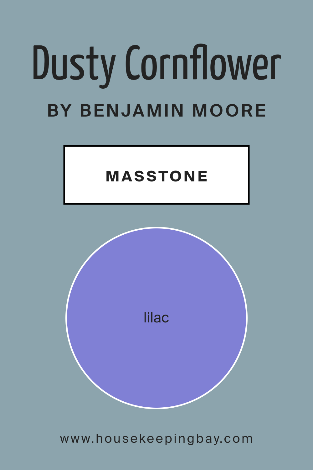
What is the Masstone of the Dusty Cornflower CSP-605 by Benjamin Moore?
Dusty Cornflower (CSP-605) by Benjamin Moore is a delightful color choice for home interiors. With a masstone of Lilac (#8080D5), this color introduces a soothing and gentle atmosphere to any room. The lilac hue gives it a soft, calming vibe, making spaces feel relaxed and inviting.
In living rooms or bedrooms, Dusty Cornflower can create a peaceful retreat, perfect for unwinding at the end of the day.
The subtle lilac undertone also helps it pair well with various design styles, from modern to traditional. It complements neutral colors like whites and greys beautifully, allowing for versatile decorating options. Additionally, this shade can bring a touch of whimsy and charm to children’s rooms or play areas without being too bold or overpowering.
In spaces with natural light, Dusty Cornflower radiates warmth, adding a gentle brightness that enhances the overall ambiance.
housekeepingbay.com
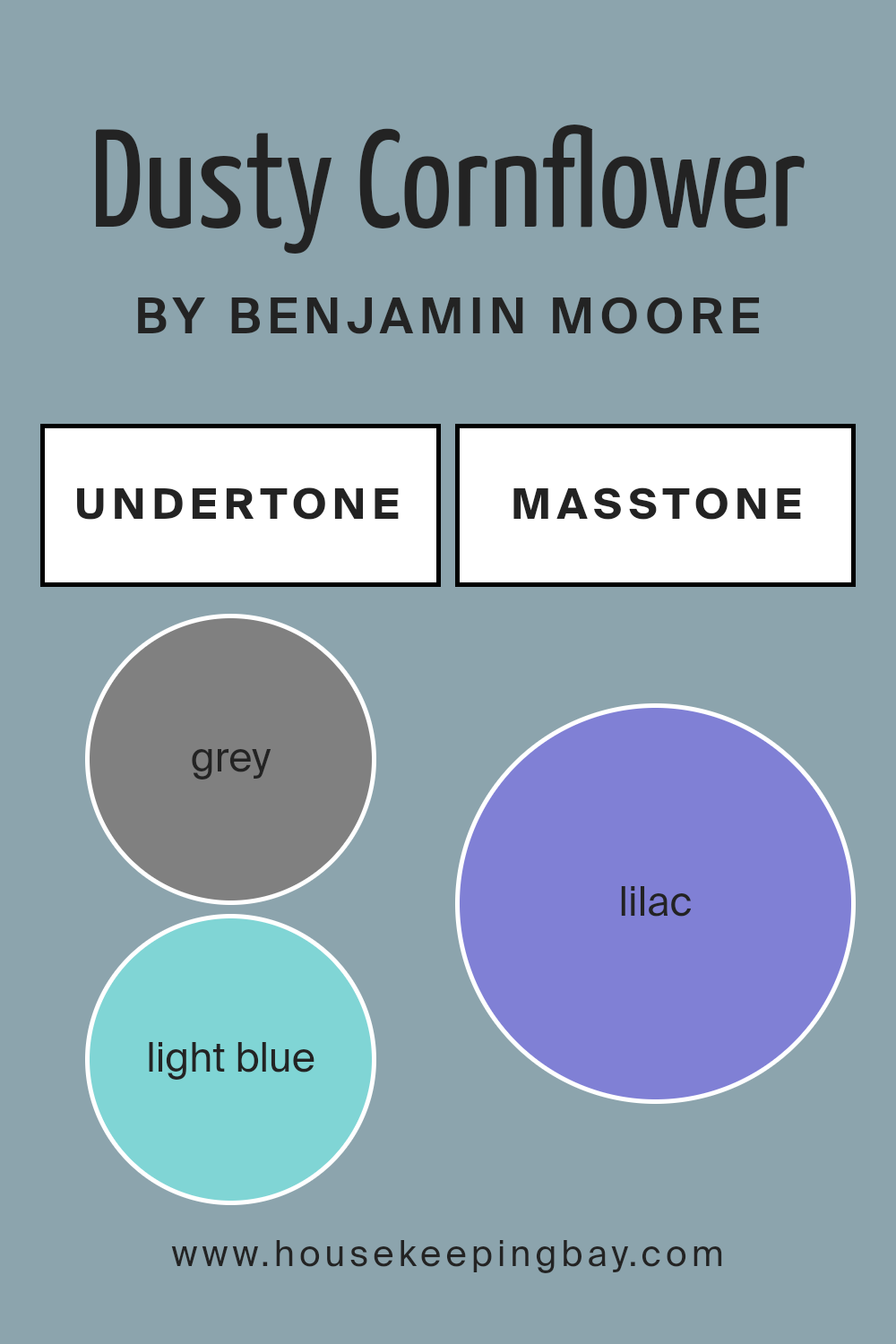
Undertones of Dusty Cornflower CSP-605 by Benjamin Moore
Dusty Cornflower CSP-605 by Benjamin Moore is a complex shade with a variety of undertones that change how it looks in a room. It features hints of grey, light blue, mint, light purple, pale pink, light gray, pale yellow, blue, dark turquoise, turquoise, light turquoise, violet, purple, fuchsia, pink, dark blue, and navy.
These undertones influence our perception by subtly changing the color’s appearance depending on lighting and surrounding colors.
In brighter spaces, the light blue and turquoise hints might become more pronounced, giving the room a cool, calming feel. In dimmer light, the darker blue and navy undertones may come forward, creating a cozy and intimate atmosphere. The slight gray and light gray influences can keep the color feeling grounded, preventing it from becoming overwhelming.
The pale pink and mint hints add a touch of warmth, making spaces feel welcoming and comfortable. Meanwhile, the purple, violet, and fuchsia undertones introduce a sense of elegance and sophistication to the walls.
The combination of these undertones ensures that Dusty Cornflower CSP-605 adapts to various settings, offering a versatile backdrop that harmonizes with multiple design styles and furniture selections. Its dynamic undertones balance warmth and coolness, making it suitable for diverse interior designs.
housekeepingbay.com
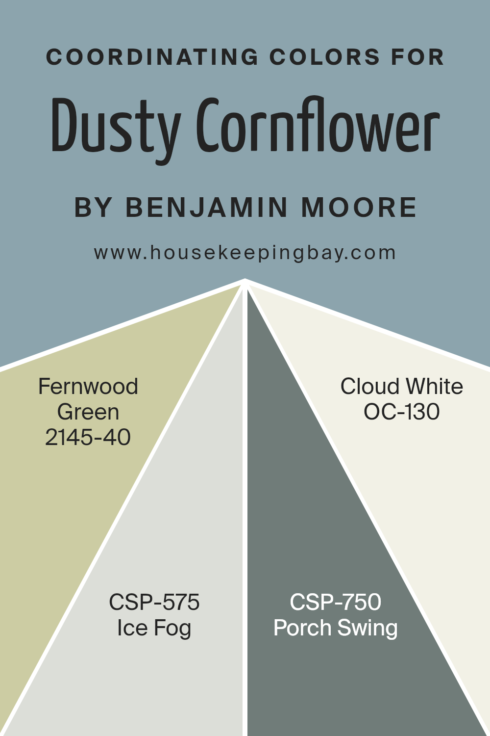
Coordinating Colors of Dusty Cornflower CSP-605 by Benjamin Moore
Coordinating colors are shades that complement each other perfectly, creating a harmonious look in any space. They bring balance and coherence, enhancing the beauty of the main hue by adding depth and variety.
In the case of Dusty Cornflower, four colors beautifully coordinate with it: Fernwood Green, Ice Fog, Porch Swing, and Cloud White. These shades, when used together, establish a sense of unity that is visually appealing and pleasing to the eye.
Fernwood Green is a soft, warm green that adds a natural, earthy touch, working well as a grounding element. Ice Fog introduces a light gray with a hint of coolness, offering a gentle contrast against Dusty Cornflower.
Porch Swing, on the other hand, brings in a muted beige that feels cozy and inviting, perfect for creating a welcoming environment. Finally, Cloud White completes the palette with its clean, bright quality, providing a crisp backdrop that enhances all the other colors.
When these shades come together with Dusty Cornflower, they create a space that feels balanced, cohesive, and comfortable, ideal for both relaxation and conversation.
You can see recommended paint colors below:
- 2145-40 Fernwood Green
- CSP-575 Ice Fog
- CSP-750 Porch Swing
- OC-130 Cloud White
housekeepingbay.com
How Does Lighting Affect Dusty Cornflower CSP-605 by Benjamin Moore?
Lighting plays a significant role in how we perceive colors. Different types of light can change the appearance of paint colors, including a shade like Dusty Cornflower CSP-605 by Benjamin Moore. Let’s explore how this color looks under various lighting conditions, both artificial and natural.
In artificial light, colors can appear different based on the light bulb used. Warm artificial lights, such as incandescent bulbs, tend to bring out the warm tones in Dusty Cornflower, making it appear cozier. On the other hand, cool fluorescent lights might make the color look more muted or subdued.
Natural light also has a significant impact, changing throughout the day. In rooms facing north, which receive cooler, indirect light, Dusty Cornflower might appear more bluish. This light softens colors, leading to a calmer atmosphere. This might suit spaces where subtlety is key.
In south-facing rooms, the abundance of natural light, especially during midday, enhances colors. Dusty Cornflower will appear brighter and more vibrant in these conditions. This lively effect might make the space feel more inviting.
East-facing rooms receive warm, morning sunlight, displaying Dusty Cornflower with a gentle glow. By afternoon, the light becomes cooler, which can make this shade appear more muted. This transition can create a dynamic effect, where the room changes mood throughout the day.
In west-facing rooms, the afternoon and evening light brings out warmer tones. At sunset, Dusty Cornflower can appear richer, almost with a golden hint. This transformation can make evenings feel cozy and intimate.
When choosing paint colors, it’s crucial to consider the changing nature of light. Testing Dusty Cornflower under different conditions can help make informed decisions about how it will look in your space. Understanding these dynamics ensures satisfaction and harmony in your home’s color palette.
housekeepingbay.com
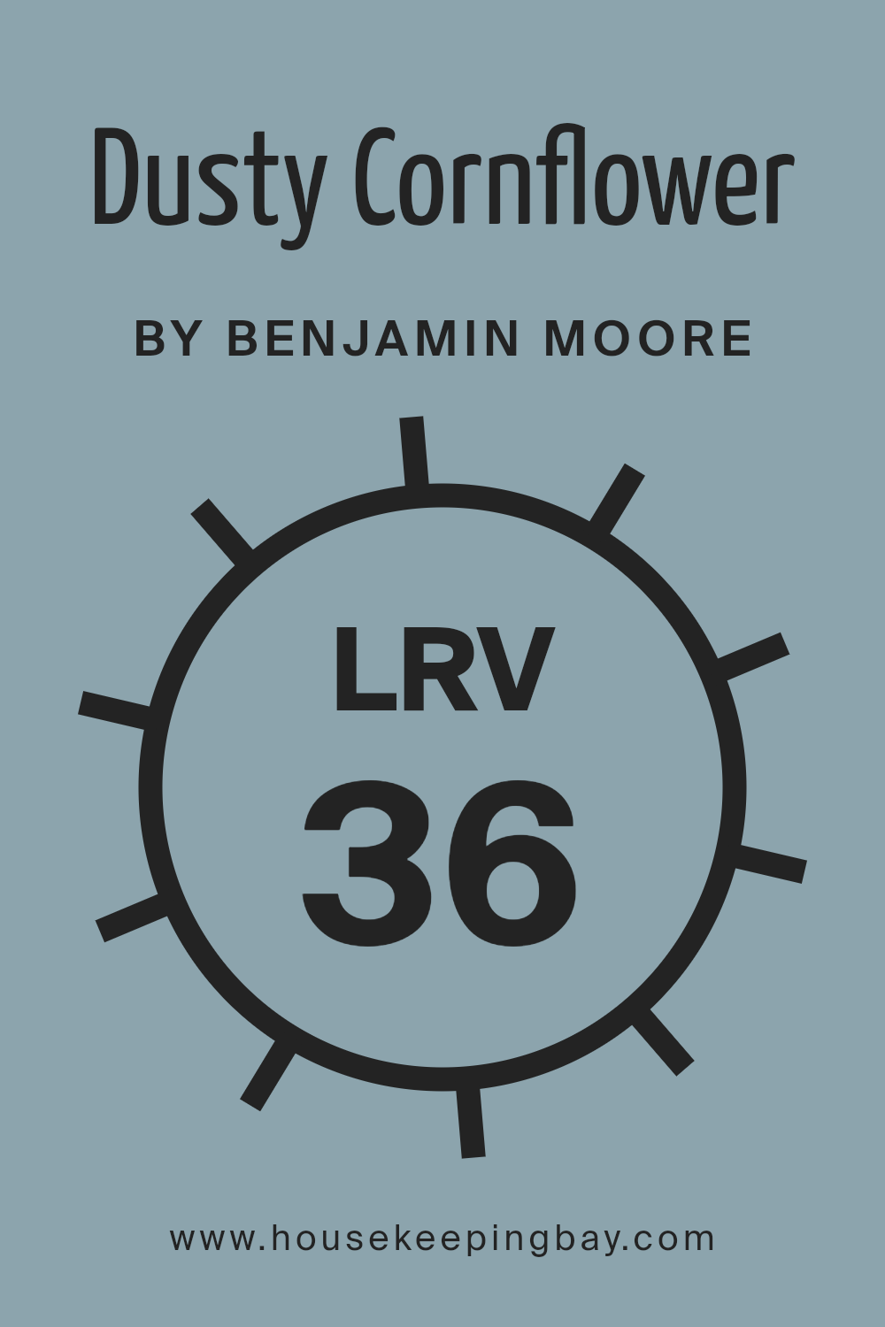
What is the LRV of Dusty Cornflower CSP-605 by Benjamin Moore?
LRV stands for Light Reflectance Value, a measure used to describe how much light a color reflects or absorbs. The scale ranges from 0 to 100, where 0 is absolute black (reflecting no light) and 100 is pure white (reflecting all the light).
When you paint a room, the LRV helps predict how light or dark a color will appear on the walls. It can significantly affect a room’s overall brightness. A color with a high LRV will reflect more light and appear brighter, making a room feel more spacious and open.
Conversely, a color with a low LRV absorbs more light, so it might make a room feel cozier and more intimate.
Dusty Cornflower CSP-605 by Benjamin Moore has an LRV of 36.19. This value indicates that the color reflects a moderate amount of light but also has a fair amount of depth. On walls, it can appear as a rich and muted hue. It won’t make a room feel overly bright or washed out, nor will it make the space overly dark.
The balance it strikes lets it add warmth and character to a room without overwhelming it. It’s a good choice if you’re looking for something that sits comfortably in the middle of brightness and depth, offering a cozy yet sophisticated feel.
housekeepingbay.com
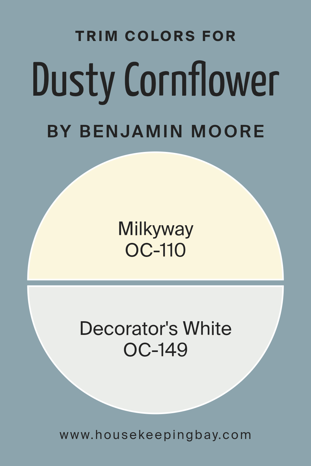
What are the Trim colors of Dusty Cornflower CSP-605 by Benjamin Moore?
Trim colors refer to the paints used for areas like baseboards, moldings, and door frames. These colors add contrast and definition to a room, enhancing the main wall color. Choosing the right trim color for Dusty Cornflower CSP-605 by Benjamin Moore is important because it affects how the overall space feels.
Dusty Cornflower is a soft, muted blue that brings a calm feeling to a room. It pairs well with both warm and cool tones, making it versatile. Using the right trim color can highlight its beauty, creating a balanced and harmonious look.
Consider OC-110, known as Milkyway. This off-white color has a hint of warmth, which can complement the cool undertones of Dusty Cornflower, adding a sense of coziness. On the other hand, OC-149, or Decorator’s White, offers a crisp, bright white that brings a clean and modern touch.
It enhances the freshness of Dusty Cornflower, making the blue appear more vivid. Choosing between these trim colors depends on whether you want to create a warm, inviting space with Milkyway or a fresh, contemporary feel with Decorator’s White.
Both options highlight the beauty of Dusty Cornflower in their unique ways.
You can see recommended paint colors below:
- OC-110 Milkyway
- OC-149 Decorator’s White
housekeepingbay.com
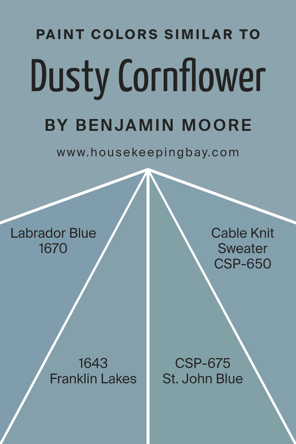
Colors Similar to Dusty Cornflower CSP-605 by Benjamin Moore
Similar colors can create harmony in a space, providing a soothing and cohesive look. When you use colors that are close to each other in tone and hue, the effect can be calming, as the eye doesn’t have to work hard to find balance. For instance, Benjamin Moore’s Dusty Cornflower (CSP-605) creates a serene atmosphere with its muted blue undertone. Labrador Blue (1670) offers a deeper shade that still feels connected, delivering a rich yet calming presence to any space.
Franklin Lakes (1643) lightens the mood with a soft, gentle blue that adds airiness without losing warmth. Each of these colors, while distinct, maintains a sense of unity, enhancing the overall ambiance.
Colors such as St. John Blue (CSP-675) invite a sense of coolness, ideal for creating a refreshing environment. Similarly, Cable Knit Sweater (CSP-650) offers a light, cozy undertone that adds a touch of comfort. Together, these colors work well because their similarities invite a seamless transition, helping rooms flow effortlessly from one to the next
Their close relationship in tone allows for creativity in design, offering versatility while maintaining a consistent theme. Each color supports the others, allowing for a sophisticated yet simple approach to interior design.
You can see recommended paint colors below:
- 1670 Labrador Blue
- 1643 Franklin Lakes
- CSP-675 St. John Blue
- CSP-650 Cable Knit Sweater
housekeepingbay.com
Colors that Go With Dusty Cornflower CSP-605 by Benjamin Moore
Colors that complement Dusty Cornflower CSP-605 by Benjamin Moore play a crucial role in creating harmonious and inviting spaces. This particular blue shade holds a gentle calmness, and pairing it with the right colors further enhances its charm.
Consider 1671 – West Coast, a rich, deep blue-green that can add a touch of depth and sophistication when used alongside Dusty Cornflower. Its bolder undertone makes it a perfect choice for accents, adding interest without overpowering.
Similarly, 2129-60 – Mt. Rainier Gray offers softer, understated elegance with its light gray-blue hue, producing a serene backdrop that pairs well with the subtlety of Dusty Cornflower.
Incorporating Polaris Blue 1649 introduces another layer of depth. It’s grounded and steady, providing a sense of stability. AF-520 – Schooner, meanwhile, comes with a muted, earthy tone that can introduce warmth and richness, creating a comfortable, lived-in feel.
For a lighter touch, Blue Heather 1620 brings a gentle, inviting ambiance, with its soft, muted blue. Lastly, there’s 2129-70 – Silver Cloud, a versatile, light gray that adds a hint of airy freshness, enhancing the overall palette without clashing.
Combining these colors provides a delicate balance, creating a cohesive and aesthetically pleasing environment.
You can see recommended paint colors below:
- 1671 West Coast
- 2129-60 Mt. Rainier Gray
- 1649 Polaris Blue
- AF-520 Schooner
- 1620 Blue Heather
- 2129-70 Silver Cloud

housekeepingbay.com
How to Use Dusty Cornflower CSP-605 by Benjamin Moore In Your Home?
Dusty Cornflower CSP-605 by Benjamin Moore is a soft and muted shade of blue that adds a calm and peaceful look to any room. This color works well in spaces like bedrooms or living rooms, where relaxation is key. It pairs nicely with neutral tones such as whites and grays, bringing a gentle contrast without overwhelming the room. Use it on the walls to create a serene atmosphere or as an accent on furniture pieces like a stylish cabinet or a cozy chair.
In a children’s room, Dusty Cornflower can be a thoughtful choice. Its subtle hue provides a serene backdrop for colorful toys and artwork. Adding textiles like curtains or rugs in this shade can bring cohesion to the room, making it feel warm and welcoming.
In the bathroom, this color adds a refreshing touch when paired with white or light-colored tiles. Accessories in sandy beige or cream can enhance the soothing vibe, making morning routines feel more pleasant.
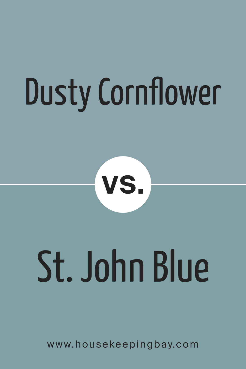
Dusty Cornflower CSP-605 by Benjamin Moore vs St. John Blue CSP-675 by Benjamin Moore
Dusty Cornflower CSP-605 and St. John Blue CSP-675 by Benjamin Moore both offer subtle blue tones, each bringing its unique charm to a space. Dusty Cornflower CSP-605 features a soft, muted blue with a hint of gray, giving it a calming and understated appearance. It’s ideal for creating a serene atmosphere in bedrooms or living spaces, offering a touch of sophistication without overwhelming brightness.
St. John Blue CSP-675 leans towards a richer, more vibrant blue compared to Dusty Cornflower. It possesses a depth that makes a space feel energetic yet serene, suitable for accent walls or areas where a bold statement is desired.
While Dusty Cornflower provides a gentle, modern touch, St. John Blue brings a more traditional and inviting feel.
Both colors work well in coastal designs, but the choice depends on whether you prefer the soft elegance of Dusty Cornflower or the lively presence of St. John Blue.
You can see recommended paint color below:
- CSP-675 St. John Blue
housekeepingbay.com
Dusty Cornflower CSP-605 by Benjamin Moore vs Cable Knit Sweater CSP-650 by Benjamin Moore
Dusty Cornflower CSP-605 by Benjamin Moore offers a soft, muted blue with a touch of gray. This color gives spaces a calm and soothing vibe, making it great for bedrooms or living rooms. It works well with both modern and traditional styles due to its versatile nature.
Cable Knit Sweater CSP-650 by Benjamin Moore, on the other hand, presents a light, warm gray with a hint of beige. This neutral tone provides a cozy and inviting feel, suited for creating comfortable spaces like family rooms or dens.
When comparing the two, Dusty Cornflower adds a gentle hint of color while Cable Knit Sweater leans more neutral, making it adaptable. Dusty Cornflower can bring a soft touch of personality with its blue undertone, while Cable Knit Sweater maintains warmth and neutrality. Both colors complement various decor, but Dusty Cornflower stands out slightly more due to its color hint. Each offers a unique way to create soothing, relaxed environments in the home.
You can see recommended paint color below:
- CSP-650 Cable Knit Sweater

housekeepingbay.com
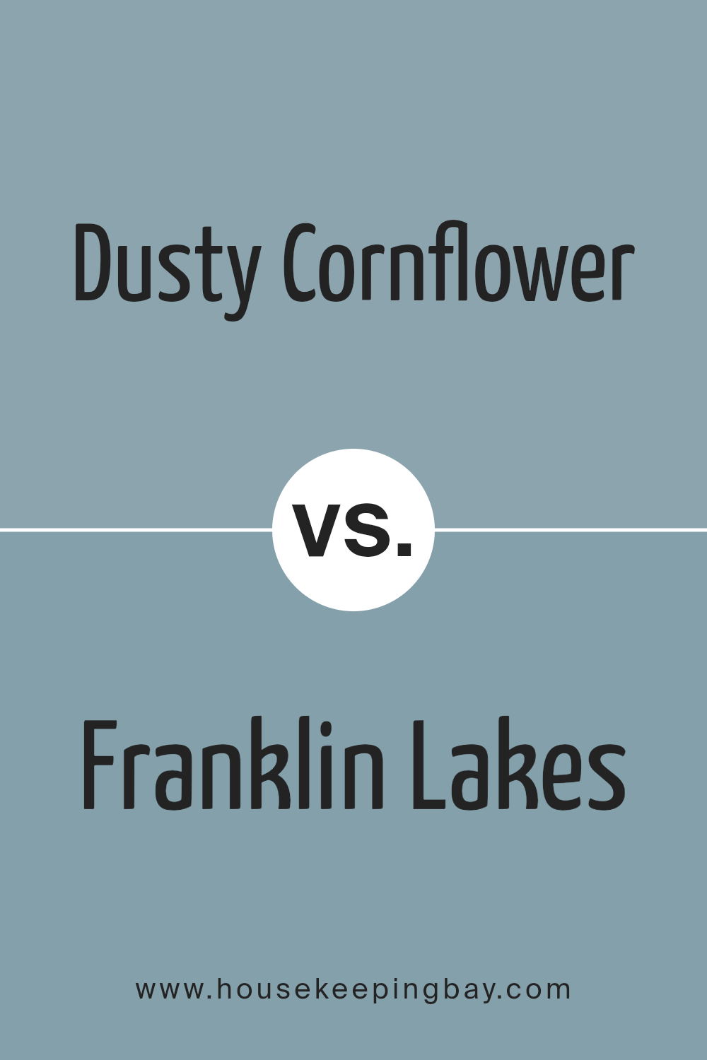
Dusty Cornflower CSP-605 by Benjamin Moore vs Franklin Lakes 1643 by Benjamin Moore
Dusty Cornflower CSP-605 by Benjamin Moore is a soft, muted blue with some gray undertones, giving it a calm, relaxed feel. It often reminds people of a cloudy sky or an old, weathered blueprint. Its subtle color can work in various rooms, offering a sense of sophistication and warmth.
Franklin Lakes 1643 by Benjamin Moore is a cooler, slightly darker shade of blue with more pronounced gray tones. This color often feels richer and more robust compared to Dusty Cornflower. It brings a more dramatic look to a space, while still maintaining elegance.
When viewing these colors side by side, Dusty Cornflower appears lighter and a bit more airy. It’s a great choice for those seeking a mild, understated presence in decor. Franklin Lakes, being deeper, adds depth and contrast, making spaces feel cozier and more intimate. Both colors have their unique charm, suitable for different styles and moods.
You can see recommended paint color below:
- 1643 Franklin Lakes
housekeepingbay.com
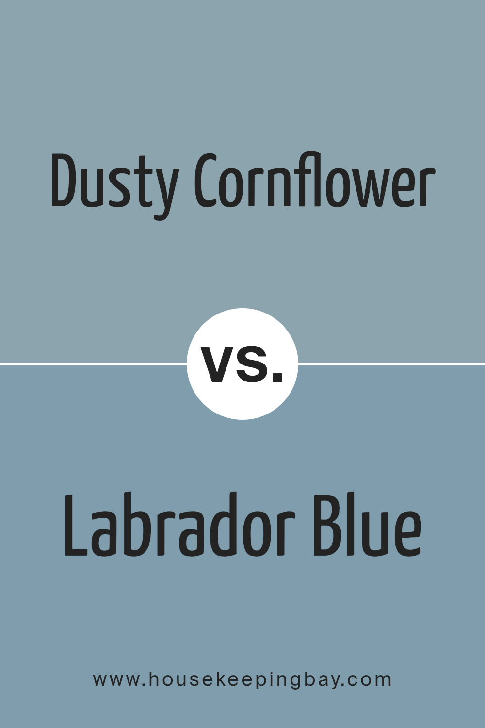
Dusty Cornflower CSP-605 by Benjamin Moore vs Labrador Blue 1670 by Benjamin Moore
Dusty Cornflower CSP-605 by Benjamin Moore is a soft, muted blue with a hint of gray, giving it an elegant and calming vibe. It brings a sense of subtle sophistication to any room. Ideal for spaces where a relaxed atmosphere is desired, this color pairs well with both light and dark neutral tones.
Labrador Blue 1670 by Benjamin Moore, on the other hand, is a richer, more vibrant blue. It carries a strong presence, adding depth and character to a space. Labrador Blue works well in rooms where you want to create a bold, confident look. It’s versatile enough to complement many decor styles, from classic to modern.
When comparing the two, Dusty Cornflower is like a gentle whisper, creating a serene environment, while Labrador Blue is more of an assertive statement, adding a dynamic splash to a room. Both colors offer unique qualities, depending on the mood you wish to create.
You can see recommended paint color below:
- 1670 Labrador Blue
housekeepingbay.com
Conclusion
In summary, CSP-605 Dusty Cornflower by Benjamin Moore offers a beautiful and versatile shade that can enrich any space. This muted blue perfectly balances with a touch of grey, creating a soft, calming atmosphere that suits a variety of settings. Whether used on walls, cabinetry, or accents, Dusty Cornflower brings a touch of serenity and sophistication.
I’ve found that this shade works exceptionally well in bedrooms, living rooms, or even kitchens, depending on the mood you wish to set. The color interacts beautifully with natural light, shifting from a comforting blue to a soft grey depending on the time of day.
Pair Dusty Cornflower with neutral tones or bold contrasts for a dynamic look. White trims can highlight its subtlety, while darker colors like navy or charcoal can add depth. This hue’s adaptability makes it a favorite choice for those seeking a timeless yet contemporary aesthetic.
The gentle nature of Dusty Cornflower encourages relaxation and introspection, providing a perfect backdrop for both social gatherings and quiet moments. Its understated elegance makes it a remarkable choice for anyone looking to refresh their space with a touch of modern, yet classic, style.
housekeepingbay.com
Ever wished paint sampling was as easy as sticking a sticker? Guess what? Now it is! Discover Samplize's unique Peel & Stick samples. Get started now and say goodbye to the old messy way!
Get paint samples


