Dufferin Terrace CC-456 by Benjamin Moore
Fresh Hues for Your Home Makeover
Are you thinking about giving your space a fresh coat of paint? You might want to consider CC-456 Dufferin Terrace by Benjamin Moore. This color is subtle yet has an undeniably warm presence that can enhance both small and large rooms.
It’s a quiet, understated hue that works beautifully to create a relaxed atmosphere. Whether it’s your living room or bedroom, applying Dufferin Terrace can give your surroundings a gentle and welcoming feel.
In this article, I’ll take you through the specifics of how CC-456 Dufferin Terrace can fit into different styles and settings. You’ll learn about its compatibility with furnishings and décor, and I’ll offer some practical tips on paint application to ensure the best outcome.
Whether you’re updating one room or revamping your entire home, CC-456 Dufferin Terrace offers a lovely backdrop that complements various interior designs.
So, let’s get started, and see how this color could work for you.
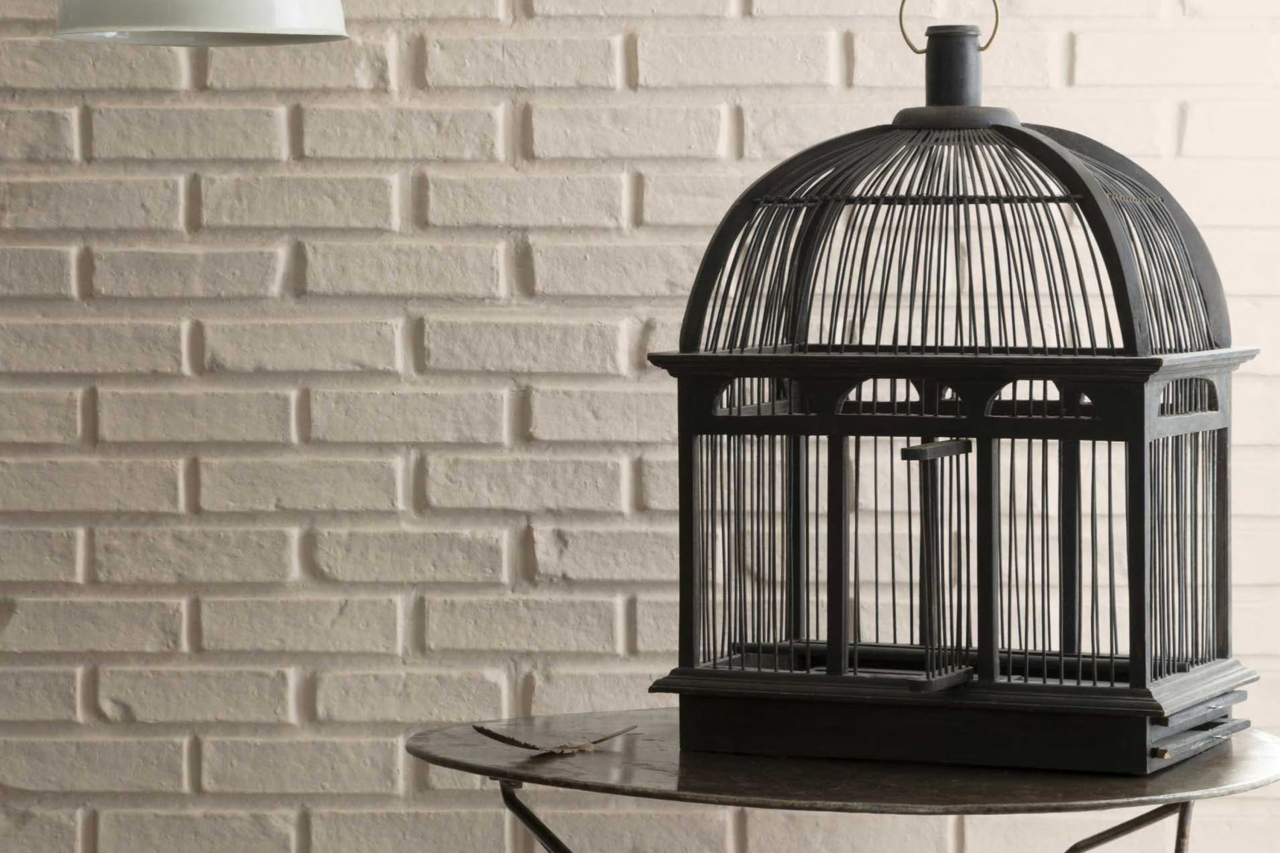
via benjaminmoore.com
What Color Is Dufferin Terrace CC-456 by Benjamin Moore?
Dufferin Terrace CC-456 by Benjamin Moore is a soothing, mid-tone beige that brings a sense of warmth and understated elegance to any space. With its balanced undertones, this paint color avoids leaning too yellow or too gray, making it incredibly versatile and easy to incorporate into various interior styles.
This color works exceptionally well in environments that aim for a classic or traditional look but is equally at home in modern and minimalist designs due to its clean, neutral base. Dufferin Terrace is perfect for creating a cozy backdrop in living rooms, bedrooms, and dining areas.
It pairs beautifully with rich wood finishes, such as walnut or mahogany, enhancing their depth and luster. Additionally, Dufferin Terrace complements natural materials like leather and stone, adding to the room’s overall warmth and texture. In terms of textures, this shade coordinates very well with soft fabrics, like cotton and linen, contributing to a relaxed and comfortable atmosphere.
When used in a space, Dufferin Terrace offers a canvas that allows furniture and decor to stand out. Whether it’s a brightly colored pillow or a striking piece of art, this color supports and enhances surrounding elements without overwhelming them.
housekeepingbay.com
Is Dufferin Terrace CC-456 by Benjamin Moore Warm or Cool color?
Dufferin TerraceCC-456 by Benjamin Moore is a versatile paint color that offers a soothing and neutral background for any room in your home. With its warm undertones, this shade brings a cozy atmosphere to spaces, making it perfect for living areas, bedrooms, and even kitchens.
Unlike bolder colors, Dufferin TerraceCC-456 doesn’t overwhelm a room but instead provides a subtle, calming presence. This makes it easy to pair with various decor styles and colors. Whether you have modern furniture or classic pieces, this color complements them beautifully, enhancing the overall feel without dominating the space.
Additionally, it works well in rooms with varying amounts of natural light, maintaining its warm tone in both brightly lit and dimmer environments. This adaptability and gentle charm make Dufferin TerraceCC-456 by Benjamin Moore a smart choice for homeowners looking to create a pleasant, inviting atmosphere in their homes.
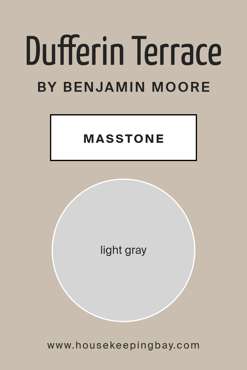
What is the Masstone of the Dufferin Terrace CC-456 by Benjamin Moore?
Dufferin Terrace CC-456 by Benjamin Moore is a light gray paint with a masstone of #D5D5D5. This gentle, soft gray creates a peaceful and calming atmosphere, making it a popular choice for many homes. Its neutral tone means Dufferin Terrace matches easily with various decor styles and colors, from bright and bold to more subdued shades.
This versatility is a significant advantage because it allows homeowners to change the look of their furnishings or accessories without worrying about clashing with the wall color. In rooms with limited natural light, the luminosity of light gray can help make the space feel brighter and larger.
Additionally, in well-lit rooms, this color helps maintain a cool, airy feel, which is especially appealing during warmer months. Its simplicity and low intensity are soothing, making it an excellent choice for bedrooms, living rooms, and even bathrooms, where creating a relaxing environment is often a priority.
housekeepingbay.com
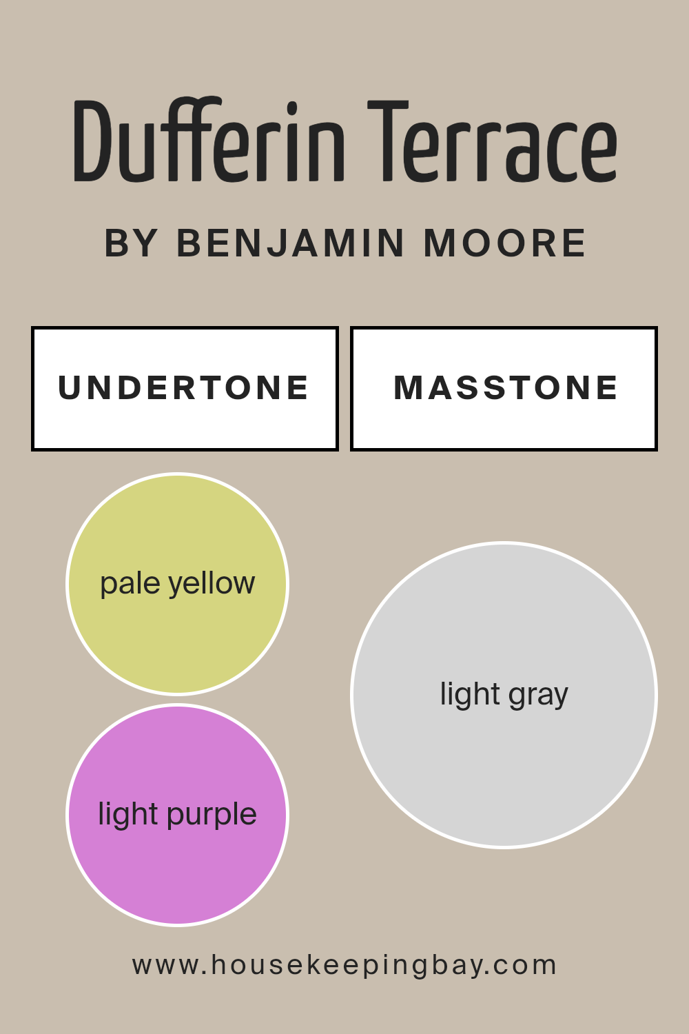
Undertones of Dufferin Terrace CC-456 by Benjamin Moore
Dufferin Terrace CC-456 by Benjamin Moore is a complex color with a fascinating mix of undertones that include pale yellow, light purple, pale pink, light blue, mint, lilac, and grey. These undertones play a significant role in how the color appears in different lighting and surroundings.
Undertones are subtle colors that lurk beneath the surface of the main color. They can make a paint color look different depending on the type of light or the colors nearby. For example, under bright sunlight, a color might show more of its yellow undertone, giving it a warmer appearance, while in dimmer light, the blue or grey undertones might make it look cooler.
In interior walls, the undertones of Dufferin Terrace CC-456 can affect the room’s mood and style. The pale yellow and mint undertones can make a space feel more welcoming and lively, which is great for living rooms or kitchens. The light purple and lilac undertones offer a hint of sophistication and can be perfect for a bedroom or study, creating a subtle, relaxing backdrop. The grey undertone helps balance the color, making it versatile and easy to pair with various decor styles and colors.
Choosing furnishings and decorations that align or contrast well with these undertones can enhance the overall aesthetic of the room. Proper lighting is also crucial as it can highlight or mute the undertones, affecting the ambiance of the space.
housekeepingbay.com
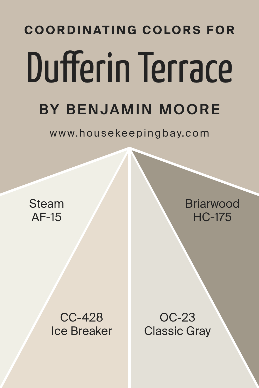
Coordinating Colors of Dufferin Terrace CC-456 by Benjamin Moore
Coordinating colors are complementary shades chosen to enhance each other when used together in an interior space. The main color sets the tone, and coordinating colors support the main hue, adding depth and character to the overall design. For instance, Dufferin Terrace CC-456 by Benjamin Moore, a sophisticated shade, has a variety of coordinating colors that bring out its best qualities in a room.
AF-15, known as Steam, is a gentle off-white that offers a subtle contrast without overwhelming the senses, making it an ideal backdrop for richer hues. It’s light and clean, providing a crisp canvas for any accent features.
CC-428, Ice Breaker, has a cool, pale blue tone that soothes and refreshes a space, complementing warmer shades beautifully with its understated presence. Another coordinate is OC-23, Classic Gray, which stands out as a versatile, mid-tone gray that blends seamlessly with a range of colors, adding a touch of sophistication to the palette.
Lastly, HC-175, known as Briarwood, brings a deep, warm taupe that enriches the environment, adding a cozy and inviting layer to the design scheme, excellent for creating a feeling of warmth in cooler toned rooms. Together, these colors build a harmonious palette that enhances the overall aesthetic of the interior.
You can see recommended paint colors below:
- AF-15 Steam
- CC-428 Ice Breaker
- OC-23 Classic Gray
- HC-175 Briarwood
housekeepingbay.com
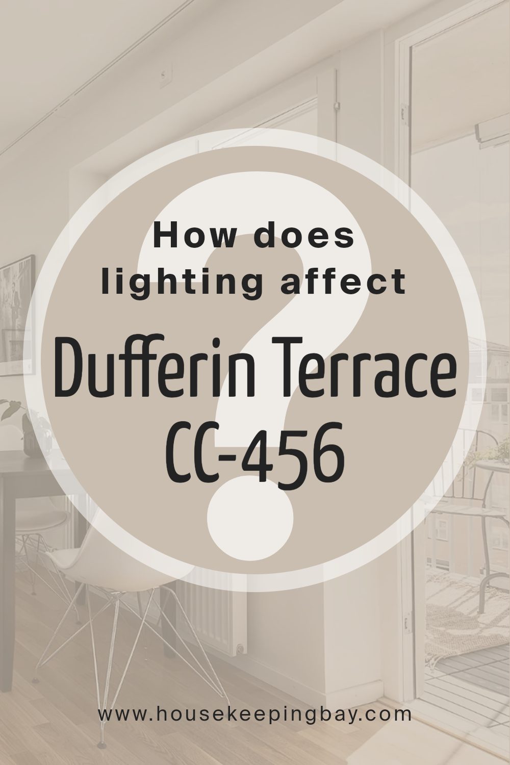
How Does Lighting Affect Dufferin Terrace CC-456 by Benjamin Moore?
Lighting plays a crucial role in how we perceive colors. The type and quality of light can dramatically change the appearance of a paint color on your walls. Different lighting conditions can enhance or mute the hues, affecting the overall ambiance of a room.
The paint color Dufferin TerraceCC-456 by Benjamin Moore is a nuanced shade that can appear differently under various lighting conditions. In artificial light, such as LED or incandescent bulbs, this color might look warmer, highlighting its underlying yellow or beige tones. This can make a room feel cozy and welcoming, especially during the evening.
In contrast, under natural sunlight, Dufferin TerraceCC-456 can reveal its cooler undertones, showing a more balanced and neutral beige. Natural light tends to bring out the truest version of paint colors, so during the day, this color could help create a calm and soothing atmosphere in a space.
The orientation of a room can further affect how Dufferin TerraceCC-456 appears:
- 1. North-faced rooms: These rooms get less direct sunlight and can seem cooler or slightly shadowy. Here, Dufferin TerraceCC-456 might lean towards its cooler side, potentially making the room appear a bit more muted and calm.
- 2. South-faced rooms: With ample sunlight, this color will brighten and show a warm, rich tone throughout the day. It enhances the room’s light, making the space feel airy and vibrant.
- 3. East-faced rooms: Morning light can make Dufferin TerraceCC-456 look very lively and fresh in the morning but might turn cooler and more subdued as the day progresses toward the evening.
- 4. West-faced rooms: Evening light in these rooms can cast a golden glow, which will warm up the color, making the space feel cozy and inviting as the day ends.
These variations show how lighting conditions should be considered when choosing a paint color, as they can significantly affect the mood and function of a room.
housekeepingbay.com
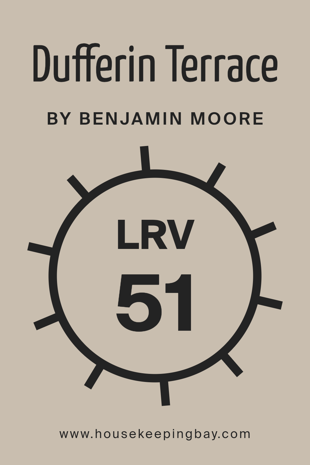
What is the LRV of Dufferin Terrace CC-456 by Benjamin Moore?
LRV stands for Light Reflectance Value, a measure used to determine how much light a paint color reflects away or absorbs into its surface. Ranging from 0 (absolute black, absorbing all light) to 100 (pure white, reflecting all light), LRV offers a practical guide to anticipate how colors will look in a setting.
Higher LRV colors make spaces appear brighter because they reflect more light, making them ideal for darker rooms. On the other hand, colors with lower LRVs create a cozier feel by absorbing more light, suitable for overly bright spaces.
Speaking of the LRV of Dufferin Terrace CC-456 by Benjamin Moore, which is 50.71, this sits at the midpoint of the LRV scale. This means the color does not lean heavily toward being overly bright nor too dark. It is versatile, providing a balance that works in various lighting conditions, reflecting a moderate amount of light to help keep the room feeling naturally illuminated yet retaining enough richness to add depth and warmth.
This balance is particularly beneficial in rooms that suffer from fluctuations in natural lighting throughout the day.
housekeepingbay.com
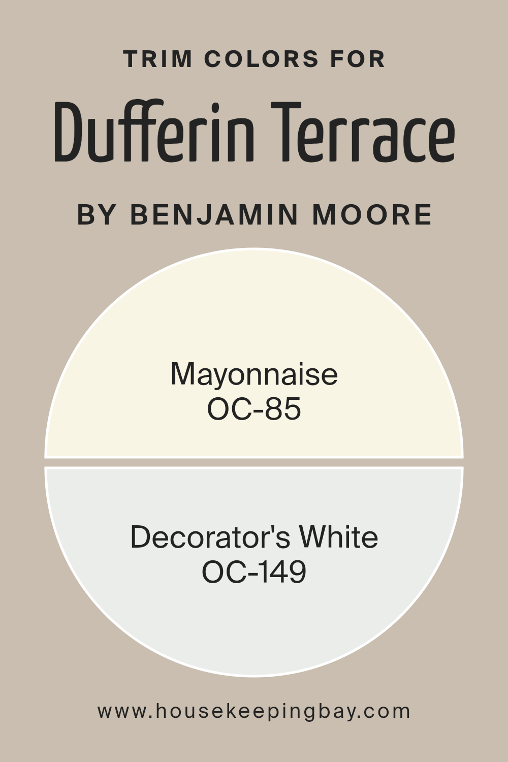
What are the Trim colors of Dufferin Terrace CC-456 by Benjamin Moore?
Trim colors are the shades used for painting the accents of a room or exterior of a building, such as door and window frames, baseboards, and crown moldings. These specific colors, like OC-85 – Mayonnaise and OC-149 – Decorator’s White by Benjamin Moore, are often selected to create a visual contrast with the primary wall colors or to complement the architecture’s features. Properly chosen trim colors can highlight distinctive architectural elements, enhance the overall atmosphere of the space, and help define various sections of a room or facade.
OC-85 – Mayonnaise is a warm, creamy white that offers a soft and subtle enhancement without overwhelming the senses. It provides a gentle contrast when used alongside deeper or more vibrant wall colors, making it a versatile choice for both traditional and contemporary spaces.
OC-149 – Decorator’s White, on the other hand, is a clean and bright white that works well to give a crisper edge to your space. It effectively reflects light, which can make smaller spaces appear larger and more inviting, making it ideal for a multitude of design backdrops.
You can see recommended paint colors below:
- OC-85 Mayonnaise
- OC-149 Decorator’s White
housekeepingbay.com
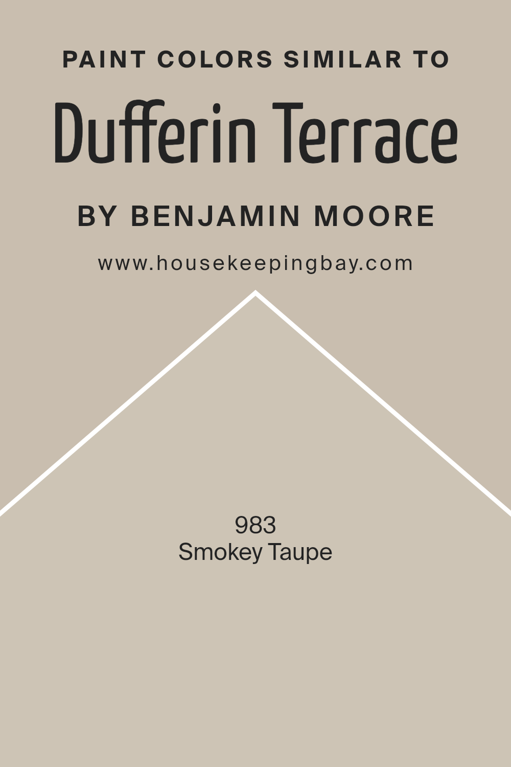
Colors Similar to Dufferin Terrace CC-456 by Benjamin Moore
Similar colors are crucial in interior design because they create a sense of harmony and cohesion in a space. When colors are from the same palette or family, they have a natural affinity for each other, allowing for a room’s aesthetic to flow smoothly without harsh contrasts. This cohesion can make a room feel more put together and intentional.
Using colors like Dufferin Terrace CC-456 and its similar shade, Smokey Taupe 983 by Benjamin Moore, demonstrates this effect well. Both colors share a soothing neutrality that offers versatility in decor, making them ideal for matching with various textures and furniture styles. When similar colors are used together, they also make spaces appear larger and more open.
Dufferin Terrace CC-456 by Benjamin Moore is a rich yet muted hue that carries an understated elegance. Its warmth lends itself easily to creating a cozy, welcoming space without overwhelming with too much intensity.
On the other hand, Smokey Taupe 983 is a softer shade that borders between beige and gray. This color is particularly useful for those seeking to achieve a minimalist look while maintaining warmth in the décor. Both colors work well together to provide a sophisticated yet calming atmosphere that can enhance virtually any living space.
You can see recommended paint color below:
housekeepingbay.com
How to Use Dufferin Terrace CC-456 by Benjamin Moore In Your Home?
Dufferin Terrace CC-456 by Benjamin Moore is a versatile paint color with a soothing appeal. This shade is a soft, neutral tone that fits effortlessly into any home setting, making rooms feel calm and welcoming. Whether you’re painting a bedroom, living room, or even a kitchen, Dufferin Terrace provides a solid foundation that pairs well with various decor styles and colors.
Homeowners can use this color to create a cozy backdrop for their daily activities. It works particularly well in spaces that aim to promote relaxation, such as bedrooms and living rooms. The subtle nature of Dufferin Terrace also makes it ideal for larger areas; it won’t overpower your furniture or art, allowing personal touches to take center stage.
Additionally, this color can help smaller spaces appear more spacious and brighter, as its light hue reflects natural light beautifully. For those updating their home, applying Dufferin Terrace can refresh their walls and bring a new sense of warmth to their living environment without overwhelming the senses.
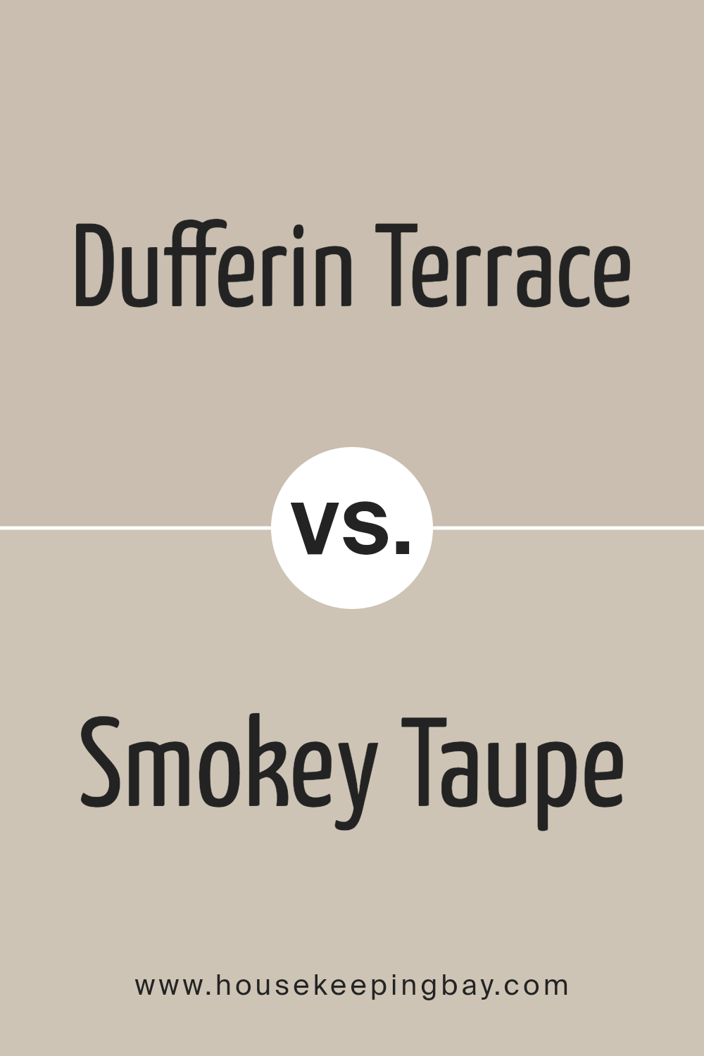
Dufferin Terrace CC-456 by Benjamin Moore vs Smokey Taupe 983 by Benjamin Moore
Dufferin Terrace CC-456 by Benjamin Moore is a rich, warm beige with hints of understated brown. It gives off a cozy feeling, ideal for creating a welcoming space. This shade pairs well with natural materials like wood and stone, enhancing the earthy vibes of a room.
In contrast, Smokey Taupe 983 by Benjamin Moore leans more towards a medium taupe that blends gray and brown. This color is versatile and sophisticated, useful for spaces that aim for a subtle, contemporary look. It works nicely in areas that get a lot of natural light, as the gray tones become more apparent, providing a soft, neutral backdrop.
Both colors offer a neutral palette, but Dufferin Terrace is warmer, making it better for traditional or rustic decors, while Smokey Taupe suits modern aesthetics due to its cooler undertones. Each color creates a distinct mood and can effectively enhance different styles and spaces.
You can see recommended paint color below:
housekeepingbay.com
As I summarize my thoughts on Benjamin Moore’s CC-456 Dufferin Terrace, I realize how this particular shade can profoundly influence the aesthetics of a space. It’s a color that offers a unique blend of sophistication and warmth, making it a versatile choice for anyone looking to refresh their home’s look. Its ability to create a cozy atmosphere while retaining a touch of elegance makes it suitable for various settings, from classic living rooms to modern kitchens.
I appreciate how this shade acts as a neutral backdrop, allowing for creative freedom with decor and furniture. Whether pairing it with bold colors for a lively vibe or soft tones for a more soothing effect, Dufferin Terrace proves to be adaptable. It’s a testament to Benjamin Moore’s commitment to providing colors that not only beautify a space but also enhance the living experience within it.
Using Dufferin Terrace could be the perfect option for anyone seeking a reliable and appealing hue to complement their home.
It stands out as a thoughtful choice in Benjamin Moore’s extensive palette, demonstrating once again why they remain a leader in the paint industry.
housekeepingbay.com
