Deep Mulberry 2069-10 by Benjamin Moore
A Burst of Bold Berry Charm
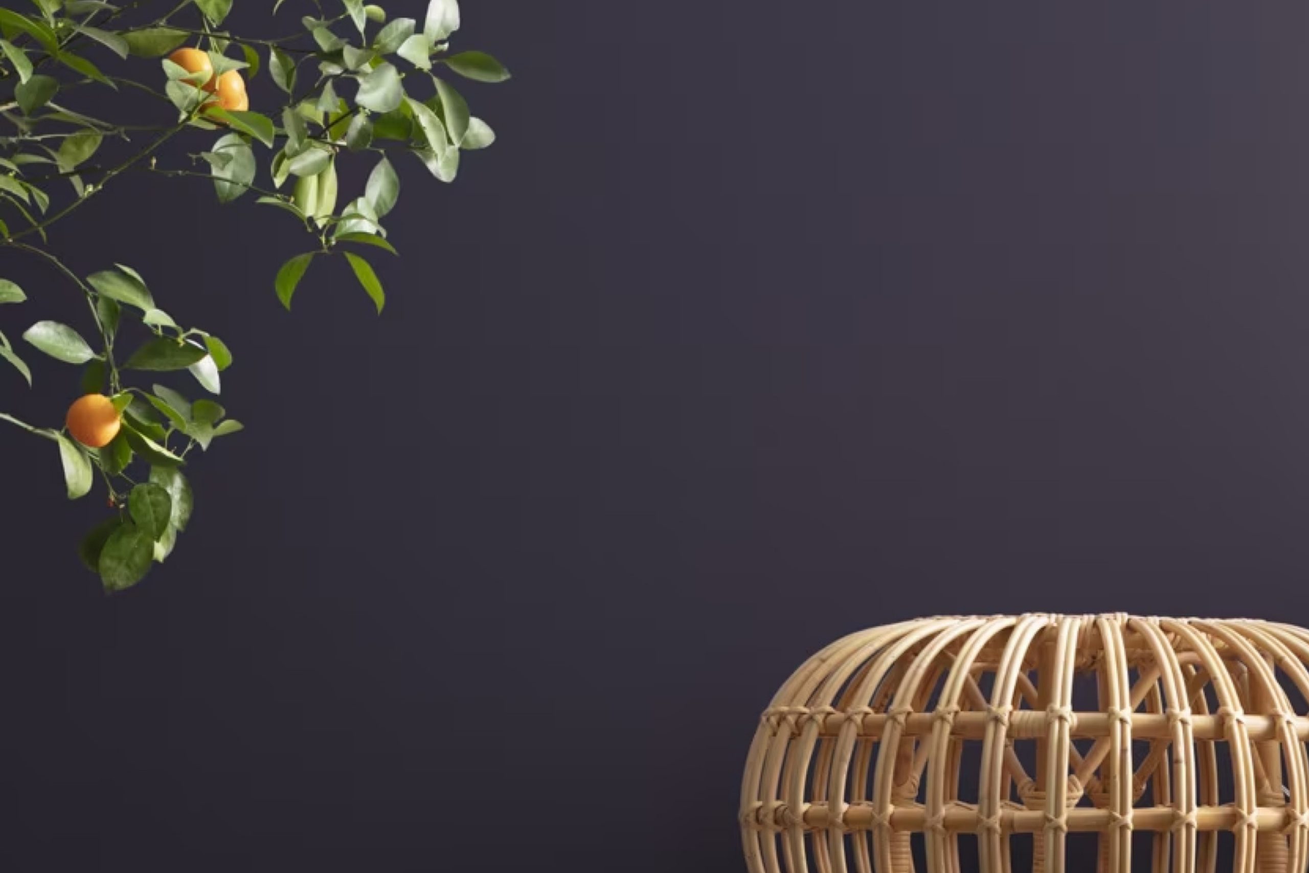
If you’ve been thinking about giving your space a fresh coat of paint and love a touch of drama, you might really like 2069-10 Deep Mulberry by Benjamin Moore. This rich, deep purple shade can create a cozy, inviting feel in any room, perfect for adding a bold yet sophisticated flair. It’s the kind of color that can really set the mood – think elegant dinner parties or a quiet evening with a book.
Using Deep Mulberry can add a touch of sophistication to your living room, dining area, or bedroom. You might be surprised by how well it pairs with different decor styles, whether you lean towards modern minimalism or something more classic. It can also balance well with lighter hues and metallic accents, giving you plenty of decorating options.
Let’s think about the best ways you can use Deep Mulberry in your home to make each room special and deeply reflective of your personal style.
Whether you decide to paint an accent wall or commit to coloring an entire room, this shade has the potential to truly enhance your living space.
via benjaminmoore.com
What Color Is Deep Mulberry 2069-10 by Benjamin Moore?
Deep Mulberry 2069-10 by Benjamin Moore is a rich, dark hue, reminiscent of the berry from which it draws its name. This color combines notes of deep purple and burgundy, resulting in a sophisticated and warm presence suitable for various spaces. Well-suited for creating cozy, intimate settings, Deep Mulberry can anchor a room with its strong visual impact.
In terms of interior styles, Deep Mulberry shines in classic and contemporary settings. For a traditional approach, pairing it with luxe fabrics like velvet or silk adds a layer of opulence, particularly in living rooms or bedrooms.
When used in modern decor, it contrasts beautifully against clean lines and minimalist furniture, offering a bold backdrop that makes lighter colors pop. Material-wise, Deep Mulberry pairs excellently with natural wood, particularly darker tones like walnut or mahogany, which complement its depth without competing for attention. Metallic accents in gold or bronze can also enhance this color’s warmth, bringing out its vibrant undertones.
For textures, soft, plush textiles such as wool or chunky knits will balance the color’s intensity, creating a welcoming and balanced space. Overall, Deep Mulberry 2069-10 is versatile, lending itself to a range of designs that appreciate a touch of drama and sophistication.

housekeepingbay.com
Is Deep Mulberry 2069-10 by Benjamin Moore Warm or Cool color?
Deep Mulberry 2069-10 by Benjamin Moore is a rich, vibrant purple hue that brings a strong sense of personality to any room. This color is ideal for someone looking to make a bold statement in their home.
Its deep purple tone can make large rooms feel cozier and more intimate while adding depth and sophistication to smaller spaces. When used on a feature wall, Deep Mulberry 2069-10 can serve as a striking backdrop for art, furniture, or décor, highlighting these elements without overwhelming them.
In living rooms or bedrooms, combining Deep Mulberry with softer, neutral shades like light grays or creams can balance out its intensity, providing a nice contrast that is pleasing to the eye. In dimly lit or north-facing rooms, this color can add warmth, creating a cozy, inviting atmosphere. Also, it is versatile for contemporary or traditional settings, fitting well with various decorating styles.
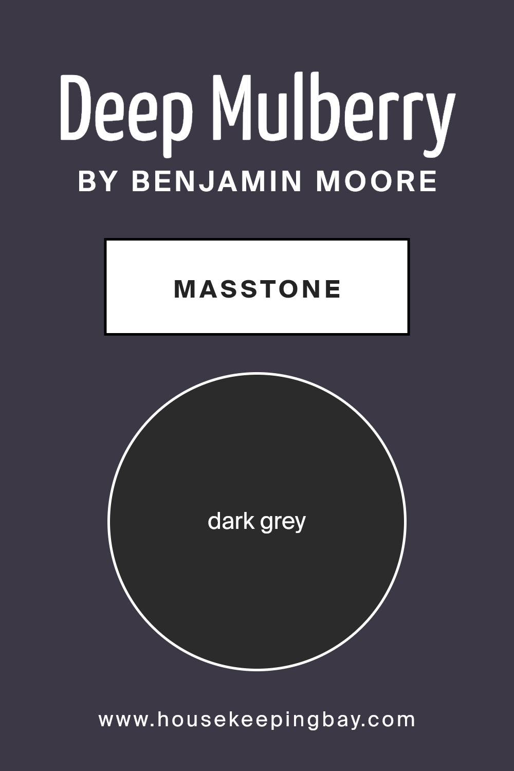
What is the Masstone of the Deep Mulberry 2069-10 by Benjamin Moore?
Deep Mulberry 2069-10 by Benjamin Moore, with its masstone of dark grey, identified by the color code #2B2B2B, offers a distinct and sophisticated presence in any home. This shade, because of its deep and immersive dark grey tone, is excellent for creating a strong visual anchor in a room.
It works particularly well in areas that benefit from a feeling of coziness and containment, such as bedrooms or dens. In spaces with ample natural light, Deep Mulberry can provide an elegant contrast, making the room feel more grounded and secure.
Conversely, in smaller or dimly-lit spaces, using this color might make the room appear smaller or more confined. Consequently, it is advised to balance it with lighter colors or reflective surfaces to maintain a feeling of spaciousness. Overall, Deep Mulberry is versatile enough to add depth and sophistication to any space while providing a robust backdrop for both modern and traditional styles.
housekeepingbay.com
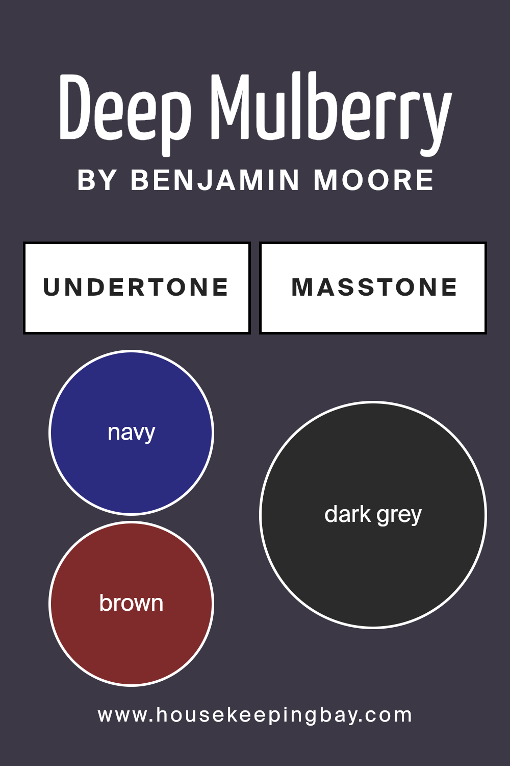
Undertones of Deep Mulberry 2069-10 by Benjamin Moore
Deep Mulberry 2069-10 by Benjamin Moore is a complex color with a palette of intriguing undertones that significantly influence its appearance in varying lighting and surroundings. This paint contains hints of navy, brown, dark green, purple, dark turquoise, olive, and grey. These undertones contribute to the color’s versatility and complexity, impacting how it is perceived in different spaces.
On interior walls, Deep Mulberry 2069-10 may manifest differently depending on the room’s natural and artificial light. In bright sunlight, the purple and navy undertones might become more prominent, giving the walls a rich, regal feel. In softer, artificial light, the brown and dark green undertones could make the space feel cozy and grounded.
The presence of olive and grey undertones helps smooth out the vibrancy, lending a subtle neutrality to the color. This makes Deep Mulberry 2069-10 adaptable and nuanced, capable of complementing a range of decor styles from modern to traditional.
Overall, the mix of undertones in Deep Mulberry 2069-10 allows it to shift in mood and impact, making it a unique choice for those looking to add depth and sophistication to their interiors without overwhelming the senses. This color’s ability to adapt subtly in different environments and lighting conditions makes it a practical and intriguing choice for interior walls.
housekeepingbay.com
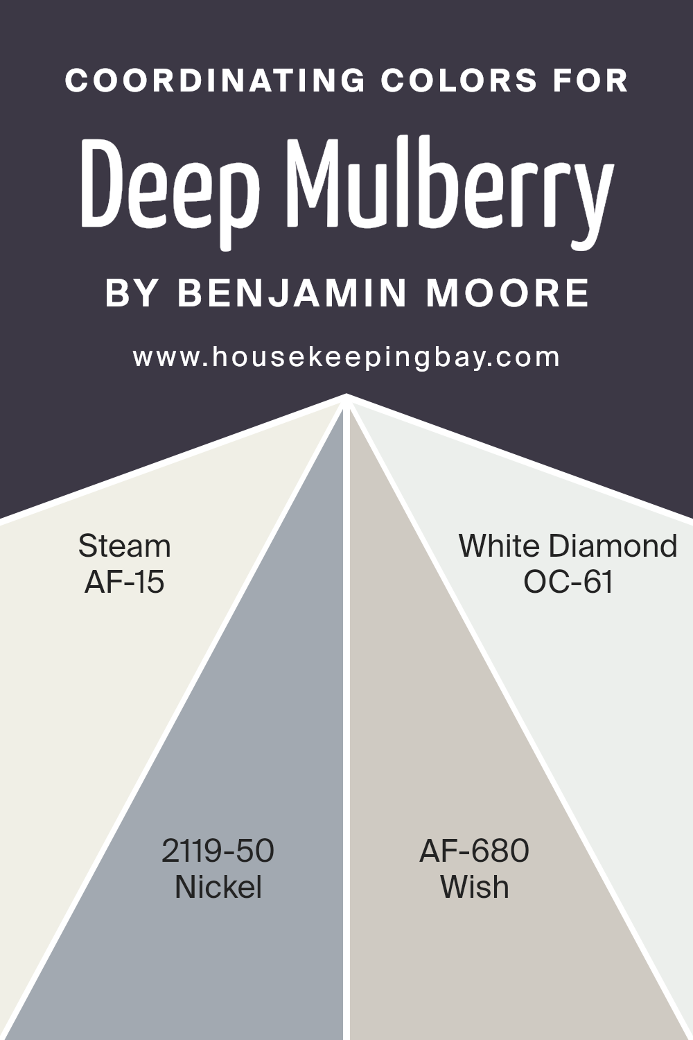
Coordinating Colors of Deep Mulberry 2069-10 by Benjamin Moore
Coordinating colors are selected to complement and enhance the appearance of a primary color by creating visual harmony and balance in a space. When you use a bold shade like Deep Mulberry 2069-10 by Benjamin Moore, adding coordinating colors can help to soften the impact or highlight its richness, depending on the colors chosen. For instance, neutrals and subtle hues often work best as they can temper the boldness of a deep color or allow it to stand out as a focal point without competing for attention.
The coordinating color AF-15 – Steam provides a clean and fresh look, serving almost as a crisp canvas that allows the vibrancy of Deep Mulberry to pop even more. On the other hand, 2119-50 – Nickel is a subtle, muted gray that can act as a grounding element, effortlessly tying in the intense purple of Deep Mulberry with more understated parts of the decor.
AF-680 – Wish offers a slightly warmer tone, giving a soft, soothing backdrop that can help in creating a more inviting atmosphere. Lastly, OC-61 – White Diamond has a slight sparkle to it, adding a hint of brilliance that contrasts nicely with the rich depth of Deep Mulberry, ensuring that the space feels dynamic yet harmonious.
You can see recommended paint colors below:
- AF-15 Steam
- 2119-50 Nickel
- AF-680 Wish
- OC-61 White Diamond
housekeepingbay.com
How Does Lighting Affect Deep Mulberry 2069-10 by Benjamin Moore?
Lighting plays a crucial role in how colors appear in a space. Different light sources can dramatically change the perception of color. For example, Deep Mulberry 2069-10 by Benjamin Moore may look different under various lighting conditions and directional exposures.
In artificial light, Deep Mulberry can take on a richer, more intense hue. Incandescent lighting, which tends to emit a warmer glow, can bring out the cozy, comfortable qualities of this deep, vibrant color. Fluorescent lighting, however, can make it appear slightly bluer and less warm due to its cooler tone.
In natural light, the appearance of Deep Mulberry varies depending on the time of day and the weather. On a sunny day, natural sunlight can make the color look brighter and more dynamic. On a cloudy day, it might appear a bit muted but still retains its depth.
The orientation of the room also affects how Deep Mulberry is perceived:
– North-facing rooms: These rooms get less direct sunlight, which can make colors appear cooler and more subdued. Here, Deep Mulberry may look more like a dark, shadowy plum.
– South-facing rooms: These rooms benefit from abundant daylight, which can make Deep Mulberry appear warmer and more vibrant. The color can really pop and feel lively in a south-facing room.
– East-facing rooms: Morning light is cooler, so Deep Mulberry might appear slightly muted in the morning but will warm up later in the day as the sun moves.
– West-facing rooms: Evening light brings warmth and a golden hue, making Deep Mulberry feel rich and welcoming as the day progresses into night.
Understanding how light interacts with paint colors like Deep Mulberry can help in making informed decisions about painting and decorating to achieve the desired atmosphere in any room.
housekeepingbay.com
What is the LRV of Deep Mulberry 2069-10 by Benjamin Moore?
LRV stands for Light Reflectance Value, a measure used to describe the percentage of light a paint color reflects back into a room. It ranges from 0, which absorbs all light and appears completely black, to 100, reflecting all light and appearing pure white.
This value helps in assessing how a color might look when applied to large surfaces like walls. A higher LRV results in a brighter room since more light bounces back, while a lower LRV can make a space feel dimmer because it absorbs more light.
Deep Mulberry2069-10 by Benjamin Moore has an LRV of 5.36, which is fairly low. This means it is a dark color that doesn’t reflect much light. In practical terms, when used on walls, this color can make spaces appear cozier and more enclosed.
It might not be ideal for a small room as it could make the space feel smaller and darker. However, in a well-lit or larger room, it can add a sense of depth and richness, provided there is enough lighting to balance the deep hue of the walls.

housekeepingbay.com
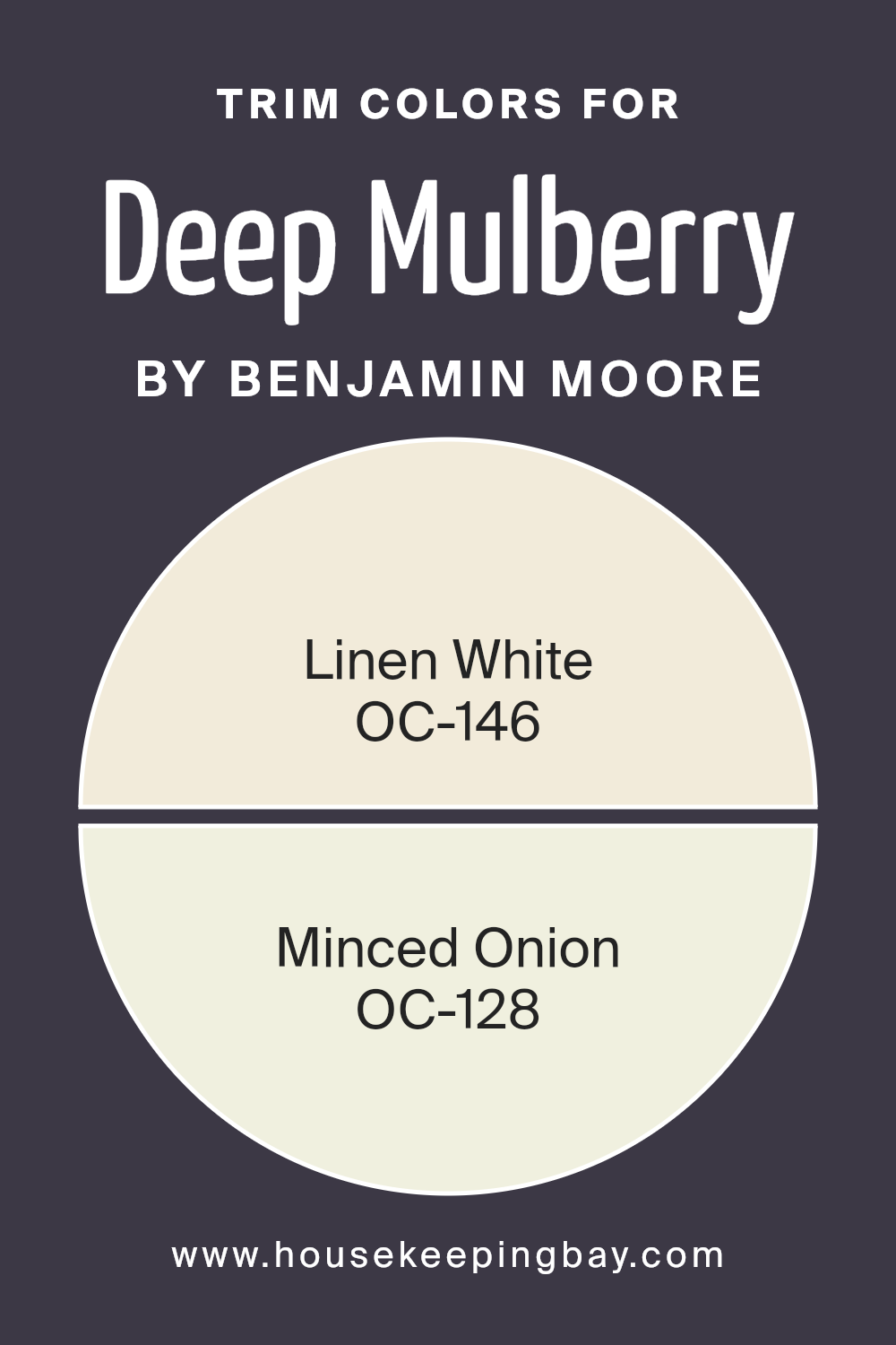
What are the Trim colors of Deep Mulberry 2069-10 by Benjamin Moore?
Trim colors are the shades selected for the architectural trim elements like door frames, window trims, and skirting boards, that accentuate or complement the main wall color. For Deep Mulberry 2069-10 by Benjamin Moore, choosing the right trim color is crucial as it helps in highlighting the rich, bold hues of the walls, giving a neat and finished look to the room.
The trim colors can either contrast sharply or blend subtly with the main color, depending on the desired visual impact and the ambiance of the space. Using OC-146 – Linen White, a soft and warm white shade, offers a gentle contrast that is not too stark against the deep tones of Deep Mulberry, providing a soothing border that lightens the space.
OC-128 – Minced Onion, on the other hand, is a muted, slightly grayish color that merges smoothly with darker shades, thereby softening the overall feel and adding a sophisticated touch to the mulberry walls. Both colors add definition and character to the space, enhancing the overall aesthetic without overwhelming the primary color choice.
You can see recommended paint colors below:
- OC-146 Linen White
- OC-128 Minced Onion
housekeepingbay.com
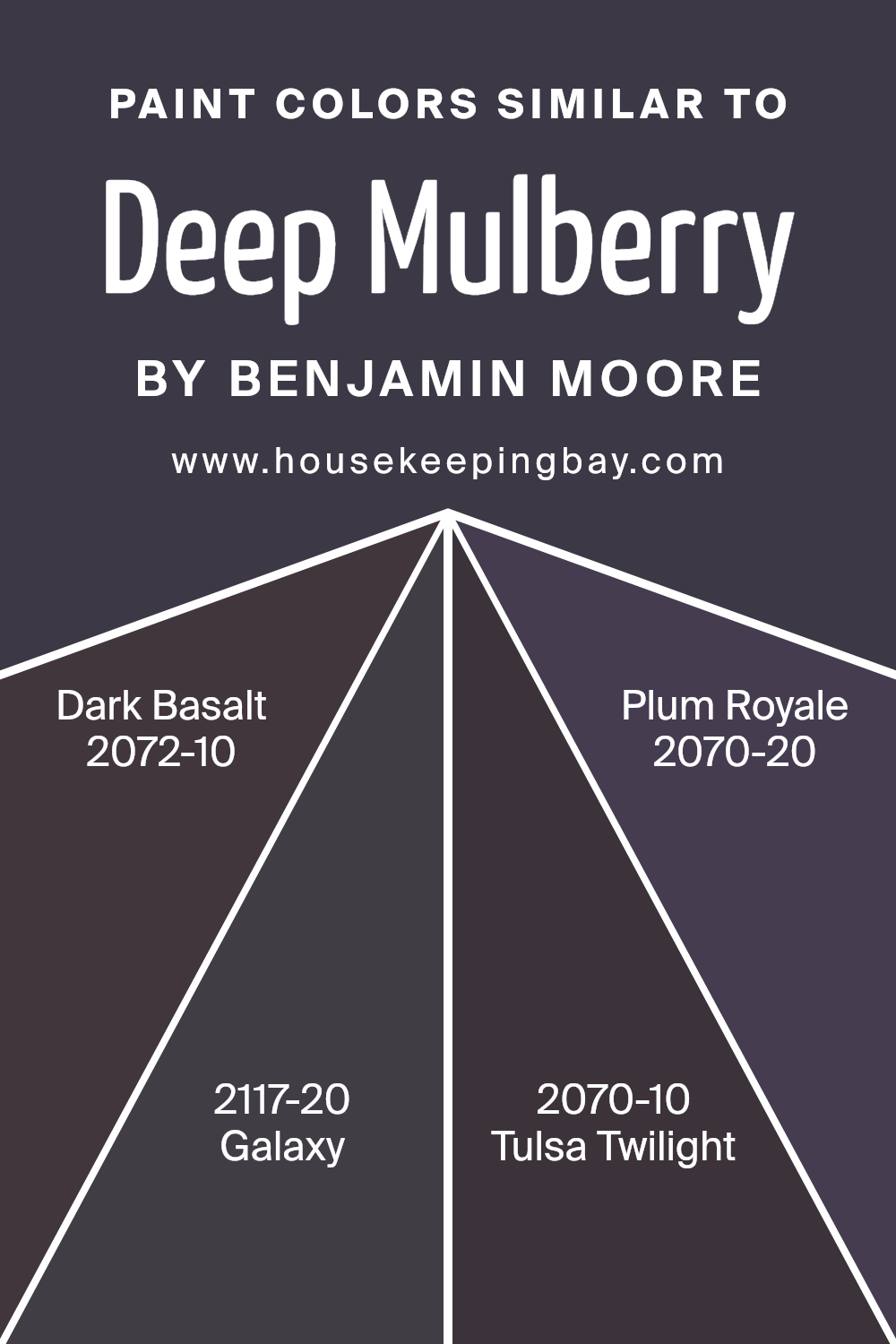
Colors Similar to Deep Mulberry 2069-10 by Benjamin Moore
Integrating similar colors in design is essential for achieving a harmonious and balanced look. Similar colors, such as those related to Deep Mulberry 2069-10 by Benjamin Moore, have the power to enrich environments subtly.
For example, colors like Dark Basalt 2072-10 or Galaxy 2117-20, which share similar depths and intensities, can enhance the overall aesthetic without causing a sharp contrast. This is especially useful in spaces where a calming continuity is desired, allowing other design elements like furniture or artworks to stand out without overwhelming the senses.
For instance, Dark Basalt 2072-10 is a deep charcoal hue with a hint of purple, making it an excellent foundational color that adds sophistication and depth to a room. Galaxy 2117-20, on the other hand, is richer and leans more towards an intense violet, perfect for creating focal points in a space without being too bright or overpowering. Tulsa Twilight 2070-10 and Plum Royale 2070-20 are also beautiful choices that lie within this color spectrum. Tulsa Twilight presents a muted purple, adding a sense of mystery and elegance to spaces.
Plum Royale offers a bolder, deeper purple that can inject a room with a sense of royal warmth and luxury. Such colors work well together to provide a cohesive but dynamic visual experience, allowing each hue to contribute to a sophisticated atmosphere.
You can see recommended paint colors below:
- 2072-10 Dark Basalt
- 2117-20 Galaxy
- 2070-10 Tulsa Twilight
- 2070-20 Plum Royale
housekeepingbay.com
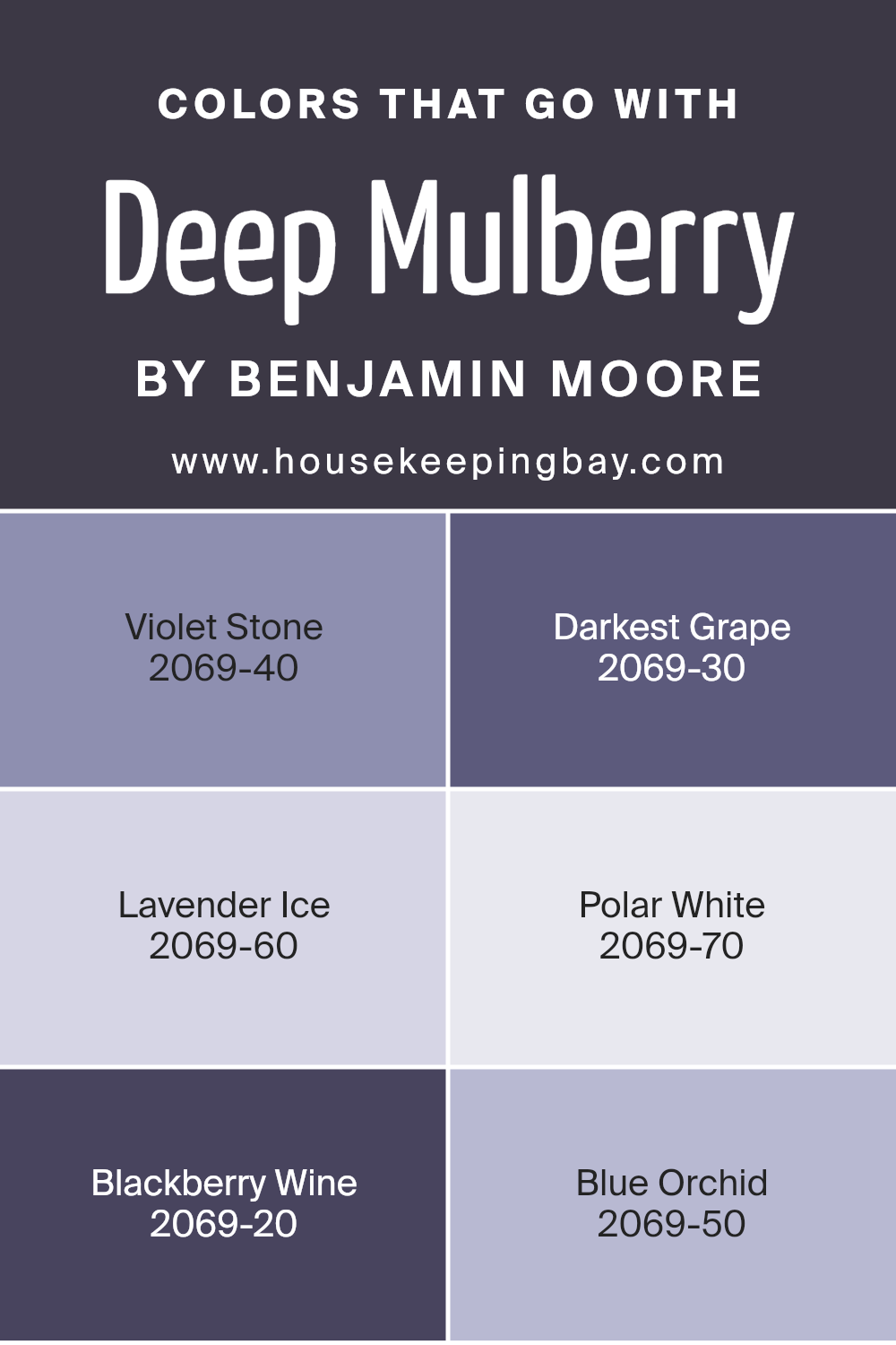
Colors that Go With Deep Mulberry 2069-10 by Benjamin Moore
Selecting complementary colors for Deep Mulberry 2069-10 by Benjamin Moore is essential for creating a balanced and harmonious space. These colors help highlight the rich depth of Deep Mulberry, allowing interior spaces to feel cohesive and thoughtfully designed. When paired accurately, these colors enhance the aesthetic of a room, making design choices feel intentional and well-curated.
The colors Violet Stone, Darkest Grape, Lavender Ice, Polar White, Blackberry Wine, and Blue Orchid each play a unique role. Violet Stone, a subtle shade, acts as a soft background that allows Deep Mulberry to shine.
Darkest Grape is a darker tone that can provide a striking contrast, adding visual depth to spaces. Lavender Ice is much lighter and brings a fresh, airy feel, perfect for adding a touch of lightness to the intensity of Deep Mulberry.
Polar White offers a crisp contrast, making the deep purple of Deep Mulberry pop, ideal for trim or ceilings. Blackberry Wine complements Deep Mulberry with its similar saturation but slightly lighter hue, ensuring the room feels layered without overwhelming the senses.
Finally, Blue Orchid introduces a hint of blue, providing a cool counterpoint to the warm undertones in Deep Mulberry, great for creating a dynamic color scheme. Together, these colors form a versatile palette that can suit various design tastes and settings.
You can see recommended paint colors below:
- 2069-40 Violet Stone
- 2069-30 Darkest Grape
- 2069-60 Lavender Ice
- 2069-70 Polar White
- 2069-20 Blackberry Wine
- 2069-50 Blue Orchid
housekeepingbay.com
How to Use Deep Mulberry 2069-10 by Benjamin Moore In Your Home?
Deep Mulberry 2069-10 by Benjamin Moore is a rich, intense purple paint color that adds a bold touch to any space. This deep purple can make large rooms feel cozier and small spaces look more inviting. It works well in living rooms or dining areas, creating a dramatic backdrop for furniture and art.
You can use it on an accent wall to add a pop of color without overwhelming the room. In bedrooms, Deep Mulberry can create a cozy, intimate vibe, especially when paired with soft lighting and neutral colors.
This color pairs beautifully with light grays, creamy whites, and silver accents, helping to balance its depth. In a bathroom, applying it on cabinetry or an accent wall could turn an ordinary space into a more stylish one. To brighten up spaces with limited light, combine Deep Mulberry with lighter colors on trim or decorative moldings. This versatile color can enrich any home with its deep, rich hue.
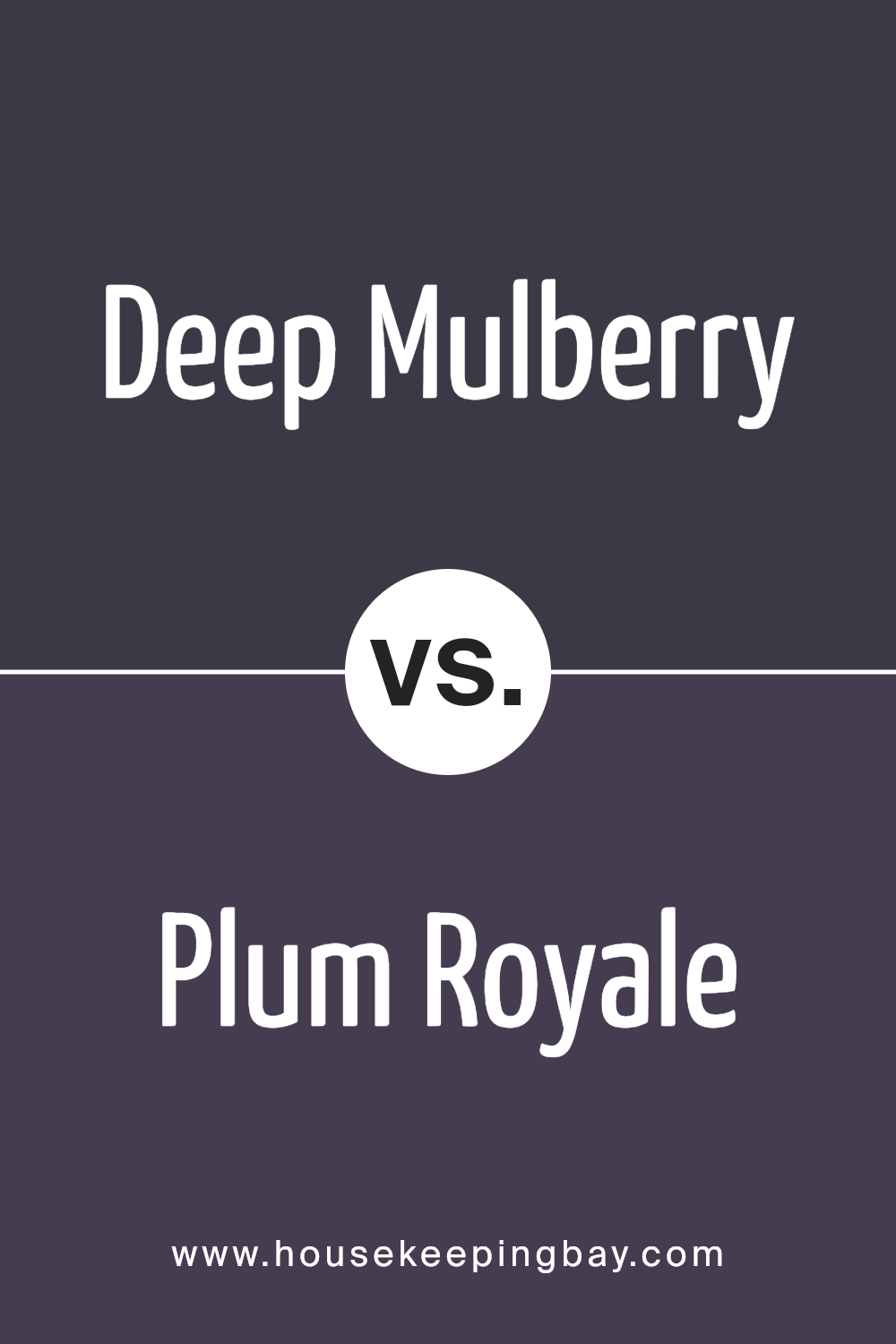
Deep Mulberry 2069-10 by Benjamin Moore vs Plum Royale 2070-20 by Benjamin Moore
Deep Mulberry 2069-10 by Benjamin Moore is a rich, deep purple with strong red undertones, giving it a vibrant and cozy feel. It’s a color that can make spaces feel more intimate and inviting. When used on walls, it can create a sophisticated backdrop that pairs well with warm neutrals or metallic accents.
Plum Royale 2070-20, also by Benjamin Moore, is slightly darker and leans more towards a true purple. This shade is intense and bold, making it ideal for a focal point in a room or for accent walls. It can also add drama and depth to a space, working well with light grays, creams, and even deep greens for a balanced look.
Both colors, Deep Mulberry and Plum Royale, are suited for those who want to add a touch of sophistication and warmth to their environment. However, Plum Royale, being darker, may make a room feel smaller but more dramatic, while Deep Mulberry can evoke a sense of coziness without feeling too closed in.
You can see recommended paint color below:
- 2070-20 Plum Royale
housekeepingbay.com
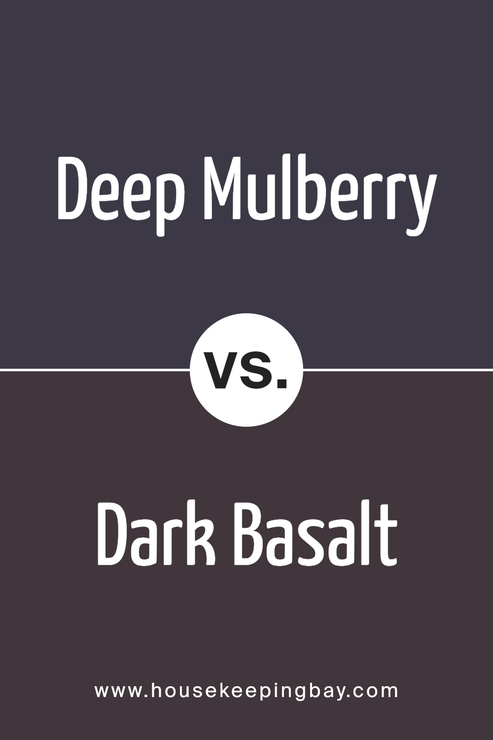
Deep Mulberry 2069-10 by Benjamin Moore vs Dark Basalt 2072-10 by Benjamin Moore
Deep Mulberry 2069-10 and Dark Basalt 2072-10, both from Benjamin Moore, offer distinct vibes for interior spaces. Deep Mulberry is a rich, vibrant purple that can add a bold and cozy feeling to a room. It works well in spaces designed for creativity or relaxation, giving off a warm and inviting ambiance.
In contrast, Dark Basalt 2072-10 leans towards a strong, deep gray with a hint of blue undertone. This color is perfect for creating a sophisticated and modern atmosphere. It’s versatile, working well in various areas such as living rooms or offices, providing a neutral backdrop that complements a wide range of décor.
Both colors are deep and intense, suitable for making a statement in a space. However, while Deep Mulberry brings warmth and vibrance, Dark Basalt offers a more subdued and contemporary look. Each color has its unique charm and can significantly influence the mood and style of a room.
You can see recommended paint color below:
- 2072-10 Dark Basalt
housekeepingbay.com
Deep Mulberry 2069-10 by Benjamin Moore vs Tulsa Twilight 2070-10 by Benjamin Moore
Deep Mulberry 2069-10 and Tulsa Twilight 2070-10 by Benjamin Moore are both dark, rich hues but they offer different vibes. Deep Mulberry leans more towards a deep purple shade, reminiscent of ripe mulberries. It’s a bold color that can add a sense of luxury and depth to a space. Perfect for creating a cozy, intimate feel in a room, it suits areas like bedrooms or dining rooms where you want a touch of sophistication.
Tulsa Twilight, however, has a more blue-base, presenting as a very dark blue that almost looks black in dimmer light. This color is ideal for those who wish to add drama and a bit of mystery to their environment. It works well in spaces that aim for a more serious, grounded aesthetic, like home offices or libraries.
Both colors are intense and can serve as excellent backgrounds for lighter furnishings or decor pieces, allowing them to pop against these dark backdrops. The choice between them depends on whether you prefer the warmer, purple tones of Deep Mulberry or the cooler, deep blue tones of Tulsa Twilight.
You can see recommended paint color below:
- 2070-10 Tulsa Twilight

housekeepingbay.com
Deep Mulberry 2069-10 by Benjamin Moore vs Galaxy 2117-20 by Benjamin Moore
Deep Mulberry 2069-10 by Benjamin Moore is a rich, dark purple with warm undertones that adds a cozy and sophisticated feel to any space. It is particularly well-suited for creating a focal point in a room or for providing a background that evokes warmth and comfort.
Meanwhile, Galaxy 2117-20, also by Benjamin Moore, tends towards a darker, more intense blue with a deep saturation that implies a sense of boldness and drama. This color is ideal for achieving a striking impact, making it a great choice for accents or rooms designed for entertainment and impact.
While both colors are deep and vibrant, Deep Mulberry leans towards a purple hue that is softer and more traditionally linked to luxury, whereas Galaxy, with its blue tones, suggests a modern and dynamic vibe. Each color can dramatically influence the atmosphere of a room, depending on whether a warm, inviting setting or a dynamic, contemporary look is desired.
You can see recommended paint color below:
- 2117-20 Galaxy

housekeepingbay.com
As I wrap up my thoughts on Benjamin Moore’s 2069-10 Deep Mulberry paint, I am impressed with its unique and rich hue. This color makes a bold statement and can significantly enhance the aesthetic of any room.
Whether it’s adding sophistication to a bedroom or a touch of drama to a living room, Deep Mulberry proves to be an excellent choice for those wanting to introduce a deep, impactful color into their home decor. I appreciate how it pairs beautifully with various textures and complementary colors, offering endless possibilities for interior design.
For anyone considering a new paint color that brings both warmth and depth to a space, I definitely suggest considering Deep Mulberry. It’s not just a paint; it’s a way to make any space feel special and beautifully appointed.

housekeepingbay.com
