Cromwell Gray HC-103 by Benjamin Moore
Soft Elegance for Lasting Beauty
Picture a shade that combines the timeless elegance of gray with a touch of warmth. HC-103 Cromwell Gray by Benjamin Moore offers just that, creating a perfect balance for any space in your home. As you consider revamping your living room, bedroom, or even a cozy reading nook, this color can serve as a foundation that supports various design styles and complements an array of other colors.
You might find that Cromwell Gray strikes a unique note that is neither too cold nor overly warm, making it an ideal choice for those who desire a neutral yet inviting atmosphere. It works well in both traditional and modern settings.
By using Cromwell Gray, your rooms can achieve a sophisticated look without being overly formal. It harmonizes beautifully with natural materials like wood and stone, as well as with other paint colors, allowing you to create a cohesive and well-thought-out design throughout your home. Whether you’re pairing it with soft whites, bold accents, or other neutrals, Cromwell Gray adapts effortlessly to your vision.
Contemplating a change in your interiors?
Consider how this shade might offer just the right amount of character and refinement, making your home feel both new and timeless simultaneously.
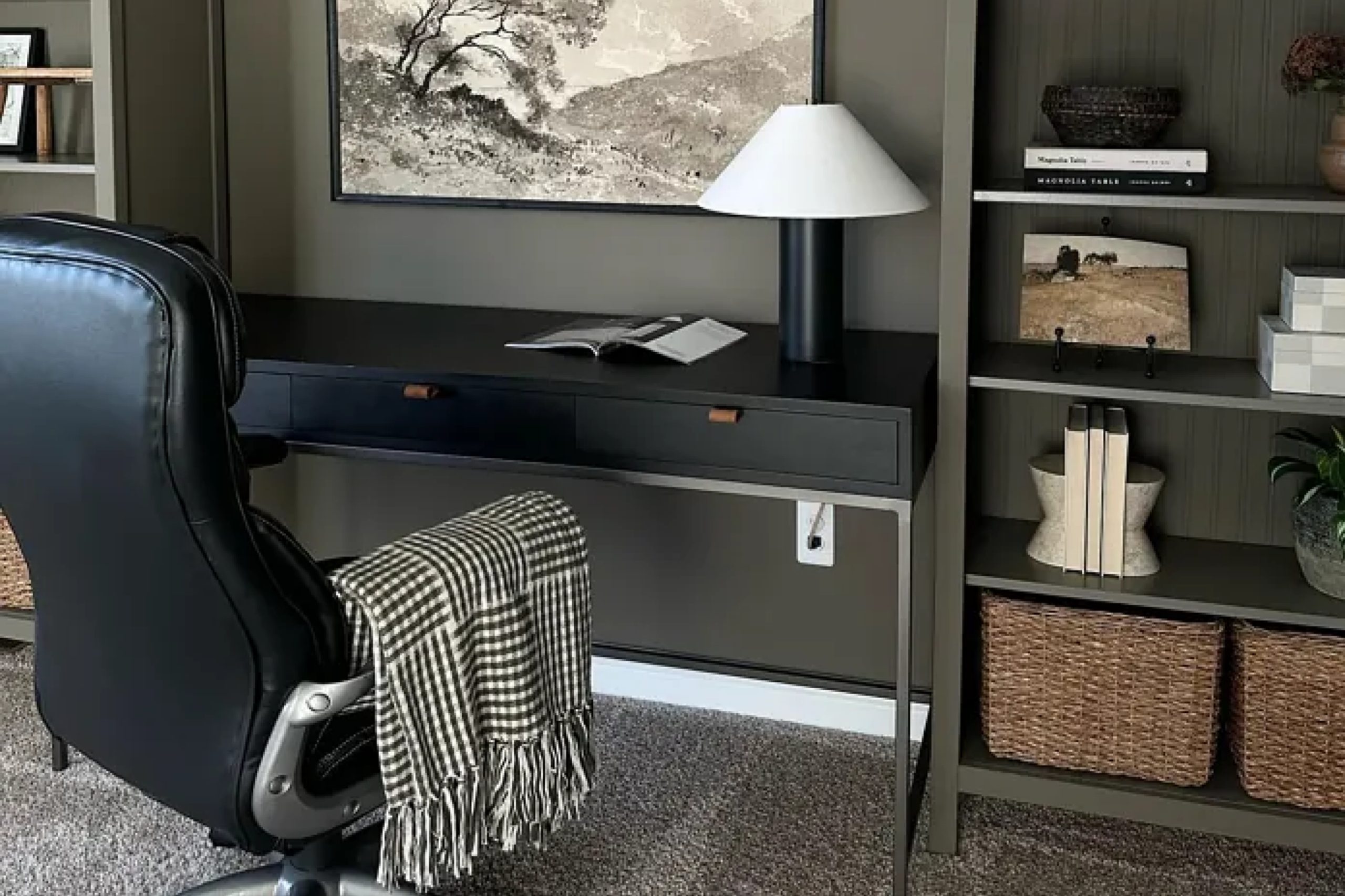
via plan-home.com
What Color Is Cromwell Gray HC-103 by Benjamin Moore?
Cromwell Gray HC-103 by Benjamin Moore is a versatile and muted shade. The hue is a balanced blend of gray with subtle undertones that hint at green and brown, creating a rich, earthy tone. With its comfortable and classic feel, Cromwell Gray is ideal for traditional and modern interiors alike. It lends warmth and sophistication to a room without being overpowering.
In terms of style, Cromwell Gray works beautifully in both rustic and contemporary settings. In a rustic environment, it complements natural materials such as exposed wooden beams, stone, and metal fixtures.
For a more modern approach, it pairs well with sleek lines and minimalist decor, offering a soothing backdrop for bold artwork and unique furniture pieces.
Cromwell Gray also harmonizes well with various textures. Textured fabrics like linen and wool bring out its subtle warmth, while leather furniture can add an element of luxury. This color works nicely with natural wood finishes, from light oak to dark walnut, blending seamlessly into different decor styles.
Pairing Cromwell Gray with soft whites and creams can create a bright, airy atmosphere, while deep blues and greens can offer more contrast and depth. Its versatility makes it a valuable choice for any room.
housekeepingbay.com
Is Cromwell Gray HC-103 by Benjamin Moore Warm or Cool color?
Cromwell Gray HC-103 by Benjamin Moore is a versatile color that brings warmth and sophistication to any space. It’s a medium-toned gray with hints of green and brown, giving it a muted, earthy feel. This subtle mix makes it a great choice for those wanting a neutral yet interesting color.
In the home, Cromwell Gray can easily create a cozy and inviting atmosphere. It works well in living rooms, providing a calm and comfortable backdrop that pairs nicely with various furniture styles and colors.
In bedrooms, it offers a soothing environment, perfect for unwinding. Bathrooms benefit from its natural tone, adding a touch of elegance without overpowering the space.
Cromwell Gray also pairs well with both light and dark accents. It complements white trims for a crisp look or pairs with deeper shades for a more dramatic effect. Its adaptable nature makes it suitable for many styles, from modern to traditional.
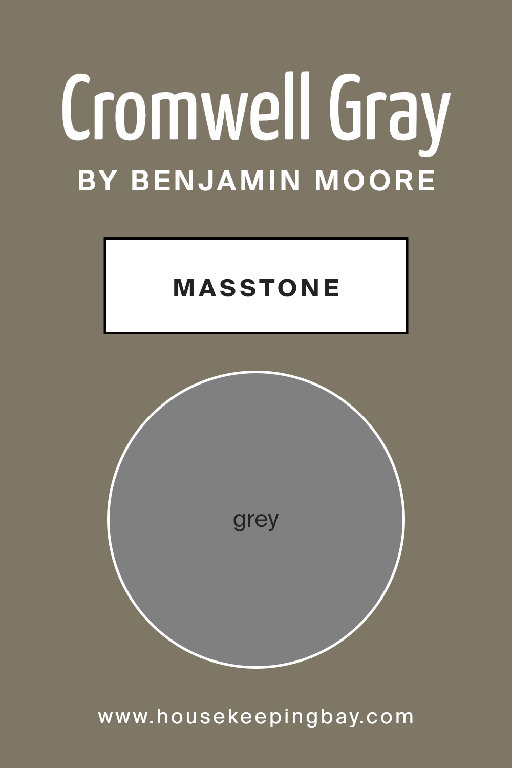
What is the Masstone of the Cromwell Gray HC-103 by Benjamin Moore?
Cromwell Gray HC-103 by Benjamin Moore is a versatile color choice for home interiors. Its masstone is a balanced grey (#808080), which is neutral and helps create a calm and understated atmosphere. This color works well in various rooms, including living rooms, bedrooms, and kitchens, because it doesn’t overpower other elements in the space.
The neutrality of this grey allows it to pair well with both warm and cool accents, such as white, beige, navy, or even brighter shades if you want contrast.
In living areas, Cromwell Gray can make rooms feel cozy yet open. In more intimate spaces like bedrooms, it fosters a serene environment, promoting relaxation. In kitchens or dining rooms, it provides a clean backdrop, letting you highlight bright furnishings or colorful dishware. Grey is timeless, making it a safe choice if you want a look that won’t age quickly.
Its ability to blend seamlessly into different styles and themes makes it popular in home design.
housekeepingbay.com
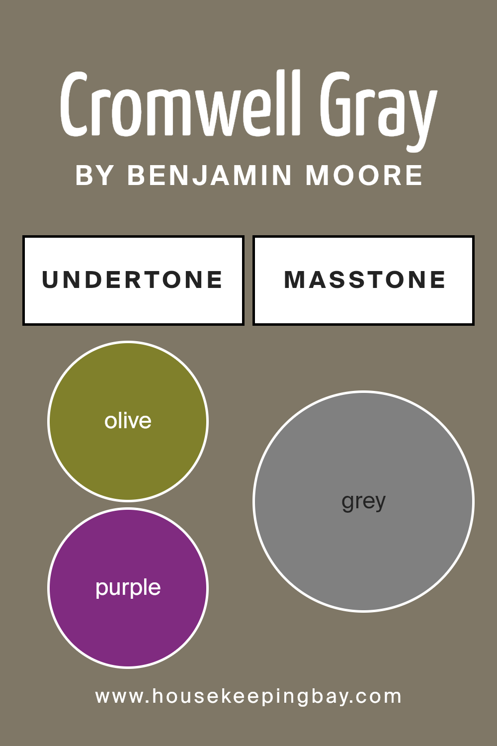
Undertones of Cromwell Gray HC-103 by Benjamin Moore
Cromwell Gray HC-103 by Benjamin Moore is a complex shade that carries a range of subtle undertones. These undertones, such as olive, purple, dark turquoise, and others, influence how the color appears under different lighting conditions and in varying contexts.
For instance, the olive and dark green undertones can lend the gray a warmer, earthier feel when paired with natural elements or wooden interiors. This can create a cozy, inviting atmosphere in a living area or study.
In contrast, the purple and dark turquoise undertones add depth and richness, making the gray feel more sophisticated and elegant. These undertones also can make the color appear slightly cooler, which works well in modern or minimalist spaces.
The presence of pale pink and light green undertones can subtly brighten the shade, introducing a soft and airy quality to the room, ideal for bedrooms or areas that benefit from a calming ambiance.
Overall, these undertones shape the way Cromwell Gray interacts with the surroundings and lighting. They affect how the walls look during different times of the day, making the space feel more versatile and dynamic.
When choosing Cromwell Gray for an interior, considering these undertones helps in achieving the desired mood and style for the room.
housekeepingbay.com
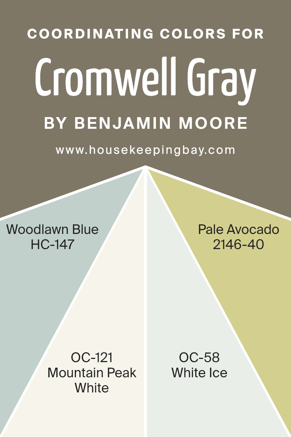
Coordinating Colors of Cromwell Gray HC-103 by Benjamin Moore
Coordinating colors are carefully selected hues that harmonize with a main color, enhancing the overall aesthetic of a space. These colors work together to create a balanced and pleasing visual experience. When coordinating colors for Cromwell Gray HC-103 by Benjamin Moore, it’s important to choose shades that complement its rich, earthy tone.
Cromwell Gray’s deep, warm quality pairs beautifully with colors that can either highlight its depth or provide a soft contrast.
One lovely coordinating color is HC-147, Woodlawn Blue, which brings a subtle, calming blue that feels fresh and airy next to the depth of Cromwell Gray. Meanwhile, OC-121, Mountain Peak White, offers a bright, crisp contrast that can lighten up a space, providing a clean look. Similarly, OC-58, White Ice, delivers a cool, icy white that can add an element of modern sophistication.
For a touch of warmth, 2146-40, Pale Avocado, introduces a gentle green hue that adds a hint of vitality without overwhelming the earthy base.
Together, these colors create a cohesive palette that allows Cromwell Gray to be the star while ensuring the space feels inviting and harmonious.
You can see recommended paint colors below:
- HC-147 Woodlawn Blue
- OC-121 Mountain Peak White
- OC-58 White Ice
- 2146-40 Pale Avocado
housekeepingbay.com
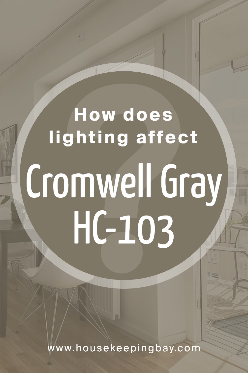
How Does Lighting Affect Cromwell Gray HC-103 by Benjamin Moore?
Lighting plays a crucial role in the perception of colors. It can change how a color appears, altering its hue, brightness, and saturation. Artificial and natural light have different effects on colors due to their distinct characteristics.
Cromwell Gray HC-103 by Benjamin Moore is a warm, medium-toned gray with slight brown undertones. In artificial light, especially under warm incandescent bulbs, Cromwell Gray may appear cozier and slightly warmer because the yellow tones in the light highlight the color’s brown undertones.
Under cooler artificial lighting, like fluorescent lights, the color might look more flat and could lose some of its warmth.
Natural light’s impact depends on the room’s orientation. In north-facing rooms, the light is cooler and more consistent throughout the day. Here, Cromwell Gray might appear grayer and slightly cooler, as the cool light subdues the warm undertones. This can create a calm, understated look.
In south-facing rooms, where the light is warmer and more intense, especially during the day, Cromwell Gray will seem warmer and more inviting. The increased light intensity can also make the color appear lighter and more vibrant, highlighting its warmth.
East-facing rooms receive bright, warm light in the morning, making Cromwell Gray appear warmer and brighter early in the day. In the afternoon, as the sunlight dims and turns cooler, the color may look more subdued and grayer.
In west-facing rooms, the opposite occurs. Morning light is dim and cooler, causing Cromwell Gray to look more muted and neutral. As the afternoon approaches, the light becomes warmer and more intense, enhancing the warm undertones and making the color appear richer and cozier.
Understanding these nuances can help in choosing the right lighting and color combinations for creating desired moods in different spaces.
housekeepingbay.com
What is the LRV of Cromwell Gray HC-103 by Benjamin Moore?
LRV, or Light Reflectance Value, measures the amount of light a color reflects. It is expressed as a percentage ranging from 0% to 100%, where 0% represents absolute black, which absorbs all light, and 100% represents pure white, which reflects all light.
A color’s LRV can significantly affect how it appears in a space because it shows how much light the color will reflect or absorb once applied to surfaces like walls.
Colors with a higher LRV tend to make a room appear brighter and more spacious, while those with a lower LRV can create a cozier, more intimate atmosphere.
Cromwell Gray HC-103 by Benjamin Moore has an LRV of 19.62, placing it on the lower end of the LRV scale. This means it reflects a limited amount of light, absorbing more of it instead.
In a room, Cromwell Gray will convey a sense of warmth and coziness, making it a good choice for spaces where a snug, welcoming feel is desirable.
Its relatively low LRV suggests that it might deepen in shade in low-light conditions or rooms without ample natural light. This makes it suitable for rooms where you want to add depth and intensity without overly darkening the space.

housekeepingbay.com
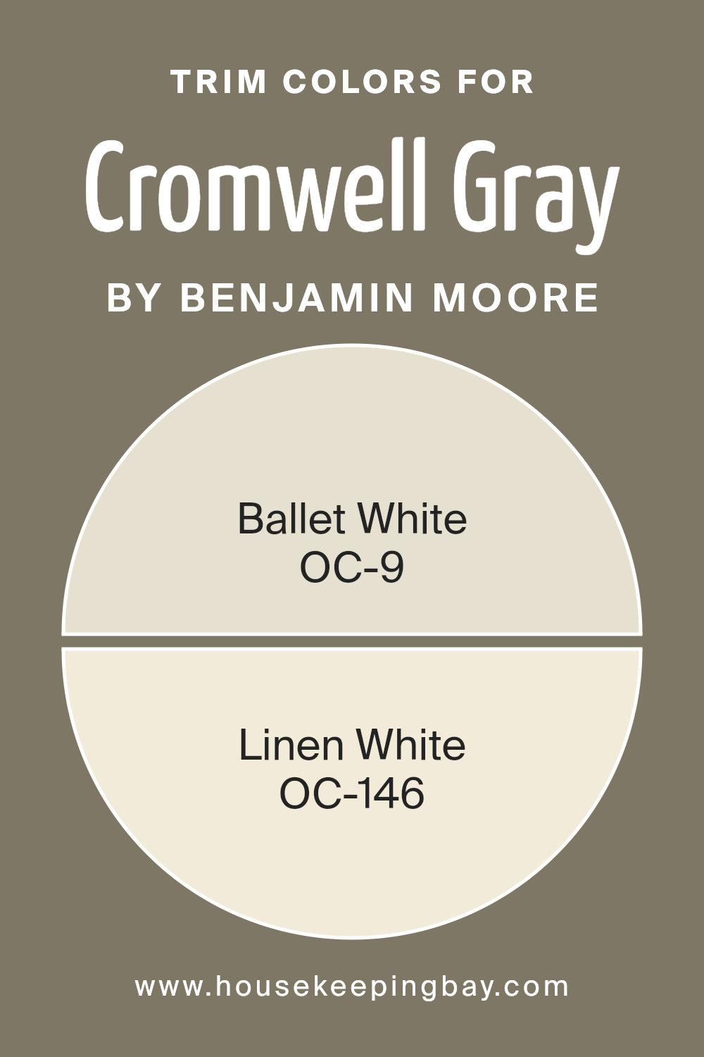
What are the Trim colors of Cromwell Gray HC-103 by Benjamin Moore?
Trim colors are the shades used to highlight or accentuate the edges and details of a room’s decor, such as baseboards, window frames, or moldings. When paired with Cromwell Gray HC-103 from Benjamin Moore, trim colors like OC-9 Ballet White and OC-146 Linen White can enhance the overall appearance and feel of a space.
Cromwell Gray is a medium-toned gray with warm undertones, creating a sophisticated and elegant ambiance. The role of trim colors is to provide contrast and complement the main wall color, bringing out its depth and character.
By using well-chosen trim colors, you can add dimension and balance to your interiors, making them feel cohesive and harmonious.
Ballet White OC-9 is a soft off-white with a subtle hint of warmth, offering a gentle contrast to Cromwell Gray’s darker tones. It provides a clean, crisp line that highlights the details and brings a bright touch to the room without overpowering the main color.
Linen White OC-146 is another excellent choice with its creamy undertones that lend a softer, relaxed feel to the space. As a trim, it enhances the coziness of Cromwell Gray, contributing to an inviting and warm atmosphere.
Both these colors effectively frame and accent the main color while enhancing the aesthetic appeal and comfort of any room where they are used.
You can see recommended paint colors below:
housekeepingbay.com
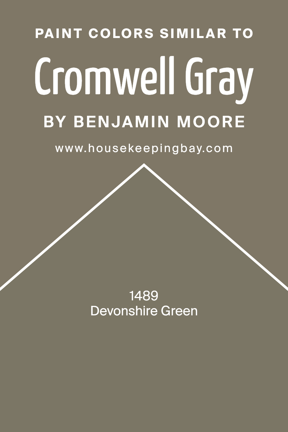
Colors Similar to Cromwell Gray HC-103 by Benjamin Moore
Colors close to Cromwell Gray HC-103 by Benjamin Moore create a sense of harmony and balance. These colors often share the same undertones, which makes them work together easily in design. For example, Devonshire Green 1489 is a soft, muted green that adds a touch of freshness and tranquility to a space.
It has a subtle warmth that brings a natural feel, similar to a peaceful countryside. Colors like Devonshire Green complement Cromwell Gray by enhancing its muted tones, creating a coherent and soothing atmosphere when used together in home decor.
Using similar colors helps maintain a consistent theme, providing a visual connection that feels comfortable and easy on the eyes. Blending colors like Cromwell Gray and Devonshire Green in a room can enhance each other’s depth and complexity without overwhelming the senses.
Their compatibility ensures that the space feels unified yet interesting. The understated nature of these colors allows for a versatile backdrop, letting other elements in the room, like furniture or art, stand out while still contributing to a calm and inviting environment.
Overall, similar colors foster cohesion, helping create a seamless and pleasing interior design.
You can see recommended paint color below:
- 1489 Devonshire Green
housekeepingbay.com
How to Use Cromwell Gray HC-103 by Benjamin Moore In Your Home?
Cromwell Gray HC-103 by Benjamin Moore offers a versatile neutral tone that can blend easily with various styles. It brings warmth and a subtle sophistication to any room. This color works well in living rooms, creating a cozy and inviting atmosphere. It pairs nicely with both modern and traditional furniture, allowing for flexibility in design choices.
In the bedroom, Cromwell Gray provides a calming environment, making it ideal for restful sleep. Its neutrality enables easy updates through changing bedding or adding colorful artwork.
In kitchens, it complements stainless steel appliances and wooden cabinets, offering a balanced backdrop for daily activities.
For those designing a home office, this gray encourages focus without being too stark. It can be used throughout the house for a cohesive look, enhancing the flow between rooms. Combine it with white trim for a clean finish or add darker accents for contrast, depending on the desired effect.
Cromwell Gray HC-103 by Benjamin Moore vs Devonshire Green 1489 by Benjamin Moore
Cromwell Gray HC-103 by Benjamin Moore offers a subtle, sophisticated shade of gray. It carries warm undertones, creating a cozy and timeless feel in any room. This color pairs well with natural materials, like wood, and provides a neutral backdrop that complements various styles, from traditional to modern.
Devonshire Green 1489, also by Benjamin Moore, brings a medium green tone with earthy hints. It feels fresh and lively, adding vibrancy and life to spaces. This shade pairs beautifully with whites and natural tones, enhancing an area with an energetic vibe.
While Cromwell Gray exudes warmth and elegance, Devonshire Green introduces a sense of vitality. Cromwell Gray suits spaces aiming for a calm, neutral ambiance, while Devonshire Green enlivens a room with its invigorating presence. Both colors offer unique charm and character, making them perfect choices depending on the mood and atmosphere you wish to create in your home.
You can see recommended paint color below:
- 1489 Devonshire Green
housekeepingbay.com
Its neutral tone provides a classic foundation for any room, making it an ideal choice for those looking to refresh their space without a dramatic overhaul.
The muted shade balances well with both cool and warm accents, allowing for creativity in furniture and decor choices.
I appreciate how Cromwell Gray manages to impart a sense of warmth and coziness, without overwhelming the senses. It holds a timeless quality, ensuring any room feels updated yet grounded. Whether applied in a living room, bedroom, or even a study, it creates a comforting backdrop for both modern and traditional styles.
Personally, I would consider Cromwell Gray for an office space, where focus and calm are paramount. The color’s subtle elegance supports productivity, while the neutral palette encourages a clear mind.
Overall, Cromwell Gray by Benjamin Moore stands as an excellent option for anyone aiming to create a serene and flexible home environment.

housekeepingbay.com
Ever wished paint sampling was as easy as sticking a sticker? Guess what? Now it is! Discover Samplize's unique Peel & Stick samples. Get started now and say goodbye to the old messy way!
Get paint samples


