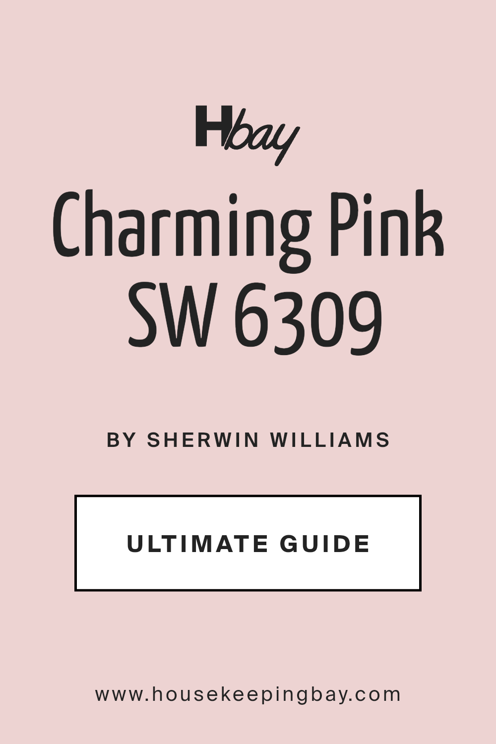
Charming Pink SW 6309 by Sherwin Williams
Embracing Warmth and Whimsy: A Dive into Delicate Hues
Welcome to our spotlight on an adorable paint color from Sherwin Williams, SW 6309 Charming Pink. This cheerful shade has quickly become a favorite for anyone looking to add a sprinkle of joy and personality to their spaces.
Charming Pink is a really versatile color that manages to be both softly subtle and radiantly warm, making it perfect for a variety of settings.
Whether you’re aiming to freshen up your living room, add a burst of energy to your kitchen, or create a soothing retreat in your bedroom, this color has the power to transform your home into a more welcoming and delightful place.
Beyond its beautiful hue, Charming Pink offers a unique balance that can enhance both modern and traditional designs.
Its ability to pair well with a wide range of decor elements—from natural wood finishes and metallic accents to various textile textures—makes it a go-to choice for decorators and homeowners alike.
Through this article, we’ll explore the charm of SW 6309 Charming Pink, giving you practical tips on how to use it in your decorating projects and why it might just be the perfect color to reflect your personal style. Get ready to be inspired by the possibilities this enchanting shade brings to the table.
What Color Is Charming Pink SW 6309 by Sherwin Williams?
Table of Contents
Charming Pink SW 6309 by Sherwin Williams is a soft, gentle color that wraps a room like a warm embrace. This hue is a light, airy pink with a touch of warmth, making spaces feel welcoming and calm. It’s a versatile shade that can brighten up any room, adding a touch of playfulness and sweetness.
This color is perfect for creating a cozy, inviting atmosphere. It works particularly well in vintage, shabby chic, and even modern minimalist interior styles, where its subtlety can be a gentle contrast to more stark elements.
Charming Pink can bring a fresh, soft glow to bedrooms, living rooms, or even bathrooms, making them feel more spacious and open.
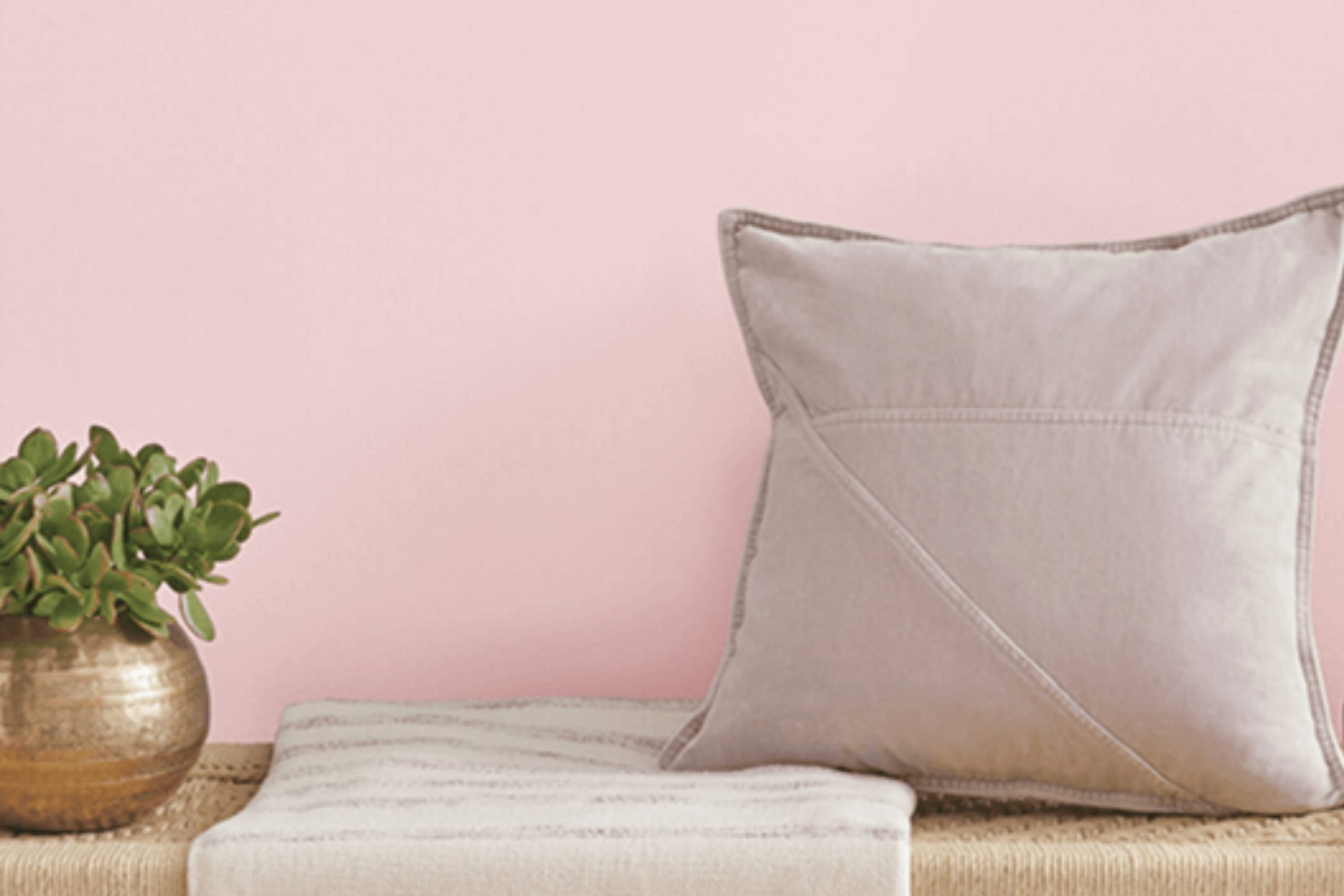
When it comes to materials and textures, Charming Pink pairs beautifully with light woods, adding a natural, earthy feel to the softness of the color. It also goes well with metallic finishes like gold or brass, bringing a touch of elegance to the overall look.
For textures, think cotton, linen, and soft wool – fabrics that enhance the comforting feel of the color. Combined with white or light grey, Charming Pink creates a soothing palette that’s easy on the eyes, perfect for spaces meant for relaxation and calm.
housekeepingbay.com
Is Charming Pink SW 6309 by Sherwin Williams Warm or Cool color?
Charming PinkSW 6309 by Sherwin Williams is a unique shade that brings a soft, gentle vibe into any space. Think of the inside of a seashell or the first blush of sunrise – that’s the kind of warm, inviting feel this color adds to a room. Because it’s not too bright or overwhelming, it can fit into many parts of the home like bedrooms, bathrooms, or even as an accent in living areas. This color has a way of making spaces look cozy and welcoming without trying too hard.
What’s great about Charming Pink is that it pairs well with a lot of other colors. Whether you’re matching it with neutral tones like whites and greys for a calm look, or going bold by pairing it with dark blues or greens, it holds its own and adds a soft touch of personality.
It’s especially helpful in rooms that could use a little more light or warmth, as it reflects light beautifully, making spaces appear larger and more inviting. Overall, Charming PinkSW 6309 is a versatile, warm color that can lighten up your home in a subtle, sweet way.
What is the Masstone of the Charming Pink SW 6309 by Sherwin Williams?
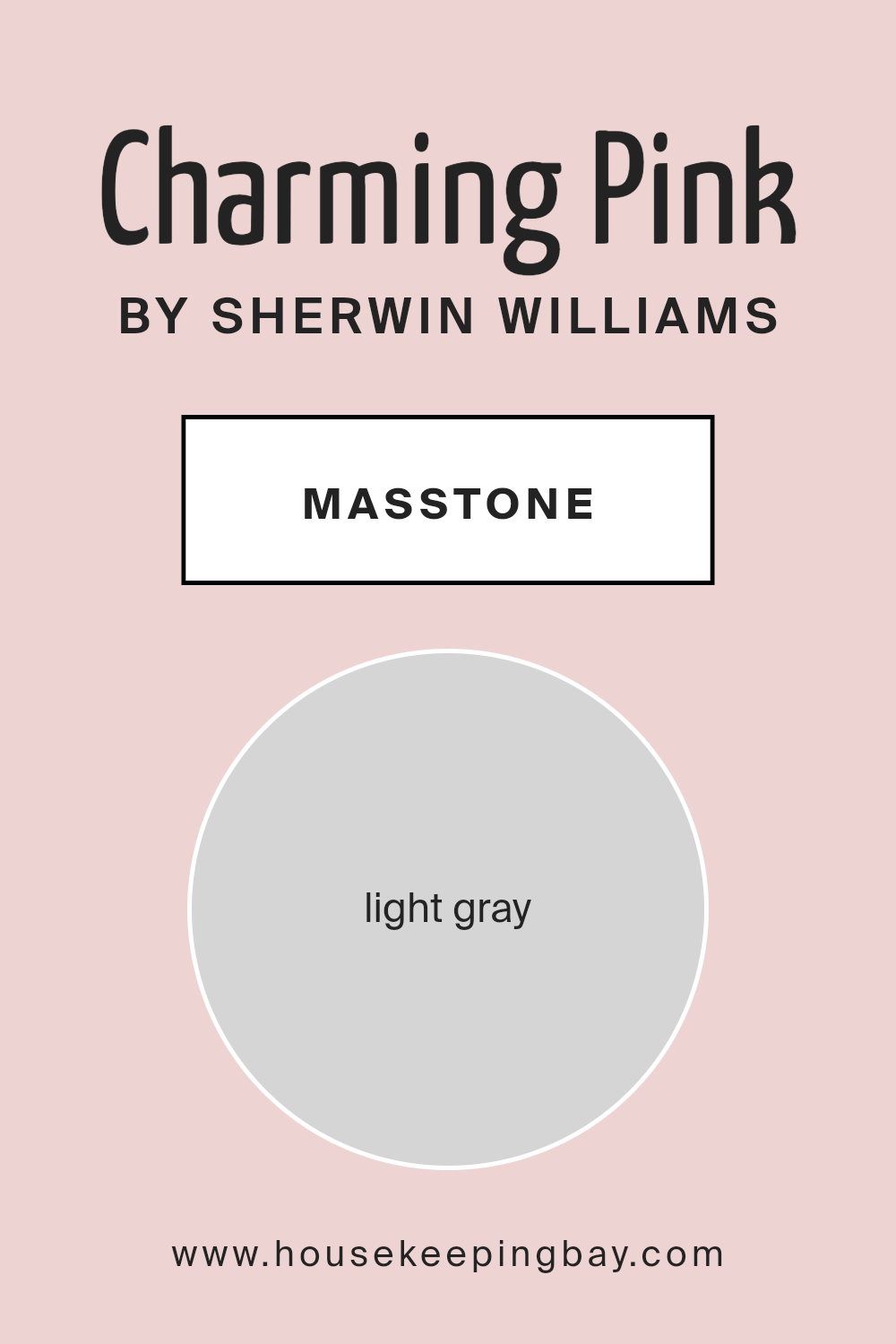
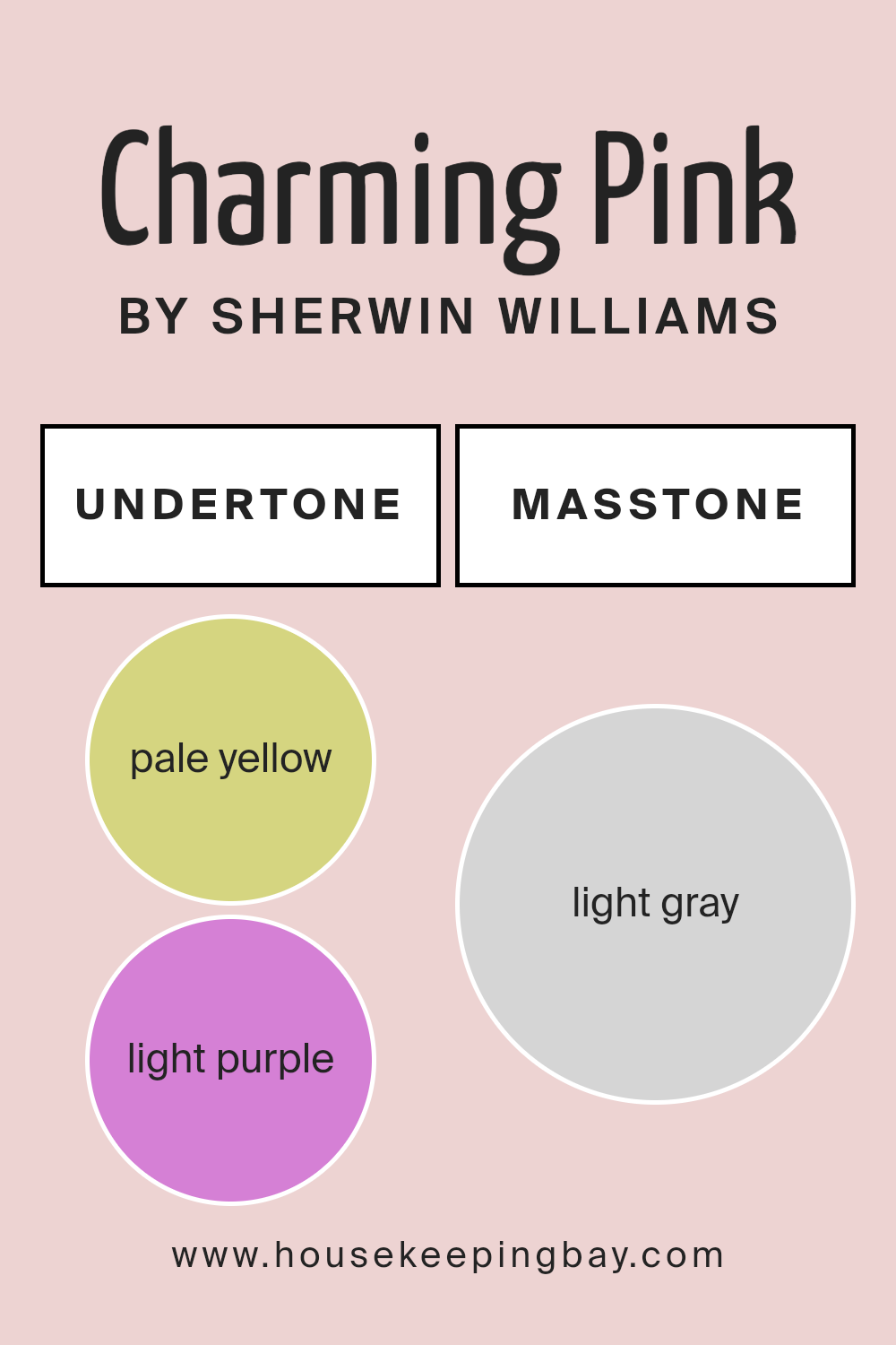
Charming Pink SW 6309 by Sherwin Williams might trick you by its name, but its masstone, which is the color you see when the paint is undiluted, looks like light gray (color code #D5D5D5). This aspect makes it a super flexible choice for homes. Since it’s not a strong or bold color, it kind of acts like a chameleon. It means that in different lights or when paired with other colors, Charming Pink can either pick up more of its pinkish hue or lean into its gray side.
This color’s light gray tone helps make rooms feel larger and more open, which is awesome for small spaces or rooms that don’t get a lot of natural light. It’s gentle and neutral, so it works well with just about any style or decor.
You can match it with bright colors for a soft backdrop or keep things calm with whites and other neutrals. Because of this, Charming Pink is great for anyone wanting to refresh their space without making it feel too busy or overwhelming.
housekeepingbay.com
Undertones of Charming Pink SW 6309 by Sherwin Williams
Charming Pink SW 6309 by Sherwin Williams is a unique paint color that might seem straightforward at first glance, but it has subtle complexities that change how it appears in different environments. Its undertones consist of pale yellow and light purple. Undertones in paint colors are like hidden colors that can affect how the main color looks under various lighting conditions.
For example, in bright sunlight, undertones can become more noticeable, while in dim light, they might blend more into the background.
When it comes to Charming Pink SW 6309, the pale yellow undertone adds a warm and soft glow, making the pink appear cozy and inviting rather than overly sweet. On the other hand, the light purple undertone brings a touch of sophistication and depth, preventing the pink from feeling too childish.
Together, these undertones ensure that Charming Pink maintains a balanced and versatile character, making it suitable for various interior walls.
In your home, Charming Pink can create a welcoming atmosphere in living spaces or add a touch of playfulness in bathrooms and bedrooms without overwhelming the senses. Its ability to reflect light gently due to its undertones can make small rooms appear larger and more open. The exact effect of Charming Pink on your walls will depend significantly on the room’s lighting and surrounding colors, demonstrating the importance of undertones in influencing the overall perception of the paint color.
housekeepingbay.com
Coordinating Colors of Charming Pink SW 6309 by Sherwin Williams
Coordinating colors are a palette of hues that complement each other and work together to enhance the overall aesthetic of a space. These colors are chosen based on their ability to support and enrich the main color, creating a cohesive and pleasing look.
For instance, when considering Charming Pink SW 6309 by Sherwin Williams, selecting the right coordinating colors is key to bringing out its beauty without overwhelming it.
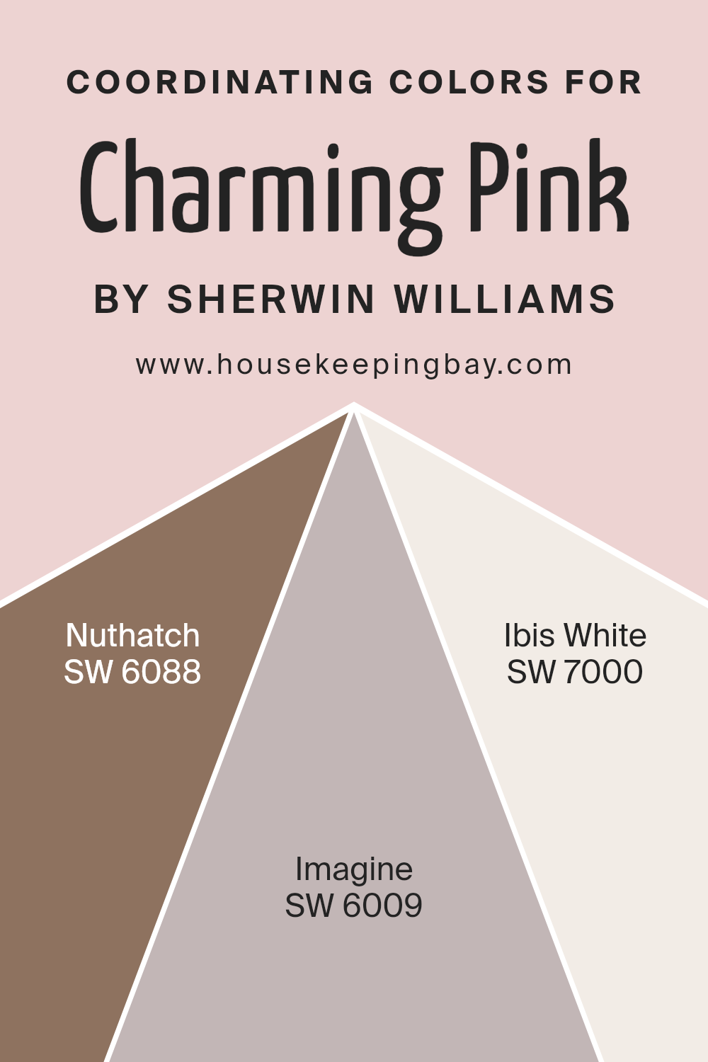
Coordinating colors for Charming Pink include Nuthatch SW 6088, Imagine SW 6009, and Ibis White SW 7000, each offering a unique contribution to the color scheme.
Nuthatch SW 6088 is a warm, earthy tone that grounds the softness of Charming Pink, adding depth and a natural touch to spaces. Its subtle strength provides a balanced backdrop that allows Charming Pink to shine without losing the room’s overall harmony.
Imagine SW 6009, on the other hand, is a lighter, airy shade that enhances the freshness of Charming Pink. It works wonderfully to create a sense of spaciousness and light, making rooms feel open and welcoming.
Ibis White SW 7000 is a clean, crisp white that acts as the perfect canvas for Charming Pink. It highlights the pink’s gentle warmth, ensuring that the environment feels cohesive and thoughtfully curated.
Together, these coordinating colors enable Charming Pink to stand out, enriching the color’s presence in any room and creating an inviting, harmonious space.
You can see recommended paint colors below:
- SW 6088 Nuthatch
- SW 6009 Imagine
- SW 7000 Ibis White
housekeepingbay.com
How Does Lighting Affect Charming Pink SW 6309 by Sherwin Williams?
Lighting plays a key role in how we perceive colors. The same color can appear different under various light sources. This is important to consider when choosing paint colors for your room. Let’s take “Charming Pink SW 6309” by Sherwin Williams as an example to see how lighting can affect this color.
Artificial Light vs. Natural Light
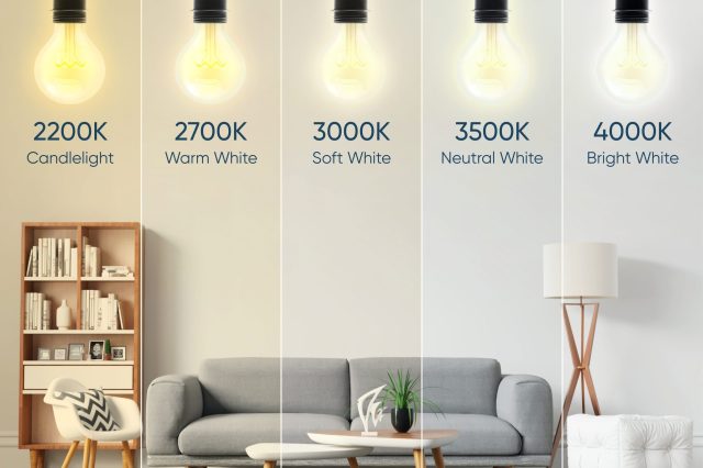
Under artificial light, colors can vary greatly depending on the type of bulb. Warm lighting can make Charming Pink look more cozy and inviting, enhancing its warm undertones. In contrast, cool LED or fluorescent lights could make the color appear brighter and slightly more vivid. It’s important to test your paint colors under the lighting conditions that will be most common in the space.
Natural Light
Natural light can change the appearance of Charming Pink throughout the day. The quality of natural light differs based on the direction your room faces:
- North-Faced Rooms:These rooms get less direct sunlight, which might make Charming Pink appear softer and more muted. In north-facing light, colors can look cooler, so this pink might lose some of its warmth and look more neutral or even slightly greyish.
- South-Faced Rooms:South-facing rooms are flooded with warm light for the most part of the day, making Charming Pink appear brighter and more vibrant. The warm undertones in the color will be highlighted, creating a lively and cheerful space.
- East-Faced Rooms: Morning light in east-facing rooms is warm and yellowish, which can make Charming Pink look very soft and warm in the morning. However, as the day progresses, the light becomes whiter, which could make the color look closer to its true shade.
- West-Faced Rooms: West-facing rooms benefit from the warm, orange-toned light of the sunset, which can intensify the warmth of Charming Pink, making it look more dynamic and rich in the afternoon and evening.
Remember, it’s always a good idea to get a sample and observe how the color changes in your specific room at different times of the day and under different lighting conditions before making a decision.
housekeepingbay.com
What is the LRV of Charming Pink SW 6309 by Sherwin Williams?
LRV stands for Light Reflectance Value, which is a measure of how much light a color reflects or absorbs. Imagine it as a scale from 0 to 100, where 0 is pure black, absorbing all the light, and 100 is bright white, reflecting all the light back.
This value helps you understand how light or dark a color will look on your walls. Colors with higher LRVs are generally brighter and make spaces feel more open and airy because they reflect more light around the room.
On the other hand, colors with lower LRVs can make a space feel cozier but smaller, as they absorb more light.
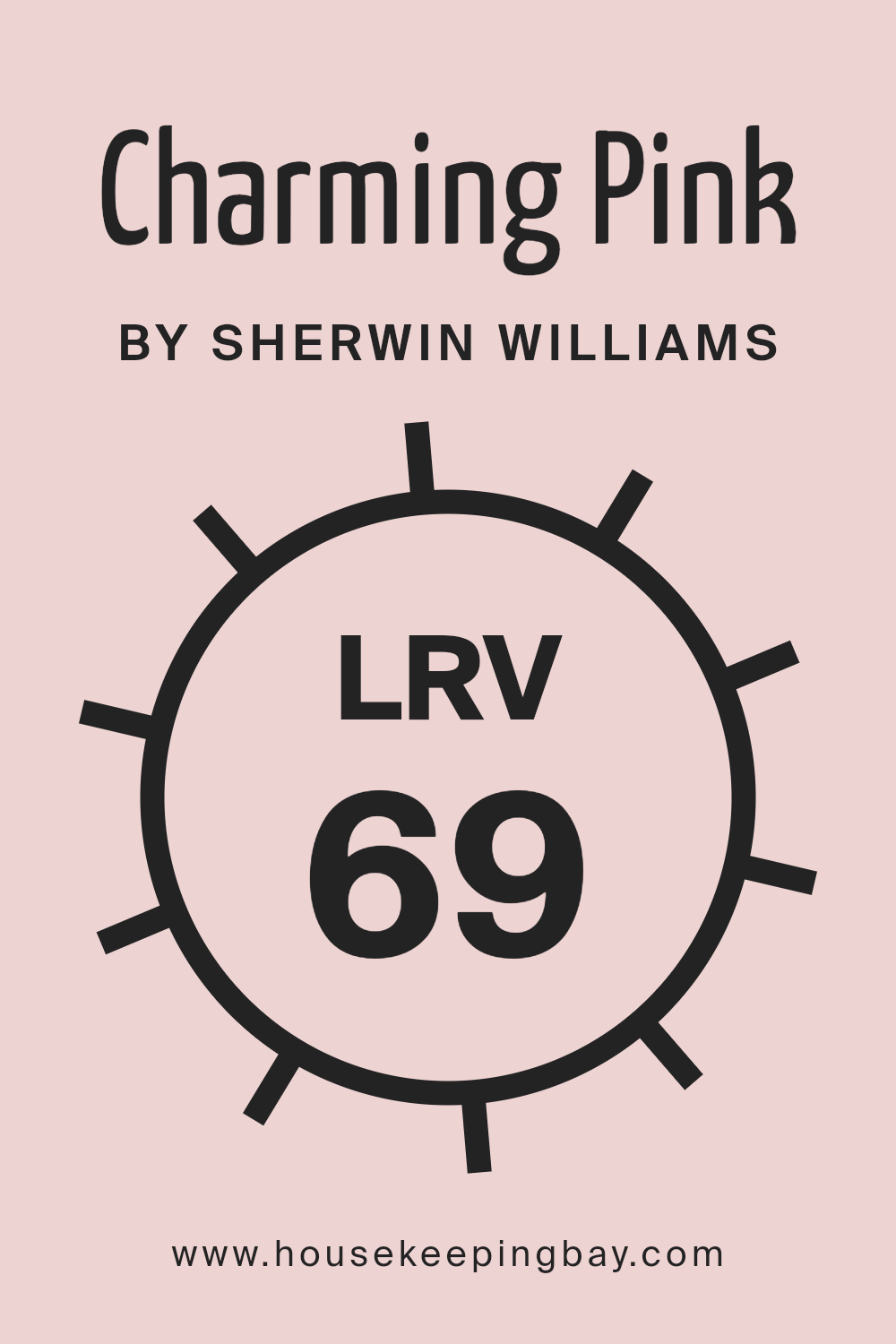
Given that the LRV of Charming Pink SW 6309 by Sherwin Williams is 69.308, it’s on the lighter end of the scale. This means it reflects a good amount of light, contributing to making a room look brighter and more spacious.
For Charming Pink, this relatively high LRV suggests that it is a soft, light color perfect for creating a gentle, uplifting ambiance in a space. In a room with plenty of natural light, Charming Pink would likely appear even lighter and more airy, while in a less lit room, it would still manage to maintain its light-hearted feel due to its higher LRV, making it a versatile choice for a range of lighting conditions.
housekeepingbay.com
What are the Trim colors of Charming Pink SW 6309 by Sherwin Williams?
Trim colors are essentially the shades used for painting the architectural details of a room or a house, such as door frames, baseboards, moldings, and window sills. The choice of trim color can significantly enhance the aesthetic appeal of a space and create a harmonious or striking contrast with the wall colors.
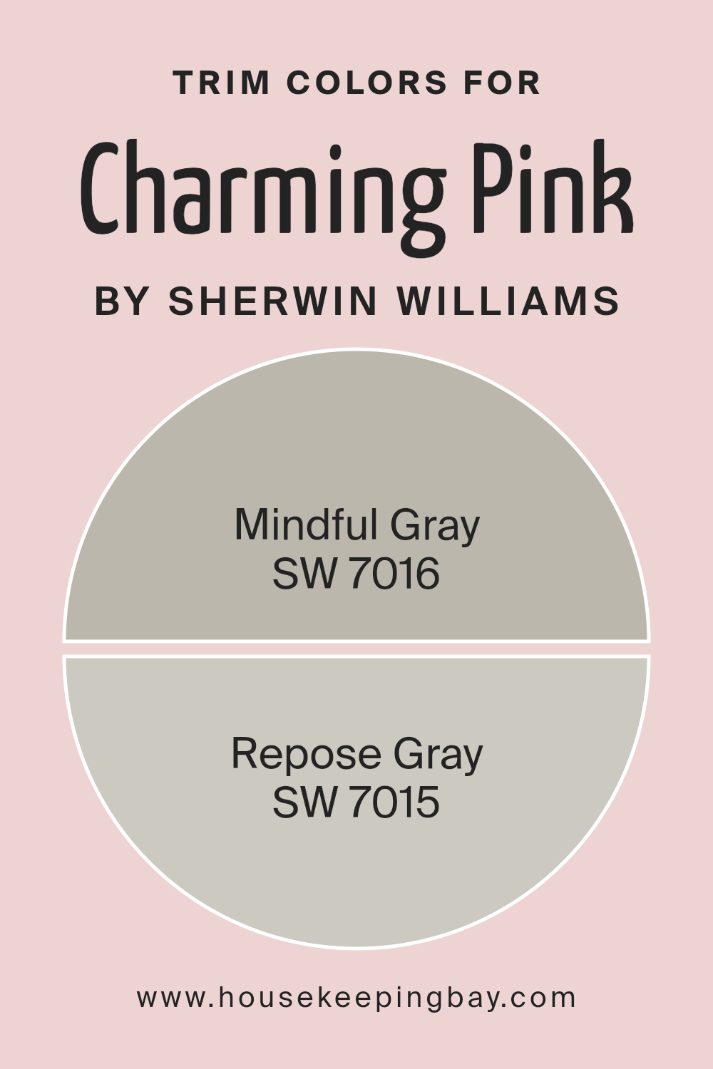
When it comes to Charming Pink SW 6309 by Sherwin Williams, selecting the right trim color is crucial because it can either accentuate the warmth and softness of the pink or offer a subtle balance to its vibrancy. Trim colors like SW 7016 – Mindful Gray and SW 7015 – Repose Gray are excellent choices for this purpose, as they can complement or softly contrast the gentle nature of Charming Pink without overwhelming it.
Mindful Gray SW 7016 is a warm, gentle gray that carries an air of sophistication and neutrality, making it a versatile choice for trim, offering a grounded contrast to the softness of Charming Pink SW 6309.
Its ability to act as a neutral backdrop means it can seamlessly tie together spaces, providing a crisp, yet understated frame that enhances the overall look without stealing the spotlight.
On the other hand, Repose Gray SW 7015 is a lighter, slightly warmer gray with the ability to brighten and uplift. It’s particularly effective in enhancing the cozy, inviting feel of Charming Pink, by framing it in a way that balances light reflection and warmth, ensuring that the space feels open and airy.
Both colors, in their own way, serve to elegantly highlight the wall color, creating a sophisticated and cohesive look.
You can see recommended paint colors below:
- SW 7016 Mindful Gray
- SW 7015 Repose Gray
housekeepingbay.com
Colors Similar to Charming Pink SW 6309 by Sherwin Williams
Similar colors play a critical role in creating a harmonious and visually appealing space. When colors are closely related, such as the variations of Charming Pink SW 6309 by Sherwin Williams and its similar hues, they create a smooth visual flow that is easy on the eyes.
These similar colors offer subtle differences that can be used to add depth and dimension without creating a stark contrast. For instance, when decorating a room, using these related shades allows for a cohesive look, wherein each element seems to naturally belong together. This approach can also highlight architectural features or furnishings by using slightly different but related colors.
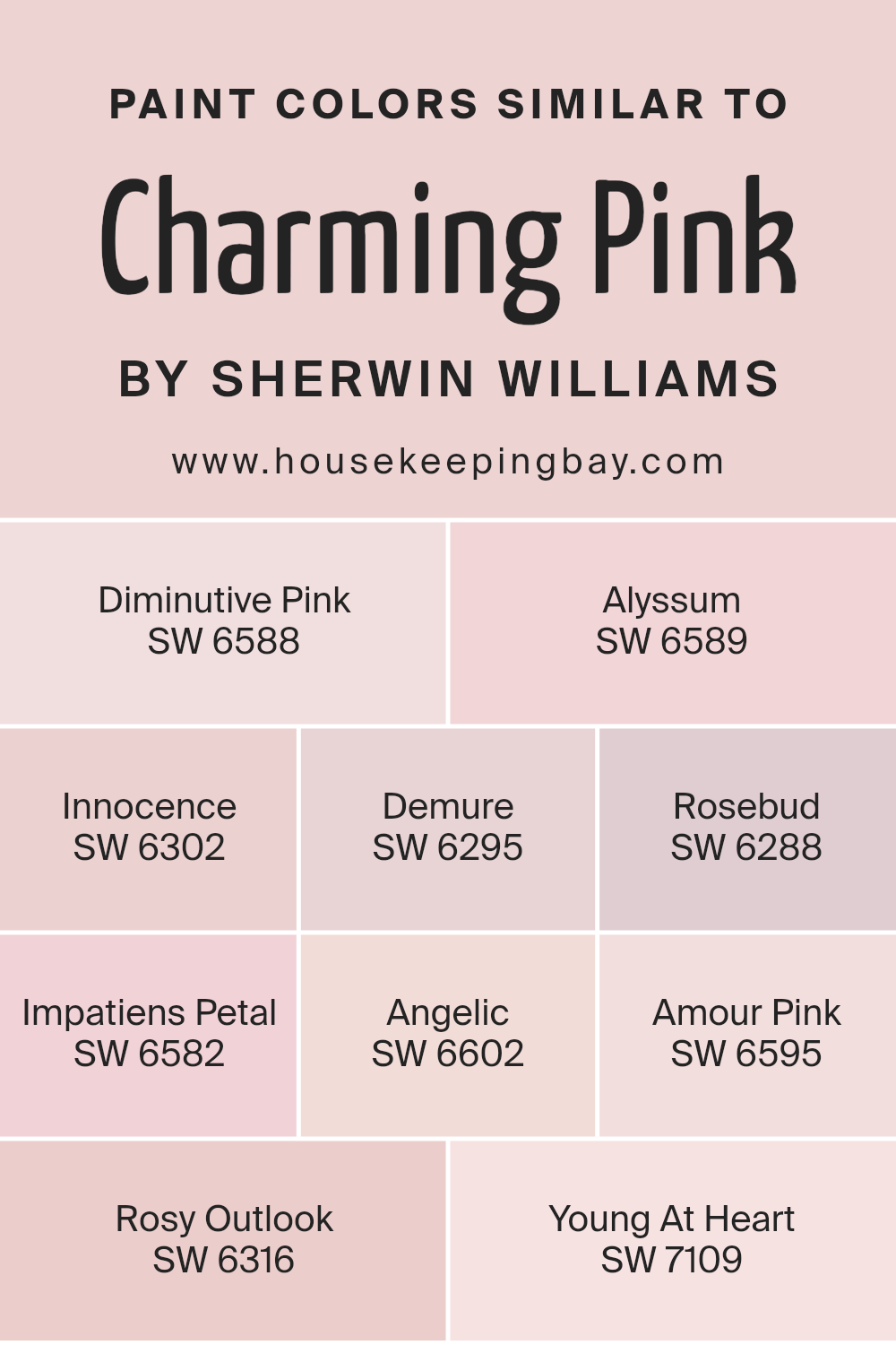
The selection of colors like Diminutive Pink, Alyssum, Innocence, Demure, Rosebud, Impatiens Petal, Angelic, Amour Pink, Rosy Outlook, and Young At Heart offers a palette that ranges from soft and subtle to slightly more vibrant, yet all maintain a connection through their underlying pink tones. Diminutive Pink is a faint, almost whisper-soft pink for a gentle touch of color.
Alyssum, by comparison, leans toward a creamy hue that borders on white with just a hint of pink, perfect for a soft, neutral backdrop. Innocence often acts as a bridge between pink and peach, giving warmth to any space.
Demure offers an understated elegance with its subdued, almost muted pink, while Rosebud introduces a more pronounced pink that’s lively yet not overpowering.
Impatiens Petal is a playful, light-hearted pink with a slight touch of coral. Angelic is as serene as it sounds, providing a very pale, soothing pink. Amour Pink adds a bit more depth with its slightly richer tone, inviting a sense of cheerfulness.
Rosy Outlook is optimistic and bright, without being too bold, and Young At Heart brings a youthful energy with a vibrant, yet soft pink. Together, these colors demonstrate the power of using similar hues to create a cohesive, inviting, and dynamic space.
You can see recommended paint colors below:
- SW 6588 Diminutive Pink
- SW 6589 Alyssum
- SW 6302 Innocence
- SW 6295 Demure
- SW 6288 Rosebud
- SW 6582 Impatiens Petal
- SW 6602 Angelic
- SW 6595 Amour Pink
- SW 6316 Rosy Outlook
- SW 7109 Young At Heart
housekeepingbay.com
How to Use Charming Pink SW 6309 by Sherwin Williams In Your Home?
Charming Pink SW 6309 by Sherwin Williams is a delightful color that can bring a fresh, lively vibe into any home. This color has a soft, welcoming appeal that makes it perfect for adding a touch of warmth and joy to your spaces. Whether you’re looking to paint a whole room or just want to spruce up a small area, Charming Pink is versatile and easy to use.
For those wanting to refresh their living room or bedroom, applying Charming Pink on a feature wall can create a cozy, inviting atmosphere. It pairs well with light colors like whites and creams, as well as with natural wood finishes, helping to create a balanced, harmonious look.
In a child’s room or play area, this color shines by adding a playful, yet not overwhelming, burst of energy and positivity.
You can also use Charming Pink in accessories and decor if you’re not ready to commit to painting walls. Think throw pillows, blankets, or even a statement piece of furniture. This approach lets you add pops of color that brighten up the room without making any permanent changes.
Charming Pink SW 6309 by Sherwin Williams vs Rosebud SW 6288 by Sherwin Williams
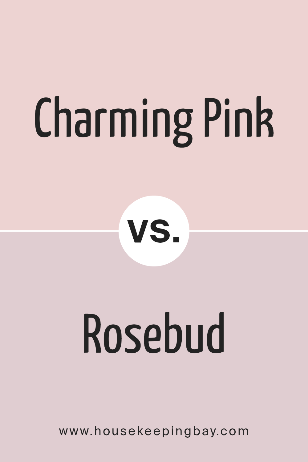
Charming Pink and Rosebud, both by Sherwin Williams, offer lovely shades of pink, but they differ in their vibe. Charming Pink is lighter and has a more delicate touch to it. It brings a soft and gentle atmosphere to any room, making it perfect for creating a cozy and inviting space. Its lightness adds a subtle warmth without overwhelming the senses.
On the other hand, Rosebud is a bit deeper and richer. This color has more intensity, providing a stronger presence. It suits those looking to add a bit more color to their room without going too bold. Its richness makes it great for adding a hint of elegance and sophistication.
Both colors are beautiful, but the choice between them depends on the mood you want to set.
Charming Pink is all about softness and light, creating a serene space. Rosebud offers a touch of depth and luxury, making it ideal for a more pronounced pink statement.
You can see recommended paint color below:
- SW 6288 Rosebud
housekeepingbay.com
Charming Pink SW 6309 by Sherwin Williams vs Demure SW 6295 by Sherwin Williams
Charming Pink SW 6309 by Sherwin Williams and Demure SW 6295 from the same brand are both appealing, yet they stand out in their own unique ways.
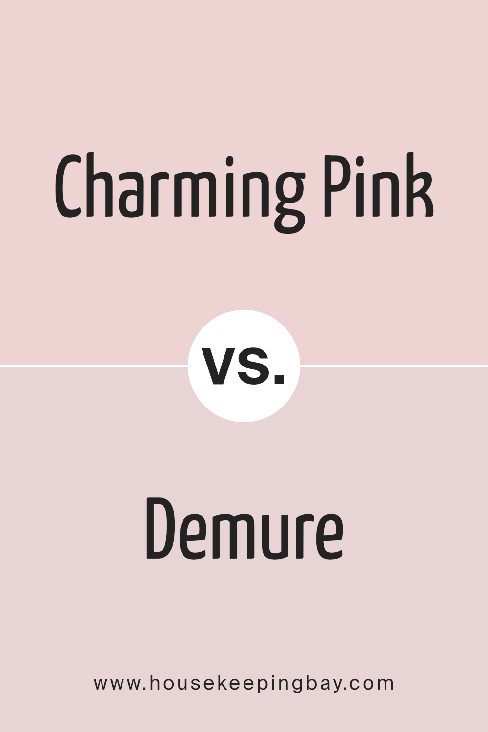
Charming Pink, as the name suggests, is a lively and bright shade that brings a cheerful vibe to any space. It has a vibrant energy that can make a statement in a room, adding a playful yet sophisticated touch. On the other hand, Demure SW 6295 offers a subtler, softer feel. It’s a more muted and gentle color, providing a sense of calm and serenity that’s perfect for creating a relaxing atmosphere.
While Charming Pink is bold and can add a pop of color, Demure leans towards creating a soothing backdrop, ideal for spaces where you want to unwind. Both colors reflect different moods and can beautifully complement each other, Charming Pink bringing the zest, and Demure offering a tranquil counterpoint.
You can see recommended paint color below:
- SW 6295 Demure
housekeepingbay.com
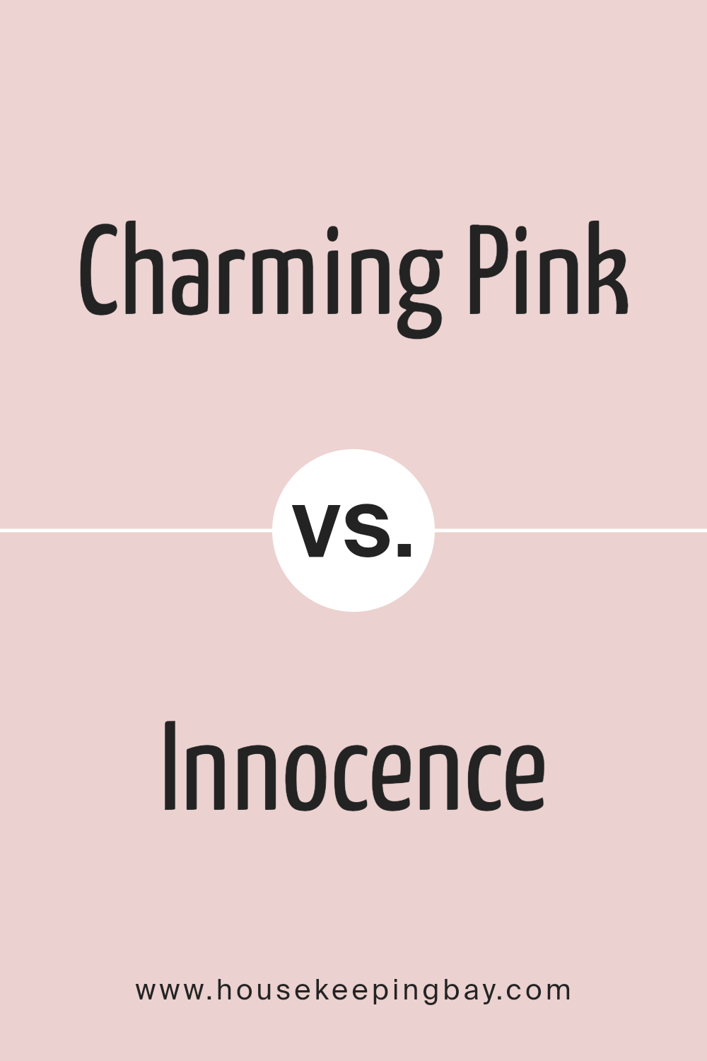
Charming Pink SW 6309 by Sherwin Williams vs Innocence SW 6302 by Sherwin Williams
Charming Pink SW 6309 and Innocence SW 6302 by Sherwin Williams are both beautiful colors, but they have their own unique vibes. Starting with Charming Pink, it’s a color that stands out more. It has a deeper, richer tone that really draws your attention. Imagine a pink that’s not too bright but not too soft either; it’s kind of the perfect medium pink that adds a warm and cozy feeling to any room.
On the other hand, Innocence SW 6302 is lighter and much more subtle. It’s a softer, more delicate pink that brings a gentle and calming feel. It’s like the first light hue of a morning sky – serene and soothing. It’s great for creating a peaceful and relaxing space, without overwhelming the senses.
While Charming Pink can add a bit of a statement and warmth to a room because of its richer tone, Innocence lends a more tranquil and airy vibe due to its lighter touch. Both colors are beautiful, it just depends on what feeling you want to bring into your space.
You can see recommended paint color below:
- SW 6302 Innocence
housekeepingbay.com
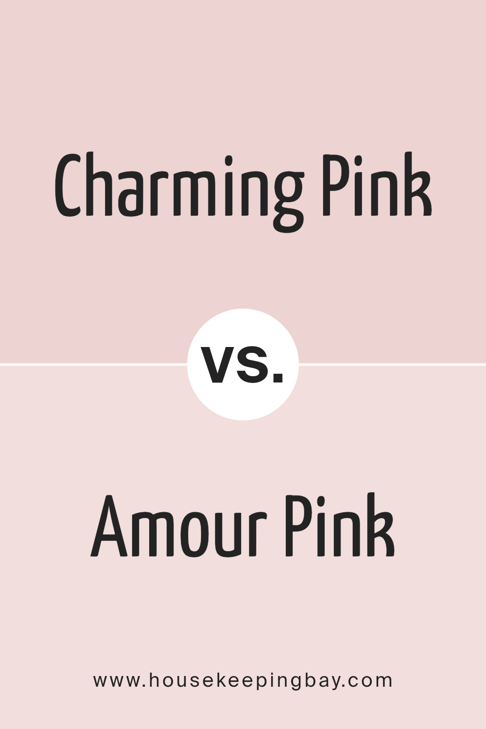
Charming Pink SW 6309 by Sherwin Williams vs Amour Pink SW 6595 by Sherwin Williams
Charming Pink SW 6309 and Amour Pink SW 6595, both by Sherwin Williams, are quite the duo when it comes to pink hues. Starting off, Charming Pink is a soft, subtle color. It’s not too bright but has just enough pop to make a space feel welcoming and warm. Think of it like the gentle blush on someone’s cheek – there, but not overpowering.
On the flip side, Amour Pink SW 6595 turns up the volume a bit. It’s a richer, more vibrant pink. This one grabs more attention without being too loud. It’s like the color of a pink flower in full bloom – noticeable and full of life.
So, if you’re deciding between the two, consider the vibe you’re going for. Charming Pink is perfect for creating a calm, soothing space with a hint of color. Amour Pink, however, is your go-to if you want to make a bolder statement without going over the top. Both are beautiful, just in their own unique ways!
You can see recommended paint color below:
- SW 6595 Amour Pink
housekeepingbay.com
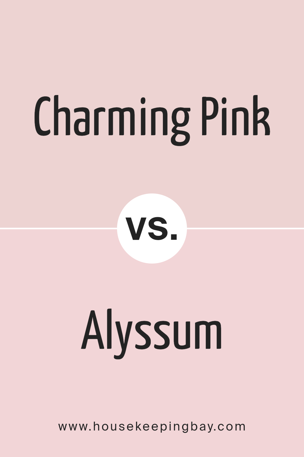
Charming Pink SW 6309 by Sherwin Williams vs Alyssum SW 6589 by Sherwin Williams
Charming Pink SW 6309 and Alyssum SW 6589, both by Sherwin Williams, have their own unique vibes. Charming Pink brings a cozy and warm feel to a space. It’s not too bright but has a soft, welcoming touch that makes rooms feel friendly and snug.
Think of it as a gentle hug from a room. On the other hand, Alyssum SW 6589 is lighter, leaning more towards a delicate, airy feel. It’s the kind of color that makes small spaces seem bigger and dark rooms feel brighter.
It’s refreshing, like a light breeze in a room. Even though both colors bring warmth, Charming Pink adds depth and a sense of comfort, while Alyssum offers a cleaner, crisper look.
They could complement each other well in a space, with Alyssum brightening things up and Charming Pink adding a layer of softness.
You can see recommended paint color below:
- SW 6589 Alyssum
housekeepingbay.com
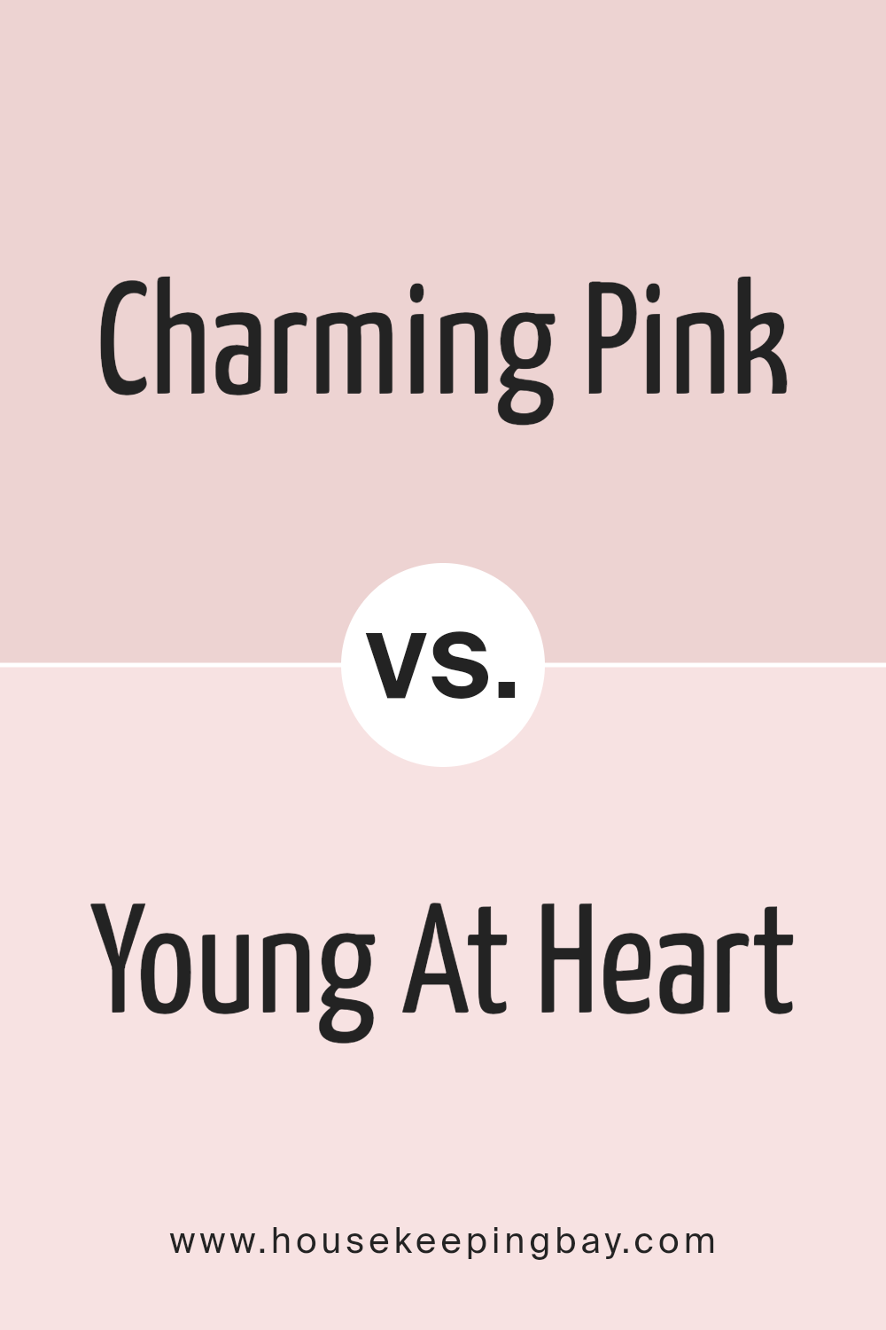
Charming Pink SW 6309 by Sherwin Williams vs Young At Heart SW 7109 by Sherwin Williams
Charming Pink and Young At Heart are two colors by Sherwin Williams that share a similar vibe but have their unique shades. Charming Pink is a soft, gentle color that adds a cozy and light feel to any room.
It’s like that warm, fuzzy feeling of happiness, making spaces welcoming and cheerful. On the other hand, Young At Heart steps it up a notch with a bit more vibrancy. It’s a brighter shade that brings a lively and playful energy into the room.
While both colors are from the pink family, Charming Pink leans towards subtlety and calmness, perfect for creating a soothing space.
Young At Heart, with its stronger presence, is great for adding a pop of color and fun. Together, they offer a range of options for those looking to incorporate pink into their decor, whether aiming for a serene retreat or a dynamic, joyful area.
You can see recommended paint color below:
- SW 7109 Young At Heart
housekeepingbay.com
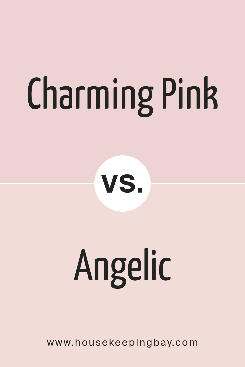
Charming Pink SW 6309 by Sherwin Williams vs Angelic SW 6602 by Sherwin Williams
Charming Pink SW 6309 by Sherwin-Williams is a rich, warm pink that feels cozy and inviting. It’s a color that can light up a room with its cheerful vibe, making spaces feel more welcoming and comfortable.
On the other hand, Angelic SW 6602, also by Sherwin-Williams, is a much softer, lighter pink. It has a gentle, soothing quality, creating a serene and peaceful atmosphere. This color is great for creating a tranquil space, perfect for relaxation.
While both colors are pink, Charming Pink has a stronger, more vibrant look, which can add a pop of color to any room without being too overwhelming.
Angelic, with its softer tone, is more understated, offering a delicate touch of warmth. It’s ideal for those who prefer their spaces to have a subtle hint of color while maintaining a feeling of open and airy lightness.
In summary, Charming Pink brings warmth and a lively spirit, whereas Angelic is about softness and tranquility, making each suitable for different moods and settings.
You can see recommended paint color below:
- SW 6602 Angelic
housekeepingbay.com
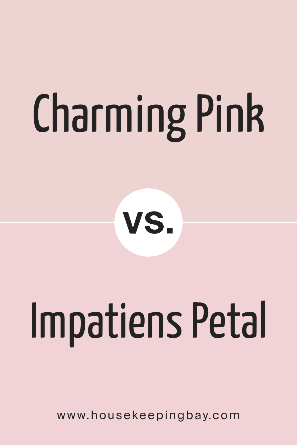
Charming Pink SW 6309 by Sherwin Williams vs Impatiens Petal SW 6582 by Sherwin Williams
Charming Pink SW 6309 and Impatiens Petal SW 6582 are both colors by Sherwin Williams, but they have their unique vibes. Charming Pink is like a cozy hug. It’s a gentle color, not too bright or overpowering. It’s perfect for creating a calm and soothing atmosphere in a room. On the other hand, Impatiens Petal is more lively.
It has a bit more punch, making it stand out more. This color can add a fun and energetic feel to a space. While both colors belong to the pink family, Charming Pink leans toward a softer, more muted tone, whereas Impatiens Petal is brighter and more vivid.
Depending on what mood you want to set, Charming Pink is great for a peaceful vibe, and Impatiens Petal is the go-to for adding some cheerfulness to your space.
You can see recommended paint color below:
- SW 6582 Impatiens Petal
housekeepingbay.com
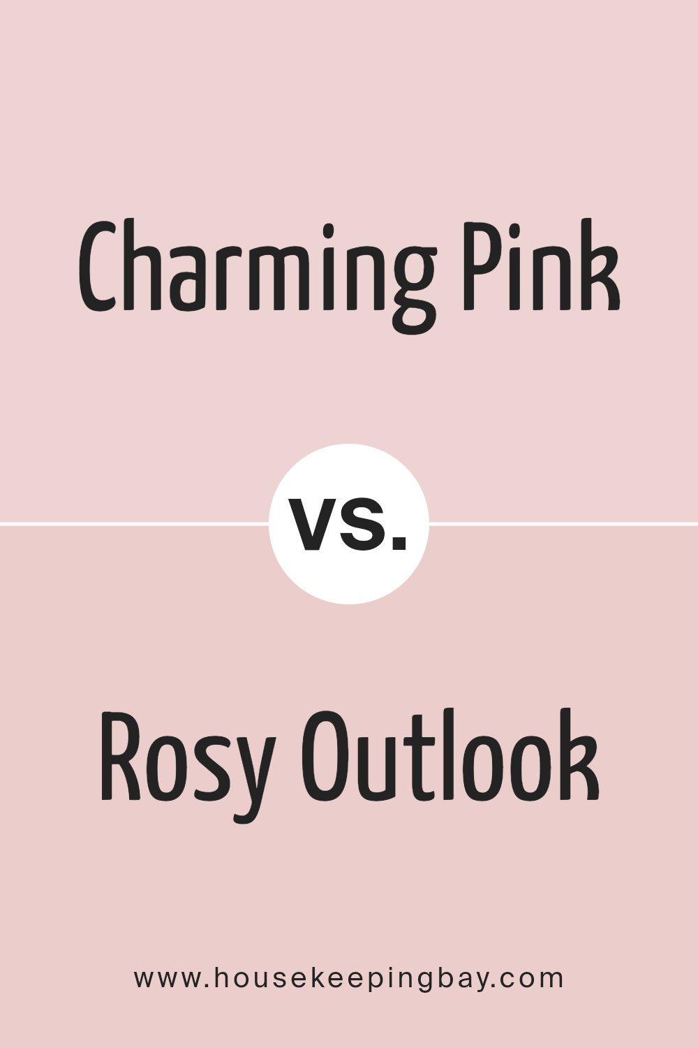
Charming Pink SW 6309 by Sherwin Williams vs Rosy Outlook SW 6316 by Sherwin Williams
Charming Pink SW 6309 and Rosy Outlook SW 6316, both from Sherwin Williams, offer unique shades of pink, each with its own vibe. Charming Pink is a gentle, soothing pink. It’s like the soft touch of early morning light, warm and welcoming.
It creates a cozy and inviting atmosphere without being too overpowering.
On the other hand, Rosy Outlook is a bit deeper and richer. It feels like the glow of a setting sun, offering a sense of calmness and hope. While both colors share a pink base, Charming Pink leans towards a lighter, more subtle hue. Rosy Outlook, however, stands out with a stronger presence, bringing a more noticeable pink that can add a cheerful warmth to any space.
Both colors are great, but your choice depends on the mood you want to create: Charming Pink for a light, airy feel, or Rosy Outlook for a brighter, more vibrant touch.
You can see recommended paint color below:
- SW 6316 Rosy Outlook
housekeepingbay.com
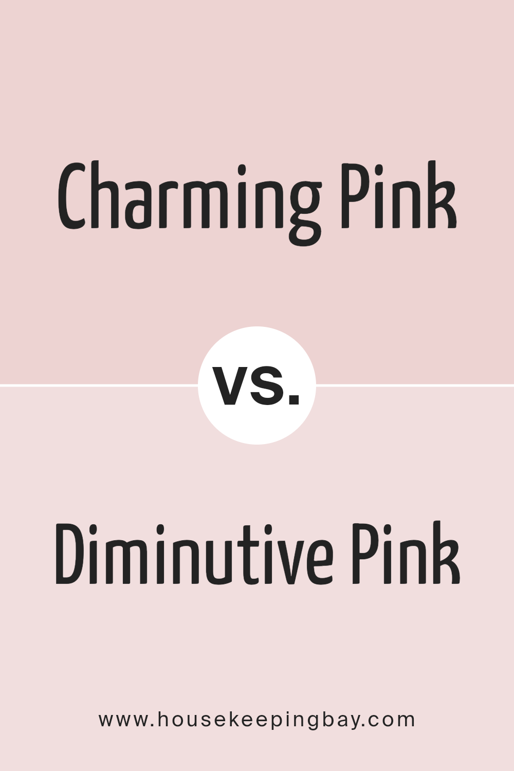
Charming Pink SW 6309 by Sherwin Williams vs Diminutive Pink SW 6588 by Sherwin Williams
Charming Pink SW 6309 and Diminutive Pink SW 6588, both by Sherwin Williams, are two distinctive shades.
Charming Pink is a soft, gentle color. It feels like a calm whisper in a busy room, bringing a soothing presence without being too loud. It’s the kind of color that can make a space feel cozy and inviting, perfect for bedrooms or living areas where you want a touch of warmth without overwhelming the senses.
On the other hand, Diminutive Pink is a lighter, more understated shade. It’s quieter, offering just a hint of color. Imagine the faint blush on a peach; that’s the subtle touch Diminutive Pink brings to a room. It’s ideal for spaces that you want to keep mostly neutral but with a slight nudge of personality.
When comparing, Charming Pink brings more presence and warmth, making a statement in a gentle way, while Diminutive Pink is about adding a soft, almost unnoticed glow to a space.
You can see recommended paint color below:
- SW 6588 Diminutive Pink
housekeepingbay.com
Conclusion
Charming Pink SW 6309 by Sherwin Williams is a unique shade that stands out due to its soft yet vibrant nature. This color finds a perfect balance, offering a soothing vibe that’s neither too overpowering nor too subtle. It’s an ideal choice for anyone wanting to add a touch of warmth and cheerfulness to their space without going for something too bold.
Whether it’s applied in a bedroom to create a cozy retreat or used in a living area for a welcoming atmosphere, Charming Pink manages to breathe life into any room, making it look fresh and inviting.
Selecting Charming Pink for your next project means you’re opting for a versatile color that pairs well with various decor styles and preferences. Its ability to complement different materials and textures makes it a hassle-free choice for both contemporary and traditional settings.
Moreover, its universal appeal ensures that it can be beautifully integrated into various parts of a home, be it through wall paint, accent pieces, or even textiles.
Ultimately, Charming Pink SW 6309 stands as a testament to how a gentle yet lively hue can transform an ordinary space into something extraordinary, infusing it with personality and charm.
housekeepingbay.com
Ever wished paint sampling was as easy as sticking a sticker? Guess what? Now it is! Discover Samplize's unique Peel & Stick samples. Get started now and say goodbye to the old messy way!
Get paint samples
