Silver Lake 1598 by Benjamin Moore
Unveiling Serenity in Shades of Silver
In search of the perfect paint color for your next home project? Consider 1598 Silver Lake by Benjamin Moore, a versatile shade that might just be what you need. This unique color finds a special balance between cool and warm tones, making it suitable for any room in your house.
Whether you’re sprucing up your living room, bedroom, or even your kitchen, Silver Lake offers a fresh, modern feel without being overpowering.
The color subtly reflects natural light, creating a gentle ambiance that enhances the space without the need for bold color statements. It works well with various decor styles, from contemporary to traditional, giving you flexibility in designing your ideal interior.
If you’re unsure about committing to a new color, Silver Lake is a safe yet stylish choice that pairs well with many different furnishings and finishes, ensuring a cohesive look throughout your home.
Try this shade if you’re looking for a change that calms the mood and brings a fresh perspective to your living environment.
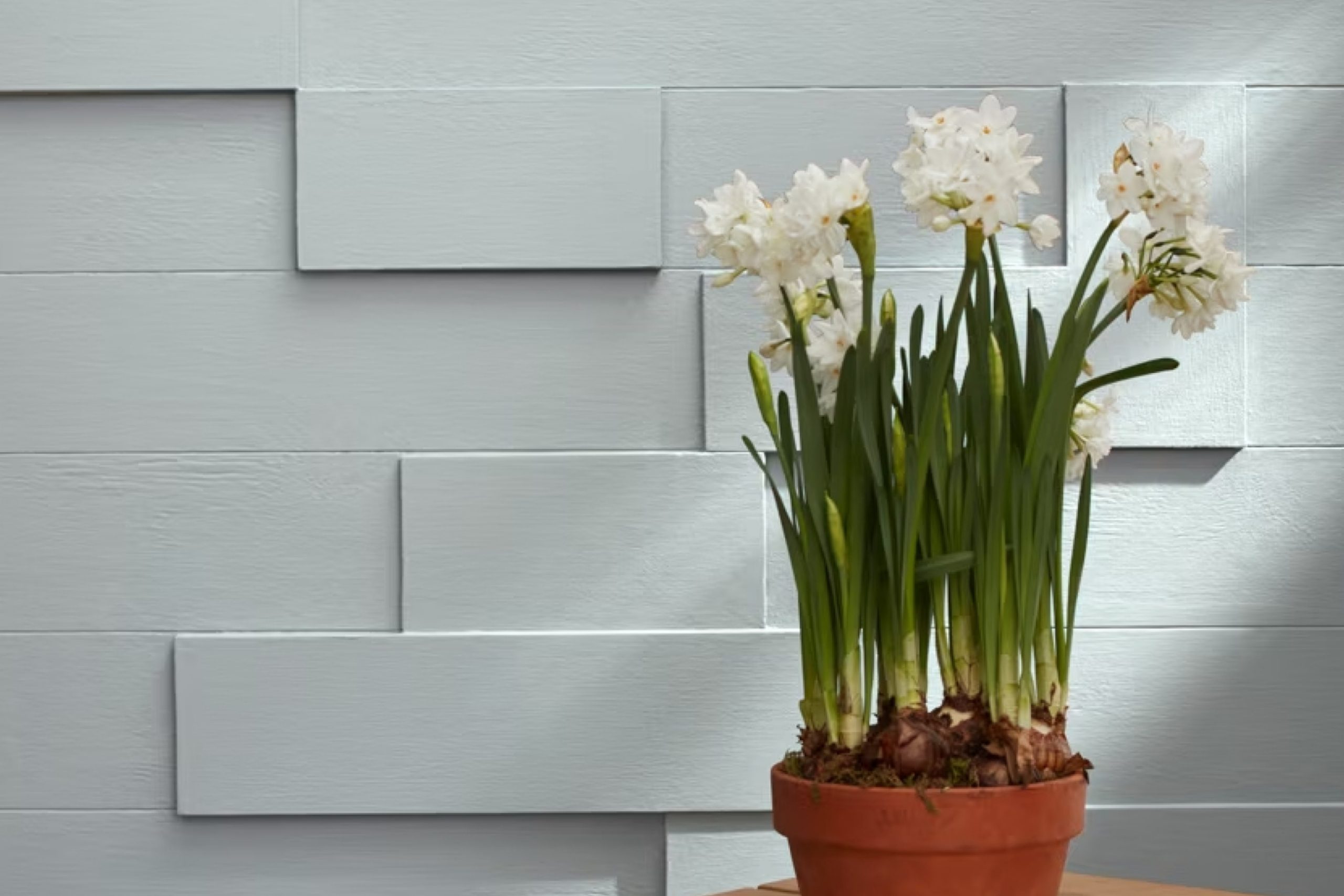
via benjaminmoore.com
What Color Is Silver Lake 1598 by Benjamin Moore?
Silver Lake 1598 by Benjamin Moore is a versatile gray shade with hints of blue, offering a calming and soothing atmosphere to any space. This hue perfectly reflects light, providing a subtle brightness to rooms that may lack natural sunlight. Its cool undertones make it an ideal choice for creating a serene and composed environment.
Silver Lake works exceptionally well in contemporary, minimalist, and Scandinavian-style interiors, aligning with the clean and uncluttered aesthetics typical of these designs. This color complements sleek, modern furniture and fixtures, highlighting their shapes and materials without overwhelming the senses.
When pairing Silver Lake with materials and textures, consider using natural wood, which adds warmth and contrast to the coolness of the color. Textures like linen, wool, and cotton in neutral shades also blend beautifully, enhancing the cozy yet chic vibe of the space. Metallic accents in silver or chrome can mirror the hue’s subtle blue undertones, creating a coherent and refined look.
Using Silver Lake in such combinations helps achieve a balanced and harmonious interior that feels both welcoming and stylish, making it a highly adaptable choice for any home looking to combine modernity with comfort.
housekeepingbay.com
Is Silver Lake 1598 by Benjamin Moore Warm or Cool color?
Silver Lake 1598 by Benjamin Moore is a soft gray color with blue undertones. It offers a calm vibe to any room in the house. Its versatility is one of its biggest strengths. Silver Lake works well in various settings, whether in a bedroom to create a soothing atmosphere or in a living room where it complements both modern and traditional decor.
When paired with brighter colors, Silver Lake does not overpower; it seamlessly blends in, ensuring the brighter shades stand out. The color also serves as a fantastic base for different textures and materials, allowing furniture and decorations to truly shine.
In spaces with ample natural light, Silver Lake reflects beautifully, enhancing the room’s overall feeling of openness and airiness. In dimmer spaces, it maintains its charm without turning too cold, making it friendly for places lacking in strong sunlight. This adaptability makes Silver Lake a popular choice for homeowners looking for a reliable yet effective wall color.
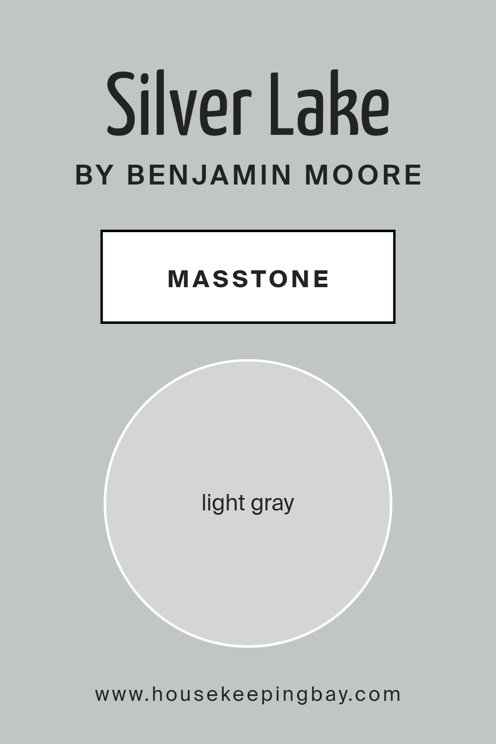
What is the Masstone of the Silver Lake 1598 by Benjamin Moore?
Silver Lake 1598 by Benjamin Moore has a light gray masstone, coded as #D5D5D5. This specific shade of gray is soft and subtle, making it a versatile choice for home interiors. Since it is not too dark or too bright, Silver Lake helps create a neutral backdrop that allows for a wide range of decorating styles.
Whether you’re aiming for a modern look with bold accent colors or a more traditional feel with soft pastels, this color fits effortlessly.
The light gray masstone also helps small spaces appear larger and more open, as it reflects more light compared to darker hues. This characteristic is particularly useful in areas like apartments or smaller rooms that could benefit from a sense of expanded space. Additionally, Silver Lake’s neutrality offers a calming effect in busy home environments, promoting a relaxed atmosphere. Overall, this masstone is practical for maintaining a clean and cohesive look throughout a home, harmonizing well with other colors and decor elements.
housekeepingbay.com
Undertones of Silver Lake 1598 by Benjamin Moore
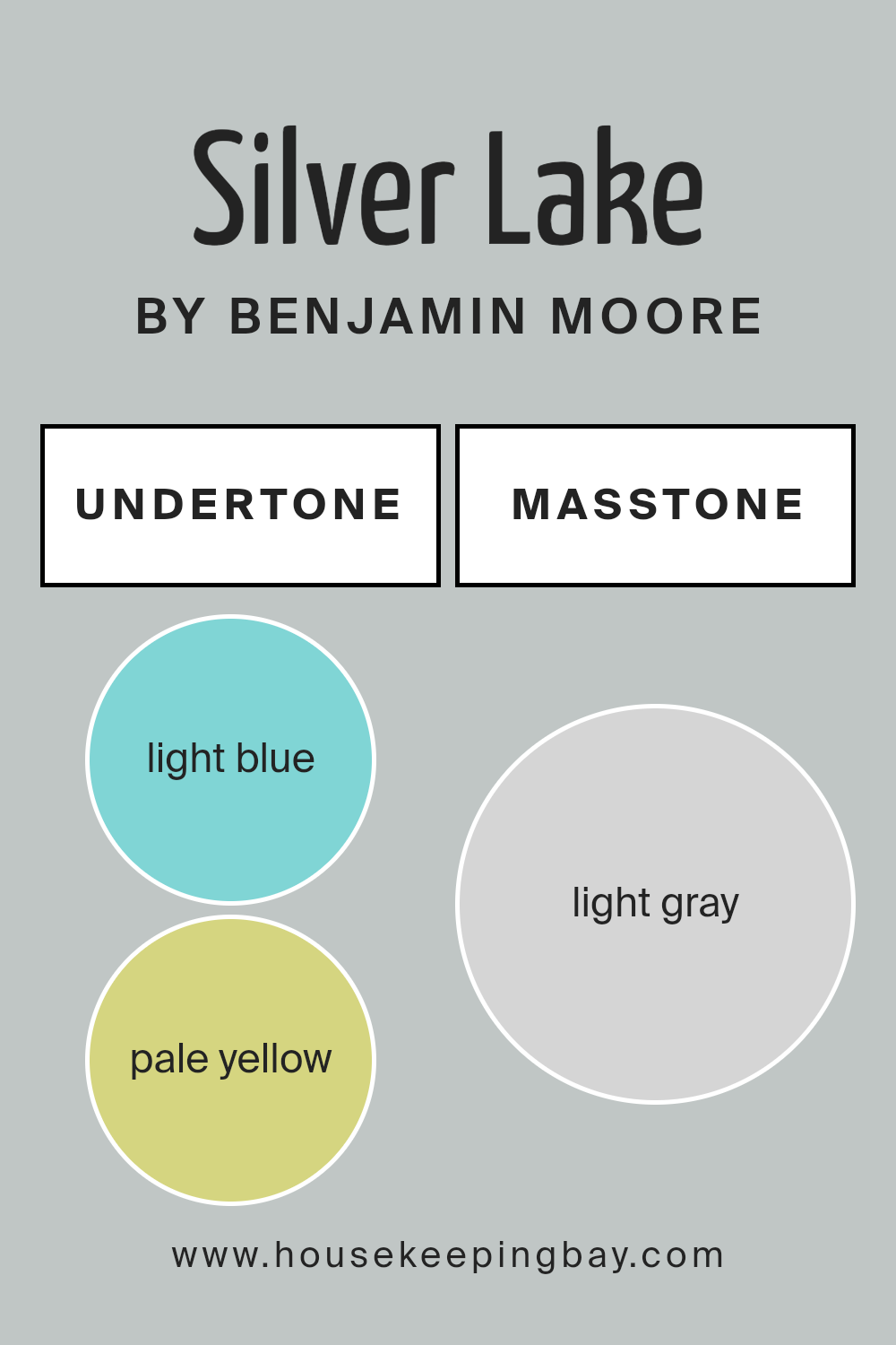
Silver Lake 1598 by Benjamin Moore features a complex blend of undertones that can subtly influence the overall appearance of the paint depending on the lighting and surrounding colors. These undertones include light blue, pale yellow, light purple, mint, lilac, pale pink, and grey, each adding a unique dimension to the paint.
Undertones are secondary colors that are not always immediately apparent but affect our perception of the main color. In interior spaces, the impact of these undertones can significantly alter how a color appears from one room to another or at different times of the day.
For instance, light from a window can highlight the blue or mint undertones, giving the room a cooler feel. Conversely, in artificial lighting, the pale yellow or pink undertones might become more dominant, providing a warmer and softer appearance.
When applied to interior walls, Silver Lake 1598 offers a versatile backdrop that shifts subtly with changes in light and decor. These shifting undertones can make the space feel dynamic and adaptable. For example, the pale yellow and light purple can make a room feel more welcoming and cozy, while the light blue and mint could lend a fresher, crisper look.
This flexibility makes Silver Lake 1598 a popular choice for various rooms and styles, allowing for personalization based on furniture and decoration colors.
housekeepingbay.com
Coordinating Colors of Silver Lake 1598 by Benjamin Moore
Coordinating colors are selected to complement a primary color, enhancing the overall aesthetic of a space by creating a balanced color scheme. In the case of Silver Lake 1598 by Benjamin Moore, a serene gray shade, the coordinating colors chosen play a crucial role in either subtly contrasting with or reinforcing the soothing nature of the main hue.
These coordinating colors add depth and dimension to décor, ensuring that all elements in a room work harmoniously.
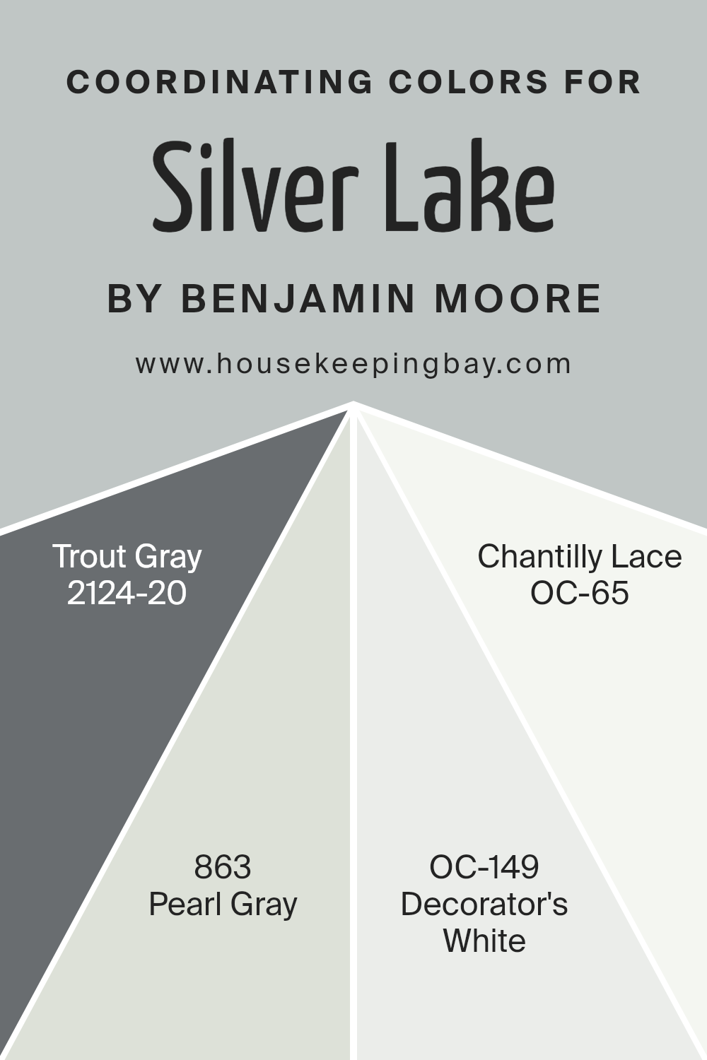
For instance, Trout Gray 2124-20 is a deep, bold gray that brings a strong, grounded feel to spaces, making it a perfect counterbalance to the lighter Silver Lake. Pearl Gray 863, on the other hand, is a mid-tone gray that shares a similar undertone with Silver Lake, providing a seamless visual flow between colors. Decorator’s White OC-149 offers a clean, crisp white ideal for trim and ceilings, which helps to brighten and open up spaces.
Chantilly Lace OC-65 is another white, but with a slightly softer feel compared to Decorator’s White, lending a gentler transition between the more pronounced grays in the palette. Together, these colors create a cohesive look that enhances the base color without overwhelming it.
You can see recommended paint colors below:
- 2124-20 Trout Gray
- 863 Pearl Gray
- OC-149 Decorator’s White
- OC-65 Chantilly Lace
housekeepingbay.com
How Does Lighting Affect Silver Lake 1598 by Benjamin Moore?
Lighting significantly impacts how colors appear in various environments. The color “Silver Lake 1598” by Benjamin Moore is a versatile shade that reacts uniquely under different lighting conditions.
In artificial light, “Silver Lake 1598” tends to appear slightly more gray than under natural light. This is because artificial lighting, depending on the bulb type, can have a yellowish tint, which brings out the warmer undertones in the color. Fluorescent lights can make it look cooler, pulling out more of the subtle blue undertones.
Under natural sunlight, “Silver Lake 1598” flourishes, showing its true color balance. It looks crisp and vibrant, maintaining a perfect balance between gray and the faint bluish tones that make it unique.
The orientation of rooms also affects how “Silver Lake 1598” is perceived:
- North-Faced Rooms: These rooms receive less direct sunlight, meaning “Silver Lake 1598” might appear more muted and cooler. The subtle blue tones of the paint become more pronounced, giving the room a calm and serene feel.
- South-Faced Rooms: These rooms benefit from ample sunlight, making “Silver Lake 1598” look brighter and more lively. Here, the color can appear lighter and reveal some of its warm undertones throughout the day.
- East-Faced Rooms: In these rooms, morning light can make “Silver Lake 1598” seem soft and welcoming. The early sun enhances the paint’s cooler tones, but as the sun moves, the color shifts slightly, maintaining a balanced cool warmth.
- West-Faced Rooms: Evening light brings a warmer tone to the room, affecting how “Silver Lake 1598” is seen. During sunset, expect this color to look warmer and richer, complementing the reds and oranges of the setting sun.
Overall, “Silver Lake 1598” shows a chameleon-like ability to adapt its appearance based on the lighting and orientation of the room, offering various experiences throughout the day and in different settings.
housekeepingbay.com
What is the LRV of Silver Lake 1598 by Benjamin Moore?
LRV stands for Light Reflectance Value, which is a measurement used to determine how much light a paint color reflects back into a room. This value is represented on a scale from 0, which is completely black and absorbs all light, to 100, which is pure white and reflects all light.
The LRV is crucial in choosing paint colors because it helps you understand how bright or dark a color will appear once applied to your walls. A higher LRV means the color will reflect more light, making the space feel brighter and more open, while a lower LRV will result in a darker look, possibly making a room feel smaller or cozier.
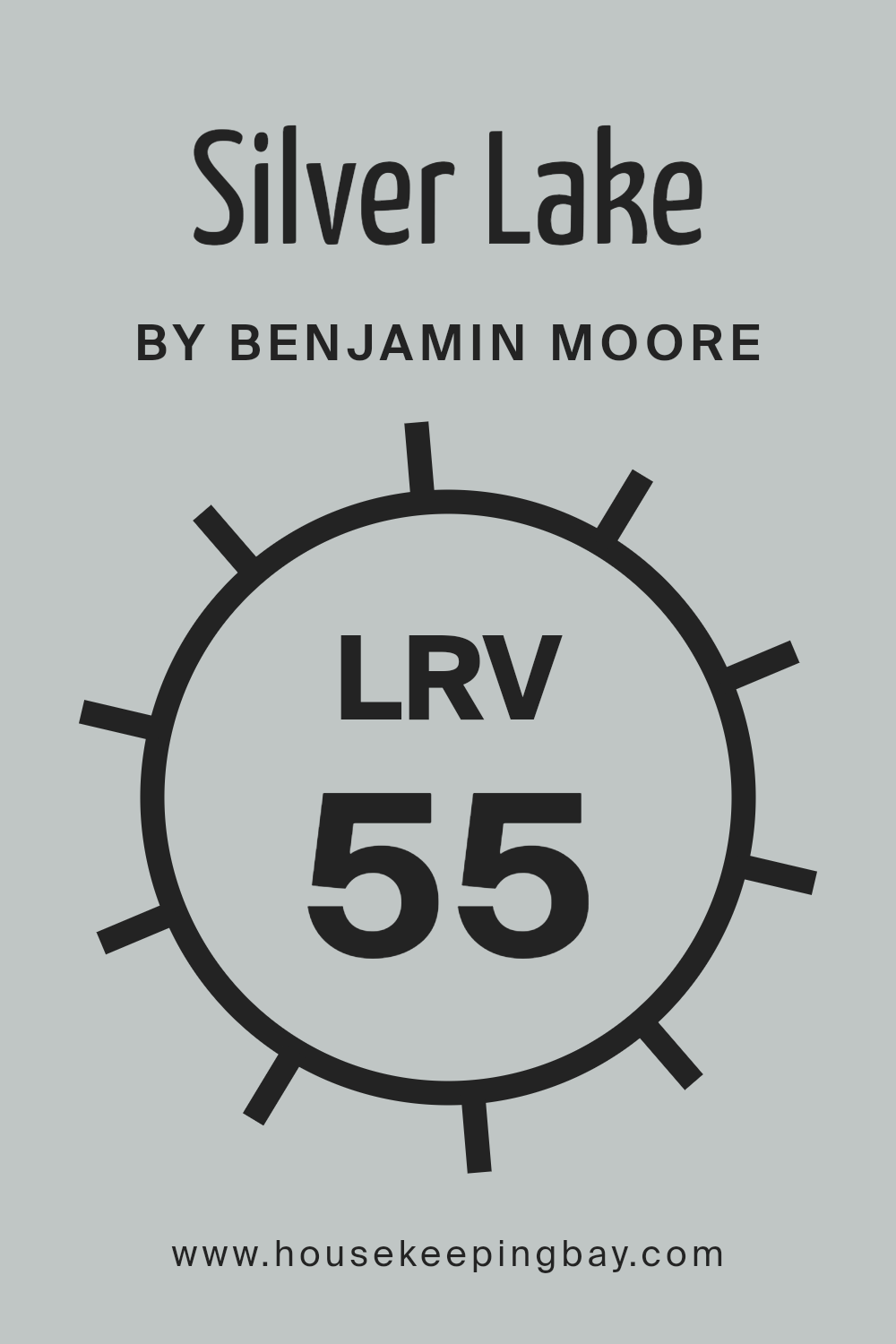
For Silver Lake 1598 by Benjamin Moore, with an LRV of 54.82, the color sits in the mid-range of light reflectance. This means it won’t make a room feel as bright as colors with higher LRVs, nor will it make it feel overly dark. It’s a balanced choice that offers a moderate amount of light reflection, suitable for spaces where you want a mixture of warmth and airiness.
The specific LRV of Silver Lake ensures that it remains visually soft and flexible, working well in various lighting conditions and complementing different room sizes and styles.
housekeepingbay.com
What are the Trim colors of Silver Lake 1598 by Benjamin Moore?
Trim colors are specific shades used to accentuate the architectural details of a room, such as door frames, moldings, and window trims. They play a vital role in defining spaces and enhancing the overall aesthetic appeal.
For instance, when paired with a main wall color like Silver Lake 1598 by Benjamin Moore—a muted, versatile gray—trim colors can significantly influence the mood and perception of the space.
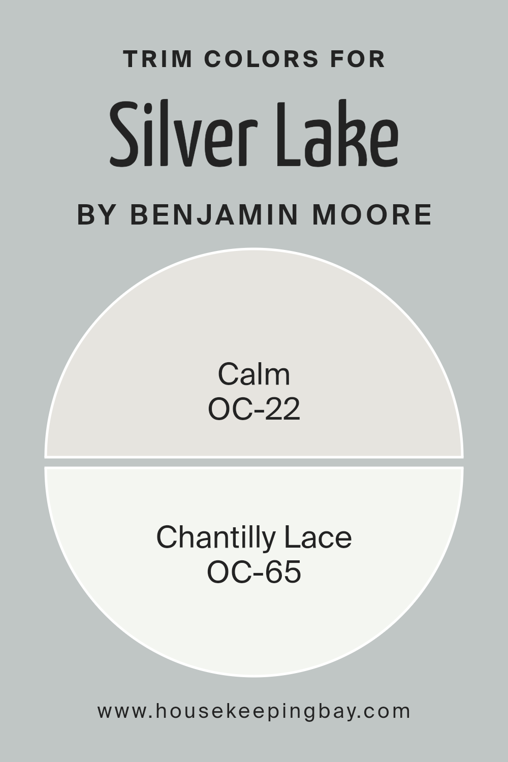
Trim colors like OC-22 Calm and OC-65 Chantilly Lace from Benjamin Moore provide subtle contrast, which can help important architectural details stand out and contribute to a more polished and cohesive look.
OC-22 Calm is a soft, off-white shade that offers a hint of warmth without overpowering the senses. This color works beautifully as a trim for adding a gentle separation between the walls and the trim that borders subtle but clearly defined edges
. On the other hand, OC-65 Chantilly Lace is a clean, bright white that gives a crisp, refreshing boundary around doors and windows. Its radiant purity can highlight the best features of a room, giving it a fresh, inviting appearance that complements the soft tones of Silver Lake 1598.
You can see recommended paint colors below:
- OC-22 Calm
- OC-65 Chantilly Lace
housekeepingbay.com
Colors Similar to Silver Lake 1598 by Benjamin Moore
Similar colors play a crucial role in creating aesthetically pleasing and harmoniously designed spaces. Selecting colors from the same palette, such as those similar to Silver Lake 1598 by Benjamin Moore, ensures that all elements in a room can coexist without clashing, which enhances the overall appeal and unity of a space.
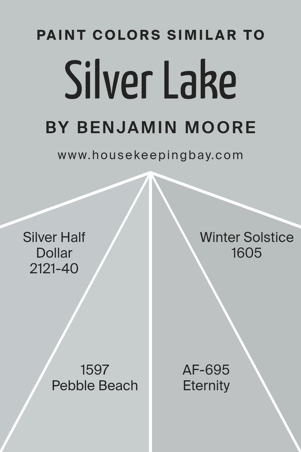
For instance, using colors like Silver Half Dollar, Pebble Beach, Eternity, and Winter Solstice alongside Silver Lake enables designers or homeowners to establish a soothing and cohesive environment. These colors work together to offer subtle contrasts that enrich the visual dynamics without overwhelming the eye.
Silver Half Dollar 2121-40 is a light gray that offers a clean and polished look, ideal for minimalist or modern interiors. Slightly darker, Pebble Beach 1597 introduces a depth that complements wood furnishings and natural textures.
Eternity AF-695 is a soft, muted gray with a hint of blue, perfect for creating a serene atmosphere in places like bedrooms or studies.
Finally, Winter Solstice 1605 provides a cooler, almost icy hue that brings a crisp freshness to any space, especially useful in areas with plenty of sunlight to create a balanced look. Each color, carrying its unique character, allows for flexible design choices while maintaining a cohesive visual flow.
You can see recommended paint colors below:
- 2121-40 Silver Half Dollar
- 1597 Pebble Beach
- AF-695 Eternity
- 1605 Winter Solstice
housekeepingbay.com
Colors that Go With Silver Lake 1598 by Benjamin Moore
Choosing complementary colors for Silver Lake 1598 by Benjamin Moore is crucial for achieving a harmonious look in any space. These shades work well together because they share cool undertones that provide a subtle, cohesive ambiance.
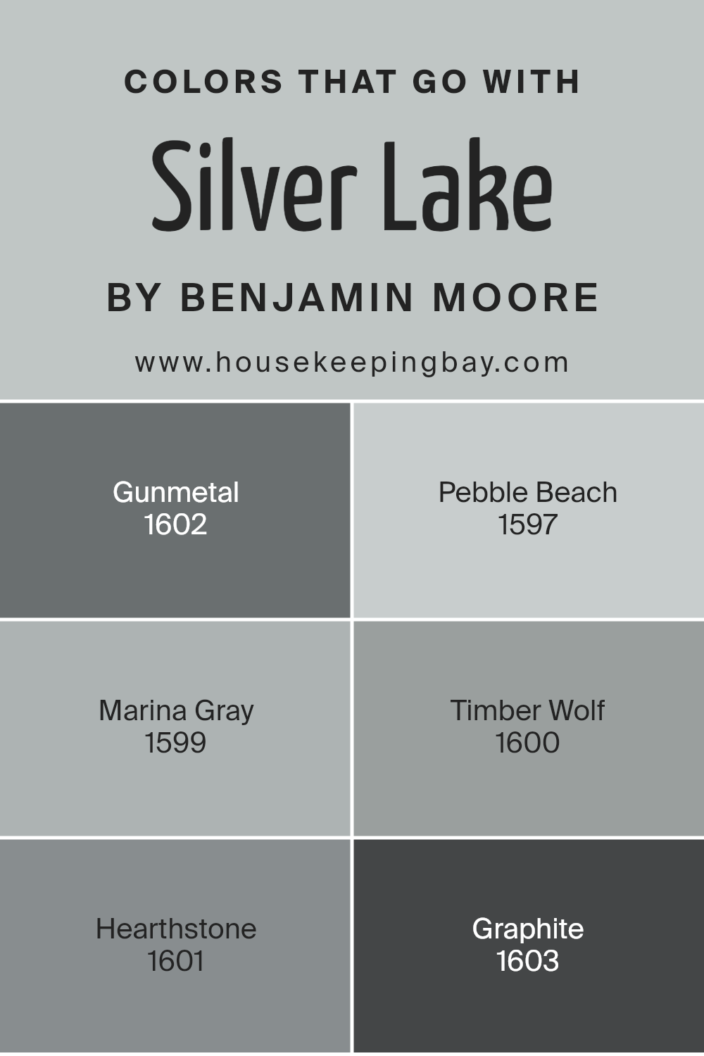
For example, Gunmetal 1602 has a deep, rich hue offering a strong contrast that highlights the lighter tones of Silver Lake. Pebble Beach 1597, on the other hand, is a mid-tone gray that bridges the gap between Silver Lake and darker colors like Gunmetal. By blending these colors, you create a layered effect that adds depth to the interior design.
Marina Gray 1599 is another excellent match, lending a soft, gentle color that is easy on the eyes, which complements the slight vibrancy of Silver Lake. Timber Wolf 1600 is a lighter gray that can brighten up a space while still aligning with the cool, subdued palette associated with Silver Lake.
Hearthstone 1601 brings in a warmer tone, which can warm up the overall feel without clashing with the cooler grays.
Lastly, Graphite 1603 offers a nearly black shade that is both bold and elegant, providing a dramatic flair that pairs beautifully with the lighter grays for a sophisticated look. Altogether, these colors create a seamless and aesthetic palette that enhances the beauty of any room.
You can see recommended paint colors below:
- 1602 Gunmetal
- 1597 Pebble Beach
- 1599 Marina Gray
- 1600 Timber Wolf
- 1601 Hearthstone
- 1603 Graphite
housekeepingbay.com
How to Use Silver Lake 1598 by Benjamin Moore In Your Home?
Silver Lake 1598 by Benjamin Moore is a versatile gray paint with subtle blue undertones, making it perfect for creating a soothing atmosphere in any room. The color is light enough to make small spaces feel bigger and works well with both modern and traditional decors.
For living rooms or bedrooms, Silver Lake provides a soft background that complements white trim and hardwood floors, offering a serene feel. It’s also an excellent choice for bathrooms and kitchens, where it pairs nicely with marble or granite countertops and stainless steel appliances.
If you want to add a touch of sophistication without overwhelming your space, consider painting accent walls or cabinets with this gentle hue. Silver Lake is durable and easy to apply, ensuring a smooth finish. Using this color can help unify rooms and introduce a fresh, airy vibe into your home.
Silver Lake 1598 by Benjamin Moore vs Winter Solstice 1605 by Benjamin Moore
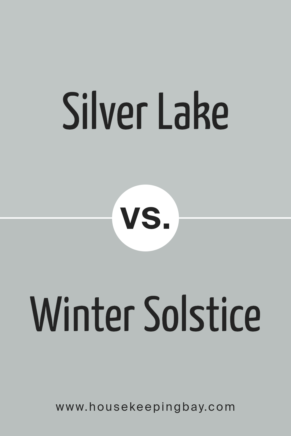
Silver Lake 1598 and Winter Solstice 1605 by Benjamin Moore are two subtle colors that have their unique appeals. Silver Lake 1598 is a soft, muted gray with a touch of lavender, giving it a serene and slightly warm feel. It’s ideal for creating a peaceful and inviting atmosphere in any space. This color works well in areas where you want to promote calmness, such as bedrooms or quiet seating areas.
In contrast, Winter Solstice 1605 is a deeper, more intense gray that leans towards the cooler side. This shade can add a more dramatic and sophisticated touch to a room, making it perfect for modern living spaces or as an accent wall to add depth and interest.
Both colors share a gray base, but Silver Lake is lighter and warmer, making it more reflective and adaptable to various lighting conditions. Winter Solstice, being darker and cooler, offers a bold statement that can anchor a room’s decor. These differences make each color suitable for specific moods and settings in interior design.
You can see recommended paint color below:
- 1605 Winter Solstice
housekeepingbay.com
Silver Lake 1598 by Benjamin Moore vs Eternity AF-695 by Benjamin Moore
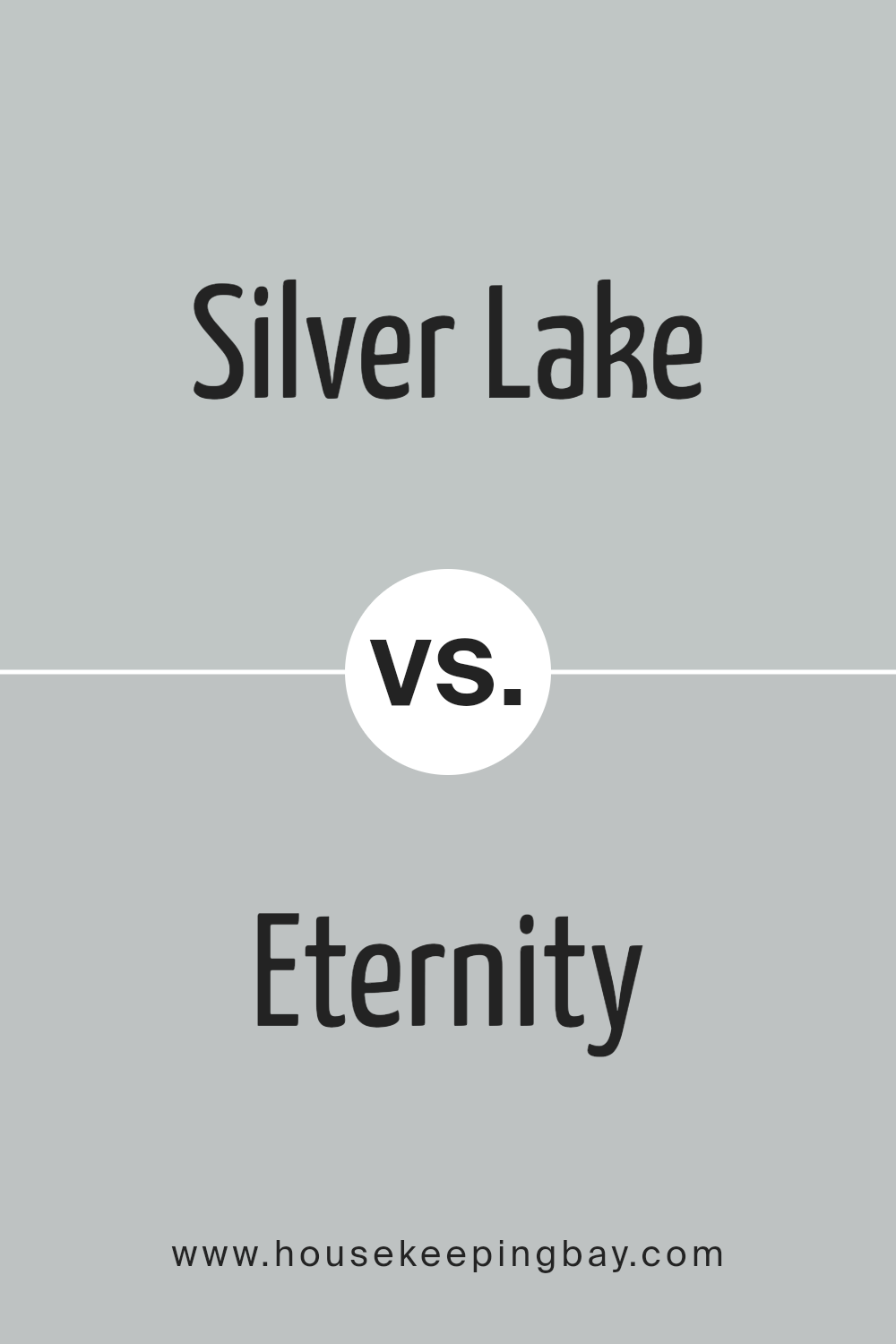
Silver Lake 1598 by Benjamin Moore is a soft gray with blue undertones, giving it a cool and calming effect that is versatile for various spaces. This color reflects light well, making rooms appear larger and more open. It suits modern decors and works well in spaces like living rooms and kitchens where a fresh, clean look is desired.
Eternity AF-695, also by Benjamin Moore, is a deeper gray that leans towards a charcoal tone. This color provides a feeling of sophistication and is ideal for creating a focal point in a room. It’s particularly effective in formal areas or bedrooms, where its richness can add a sense of coziness and warmth.
Both colors offer unique qualities: Silver Lake has a lighter, airier feel, while Eternity gives depth and drama to a space. When choosing between them, consider the mood and functional needs of the room.
You can see recommended paint color below:
- AF-695 Eternity
housekeepingbay.com
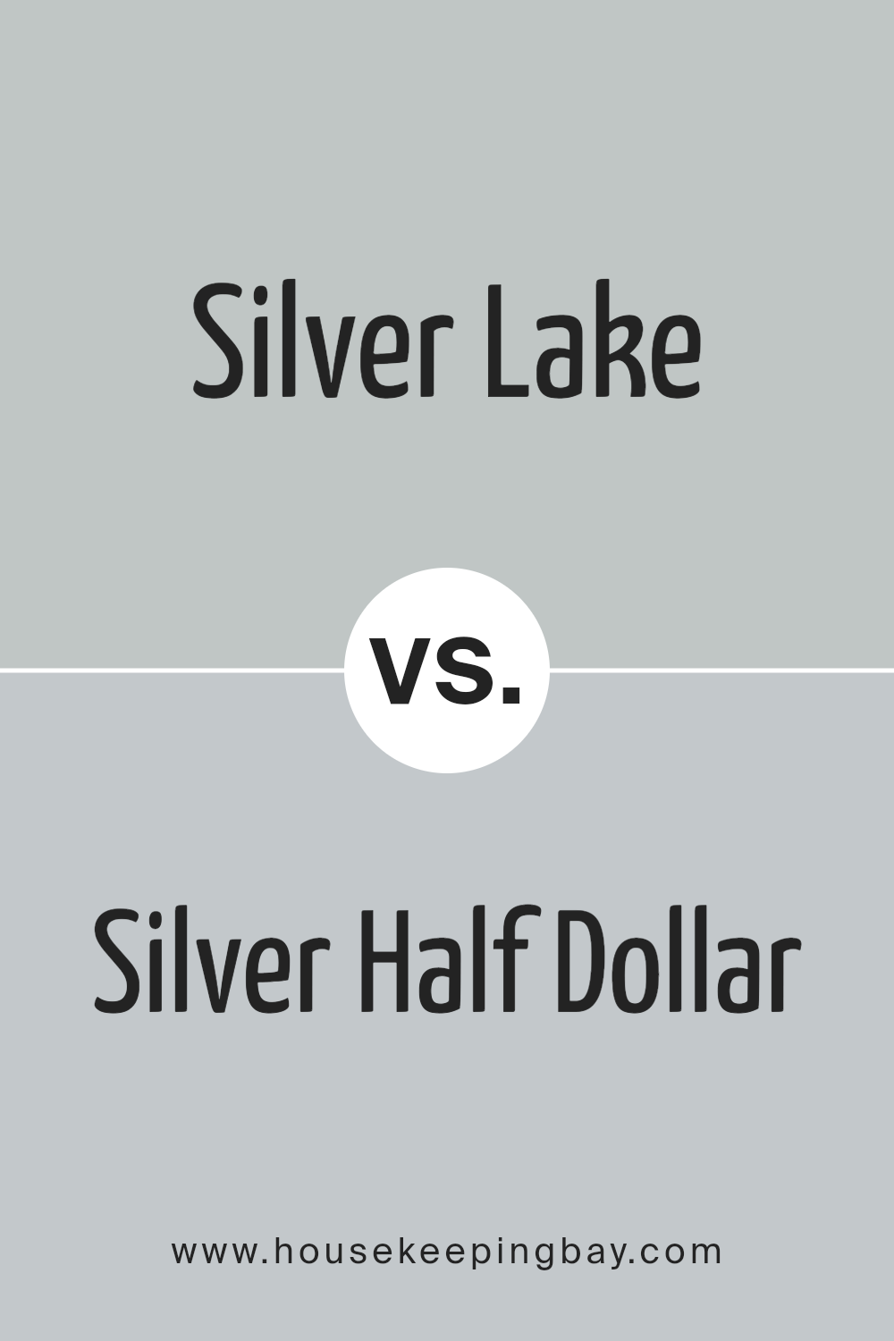
Silver Lake 1598 by Benjamin Moore vs Silver Half Dollar 2121-40 by Benjamin Moore
Silver Lake 1598 by Benjamin Moore is a subtle, soft gray with hints of blue that give it a serene quality. This color is great for creating a peaceful atmosphere in any room, making it feel light and soothing. It pairs well with soft furnishings and can help make small spaces appear larger.
Contrastingly, Silver Half Dollar 2121-40 by Benjamin Moore is a neutral gray that tilts more towards a classic, straightforward gray tone. This shade is more neutral than Silver Lake, making it highly versatile for various spaces and design styles. Silver Half Dollar works well in modern decor schemes and can also serve as a background color, allowing other colors in the room to stand out.
Both colors offer their unique appeal, with Silver Lake providing a cooler, softer look and Silver Half Dollar offering a more straightforward, adaptable gray. They can be used in different contexts depending on the desired effect and atmosphere in the room.
You can see recommended paint color below:
- 2121-40 Silver Half Dollar
housekeepingbay.com
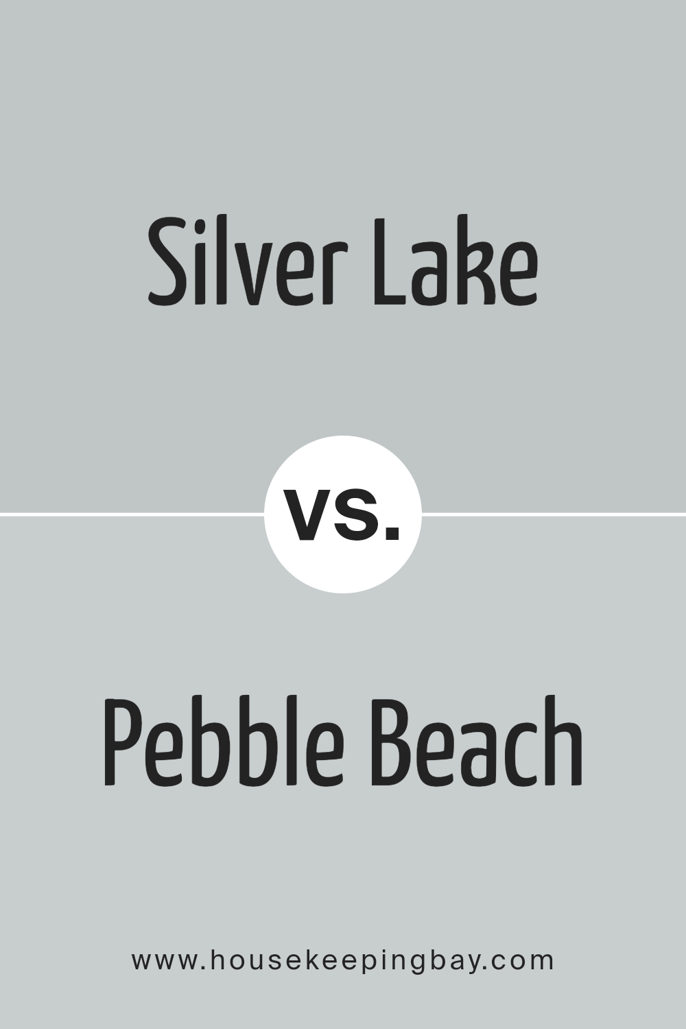
Silver Lake 1598 by Benjamin Moore vs Pebble Beach 1597 by Benjamin Moore
Silver Lake 1598 and Pebble Beach 1597 by Benjamin Moore are both subtle and sophisticated colors, yet they present unique characteristics. Silver Lake is a cooler, light gray with a soft blue undertone. This gives it a calm, serene appeal, making it ideal for creating a peaceful and airy space. It reflects light beautifully, which can help make small spaces appear larger and more open.
Pebble Beach, just a shade darker, leans slightly warmer with its beige undertones. This quality adds a touch of coziness and warmth to environments, making it perfect for living areas or bedrooms where a snug, welcoming feel is desired. It pairs well with a variety of decor styles, from modern to rustic, enhancing wood tones and natural elements particularly well.
By comparing these two, Pebble Beach offers warmth and coziness, while Silver Lake provides a crisper, more refreshing look. Each color suits different aesthetic needs and preferences, making them versatile choices for home interiors.
You can see recommended paint color below:
- 1597 Pebble Beach
housekeepingbay.com
Conclusion
In wrapping up thoughts on Benjamin Moore’s 1598 Silver Lake, it’s clear that this paint shade offers a versatile and soothing option for transforming any room in your home. Its subtle balance between gray and blue mirrors a serene lake at dawn, providing a calming presence. This particular shade proves ideal for anyone seeking a gentle yet sophisticated backdrop that enhances various decor styles without overwhelming the senses.
Whether you’re refreshing your living room, bedroom, or even your kitchen, 1598 Silver Lake adapts beautifully, reflecting natural light during the day while maintaining its depth in the evening. It pairs wonderfully with a range of accent colors, from soft pastels to bold hues, allowing you to personalize your space uniquely.
Moreover, for those concerned with quality and sustainability, Benjamin Moore’s long-standing commitment to producing premium, durable paints ensures that choosing 1598 Silver Lake is not only an aesthetically pleasing decision but also a practical one. It’s a paint that stands the test of time, keeping your walls looking freshly painted years after the initial application.
So, if you’re thinking about refreshing your home’s appearance or creating a peaceful, inviting space, 1598 Silver Lake is an excellent choice that won’t disappoint. Its ability to harmonize with various settings and its enduring quality makes it a wise investment for any homeowner.
housekeepingbay.com
