Agua Fria SW 9053 by Sherwin Williams
Refresh Your Space with a Splash of Cool Hues
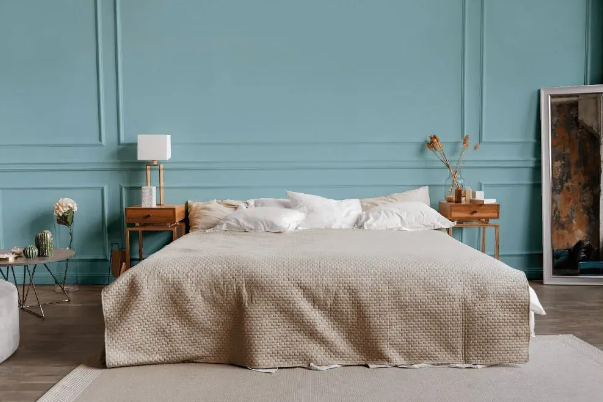
What about transforming your living space with a single coat of paint, changing the entire mood of a room effortlessly. That’s exactly what you can achieve with Sherwin Williams’ SW 9053 Agua Fria. This shade offers a gentle, refreshing hue that evokes a sense of cool calmness and relaxation.
When you open the can, you’re greeted with a color reminiscent of serene waters and peaceful skies, perfect for creating a tranquil atmosphere in any space.
Whether you’re updating a cozy bedroom or a bustling kitchen, Agua Fria complements various styles and decors. Its soft, cool tone works beautifully with natural wood, sleek metals, and vibrant textiles, allowing you to create a harmonious and inviting environment.
As you consider colors for your next project, SW 9053 Agua Fria stands out for its ability to subtly enhance rather than overpower, giving your home a soothing sanctuary feel.
Let this refreshing shade be your key to renewing your space’s ambiance, bringing a breath of fresh air into your everyday life.
via plan-home.com
What Color Is Agua Fria SW 9053 by Sherwin Williams?
Table of Contents
Agua Fria SW 9053 by Sherwin Williams is a gentle, cool shade of blue with green undertones, reminiscent of clear, tranquil waters. Its soothing nature makes it ideal for creating a calming and relaxed atmosphere in any space. This color lends itself beautifully to various interior styles, from coastal and Mediterranean to modern and minimalist designs, where a touch of nature’s serenity is desired.
In a coastal or beach-themed room, pair Agua Fria with natural materials like light woods, rattan, or sisal rugs to enhance its breezy, ocean-inspired feel.
For a more modern look, combine this hue with sleek metals, such as chrome or brushed nickel, and crisp white accents to maintain a clean, sophisticated aesthetic.
In a Mediterranean style, terra cotta tiles or warm-toned ceramics can complement the coolness of the blue-green.
Texturally, Agua Fria works well with soft linens and cottons, creating a cozy environment that invites relaxation. Incorporating elements like woven baskets or jute accessories will add depth and interest.
Whether used as an accent wall, in textiles, or as the main color scheme, Agua Fria brings a refreshing, serene vibe to a home, making it a versatile option for personalizing any room.
housekeepingbay.com
Is Agua Fria SW 9053 by Sherwin Williams Warm or Cool color?
Agua Fria SW 9053 by Sherwin Williams provides a calm, soothing atmosphere with its soft blue-gray tone. This color works well in homes, offering a sense of peace and relaxation. Its cool undertones create a fresh, airy look, making spaces feel more open and inviting.
When used in living rooms or bedrooms, Agua Fria promotes a sense of calmness, perfect for unwinding after a long day.
The color pairs beautifully with whites and natural wood elements, enhancing its serene effect. In kitchens or bathrooms, it offers a clean, crisp appearance, complementing stainless steel or white fixtures. By reflecting light softly, it can brighten up areas without overwhelming them.
Whether on walls or accents, Agua Fria provides a versatile backdrop that adapts to various styles, from modern to traditional. Overall, this color brings a gentle balance to home interiors, making them feel welcoming and serene.
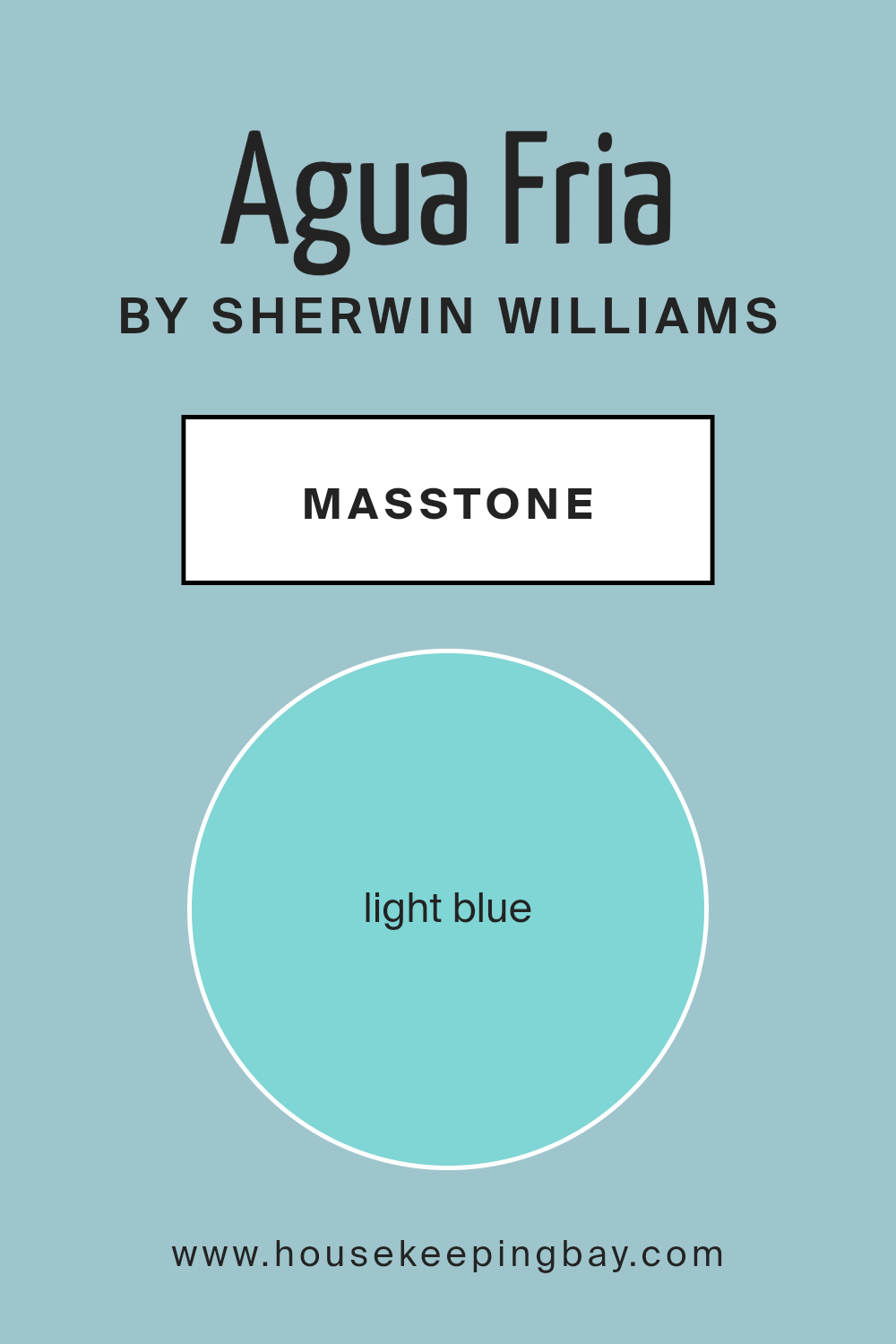
What is the Masstone of the Agua Fria SW 9053 by Sherwin Williams?
Agua FriaSW 9053 by Sherwin Williams has a light blue masstone, with the color code #80D5D5. This shade brings a calm and fresh feeling to rooms. Its lightness can make spaces feel open and airy, which is perfect for smaller rooms or those lacking natural light.
The cool tone of Agua FriaSW 9053 creates a relaxed atmosphere, making it a good choice for bedrooms and bathrooms where comfort is important.
In living spaces or kitchens, this color can add a touch of modern flair. Pairing it with whites or light grays can enhance its crispness, making a room feel clean and bright. Wooden accents or darker blues can provide contrast, adding depth to the space. Overall, Agua FriaSW 9053 is versatile and friendly, easily fitting into various decor styles.
It’s well-suited for those who want a peaceful environment with a hint of contemporary style.
housekeepingbay.com
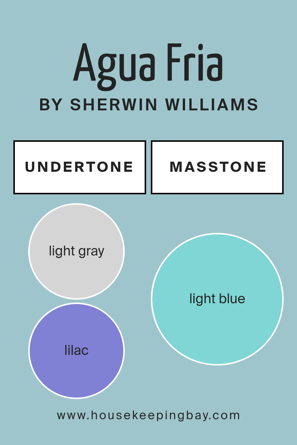
Undertones of Agua Fria SW 9053 by Sherwin Williams
Agua Fria SW 9053 by Sherwin Williams has various undertones that influence how it appears on walls, especially in interiors. Undertones are subtle hints of color that can change how a main color is perceived. For Agua Fria SW 9053, these undertones include light gray, lilac, mint, light purple, pale yellow, grey, pale pink, turquoise, blue, light turquoise, and dark turquoise.
In spaces, these soft undertones can play with lighting and surrounding decor. In bright sunlight, lilac and light purple undertones might give the room a gentle, soothing vibe.
At night or in shaded interiors, the dark turquoise and grey can bring out deeper, more muted aspects of the color, making it feel more grounded.
The combination of pale yellow and mint makes Agua Fria feel fresh and airy, ideal for kitchens or bathrooms where a light, clean feel is preferred.
Meanwhile, the hints of pale pink and turquoise can offer a playful edge, suitable for kids’ rooms or spaces aiming for a cheerful tone.
The balance of these undertones in Agua Fria ensures it remains versatile, working well in different settings, and can either warm up or cool down a room depending on light and surrounding elements.
housekeepingbay.com
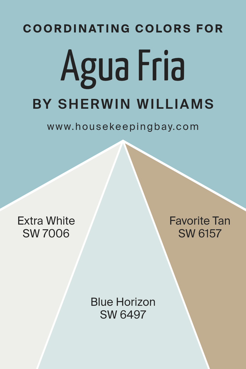
Coordinating Colors of Agua Fria SW 9053 by Sherwin Williams
Coordinating colors are those that complement or enhance the appearance of a primary color by creating a harmonious and visually pleasing palette. These colors work together to bring balance and unity to a space.
When considering coordinating colors for Sherwin Williams’ Agua Fria SW 9053, think of using SW 7006 – Extra White, SW 6497 – Blue Horizon, and SW 6157 – Favorite Tan.
These selections bring out different characteristics of Agua Fria, an alluring green-blue that can be the star of a room or a subtle supporting hue.
SW 7006 – Extra White is crisp and clean, offering a bright canvas that highlights other colors while keeping the room feeling fresh and airy.
It pairs well with Agua Fria by providing a clear contrast that makes the green-blue tones pop. SW 6497 – Blue Horizon introduces a soft, calming blue that echoes the cool undertones of Agua Fria, enhancing its soothing quality.
It feels like a gentle breeze, perfect for spaces meant for relaxation. Lastly, SW 6157 – Favorite Tan brings warmth to the palette with its earthy, light brown shade.
This color balances the cooler tones, making the overall look more grounded and inviting. Together, these colors can create a well-balanced and visually engaging space.
You can see recommended paint colors below:
- SW 7006 Extra White
- SW 6497 Blue Horizon
- SW 6157 Favorite Tan
housekeepingbay.com
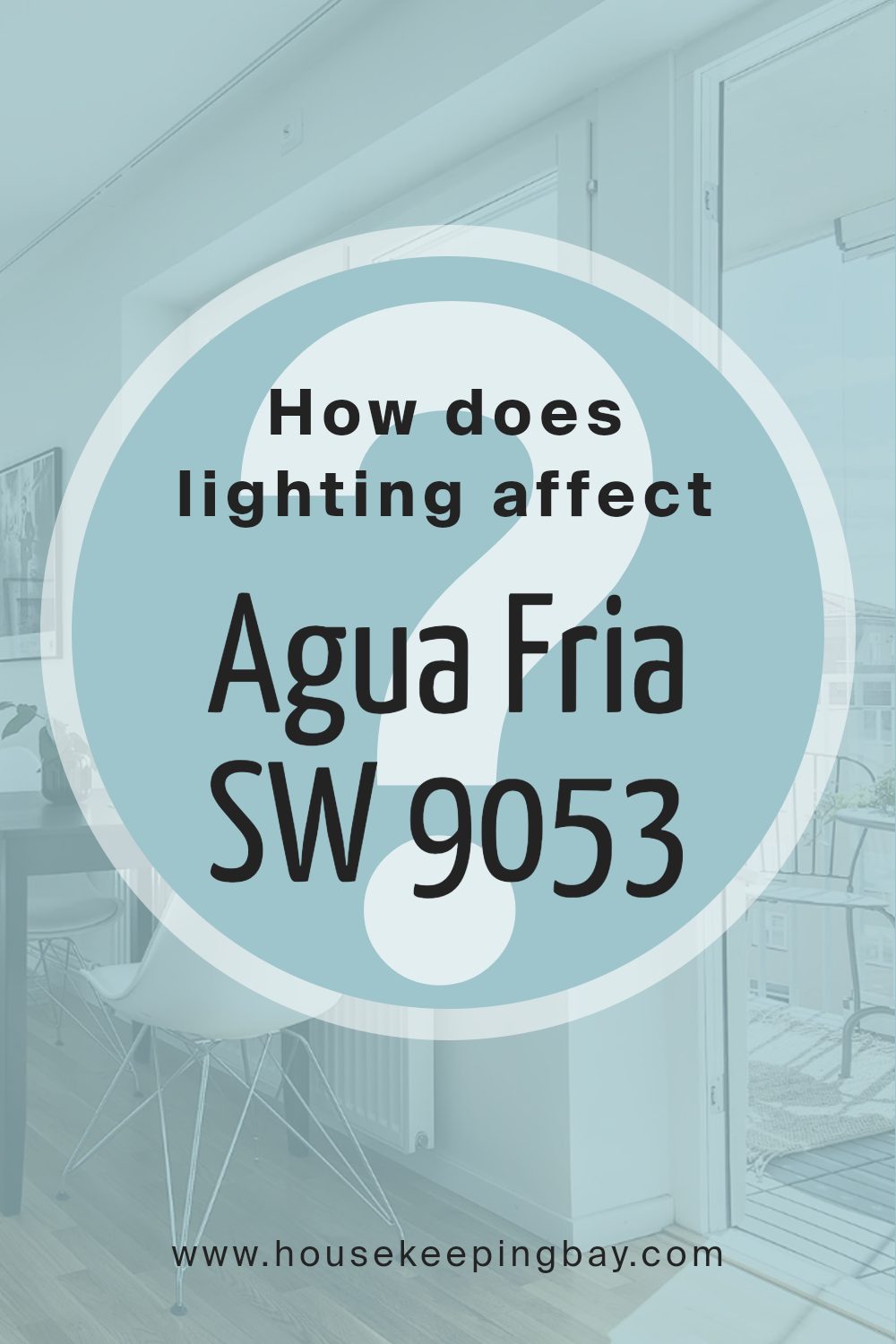
How Does Lighting Affect Agua Fria SW 9053 by Sherwin Williams?
Lighting plays a crucial role in how we perceive colors. Natural and artificial lights can make colors appear different. When it comes to the color Agua Fria SW 9053 by Sherwin Williams, the type of lighting can significantly affect how it looks.
In artificial lighting, the color can change based on the bulb used. Incandescent bulbs tend to cast a warm yellow glow, which can make Agua Fria appear softer and slightly warmer. Fluorescent lighting, on the other hand, emits a cooler light, which can make this color seem a bit more muted or dull.
LED lights, available in a wide range of temperatures, can either warm up or cool down the appearance of Agua Fria, depending on the type.
In natural light, Agua Fria may look different at various times of the day or in different areas of a house. In north-facing rooms, which get softer and cooler light, the color might appear a bit more muted and grayish, given less direct sunlight.
This subtle lighting can bring out the cooler tones in Agua Fria.
In south-facing rooms, sunlight enters more directly and brings a warm glow throughout the day. In these rooms, Agua Fria might look more vibrant, with the blue tones standing out more crisply. The natural light in these rooms highlights the true essence of the color.
East-facing rooms receive bright, warm light in the morning, making Agua Fria appear fresher and brighter early in the day. As the day progresses, the color might appear cooler since the light fades in intensity and warmth.
West-facing rooms get warmer light in the afternoon and early evening. In these spaces, Agua Fria can appear warmer and richer, emphasizing the depth of its hue as the golden sunset filters in.
Understanding how lighting affects color helps in making informed choices about paint colors in different spaces.
housekeepingbay.com
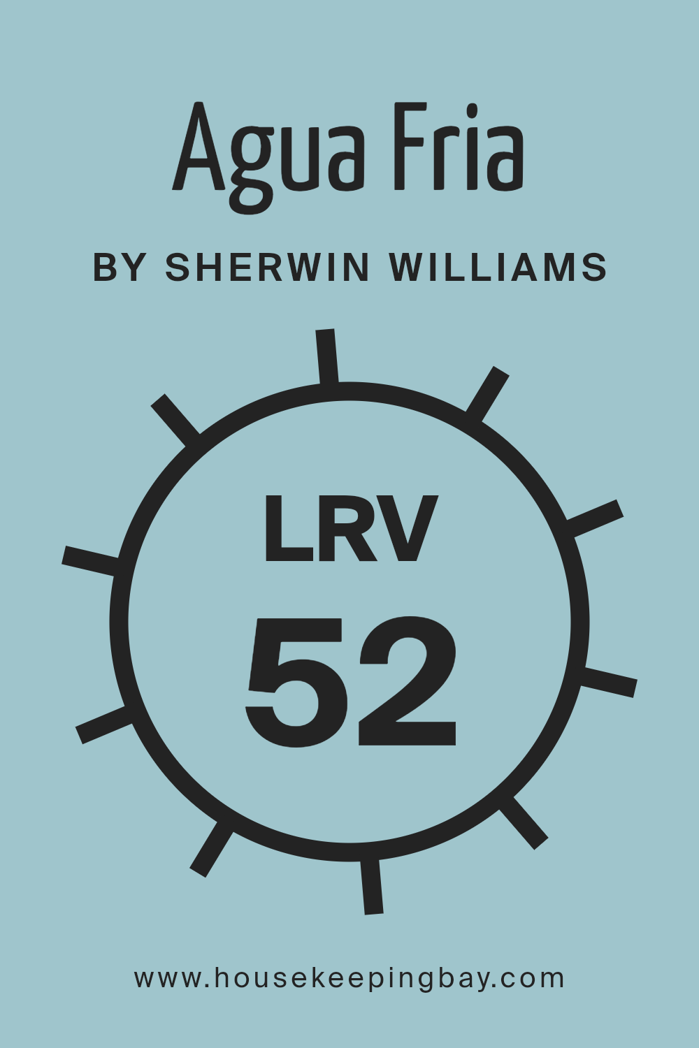
What is the LRV of Agua Fria SW 9053 by Sherwin Williams?
The Light Reflectance Value, or LRV, is a measurement used to indicate how much light a color reflects. It’s shown as a percentage from 0 to 100. A low LRV means the color absorbs more light, making it darker, while a high LRV means the color reflects more light, making it lighter.
This is important when choosing paint colors because it can affect how a room feels. A room with colors that have a low LRV might feel cozier or more dramatic, while those with a high LRV can feel more open or brighter.
Agua Fria, with an LRV of 51.631, falls in the middle range, which means it reflects about half the light it receives. This lets it balance between light and dark, providing a neutral feel. On walls, Agua Fria can maintain a sense of brightness without being too overpowering, making rooms feel neither cramped nor too open.
It offers versatility, working well in various spaces, whether they’re well-lit or rely on artificial light. This makes it a flexible choice for many different settings where a medium tone is needed.
housekeepingbay.com
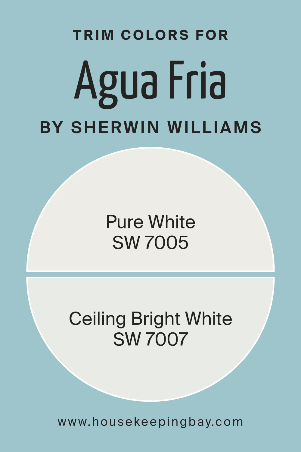
What are the Trim colors of Agua Fria SW 9053 by Sherwin Williams?
Trim colors refer to the paint used for the finishing touches on the edges, corners, and moldings of a room, highlighting these architectural features. They are important because they create a clean, defined look that complements the main wall color, in this case, Agua Fria SW 9053.
When paired with this gentle, subdued shade, trim colors can enhance the overall appearance, adding a crisp contrast that helps the walls and other design elements stand out.
Using neutral trim colors like SW 7005 – Pure White and SW 7007 – Ceiling Bright White can be particularly effective with Agua Fria.
Pure White carries a soft, versatile tone that works with a wide range of colors, providing a clean and timeless finish. On the other hand, Ceiling Bright White offers a slightly cooler undertone, which can add a touch of brightness and clarity to a room.
Both Pure White and Ceiling Bright White as trim colors can subtly impact the room’s mood without overpowering Agua Fria’s calm, understated blue-green. Pure White, with its perfect balance between warm and cool, acts as a seamless partner for Agua Fria, accentuating the walls while maintaining a cohesive look.
Ceiling Bright White can enhance light and space in a room, providing a fresh and airy feel. Together, they ensure that Agua Fria does not feel isolated, creating harmony in the overall design. These trim colors bring out the best in Agua Fria, highlighting its peaceful tones and making the space inviting and well put together.
You can see recommended paint colors below:
housekeepingbay.com
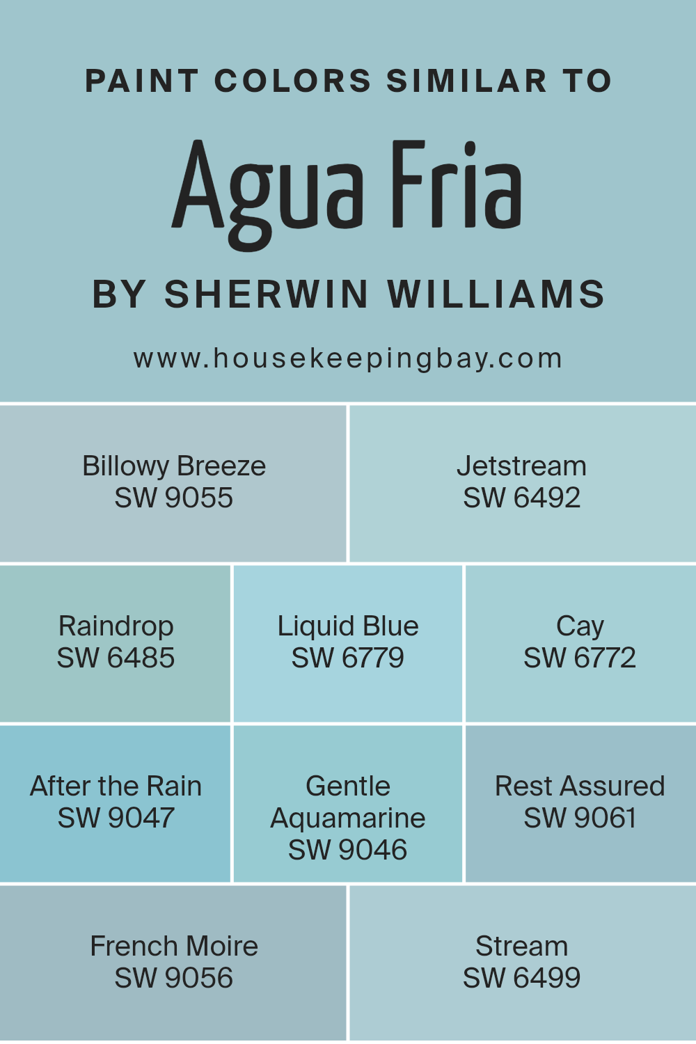
Colors Similar to Agua Fria SW 9053 by Sherwin Williams
Similar colors are essential in design because they create harmony and balance. Take, for instance, the color Agua Fria SW 9053 by Sherwin Williams, a calming blue-green that evokes freshness and calmness. By pairing Agua Fria with similar shades such as SW 9055 – Billowy Breeze or SW 6492 – Jetstream, you can make a space feel cohesive and pleasing.
Billowy Breeze has a soft blue with a touch of gray, giving it a calm and airy feel. Jetstream is a lighter sky blue that can brighten a room.
Other colors like SW 6485 – Raindrop and SW 6779 – Liquid Blue share the freshness of a spring shower or clear sea waters. Raindrop offers a crisp, clean blue, while Liquid Blue adds a bit more depth with its vivid tone. SW 6772 – Cay brings in a tropical appeal with its green-blue mix, creating a sense of relaxation.
After the Rain SW 9047 and SW 9046 – Gentle Aquamarine both add a subtle green hint, reminiscent of natural waters. SW 9061 – Rest Assured offers a deeper blue tone, perfect for creating a cozy space, while SW 9056 – French Moire is a muted grayish-blue, ideal for adding sophistication.
Stream SW 6499 is a serene blue, like calm water flowing gently. Together, these similar colors work to enhance beauty and create environments that feel naturally connected.
You can see recommended paint colors below:
- SW 9055 Billowy Breeze
- SW 6492 Jetstream
- SW 6485 Raindrop
- SW 6779 Liquid Blue
- SW 6772 Cay
- SW 9047 After the Rain
- SW 9046 Gentle Aquamarine
- SW 9061 Rest Assured
- SW 9056 French Moire
- SW 6499 Stream
housekeepingbay.com
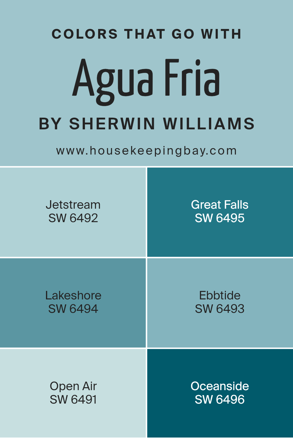
Colors that Go With Agua Fria SW 9053 by Sherwin Williams
Agua Fria SW 9053 by Sherwin Williams is a calm, muted blue-gray shade that provides a serene backdrop in any space. It’s important to choose complementary colors that enhance this base shade, creating a cohesive and inviting atmosphere.
For instance, SW 6492 Jetstream, a light and airy blue, adds a refreshing touch that pairs well with Agua Fria. SW 6495 Great Falls offers a soft, cool green that brings a natural, soothing vibe, making it an excellent choice in spaces where relaxation is key.
As you look at SW 6494 Lakeshore, its deeper blue-green tone can add depth and warmth, effortlessly anchoring rooms without overwhelming them. Meanwhile, SW 6493 Ebbtide, with its gentle teal hue, offers a subtle pop of color, ideal for accents.
SW 6491 Open Air provides a pale blue touch that evokes openness and lightness, perfect for making smaller spaces feel larger.
Finally, SW 6496 Oceanside delivers a rich, jewel-toned blue that can make a bold statement or tie elements of a room together. These colors, each with their unique traits, work in harmony with Agua Fria to create a balanced and pleasing environment.
You can see recommended paint colors below:
- SW 6492 Jetstream
- SW 6495 Great Falls
- SW 6494 Lakeshore
- SW 6493 Ebbtide
- SW 6491 Open Air
- SW 6496 Oceanside
housekeepingbay.com
How to Use Agua Fria SW 9053 by Sherwin Williams In Your Home?
Agua Fria SW 9053 by Sherwin Williams is a paint color that creates a calm and refreshing atmosphere in any home. This shade of blue has subtle undertones that make it perfect for both traditional and modern interiors. People can use it in the living room to promote relaxation and comfort. Pair it with white or cream-colored furniture and accessories to keep the room light and airy.
In a bedroom, Agua Fria offers a soothing backdrop for rest and can be enhanced with soft linens and natural wood accents. It also works well in bathrooms, where its cool hue complements fixtures and adds a fresh feel. Combine it with silver or chrome accents for a touch of elegance.
For those who appreciate a peaceful workspace, painting an office in Agua Fria can inspire focus and calm. Overall, this versatile color can enhance various areas of a home, creating a serene environment.
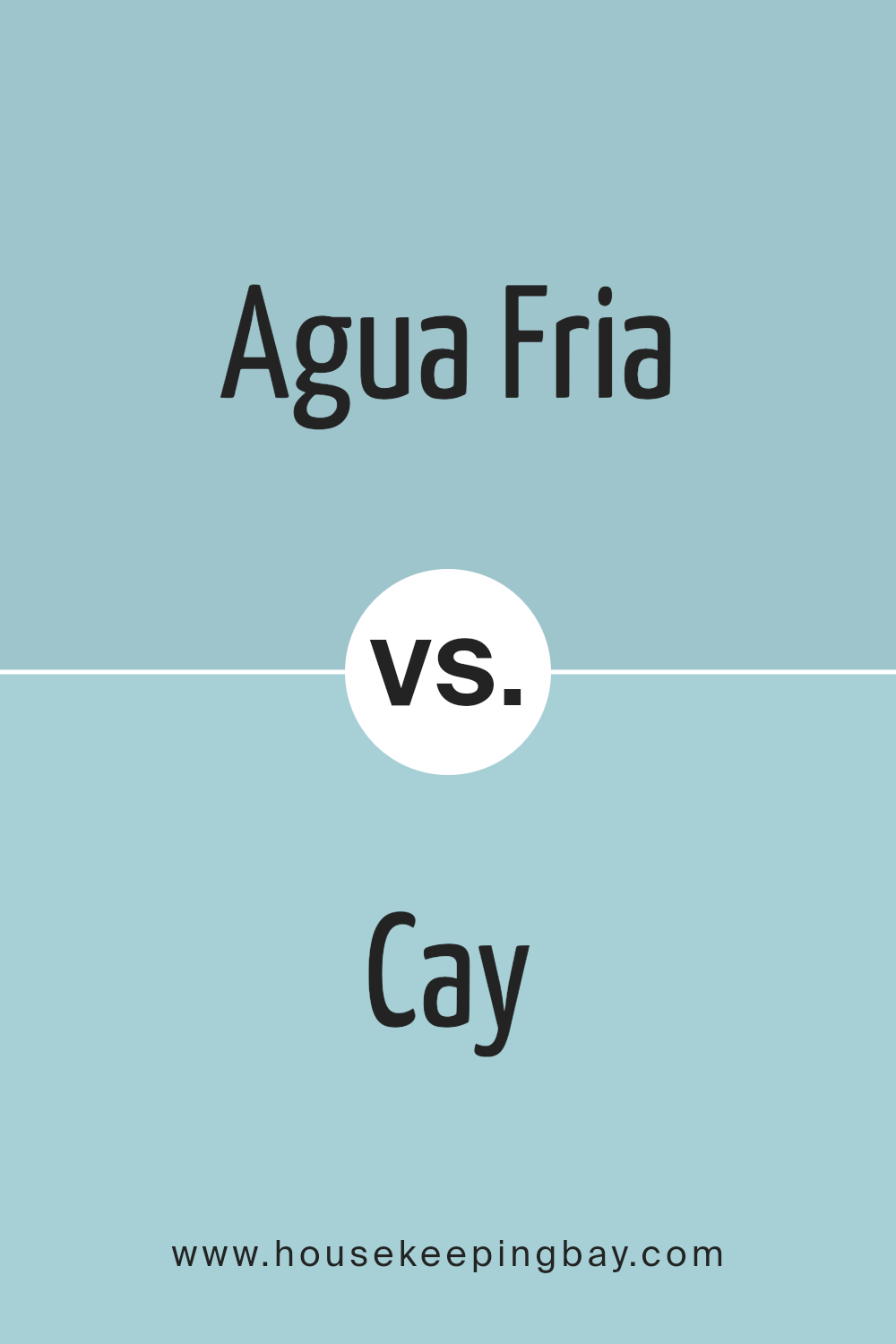
Agua Fria SW 9053 by Sherwin Williams vs Cay SW 6772 by Sherwin Williams
Agua Fria SW 9053 and Cay SW 6772, both from Sherwin Williams, present a delightful contrast. Agua Fria offers a muted, soft blue-gray that evokes calmness and a sense of space, making it ideal for living rooms or bedrooms. This color can create a relaxed environment and pairs well with white or light gray accents to maintain a peaceful feel.
In contrast, Cay SW 6772 is a vibrant, cheerful blue with a tropical essence. It can energize a room, making it a suitable option for areas where a lively and fresh atmosphere is desired, such as in a kitchen or a child’s playroom.
Both colors bring their unique personalities: Agua Fria offers subtlety and quiet elegance, while Cay bursts with energy and positivity. When choosing between them, consider the mood you aim to convey; calm and soothing versus lively and invigorating.
You can see recommended paint color below:
- SW 6772 Cay
housekeepingbay.com
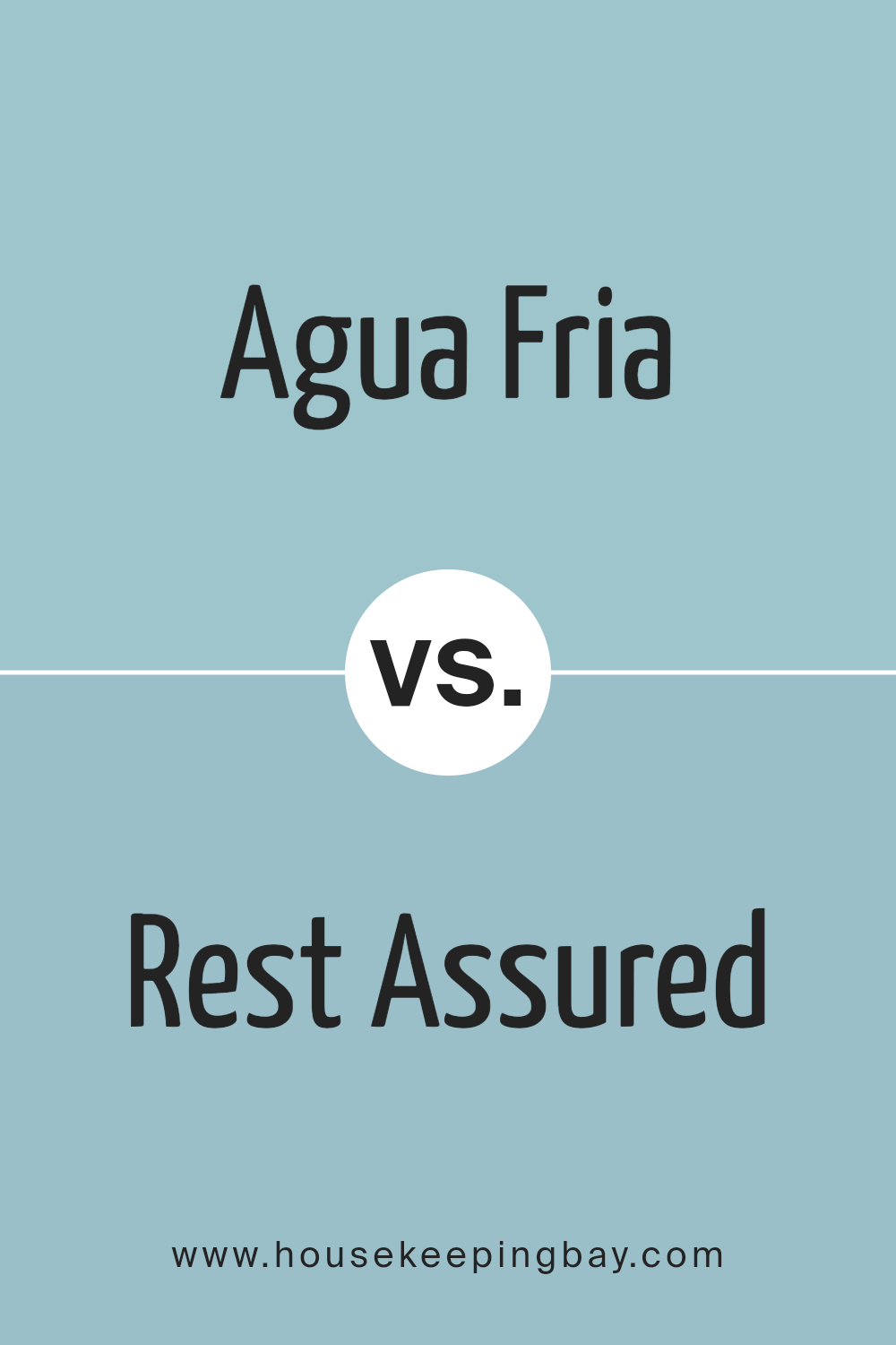
Agua Fria SW 9053 by Sherwin Williams vs Rest Assured SW 9061 by Sherwin Williams
Agua Fria SW 9053 and Rest Assured SW 9061, both from Sherwin Williams, offer unique vibes for interior spaces. Agua Fria is a cool, muted blue, evoking a sense of calm and serenity. It’s versatile, ideal for spaces needing a soft, calming touch. This shade fits well in bedrooms or living rooms, complementing a range of furniture and decor styles.
Rest Assured, by contrast, also brings peace but with a slightly warmer undertone. It’s a gentle, middle-ground blue, inviting comfort. This color works great in areas where a welcoming atmosphere is preferred, like living rooms or cozy corners of a home.
Both colors share a sense of calmness, yet Agua Fria leans more towards the cool end of the spectrum while Rest Assured adds a hint of warmth, which can affect the mood of a space significantly. Choosing between them depends on the atmosphere and design style desired.
You can see recommended paint color below:
- SW 9061 Rest Assured
housekeepingbay.com
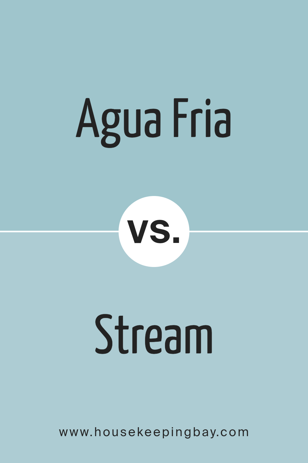
Agua Fria SW 9053 by Sherwin Williams vs Stream SW 6499 by Sherwin Williams
Agua Fria SW 9053 by Sherwin Williams and Stream SW 6499 both bring unique vibes to spaces but differ in their tones and moods. Agua Fria SW 9053 offers a cool, muted blue with a hint of green, creating a refreshing and calm atmosphere. It’s a versatile color that works well in various settings, be it modern or traditional.
Stream SW 6499 presents a brighter, more vibrant blue with a playful edge. This color invokes a lively and energetic mood, making it perfect for spaces that need a bit of an uplift or a cheerful touch.
While Agua Fria has a subtlety that promotes relaxation, Stream brings a sense of enthusiasm and energy. Both colors serve different purposes: Agua Fria for a serene palette, and Stream for a lively ambiance. Selecting between the two depends on whether a space aims for tranquility or vibrancy.
You can see recommended paint color below:
- SW 6499 Stream
housekeepingbay.com
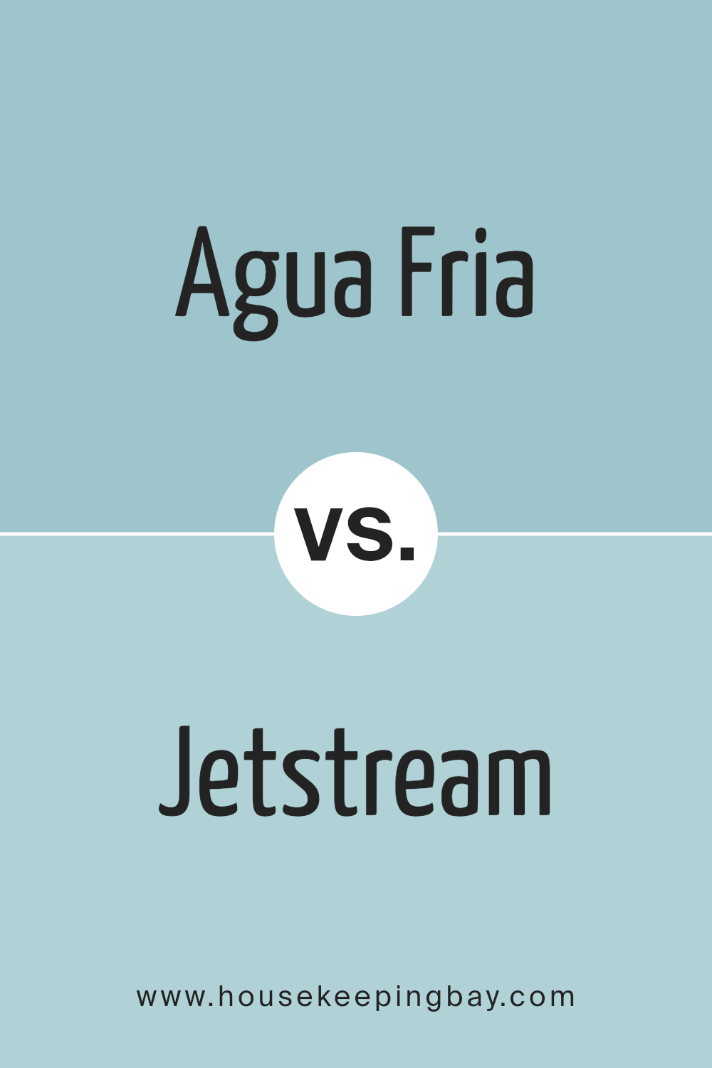
Agua Fria SW 9053 by Sherwin Williams vs Jetstream SW 6492 by Sherwin Williams
Agua Fria SW 9053 and Jetstream SW 6492, both by Sherwin Williams, present unique moods. Agua Fria offers a soothing, cool green with hints of blue, like calm waters. It adds a serene and refreshing touch to spaces, ideal for bedrooms or living rooms seeking relaxation.
Jetstream, in contrast, leans more towards blue with a soft, airy feel, reminiscent of clear skies. It brightens up spaces, bringing in a sense of openness and freedom, perfect for bathrooms or kitchens where brightness matters.
While both hues share a calming nature, Agua Fria’s green undertone feels grounded and natural, whereas Jetstream’s blue dominance creates a more energizing effect. Both colors work well in modern and traditional settings, but your choice might depend on whether you prefer the gentle coolness of water or the invigorating breeziness of sky.
You can see recommended paint color below:
- SW 6492 Jetstream
housekeepingbay.com
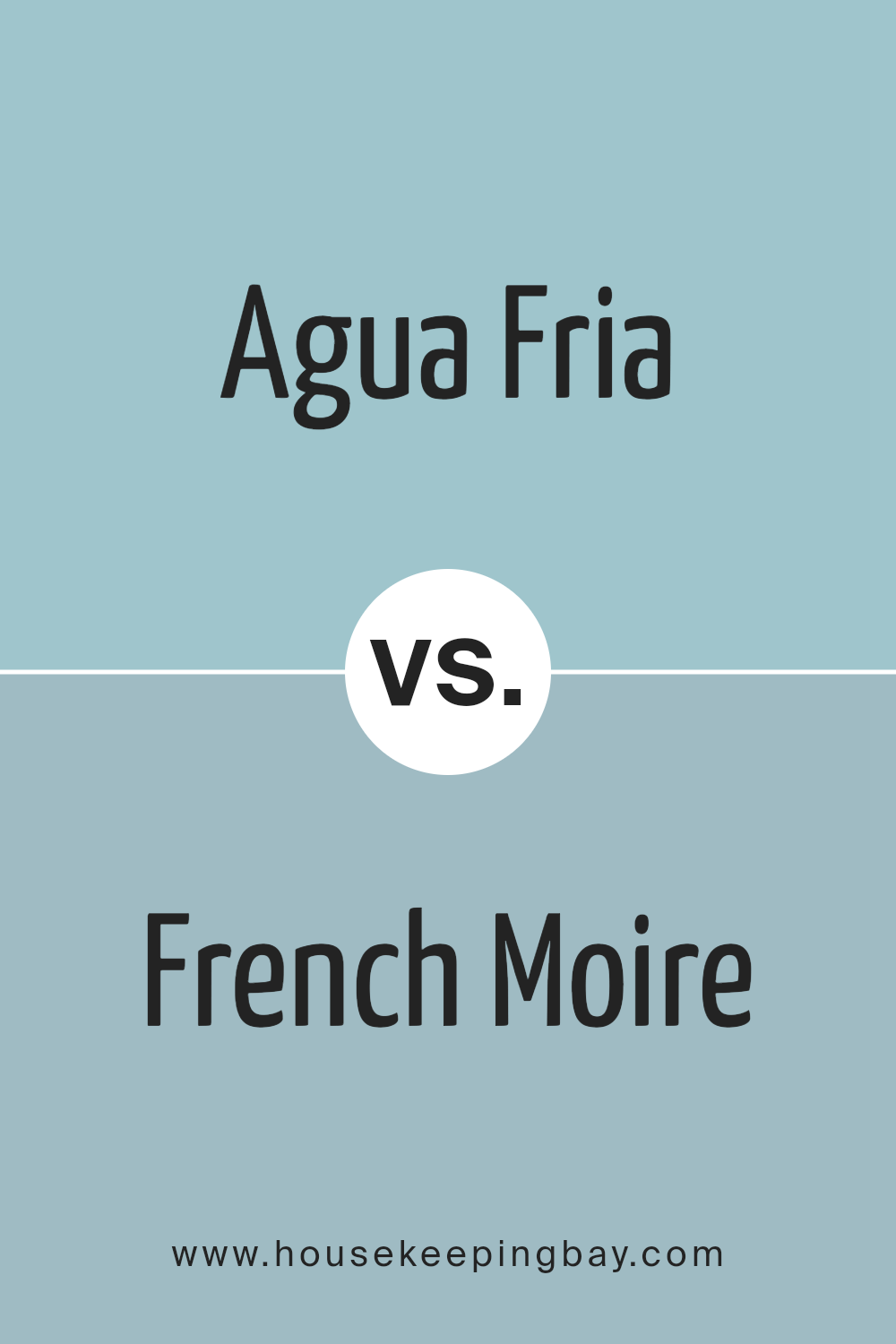
Agua Fria SW 9053 by Sherwin Williams vs French Moire SW 9056 by Sherwin Williams
Agua Fria SW 9053 and French Moire SW 9056 by Sherwin Williams both offer unique characteristics, making them suitable for different preferences. Agua Fria SW 9053 is a soft, muted blue-gray. It has a calming effect, often reminding one of overcast skies or gentle waters. This color tends to create a relaxed atmosphere in any room. It’s versatile and pairs well with various neutral tones.
French Moire SW 9056, by contrast, presents a deeper, richer blue. It feels more dramatic and bold, adding depth and sophistication to spaces. This color commands attention and works well in areas where you want to make a statement, such as an accent wall or a study.
Both colors can complement each other in a decor scheme, with Agua Fria providing a light, airy base and French Moire adding intensity and focus. Choosing between them will depend on the mood and effect you desire for your space.
You can see recommended paint color below:
- SW 9056 French Moire
housekeepingbay.com
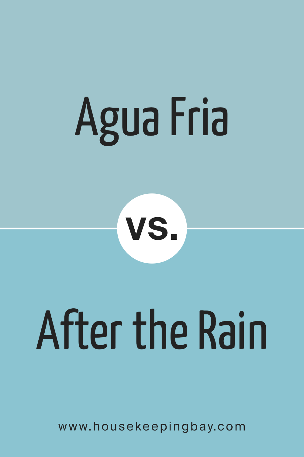
Agua Fria SW 9053 by Sherwin Williams vs After the Rain SW 9047 by Sherwin Williams
Agua Fria SW 9053 and After the Rain SW 9047, both by Sherwin Williams, offer unique vibes despite being in the blue family. Agua Fria is a deeper, muted blue with gray undertones, giving it a calming, reserved feel. It brings sophistication and can anchor a room with a grounded sense. Ideal for spaces needing depth without overwhelming brightness, it pairs well with neutrals and earth tones.
After the Rain, by contrast, is lighter and more vibrant. This color has a fresh, airy quality that reflects a brighter atmosphere. It’s suitable for rooms where a lively, open feel is desired, such as living rooms or kitchens, and pairs beautifully with whites and soft pastels.
In essence, Agua Fria serves well in calm, sophisticated settings, while After the Rain injects energy and lightness, making it perfect for uplifting spaces. Both colors, while blue, offer different moods and uses in design.
You can see recommended paint color below:
- SW 9047 After the Rain
housekeepingbay.com
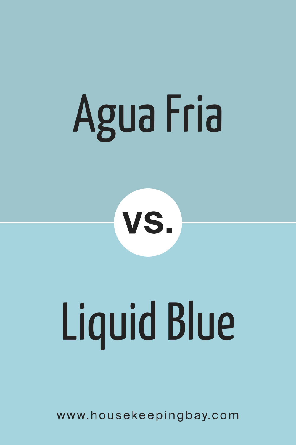
Agua Fria SW 9053 by Sherwin Williams vs Liquid Blue SW 6779 by Sherwin Williams
Agua Fria SW 9053 and Liquid Blue SW 6779, both by Sherwin Williams, offer distinct vibes. Agua Fria is a soothing, muted green with a hint of blue, evoking a calm and natural feel. It brings a sense of balance and harmony, making it a great choice for spaces where relaxation and serenity are desired. The color leans towards earthy and understated, perfect for a subtle and peaceful environment.
Liquid Blue, however, bursts with energy and brightness. It’s a vivid, electric blue that adds a lively touch to any room. This color commands attention and can energize a space, making it ideal for areas where vibrancy and dynamism are wanted.
It works well as an accent or in more daring interior designs.
While Agua Fria offers a gentle, calming presence, Liquid Blue brings boldness and excitement, allowing versatility in creating different atmospheres depending on personal taste or mood.
You can see recommended paint color below:
- SW 6779 Liquid Blue
housekeepingbay.com
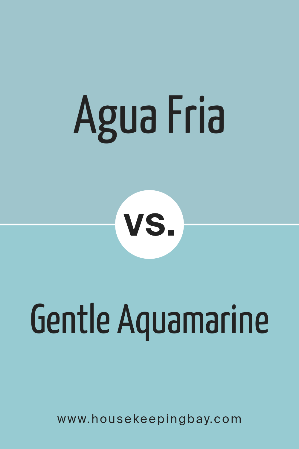
Agua Fria SW 9053 by Sherwin Williams vs Gentle Aquamarine SW 9046 by Sherwin Williams
Agua Fria SW 9053 and Gentle Aquamarine SW 9046 by Sherwin Williams both belong to the cool, refreshing side of the color spectrum. Agua Fria SW 9053 is deeper, with a more muted tone, resembling a shade mixed with soft gray undertones. This color offers a calming presence, ideal for creating a serene and grounded space.
In contrast, Gentle Aquamarine SW 9046 is lighter and brighter. It features a hint of sea green, bringing more vitality and energy to a room. Its clarity captures the feeling of a breezy ocean day, perfect for adding freshness and openness.
While both colors can evoke a sense of calm, Agua Fria provides a more sophisticated, subdued backdrop. Meanwhile, Gentle Aquamarine works well to rejuvenate and enliven a space. Whether aiming for a tranquil, relaxing environment or a lively, fresh area, these colors offer distinct yet complementary characteristics.
You can see recommended paint color below:
- SW 9046 Gentle Aquamarine
housekeepingbay.com
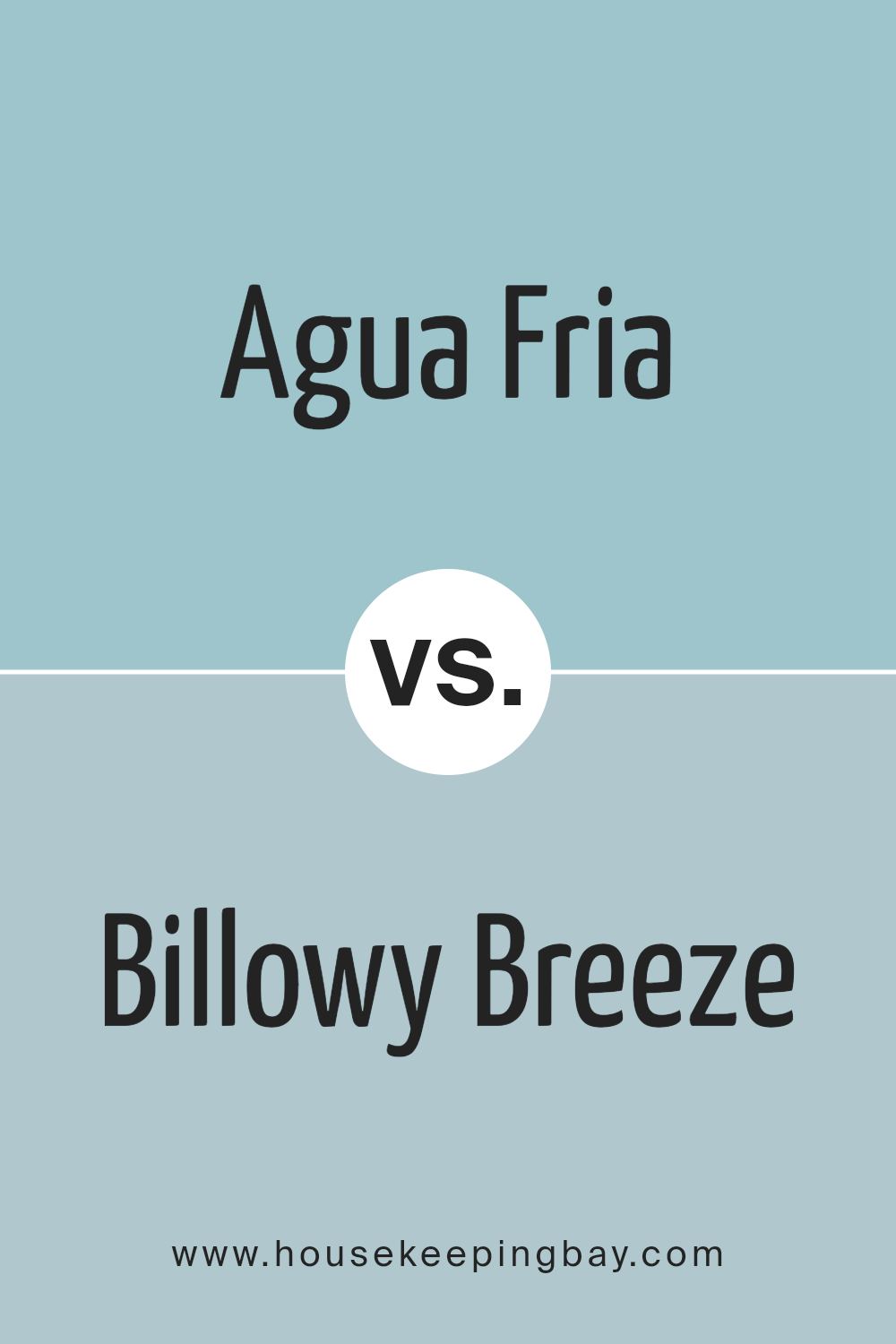
Agua Fria SW 9053 by Sherwin Williams vs Billowy Breeze SW 9055 by Sherwin Williams
Agua Fria SW 9053 and Billowy Breeze SW 9055 by Sherwin Williams are lovely colors that share some similarities but also have unique features. Agua Fria is a cool, muted green with a touch of blue, giving it a grounded, earthy feel. It resembles the calm of shaded foliage.
Billowy Breeze, meanwhile, appears as a softer shade with more noticeable blue undertones, evoking a sense of airy lightness reminiscent of a clear sky. When used in a room, Agua Fria can create a cozy, intimate atmosphere ideal for spaces like bedrooms or reading nooks.
Billowy Breeze suits spaces where you want a light and open ambiance, such as living rooms or bathrooms. Both work well with neutral accents but offer different moods: Agua Fria feels more serene and grounded, while Billowy Breeze provides a fresh and uplifting vibe.
They can be great choices for different purposes depending on the desired effect in a space.
You can see recommended paint color below:
- SW 9055 Billowy Breeze
housekeepingbay.com
Agua Fria SW 9053 by Sherwin Williams vs Raindrop SW 6485 by Sherwin Williams
Agua Fria SW 9053 and Raindrop SW 6485 by Sherwin Williams are both calm, cool colors, but they have distinct differences. Agua Fria is a muted, earthy blue-green, feeling like a deep, still lake or a forest under shadow. It has a soothing and grounding quality, perfect for spaces needing a sense of calm and restfulness.
Raindrop SW 6485, though also in the blue-green family, is lighter and brighter. It resembles clear skies just after rain, offering a fresh and airy feeling.
Its lightness can make spaces feel open and inviting, ideal for areas where you want to add a gentle, uplifting touch without overwhelming brightness.
While both colors belong to the same color family, Agua Fria leans more towards a subtle ambiance, whereas Raindrop adds a touch of lightness and cheer.
These differences make each suitable for different moods and room types.
You can see recommended paint color below:
- SW 6485 Raindrop

housekeepingbay.com
Conclusion
SW 9053 Agua Fria by Sherwin Williams brings a fresh and calming addition to any space. As I consider this hue, its versatility stands out. It’s a soft, muted blue-green that lends itself well to creating a serene environment.
Whether used in living rooms, bedrooms, or even kitchens, it pairs wonderfully with both light and dark accents, making it an excellent choice for various design styles.
In my experience, Aqua Fria serves as a pleasant backdrop, allowing other elements in the room to shine while maintaining its presence. It provides a sense of calm and relaxation, perfect for spaces where I wish to unwind.
This color harmonizes with natural elements, making it ideal for spaces with plenty of natural light, enhancing its soothing quality.
Additionally, pairing Agua Fria with warm woods and metallics enriches its cool tones, adding depth and interest without overwhelming the senses. Its subdued nature presents countless possibilities for incorporating into existing color schemes or building a new palette around it.
I find that Aqua Fria successfully combines warmth and coolness for a balanced, inviting atmosphere. It’s a testament to the power of color in home decor, offering both style and serenity in equal measure without overpowering the room.
housekeepingbay.com
Ever wished paint sampling was as easy as sticking a sticker? Guess what? Now it is! Discover Samplize's unique Peel & Stick samples. Get started now and say goodbye to the old messy way!
Get paint samples


