Winter Sunshine 345 by Benjamin Moore
Brighten Up Your Days with This Cheerful Shade
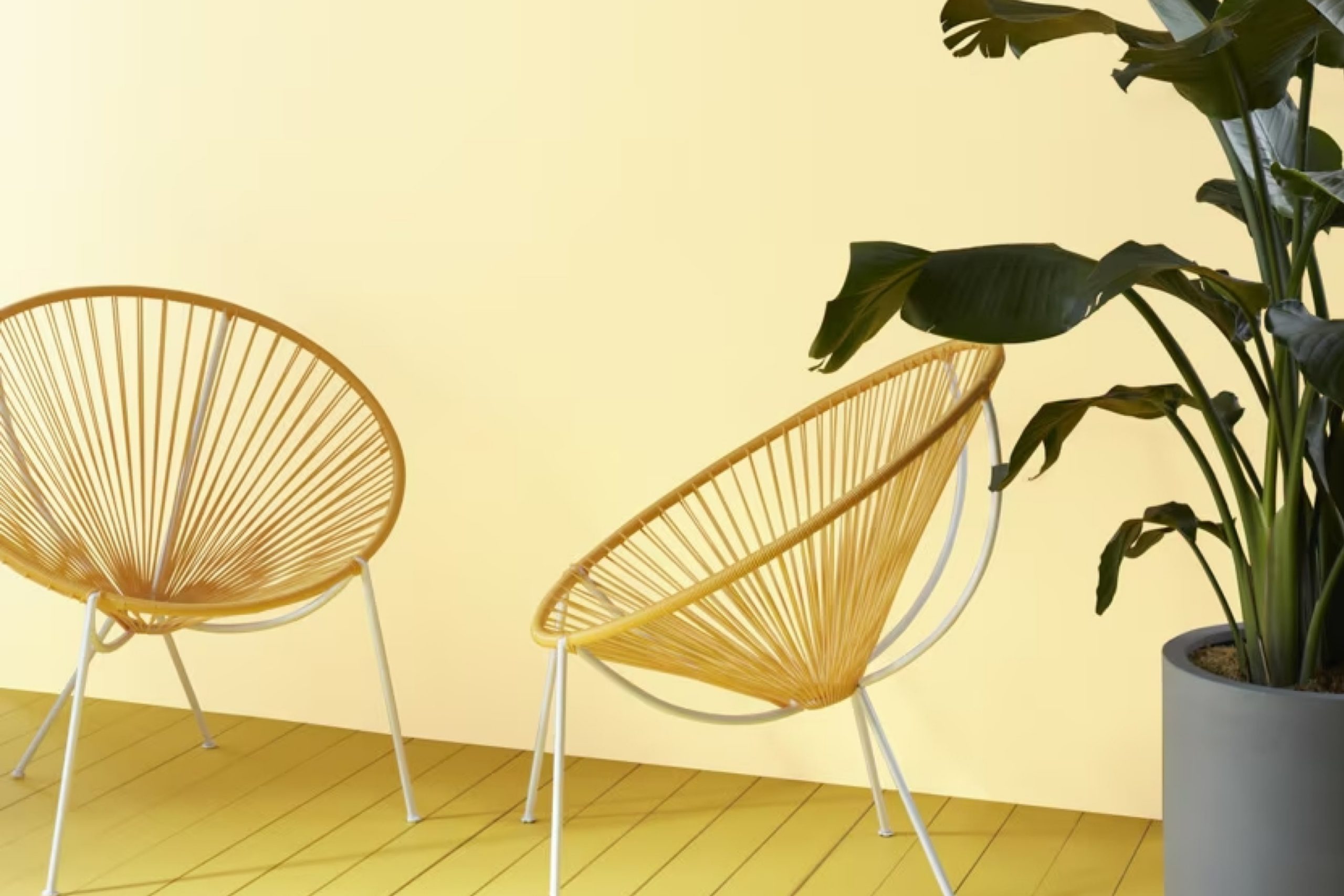
Let me talk about Benjamin Moore’s 345 Winter Sunshine. This shade can brighten up your space on the grayest days! It’s a warm, soothing color that adds a gentle, welcoming glow to any room, making it feel cozy and peaceful during the cold season.
Winter Sunshine is perfect for giving your living area, bedroom, or even your kitchen a touch of soft sunlight. The color pairs beautifully with minimalist styles and complements both modern and classic decors. It’s amazing how a simple paint job using the right color can turn a dull room into a cheerful sanctuary.
So, if your home feels a bit dreary and you’re craving more warmth and light, consider what a transformation 345 Winter Sunshine can offer. It’s straightforward and can significantly alter the look and feel of your interiors without overwhelming your senses.
Why not give your walls a fresh coat and see the difference for yourself?
via benjaminmoore.com
What Color Is Winter Sunshine 345 by Benjamin Moore?
Winter Sunshine 345 by Benjamin Moore is a warm, inviting yellow that adds a subtle brightness to any space. This paint color is soft enough to enhance a room without overwhelming it, making it ideal for creating a cozy, comfortable atmosphere. It has an uplifting quality that can make smaller spaces seem more open and larger areas feel inviting.
Winter Sunshine 345 works particularly well in casual or rustic interior designs due to its earthy tone. It is an excellent choice for living rooms, kitchens, and sunrooms where natural light can complement its warmth. This color pairs beautifully with natural wood textures, enhancing the grains and bringing a touch of nature indoors. It also goes well with soft, matte finishes like unglazed ceramics and linens, adding a homespun charm to the decor.
Additionally, Winter Sunshine 345 can be a great background for eclectic interiors, where it can serve as a neutral base for brighter colors and varied textures. Combining it with metals like copper or bronze can introduce an elegant contrast, while keeping the overall feel warm and welcoming. This versatility makes Winter Sunshine 345 a flexible choice, fitting into many styles while maintaining a distinct presence that enhances the overall aesthetic of a home.
housekeepingbay.com
Is Winter Sunshine 345 by Benjamin Moore Warm or Cool color?
Winter Sunshine345 by Benjamin Moore is a warm, soft yellow paint color that brings a cheerful vibe to any room. This shade is perfect for spaces that need a touch of brightness but where a vibrant yellow might be too overpowering. Winter Sunshine345 reflects natural light beautifully, making it ideal for rooms that don’t get a lot of sunlight. Even on cloudy days, this color can help make your space feel warmer and more inviting.
In homes, Winter Sunshine345 works well in living rooms, kitchens, and bedrooms. It pairs nicely with whites, grays, and blues, offering versatile color schemes for decorating. This particular yellow is gentle enough not to overwhelm the space and can seamlessly integrate with many decor styles, from traditional to modern.
When used in smaller spaces, like a bathroom or an entryway, Winter Sunshine345 can give the illusion of a bigger area, thanks to its light-reflective properties. This choice is top for creating a cozy, uplifting atmosphere in your home.
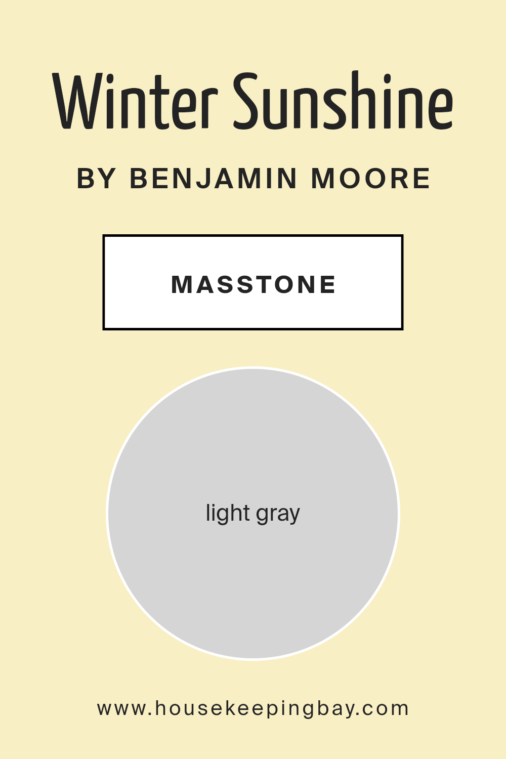
What is the Masstone of the Winter Sunshine 345 by Benjamin Moore?
Winter Sunshine 345 by Benjamin Moore has a masstone of light gray, identified by the color code #D5D5D5. This shade is soft and subtle, making it incredibly versatile for use in homes. Its gentle gray hue offers a neutral backdrop that pairs well with almost any color palette, from bright and bold hues to softer, toned-down shades. This flexibility allows homeowners to easily update their decor with new accent colors without needing to repaint entire rooms.
The light gray masstone of Winter Sunshine 345 also helps to maximize the sense of space and light in a room. It reflects natural light effectively, which can make smaller spaces feel more open and airy. This characteristic is especially valuable in areas that receive limited sunlight during the long winter months, helping to keep rooms looking bright and welcoming.
Moreover, its neutrality brings a calm and orderly feel to spaces, making it a smart choice for areas like living rooms and bedrooms where comfort and relaxation are priorities.
housekeepingbay.com
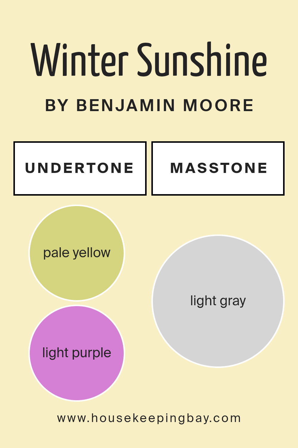
Undertones of Winter Sunshine 345 by Benjamin Moore
Winter Sunshine 345 by Benjamin Moore is a versatile paint color with a rich array of undertones that can subtly influence the ambiance of any room. Undertones are secondary colors that add depth and complexity to a primary paint color, affecting how it appears under different lighting conditions and when paired with various interior elements.
The undertones in Winter Sunshine 345 include pale yellow, light purple, light blue, pale pink, mint, lilac, and grey. These undertones contribute to the paint’s adaptability and can alter its appearance in subtle ways. For example, the pale yellow undertone can make a room feel warmer and more inviting, whereas the light blue undertone might give a sense of calmness and freshness.
When applied to interior walls, the complexity of Winter Sunshine 345’s undertones can enhance the dimensions of a space. In natural light, lighter undertones like mint and pale yellow might become more prominent, creating a bright and airy feel. In artificial lighting, deeper undertones such as lilac and grey might stand out, adding sophistication and grounding the space.
The mix of undertones means that Winter Sunshine 345 is not just a single shade but a dynamic palette that can adapt to different styles and tastes, making it effective for various rooms, from sunny kitchens to cozy bedrooms. By understanding and considering these undertones, one can effectively use this color to achieve a desired mood and aesthetic in home decor.
housekeepingbay.com
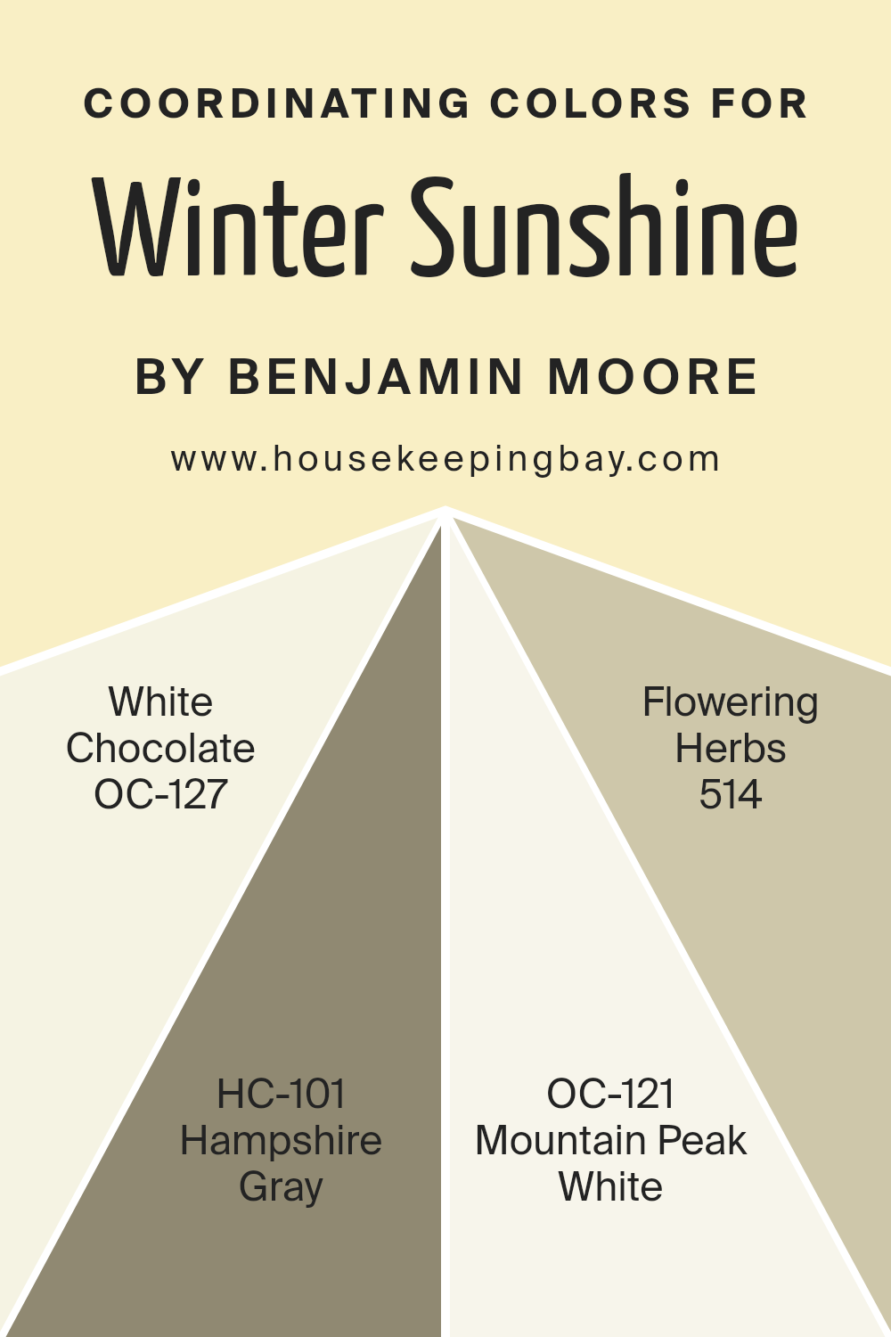
Coordinating Colors of Winter Sunshine 345 by Benjamin Moore
Coordinating colors are selected to create a harmonious atmosphere, complementing a main color, in this case, Winter Sunshine 345 by Benjamin Moore. These colors work by balancing the brightness, shade, and tone closely associated with the primary color, ensuring a visually appealing result that feels cohesive.
Winter Sunshine 345 pairs well with shades like OC-127 – White Chocolate, a warm ivory that offers a soft background, making any room feel cozy and inviting. HC-101 – Hampshire Gray is a mid-tone gray that adds a sophisticated touch, perfect for grounding lighter colors or enhancing a modern aesthetic. OC-121 – Mountain Peak White is a crisp white with subtle undertones that can brighten spaces while creating a sense of openness and clarity.
Lastly, 514 – Flowering Herbs is a muted green that recalls the natural world, ideal for adding a touch of calmness and freshness to interiors. Each of these colors supports and complements Winter Sunshine 345, ensuring that each room has depth and character while maintaining a seamless look.
You can see recommended paint colors below:
- OC-127 White Chocolate
- HC-101 Hampshire Gray
- OC-121 Mountain Peak White
- 514 Flowering Herbs
housekeepingbay.com
How Does Lighting Affect Winter Sunshine 345 by Benjamin Moore?
Lighting plays a crucial role in how colors appear in a space. It can alter the perception of a color’s hue, brightness, and saturation. For instance, “Winter Sunshine 345” by Benjamin Moore is a shade that reacts distinctly under different light conditions.
In artificial light, “Winter Sunshine 345” tends to look warmer and richer. This is because most artificial lighting, such as incandescent bulbs, has a yellowish tint that enhances warm hues.
In spaces lit by LEDs or fluorescent lights, which have a range of color temperatures, this color might appear slightly less warm, depending on the chosen temperature of the bulbs.
Natural light, however, affects “Winter Sunshine 345” differently throughout the day and depending on the direction of the room.
In north-facing rooms, natural light is cooler and more consistent throughout the day. Here, “Winter Sunshine 345” might appear more muted and subtle, giving off a calm, gentle vibe. South-facing rooms receive more intense light, especially in the middle of the day, making this color look brighter and more vibrant.
East-facing rooms are filled with warm and gentle morning light but become less intense in the afternoon. This means “Winter Sunshine 345” will look lively and warm in the morning but softer as the day progresses. Conversely, in west-facing rooms, the color will start off softer in the morning and gain intensity towards the evening as it catches the warmer, golden hues of the sunset.
Overall, “Winter Sunshine 345” can offer a range of visual experiences depending on the room’s orientation and the type of light it receives, shifting from gentle and subdued to warm and vibrant. This makes it a versatile color choice capable of adapting to various lighting conditions and room settings.
housekeepingbay.com
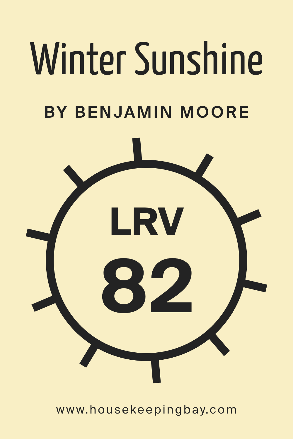
What is the LRV of Winter Sunshine 345 by Benjamin Moore?
LRV stands for Light Reflectance Value, a measure used to describe the percentage of light a paint color reflects compared to the total light it receives. This number can range from 0 (complete absorption of light, giving a true black) to 100 (complete reflection of light, essentially a perfect white).
LRV is crucial in choosing paint colors as it helps gauge how light or dark a color will appear once applied to the walls of a room. Higher LRV values indicate lighter colors that can make spaces appear more open and airy, while lower LRV values suggest darker shades that can lend a cozier, more enclosed feel to a space.
With an LRV of 81.71, Winter Sunshine 345 by Benjamin Moore is a paint color that falls on the lighter end of the spectrum. This high LRV means it reflects much of the light that strikes it, making it a good choice for making a room feel brighter and more spacious. In rooms with less natural light, using a color like Winter Sunshine can help compensate by maximizing the available light, thus preventing the space from feeling dim or cramped.
The light-reflective quality of this particular shade will also help in maintaining a lively and fresh ambiance, even in smaller or less illuminated areas.
housekeepingbay.com
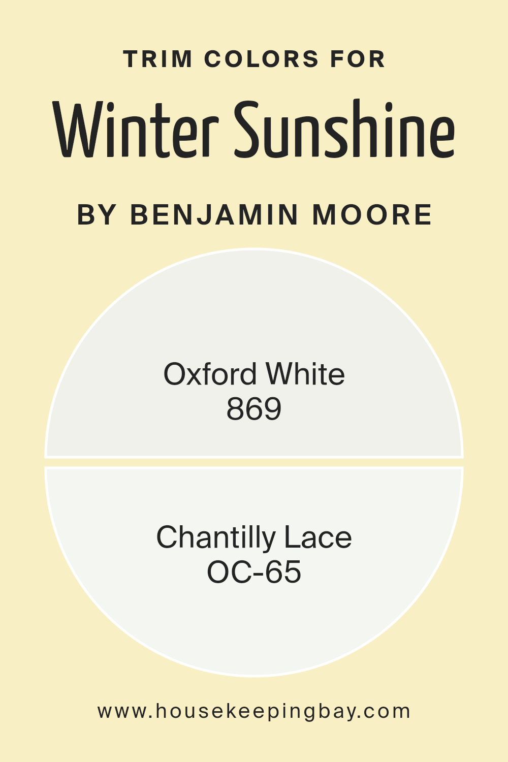
What are the Trim colors of Winter Sunshine 345 by Benjamin Moore?
Trim colors are the shades used to accentuate the architectural details of a room, such as moldings, window frames, and door panels. Specifically chosen trim colors can enhance the main wall hue and help define the overall aesthetic of a space. For instance, when paired with Winter Sunshine 345 by Benjamin Moore, using trims like Oxford White 869 or Chantilly Lace OC-65 can create a harmonious and clean look, bringing a refined finish to the environment. The selection of a trim color adds depth and distinction, rendering subtle yet impactful visual boundaries that can make the core color appear more cohesive and neatly polished.
Oxford White 869 is a soft yet vibrant white that brings a fresh and airy feel to any space. It’s particularly effective at making other colors pop without overpowering them, providing a gentle contrast.
On the other hand, Chantilly Lace OC-65 offers a crisp and ultra-clean white, which works beautifully to create a sharp, sophisticated edge. This color is particularly useful in spaces aiming for a modern vibe but still wants to maintain a warm and inviting atmosphere. Together, these colors complement Winter Sunshine 345, ensuring the main hue stands out while the rooms remain light and spacious.
You can see recommended paint colors below:
housekeepingbay.com
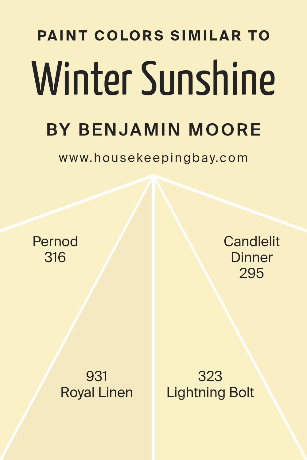
Colors Similar to Winter Sunshine 345 by Benjamin Moore
Similar colors play a crucial role in interior design because they create a sense of harmony and flow, making spaces feel cohesive and thoughtfully put together. By using shades that closely align with Winter Sunshine 345 by Benjamin Moore, such as Pernod, Royal Linen, Lightning Bolt, and Candlelit Dinner, one can develop a soothing palette that gently transitions from one hue to the next. These nuances in color variations can subtly enhance the aesthetic appeal without overwhelming the senses, providing a serene and inviting atmosphere.
For instance, Pernod is a light, creamy hue that imparts a soft glow reminiscent of early morning light, giving a room an airy feel. Royal Linen offers a slightly denser, yet equally gentle touch of color, akin to an unbleached linen fabric, perfect for a calming ambiance in living spaces.
Lightning Bolt presents a crisp, vibrant white that reflects maximum light, revitalizing a space with its bright presence. Finally, Candlelit Dinner is a warm, muted yellow that envelops spaces in a cozy, soft radiance, ideal for creating a relaxing vibe in dining or living areas. Using these colors together ensures a visually appealing palette that enhances natural light and provides a harmonious visual flow.
You can see recommended paint colors below:
- 316 Pernod
- 931 Royal Linen
- 323 Lightning Bolt
- 295 Candlelit Dinner
housekeepingbay.com
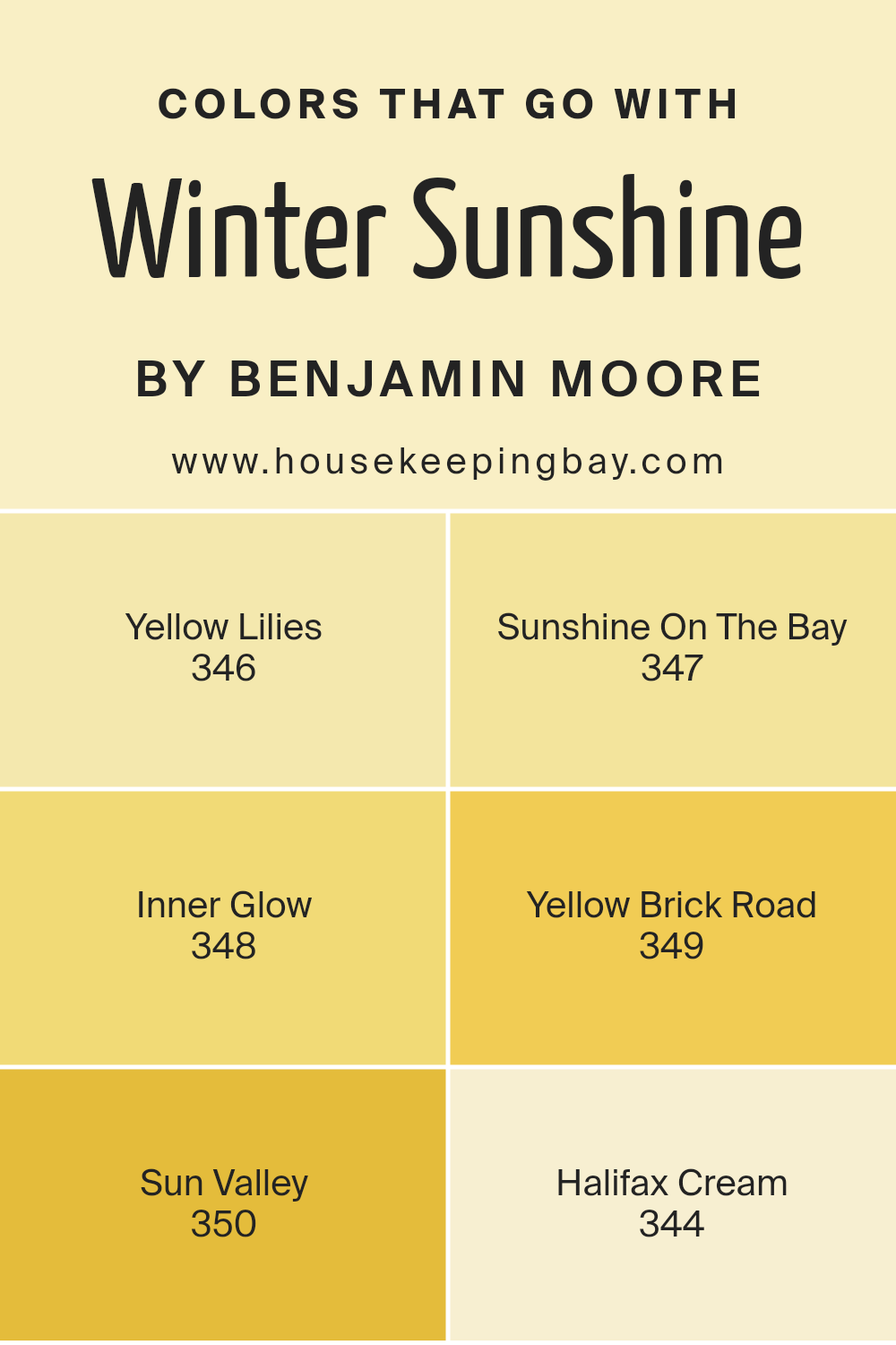
Colors that Go With Winter Sunshine 345 by Benjamin Moore
Choosing complementary colors to pair with Winter Sunshine 345 by Benjamin Moore is crucial because it ensures that the overall aesthetic in your space is harmonious and pleasing to the eye. Opting for colors like Yellow Lilies, Sunshine On The Bay, Inner Glow, Yellow Brick Road, Sun Valley, and Halifax Cream can enhance the vibe of a room by supporting or contrasting with the base color in just the right ways.
Yellow Lilies 346 is a vibrant shade that breathes life into spaces, perfect for creating a cheerful and inviting atmosphere. Sunshine On The Bay 347 offers a more subdued yellow, providing a calm and soft background that is easy on the eyes. Inner Glow 348, a deeper hue, adds warmth and depth, making it ideal for cozy settings. Yellow Brick Road 349 is rich and earthy, a great choice for adding a touch of vintage or rustic charm.
Sun Valley 350 moves towards a bolder, more dramatic yellow, injecting energy and vivacity, which can be great for accent walls or decor highlights. Lastly, Halifax Cream 344 is subtle and light, providing a neutral backdrop that complements the brighter tones of the other colors. Together, these colors work cohesively to create a balanced and inviting space.
You can see recommended paint colors below:
- 346 Yellow Lilies
- 347 Sunshine On The Bay
- 348 Inner Glow
- 349 Yellow Brick Road
- 350 Sun Valley
- 344 Halifax Cream
housekeepingbay.com
How to Use Winter Sunshine 345 by Benjamin Moore In Your Home?
Winter Sunshine 345 by Benjamin Moore is a warm, gentle yellow paint that brings a cozy feel to any room. It mimics the soft hues of early morning sunlight in winter, creating a calm and inviting atmosphere.
This color works well in various spaces, including living rooms, kitchens, and bedrooms. For those looking to add a sense of cheerfulness and warmth to their home without overwhelming the space, Winter Sunshine 345 is a perfect choice.
You can pair it with whites and grays to maintain a subtle, uplifted look, or combine it with darker colors like navy or forest green for a bold contrast that still feels homely. In a kitchen, Winter Sunshine 345 can make the space appear brighter and more welcoming, making it a great backdrop for family meals. In a bedroom, it provides a soothing backdrop that helps create a pleasant, restful environment, ideal for relaxation.
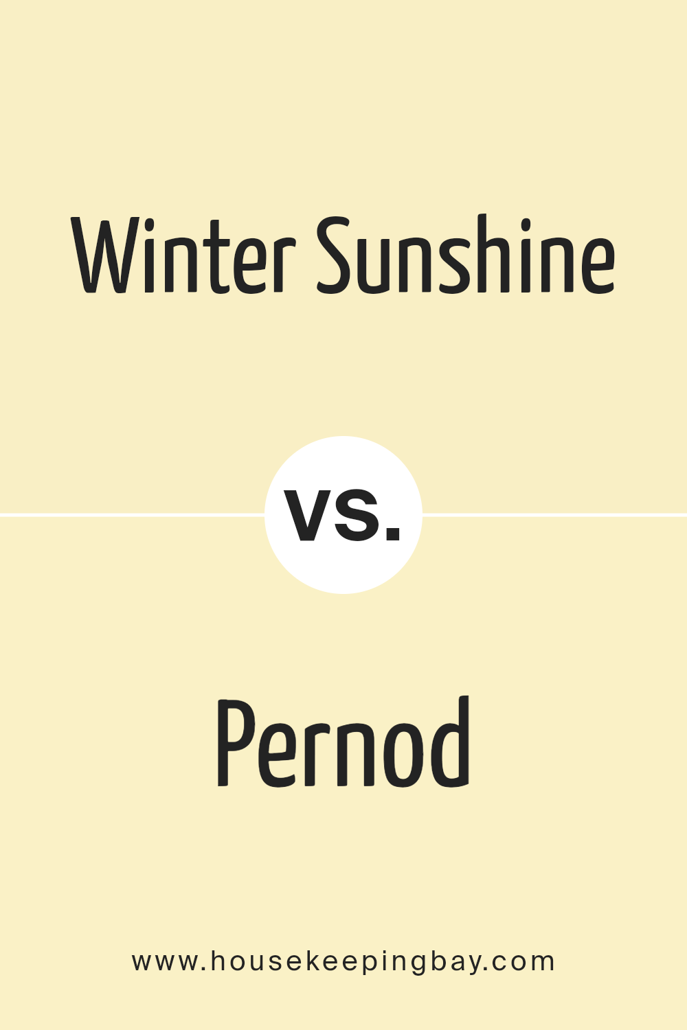
Winter Sunshine 345 by Benjamin Moore vs Pernod 316 by Benjamin Moore
Winter Sunshine 345 by Benjamin Moore is a vibrant color with hints of yellow that project brightness and warmth, making it an excellent choice for spaces meant to feel energetic and inviting. This hue has a refreshing quality that mimics a sunny day, ideal for both small spaces needing a lift and larger areas where a sense of openness is desired.
In contrast, Pernod 316 brings a softer touch with its subdued, creamy yellow tone. This color provides a gentle warmth and is less intense than Winter Sunshine, making it perfect for creating a cozy and soothing environment. It’s well-suited for bedrooms or living areas where a calm and relaxed atmosphere is preferred.
Both colors offer unique atmospheres; Winter Sunshine energizes a space, while Pernod is more about creating a peaceful retreat. Depending on the mood you want to set, each color has its distinct charm and utility.
You can see recommended paint color below:
- 316 Pernod
housekeepingbay.com
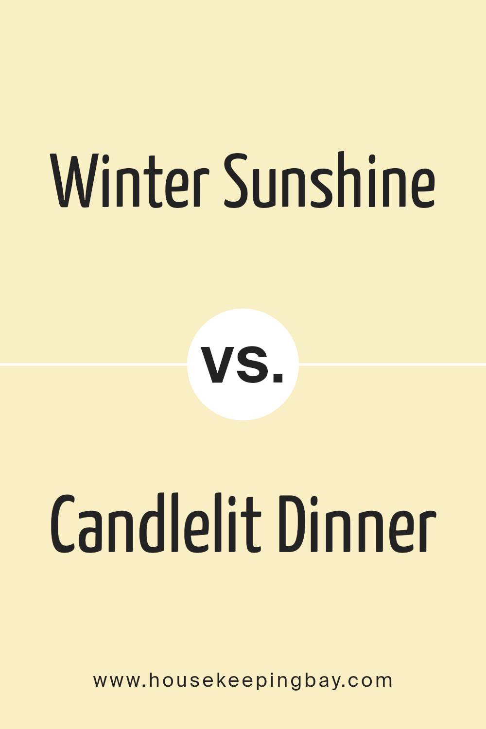
Winter Sunshine 345 by Benjamin Moore vs Candlelit Dinner 295 by Benjamin Moore
Winter Sunshine 345 and Candlelit Dinner 295 by Benjamin Moore are both unique colors, ideal for different ambiances. Winter Sunshine 345 is a vibrant, cheerful yellow that brings a sunny warmth to any space, making it feel welcoming and lively. This color works well in areas where natural light enhances its brightness, such as kitchens and sunrooms.
In contrast, Candlelit Dinner 295 offers a more subdued tone. It is a muted terracotta, blending reddish-brown and orange hues, which gives a cozy and comforting feel. This color is perfect for spaces where a calm, soothing atmosphere is desired, like dining rooms or bedrooms.
While Winter Sunshine 345 injects energy and light, lifting the mood of a room, Candlelit Dinner 295 creates a relaxing retreat with its earthy, warm presence. The choice between them depends largely on the desired effect: brightness and vivacity or warmth and calmness. Both colors reflect different aspects of a well-designed home environment.
You can see recommended paint color below:
- 295 Candlelit Dinner
housekeepingbay.com
Winter Sunshine 345 by Benjamin Moore vs Royal Linen 931 by Benjamin Moore
Winter Sunshine 345 by Benjamin Moore is a bright, cheerful yellow. It emits warmth and can make spaces feel sunny and inviting, even on dull days. This color is ideal for kitchens or living rooms where a boost of energy is desired.
Royal Linen 931, by contrast, is a subtle, neutral beige. It provides a calm, soothing backdrop, perfect for bedrooms or areas where relaxation is key. Unlike the vibrant punch of Winter Sunshine, Royal Linen offers a gentle, understated elegance that complements a variety of decor styles and other hues.
While Winter Sunshine injects energy, Royal Linen delivers a peaceful vibe. One could use Winter Sunshine to add a spotlight of cheer in a specific area, whereas Royal Linen could serve beautifully as a base across larger areas for a harmonious and serene atmosphere. Each color serves distinct purposes depending on the mood one wishes to create.
You can see recommended paint color below:
- 931 Royal Linen
housekeepingbay.com
Winter Sunshine 345 by Benjamin Moore vs Lightning Bolt 323 by Benjamin Moore
Winter Sunshine 345 by Benjamin Moore is a gentle, warm yellow. It gives off a subtle, cozy vibe that can make spaces feel welcoming and cheerful. This shade works well in rooms needing a boost of brightness, especially in dimmer areas of the home or during months with less sunlight.
Lightning Bolt 323 is also a yellow tone, but it’s significantly paler compared to Winter Sunshine 345. It’s closer to a pastel, offering a softer and more neutral look. This color suits spaces aiming for a light, airy feel, functioning excellently in minimalist designs or areas where simplicity is preferable.
While both colors inject warmth into a room, Winter Sunshine 345 does so with more intensity due to its deeper saturation. In contrast, Lightning Bolt 323 is more subdued and might be easier to pair with various decor styles due to its understated nature. Both colors can, however, effectively brighten a space, with each lending its unique character depending on the mood or theme you wish to achieve.
You can see recommended paint color below:
- 323 Lightning Bolt
housekeepingbay.com
Conclusion
As I come to the end of discussing 345 Winter Sunshine by Benjamin Moore, I feel genuinely impressed by this paint color. The soft, warm glow of this hue makes any room feel more inviting and cozy. It invokes the faint radiance of morning light in winter, creating a peaceful, gentle atmosphere that enhances both contemporary and traditional interiors.
I have found that when paired with complementary colors, such as soft greens or muted blues, 345 Winter Sunshine achieves a balance that is visually soothing. It’s particularly effective in bedrooms and living areas where calm is paramount. For those looking to add a bit more character, using this shade alongside darker accents like navy or charcoal can make the space more dynamic without overwhelming the senses.
From my own perspective, 345 Winter Sunshine stands out as an excellent choice for anyone looking to refresh their home’s look while maintaining a sense of warmth and light. It offers flexibility, blending seamlessly with different styles and decor elements, which makes it quite practical for a variety of spaces.
All in all, I appreciate the versatility and gentle charm of 345 Winter Sunshine by Benjamin Moore. It certainly holds potential to beautify spaces while reflecting a serene, welcoming environment. Whether you’re redoing a single room or revamping your entire home, this color offers a lovely palette to work with.

housekeepingbay.com
