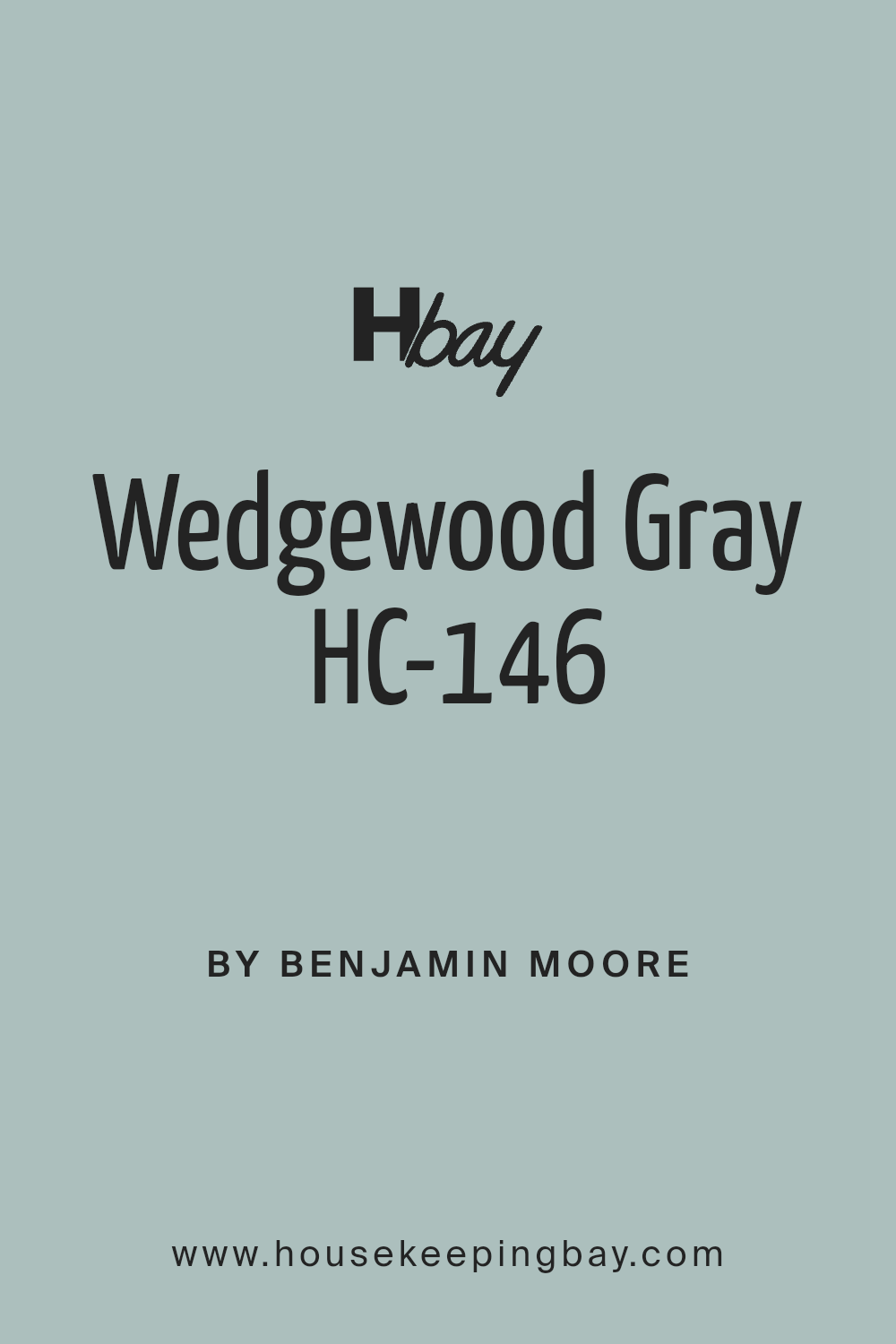
Wedgewood Gray HC-146 by Benjamin Moore
Classic Style with a Modern Touch
Have you ever wondered about the perfect shade of gray to refresh your space? Look no further than HC-146 Wedgewood Gray by Benjamin Moore. It’s a popular choice for many homeowners, and for a good reason. This color strikes the right balance between warmth and coolness, making it a wonderful addition to any room.
Imagine a shade that can complement both modern and traditional settings without missing a beat. Wedgewood Gray does just that. Whether you’re updating your living room, bedroom, or office, this hue can enhance your space effortlessly.
Its subtle blue undertones create a calming and gentle atmosphere, while the gray base brings a touch of elegance and sophistication.
Think about how colors can influence your mood. Wedgewood Gray offers a soothing backdrop that encourages relaxation and focus. It’s perfect for those moments when you want to sit back with a book or get some work done.
The beauty of Wedgewood Gray lies in its ability to pair well with a variety of colors. It works wonderfully with whites, creams, and darker shades, giving you plenty of options to personalize your decor. You can even accent it with bold colors for a fresh look.
Consider giving Wedgewood Gray a try. It may be just the color you need to bring new life to your home.
via benjaminmoore.com
What Color Is Wedgewood Gray HC-146 by Benjamin Moore?
Wedgewood Gray HC-146 by Benjamin Moore is a calming blend of blue and gray with a hint of green, creating a muted tone. This color brings a sense of serenity and works well in both traditional and modern spaces. It’s perfect for those who want a cool-toned room without it feeling too chilly.
In a coastal or beach-inspired home, Wedgewood Gray fits seamlessly with natural elements. Pair it with crisp white trim to make the color pop. For a traditional setting, use it alongside dark wood furniture, which provides a beautiful contrast.
In a modern interior, this color works well with sleek metallics like stainless steel or brushed nickel. It also pairs nicely with soft textiles. Think plush velvet in dark navy for a touch of luxury, or light linen for an airy feel. Natural stone elements, such as marble or quartz, complement its tones beautifully, adding depth but keeping things grounded.
Use Wedgewood Gray in living rooms or bedrooms where you seek comfort and relaxation. Its understated elegance allows it to work as a backdrop, letting other design features stand out. Simple and versatile, this color adapts well to various styles and preferences, providing a base for various design choices.
housekeepingbay.com
Is Wedgewood Gray HC-146 by Benjamin Moore Warm or Cool color?
Wedgewood Gray HC-146 by Benjamin Moore is a versatile color that combines blue undertones with soft gray, creating a calming and elegant look. This balanced shade works well in various rooms, including living rooms, bedrooms, and kitchens. It enhances natural light, giving spaces a brighter feel while maintaining a cozy atmosphere.
When used on walls, Wedgewood Gray provides a soothing backdrop that complements both modern and traditional decor styles.
In living areas, this color pairs well with whites and creams for a fresh, clean appearance. Adding darker accents, like navy or charcoal, can increase depth and interest. In bedrooms, it encourages relaxation and restfulness, mixing easily with soft pastels for a gentle look. In kitchens, Wedgewood Gray offers a classic touch, matching beautifully with stainless steel appliances and wooden cabinets.
Overall, this color’s adaptability makes it a popular choice for homeowners looking to create a harmonious and timeless environment.
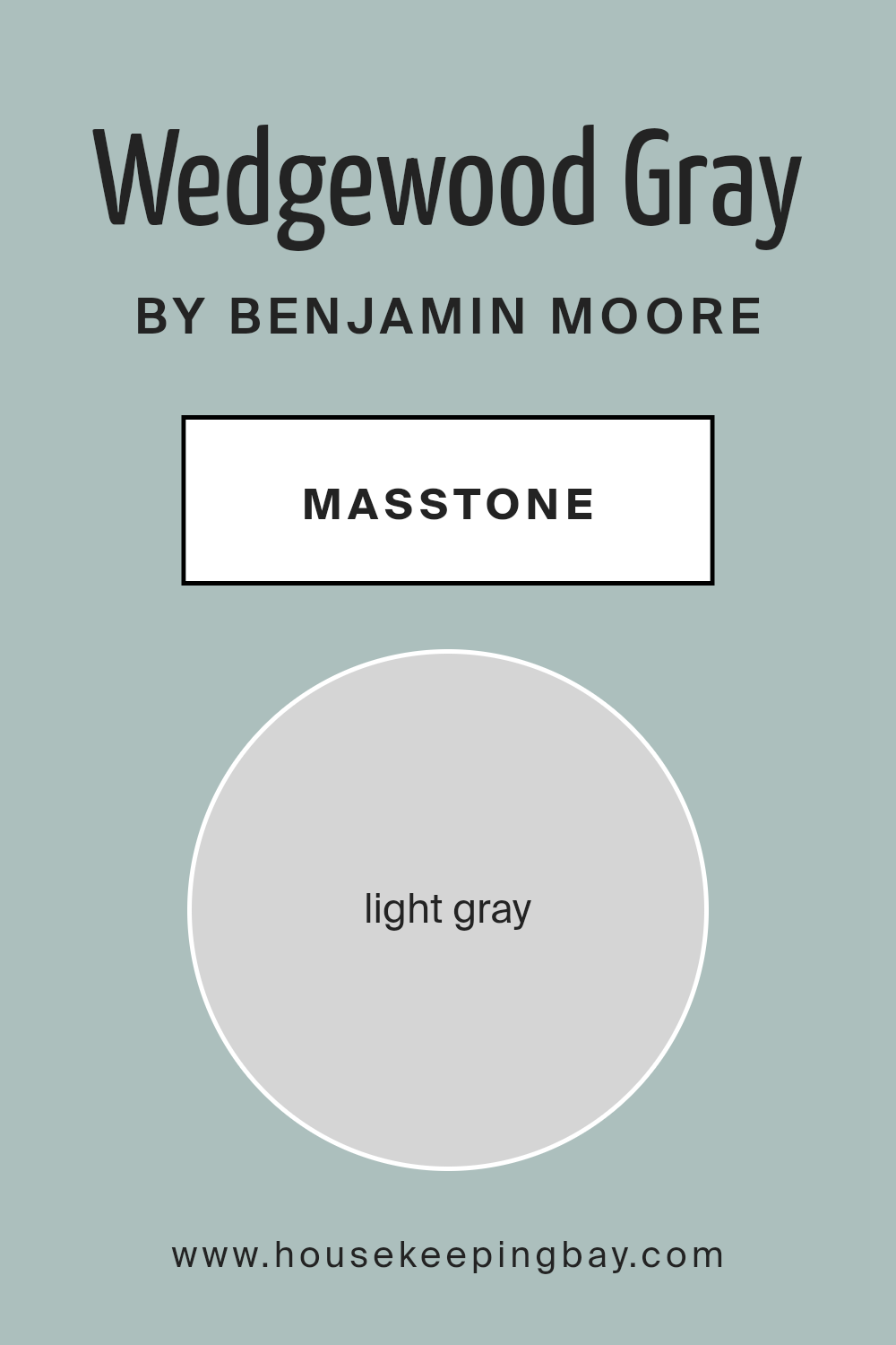
What is the Masstone of the Wedgewood Gray HC-146 by Benjamin Moore?
Wedgewood Gray HC-146 by Benjamin Moore is a soothing light gray color. It has a masstone of #D5D5D5, which means it appears as a very balanced and neutral gray. This color works well in homes because it creates a calm and peaceful atmosphere. It does not overpower a room, making it versatile for different spaces like living rooms, bedrooms, or kitchens.
The light gray tone reflects natural light, helping rooms feel brighter and more open. This makes small spaces appear larger and airy. Wedgewood Gray pairs well with both warm and cool colors, giving homeowners plenty of flexibility when choosing furniture, fabrics, or accessories.
Its neutrality makes it an excellent backdrop, allowing other colors to pop. This gray is ideal for those who want a modern, understated look. It suits various decorating styles, from traditional to contemporary, making it a favorite choice for many homes.
housekeepingbay.com
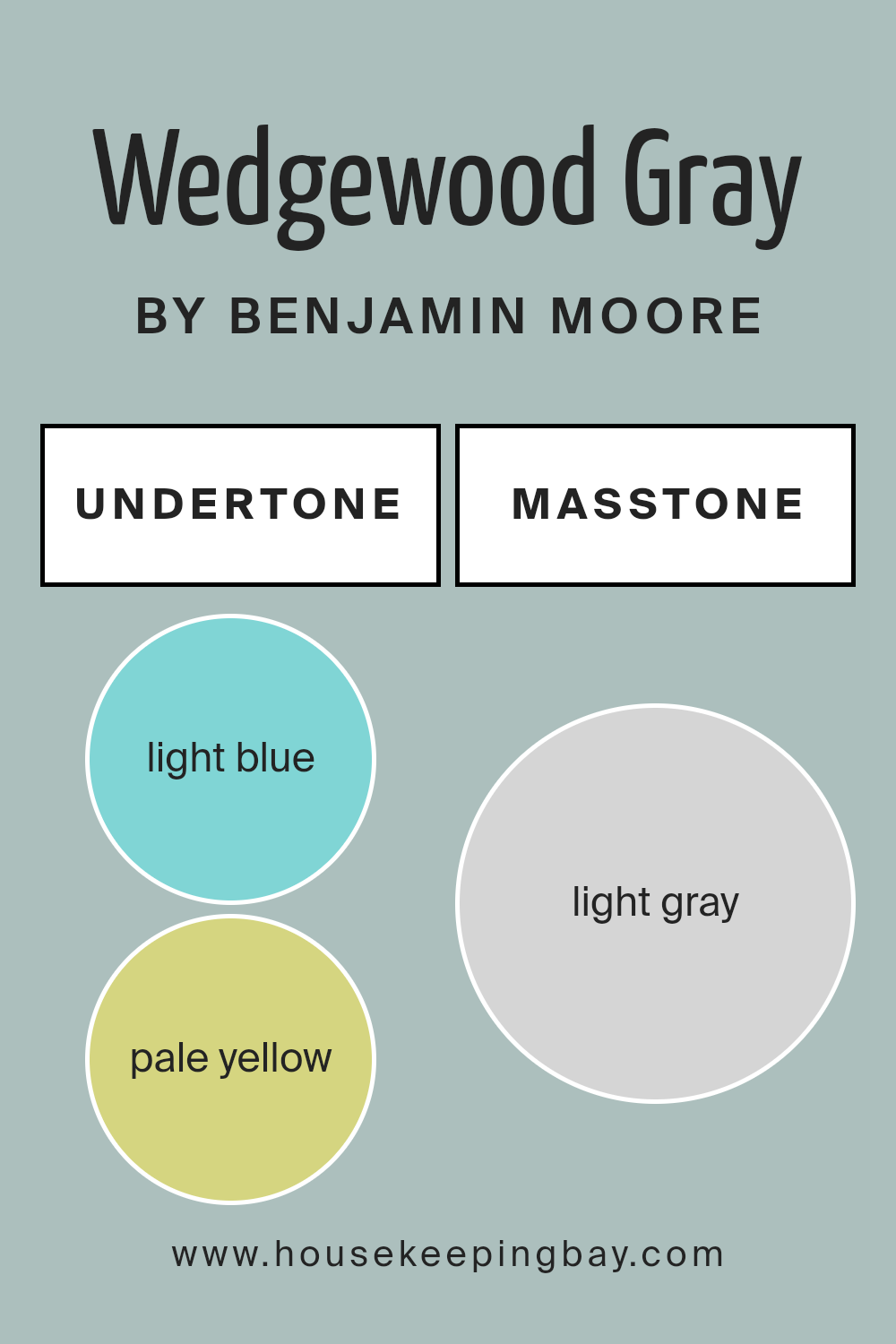
Undertones of Wedgewood Gray HC-146 by Benjamin Moore
Wedgewood Gray HC-146 by Benjamin Moore presents a complex backdrop of undertones that influence its appearance on walls. Its primary gentle, grayish-blue hue can shift subtly due to various undertones like light blue, pale yellow, and mint. These undertones play a crucial role in its overall perception, either warming or cooling the color.
Light blue and mint add a fresh, calming feel, making spaces more open and airy. This lightness helps create an inviting atmosphere, ideal for living areas or bedrooms. In contrast, undertones like pale yellow bring warmth.
This warmth can make a space feel more cozy and comfortable, especially when natural light is scarce or indirect.
Adding to this, light purple and lilac introduce a soft sophistication, infusing elegance into interior spaces. These tones can intensify in the evening light, offering a gentle transition as daylight fades. Meanwhile, pale pink can subtly romanticize the room, enhancing a sense of gentle charm.
Lastly, gray undertones provide a grounded, neutral backdrop, allowing furniture and décor to pop without overshadowing. Wedgewood Gray’s chameleon-like quality allows it to adapt well to various styles, be it modern minimalism or classic tradition, making it a versatile choice for any home’s interior.
housekeepingbay.com
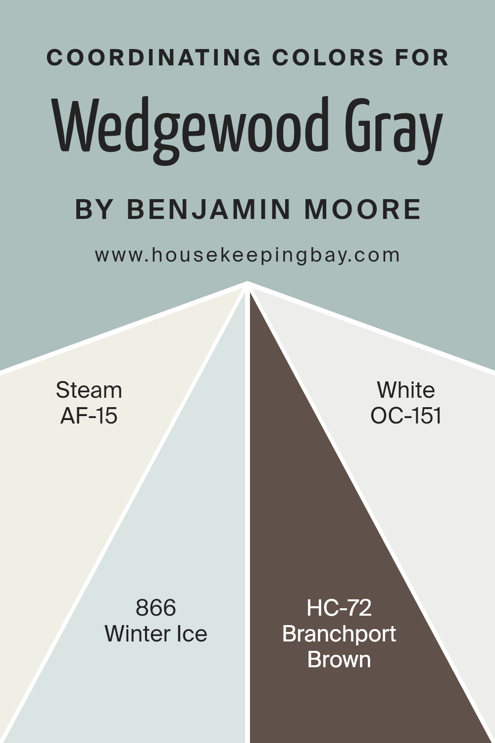
Coordinating Colors of Wedgewood Gray HC-146 by Benjamin Moore
Coordinating colors are shades that complement each other well and are often used together to create a balanced and harmonious look. When choosing coordinating colors for Wedgewood Gray HC-146 by Benjamin Moore, several options can enhance its muted blue-gray tone.
For instance, AF-15, known as Steam, is a soft, warm white that provides a gentle contrast without overpowering the main color. This shade offers a delicate touch, pairing well with Wedgewood Gray for a light and airy atmosphere.
Another coordinating option is 866, Winter Ice. This is a cool, pale blue that enhances the subtle blue notes in Wedgewood Gray, creating a cohesive and refreshing palette. Meanwhile, HC-72 Branchport Brown offers a rich, earthy contrast with its deep brown undertones.
This color adds depth and sophistication to the palette, grounding the cooler colors with warmth. Finally, OC-151 White brings a clean and crisp element to the mix. It helps highlight architectural details and adds a sense of brightness to any space.
Together, these colors form a pleasing combination that works in various settings, offering a balanced and inviting look without unnecessary complexity.
You can see recommended paint colors below:
- AF-15 Steam
- 866 Winter Ice
- HC-72 Branchport Brown
- OC-151 White
housekeepingbay.com
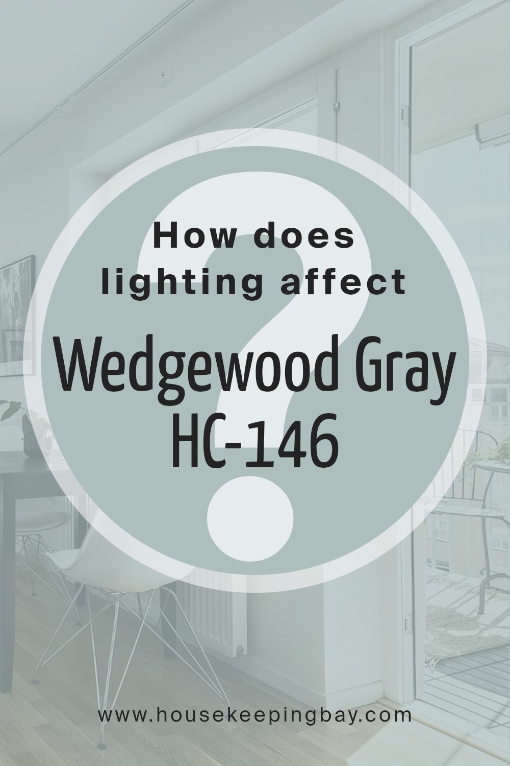
How Does Lighting Affect Wedgewood Gray HC-146 by Benjamin Moore?
Lighting significantly influences how we perceive colors. The same color can look different under various lighting conditions because light affects its brightness, depth, and hue. For example, Wedgewood Gray HC-146 by Benjamin Moore can appear different depending on whether it is seen under artificial or natural light.
When viewed in artificial light, like LED or incandescent bulbs, Wedgewood Gray may lean towards a warmer or cooler tone based on the bulb used. Incandescent bulbs give off a warm, yellow light, which can make the color appear softer and more muted. Conversely, LED lights tend to have a cooler or more neutral glow, which can make the color appear crisper.
In natural light, Wedgewood Gray looks different throughout the day as the intensity and angle of sunlight change. This color takes on a more dynamic character, appearing lighter or darker depending on the time.
In north-facing rooms, which generally receive less direct sunlight, Wedgewood Gray might appear cooler and somewhat subdued. The natural light in these rooms is often indirect and can bring out the blue undertones in the paint, giving it a more subtle look.
In south-facing rooms, which receive ample direct sunlight, Wedgewood Gray can look brighter and warmer. The intense natural light can enhance the warmer undertones in the paint, making the room feel more vibrant and welcoming.
In east-facing rooms, the color can appear light and fresh in the morning when the sunlight is warmer and softer. However, as the day progresses, the light becomes cooler, which can emphasize the cooler gray and blue tones.
West-facing rooms experience the opposite effect. Early in the day, the light can be dimmer and cooler, making Wedgewood Gray look more muted and cool. In the afternoon and evening, as the sunlight becomes warmer and more direct, the color may warm up.
In summary, Wedgewood Gray HC-146 by Benjamin Moore changes based on lighting, highlighting its versatility and depth.
housekeepingbay.com
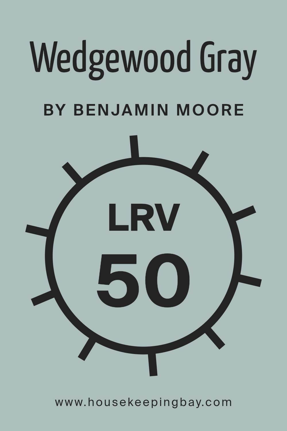
What is the LRV of Wedgewood Gray HC-146 by Benjamin Moore?
The Light Reflectance Value, or LRV, measures the amount of light a color reflects. It’s scaled from 0 to 100, where 0 is absolute black, reflecting no light, and 100 is pure white, reflecting all light back. The LRV is important because it gives you an idea of how light or dark a color will appear in a room.
Colors with higher LRV values tend to make spaces feel larger and more open since they reflect more light. Conversely, colors with lower LRV values absorb more light, creating a cozy and intimate atmosphere.
Wedgewood Gray HC-146 by Benjamin Moore has an LRV of 49.59, placing it in the middle range. This means it reflects about half the light that hits it. In a room, this color will neither be too dark nor too bright. It has enough light reflection to keep the room from feeling too enclosed, yet it provides enough depth to add character and warmth.
This balance makes Wedgewood Gray a versatile choice for many spaces, offering a gentle interplay of light and shadow. It can adapt well to both natural and artificial lighting, changing subtly throughout the day.
housekeepingbay.com
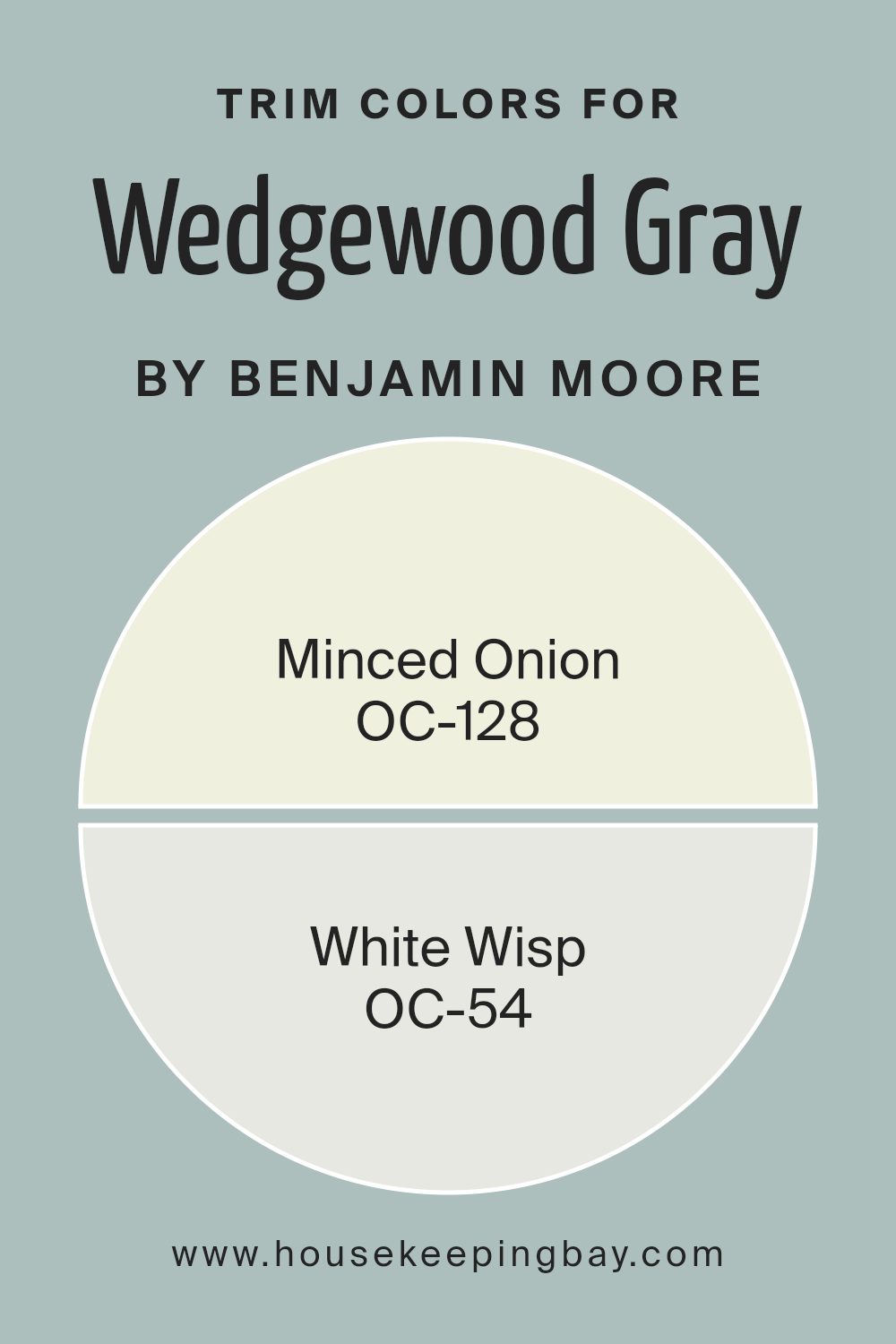
What are the Trim colors of Wedgewood Gray HC-146 by Benjamin Moore?
Trim colors refer to the paint colors used for the edges and details of a room, such as baseboards, window frames, and door frames. These colors highlight architectural features and help create a clear distinction between different surfaces, adding depth and character to a space.
For Wedgewood Gray HC-146 by Benjamin Moore, which is a soft, muted blue-gray, choosing the right trim colors can enhance its calming and sophisticated appearance. When paired with Wedgewood Gray, trim colors like OC-128 Minced Onion and OC-54 White Wisp play distinct roles.
Minced Onion OC-128 is a warm, creamy white that adds a touch of coziness and complements the cool undertones of Wedgewood Gray. This pairing brings a balanced warmth to a room, making it inviting and comfortable. On the other hand, White Wisp OC-54 is a gentle, clean off-white that introduces a crisper, more airy feel.
When used as a trim, White Wisp reflects light beautifully, adding brightness and making the edges of the room feel fresh and open. Both trim colors enhance Wedgewood Gray’s subtle elegance and help define the space with their unique characteristics.
You can see recommended paint colors below:
- OC-128 Minced Onion
- OC-54 White Wisp
housekeepingbay.com
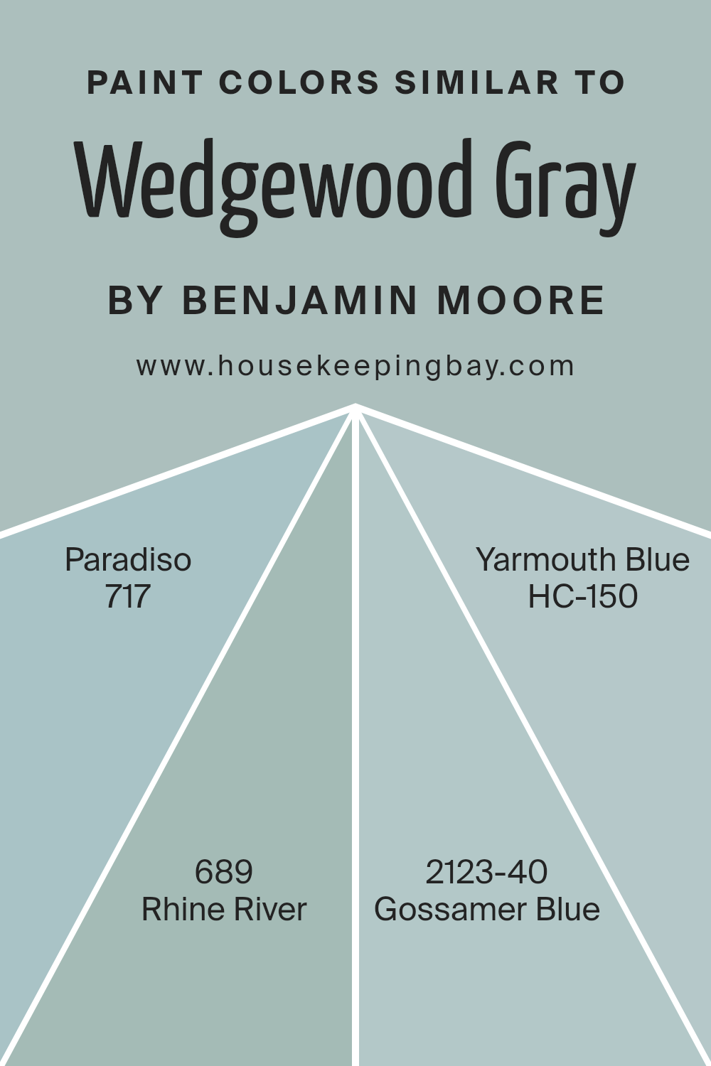
Colors Similar to Wedgewood Gray HC-146 by Benjamin Moore
Similar colors play a vital role in creating harmonious spaces by offering gentle transitions from one hue to another. These colors, when used together, can create a unified and cohesive look in any room. For example, the Wedgewood Gray HC-146 by Benjamin Moore is a soft, muted gray with blue undertones, known for its ability to bring calmness.
When paired with similar shades, it enhances the calming effect. The color 717 – Paradiso adds a hint of green to the mix, providing a refreshing touch reminiscent of tranquil outdoor scenes. Meanwhile, 689 – Rhine River leans into a deeper blue, giving a sense of depth and coolness that pairs beautifully with Wedgewood Gray.
The colors keep the theme cohesive and allow each room or space to maintain a consistent feel. The shade 2123-40 – Gossamer Blue, with its airy and light characteristics, complements this palette by adding a sense of spaciousness and openness. Lastly, HC-150 – Yarmouth Blue brings a classic and clean look, with a perfect balance of blue and gray.
Using these colors together ensures a pleasing and balanced environment, making them perfect for spaces where relaxation and comfort are important. Their subtle differences allow for a layered and interesting visual experience without overwhelming the senses.
You can see recommended paint colors below:
- 717 Paradiso
- 689 Rhine River
- 2123-40 Gossamer Blue
- HC-150 Yarmouth Blue
housekeepingbay.com
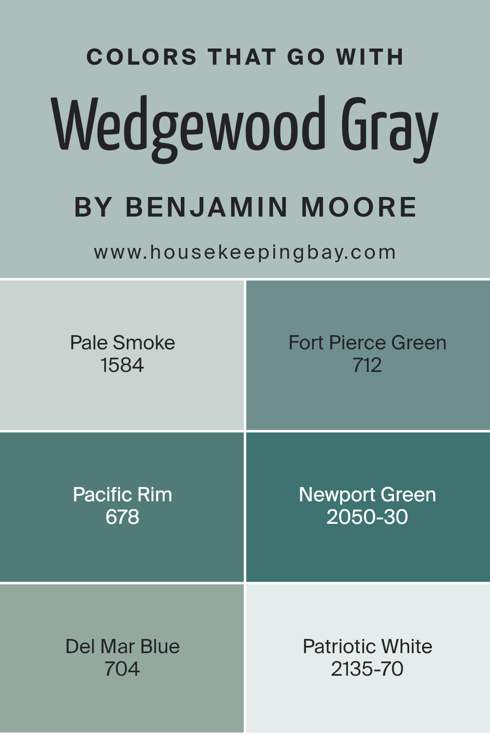
Colors that Go With Wedgewood Gray HC-146 by Benjamin Moore
Wedgewood Gray HC-146 by Benjamin Moore is a versatile and elegant color that serves as a beautiful backdrop in any room. Its soft, muted undertones allow it to pair seamlessly with a variety of other colors, enhancing the overall aesthetic of a space.
When combined with 1584 – Pale Smoke, the result is a soothing and calming environment; Pale Smoke’s gentle lightness complements the depth of Wedgewood Gray, offering a sense of balance and harmony. Adding 712 – Fort Pierce Green brings a touch of nature indoors, lending an earthy richness that works well in spaces looking to foster warmth and comfort.
On the other hand, 678 – Pacific Rim introduces a vibrant burst of life beside Wedgewood Gray. This lively hue adds energy and dynamism, making it perfect for accent pieces or statement walls. Meanwhile, 2050-30 – Newport Green infuses an element of sophistication and luxury, with its deeper green tones that resonate richly with Wedgewood Gray’s understated elegance.
For a refreshing contrast, 704 – Del Mar Blue lends a sea-inspired breeziness that captures the essence of coastal aesthetics. Lastly, 2135-70 – Patriotic White offers a clean, bright touch, enhancing Wedgewood Gray’s distinct yet subtle tones by providing crisp contrast and light.
Together, these colors ensure that rooms feel welcoming and beautifully coordinated.
You can see recommended paint colors below:
- 1584 Pale Smoke
- 712 Fort Pierce Green
- 678 Pacific Rim
- 2050-30 Newport Green
- 704 Del Mar Blue
- 2135-70 Patriotic White
housekeepingbay.com
How to Use Wedgewood Gray HC-146 by Benjamin Moore In Your Home?
Wedgewood Gray HC-146 by Benjamin Moore is a versatile paint color that sits comfortably between blue and green with a touch of gray. This hue brings a calm and soothing atmosphere to any room. It’s perfect for those who want to introduce a subtle sense of color without overpowering a space.
In a living room or bedroom, Wedgewood Gray can create a cozy and inviting environment. It pairs well with soft whites and creams, making it ideal for use on walls, with white trim for a clean, classic look. In kitchens, it works wonderfully with light cabinets and stainless-steel appliances, giving a fresh and modern feel.
For those trying to add a bit of character to their home office, this color can help make a space feel more serene and focused, allowing for better concentration. Wedgewood Gray also complements natural elements like wood and stone, making it a great choice for homes with rustic or traditional decor.
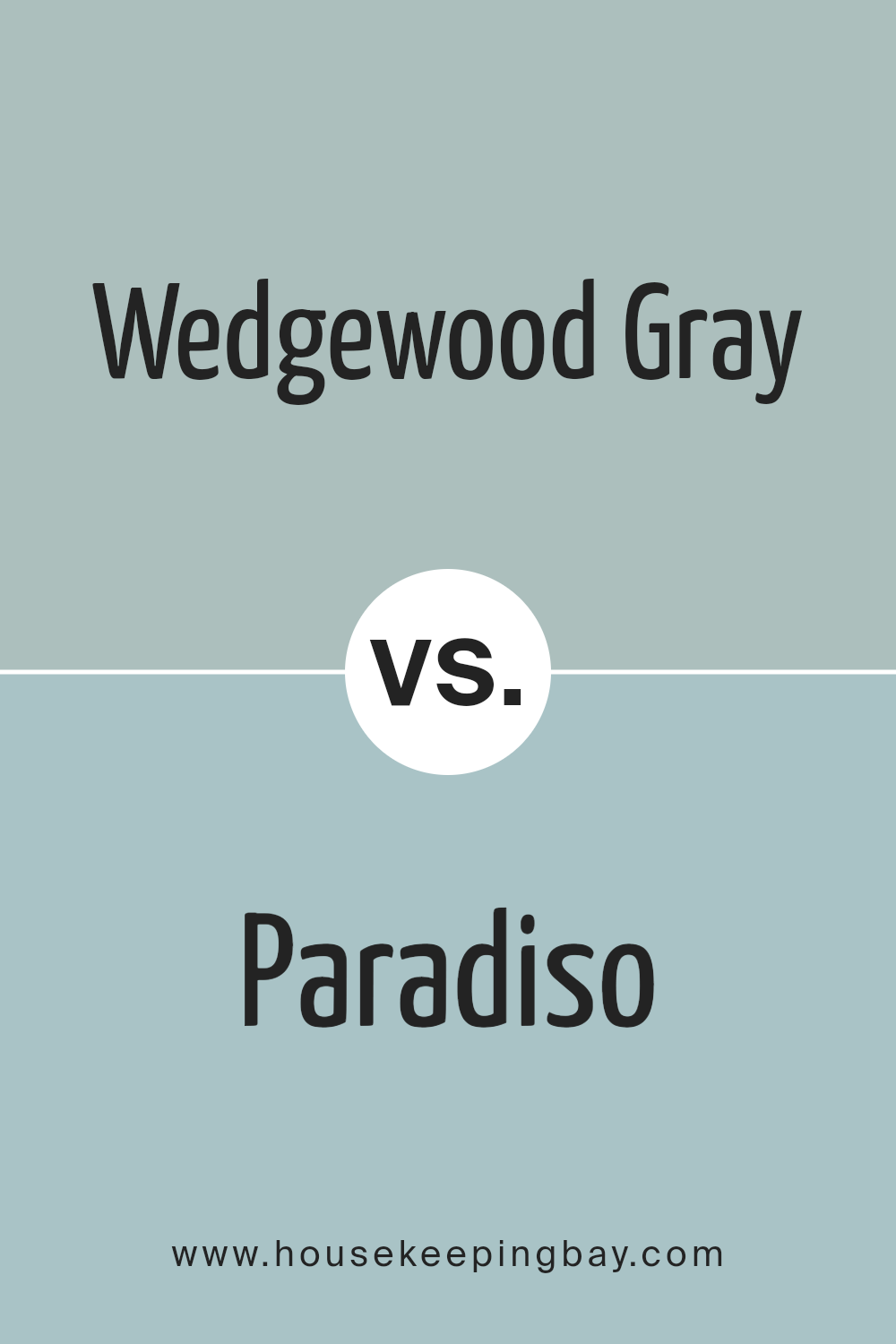
Wedgewood Gray HC-146 by Benjamin Moore vs Paradiso 717 by Benjamin Moore
Wedgewood Gray HC-146 by Benjamin Moore is a soft, muted gray-blue. It offers a cool, calming tone reminiscent of gentle skies or serene seas. It feels light and airy, making spaces appear larger and more open. Its subtle hue can adapt to various lighting conditions, appearing slightly different based on sunlight or artificial lighting, yet maintains its generally tranquil ambiance.
Paradiso 717, however, is a much bolder choice from Benjamin Moore. It is a deep teal shade that brings richness and drama to any room. This robust color carries a sense of elegance and can create a cozy, intimate atmosphere.
Paradiso has more intensity compared to the understated Wedgewood Gray, injecting vigor and depth into spaces.
While Wedgewood Gray leans towards a soft, understated vibe, Paradiso offers a striking, vibrant character. Both colors charm in their own unique ways, playing distinct roles in design aesthetics.
You can see recommended paint color below:
- 717 Paradiso
housekeepingbay.com
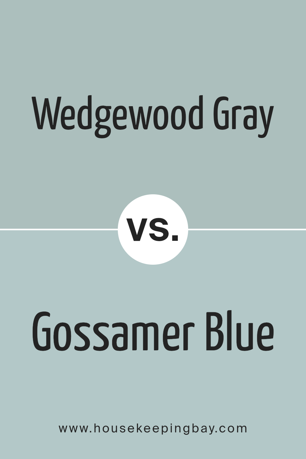
Wedgewood Gray HC-146 by Benjamin Moore vs Gossamer Blue 2123-40 by Benjamin Moore
Wedgewood Gray HC-146 by Benjamin Moore is a soft, muted gray with blue undertones. It offers a subtle, sophisticated look, resembling a gentle morning mist. It’s versatile and works well in living rooms, bedrooms, or any space where you want a calming atmosphere. The color has an understated elegance, making it easy to pair with both light and dark accents.
Gossamer Blue 2123-40 by Benjamin Moore, in contrast, is a lighter, more vibrant shade of blue. It feels airy and fresh, reminding one of clear skies on a sunny day. This color can brighten up a space, making it ideal for bathrooms, kitchens, or children’s rooms. It has a cheerful, uplifting vibe that adds energy without being overpowering.
Together, these colors offer a balanced palette. Wedgewood Gray adds sophistication and calm, while Gossamer Blue introduces lightness and joy, giving you flexibility in creating a cohesive look.
You can see recommended paint color below:
- 2123-40 Gossamer Blue
housekeepingbay.com
Wedgewood Gray HC-146 by Benjamin Moore vs Rhine River 689 by Benjamin Moore
Wedgewood Gray HC-146 and Rhine River 689, both from Benjamin Moore, present unique personalities while sharing a similar vibe. Wedgewood Gray HC-146 is a soft blue-gray, evoking a calm, soothing atmosphere. It pairs well with both modern and traditional decor, adding a touch of elegance to any room. The color has enough depth to stand alone but can also serve as a backdrop for bolder accents.
Rhine River 689, by contrast, is a deeper, richer blue-green. This color brings more drama and depth to a space, offering a sense of coziness and warmth. While Rhine River can create a more intimate environment, it may not be as versatile as Wedgewood Gray, due to its stronger presence.
Choosing between the two depends on the desired mood: Wedgewood Gray offers a lighter, more airy feel, while Rhine River provides richness and comfort. Both colors, though different, carry a serene undertone fitting for various aesthetics.
You can see recommended paint color below:
- 689 Rhine River
housekeepingbay.com
Wedgewood Gray HC-146 by Benjamin Moore vs Yarmouth Blue HC-150 by Benjamin Moore
Wedgewood Gray HC-146 and Yarmouth Blue HC-150, both from Benjamin Moore, share calm, soothing tones but differ in undertones and brightness. Wedgewood Gray, primarily gray with subtle blue and green hints, exudes a sophisticated, muted vibe. Its balanced mix brings versatility, making it suitable for various home settings.
Meanwhile, Yarmouth Blue tilts more towards blue, with gentle green undertones, providing a slightly brighter, more playful feel. This hue can lighten and energize spaces while retaining a sense of calmness. Wedgewood Gray suits elegant, understated environments, ideal for living rooms or bedrooms seeking a quiet, refined backdrop.
Yarmouth Blue, with its cheerful touch, works well in areas needing a fresh, airy atmosphere, like bathrooms or kitchens. Both colors maintain a serene feel, yet their distinct undertones allow them to differentially enhance a room’s personality and mood, depending on the desired ambiance.
You can see recommended paint color below:
- HC-150 Yarmouth Blue
housekeepingbay.com
Conclusion
Its subtle blend of blue and gray creates a serene yet sophisticated backdrop, suitable for various design styles. In my experience, Wedgewood Gray works well in both traditional and modern settings, offering versatility and elegance.
The color’s soft undertones make rooms feel airy and open while adding a touch of warmth that prevents spaces from feeling too cold or stark. It pairs nicely with crisp whites for a clean look or with deeper tones like navy and charcoal for a more dramatic effect.
I’ve noticed that it also complements natural materials, making it a great choice for rooms with wooden elements or stone accents.
Lighting can influence its appearance, with natural light bringing out its blue tones and artificial lighting highlighting its gray aspects. This means it adapts beautifully to different times of day and varying light conditions.
As a neutral color with character, Wedgewood Gray serves as a canvas for personal style, allowing other decor elements to shine while maintaining a cohesive and calming atmosphere.
In summary, Wedgewood Gray by Benjamin Moore is a versatile choice for those looking to create a space that feels both inviting and refined. Its timeless quality ensures it remains a favorite among design enthusiasts.
housekeepingbay.com
Ever wished paint sampling was as easy as sticking a sticker? Guess what? Now it is! Discover Samplize's unique Peel & Stick samples. Get started now and say goodbye to the old messy way!
Get paint samples


