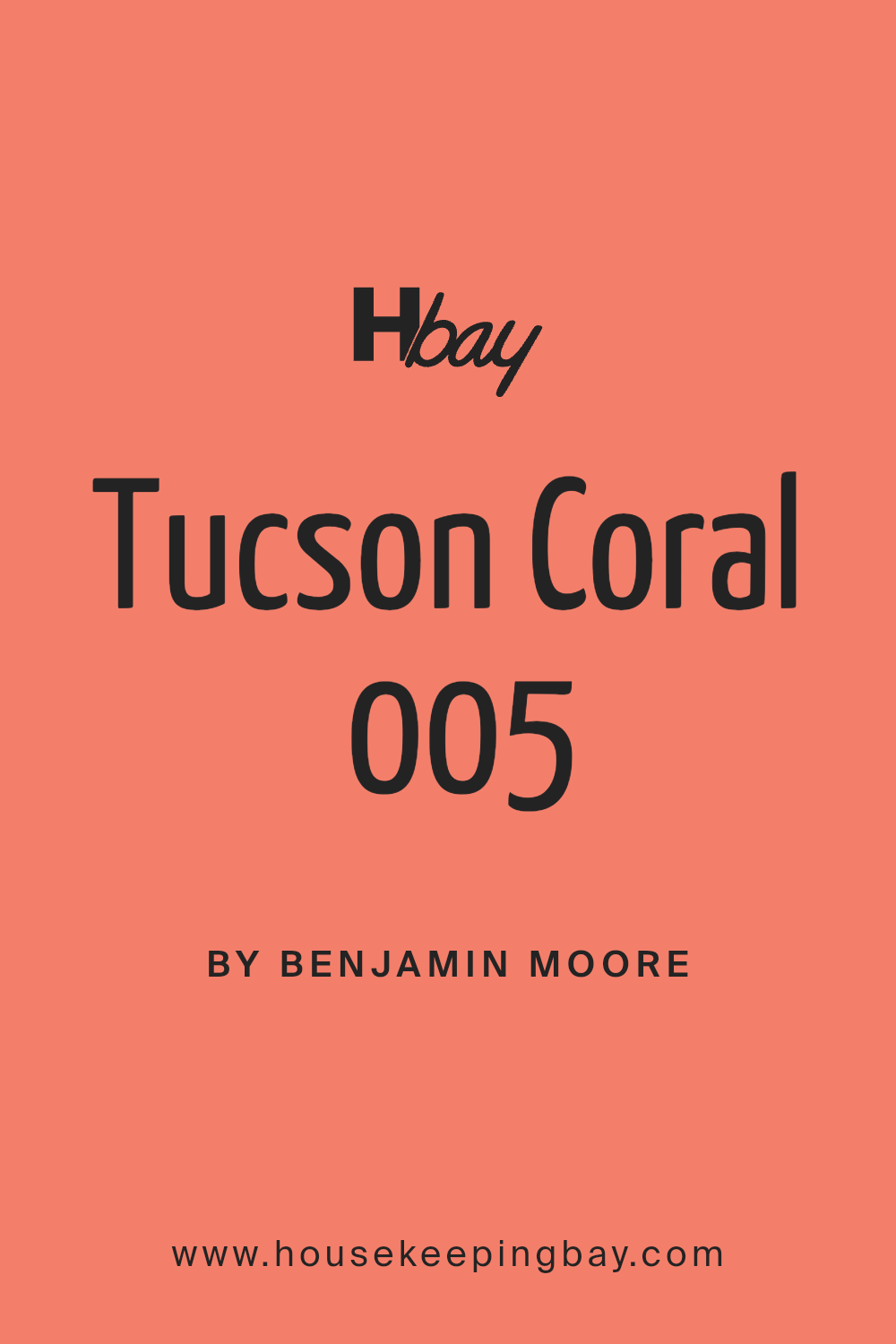
Tucson Coral 005 by Benjamin Moore
Brightening Your World with a Splash of Warmth
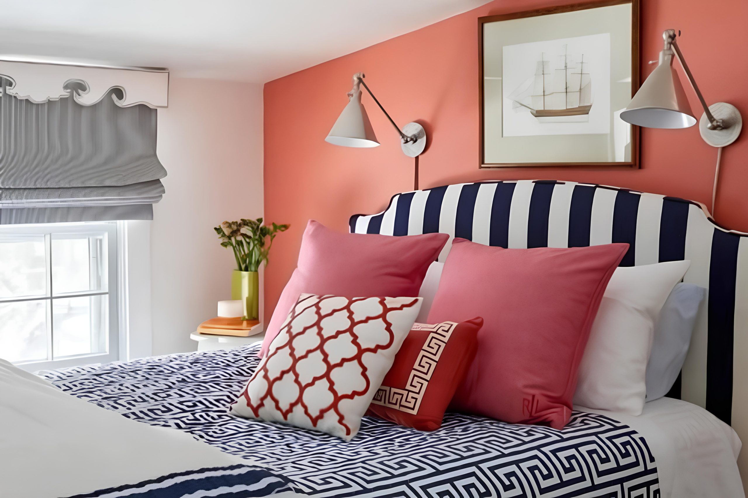
Have you heard about 005 Tucson Coral by Benjamin Moore? It’s a paint color that stands out for its warm, inviting hue that can brighten up any space. When you use Tucson Coral in your home, you can add a cheerful and cozy atmosphere to your rooms.
This shade has a unique blend of pink and orange tones, making it perfect for adding a splash of warmth to living areas, bedrooms, or even kitchens.
Whether you decide to paint an entire room or just a single accent wall, Tucson Coral offers a fresh, modern look while still feeling homey and comforting. It pairs well with a wide range of decor styles and complements other colors beautifully, from soft neutrals to vibrant blues and greens.
So, if you’re thinking of refreshing your home’s look, 005 Tucson Coral might just be the color you need.
via plan-home.com
What Color Is Tucson Coral 005 by Benjamin Moore?
Tucson Coral 005 by Benjamin Moore is a warm, inviting shade that combines the softness of pink with a touch of vibrant peach. This color exudes a cheerful energy that can lighten up any room and make spaces feel more welcoming. Tucson Coral has a perfectly balanced saturation level, making it versatile for various design preferences. It’s neither too bold nor too pale, ensuring it complements many decor styles and settings.
Tucson Coral works exceptionally well in coastal, bohemian, and contemporary interior styles. Its sunny disposition is ideal for creating focal points in living rooms, kitchens, or bedrooms. In coastal-styled interiors, it pairs beautifully with blues and sandy neutrals for a beachy, relaxed feel. Bohemian rooms benefit from its playful, lively character when matched with rich textures like woven rugs and macrame wall hangings.
This color is also a great choice for spaces where natural materials dominate. Pairing it with light woods, linen fabrics, and ceramic accessories can enhance its warmth and add to a space’s overall light-hearted feel. Tucson Coral can be effectively used on accent walls, for furniture pieces, or even textiles to inject a sense of joy and unique style into an interior.
housekeepingbay.com
Is Tucson Coral 005 by Benjamin Moore Warm or Cool color?
Tucson Coral 005 by Benjamin Moore is a warm, inviting paint color that can bring a cheerful and cozy atmosphere to any room in a home. This peachy hue has a softness that makes it versatile enough to use in various spaces, from kitchens to bedrooms. Its gentle warmth works well with natural light, enhancing small spaces to appear more open and airy.
In larger rooms, Tucson Coral can add a sense of comfort and warmth, especially when paired with neutral tones like whites, beiges, and light grays.
Due to its calming nature, Tucson Coral is also a good choice for spaces where relaxation is key, such as bathrooms and living areas. When used in active spaces like a kitchen or dining room, it introduces a fresh, lively vibe without overwhelming the senses. This color combines nicely with wooden furniture and natural elements, creating a balanced and harmonious environment. Its versatility and pleasant appeal make it a popular choice for those looking to add a subtle yet impactful hue to their home decor.
What is the Masstone of the Tucson Coral 005 by Benjamin Moore?
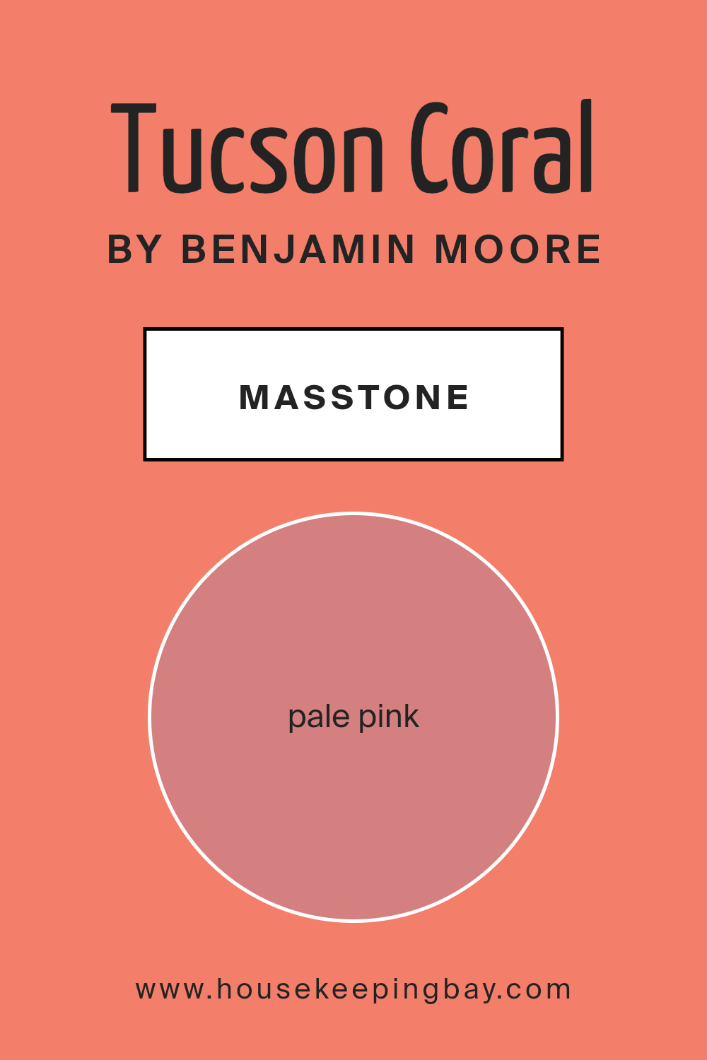
Tucson Coral 005 by Benjamin Moore is a gentle and soft color with a pale pink masstone, represented by the color code #D58080. This shade has a warm and inviting quality that makes it perfect for creating a cozy and comforting atmosphere in homes. When used on walls, it adds a subtle pop of color without overpowering the space. This makes it an excellent choice for living rooms, bedrooms, or bathrooms where you want to add a touch of warmth and softness.
The pale pink hue of Tucson Coral 005 can also make rooms appear brighter and more open due to its light-reflecting properties.
This is particularly beneficial in smaller or darker spaces that could use a lift. Furthermore, its versatility allows it to pair well with a wide range of decor styles and colors, including whites, grays, and even darker shades, providing a harmonious look in any home setting. The soothing quality of this pale pink also helps to foster a peaceful and relaxing environment, ideal for spaces where comfort is key.
housekeepingbay.com
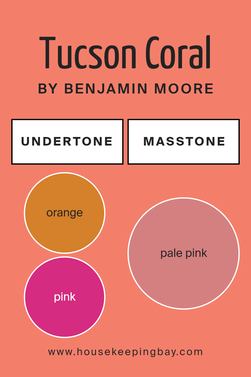
Undertones of Tucson Coral 005 by Benjamin Moore
Tucson Coral 005 by Benjamin Moore is a unique color that includes a complex mix of undertones. These undertones directly influence how the color appears in different settings and lighting conditions. Undertones like orange, pink, and pale yellow give Tucson Coral a warm and inviting quality, making it ideal for living rooms and bedrooms where a cozy atmosphere is desired. On the other hand, its shades of light purple and red introduce a subtle vibrancy that can energize a space.
Undertones are subtle colors that lie beneath the surface of the main color. They can enhance the main hue or shift how it is perceived under various lighting conditions. For instance, grey and light gray undertones in Tucson Coral can mute its warmth slightly, giving it a more sophisticated edge. This makes the color versatile for both modern and traditional spaces.
On interior walls, these undertones play a significant role. In natural light, the lighter undertones like pale yellow and mint might become more pronounced, providing a fresh and airy feel. Meanwhile, in artificial lighting, darker undertones like brown and olive might emerge, lending a richer and more enveloping feel. This chameleon-like quality can be particularly useful in rooms that serve multiple purposes or have varying light conditions throughout the day.
By understanding and considering these undertones, one can effectively use Tucson Coral to achieve the desired mood and style in a space.
housekeepingbay.com
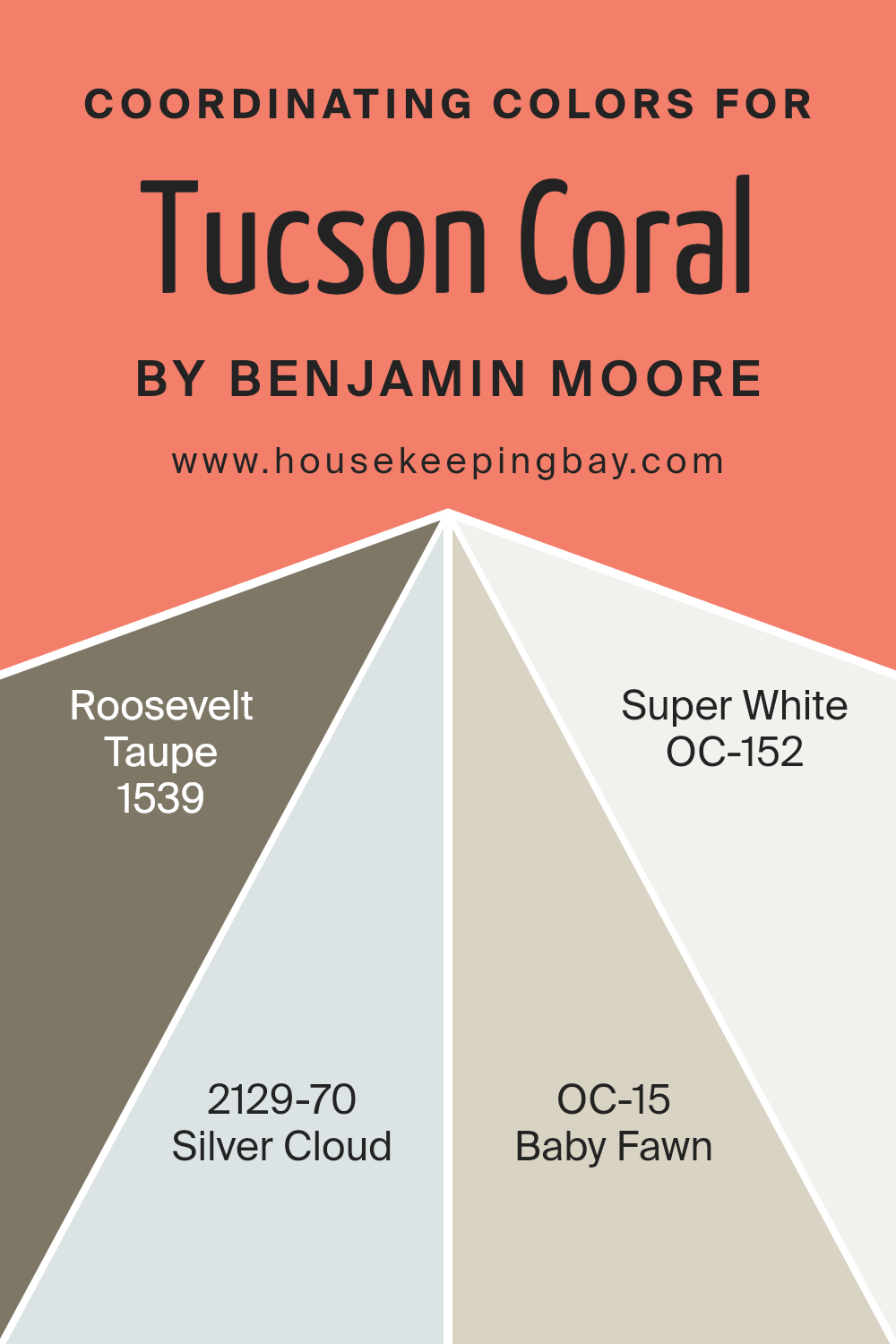
Coordinating Colors of Tucson Coral 005 by Benjamin Moore
Coordinating colors are selected hues that work harmoniously with a main color to enhance the overall aesthetic of a space. In the case of Tucson Coral by Benjamin Moore, an engaging and warm coral hue, coordinating colors like Roosevelt Taupe, Silver Cloud, Baby Fawn, and Super White have been chosen to complement this vibrant shade. These colors blend well together due to their varying degrees of saturation and brightness, creating a balanced and inviting color palette.
Roosevelt Taupe is a deep, complex taupe that adds a grounding effect when paired with the brighter Tucson Coral. This color brings a sense of solidity and sophistication to any room. Silver Cloud, on the other hand, is a light, airy gray that offers a subtle contrast, softening the overall look and introducing a serene atmosphere.
Baby Fawn is a gentle beige with a hint of warmth, making spaces feel more open and relaxed, an excellent partner for the lively Tucson Coral. Finally, Super White offers a crisp and clean look, providing a sharp contrast that makes the coral pop and energizes any area it’s used in, ensuring that the space feels vibrant yet balanced.
You can see recommended paint colors below:
- 1539 Roosevelt Taupe
- 2129-70 Silver Cloud
- OC-15 Baby Fawn
- OC-152 Super White
housekeepingbay.com
How Does Lighting Affect Tucson Coral 005 by Benjamin Moore?
Lighting significantly influences how colors appear in a space. Colors can shift dramatically under different lighting conditions. The paint color Tucson Coral005 by Benjamin Moore is a vibrant example that highlights these effects.
In artificial light, Tucson Coral005 tends to appear warmer and more intense. This is because most artificial lighting, such as incandescent bulbs, has a yellowish tone that enhances warm hues. LED or fluorescent lights, which can have cooler tones, might make Tucson Coral005 look slightly less saturated but still pleasantly warm.
In natural light, the appearance of Tucson Coral005 can change depending on the time of day and weather conditions. Sunlight brings out the truest form of this color, making it appear lively and fresh. On a cloudy day, it might look more subdued but still maintains its warm, soothing quality.
For rooms with different exposures:
– North-faced rooms receive less direct sunlight, often casting a cooler, bluer light. Here, Tucson Coral005 might appear slightly muted and less vibrant. It could give the room a softer, more subtle look.
– South-faced rooms are bathed in abundant sunlight for most of the day, which can amplify the vibrancy of Tucson Coral005, making it appear very bright and energetic.
– East-faced rooms get bright morning light. Tucson Coral005 in such rooms will look lively in the morning, transitioning to a softer warmth in the afternoon as natural light fades.
– West-faced rooms gain intense light in the late afternoon. Tucson Coral005 will show a dramatic, warm glow during this time, potentially feeling more intense than during the morning or midday.
Positioning Tucson Coral005 in any room requires considering these lighting effects to achieve the desired mood and visual impact. Whether it’s creating a cozy nook with soft artificial light or a vibrant area using the room’s natural exposure, understanding how light interacts with color can help in making informed design choices.
housekeepingbay.com
What is the LRV of Tucson Coral 005 by Benjamin Moore?
LRV, or Light Reflectance Value, measures the percentage of light a paint color reflects from or absorbs into a painted surface. An LRV scale ranges from 0 to 100, where 0 represents pure black that absorbs all light and 100 indicates bright white that reflects all light.
This measurement helps in choosing the right paint color for a room based on how much natural or artificial light it receives, ensuring the space feels comfortable and looks visually pleasing. A color’s LRV affects whether a room appears lighter or darker, effectively impacting its overall ambiance.
The LRV of Tucson Coral005 by Benjamin Moore is 33.65, meaning it does not reflect a lot of light but isn’t extremely dark either. Its moderate reflectance makes it versatile for rooms that receive a fair amount of natural light or well-lit by artificial means, maintaining the richness of its pinkish-orange hue without overwhelming the space.
In dimly lit rooms, however, the color might appear more muted and less vibrant. This balanced LRV makes Tucson Coral a practical choice for adding a gentle splash of color while keeping the room feeling cozy and moderately bright.

housekeepingbay.com
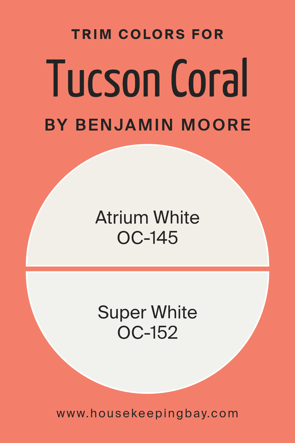
What are the Trim colors of Tucson Coral 005 by Benjamin Moore?
Trim colors are specifically chosen paint shades used to accentuate or highlight the architectural details and edges on walls, door frames, window frames, and moldings inside a home. When using Tucson Coral 005 by Benjamin Moore, selecting compatible trim colors such as OC-145 – Atrium White and OC-152 – Super White can significantly enhance the visual appeal of a room. These lighter trim colors create a clean, crisp contrast that makes the vibrant warmth of Tucson Coral really stand out, giving the space a structured yet fresh look.
Atrium White OC-145 is a soft, creamy white that brings light and a sense of airiness to a space. It pairs beautifully with brighter, more saturated colors like Tucson Coral, providing a subtle, soothing backdrop that allows the coral to shine without overwhelming the senses.
On the other hand, Super White OC-152 is a bold, pure white that offers a sharper contrast, which can be perfect for modern spaces looking to define design lines more distinctly. This paint color is ideal for creating a refined edge that cleanly separates different color fields, helping Tucson Coral pop and truly catch the eye.
You can see recommended paint colors below:
- OC-145 Atrium White
- OC-152 Super White
housekeepingbay.com
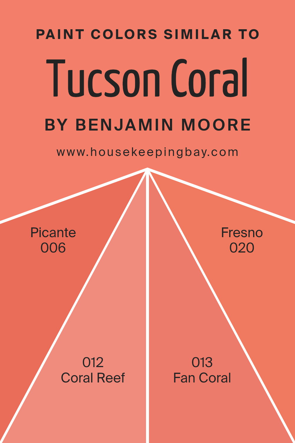
Colors Similar to Tucson Coral 005 by Benjamin Moore
Choosing similar colors in interior design can create a harmonious and cohesive look, making spaces feel more put together and pleasing to the eye. Colors that are similar to Tucson Coral 005 by Benjamin Moore share a common base tone which allows them to blend seamlessly.
This can be particularly beneficial in open-plan spaces where different functional areas need to be visually connected without stark contrasts that could disrupt the flow. Using shades like Picante 006, Coral Reef 012, Fan Coral 013, and Fresno 020 enables a gradual and subtle variation that enriches the environment without overwhelming it with too many divergent colors.
Picante 006, a gently fired shade, softens spaces with its warm, muted inferno quality, providing an inviting ambiance. Coral Reef 012 offers a lively pop that is buoyant yet not overly bold, making it great for encouraging a friendly and sociable atmosphere. Fan Coral 013, with its understated approach, adds a touch of warmth that is never overpowering, ideal for areas that demand a soothing touch.
Fresno 020 rounds out this collection with its deeper, more grounded appearance, perfect for adding depth and interest to any room. Together, these shades weave a visual thread through the space that enhances the aesthetic appeal and creates a unified look.
You can see recommended paint colors below:
- 006 Picante
- 012 Coral Reef
- 013 Fan Coral
- 020 Fresno
housekeepingbay.com
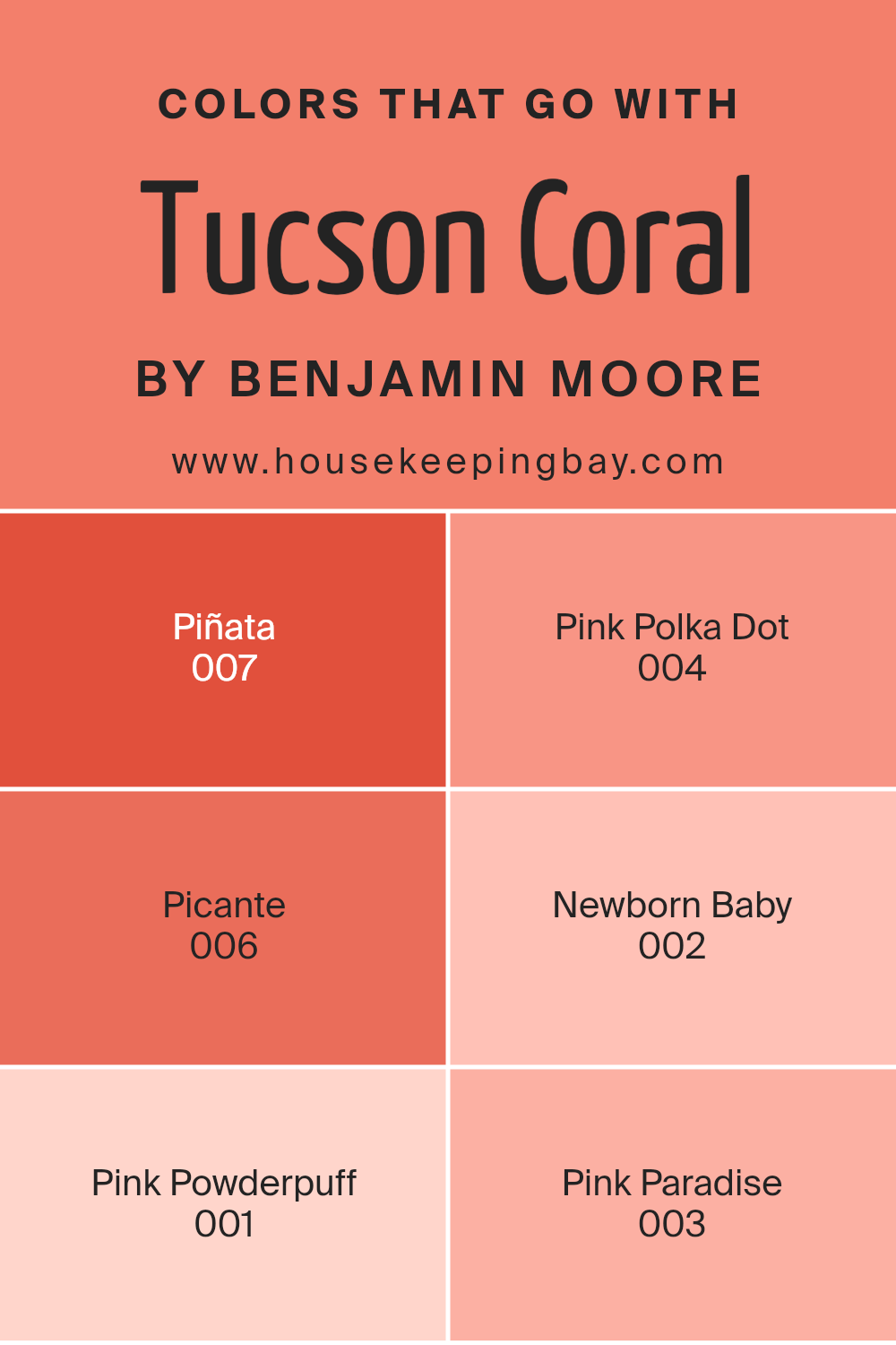
Colors that Go With Tucson Coral 005 by Benjamin Moore
Colors that complement Tucson Coral 005 by Benjamin Moore, such as Piñata, Pink Polka Dot, Picante, Newborn Baby, Pink Powderpuff, and Pink Paradise, are essential for creating aesthetic balance and enhancing visual appeal in any space. These companion colors help highlight Tucson Coral’s vibrant yet soothing nature, allowing it to stand out or blend in delicately within a design scheme depending on the chosen combination. When used thoughtfully, these colors can create harmony and bring out the best features of each hue to produce a cohesive and appealing look.
Let’s discuss how each color interacts with Tucson Coral. Piñata 007 is a lively, festive color that injects energy and a sense of fun into spaces. It pairs well with Tucson Coral by offering a striking contrast that is both lively and pleasing to the eye. Pink Polka Dot 004 is a lighter, playful tone that provides a soft background, making Tucson Coral pop beautifully when used together.
Picante 006 is a robust, bold choice that adds depth and an intriguing twist when positioned next to the more subdued Tucson Coral, resulting in a rich, warm palette. Newborn Baby 002, with its gentle, calming quality, creates a tender complement to Tucson Coral, enhancing the softer side of the hue. Pink Powderpuff 001 offers a dusty rose tint, which combines elegantly with Tucson Coral for a more muted, sophisticated look.
Lastly, Pink Paradise 003 shouts tropical bliss and contrasts nicely with Tucson Coral, establishing a vibrant and refreshing visual connection that’s hard to overlook. Together, these colors offer myriad possibilities to beautify and personalize any decorating endeavor.
You can see recommended paint colors below:
- 007 Piñata
- 004 Pink Polka Dot
- 006 Picante
- 002 Newborn Baby
- 001 Pink Powderpuff
- 003 Pink Paradise
housekeepingbay.com
How to Use Tucson Coral 005 by Benjamin Moore In Your Home?
Tucson Coral 005 by Benjamin Moore is a warm, inviting paint color that brightens any room in your house with its vibrant hue, reminiscent of sunset shades. This color fits well in spaces that could use a cheerful lift, such as a living room or dining area.
Using Tucson Coral on one wall as an accent can add a lively pop while complementing neutral tones like grays, whites, or soft browns on other walls and furniture. It’s also ideal for bedrooms where soft, comforting colors create a cozy retreat after a long day.
For bathrooms, pairing it with white trim and fixtures highlights the color’s warmth, making the space feel welcoming. If you enjoy a splash of color in your kitchen, Tucson Coral can be used on cabinets or a backsplash to enhance the room’s energy and warmth. Tucson Coral is versatile, compatible with both modern and traditional decor, and helps make your home feel personalized and cheerful.
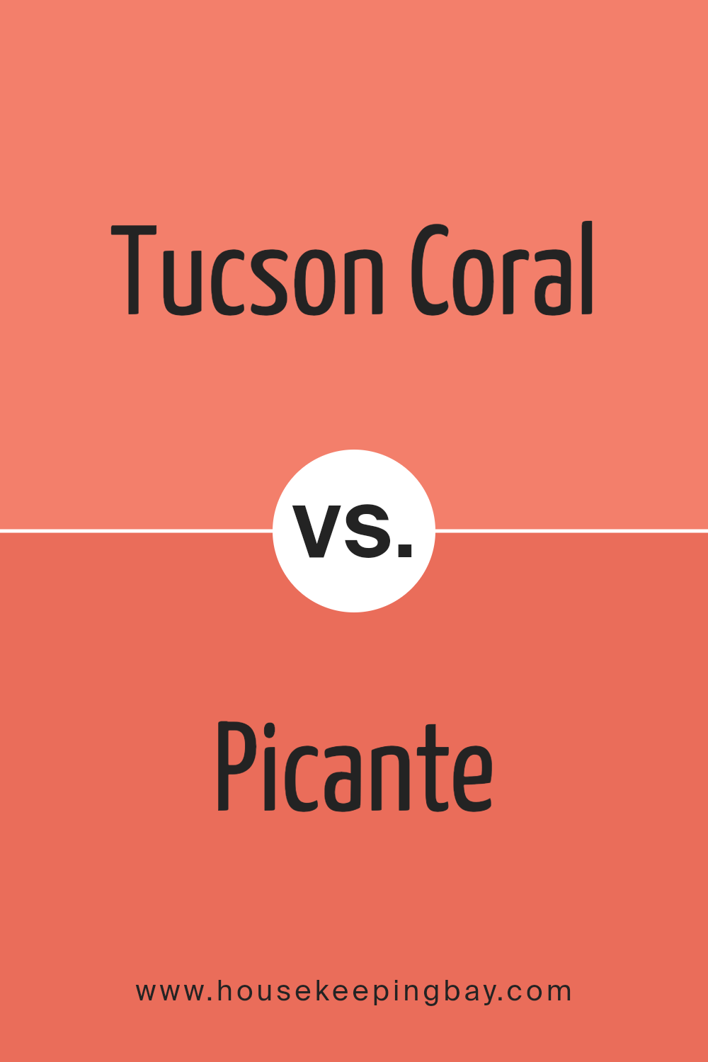
Tucson Coral 005 by Benjamin Moore vs Picante 006 by Benjamin Moore
Tucson Coral 005 by Benjamin Moore is a soft, welcoming shade with a gentle peachy hue that adds warmth and lightness to a space. It creates a soothing atmosphere, making it ideal for living areas or bedrooms where a calming influence is desired. This color pairs beautifully with light neutrals and natural materials, suggesting a subtle yet inviting aesthetic.
Picante 006, also by Benjamin Moore, offers a bolder, more vibrant look. It’s a deep, rich red with undertones that can energize a room instantly. This color is perfect for making a statement, whether on an accent wall or throughout a dining room or kitchen. It works well with dark woods and can complement modern or traditional decor.
Both Tucson Coral 005 and Picante 006 have their unique appeal, with Tucson Coral providing a light, airy feel and Picante bringing intensity and warmth. Their uses vary depending on the desired impact and the room’s function, allowing for flexibility in design choices.
You can see recommended paint color below:
- 006 Picante
housekeepingbay.com
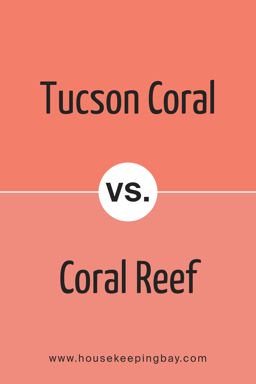
Tucson Coral 005 by Benjamin Moore vs Coral Reef 012 by Benjamin Moore
Both Tucson Coral 005 and Coral Reef 012 by Benjamin Moore are vibrant paint colors, but they each bring a distinct appeal to a space. Tucson Coral 005 leans towards a bright but subdued peach tone, delivering a gentle warmth to any room. This color is ideal for spaces where you want a cozy, inviting atmosphere without overwhelming the senses. It pairs beautifully with soft neutrals and provides a soothing backdrop.
Coral Reef 012, however, is richer and more pronounced. It has a deeper, more robust coral hue that tends to energize a space. This color is perfect for making a statement, whether on an accent wall or throughout a room. It also works well with both light and dark contrasts, such as whites or deep greens and blues, allowing for versatile decorating options.
In summary, while both colors share a coral base, Tucson Coral 005 offers a more muted warmth, whereas Coral Reef 012 adds a spirited pop of color to interiors.
You can see recommended paint color below:
- 012 Coral Reef
housekeepingbay.com
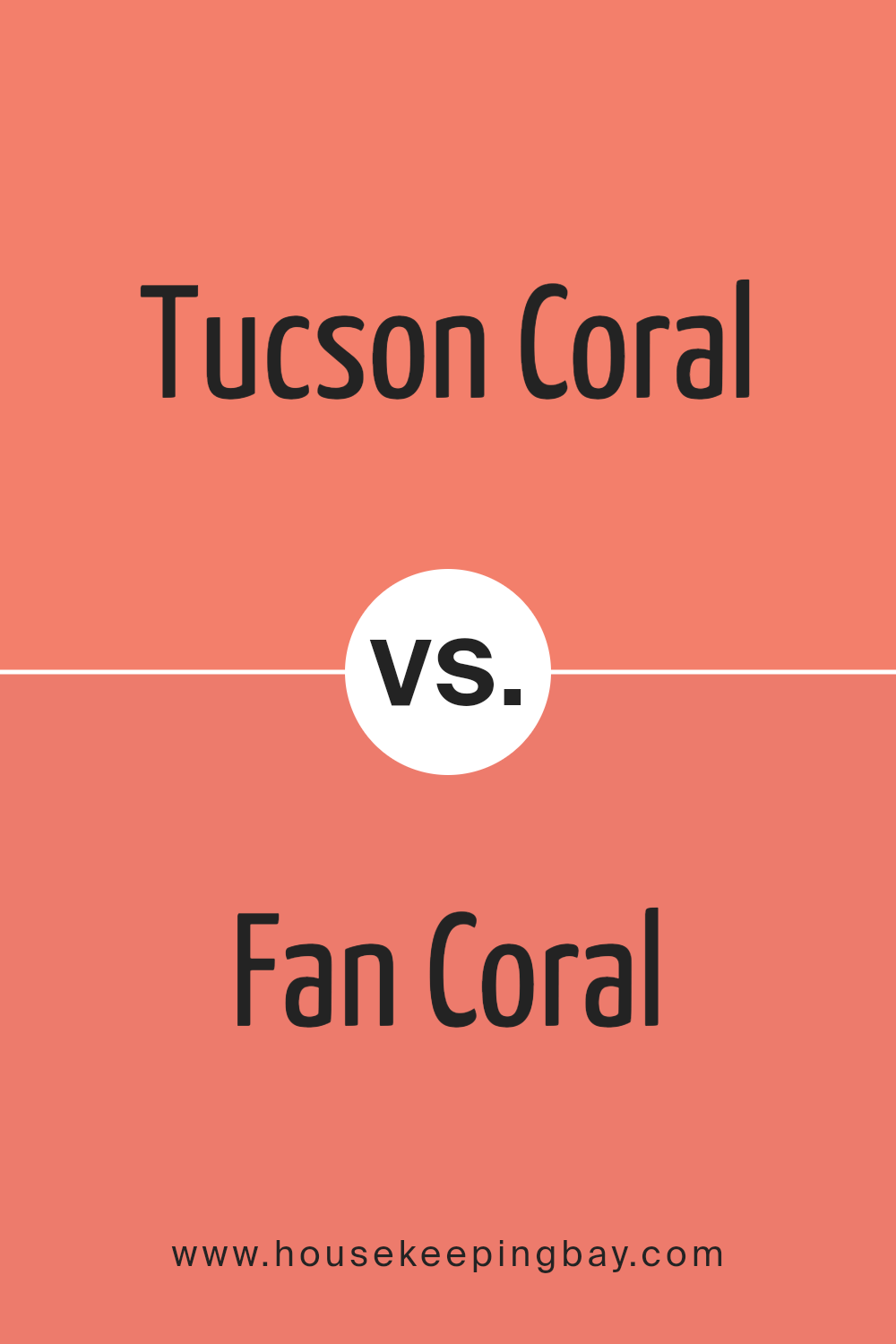
Tucson Coral 005 by Benjamin Moore vs Fan Coral 013 by Benjamin Moore
Tucson Coral 005 by Benjamin Moore is a rich, warm coral hue that radiates a soft and welcoming vibe, making it great for spaces where you want to add a cozy, vibrant touch. This shade leans more towards an earthy terracotta, providing a rustic charm that pairs well with natural elements and neutral tones. It creates a snug atmosphere in any room, particularly effective in living areas or bedrooms where comfort is key.
In comparison, Fan Coral 013 by Benjamin Moore is lighter and has a more gentle presence. Its subtler, pinkish undertone gives it a fresh and airy feel, which is ideal for smaller spaces or rooms that need a brightening lift. This color works beautifully in bathrooms and kitchens, where it can illuminate the space without overwhelming it with too much saturation.
Both colors offer a unique approach to incorporating coral tones in your decor, with Tucson Coral 005 bringing depth and warmth, while Fan Coral 013 offers a lighter, refreshing vibe.
You can see recommended paint color below:
- 013 Fan Coral
housekeepingbay.com
Tucson Coral 005 by Benjamin Moore vs Fresno 020 by Benjamin Moore
Tucson Coral 005 by Benjamin Moore is a vibrant, warm pink with a touch of orange that gives it a lively and cozy feel. This color creates a cheerful ambiance, perfect for energizing a room and making it feel inviting. It’s brilliant for spaces that need a pop of color and works well in living areas or bedrooms where a sense of comfort is desired.
Fresno 020 by Benjamin Moore, in contrast, is a calmer, more subdued gray with a slightly cooler tone. This color provides a neutral backdrop that’s versatile and soothing, making it ideal for modern and minimalist design schemes. Perfect for creating a peaceful and stable atmosphere, Fresno 020 is suitable for offices or any space where concentration and a low-key vibe are preferable.
When compared, Tucson Coral 005 brings warmth and vibrancy, while Fresno 020 offers a subtle and calming influence, showing how different colors can fulfill various roles depending on the desired mood and setting.
You can see recommended paint color below:
- 020 Fresno
housekeepingbay.com
Conclusion
I just finished looking into 005 Tucson Coral by Benjamin Moore, and it’s genuinely impressive how one paint color can influence a space. The unique property of this coral hue lies in its ability to blend warmth and a sense of cheer into any room. When applied, it has a soft vibrancy that doesn’t overwhelm but rather offers a gentle pop of color that can make your décor elements really shine.
From a practical standpoint, Tucson Coral seems versatile. I found it suits a variety of spaces from living rooms and kitchens to bedrooms, creating different impacts depending on the lighting and accompanying design elements. Especially in spaces aiming for a fresh yet cozy ambiance, this shade stands out as a thoughtful choice.
Moreover, 005 Tucson Coral pairs well with both light neutrals and bold colors, making it a handy palette tool for anyone looking to renew their living space without committing to drastic changes. As a recommendation for those considering a paint update or a full-on room renovation, Tucson Coral provides a lively yet soothing option, which can facilitate a refreshing new look even in spaces that need a little extra character.
Overall, Tucson Coral by Benjamin Moore isn’t just another paint color—it’s a viable pathway for creating a warm, inviting home atmosphere without steering into overly dramatic hues. For anyone aiming to introduce a bit of brightness while maintaining softness, this color might just be the perfect match.
housekeepingbay.com
