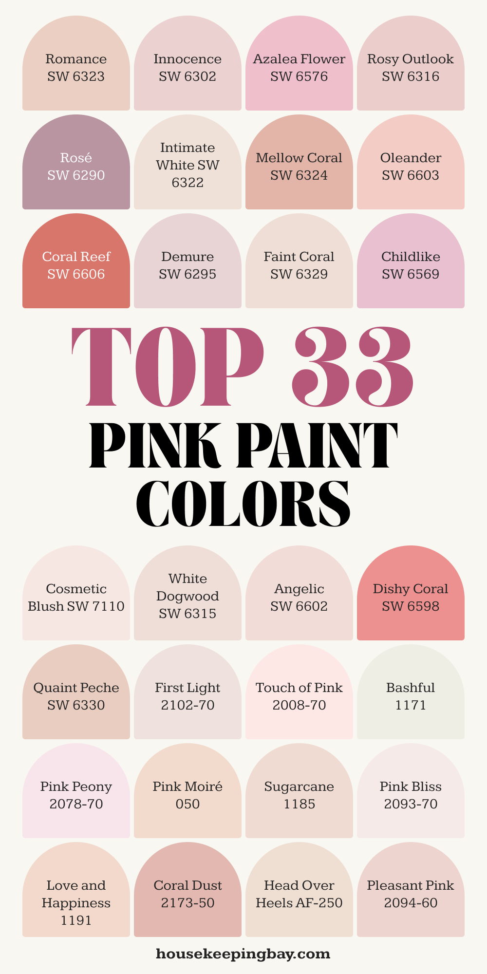
Top 33 Pink Paint Colors to Light up your Room
Soft, bold, and everything in between find the prettiest pinks for any room
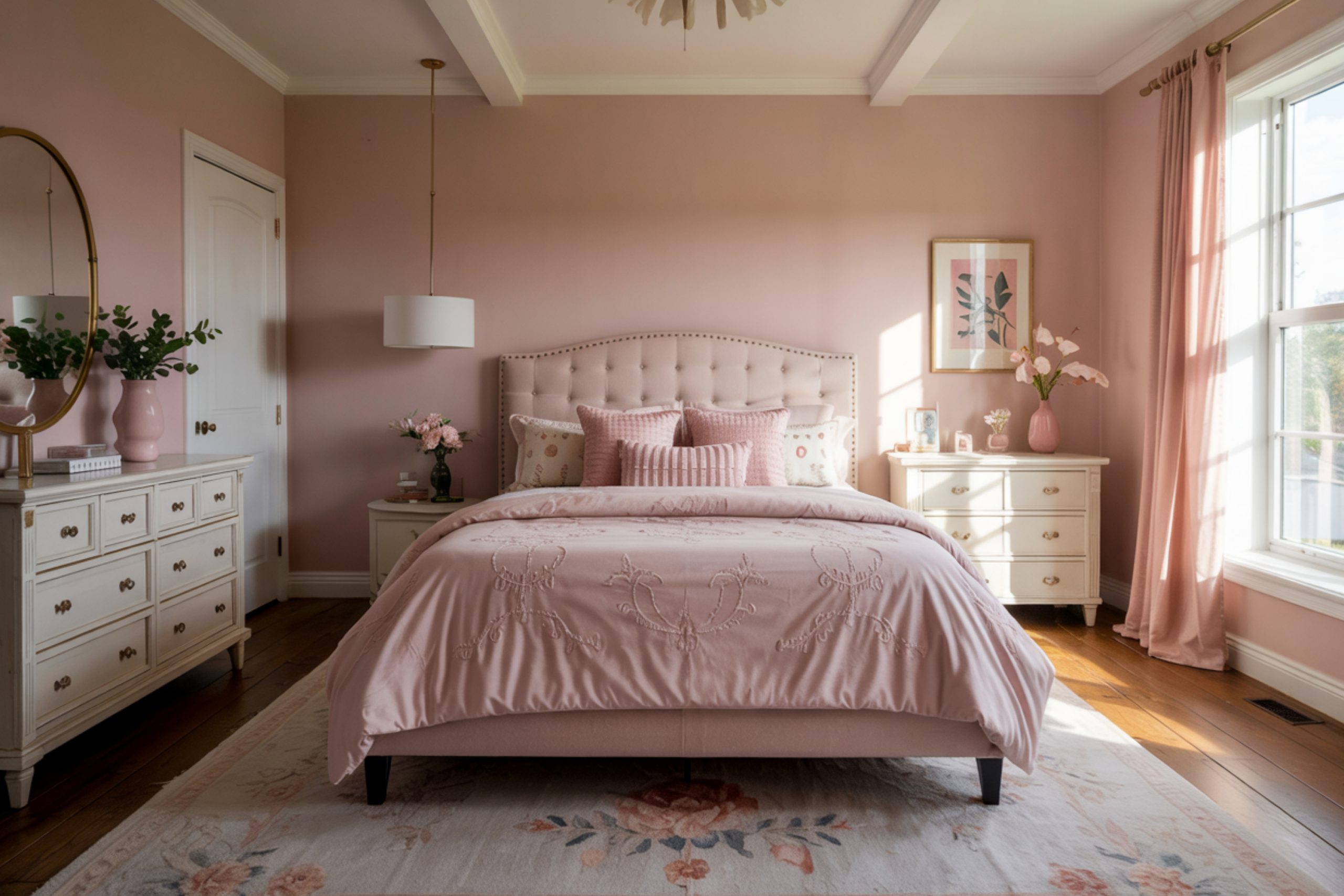
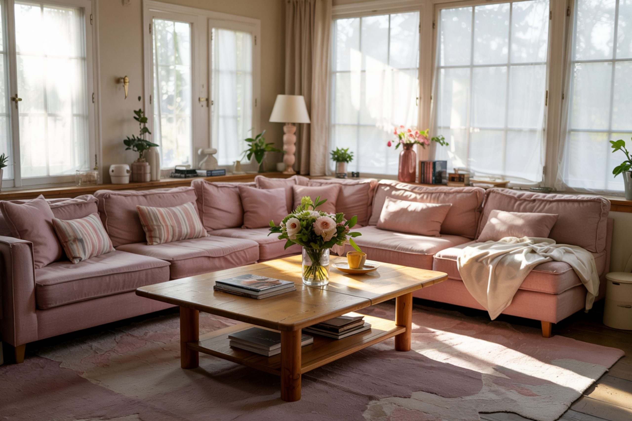
I’ve seen pink work its magic in more rooms than I can count. Bedrooms feel calmer, nurseries feel warmer, and even kitchens get a fun, unexpected glow. What I love about pink is how many versions of it there are. Some are barely-there blushes, and some bring in coral or peachy energy. Each one can change the way a room feels without doing too much.
When I help clients pick the right shade, it’s always personal. Pink reminds some people of childhood, and for others, it just feels cozy or happy.
It’s not just for little girls’ rooms anymore—I’ve used pink in dining rooms, mudrooms, and even home offices. The key is choosing the right pink.
This year, I’ve seen a lot of interest in softer pinks with a touch of warmth. Sherwin-Williams has some of the best ones right now, but I also have my tried-and-true favorites from other brands.
Here are the ones I keep going back to.
via housekeepingbay.com
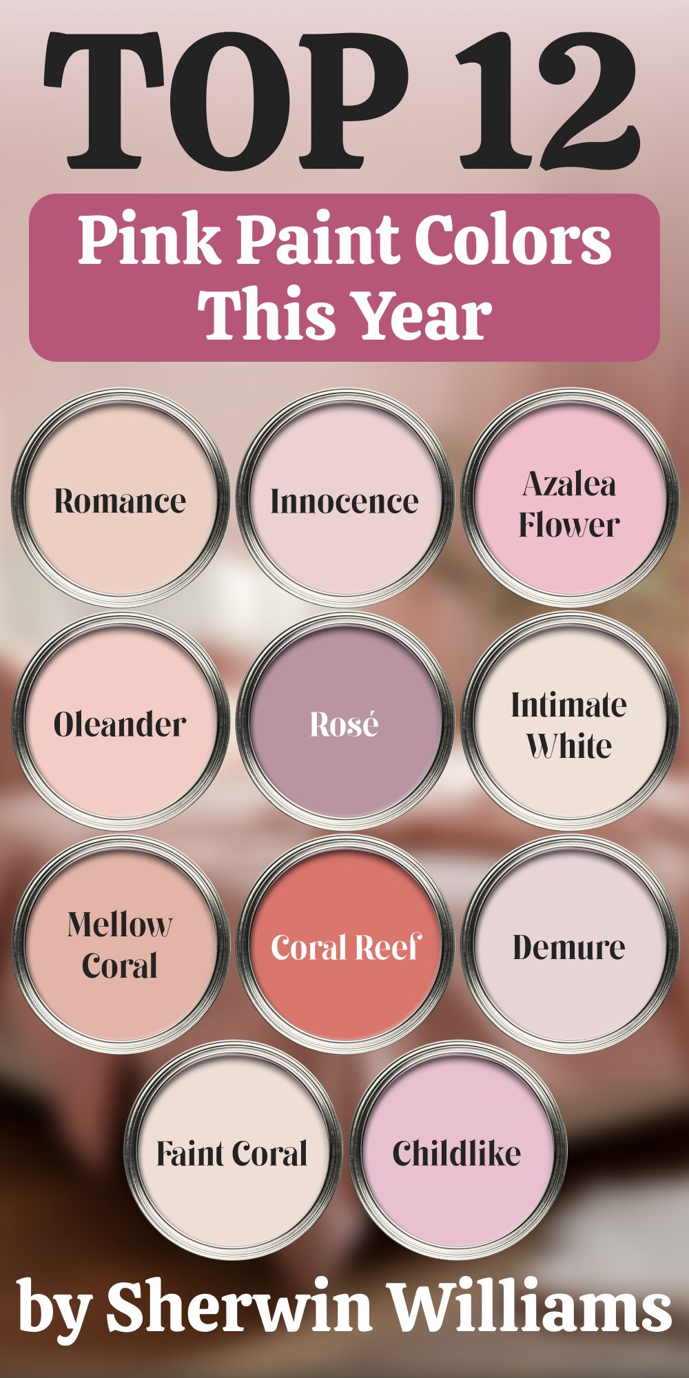
Top 12 Pink Paint Colors from Sherwin-Williams This Year
Table of Contents
These are the shades I’ve been using most this year — and honestly, they’ve made my job so much easier. Each of these brings out something special. Whether I’m staging a soft nursery or refreshing a guest bath, these pinks just work.
1. Romance SW 6323
This is my go-to for bedrooms. It’s soft, cozy, and has that slight warmth that makes the room feel settled. Works beautifully with brass or cream accents.
2. Intimate White SW 6322
It’s barely pink, almost like white with a blush. Great for anyone who’s scared of color but still wants something more interesting than plain white.
3. Innocence SW 6302
One of the most popular with my clients this year. There’s a calmness in it—it feels clean but not cold.
4. Azalea Flower SW 6576
This one is bold! If you’re looking for something fun and loud, Azalea Flower brings the energy. I used it in a powder room with black and white tile—amazing.
5. Rosy Outlook SW 6316
Cheerful and light. It’s the kind of color that looks good at any time of the day. Works especially well in rooms with lots of natural light.
6. Rosé SW 6290
More muted and elegant. I often suggest this to clients who want pink without the “bubblegum” look.
7. Mellow Coral SW 6324
Warm, peachy, and perfect for accent walls. If someone’s torn between orange and pink—this is the answer.
8. Oleander SW 6603
A mid-toned pink that feels vintage. I’ve used this one in a little girl’s room with floral wallpaper—sweet without being too soft.
9. Coral Reef SW 6606
Sherwin-Williams Color of the Year in the past—and for good reason. It’s bold and happy. Use this if you’re feeling brave.
10. Demure SW 6295
Light, cool, and fresh. It reminds me of spring mornings. Good for hallways and even laundry rooms.
11. Faint Coral SW 6329
So subtle that it almost reads as a peachy neutral. It’s perfect for modern spaces that still want a touch of charm.
12. Childlike SW 6569
Just like the name says—fun and playful. I used it recently in a craft room, and it made the space feel alive.
via housekeepingbay.com
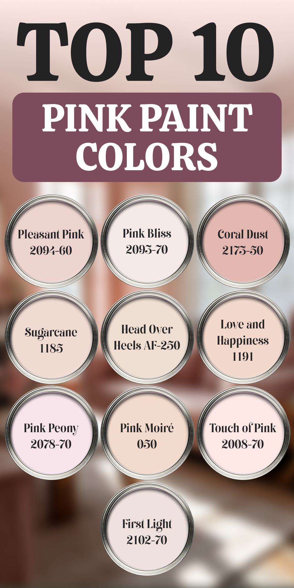
Top 10 Pink Paint Colors (Non–Sherwin-Williams)
These come from Benjamin Moore and a few other brands. I’ve used them in real homes, real rooms, with real families. Some are light like cotton candy, others are deep and cozy. Here’s why each one made the list.
1. BM First Light 2102-70 (Benjamin Moore)
This was Benjamin Moore’s Color of the Year a few years ago, and honestly, it still feels fresh. It’s clean, soft, and not too sweet — just modern and gentle. I’ve used it in entryways, and it makes a quiet first impression.
“We selected First Light as our Color of the Year to reflect a new definition of the home – one of comfort, security, optimism and joy.” – Andrea Magno, Benjamin Moore
2. BM Touch of Pink 2008-70
Delicate and barely-there. I love using this when someone says “I want white walls but interesting.” It’s perfect for Scandinavian-style interiors.
3. BM Bashful 1171
A classic blush tone. Not too trendy, which is great if you want a pink that won’t feel dated in a year or two.
4. BM Melted Ice Cream 2095-70
Yes, it’s as soft and sweet as it sounds. I used this in a home office, and paired it with pale oak shelves — calming, but not boring.
5. BM Pink Moiré 050
Slightly cool, a little vintage. It has that old-Hollywood-powder-room vibe. Great with chrome or silver accents.
6. BM Sugarcane 1185
Leans peach, and works beautifully in warmer lighting. It flatters skin tones too — try it in a bathroom or dressing area.
7. BM Pink Bliss 2093-70
Dreamy and easy. It’s been around forever, and there’s a reason designers keep going back to it. I’ve used this with white trim and light wood floors — the whole room felt lifted.
8. BM Love and Happiness 1191
The name says it all. This one has a peachy glow to it. It’s the kind of pink that works great in kitchens and breakfast nooks.
9. BM Coral Dust 2173-50
Deeper, more grounded. I like using this when a space needs warmth and some depth, without going too red or orange.
10. BM Head Over Heels AF-250
Sophisticated and subtle. It’s that perfect balance of pink and beige. I recommend this for grown-up bedrooms or guest rooms.
via housekeepingbay.com
All 33 Pink Paint Colors at a Glance
Here’s every pink shade from this article, grouped so you can find your favorites fast:
🎨 Sherwin-Williams – Top Picks (12)
- Romance SW 6323
- Intimate White SW 6322
- Innocence SW 6302
- Azalea Flower SW 6576
- Rosy Outlook SW 6316
- Rosé SW 6290
- Mellow Coral SW 6324
- Oleander SW 6603
- Coral Reef SW 6606
- Demure SW 6295
- Faint Coral SW 6329
- Childlike SW 6569
🎨 Sherwin-Williams – Additional Beauties
- Cosmetic Blush SW 7110
- White Dogwood SW 6315
- Angelic SW 6602
- Dishy Coral SW 6598
- Quaint Peche SW 6330
via housekeepingbay.com
🎨 Other Brands – Designer Favorites
- First Light 2102-70
- Touch of Pink 2008-70
- Bashful 1171
- Melted Ice Cream 2095-70
- Pink Moiré 050
- Sugarcane 1185
- Pink Bliss 2093-70
- Love and Happiness 1191
- Coral Dust 2173-50
- Head Over Heels AF-250
- Pleasant Pink 2094-60
- Pink Powderpuff 001
- Pink Peony 207-70
- Springtime Bloom 2090-40
- Rosette AF-260
- Pleasant Pink 2094-70
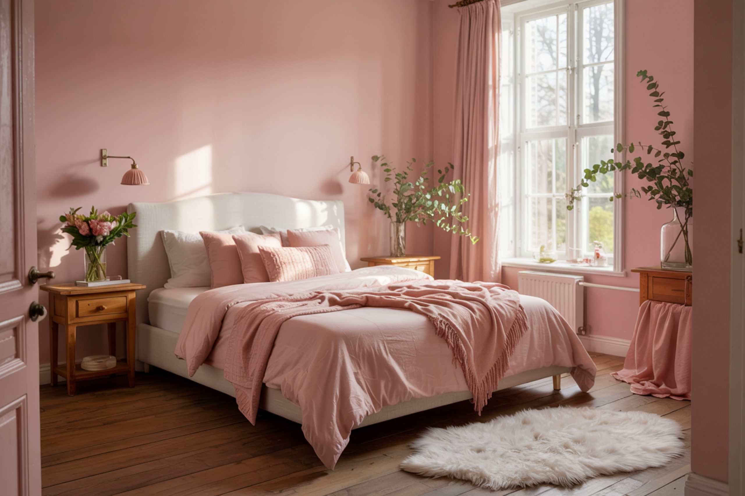
A Quick Note Before You Choose
If there’s one thing I’ve learned from working in so many homes, it’s this: pink isn’t just a color — it’s a feeling. It can make a room feel soft, happy, hopeful, calm, or bold. And no, it’s not just for little girls’ rooms.
When picking the right pink, here’s what I tell my clients:
- Test in different light. Morning and evening light change everything. Always try samples first.
- Pay attention to undertones. Some pinks lean peachy, others go blue or even gray.
- Don’t be afraid to go bolder. Sometimes, a stronger pink actually balances better with furniture and finishes.
According to Statista, the market for interior paint is growing every year, and soft shades like blush and rose are consistently ranking in the top trending colors worldwide (source). That tells me one thing: people are craving comfort. And pink delivers that.
So whether it’s a whisper or a statement, there’s a pink out there that can make your home feel more you.
Want help picking the right one for your space? I’ve seen how one small color shift can change the whole feeling of a room — and I’m always here to help.
via housekeepingbay.com
What I Always Tell My Clients About Pink
Choosing paint feels like a small thing — until you’re standing in front of 100 shades of pink wondering what’s too much and what’s not enough. I’ve been there with so many families, couples, and even first-time homeowners. And here’s the truth
Pink is personal.
It can feel comforting, playful, modern, vintage, or just plain happy. Some of us need softness. Some of us need a little brightness. And pink gives you both, depending on the one you choose.
If you’re still unsure where to start:
- Go lighter than you think if it’s a whole room. It always looks deeper once it’s on four walls.
- Accent walls are your friend. Want to test a bold pink? Try it behind the bed or in a powder room.
- Don’t skip the sample swatches. Always paint a little patch on your wall and check it during different times of day.
And if all else fails?
Pick the one that makes you smile. That’s the color that belongs in your home.
Thanks for reading — now go find your pink 💗
via housekeepingbay.com
