Tangerine Zing 132 by Benjamin Moore
Brighten Your World with This Vibrant Hue
Tangerine Zing isn’t just a pretty face; it’s also designed to last and resist fading, ensuring that your walls look freshly painted for years to come. Whether you’re planning to update your living room, kitchen, or a small nook, this color will bring a sense of warmth and energy to your space.
Plus, it pairs beautifully with a wide range of decor styles, from modern minimalism to rustic farmhouse.If you’re unsure how to use such a bold color, I’ll give you tips on finding the right accents and complementary colors. Matching Tangerine Zing with neutral shades or cool blues can create a balanced and appealing palette.
This way, you can enjoy a lively yet harmonious atmosphere in your home.
via benjaminmoore.com
What Color Is Tangerine Zing 132 by Benjamin Moore?
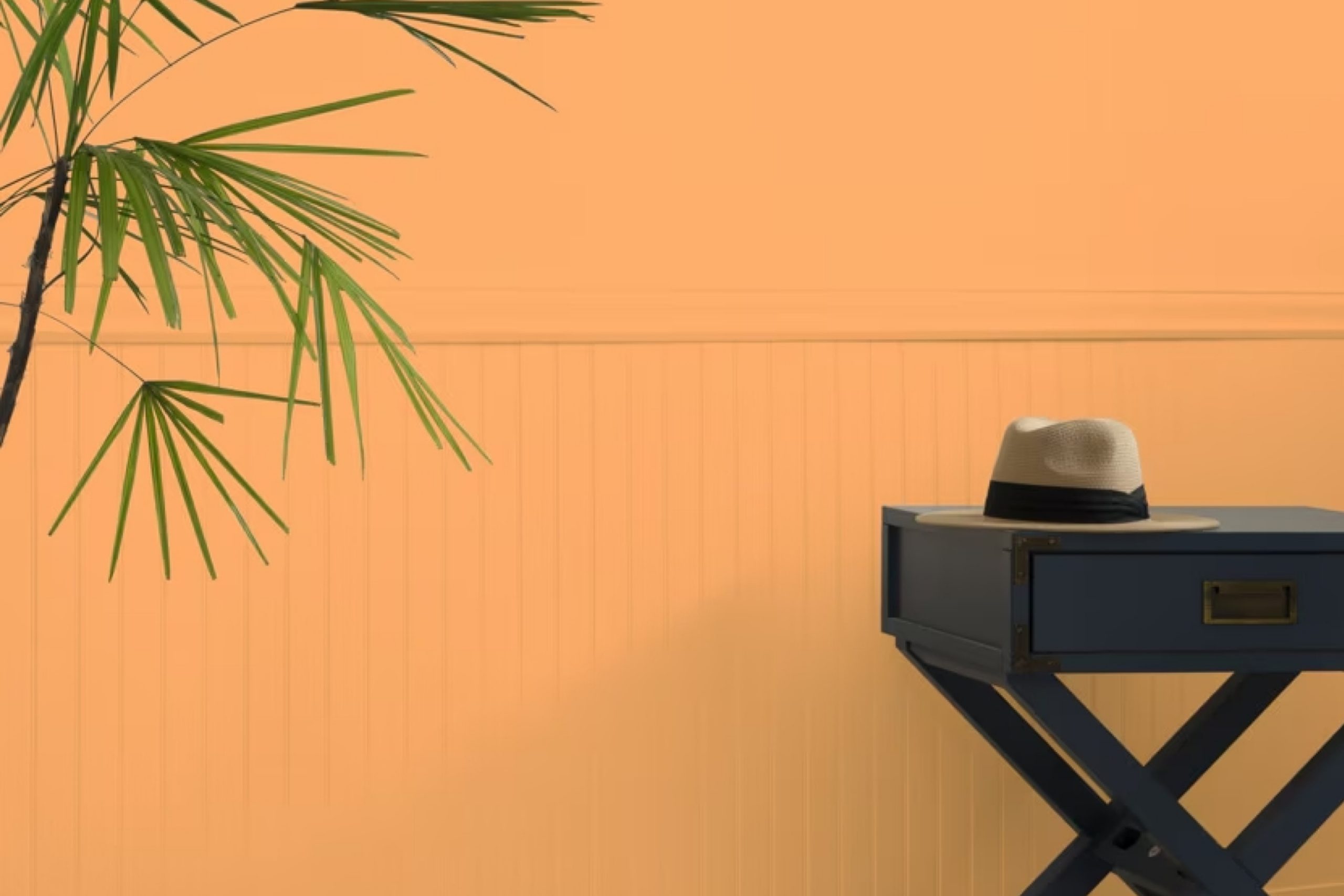
The color “Tangerine Zing 132” by Benjamin Moore is a vibrant, playful shade of orange that adds a lively pop to any room. This warm, inviting hue is reminiscent of a cheery tangerine fruit, making it perfect for creating a cozy yet energetic atmosphere.
It works exceptionally well in rooms that benefit from a burst of color, such as kitchens, dining areas, or playrooms. Its brightness can also energize entryways or add a focal point to a neutral living space.
When it comes to interior styles, Tangerine Zing 132 puts a fresh twist on modern, eclectic, and even retro designs. It pairs beautifully with clean white or cool gray to maintain a balanced, modern look, or with teal and navy for a more dynamic and playful space. In terms of materials and textures, this shade goes well with natural wood, which can soften its intensity and add warmth to the space.
Textiles like linen or cotton in neutral tones help create a relaxed environment, while metallic accents in copper or gold can enhance the color’s inherent warmth. Smooth, matte finishes on walls allow Tangerine Zing 132 to stand out, making it a bold choice for anyone looking to infuse their home with personality and zest.
housekeepingbay.com
Is Tangerine Zing 132 by Benjamin Moore Warm or Cool color?
Tangerine Zing132 by Benjamin Moore is a vibrant, bold color that instantly infuses any space with energy. This particular shade of orange has a playful yet sophisticated vibe, making it a great choice for those looking to add a pop of brightness in their home. Its lively hue can rejuvenate a room, whether it’s painted on an accent wall or used in smaller decorative touches like cushions or vases.
Applying Tangerine Zing132 in living areas or kitchens can make the spaces feel more inviting and cheerful, as the color is warm and welcoming. It’s especially effective in spaces that receive plenty of natural light, where the sunlight can enhance the intensity and warmth of the color.
However, because it is such a strong color, it’s important to balance Tangerine Zing132 with neutral tones like whites, grays, or soft browns. This balance helps to ensure that the orange doesn’t overwhelm the space but rather serves as an energizing focal point. Perfect for homeowners seeking to add a lively and refreshing touch to their decor.
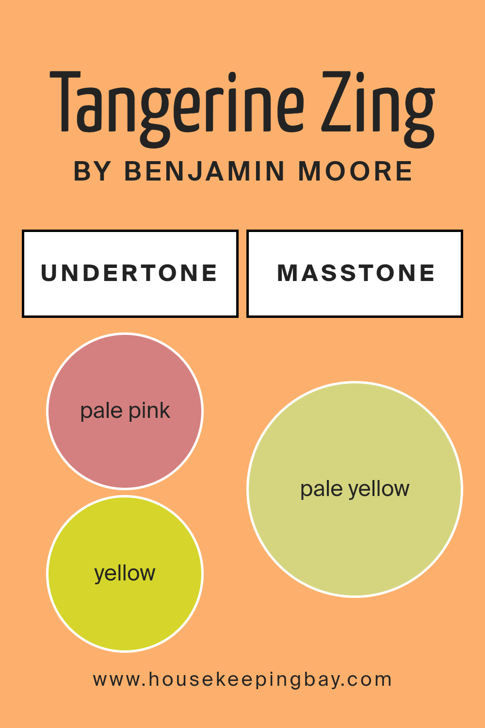
What is the Masstone of the Tangerine Zing 132 by Benjamin Moore?
Tangerine Zing132 by Benjamin Moore has a masstone of pale yellow, specifically marked by the color code #D5D580. This soft and subtle shade holds a gentle vibe that introduces a calm and cheerful atmosphere into any room.
Its lightness can make spaces appear larger and more open, which is excellent for smaller rooms or areas lacking natural lighting. The pale yellow hue works beautifully in various settings because it pairs easily with other colors, whether pastels or more dynamic shades.
It’s especially useful in living areas and kitchens where a welcoming, warm environment is desired. In bedrooms, it can help create a serene setting conducive to relaxation. Furthermore, the neutrality and softness of pale yellow mean it won’t overwhelm your space, but rather complement existing decor and furniture, making it a versatile choice for many homes.

housekeepingbay.com
Undertones of Tangerine Zing 132 by Benjamin Moore
Tangerine Zing132 by Benjamin Moore is a vibrant color that can invigorate any space with its lively hue. However, what makes this color particularly special is its complex blend of undertones. Understanding the role of undertones in Tangerine Zing132 can greatly affect how it appears in different settings and lighting conditions.
Undertones are subtle colors that lurk beneath the surface of the main color. They can shift the perception of the color depending on the lighting and surrounding elements. For Tangerine Zing132, the undertones are varied, including pale pink, yellow, orange, light gray, light purple, mint, grey, light green, olive, light blue, and lilac.
This wide range of undertones can make the color appear softer in dim light, or more vibrant under bright light. When applied to interior walls, Tangerine Zing132’s pale pink and orange undertones create a warm and welcoming feel, adding a soft glow to the room.
The yellow undertone adds brightness, making the space feel more alive. Contrasting undertones like light gray and olive can tone down the intensity, allowing the color to blend more harmoniously with different decor styles and color schemes.
Additionally, the light blue and mint undertones offer a subtle coolness that can balance the warmth of Tangerine Zing132, making it versatile for various rooms, whether it’s a sunny kitchen or a cozy bedroom. This balance ensures that the color maintains its beauty and depth, reflecting various moods and atmospheres throughout the day.
housekeepingbay.com
Coordinating Colors of Tangerine Zing 132 by Benjamin Moore
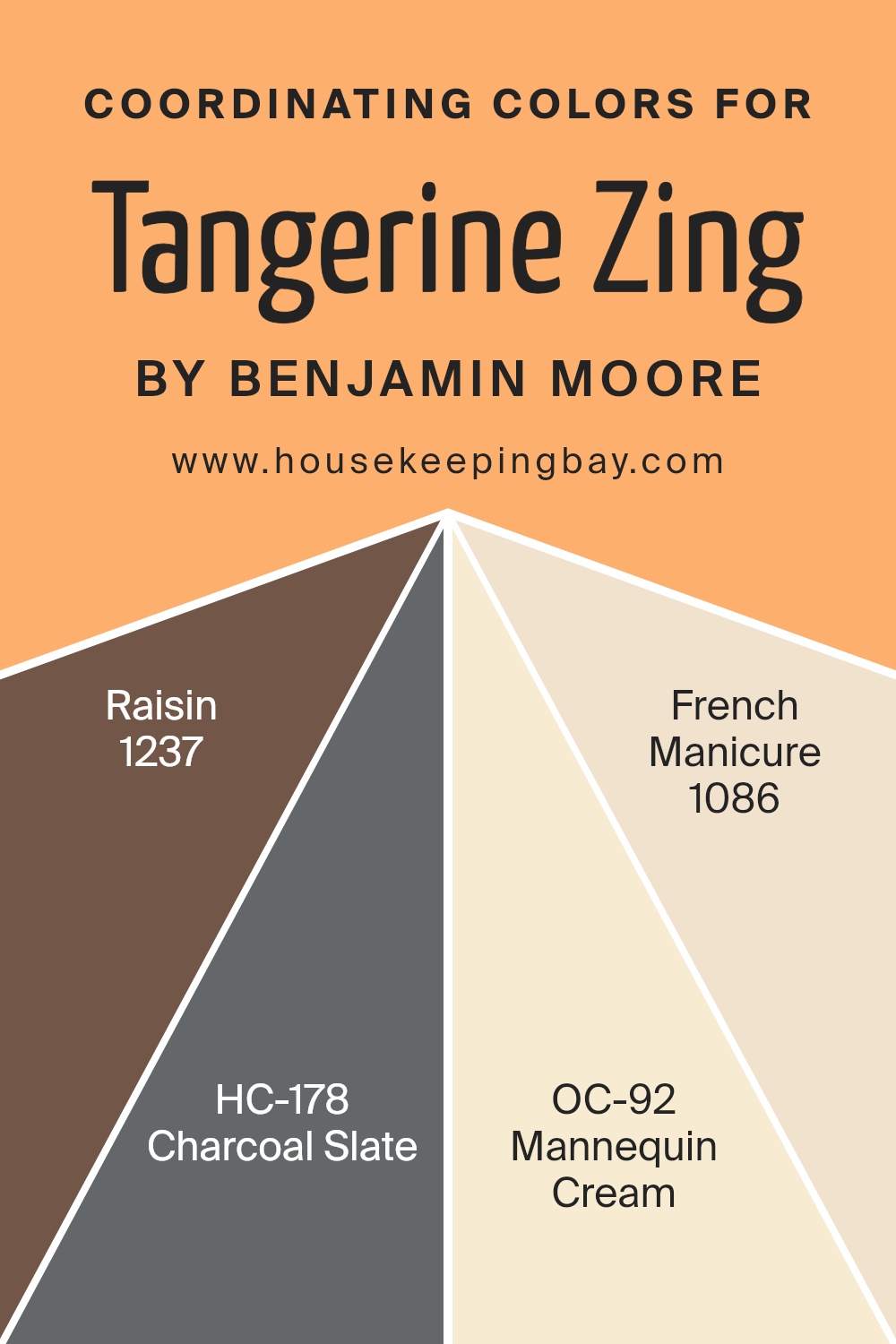
Coordinating colors are selected to complement each other while bringing balance and harmony to a space. When setting up a color scheme around Tangerine Zing 132 by Benjamin Moore, a vibrant orange shade, it’s crucial to pick hues that can subtly enhance it without overpowering the brightness and energy it exudes. Colors such as 1237 – Raisin, HC-178 – Charcoal Slate, OC-92 – Mannequin Cream, and 1086 – French Manicure serve as perfect partners in creating an inviting and well-rounded palette.
1237 – Raisin is a deep, rich purple that adds a touch of sophistication and depth to rooms when combined with Tangerine Zing. It provides a good contrast that allows both colors to stand out.
HC-178 – Charcoal Slate, on the other hand, is a dark, almost black shade of gray that offers a grounding effect, ensuring that the vibrant orange does not overwhelm the senses. OC-92 – Mannequin Cream is a soft, warm beige that acts as a neutral backdrop, making it an excellent choice for walls, allowing more vivid colors like Tangerine Zing to pop.
Lastly, 1086 – French Manicure is a pale, subtle pink that lends a gentle, soothing feel to the space, working well with the warmth of Tangerine Zing to create a cozy atmosphere. Together, these coordinating colors offer a balanced environment, ensuring each hue has its moment to shine.
You can see recommended paint colors below:
- 1237 Raisin
- HC-178 Charcoal Slate
- OC-92 Mannequin Cream
- 1086 French Manicure
housekeepingbay.com
How Does Lighting Affect Tangerine Zing 132 by Benjamin Moore?
Lighting plays a crucial role in how we perceive color because it can alter the appearance and mood of any paint, like Tangerine Zing 132 by Benjamin Moore. This vibrant shade of orange depends significantly on the lighting conditions to reveal its true character.
In artificial light, such as LED or incandescent bulbs, Tangerine Zing 132 displays a warm, cozy glow. This is because artificial lighting tends to enhance warm hues, making spaces feel welcoming. Under fluorescent lights, however, this color might appear slightly more washed out due to the cooler tone of the light, which can slightly dull the vibrancy of warmer colors.
Under natural light, Tangerine Zing 132 behaves quite differently throughout the day. Natural light is generally the best to showcase this lively orange as it reveals the color’s true brightness and depth. During sunrise and sunset, when the sun casts a golden hue, Tangerine Zing 132 looks exceptionally vibrant and warm.
The orientation of a room also affects how Tangerine Zing 132 is perceived:
- – North-faced rooms: These rooms get less direct sunlight, which can make Tangerine Zing 132 look a bit more subdued and less intense. It may require additional lighting to bring out its warmth.
- – South-faced rooms: With ample sunlight, south-facing rooms highlight the bright and cheerful aspect of Tangerine Zing 132, making it look exceptionally vivid and dynamic.
- – East-faced rooms: Morning light can make Tangerine Zing 132 look bright and fresh. As the light changes, the color will gradually shift and appear softer in the later part of the day.
- – West-faced rooms: Evening light brings out the depth and warmth in Tangerine Zing 132, often enhancing its cozy, inviting quality.
In summary, the mood and effectiveness of Tangerine Zing 132 by Benjamin Moore depend greatly on both the type of light and room orientation, influencing how this bold color is ultimately perceived and enjoyed.
housekeepingbay.com
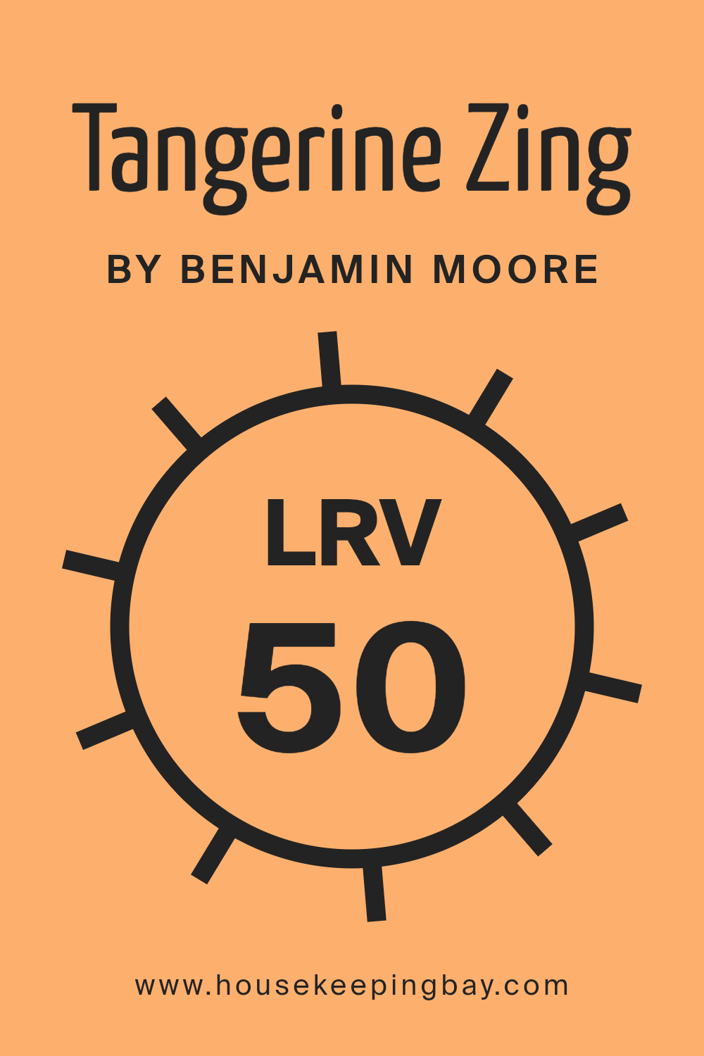
What is the LRV of Tangerine Zing 132 by Benjamin Moore?
LRV stands for Light Reflectance Value, a measurement that shows the percentage of light a paint color reflects from or absorbs into a painted surface. An LRV scale runs from 0, which is totally black and absorbs all light, to 100, perfectly white and reflects all light. This value helps determine how light or dark a color will appear once applied to your walls.
When choosing paint, considering its LRV is crucial as it affects the brightness of the room. Higher LRV values make rooms appear lighter and can make small spaces seem larger, while lower values can make rooms feel cozier but possibly darker.
The LRV of Tangerine Zing (132) by Benjamin Moore is 50.43, placing it in the mid-range of light reflectance. This specific LRV implies that Tangerine Zing is a balanced choice, neither too dark nor overwhelmingly bright.
It’s versatile, reflecting a moderate amount of light, which helps maintain the color’s true vibrancy without the risk of it becoming too overpowering or fading into the background. In well-lit spaces, this LRV ensures that Tangerine Zing remains lively and dynamic, making it an excellent choice for adding a warm, energetic feel to any room.
housekeepingbay.com
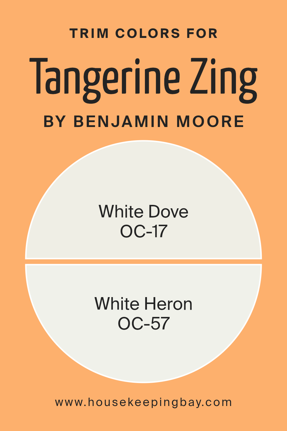
What are the Trim colors of Tangerine Zing 132 by Benjamin Moore?
Trim colors are specific shades used to accentuate or define the edges and transitions between walls and architectural features such as doors, window frames, and baseboards. When selecting a trim color, the goal is often to complement the primary wall color, enhancing the overall aesthetic and cohesion of a space.
For a vibrant wall color like Tangerine Zing132 by Benjamin Moore, choosing a neutral trim color can effectively balance the brightness while providing a clean, refined look. Colors like OC-17 White Dove and OC-57 White Heron are popular choices that can pair well with more intense hues, ensuring that the bold wall color stands out without overwhelming the senses.
OC-17 White Dove is a soft, warm white that offers a subtle hint of creaminess, making it an excellent choice for providing a gentle contrast without competing with the vividness of Tangerine Zing132. It creates a soothing boundary that can make the tangerine appear even more vibrant.
On the other hand, OC-57 White Heron presents a crisper and slightly cooler tone, delivering a sharper distinction against warmer colors. This color is especially helpful in modern spaces where a clean, precise appearance is desired, helping to make the area look more open and airy.
You can see recommended paint colors below:
- OC-17 White Dove
- OC-57 White Heron
housekeepingbay.com
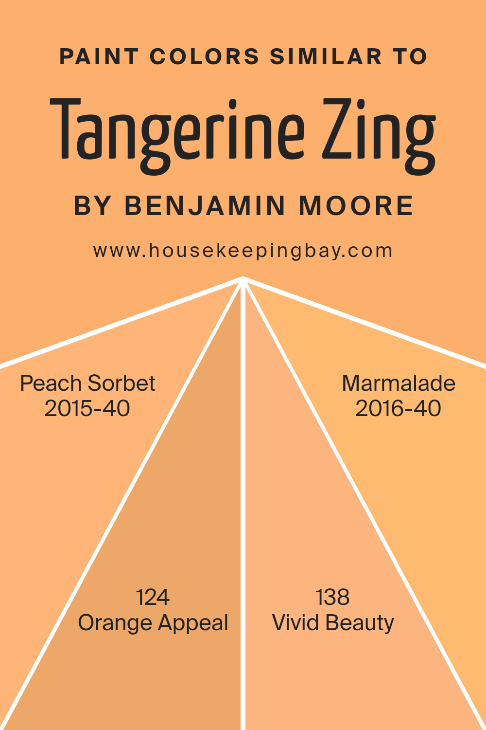
Colors Similar to Tangerine Zing 132 by Benjamin Moore
Similar colors are key in creating harmonious color schemes that have a pleasing effect to the eye. Colors close in shade to each other, such as the Tangerine Zing and its relatives including Peach Sorbet, Orange Appeal, Vivid Beauty, and Marmalade by Benjamin Moore, offer a seamless visual experience.
They allow for variations in decor without overwhelming the space with too much contrast. By using colors that are alike, you set a tone that is coherent yet flexible, providing a balanced backdrop that can shift slightly with different undertones or intensities.
Peach Sorbet is a soft, warm hue reminiscent of a sweet summer dessert. It lightens the atmosphere of a room without forgoing the comfort of a subtle color. Orange Appeal, however, brings a zestier, brighter look that is lively and inviting.
Vivid Beauty is named aptly as it offers a striking, bold orange that brings energy to a space. Lastly, Marmalade is a deep, rich color that resembles the citrus fruit preserve, providing a cozy, comforting feel that works well in a variety of spaces. Together, these colors present a rich palette that allows for creative freedom while maintaining aesthetic unity.
You can see recommended paint colors below:
- 2015-40 Peach Sorbet
- 124 Orange Appeal
- 138 Vivid Beauty
- 2016-40 Marmalade
housekeepingbay.com
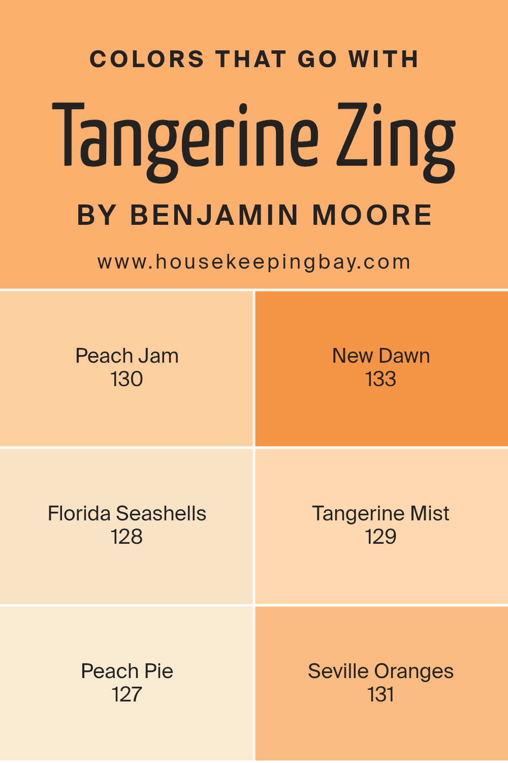
Colors that Go With Tangerine Zing 132 by Benjamin Moore
Choosing the right colors that complement Tangerine Zing 132 by Benjamin Moore is crucial as it ensures a harmonious and pleasing palette for any room. When paired correctly, these colors enhance the vibrant hue of Tangerine Zing, creating a balanced and inviting space.
For instance, Peach Jam 130 offers a soft contrast with its muted peach tone, making it ideal for a gentle backdrop that allows Tangerine Zing to stand out. New Dawn 133 lends a subtle freshness with its light and airy feel, perfect for adding a sense of calm to balance the vivacity of Tangerine Zing.
Florida Seashells 128 brings in a hint of sandy beige, which complements the orange tones of Tangerine Zing without overwhelming the space, providing a neutral ground that ties the vibrant and soft elements together. Tangerine Mist 129, sharing a similar citrus inspiration, works seamlessly with Tangerine Zing, reinforcing the zest of the room with its lighter orange shade.
Meanwhile, Peach Pie 127 has a creamy, soothing presence that pairs beautifully alongside the more intense Tangerine Zing, softening the overall look. Seville Oranges 131 rounds out the selection with its deep, rich citrus shade, adding depth and warmth to the scheme, ensuring the room feels cozy and well-coordinated.
You can see recommended paint colors below:
- 130 Peach Jam
- 133 New Dawn
- 128 Florida Seashells
- 129 Tangerine Mist
- 127 Peach Pie
- 131 Seville Oranges
housekeepingbay.com
How to Use Tangerine Zing 132 by Benjamin Moore In Your Home?
Tangerine Zing 132 by Benjamin Moore is a vibrant, energetic orange paint that adds a cheerful touch to any space. This lively color is perfect for those who want to add a splash of brightness and vitality to their home. It works well in areas like the kitchen or a playroom where high energy and happiness are key elements.
When used in small rooms or accent walls, Tangerine Zing can create a focal point without overwhelming the space. Pairing it with neutral tones such as white or gray can balance its intensity, while cool blues can offer a pleasing contrast. For a modern twist, you can also mix it with metallic accessories or cool-toned greens for a fresh look.
This color is ideal for DIY projects like painting furniture or doors, offering a quick and budget-friendly way to refresh your surroundings. Tangerine Zing 132 can indeed make any room feel more alive and inviting, perfect for those looking to brighten up their home with simple touches.
Tangerine Zing 132 by Benjamin Moore vs Vivid Beauty 138 by Benjamin Moore
Tangerine Zing 132 by Benjamin Moore is a vibrant, energetic orange that adds a lively touch to any space. It’s ideal for creating a focal point in a room or adding a burst of cheerfulness. This color works well in areas like kitchens or playrooms, where you want a fun, inviting atmosphere.
In contrast, Vivid Beauty 138 by Benjamin Moore is a softer, more subdued orange. It maintains some brightness but with a gentler approach, suited to creating a warm, cozy feel. It is perfect for living rooms or bedrooms where a more relaxed environment is desired.
Both colors are eye-catching in their own ways. Tangerine Zing is bold and can energize a space, while Vivid Beauty offers warmth and a soothing ambiance. Depending on the mood you’re aiming to achieve, each has its appeal for different settings and preferences.
You can see recommended paint color below:
- 138 Vivid Beauty
housekeepingbay.com
Tangerine Zing 132 by Benjamin Moore vs Orange Appeal 124 by Benjamin Moore
Tangerine Zing 132 by Benjamin Moore is a vibrant, energetic orange that packs a real punch. It’s the kind of color that brightens up a space and brings a lively ambiance to any room. This shade is great if you’re looking to add a cheerful pop to your decor.
In contrast, Orange Appeal 124 by Benjamin Moore is a softer, more subdued orange. It offers warmth without being too bold, making it an excellent choice for those seeking a more relaxed feel in their space. This color has a comforting quality that can make a room feel cozy and inviting.
Both Tangerine Zing and Orange Appeal offer distinctive vibes—Tangerine Zing is more about vibrancy and energy, while Orange Appeal leans towards a soothing and warm atmosphere. Choosing between them depends on the mood you want to create in your space.
You can see recommended paint color below:
- 124 Orange Appeal
housekeepingbay.com
Tangerine Zing 132 by Benjamin Moore vs Peach Sorbet 2015-40 by Benjamin Moore
Tangerine Zing 132 and Peach Sorbet 2015-40 by Benjamin Moore are both warm, inviting colors, but they have distinct tones. Tangerine Zing is a vibrant, energetic orange with a bold presence that can brighten and energize a space. Its lively hue is perfect for areas where you want to add cheer and stimulation, like a kitchen or a playroom.
Peach Sorbet, meanwhile, is a softer, more subtle color. It leans more towards a gentle peach shade that creates a soothing effect, making it ideal for spaces where a calm and peaceful atmosphere is desired, such as bedrooms or bathrooms. Its understated warmth is versatile and can blend well with other softer hues to create a cozy feel.
Both colors can add warmth to a room, but Tangerine Zing does so with more intensity, while Peach Sorbet offers a quieter, more delicate charm. Each can be used effectively depending on the mood and function you wish to achieve in your space.
You can see recommended paint color below:
- 2015-40 Peach Sorbet
housekeepingbay.com
Tangerine Zing 132 by Benjamin Moore vs Marmalade 2016-40 by Benjamin Moore
Tangerine Zing 132 by Benjamin Moore is a lively and vibrant orange with a fresh, zesty vibe. Its bright tone injects energy into any space, making it a great choice for areas where you want to create a cheerful and inviting atmosphere. The color is particularly effective in spaces like kitchens and playrooms, where its vivacity enhances the lively setting.
Marmalade 2016-40, also by Benjamin Moore, shares the same orange family but leans towards a deeper, richer hue. This warmth makes Marmalade a cozy and comforting color, ideal for living rooms or dining areas where warmth and relaxation are key.
The depth of Marmalade provides a sophisticated backdrop that complements wood finishes and earthy decor elements nicely. While both colors share a base orange tone, Tangerine Zing is lighter and more electric, promoting a sense of energy. In contrast, Marmalade offers a more subdued warmth, perfect for a relaxing and warm environment. Choosing between them depends on the mood and function of the room you are decorating.
You can see recommended paint color below:
- 2016-40 Marmalade
housekeepingbay.com
In summary, the lively hue of 132 Tangerine Zing by Benjamin Moore is more than just a paint color. It invites warmth and energy into any space, making it ideal for anyone looking to inject a sense of vibrancy into their surroundings.
Its invigorating shade is perfect for creating focal points in rooms that crave a touch of cheerfulness. Whether applied to an accent wall, a piece of furniture, or an entire room, 132 Tangerine Zing stands out with its boldness while still maintaining a welcoming atmosphere.
From my experience, this color works exceptionally well in spaces that benefit from natural light, which enhances its dynamic yet cozy glow. Practical in both residential and commercial settings, it pairs splendidly with neutral tones, deep blues, and grays, which help balance its intensity. This versatility makes it suitable for various design styles, from modern to rustic. Using 132 Tangerine Zing not only revitalizes the look of a space but also impacts mood and creativity, making it a top choice for anyone looking to refresh their environment.
Whether one loves art, seeks inspiration, or simply wants a cheerful space, this color promises not just a visual upgrade but also an emotional lift. For those ready to breathe new life into their surroundings, 132 Tangerine Zing by Benjamin Moore comes highly recommended as a vibrant, spirited option.
housekeepingbay.com
Ever wished paint sampling was as easy as sticking a sticker? Guess what? Now it is! Discover Samplize's unique Peel & Stick samples. Get started now and say goodbye to the old messy way!
Get paint samples


