Stained Glass CSP-685 by Benjamin Moore
Illuminating Spaces with Vibrant Hues
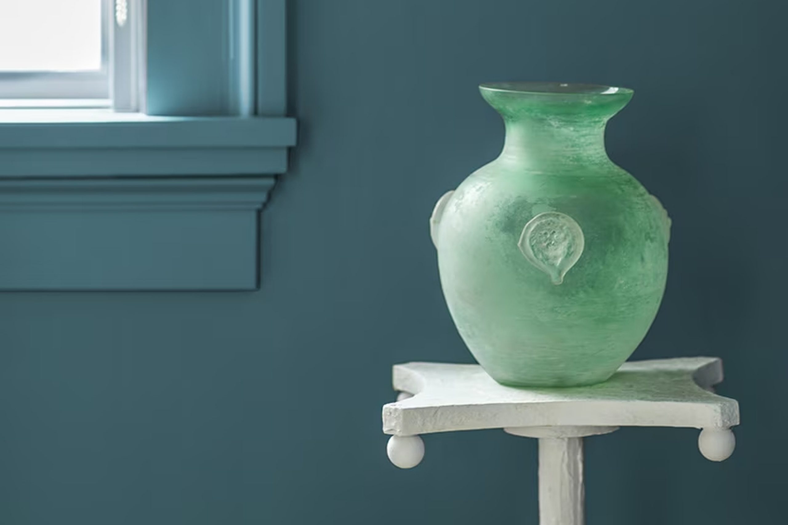
When you’re looking to refresh a room with a sense of calm and timeless elegance, CSP-685 Stained Glass by Benjamin Moore is a fantastic choice. This paint color is inspired by the serene hues found in church windows and the subtle shadows they cast.
Its rich, deep tone provides a soothing presence, making it ideal for spaces where you want to unwind or focus. Whether you’re painting a bedroom, bathroom, or a cozy reading nook, Stained Glass offers a unique beauty that enhances the space’s aesthetic while keeping things grounded and peaceful.
Moreover, the versatility of CSP-685 Stained Glass allows you to complement various decors, from modern to traditional, without overwhelming the senses. It pairs well with light, airy fabrics, and natural materials like wood and stone, creating an inviting atmosphere. You’ll appreciate how this color maintains its charm under different lighting conditions, reflecting subtle changes throughout the day.
So, if you’re looking for a paint color that adds a refined touch and a peaceful ambiance to your room, consider Benjamin Moore’s CSP-685 Stained Glass. It’s an excellent way to add a special element to your home that feels both personal and universally appealing.
via benjaminmoore.com
What Color Is Stained Glass CSP-685 by Benjamin Moore?
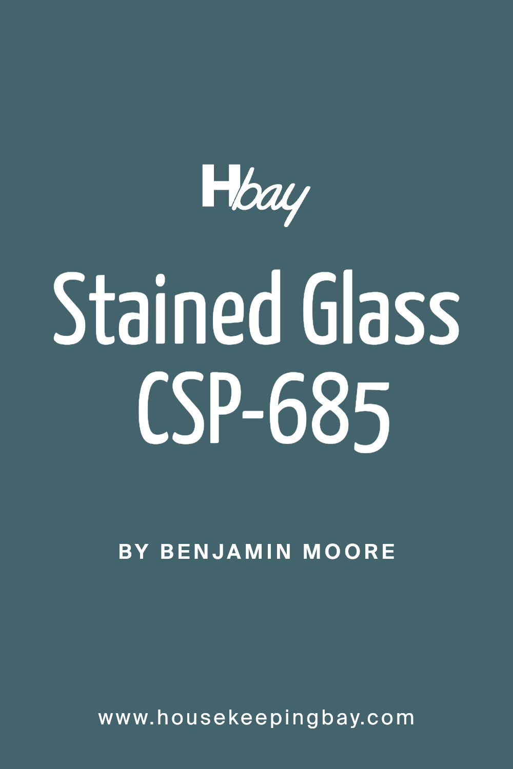
Stained Glass CSP-685 by Benjamin Moore is a deep, soothing blue with hints of teal, evoking the serenity and richness of actual stained glass. This color brings a calming but sophisticated tone to any room, making it ideal for spaces where you want a touch of elegance without overwhelming brightness.
In terms of interior styles, Stained Glass works exceptionally well in coastal, contemporary, and modern settings due to its cool and fresh undertone. It’s an excellent choice for living rooms and bedrooms where a peaceful atmosphere is desired. Additionally, it is versatile enough for bathrooms and kitchens when paired with the right accents.
When it comes to materials and textures, Stained Glass pairs beautifully with natural wood, adding warmth to the coolness of the blue. Lighter woods like oak and maple enhance its serene quality, while darker woods like walnut add a striking contrast. Metallic finishes like brushed nickel or muted gold bring a chic touch to this color. For textiles, think about incorporating velvety textures or smooth linens that reflect its refined aesthetic.
This color also works well with marble or granite, adding an air of luxury to the space. Combining Stained Glass with complementary colors like soft grays or vibrant whites can create a balanced and visually harmonious environment.
housekeepingbay.com
Is Stained Glass CSP-685 by Benjamin Moore Warm or Cool color?
Stained Glass CSP-685 by Benjamin Moore is a rich, deep teal shade that adds a touch of sophistication and depth to any room. This color pairs beautifully with both light and dark furniture, allowing for versatile design choices.
In a living room, it can create a cozy, inviting atmosphere, while in a bedroom, it might add a serene, calm feeling. The versatility of Stained Glass means it works well in various spaces, from modern to traditional.
Because of its bold nature, it can also serve as an excellent accent color. For instance, using it on a single wall can make it the focal point of the room, while other walls might be painted a lighter color to keep the space feeling open and airy. Additionally, in spaces with ample natural light, Stained Glass can appear vibrant and dynamic, changing subtly with the day’s light levels.
Whether used in large quantities or small touches, Stained Glass CSP-685 brings a unique, personal flair to homes, making it a popular choice for those looking to add character and style to their interiors.
What is the Masstone of the Stained Glass CSP-685 by Benjamin Moore?
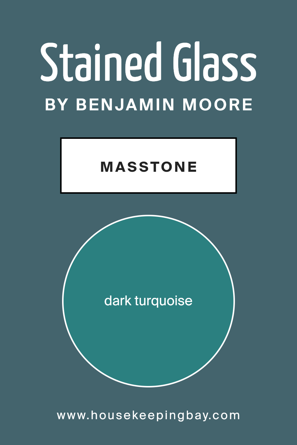
Stained Glass CSP-685 by Benjamin Moore is a rich, dark turquoise, a unique shade that adds a sophisticated flair to any home. Its masstone, registering a deep blend that resembles the color of ocean depths or dense, lush foliage, offers a soothing effect in interior spaces.
This color works marvelously in homes for several reasons. Firstly, its vibrant yet calming hue makes it an ideal choice for creating a relaxing atmosphere in areas like bedrooms or bathrooms. Secondly, given its darker tone, Stained Glass can serve as a dramatic backdrop, helping furniture and artwork in lighter colors stand out beautifully.
It’s also versatile, complementing both modern and traditional decor seamlessly. Using this color can instantly inject a sense of serene elegance into any room, making spaces feel more cozy and inviting. It’s perfect for those looking to add a touch of sophistication without overwhelming a space visually.
housekeepingbay.com
Undertones of Stained Glass CSP-685 by Benjamin Moore
Stained Glass CSP-685 by Benjamin Moore is a complex color that adds depth to any room thanks to its rich undertones. Undertones are subtle colors that influence the main hue and can change how it appears under different lighting conditions. For example, if a paint color has green or blue undertones, it might look more vibrant in bright sunlight but could appear darker or more subdued in artificial light.
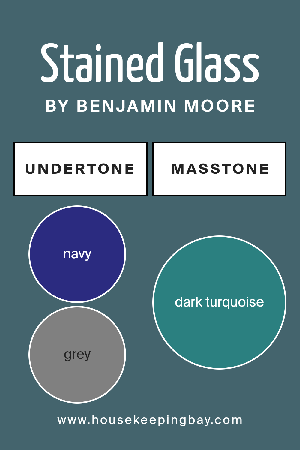
In the case of Stained Glass CSP-685, its main undertones include navy, grey, dark green, purple, and several other colors like brown, olive, and various shades of blue and green. This mix makes the color versatile and dynamic, allowing it to interact interestingly with both natural and artificial light.
On interior walls, these undertones contribute significantly to the ambiance of a room. The navy and dark green can make the space feel more grounded and calm, perfect for creating a relaxing atmosphere. Purple and grey offer a touch of sophistication, potentially making a room feel more luxurious and thoughtfully designed.
Because of the variety in its undertones, Stained Glass CSP-685 can easily complement different decor styles and preferences, adapting to light changes throughout the day. This paint color is particularly effective in spaces where mood and atmosphere are important, such as bedrooms or reading nooks.
Additionally, the color works well with a wide range of furniture wood tones and metallic finishes, providing flexibility in design choices.
housekeepingbay.com
Coordinating Colors of Stained Glass CSP-685 by Benjamin Moore
Coordinating colors are shades that complement each other and create a harmonious look when used together in a space. These colors either contrast to bring out each other’s intensity or blend smoothly to produce a subtle, pleasing effect.
When choosing coordinating colors, one should consider how they will interact within the intended environment, impacting mood and style. A well-coordinated color scheme will balance color relationships and add visual interest to a room without overwhelming it.
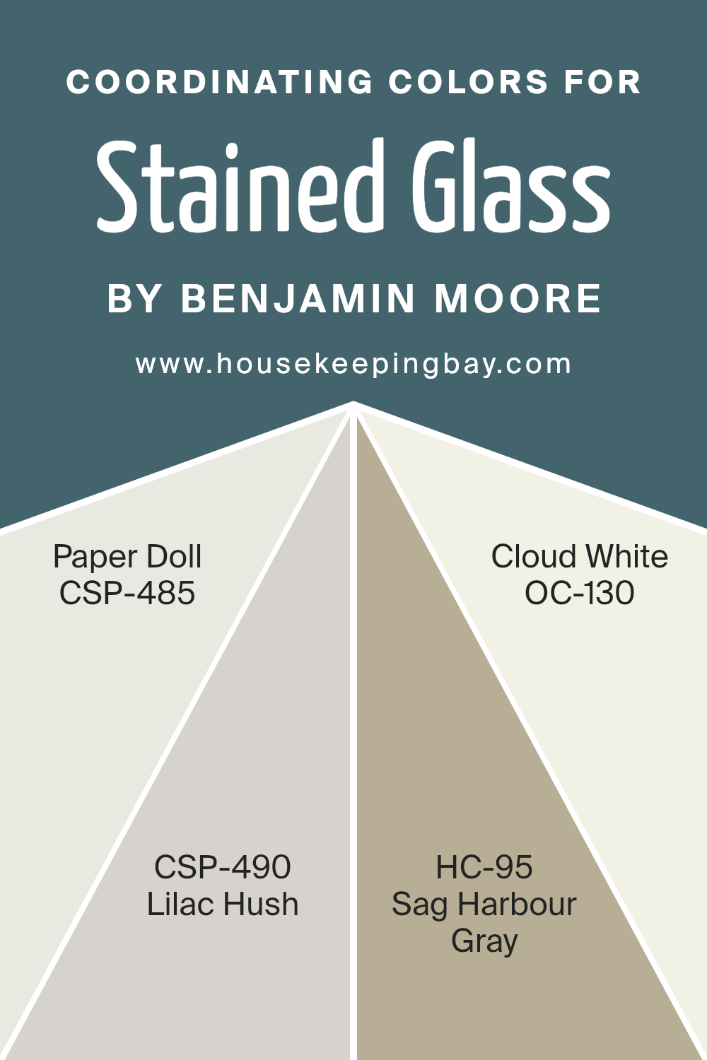
One effective pairing method involves using Stained Glass CSP-685 by Benjamin Moore with other carefully selected shades such as Paper Doll CSP-485, a soft, muted pink that offers a gentle pop of color, perfect for creating a soft, soothing atmosphere.
Lilac Hush CSP-490 adds a dash of subtle elegance with its understated purple tone, excellent for a touch of sophistication in a serene setting. Sag Harbour Gray HC-95 is a versatile mid-toned gray that serves as a sturdy ground for brighter or lighter shades to shine.
Finally, Cloud White OC-130 provides a clean and fresh backdrop, making other colors stand out beautifully while keeping the space light and airy. Together, these colors support each other ideally, enhancing the overall aesthetic appeal and character of a room.
You can see recommended paint colors below:
- CSP-485 Paper Doll
- CSP-490 Lilac Hush
- HC-95 Sag Harbour Gray
- OC-130 Cloud White
housekeepingbay.com
How Does Lighting Affect Stained Glass CSP-685 by Benjamin Moore?
Lighting significantly impacts how colors appear, as it can alter the perceived shade, intensity, and mood. Understanding this is important when selecting paint, such as Stained Glass CSP-685 by Benjamin Moore, for different rooms in a home.
In artificial light, Stained Glass CSP-685’s true character can shift based on the type of bulb used. Incandescent bulbs, which emit a warmer light, will enhance the warm undertones of this color, making it appear more vibrant and rich. On the other hand, fluorescent lighting tends to cast a cooler glow, making this color appear slightly bluish and muted.
Under natural light, Stained Glass CSP-685 will vary depending on the time of day. Morning light, which is cooler, might make the color look more subdued and cooler. In contrast, during the late afternoon when the light is warmer and golden, this same color can look more dynamic and vivid.
The orientation of the room affects how natural light influences color perception. North-faced rooms receive less direct sunlight, which tends to make colors like Stained Glass CSP-685 look cooler and slightly darker. The cooler, indirect light can make the room feel calm but can also make dark colors dominate.
In south-faced rooms, abundant direct light can make Stained Glass CSP-685 appear lighter and more lively, as the intense sunlight enhances its warmer undertones. This exposure is ideal for revealing the depth and richness of deeper colors.
East-faced rooms get plenty of morning light. Here, Stained Glass CSP-685 will look quite vibrant in the morning but might lose some of its intensity as the day progresses and the lighting becomes less direct.
Likewise, in west-faced rooms, the color will appear softer during the morning and become more intense and warmer in the afternoon as the sun sets.
Adjusting lighting conditions or choosing different bulbs can help manage how Stained Glass CSP-685 is perceived in each setting, ensuring it fits the desired aesthetic of each room.
housekeepingbay.com
What is the LRV of Stained Glass CSP-685 by Benjamin Moore?
LRV stands for Light Reflectance Value, which measures the percentage of light a paint color reflects from its surface. It ranges from 0% to 100%, with 0% being completely black and 100% being pure white. LRV is crucial because it affects how light or dark a color looks on your walls depending on how much natural or artificial light your room has.
Higher LRV colors can make a room feel brighter and more open, as they reflect more light around the space. On the other hand, colors with lower LRV can make a room feel cozier and more enclosed because they absorb more light.
The color Stained Glass CSP-685 by Benjamin Moore has an LRV of 13.15, which is fairly low. This means it will absorb a significant amount of light rather than reflecting it. This characteristic can be used to create a moodier, more intimate atmosphere in a space.
However, if used in a room with limited natural light, it might make the space appear darker and smaller. It’s ideal for larger rooms or areas with good lighting where its deep tone can come to life without making the space feel too cramped or gloomy.

housekeepingbay.com
What are the Trim colors of Stained Glass CSP-685 by Benjamin Moore?
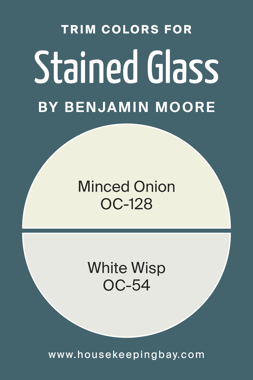
Trim colors, such as those often seen in architectural features and accents, play a crucial role in framing and highlighting the main colors used in a design or decor scheme. In the context of Stained Glass CSP-685 by Benjamin Moore, using specific trim colors like OC-128 – Minced Onion and OC-54 – White Wisp can help in enhancing the beauty and clarity of the main shade.
These trim colors add contrast or continuity, depending on their hue and brightness, providing an eye-catching boundary and complex interplay with the core paint color, which can enhance the overall aesthetic appeal of a room.
OC-128 – Minced Onion is a soft, muted color, providing a subtle complement to richer, deeper tones like Stained Glass CSP-685. It has a gentle warmth that can soften the edges and corners of a space, making it feel more cohesive and softly defined. On the other hand, OC-54 – White Wisp is a crisp, clean white that offers a sharp contrast.
It creates a fresh, bright border that can make adjacent colors pop, lending an air of freshness and clarity that enhances the depth and vibrancy of the central color theme. Together, these trim colors work harmoniously to frame and enrich the visual impact of Stained Glass CSP-685.
You can see recommended paint colors below:
- OC-128 Minced Onion
- OC-54 White Wisp
housekeepingbay.com
Colors Similar to Stained Glass CSP-685 by Benjamin Moore
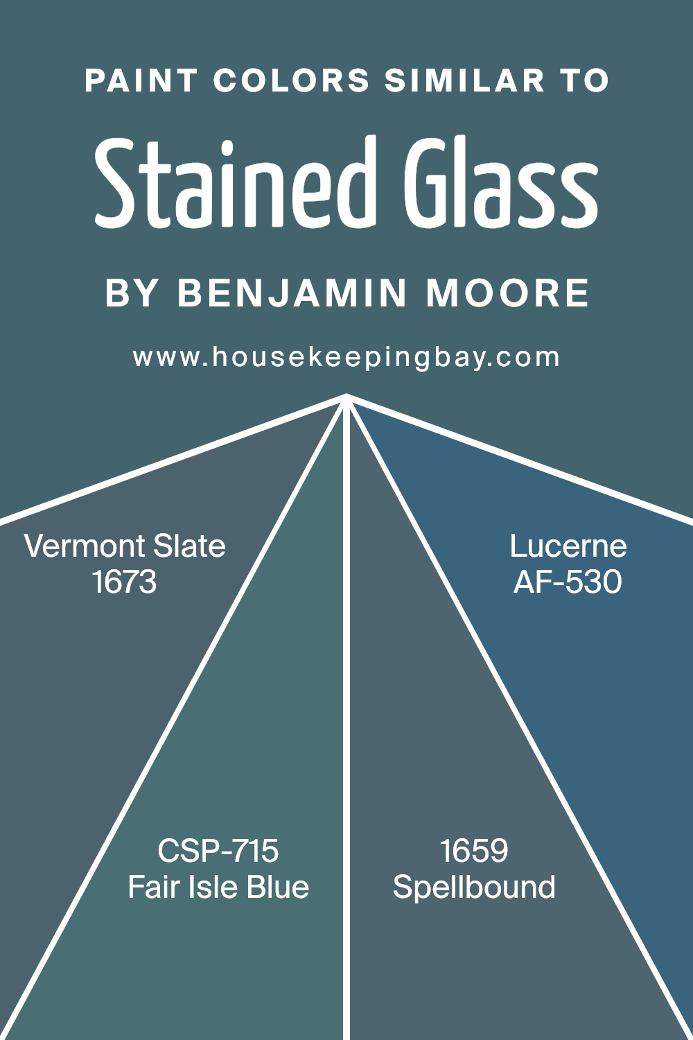
When working with similar colors, like those that echo the tones of Stained Glass CSP-685 by Benjamin Moore, achieving a serene and cohesive look becomes more manageable. Opting for harmonious shades such as Vermont Slate, Fair Isle Blue, Spellbound, and Lucerne enables designers to invoke a sense of continuity and flow in any space.
Similar colors provide a visual connection between different elements in a room, ensuring that no single piece feels out of place. This kind of coordination helps to enhance the overall aesthetic appeal, creating an environment that is both inviting and visually pleasant.
Vermont Slate offers a deep, brooding grey that brings a sophisticated edge to interiors, perfect for making bold yet refined statements. Fair Isle Blue, on the other hand, has a soft, dusky quality that soothes the eye, ideal for spaces meant to relax and calm. Spellbound presents a muted lavender hue that adds a subtle touch of intrigue and sophistication, seamlessly blending with other elements in a room.
Lastly, Lucerne provides a rich, aqua blue that refreshes the senses and gives a room a bright and airy feel, making it a great choice for a lively yet peaceful atmosphere.
You can see recommended paint colors below:
- 1673 Vermont Slate
- CSP-715 Fair Isle Blue
- 1659 Spellbound
- AF-530 Lucerne
housekeepingbay.com
Colors that Go With Stained Glass CSP-685 by Benjamin Moore
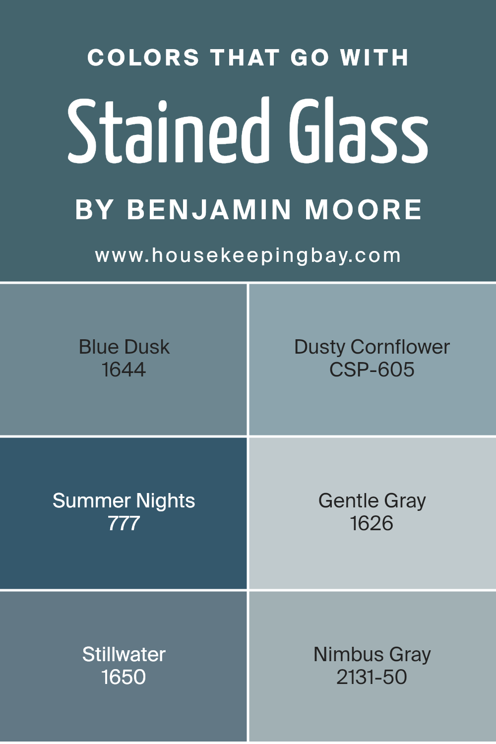
Choosing colors that harmonize with Stained Glass CSP-685 by Benjamin Moore is vital because it helps create a cohesive look in your space. Stained Glass is a deep, serene blue tone, and pairing it with the right colors can enhance the overall aesthetics of your room. The colors selected should complement or contrast well to accentuate the deep blue without clashing.
Among the complementing colors, 1644 – Blue Dusk, a slightly muted blue with a soothing feel, works well with Stained Glass to offer a subtle variation in hues. CSP-605 – Dusty Cornflower provides a lighter, airier blue that adds a fresh and gentle touch to the combination. For a more dramatic effect, 777 – Summer Nights, which is a rich, darker blue than Stained Glass, provides a striking contrast, perfect for creating a focal point.
If you prefer a softer contrast, 1626 – Gentle Gray is an excellent choice; this light gray gives a calming break from the deep blues. 1650 – Stillwater, with its hint of green, introduces an earthy element that complements the coolness of Stained Glass.
Lastly, 2131-50 – Nimbus Gray offers a mid-tone gray that supports the color scheme with its balanced intensity, ensuring that the deep blue remains the star of your decor. Together, these colors provide a harmonious palette that enhances the beauty and balance of the interior design.
You can see recommended paint colors below:
- 1644 Blue Dusk
- CSP-605 Dusty Cornflower
- 777 Summer Nights
- 1626 Gentle Gray
- 1650 Stillwater
- 2131-50 Nimbus Gray
housekeepingbay.com
How to Use Stained Glass CSP-685 by Benjamin Moore In Your Home?
Stained Glass CSP-685 by Benjamin Moore is a rich and deep teal color that adds a unique charm to any room. This shade is versatile, suitable for both modern and traditional interiors. It can create a striking statement wall in a living room or dining area, bringing a sense of depth and sophistication.
Additionally, using it in a bedroom can add a calming, cozy atmosphere, perfect for relaxing. For those who prefer subtler accents, consider painting Stained Glass CSP-685 on cabinets or a kitchen island. This can add a pop of color without overwhelming the space.
This color also pairs well with neutral tones like whites and grays, enhancing the overall aesthetic of your home. In spaces like bathrooms, using this color can craft a rich, inviting vibe, turning an often overlooked room into a stylish sanctuary. Lastly, for exterior use, this color can make doors and shutters visually striking, boosting curb appeal.
Stained Glass CSP-685 by Benjamin Moore vs Fair Isle Blue CSP-715 by Benjamin Moore
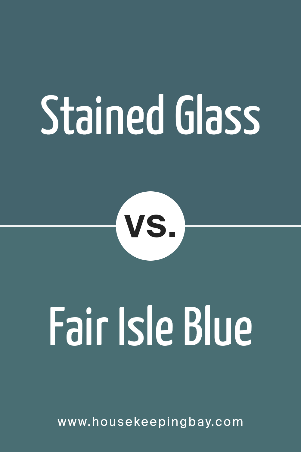
Stained Glass CSP-685 by Benjamin Moore is a rich, deep teal that adds depth and sophistication to any space. Its vivid tones are perfect for making a bold statement, whether used on an accent wall or throughout a room. It pairs well with both light and dark furniture, offering versatility in decorating styles from modern to traditional.
Fair Isle Blue CSP-715, in contrast, is much lighter and airier. This soft blue has a calming effect, making it ideal for bedrooms or bathrooms where a serene atmosphere is desired. It lacks the intensity of Stained Glass, instead providing a gentle backdrop that enhances natural light and complements neutral decor elements.
Overall, Stained Glass is dynamic and impactful, suited for those wanting to inject personality and drama into their environment. Fair Isle Blue is better suited for creating a peaceful, relaxing vibe that soothes the senses. Depending on your design goals, each color offers unique benefits for transforming the mood and style of a room.
You can see recommended paint color below:
- CSP-715 Fair Isle Blue
housekeepingbay.com
Stained Glass CSP-685 by Benjamin Moore vs Spellbound 1659 by Benjamin Moore
Stained Glass CSP-685 by Benjamin Moore is a deep, oceanic teal that brings a rich, calming feel to any space. It’s a versatile color that leans slightly towards the cool end of the spectrum, making it a good choice if you’re aiming for a serene and cozy ambiance in rooms like the living room or bedroom.
In contrast, Spellbound 1659 from Benjamin Moore is a lighter, almost mystical gray with subtle blue undertones. It’s considerably softer and lighter compared to Stained Glass, offering a more airy and gentle vibe. This shade works well in spaces that benefit from a bright, open feel, such as kitchens and bathrooms.
While Stained Glass adds depth and drama with its darker tone, Spellbound provides a refreshing and light atmosphere, making these two colors functional for different moods and settings. Both are great choices but serve distinct visual stories depending on what you wish to achieve in a room.
You can see recommended paint color below:
- 1659 Spellbound

housekeepingbay.com
Stained Glass CSP-685 by Benjamin Moore vs Vermont Slate 1673 by Benjamin Moore
The Stained Glass CSP-685 by Benjamin Moore and Vermont Slate 1673 offer unique tones for different moods and settings. Stained Glass is a vibrant, deep teal, a color that brings energy and liveliness to a room. It perfects spaces looking for a splash of brightness while maintaining a classy feel. This shade works well in living areas or as an accent wall in a neutral-toned room.
In contrast, Vermont Slate 1673 brings a more subdued, sophisticated gray-blue tone. It carries an air of subtlety and professionalism, making it suitable for spaces like offices or modern living rooms. It pairs excellently with wood finishes and metallic accents, providing a grounded base that complements various decor styles.
Both colors are versatile and can set distinct moods; choosing between them depends on the desired aesthetic and atmosphere of the room. Bright and bold versus soft and elegant, both offer potential to beautify spaces uniquely.
You can see recommended paint color below:
- 1673 Vermont Slate

housekeepingbay.com
Stained Glass CSP-685 by Benjamin Moore vs Lucerne AF-530 by Benjamin Moore
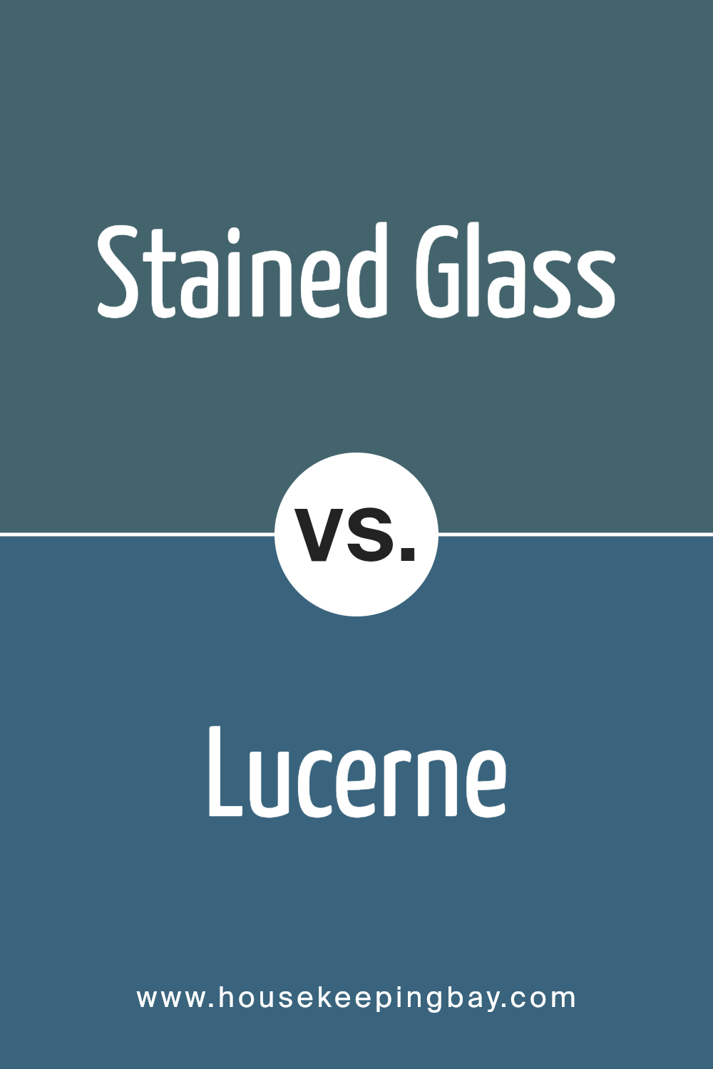
The main color, Stained Glass CSP-685 by Benjamin Moore, is a deep, rich blue with hints of teal, giving it a vibrant yet soothing presence. It makes for a bold statement and can add a lot of character to a room, especially when used on accent walls or in artistic spaces. This color works well in areas that could benefit from a splash of drama and visual interest.
Meanwhile, Lucerne AF-530, another offering from Benjamin Moore, is a softer, more muted blue with a touch of gray. This color is versatile and serene, making it ideal for creating a peaceful and inviting atmosphere in places like bedrooms or living rooms. Lucerne AF-530 pairs nicely with various decor styles and offers a more understated elegance.
Both colors provide unique aesthetics and mood settings. Stained Glass CSP-685 tends to command more attention due to its depth and richness, while Lucerne AF-530 offers a calmer, more laid-back vibe, suitable for relaxing spaces. Each color can significantly enhance a space depending on the desired emotional and visual impact.
You can see recommended paint color below:
- AF-530 Lucerne
housekeepingbay.com
Conclusion
Choosing CSP-685 Stained Glass by Benjamin Moore can be the ideal decision for your next painting project if you’re seeking a unique and versatile color. This beautiful shade offers a balance of warmth and depth, efficiently complementing various design aesthetics and personal styles.
Whether you’re updating a living room, bedroom, or an office, the adaptability of CSP-685 makes it easy to pair with different textures and furniture styles, ensuring your space remains cohesive and appealing.
Opting for CSP-685 can enhance the overall ambiance of a room. It harmoniously blends with both bold and subtle color palettes, allowing you to maintain a specific mood or atmosphere without the need for frequent redecorating. This color not only adds visual interest but also promotes a sense of comfort and well-being, making it a smart choice for spaces where you spend a lot of time.
Moreover, the quality of Benjamin Moore paints means applying CSP-685 Stained Glass will likely be a smooth process, with long-lasting results that you can enjoy over time.
Overall, incorporating this color into your home or office can help achieve a fresh, updated look while ensuring that the space remains welcoming and stylish.
housekeepingbay.com
