Nurture Green SW 6451 by Sherwin Williams
Revitalize Your Space with Nature's Hues
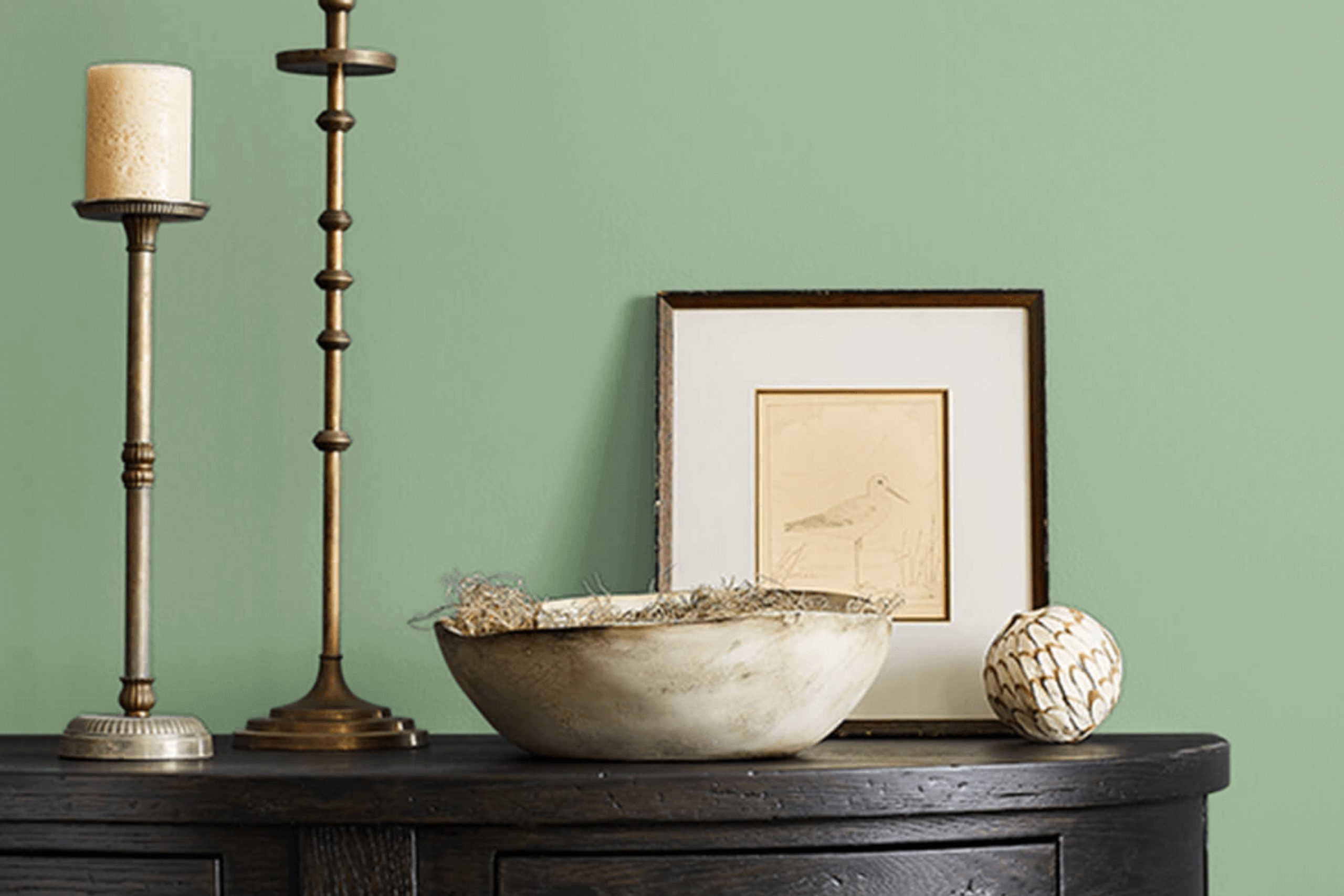
When choosing the perfect shade for your space, color isn’t just an aesthetic choice—it’s a reflection of your personality and mood. SW 6451 Nurture Green by Sherwin Williams can be a great option for those looking to bring a calming influence into their home. This shade combines the freshness of nature with the calming effects of a muted green, creating an environment that feels both refreshing and peaceful.
Imagine a space where every moment feels like a gentle hug from nature. Nurture Green does just that. It creates a soothing atmosphere without overwhelming other elements of your decor.
Whether you’re adding a touch of calm to a busy living room or creating a sanctuary in your bedroom, this color can blend seamlessly into your design scheme.
Think about the areas where you spend most of your time and how you want to feel when you’re there.
Do you want a restful place to unwind after a busy day, or an energizing environment to motivate you in the morning?
Nurture Green offers a balanced backdrop that supports either mood, making it a versatile choice for any room.
via sherwin-williams.com/
What Color Is Nurture Green SW 6451 by Sherwin Williams?
Table of Contents
Nurture Green SW 6451 by Sherwin Williams is a soft, calming shade that brings nature into your space. It’s a gentle green with a subtle undertone, making it soothing and fresh. This color works well in rooms where you want a peaceful and inviting atmosphere, like bedrooms or living rooms.
Nurture Green suits styles that lean towards the natural or minimalistic, such as Scandinavian, modern rustic, or even farmhouse. Its earthy feel complements wooden furniture, especially lighter woods like oak or maple.
Try pairing it with soft textures like linen or cotton to enhance the cozy vibe. Wool throws or knitted cushions can add warmth to the space.
In addition, Nurture Green matches well with beige or cream tones, creating a harmonious palette. For a bit of contrast, add accents in darker shades like charcoal or navy. Metallic elements, especially in brushed gold or bronze, can give the room a touch of elegance without overwhelming the calming effect.
Overall, Nurture Green is versatile and welcoming, making it an excellent choice for those who enjoy a connection with nature indoors. Whether used in small accents or on a larger scale, it brings about a sense of balance and quiet charm.
housekeepingbay.com
Is Nurture Green SW 6451 by Sherwin Williams Warm or Cool color?
Nurture Green SW 6451 by Sherwin-Williams brings a calming and gentle vibe to spaces. This soft, muted green tone fits perfectly in homes looking for a touch of nature indoors. When used on walls, it creates a peaceful atmosphere, making it ideal for bedrooms, living rooms, or any area where relaxation is key.
The color pairs beautifully with neutral shades like whites and beiges, enhancing its soothing quality. In brighter spaces with lots of sunlight, Nurture Green can feel uplifting, reflecting the light softly and making rooms feel airy and open.
In dimmer areas, it maintains a cozy and warm ambiance, making spaces feel inviting and comfortable. This adaptable color complements wood finishes and natural elements seamlessly, enhancing the home’s overall aesthetic without overwhelming it.
Nurture Green SW 6451 is perfect for those who appreciate subtle elegance and aim to create a balanced and harmonious home environment.
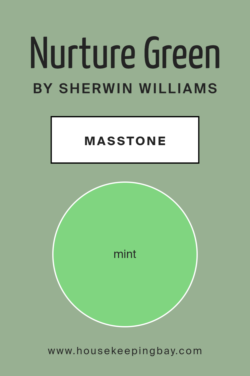
What is the Masstone of the Nurture Green SW 6451 by Sherwin Williams?
Nurture Green SW 6451 by Sherwin Williams is a gentle, minty green with the masstone of Mint (#80D580). This soft green hue brings a fresh and lively feel to any space in the home. When used in living areas or bedrooms, Nurture Green creates a calming and airy atmosphere that makes the room feel open and inviting.
Its soft, refreshing tone is perfect for kitchens or bathrooms, where it can add a clean and rejuvenating touch.
The minty masstone pairs well with neutrals like whites and grays, allowing it to stand out without overpowering other elements in the room. It can also complement natural materials such as wood, enhancing a room’s organic vibe. Additionally, Nurture Green works well with light blues or earthy tones, achieving a harmonious and balanced look.
Overall, this color brings a serene and uplifting vibe, enhancing the comfort and aesthetic of any home.
housekeepingbay.com
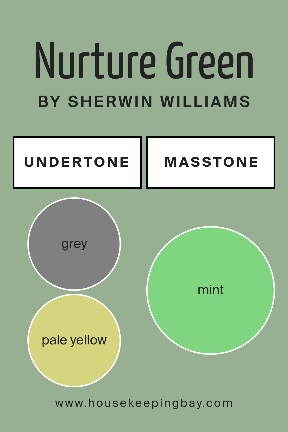
Undertones of Nurture Green SW 6451 by Sherwin Williams
Nurture Green SW 6451 by Sherwin Williams is a complex and versatile color with a range of undertones. At a glance, you might see a gentle green, but its hidden undertones make it more interesting. The subtle hints of grey, pale yellow, and light blue add coolness and calmness to the color. These undertones give it a soothing and balanced feel, making it gentle on the eyes.
The pale pink and lilac undertones add a soft, warm touch. They introduce a hint of coziness without being overwhelming. Light green and light turquoise contribute freshness and energy, while olive and dark green provide earthy depth and richness.
Undertones of light gray and light purple help in creating a sophisticated ambiance, adding subtle elegance. Yellow and orange undertones introduce warmth and vibrancy, making spaces feel lively and welcoming.
When applied to interior walls, Nurture Green can offer a refreshing and serene atmosphere, adapting to variations in natural and artificial lighting. In a sunlit room, it may appear more vivid and bright, while in dim lighting, it might take on a softer, muted tone.
The combination of its undertones ensures that Nurture Green remains adaptable, making it suitable for various rooms and decor styles.
housekeepingbay.com
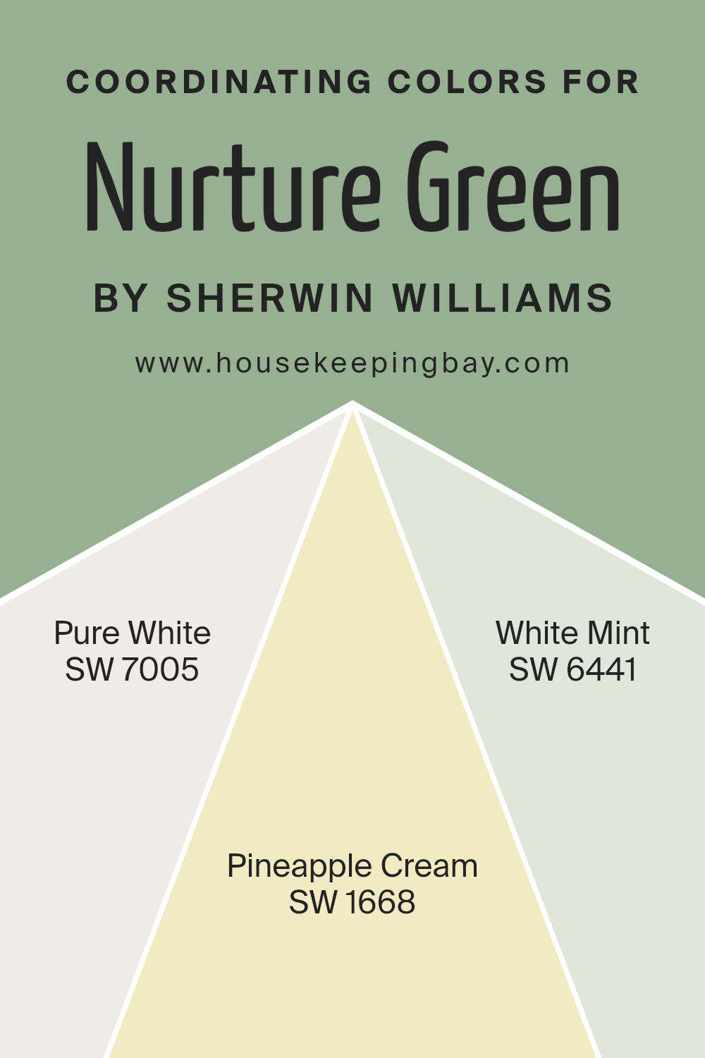
Coordinating Colors of Nurture Green SW 6451 by Sherwin Williams
Coordinating colors are hues that complement each other well when used in combination. These colors often share a similar tone or warmth, creating a harmonious look in a space. For instance, when coordinating with Nurture Green SW 6451 by Sherwin Williams, you might select colors that enhance its natural and calming vibe.
Think of coordinating colors as a family that brings out the best in one another, each playing its part without clashing.
Take SW 7005 – Pure White, for example. This color provides a clean, crisp backdrop that helps Nurture Green stand out, offering a fresh and welcoming feel. Meanwhile, SW 1668 – Pineapple Cream introduces a gentle, creamy warmth, adding a hint of brightness that doesn’t overpower the palette.
Lastly, SW 6441 – White Mint pairs delicate white with a touch of minty green, echoing the natural elements in Nurture Green and adding a subtle freshness. When used together, these colors create a balanced and refreshing atmosphere that is pleasing to the eye.
This grouping not only highlights the best features of each color but also maintains a consistent theme across your space, making it feel well-coordinated and thoughtfully designed.
You can see recommended paint colors below:
- SW 7005 Pure White
- SW 1668 Pineapple Cream
- SW 6441 White Mint
housekeepingbay.com
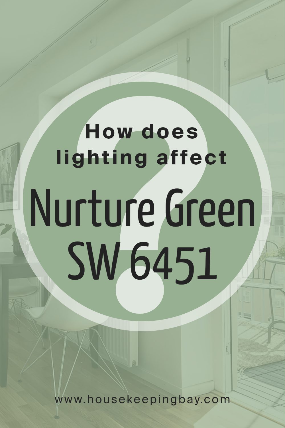
How Does Lighting Affect Nurture Green SW 6451 by Sherwin Williams?
Lighting can have a big impact on how we perceive color. The same color can look very different depending on the type of light it is exposed to. Nurture Green SW 6451 by Sherwin Williams is no exception. This is a medium-green shade that can appear warm or cool, depending on the lighting and the direction a room faces.
In natural light, Nurture Green can show its truest hue. In rooms with large windows or lots of natural light, this color can feel fresh and lively. However, artificial light can change how this green looks.
Under incandescent lights, which tend to have a yellow or warm glow, Nurture Green may seem a bit warmer or muted. Conversely, under fluorescent lights, which are cooler and more bluish, this green can appear sharper and more vibrant.
The orientation of a room can also change how Nurture Green looks. In north-facing rooms, where natural light is more diffused and cooler, this color might appear somewhat muted and darker, taking on a slightly bluish undertone.
In south-facing rooms, which receive more direct sunlight, Nurture Green can look brighter and more vivid, with the daylight enhancing its green tones.
East-facing rooms get bright, softer morning light and then less sunlight as the day progresses. In the morning, Nurture Green may have a crisp and lively feel in east-facing rooms, but it can look more subdued in the afternoon.
West-facing rooms are the opposite, where the colors can appear duller in the morning and then warm up in the afternoon and evening as the setting sun fills the room with golden light.
Thus, the perception of Nurture Green SW 6451 varies considerably with light conditions, affecting how it harmonizes with the other elements in your space.
housekeepingbay.com
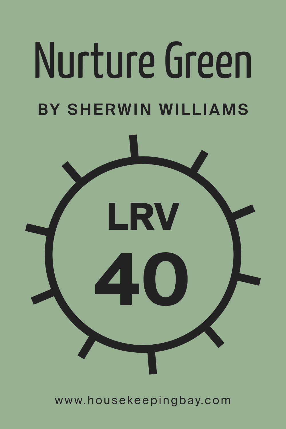
What is the LRV of Nurture Green SW 6451 by Sherwin Williams?
LRV, or Light Reflectance Value, is a measure that tells us how much light a paint color will reflect or absorb. The scale ranges from 0 to 100, where 0 means the color reflects no light, making it pure black, and 100 means it reflects all light, making it pure white.
Colors with higher LRV reflect more light, making them appear lighter on walls, while lower LRV colors absorb more light, making them appear darker. When choosing a paint color, understanding LRV is helpful because it affects how bright or dark a room might feel.
It also helps predict how the color will appear in different lighting conditions, whether natural or artificial.
For Sherwin Williams’ Nurture Green with an LRV of 39.668, this means that the color has a moderate ability to reflect light. It is neither too light nor too dark, striking a balance that makes it versatile for various spaces.
In well-lit rooms, Nurture Green can appear fresh and vibrant, while in spaces with less light, it might lean towards a more subdued, cozy feel. This balanced LRV makes Nurture Green a flexible choice, suitable for both larger spaces where you might want more light reflection and smaller areas where you might prefer a deeper, calming effect.
Understanding its LRV helps in planning how the color interacts with your space and lighting, ensuring the desired atmosphere is achieved.
housekeepingbay.com
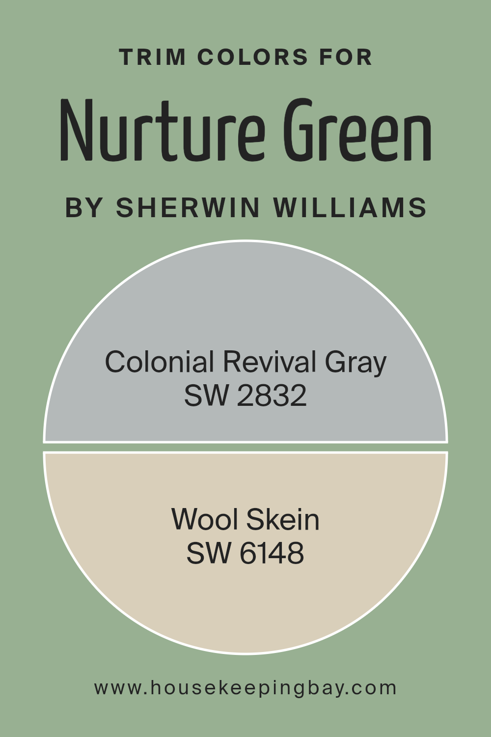
What are the Trim colors of Nurture Green SW 6451 by Sherwin Williams?
Trim colors are chosen to complement or contrast the main color of a space, adding an extra layer to its overall look. With Sherwin-Williams’ Nurture Green SW 6451, the right trim color can enhance the natural feel of the green, creating a balanced effect.
One option is Colonial Revival Gray SW 2832, a soft gray with a refined, classic essence that pairs well with green’s soothing presence. It has a hint of elegance that can subtly uplift spaces without overwhelming them.
On the other hand, Wool Skein SW 6148 offers a warm, beige-like hue with a hint of taupe. This color can complement the freshness of Nurture Green, giving the room a cozy, inviting aura.
Selecting appropriate trim colors like Colonial Revival Gray and Wool Skein is essential because they can affect how the main color is perceived. The gray undertone of Colonial Revival Gray introduces a cool balance, making Nurture Green feel even more vibrant and lively.
Meanwhile, Wool Skein adds warmth, enhancing green’s earthy qualities and creating a unified and inviting environment.
Together, these choices in trim colors make it possible to create distinct moods and atmospheres, allowing for a nuanced design that highlights the beauty of Nurture Green.
You can see recommended paint colors below:
housekeepingbay.com
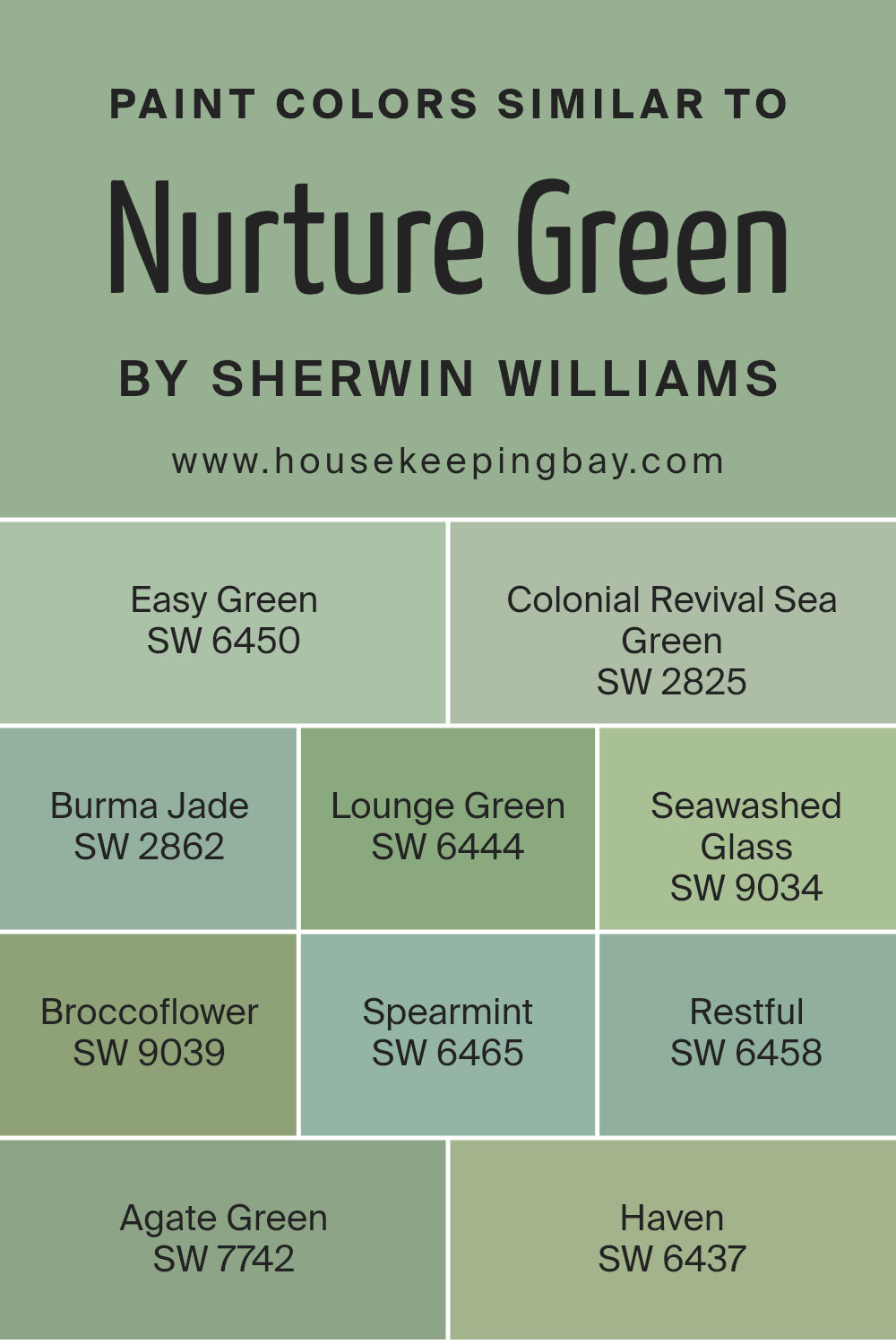
Colors Similar to Nurture Green SW 6451 by Sherwin Williams
Using similar colors can create a harmonious and balanced look in any space. When you choose colors that are similar, like the ones near Nurture Green by Sherwin Williams, you get a coherent color palette that feels calm and welcoming.
For example, the Easy Green has a light and fresh look, making it perfect for a peaceful setting. Colonial Revival Sea Green brings a hint of historic charm with its muted tones, while Burma Jade offers a rich, earthy depth that complements any room.
Lounge Green has a soft and soothing nature, ideal for creating cozy environments, and Seawashed Glass reflects a light, watery vibe that adds a refreshing touch.
Further expanding this palette, Broccoflower exudes a vibrant yet soft energy, providing a lively yet calming space. Spearmint presents a crisp, cool feel that’s also invigorating. Restful is true to its name, delivering a gentle and relaxing ambiance.
Agate Green provides a subtle nod to nature, adding a sophisticated touch. Haven, with its deep and comfortable warmth, creates a sense of security.
Using these similar colors, spaces can feel united and thoughtfully designed, as each tone effortlessly relates to the next, making the area feel cohesive and naturally pleasing to the eye.
You can see recommended paint colors below:
- SW 6450 Easy Green
- SW 2825 Colonial Revival Sea Green
- SW 2862 Burma Jade
- SW 6444 Lounge Green
- SW 9034 Seawashed Glass
- SW 9039 Broccoflower
- SW 6465 Spearmint
- SW 6458 Restful
- SW 7742 Agate Green
- SW 6437 Haven
housekeepingbay.com
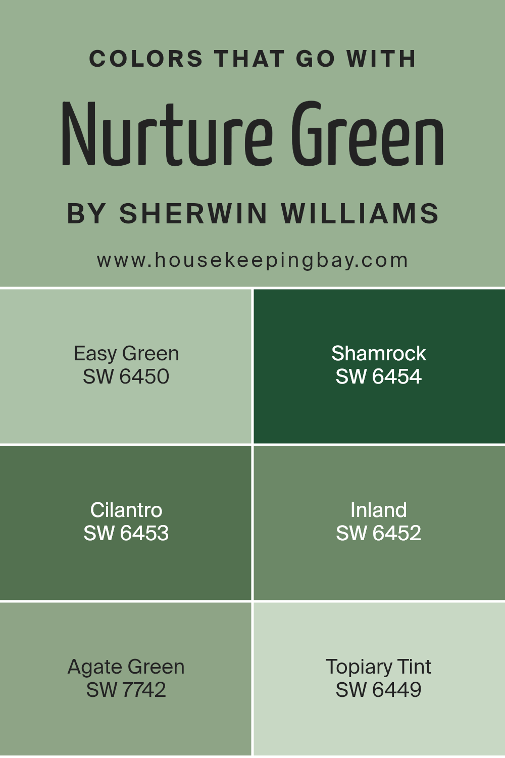
Colors that Go With Nurture Green SW 6451 by Sherwin Williams
Nurture Green SW 6451 by Sherwin Williams is a soothing color that brings a touch of nature into any space. Colors that blend well with Nurture Green are important because they create harmony and balance in a room.
Easy Green SW 6450 complements Nurture Green beautifully with its gentle and refreshing tone, evoking a sense of calmness and serenity. It’s like a breath of fresh air indoors. Shamrock SW 6454 brings a rich, lively energy. Its boldness increases joy and positivity, perfect for areas where you want to feel energized.
Furthermore, Cilantro SW 6453 adds a deeper hue that provides warmth and depth. It works well in creating cozy and intimate settings. Inland SW 6452 offers a unique, muted tone that conveys sophistication and elegance. It provides a subtle backdrop that enhances other elements in the room.
Agate Green SW 7742 brings a slight hint of blue that adds a touch of coolness and modernity.
It works well in contemporary settings, adding a hint of urban flair. Lastly, Topiary Tint SW 6449 is light and airy, creating a sense of openness and space. It’s perfect for making smaller rooms appear larger, without overwhelming the senses.
Together, these colors with Nurture Green create a balanced and cohesive look.
You can see recommended paint colors below:
- SW 6450 Easy Green
- SW 6454 Shamrock
- SW 6453 Cilantro
- SW 6452 Inland
- SW 7742 Agate Green
- SW 6449 Topiary Tint
housekeepingbay.com
How to Use Nurture Green SW 6451 by Sherwin Williams In Your Home?
Nurture Green SW 6451 by Sherwin Williams is a beautiful, earthy green paint color that brings nature indoors. This soft shade works well in various spaces around the home, creating a calm and welcoming atmosphere.
In the living room, Nurture Green pairs nicely with neutral furniture and natural textures like wood or rattan, offering a warm, inviting feel. A bedroom painted in this color feels cozy and peaceful, perfect for relaxation.
In the kitchen, it complements white or cream cabinets, giving the room a fresh, clean look. Bathrooms painted with Nurture Green provide a spa-like vibe, ideal for unwinding after a long day.
Also, it can work in a home office by creating a sense of focus while still keeping the space light and pleasant. Whether used as a main wall color or as an accent, Nurture Green adds a natural touch to any room, providing comfort and harmony.
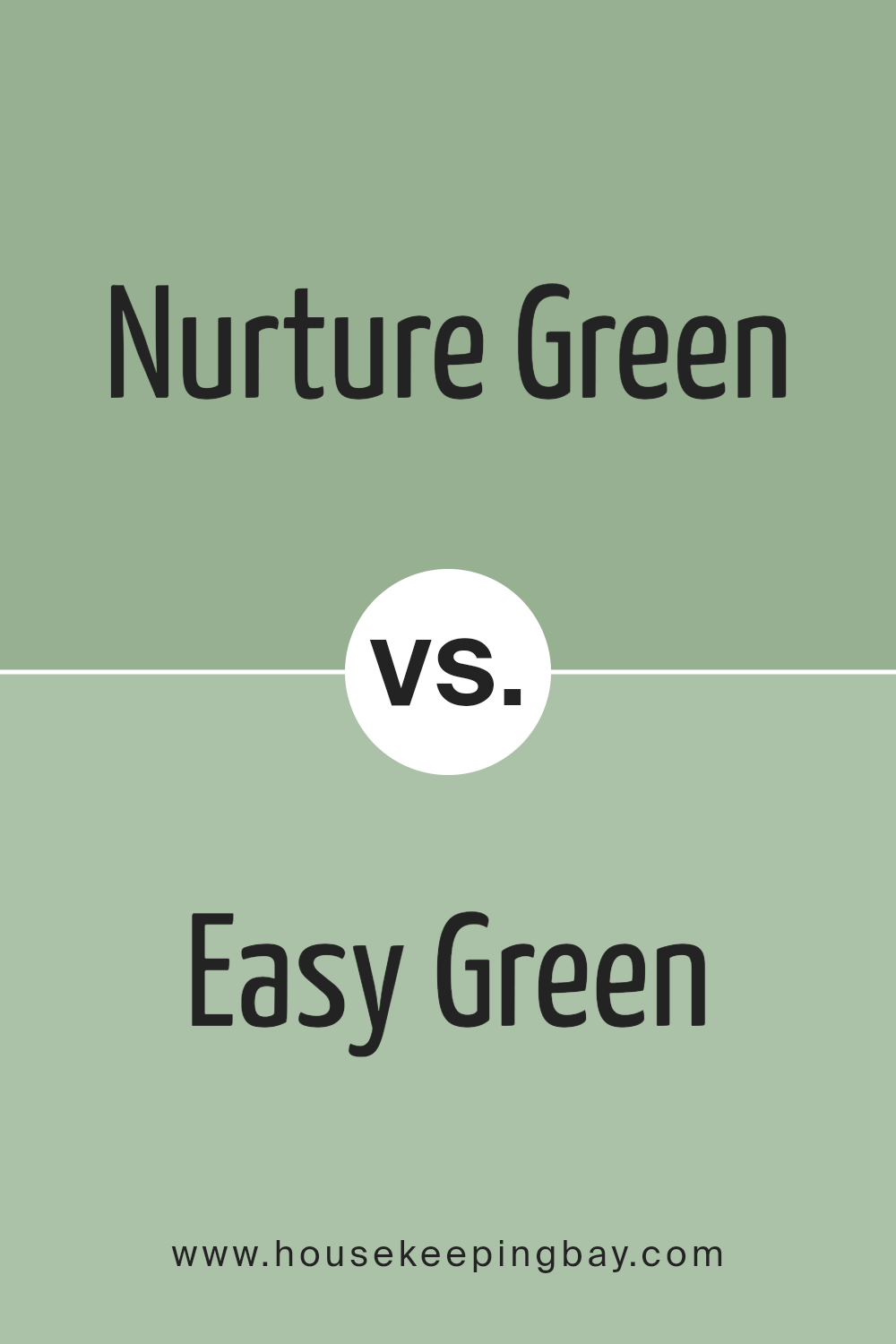
Nurture Green SW 6451 by Sherwin Williams vs Easy Green SW 6450 by Sherwin Williams
Nurture Green SW 6451 and Easy Green SW 6450, both by Sherwin Williams, are soft and welcoming shades of green. Nurture Green leans more towards a muted, earthy tone. It creates a calming environment, perfect for spaces that need a touch of nature-inspired warmth. It’s versatile and pairs nicely with natural materials like wood and stone.
Easy Green SW 6450, while similar, has a slightly lighter and fresher vibe. It brings a hint of brightness and vitality to a room without overwhelming the senses. Easy Green tends to reflect more light, making it a good choice for spaces that benefit from a little extra illumination.
Both colors exude a sense of tranquility and work well in bedrooms, living rooms, or any area needing a soothing ambiance. While they belong to the same family, Nurture Green offers a grounded presence, whereas Easy Green provides a gentle lift.
You can see recommended paint color below:
- SW 6450 Easy Green
housekeepingbay.com
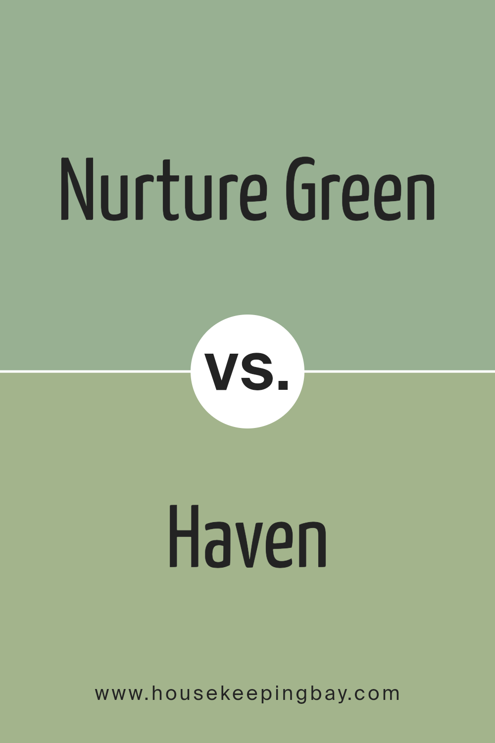
Nurture Green SW 6451 by Sherwin Williams vs Haven SW 6437 by Sherwin Williams
Nurture Green SW 6451 and Haven SW 6437 are both beautiful shades by Sherwin Williams, each offering a distinct feel. Nurture Green SW 6451 is a soft, muted green that evokes a sense of calm and connection with nature. It’s perfect for creating a soothing environment in spaces like bedrooms or living rooms, where relaxation is key. It’s subtle and understated, making it versatile for various settings.
Haven SW 6437, while still a green, presents a slightly deeper vibe, suggesting richness and a cozy ambience. It adds warmth to any room, giving spaces a welcoming presence without overwhelming the senses.
This color works well in areas where you want to feel grounded and safe, like dens or private offices.
When choosing between them, consider the mood you want to set—Nurture Green for light and peaceful, or Haven for warmth and comfort. Both add unique charm to any room.
You can see recommended paint color below:
- SW 6437 Haven
housekeepingbay.com
Nurture Green SW 6451 by Sherwin Williams vs Burma Jade SW 2862 by Sherwin Williams
Nurture Green SW 6451 and Burma Jade SW 2862 are both beautiful green shades from Sherwin Williams, but they have distinct characteristics. Nurture Green SW 6451 is a soft, earthy shade that has a calming, natural feel. It resembles the green you might find in leafy gardens or soft moss, making it ideal for creating a peaceful atmosphere in any room.
Burma Jade SW 2862 is a bit darker and more vibrant. It carries a stronger blue undertone, giving it a lively and refreshing appearance. This color brings to mind rich jade stones and can add a touch of elegance and richness to spaces.
While Nurture Green feels gentle and understated, Burma Jade is bold and invigorating. Both colors work well in homes, but the choice depends on whether you want a subtle and serene look or a bold and lively one.
You can see recommended paint color below:
- SW 2862 Burma Jade
housekeepingbay.com
Nurture Green SW 6451 by Sherwin Williams vs Colonial Revival Sea Green SW 2825 by Sherwin Williams
Nurture Green SW 6451 by Sherwin Williams is a soft, earthy green that brings a sense of calm and freshness. It feels like a whisper of nature, ideal for spaces where you want to add a touch of the outdoors. It’s versatile, working well in both modern and traditional settings.
Colonial Revival Sea Green SW 2825 is a deeper, more saturated green. It’s inspired by history, offering a richer, more vivid hue that adds character and depth to a room. This color gives a more vibrant and dramatic look, suitable for making a statement in a space.
While Nurture Green provides a gentle and airy feel, Colonial Revival Sea Green offers intensity and boldness. Choosing between them depends on whether you want a subtle background or a more pronounced color. Both add a natural feel but in different ways—one is soft and calming, the other, rich and energetic.
You can see recommended paint color below:
- SW 2825 Colonial Revival Sea Green
housekeepingbay.com
Nurture Green SW 6451 by Sherwin Williams vs Lounge Green SW 6444 by Sherwin Williams
Nurture Green SW 6451 by Sherwin Williams is a soft, muted green. It brings a sense of calmness and is perfect for creating a soothing environment, suitable for a bedroom or a relaxed living area. This color has earthy undertones that make it feel natural and grounded.
Lounge Green SW 6444, also by Sherwin Williams, is a deeper, more vibrant green. It has a bit more intensity and can add boldness and energy to a room. This shade works well in spaces where you want more character, such as a study or an accent wall.
Both colors share a connection to nature, but their intensity differs. Nurture Green is more understated and calming, perfect for relaxation. Lounge Green, with its richer tone, offers a more lively feel. Depending on the mood you want to create, choose Nurture Green for a serene ambiance and Lounge Green for a more vivid presence.
You can see recommended paint color below:
- SW 6444 Lounge Green
housekeepingbay.com
Nurture Green SW 6451 by Sherwin Williams vs Restful SW 6458 by Sherwin Williams
Nurture Green SW 6451 and Restful SW 6458 by Sherwin Williams are both beautiful greens, but they bring different vibes to a space.
Nurture Green is a warm, earthy green that feels cozy and inviting. It reminds one of lush gardens and natural landscapes, creating a sense of comfort. This color works well in living rooms or dining areas where a calming yet invigorating atmosphere is desired.
Restful SW 6458, however, leans towards a cooler, more subdued tone. It gives off a serene and peaceful vibe, making it perfect for bedrooms or spaces meant for relaxation. It’s a bit softer, making it feel like a gentle breeze through the leaves, ideal for unwinding.
Both colors share a connection with nature, but Nurture Green feels vibrant and nurturing, while Restful offers a mellow, quiet retreat. They each have their own unique charm, fitting different moods and settings in a home.
You can see recommended paint color below:
- SW 6458 Restful
housekeepingbay.com
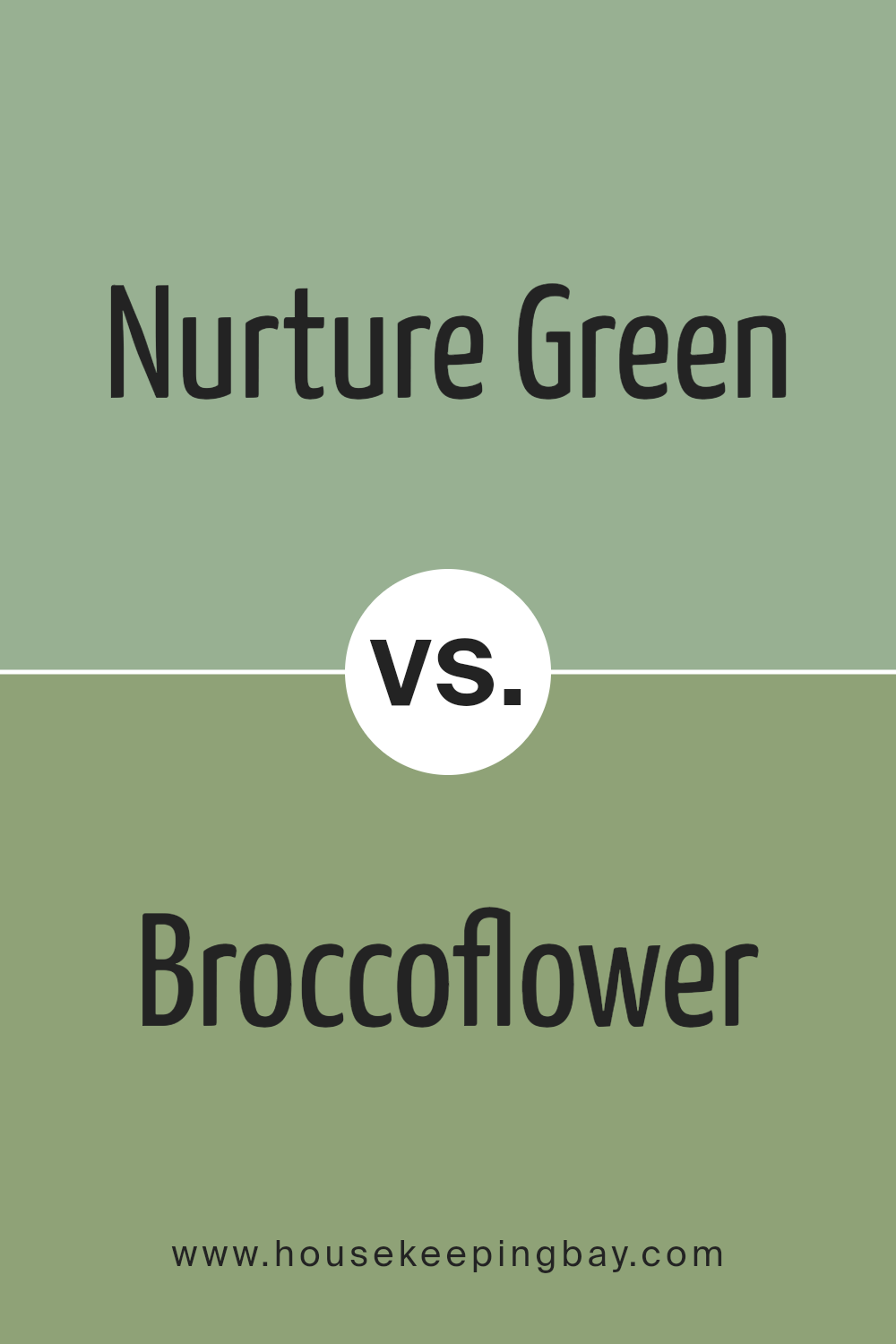
Nurture Green SW 6451 by Sherwin Williams vs Broccoflower SW 9039 by Sherwin Williams
Nurture Green SW 6451 by Sherwin Williams is a soft and soothing green that gives a feel of freshness and calm. It’s reminiscent of lush leaves and has a gentle appearance, making it perfect for spaces where relaxation and comfort are key, like bedrooms or living rooms. The color is versatile, fitting well with natural wood tones and neutral shades.
Broccoflower SW 9039 is a brighter, more vibrant green that has a playful and energetic vibe. It carries a hint of yellow, which adds warmth and cheerfulness. This color works well in areas where you want a lively and spirited atmosphere.
Kitchens, playrooms, or any space that benefits from a burst of energy could be enhanced with Broccoflower.
While both colors belong to the green family, Nurture Green leans towards subtlety and soothing effects, while Broccoflower brings a sense of lively energy and brightness.
ou can see recommended paint color below:
- SW 9039 Broccoflower
housekeepingbay.com
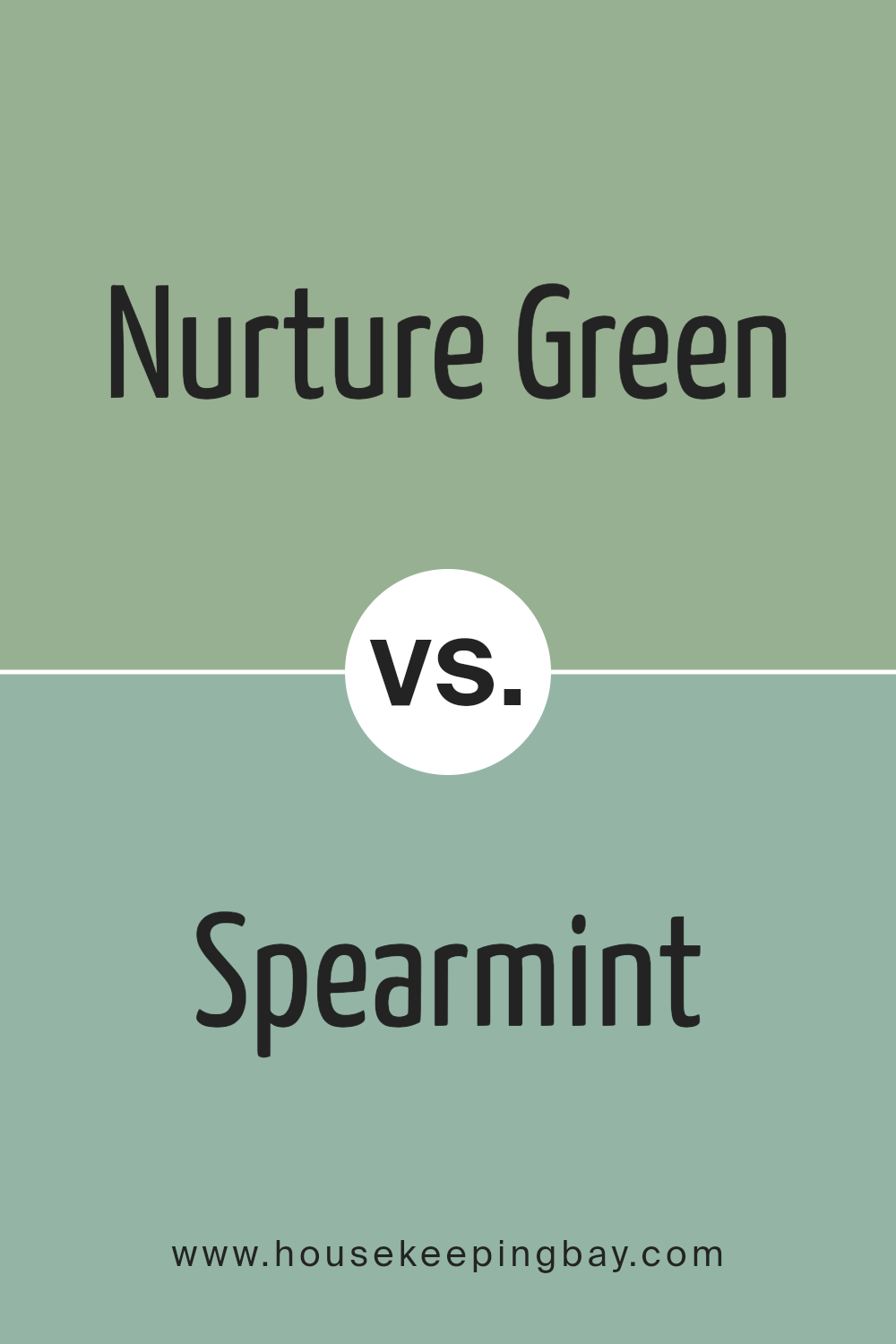
Nurture Green SW 6451 by Sherwin Williams vs Spearmint SW 6465 by Sherwin Williams
Nurture Green SW 6451 and Spearmint SW 6465 by Sherwin Williams each bring a refreshing vibe, yet they have different feels. Nurture Green is a soft, warm green. It feels like spring has entered the room, offering a cozy, welcoming atmosphere. It’s subtle, perfect for spaces where you want a comforting touch. Imagine a gentle breeze through trees or a peaceful garden path.
Spearmint SW 6465, while also green, carries a cooler tone. It has a minty freshness that feels clean and lively. This color has an energetic quality, great for spaces needing a burst of life and brightness. Think of a crisp afternoon or a breath of fresh air.
Both colors have their charm. Nurture Green suggests gentle calm, while Spearmint brings vibrancy. Together, they could harmonize well in a room, balancing warmth with freshness.
You can see recommended paint color below:
- SW 6465 Spearmint
housekeepingbay.com
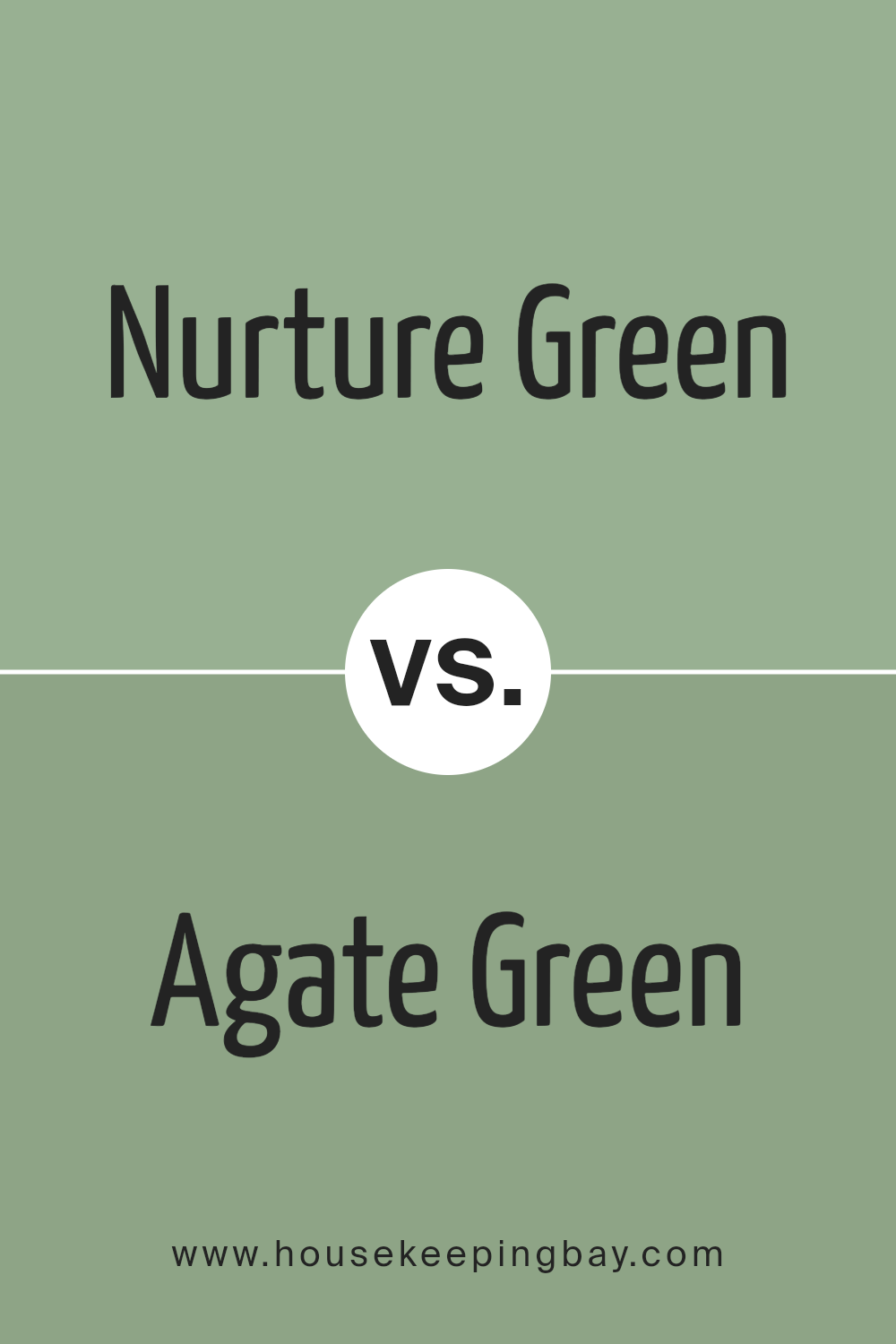
Nurture Green SW 6451 by Sherwin Williams vs Agate Green SW 7742 by Sherwin Williams
Nurture Green SW 6451 and Agate Green SW 7742 are both beautiful shades from Sherwin Williams, each with unique qualities. Nurture Green is a soft, muted green that evokes warmth and comfort. It can remind you of lush gardens or peaceful forests, making it ideal for spaces where you want to feel calm and relaxed.
Agate Green SW 7742, however, carries a deeper, richer tone. This shade has more intensity, offering a blend of green with subtle gray undertones. It feels more dramatic and sophisticated, making it perfect for creating focal points or accent walls.
While Nurture Green blends well with natural wood tones and light neutrals, providing a fresh, airy vibe, Agate Green pairs well with darker colors and metallics for a more modern and luxurious look. Both greens provide flexibility and can enhance different styles in your home, reflecting nature’s beauty in their own distinct ways.
You can see recommended paint color below:
- SW 7742 Agate Green
housekeepingbay.com
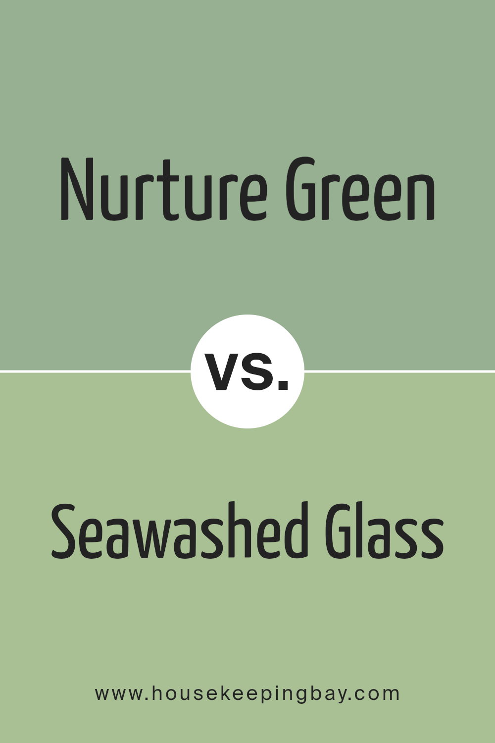
Nurture Green SW 6451 by Sherwin Williams vs Seawashed Glass SW 9034 by Sherwin Williams
Nurture Green SW 6451 and Seawashed Glass SW 9034, both by Sherwin Williams, offer unique personalities. Nurture Green is a warm, earthy tone that evokes a sense of growth and harmony. It brings to mind lush gardens and peace, making it a great choice for spaces that aim for calm and focus. It’s a soft, natural color that connects with the environment and creates a sense of balance.
Seawashed Glass, however, leans toward a lighter, more refreshing aesthetic. It has a breezy, coastal vibe reminiscent of soft ocean waves and sea breezes. This color adds a layer of lightness and openness to a space, suggesting a refreshing escape.
While Nurture Green provides warmth and a sense of grounding, Seawashed Glass offers a crisp, airy feel. Both colors can complement various styles, but their moods differ—one feels rooted and natural, while the other feels light and breezy.
You can see recommended paint color below:
- SW 9034 Seawashed Glass
housekeepingbay.com
Conclusion
I find this color to bring a refreshing and natural vibe into any space my impression of Nurture Green is that it strikes a balance between vibrancy and subtlety.
The green is lively enough to brighten a room, yet muted enough to maintain a calming presence. It feels perfect for areas where you want to create a connection with nature, like a living room or a home office. Using this shade can make these spaces feel open and inviting, bringing a bit of the outdoors inside.
When thinking about pairings, I see Nurture Green working well with soft neutrals and wood tones. It complements natural materials beautifully, making it a great choice if one wants to use it alongside wooden furniture or accents. Even though it’s a green, it doesn’t overpower; instead, I find it consistently grounding.
Given its versatility, I am confident in using Nurture Green in a range of designs, whether aiming for a modern look or something more traditional.
It offers a timeless quality that can adapt to different styles while always promoting a sense of balance and comfort.
Overall, it’s a color that induces a peaceful atmosphere without being overwhelming or too bold.
housekeepingbay.com
Ever wished paint sampling was as easy as sticking a sticker? Guess what? Now it is! Discover Samplize's unique Peel & Stick samples. Get started now and say goodbye to the old messy way!
Get paint samples


