French Toile CSP-595 by Benjamin Moore
A Classic Shade with Lasting Elegance
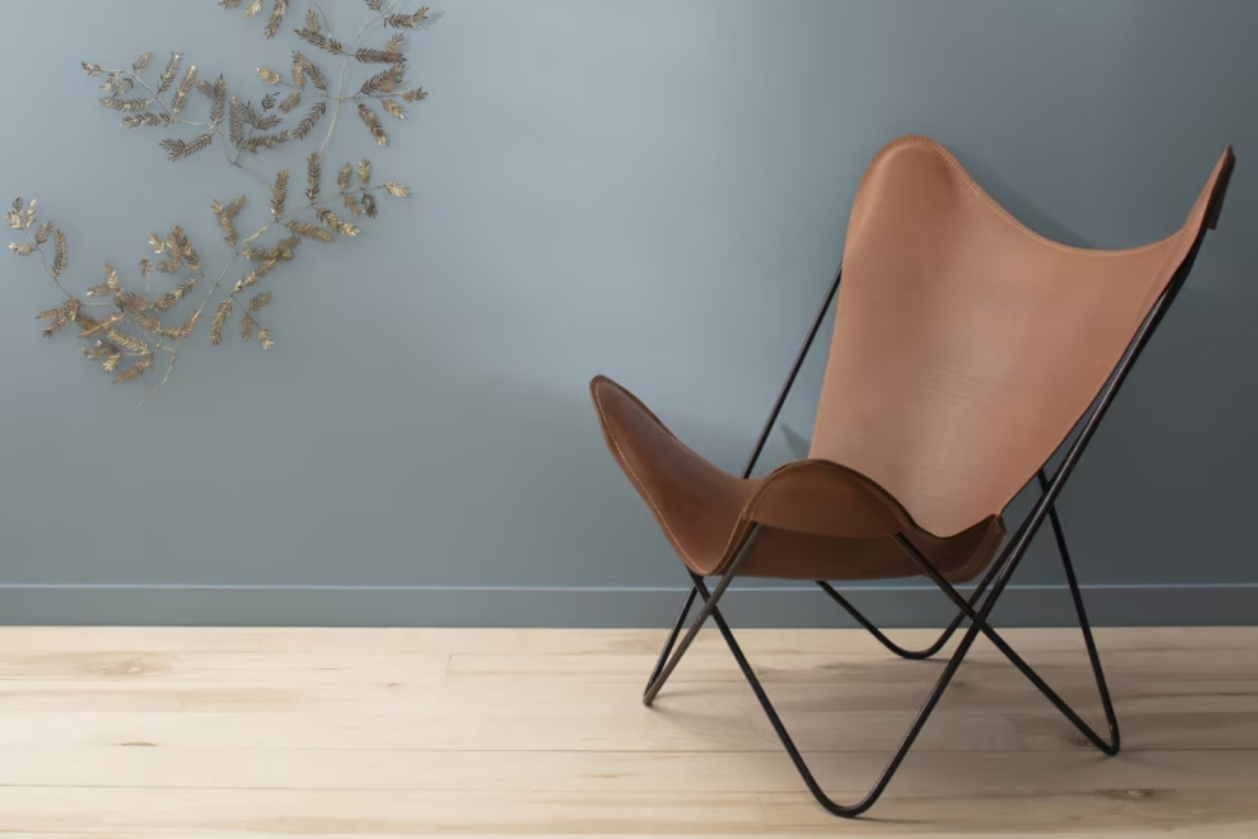
I recently discovered a paint color that I think you’ll love—CSP-595 French Toile by Benjamin Moore. This color is truly something special, offering a unique blend that can bring a room to life. French Toile is part of Benjamin Moore’s Color Stories collection, and it stands out with its subtle elegance and timeless appeal.
The color presents a gentle balance between warmth and coolness, making it suitable for different spaces in a home. Whether you’re thinking about revitalizing your living room, adding a touch of refinement to your bedroom, or updating your kitchen, French Toile can provide a sophisticated and calming backdrop.
What’s interesting about CSP-595 French Toile is its ability to pair well with a variety of other colors and design elements. Whether your style is contemporary, classic, or somewhere in between, French Toile can complement and enhance your existing decor without overwhelming it.
Choosing a paint color can be challenging, but CSP-595 offers a wonderful option for those seeking a versatile shade that adds character while maintaining an understated elegance.
With just a few brush strokes, you can effortlessly transform the feel of any space and enjoy a refreshed atmosphere.
via benjaminmoore.com
What Color Is French Toile CSP-595 by Benjamin Moore?
Table of Contents
French Toile CSP-595 by Benjamin Moore is a soft and calming shade that blends blue and gray. Its understated elegance makes it a versatile choice for a variety of interior styles. The color mimics the serene hues of a misty morning sky or a gentle sea breeze, making it ideal for creating a peaceful ambiance.
This color works wonderfully in classic or traditional interiors, often complementing vintage or antique designs. It also fits beautifully in coastal-inspired spaces where natural light can enhance its subtle, breezy character.
In modern or minimalist settings, French Toile can provide a gentle contrast against stark whites and other neutral tones, adding warmth without overpowering the simplicity of the design.
Pairing French Toile with materials and textures like linen or cotton can enhance its soft appeal. It works well with wood, especially oak or ash, for a natural, organic look.
Consider incorporating elements like wicker or rattan to add a touch of texture, or use brushed nickel and matte finishes for subtle sophistication. Stone accents, such as marble or sandstone, can further highlight its elegance. This color is versatile enough to enhance various textures, making it a flexible choice for any room in the home.
housekeepingbay.com
Is French Toile CSP-595 by Benjamin Moore Warm or Cool color?
French Toile CSP-595 by Benjamin Moore is a light, airy shade of blue-gray that brings a sense of calm and comfort to any room. Its soft hue gently balances the vibrant richness of bolder colors while adding depth to simpler palettes.
When used in living rooms or bedrooms, French Toile creates a peaceful atmosphere, helping to make spaces feel more open and inviting. This color pairs well with whites, creams, and light grays, making it versatile for various design styles, from traditional to contemporary. I
ts subtle elegance makes it suitable for both walls and accent pieces, offering a cohesive look throughout a home. Interiors painted with French Toile often have a refreshing quality, like a breath of fresh air, that enhances light and space. Whether used as a primary color or an accent, French Toile can make any room feel more serene and spacious, enhancing the overall ambiance of a home.
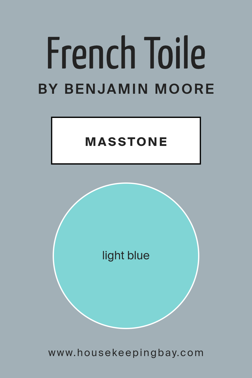
What is the Masstone of the French Toile CSP-595 by Benjamin Moore?
French ToileCSP-595 by Benjamin Moore is a pleasant light blue that can bring a peaceful vibe to any room. This color resembles a clear sky or a gentle ocean, and it makes spaces feel open and breezy. Using this color in a room can help it feel larger and more inviting, thanks to its light and airy nature.
This shade works well in various settings, such as bedrooms, living rooms, and bathrooms. It pairs beautifully with neutral colors like white or beige, creating a balanced and calming environment. You can also add accents in pastel colors for a playful touch or warm tones for contrast.
In homes, this light blue can contribute to an atmosphere of relaxation and comfort. It’s especially effective in rooms where natural light is abundant, enhancing the overall brightness. Even in smaller spaces, French ToileCSP-595 can help reduce any sense of crowding, making it an excellent choice for cozy spaces.
housekeepingbay.com
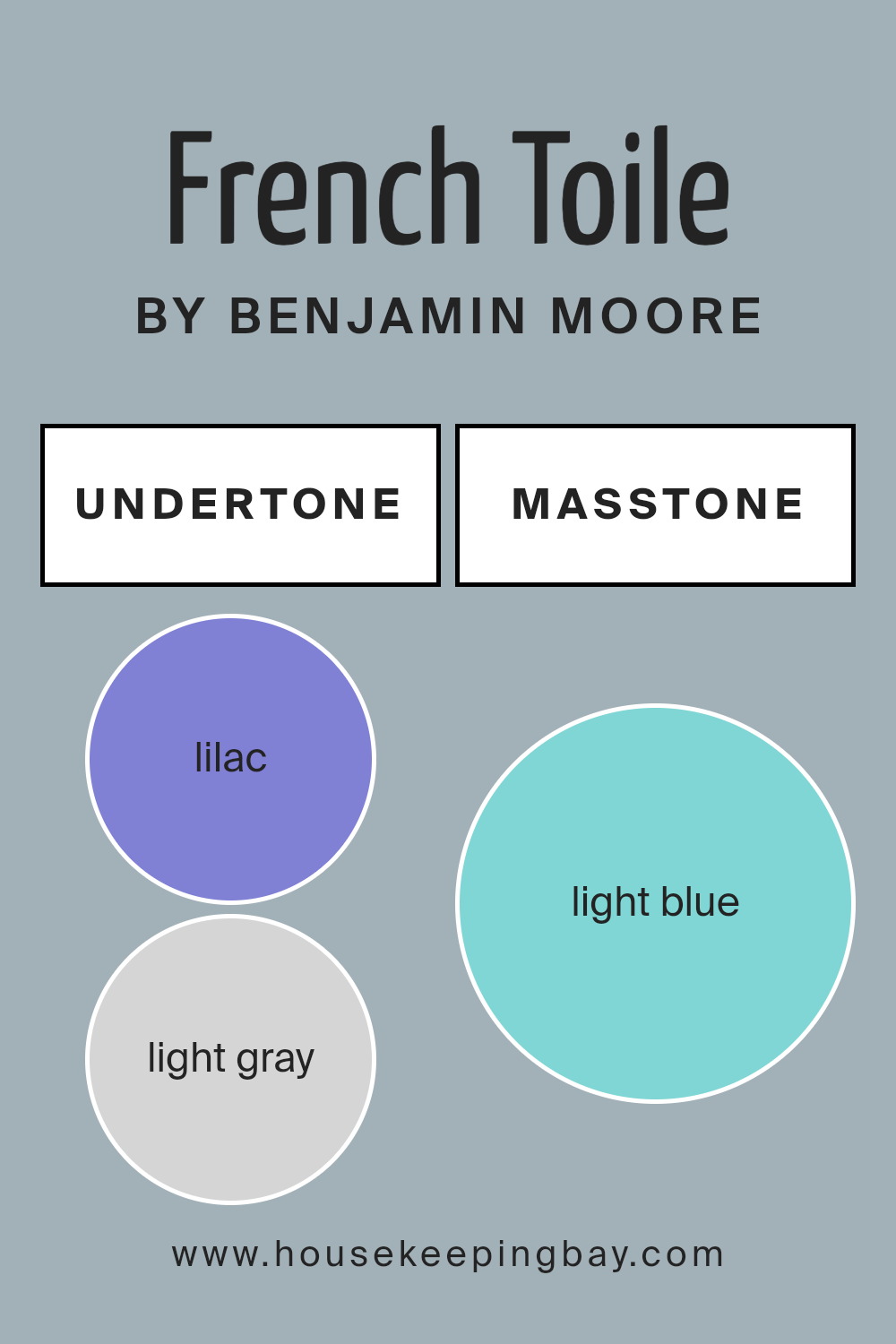
Undertones of French Toile CSP-595 by Benjamin Moore
French Toile CSP-595 by Benjamin Moore offers a unique blend of undertones, which craft the overall perception of the color. The undertones in this paint are Lilac, Light Gray, Mint, Light Purple, Grey, Pale Yellow, Pale Pink, Turquoise, Blue, Light Turquoise, and Dark Turquoise. These subtle hints influence how we see the color on walls.
Undertones in paint are underlying colors that might not be immediately apparent but can influence the primary color. They affect how the paint reacts to lighting and surrounding colors, impacting the mood of a room.
For French Toile CSP-595, the mix of cool and warm undertones makes it versatile. The lilac and light purple undertones offer a gentle touch of warmth and softness, while light gray and grey provide a neutral base, making the color sophisticated yet calm. Undertones like mint, turquoise, and light turquoise inject freshness, giving the paint a vibrant and airy feel. The pale yellow and pale pink undertones add subtle warmth and liveliness.
On interior walls, this paint can create an elegant, refreshing ambiance. Depending on the light, it can feel cozy and inviting, yet light and spacious. It works well in various spaces, adapting beautifully to the room’s function and style.
housekeepingbay.com
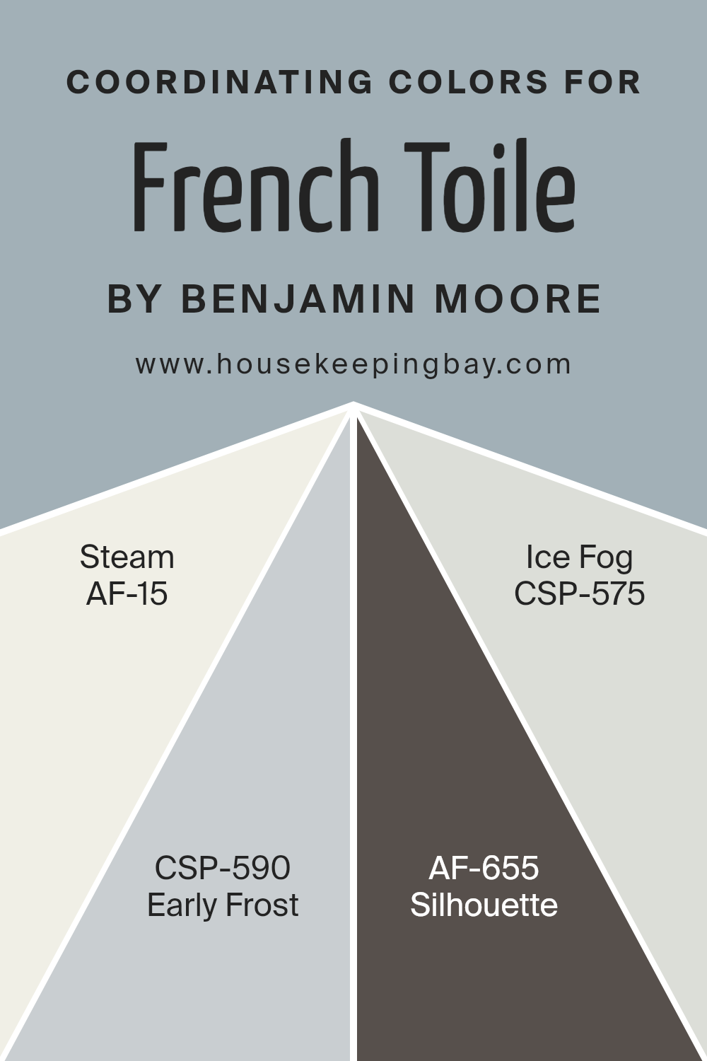
Coordinating Colors of French Toile CSP-595 by Benjamin Moore
Coordinating colors are hues that complement each other and work well together in a space to create a harmonious look. They can be used alongside a primary color to add depth and balance, enhancing the visual appeal of a room. For the Benjamin Moore color French Toile CSP-595, several colors serve as excellent coordinating options.
AF-15, known as Steam, is a light, airy white with subtle warmth that brightens a space, offering a sense of openness and cleanliness. CSP-590, called Early Frost, is a soft gray with a cool undertone, perfect for adding a modern, sleek touch while maintaining a relaxed environment.
AF-655, or Silhouette, is a rich, deep charcoal that provides a bold contrast and adds sophistication, ideal for accent walls or larger pieces of furniture. On the other hand, CSP-575, named Ice Fog, is a muted blue-gray that brings a gentle, calming effect, evoking a sense of peacefulness.
These colors, when used together, can create a cohesive and inviting atmosphere, with each color subtly enhancing each other.
Their versatility allows them to fit seamlessly into various styles, making them ideal for any space aiming for a balanced and cohesive design.
You can see recommended paint colors below:
- AF-15 Steam
- CSP-590 Early Frost
- AF-655 Silhouette
- CSP-575 Ice Fog
housekeepingbay.com
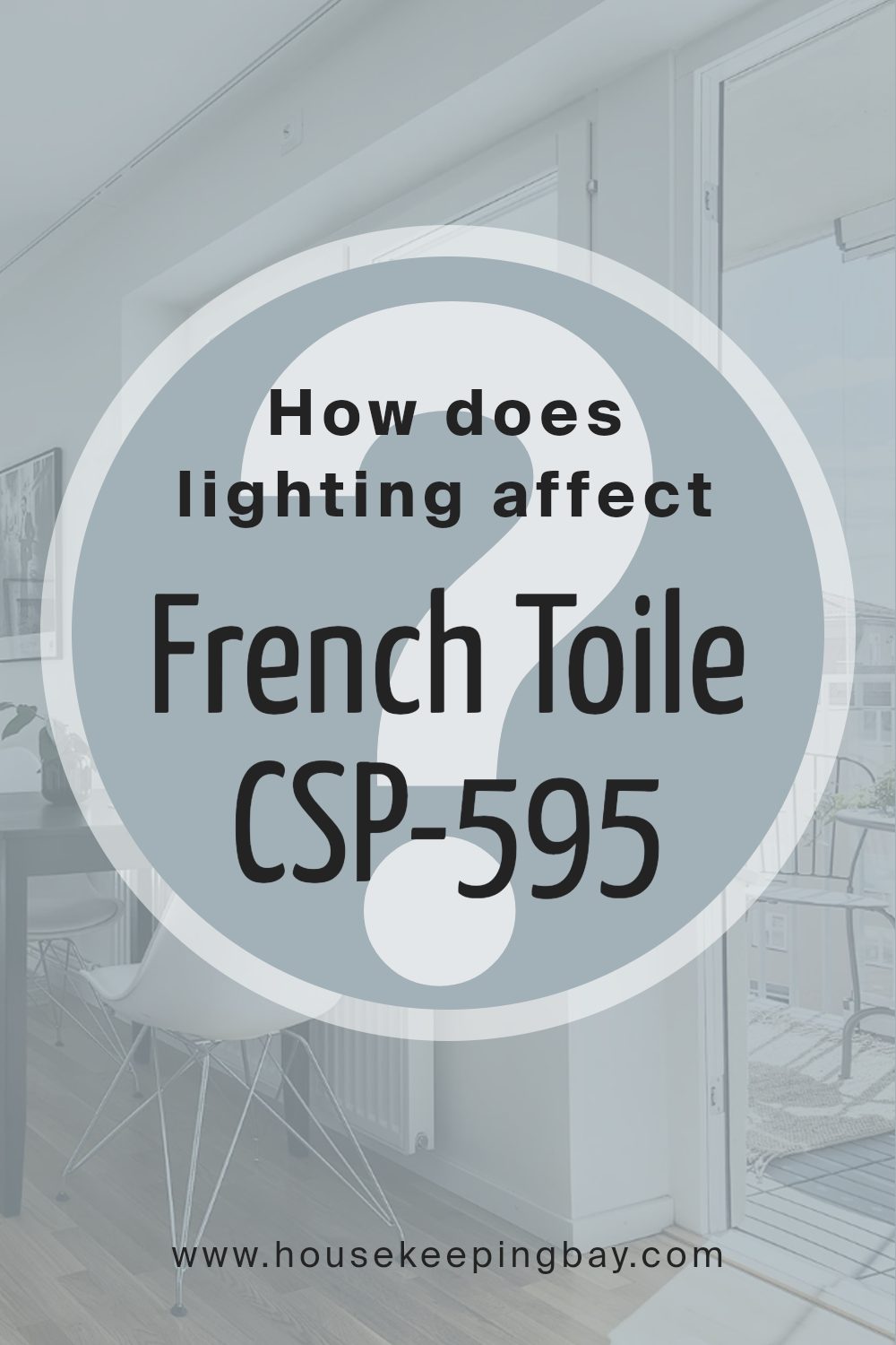
How Does Lighting Affect French Toile CSP-595 by Benjamin Moore?
Lighting plays a crucial role in how we perceive colors. The type of light—whether natural sunlight or artificial lighting—can dramatically change a color’s appearance. The color French Toile CSP-595 by Benjamin Moore, for example, can look different depending on the light it receives.
In artificial light, like LED or incandescent lighting, French Toile CSP-595 may take on a warmer or cooler tone. Incandescent bulbs, which emit a warm, yellowish light, might make this color appear slightly more muted or warmer.
On the other hand, LEDs, especially those with a cooler tone, can enhance its blue undertones, making it appear crisper.
Natural light, as it changes throughout the day, has a distinct effect. In rooms with abundant natural light, this color often appears true to its swatch. However, it’s important to consider the direction from which the light enters.
In north-facing rooms, the light is consistent but tends to be cooler and less intense. French Toile CSP-595 might appear a bit more subdued and cooler in these spaces, enhancing its blue undertones. This often gives the room a calming atmosphere.
South-facing rooms receive the most consistent sunlight throughout the day, often warmer due to direct sun exposure. Here, French Toile CSP-595 may appear brighter and slightly warmer, showing a softer side of the color.
East-facing rooms are filled with soft, warm light in the morning, turning cooler as the day progresses. In the morning, the color may seem a bit warmer, while later in the day, it shifts towards its original, softer tones.
West-facing rooms experience dim morning light and warm evening light. By afternoon, the color may look slightly muted but takes on a warm glow as the sun sets, bringing different depth to the space.
Understanding how lighting affects color can help in making informed choices about paint colors in different rooms.
housekeepingbay.com
What is the LRV of French Toile CSP-595 by Benjamin Moore?
LRV, or Light Reflectance Value, is a measure of how much light a color reflects. It is a scale from 0 to 100, where 0 is absolute black, meaning no light is reflected, and 100 is pure white, reflecting all light. When you look at colors on a wall, their LRV helps you understand how bright or dark the space will feel.
High LRV colors, closer to 100, make a room look brighter because they reflect more light. Lower LRV colors, closer to 0, absorb more light and make the space feel darker and cozier.
The LRV of French Toile, a paint color by Benjamin Moore, is 42.8. This LRV means it is a mid-tone color, neither too dark nor too light. A color with an LRV at 42.8 will reflect a moderate amount of light. In the context of a room, French Toile will add a balanced touch—not too overpowering or too subtle.
It won’t make the room feel too bright or stark, and it won’t make it feel overly dim either. The balance makes it a versatile choice, suitable for spaces where you want a bit of color without overwhelming the senses.

housekeepingbay.com
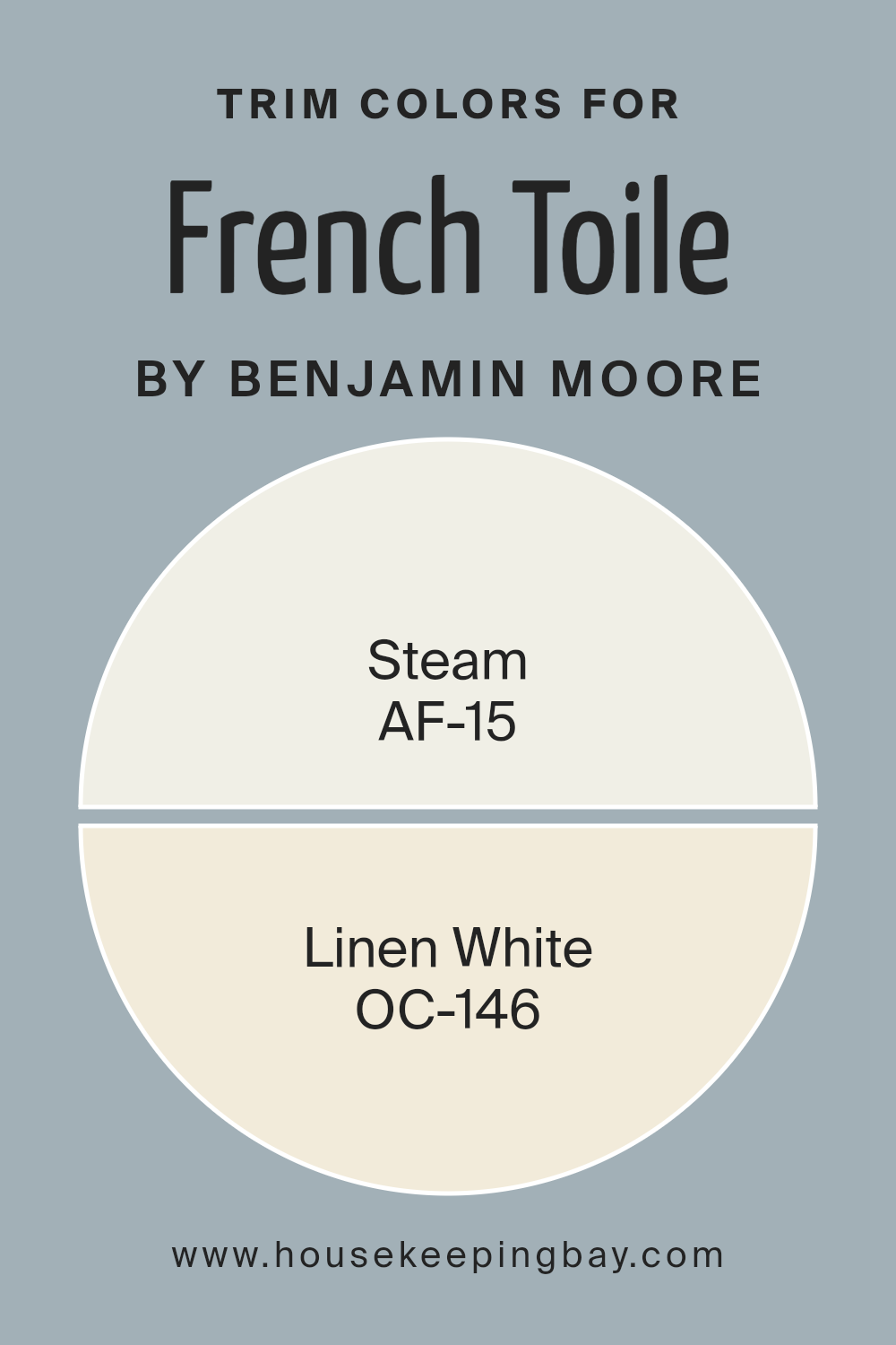
What are the Trim colors of French Toile CSP-595 by Benjamin Moore?
Trim colors refer to the shades used for the details such as moldings, doors, and window frames in a room. These colors play a significant role in enhancing the overall look of a space, serving as the finishing touch that ties the design elements together. When it comes to a pattern like French ToileCSP-595 by Benjamin Moore, selecting the right trim colors is crucial.
The intricate details and historical charm of toile can be beautifully accented with trim colors that complement its sophistication and elegance. Using the right trim shades can frame the toile pattern, highlighting its details and giving the room a complete and polished appearance.
AF-15 – Steam is a soft, clean white that provides a subtle backdrop without overpowering other elements. Its gentle tone allows it to perfectly accentuate the complex patterns and colors present in French ToileCSP-595, offering a balanced contrast.
Meanwhile, OC-146 – Linen White has a warm touch with a slightly creamy undertone, creating a cozy and inviting atmosphere.
This shade can gently complement the French toile pattern, bringing a harmonious feel to the room while ensuring that the design remains the focal point. Together, these trim colors offer versatility and warmth, allowing the toile pattern to shine in its full glory.
You can see recommended paint colors below:
housekeepingbay.com
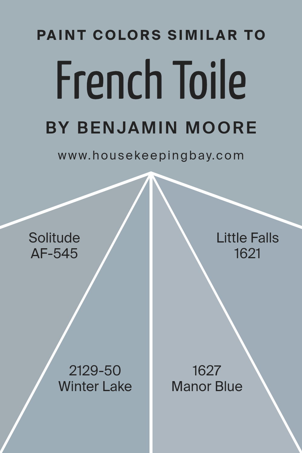
Colors Similar to French Toile CSP-595 by Benjamin Moore
Similar colors play a crucial role in design because they create a sense of harmony and unity. They bring together elements in a space without clashing or causing visual distractions. When you use colors that are close to each other on the color wheel, they blend well and create a smooth, pleasing look.
For instance, when working around the beautiful French Toile CSP-595 from Benjamin Moore, colors like AF-545 Solitude, 2129-50 Winter Lake, 1627 Manor Blue, and 1621 Little Falls serve as perfect complements. These shades can enhance the feeling of calmness and sophistication in a room.
Solitude is a light, airy blue that exudes a soft, peaceful vibe. It sets the tone for a serene environment. Winter Lake is slightly richer, providing a subtle strength while maintaining its cool edge. Manor Blue introduces a deeper, more traditional touch to the palette. This color has warmth, adding depth and interest.
Little Falls provides a gentle neutral with its muted tones, balancing the color scheme without overpowering it.
Together, these shades work in unison, wrapping the space in a soothing, cohesive narrative, making each area feel thoughtfully curated and visually interesting.
You can see recommended paint colors below:
- AF-545 Solitude
- 2129-50 Winter Lake
- 1627 Manor Blue
- 1621 Little Falls
housekeepingbay.com
Colors that Go With French Toile CSP-595 by Benjamin Moore
When choosing colors to pair with French Toile CSP-595 by Benjamin Moore, it’s important to find shades that enhance its classic charm. French Toile is a sophisticated, timeless blue that pairs beautifully with a curated palette. Alfresco 1672, a gentle green, brings an outdoor freshness to the room, adding a sense of life and nature.
Meanwhile, Thousand Oceans 1645, a rich, deep blue, provides a feeling of depth and calmness, reminiscent of the vast ocean.
Iced Slate 2130-60, a muted gray-blue, complements French Toile by offering a soft, neutral balance that keeps the space feeling airy and light. Wild Blue Yonder CSP-620, a vibrantly fresh blue, adds energy and a touch of playfulness to the mix. Violet Sparkle 1422 adds a pop of lively color with its unexpected hint of purple, introducing a cheerful and stylish flair.
Lastly, Coastline AF-570, with its warm, sandy undertones, ties these colors together, creating a cozy, inviting atmosphere.
These colors work harmoniously with French Toile to craft spaces that are homely, elegant, and full of character, each contributing its distinctive personality to the overall aesthetic.
You can see recommended paint colors below:
- 1672 Alfresco
- 1645 Thousand Oceans
- 2130-60 Iced Slate
- CSP-620 Wild Blue Yonder
- 1422 Violet Sparkle
- AF-570 Coastline

housekeepingbay.com
How to Use French Toile CSP-595 by Benjamin Moore In Your Home?
French Toile CSP-595 by Benjamin Moore is a beautiful and versatile paint color. It is a soft, muted blue that brings a calm and peaceful feel to any room. People often choose this color for bedrooms or living rooms because it creates a soothing atmosphere.
In a bedroom, French Toile can be used on all walls to make the space feel cozy and restful. Pair it with white or light gray bedding and furniture for a clean and fresh look. In living rooms, it works well as an accent wall color, adding interest without overwhelming the space.
This color also pairs nicely with wooden furniture, creating a natural and harmonious setting. In a bathroom, French Toile can provide a spa-like ambiance, perfect for relaxation. It complements white tiles and silver fixtures, adding elegance without fuss. Overall, French Toile CSP-595 is a timeless choice that suits many styles and personal tastes.
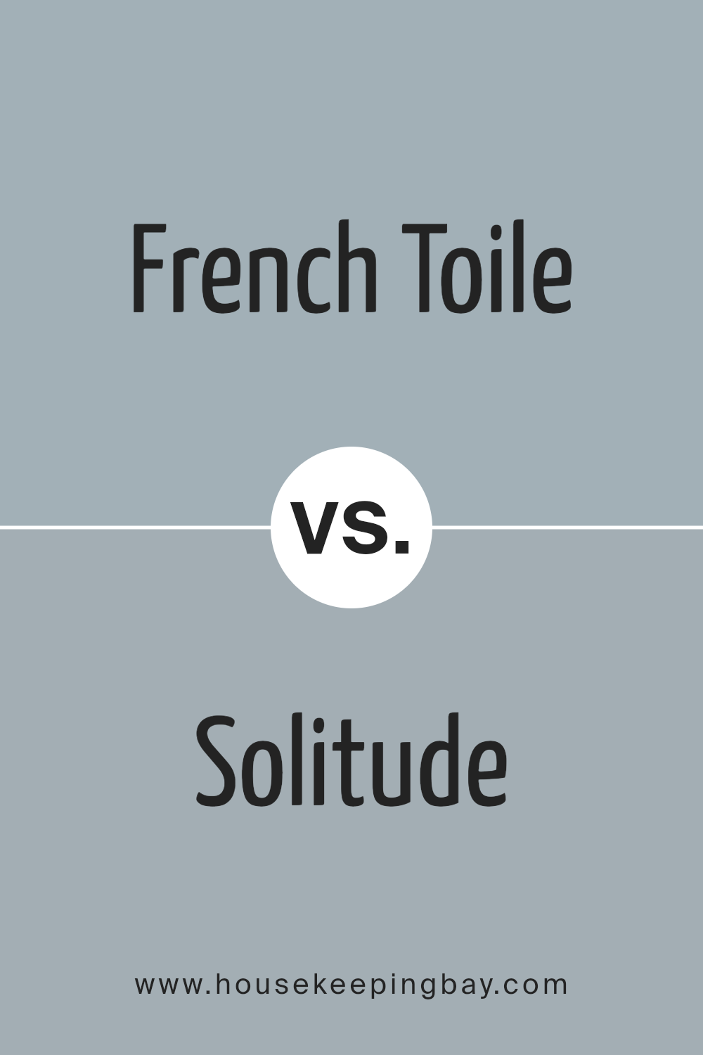
French Toile CSP-595 by Benjamin Moore vs Solitude AF-545 by Benjamin Moore
French Toile CSP-595 by Benjamin Moore is a delicate, soft blue-gray with a refined touch. This color often feels calm and soothing, making it ideal for creating serene spaces. Its subtle undertones can give a room a light and airy feel, making it versatile for many design styles.
Solitude AF-545, by contrast, is a muted, warm blue with a hint of gray, offering a cozy quality. This color brings a sense of quiet comfort to a space. While both colors reside in the blue family, Solitude feels slightly warmer and more enveloping than the crispness of French Toile.
When placed together, French Toile might brighten a room more, while Solitude can create a snug, intimate atmosphere. Both colors evoke peace, but their nuances allow for different moods. French Toile is fresher and cleaner, whereas Solitude offers a more contained and cocooning ambiance.
You can see recommended paint color below:
- AF-545 Solitude
housekeepingbay.com
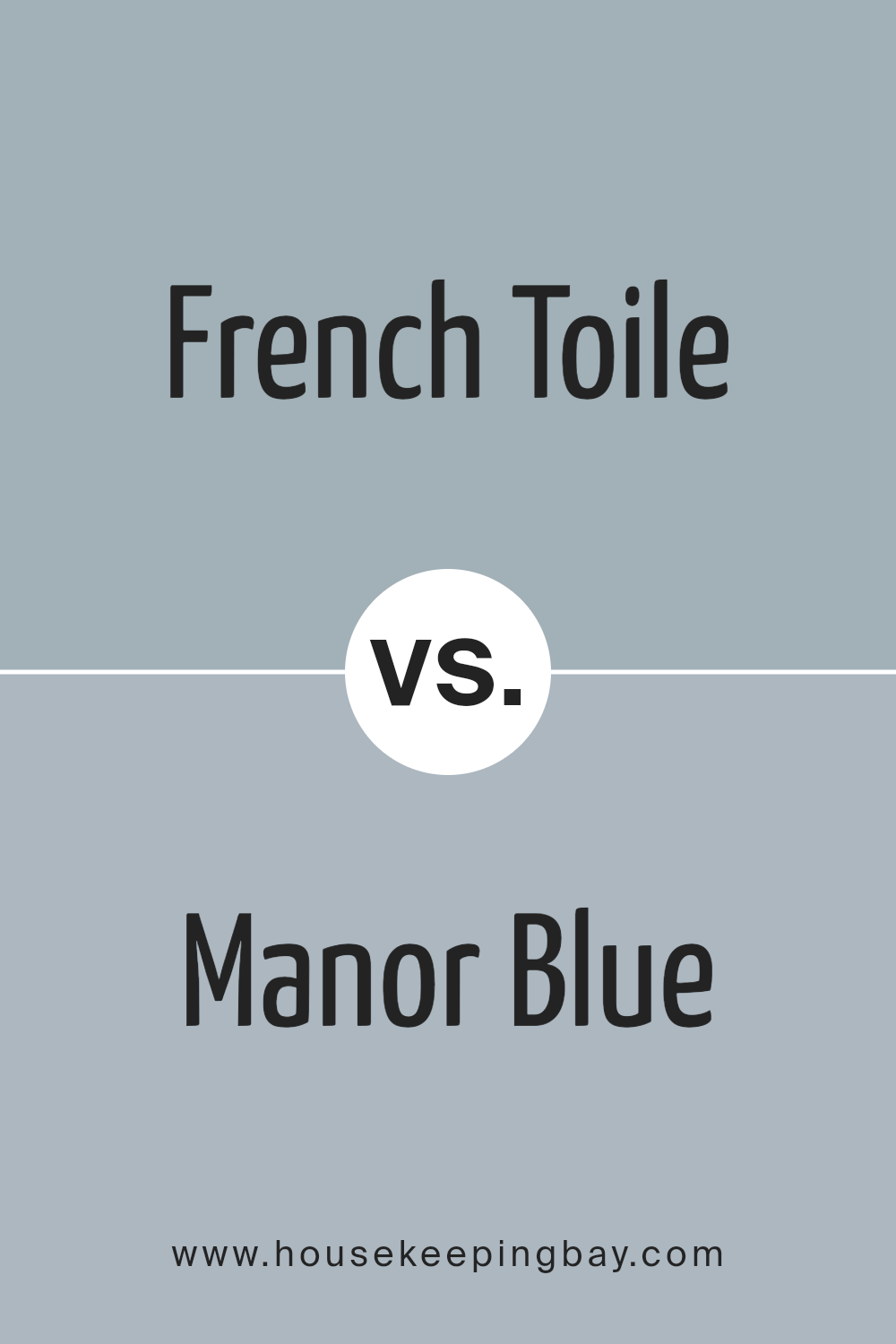
French Toile CSP-595 by Benjamin Moore vs Manor Blue 1627 by Benjamin Moore
French Toile CSP-595 by Benjamin Moore is a soft, muted blue that exudes calmness and elegance. It has a gentle, airy quality, making spaces feel open and serene. This color works well in rooms where you need a soothing atmosphere, such as bedrooms or bathrooms.
Manor Blue 1627 by Benjamin Moore, however, is a deeper and more vibrant blue. It carries a richness and depth, adding a sense of warmth and coziness to a space. Manor Blue can create a statement in dining rooms or living areas, bringing a touch of sophistication and comfort.
While French Toile offers a light and breezy feel, Manor Blue provides a bold and inviting presence. Both colors can enhance a home, but they do so in unique ways. French Toile is perfect if seeking a peaceful, airy vibe, while Manor Blue suits those who desire a more grounded, cozy environment.
You can see recommended paint color below:
- 1627 Manor Blue
housekeepingbay.com
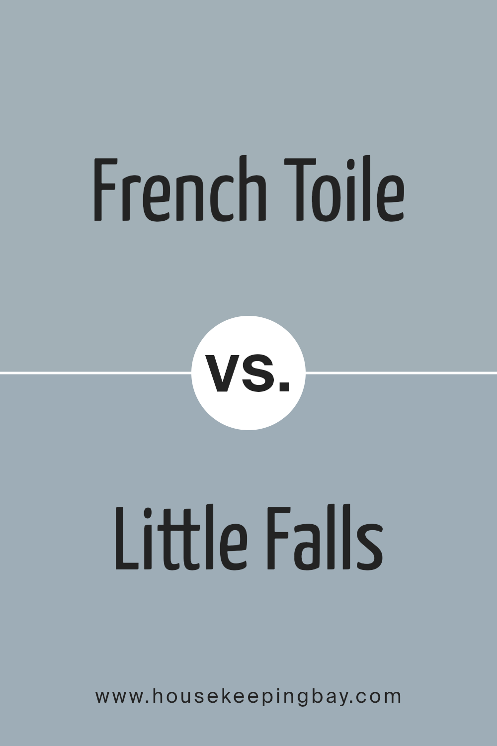
French Toile CSP-595 by Benjamin Moore vs Little Falls 1621 by Benjamin Moore
French Toile CSP-595 by Benjamin Moore is a soft, muted blue that carries a hint of gray, making it versatile for various settings. It exudes a calming, subdued feel, perfect for creating a serene atmosphere in living rooms or bedrooms. Its understated elegance can work well with both traditional and modern decor, offering a gentle backdrop without overwhelming other design elements.
Little Falls 1621, also by Benjamin Moore, is another shade of blue-gray but leans slightly more towards the gray spectrum. It presents a cooler, more neutral tone compared to French Toile.
This makes Little Falls particularly suitable for spaces where a more neutral, contemporary look is desired. It pairs well with whites, charcoals, and wood tones.
While both colors provide a calm and cool feeling, French Toile tends to be warmer and softer, whereas Little Falls offers a slightly crisper and more neutral ambiance.
Each facilitates a subtle, sophisticated aesthetic in different interior designs.
You can see recommended paint color below:
- 1621 Little Falls
housekeepingbay.com
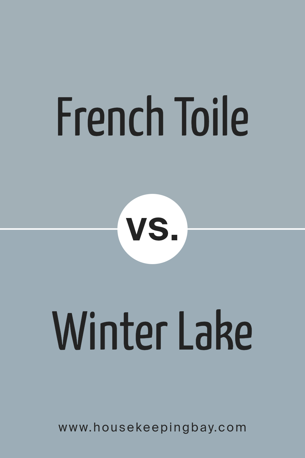
French Toile CSP-595 by Benjamin Moore vs Winter Lake 2129-50 by Benjamin Moore
French Toile CSP-595 by Benjamin Moore is a muted blue-grey shade. It exudes a classic, elegant vibe, reminiscent of fine porcelain or gentle skies. Its subtle undertones give it a sophisticated feel, making it a versatile choice for traditional or contemporary spaces.
Winter Lake 2129-50 also belongs in the blue spectrum, but it offers a slightly deeper, cooler hue. This color brings to mind the serene, cool depths of a northern lake.
Its slightly stronger presence can add depth and coziness to a room, making it suitable for spaces where a touch of intimacy is desired.
While both colors share blue characteristics, French Toile leans towards a softer, lighter side, ideal for airy, open environments. In contrast, Winter Lake’s bolder hue works well for creating a more soothing and enclosing ambiance.
Both color choices can enhance different moods within a home, offering flexibility to align with personal style preferences.
You can see recommended paint color below:
- 2129-50 Winter Lake
housekeepingbay.com
Conclusion
French Toile by Benjamin Moore, with its subtle blend of soft hues, brings a sense of calm and elegance to any space. When I see this color, it feels like I’m stepping into a world of understated sophistication. The gentle tones of French Toile create a backdrop that doesn’t overwhelm but rather complements and enhances the elements within a room.
Whether it’s a living room bathed in natural light or a cozy bedroom, the color seems to adapt beautifully, offering warmth and serenity. It has a timeless appeal that works well with both modern and traditional décor.
This versatile paint can easily blend in or stand out, depending on how it’s used.
French Toile isn’t just about color; it’s about creating an atmosphere that is both welcoming and refined. It’s perfect for those looking to refresh their walls with something that is both chic and enduring.
I find it inspiring how a single shade can offer so much depth and character, inviting personal creativity in designing a harmonious living space.
housekeepingbay.com
Ever wished paint sampling was as easy as sticking a sticker? Guess what? Now it is! Discover Samplize's unique Peel & Stick samples. Get started now and say goodbye to the old messy way!
Get paint samples


