Flint AF-560 by Benjamin Moore
Shades of Warmth: Why This Soft Gray Paint is Ideal for Your Home
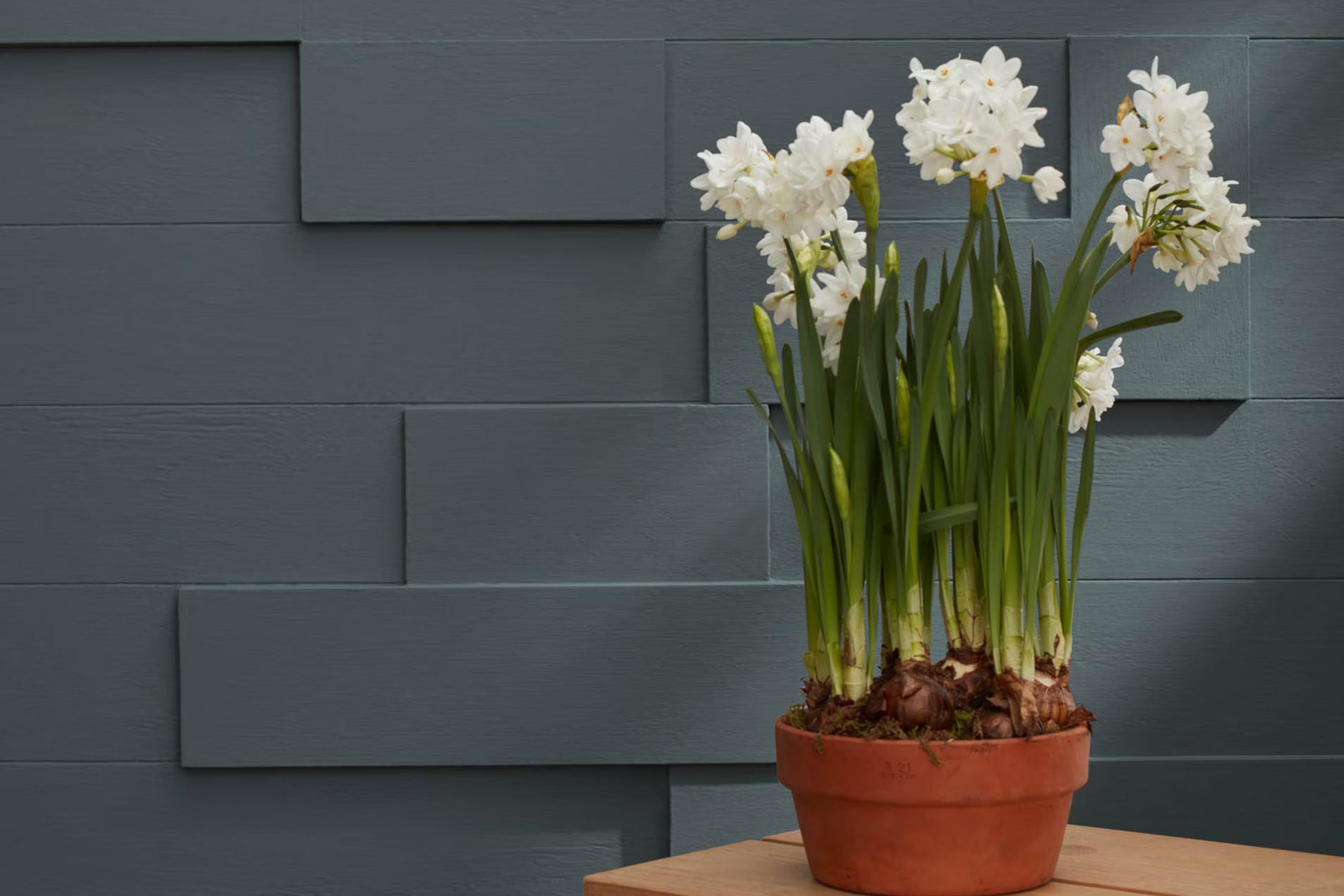
If you’re on the lookout for a fresh look for your walls, consider AF-560 Flint by Benjamin Moore. This sleek shade belongs to the Affinity Color Collection, designed to ensure that each hue complements others seamlessly. Flint is a deep, rich gray that adds a subtle hint of sophistication and groundedness to any space.
Ideal for creating a cozy, inviting atmosphere, Flint works beautifully in living rooms, bedrooms, and even kitchens. Whether you prefer a modern vibe or something more traditional, this color adapts effortlessly. Additionally, its balance between warm and cool tones makes it incredibly easy to pair with different decors and furniture finishes, bringing unity and style to your home.
I recommend trying out this color if you are refreshing your room or updating your space with a new color scheme. Flint by Benjamin Moore could be the perfect choice for your next painting project.
via benjaminmoore.com
What Color Is Flint AF-560 by Benjamin Moore?
Table of Contents
Flint AF-560 by Benjamin Moore is a rich, deep gray that brings a sense of sophistication and quiet confidence to any room. This versatile shade belongs to the Affinity Color collection, designed to harmonize with other colors seamlessly. Flint AF-560 has an understated elegance that works beautifully in a variety of interior styles, particularly modern, contemporary, and minimalist designs. Its ability to act as a neutral yet bold backdrop makes it perfect for creating a refined aesthetic.
In terms of pairing, Flint AF-560 goes well with natural materials like wood and stone, which enhance its depth and contrast. Textures such as linen, wool, and leather also complement this color effectively, adding warmth and tactile variety to the visual experience. Metallic accents in silver, chrome or brushed nickel add a sleek, modern touch when used with this shade, providing a crisp finish to the design layout.
This color is ideal for living rooms, bedrooms, and home offices, where its calming qualities can create a relaxing environment. It also works well in kitchens and dining areas, offering a contemporary look that is both practical and stylish. Overall, Flint AF-560 is a smart choice for anyone looking to introduce a strong but refined element into their space.
housekeepingbay.com
Is Flint AF-560 by Benjamin Moore Warm or Cool color?
FlintAF-560 by Benjamin Moore is a rich, deep gray color that adds sophistication to any space in the home. This versatile shade can work wonders in a variety of settings, from living rooms to bedrooms, giving each area a touch of modern elegance. The beauty of FlintAF-560 lies in its ability to pair well with many different decor styles and colors, making it a practical choice for interior design.
It can serve as a strong foundation color, allowing other elements like furniture and artwork to stand out. Additionally, its dark tone can make large, bright rooms feel cozier, providing a sense of comfort and warmth.
This color is particularly useful for highlighting architectural details such as trim, moldings, and door frames, offering a contrasting backdrop that enhances the overall aesthetic of a room. Whether you’re looking to create a dramatic statement wall or simply want to add depth to your color scheme, FlintAF-560 delivers a sleek, contemporary look that can rejuvenate any home environment.
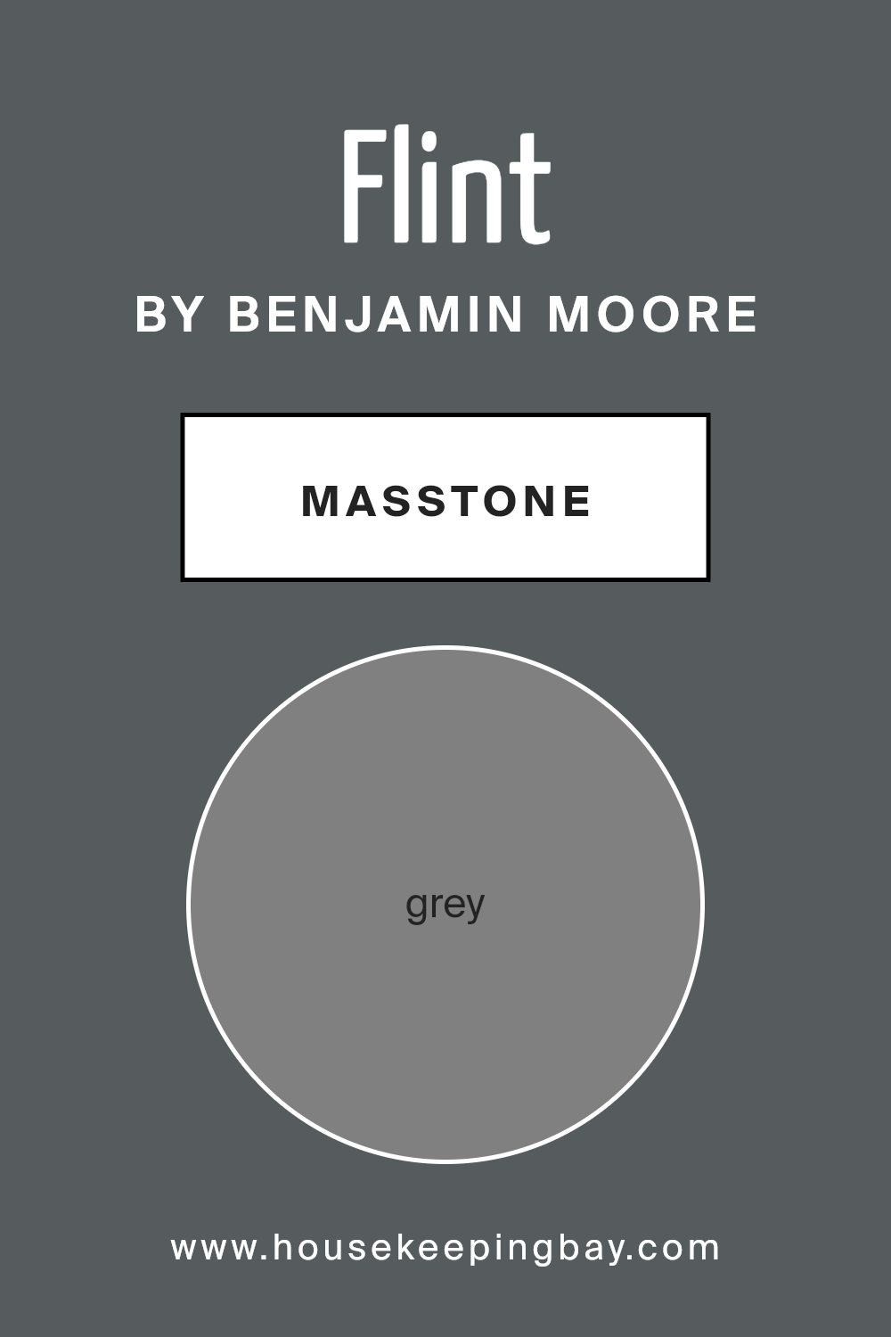
What is the Masstone of the Flint AF-560 by Benjamin Moore?
Flint AF-560 by Benjamin Moore is a robust grey color that creates a balanced, soothing atmosphere in any home. The masstone, Grey (#808080), is a perfectly neutral shade that works well in various rooms, whether you’re looking to paint a cozy bedroom or a stately living room. This particular grey doesn’t lean too cool or too warm, which makes it incredibly versatile and easy to integrate with different color schemes and decor styles.
In smaller spaces, Flint AF-560 can make the area feel more expansive and airy, an excellent trick for making tight quarters appear larger. In larger rooms, this grey provides a steady, calming background that allows furniture and artwork to stand out, without overwhelming the senses.
This makes it a favorite choice for open-plan spaces where cohesion between living, dining, and kitchen areas is essential. Flint AF-560 adapts well to different lighting conditions, maintaining its integrity and depth under both natural and artificial light sources. It’s an ideal choice for homeowners looking for a reliable and adaptable color.
housekeepingbay.com
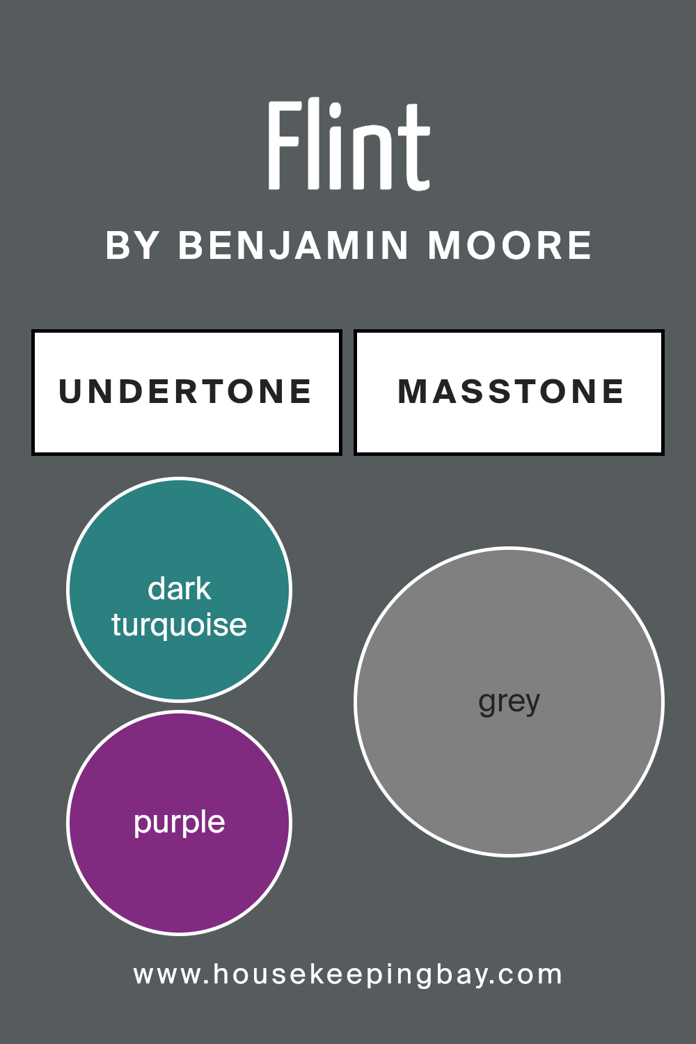
Undertones of Flint AF-560 by Benjamin Moore
FlintAF-560 by Benjamin Moore is a versatile paint color with a complex array of undertones that subtly influence how it looks in different settings. Undertones are subtle hues mixed into the main color, impacting the overall impression it leaves. For FlintAF-560, the presence of dark turquoise, purple, navy, and other shades add depth and richness, which can shift under varying lighting conditions.
When applied to interior walls, the undertones of dark turquoise and navy provide a cool, sophisticated backdrop that pairs well with modern and minimalist decor. These cooler tones may make a room feel more serene and focused. On the other hand, undertones like purple and lilac inject a touch of warmth that can soften the room’s ambiance, making spaces feel more welcoming.
In natural light, FlintAF-560’s darker green and olive undertones may emerge, enhancing connections with natural elements, which is ideal for rooms looking to achieve a balance between comfort and style. The browns and darker greys maintain grounding, adding a sense of stability and understatement.
The variety of undertones in FlintAF-560 makes it highly adaptable. It can complement a wide range of color palettes, from bold and vibrant furnishings to more subdued, earthy textures. It’s a great option for someone looking to create a nuanced and adaptable space without committing to an overtly bold color, allowing the room to change and evolve with different decor and lighting conditions.
housekeepingbay.com
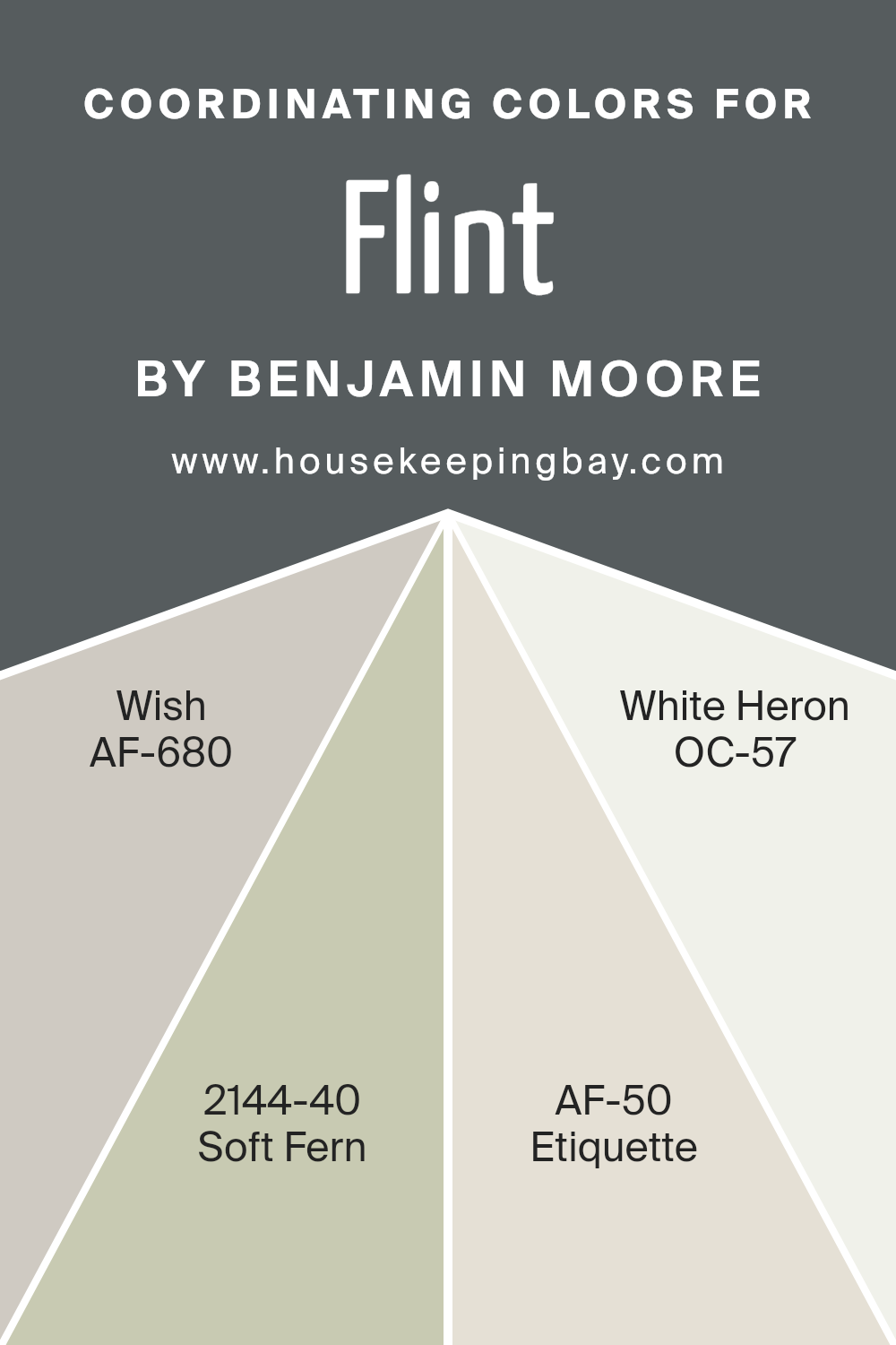
Coordinating Colors of Flint AF-560 by Benjamin Moore
Coordinating colors help create a harmonious interior by combining shades that complement each other beautifully. When working with a base color like Flint AF-560 by Benjamin Moore, a rich, deep gray, choosing the right coordinating colors can enhance the overall aesthetic and bring balance to a space. These coordinating colors work well because they share similar undertones or are contrasting in a way that draws the eye without overwhelming the senses.
AF-680, known as Wish, is a subtle, muted gray that provides a lighter contrast to Flint, keeping the ambiance soft yet sophisticated. It’s an ideal choice for larger areas or furniture to maintain a seamless look. 2144-40 Soft Fern adds a touch of nature with its gentle green hue, offering a refreshing pop of color that is neither too bold nor too dull, perfect for accent walls or decorative elements.
AF-50 Etiquette is a clean, crisp white with a slightly warm undertone, making it excellent for trim or ceiling colors to create a subtle boundary without harsh lines. Lastly, OC-57 White Heron is a bright, pure white that serves well to illuminate and open up any space, particularly useful in smaller or darker rooms to give an airy feel. Each color supports Flint AF-560 in creating a cohesive, inviting environment.
You can see recommended paint colors below:
- AF-680 Wish
- 2144-40 Soft Fern
- AF-50 Etiquette
- OC-57 White Heron
housekeepingbay.com
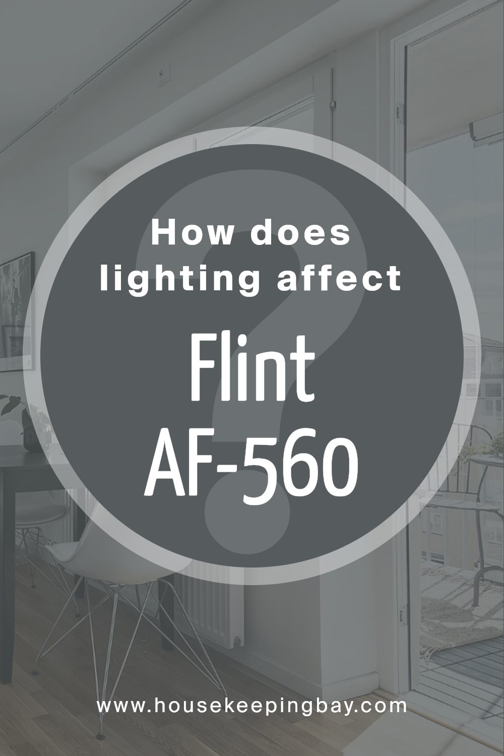
How Does Lighting Affect Flint AF-560 by Benjamin Moore?
Lighting plays a significant role in how colors appear in different environments. Colors can change dramatically under various light sources. For example, the color Flint AF-560 by Benjamin Moore can look different depending on the light in the room.
Natural Light: In natural lighting, Flint AF-560, a deep, subdued gray, appears more true to its swatch. In rooms facing south, where sunlight is warm and abundant throughout the day, Flint AF-560 can take on a lighter, slightly warm tone, making the space feel more welcoming.
North-facing rooms, however, get less direct sunlight and more cool, indirect light, which can make Flint AF-560 appear darker and more pronounced, adding a sense of depth and richness to the room.
Artificial Light: Under artificial lighting, Flint AF-560’s appearance can vary based on the type of bulbs used.
Warmer bulbs (like incandescent and warm LEDs) can soften its appearance, making the color appear slightly warmer and less stark. Cooler bulbs (such as fluorescent or daylight LEDs) might enhance the gray tones, making the color appear sharper and more vivid.
Room Orientation Effect: In east-facing rooms, where morning light is prevalent, the color can appear softer and lighter early in the day, becoming more muted as the light fades. West-facing rooms enjoy afternoon and evening light, which can make Flint AF-560 appear bolder and more dynamic towards the end of the day as the sunlight shifts from warm to cooler hues.
The overall effect of Flint AF-560 can greatly enhance different rooms based on their orientation and the type of light they receive, playing either into the strength of a bold, deep gray or softening into a more diffused, warm backdrop. Therefore, considering the light exposure in a room is crucial when choosing this versatile color.
housekeepingbay.com
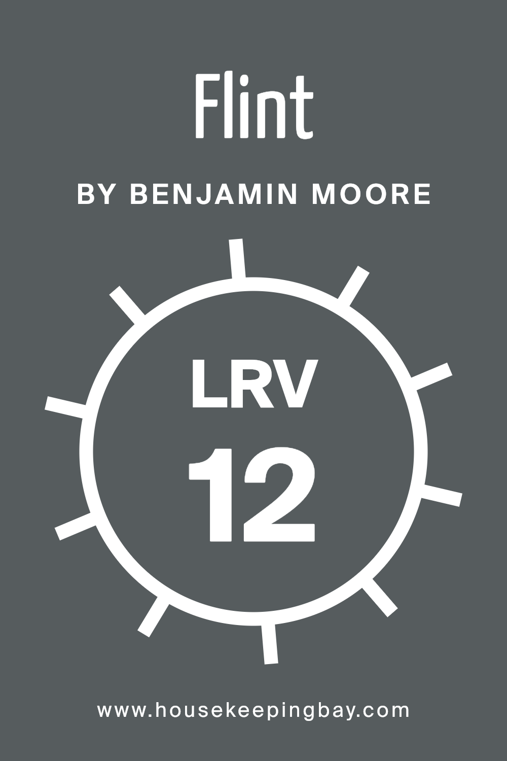
What is the LRV of Flint AF-560 by Benjamin Moore?
LRV stands for Light Reflectance Value, which is a measure of the amount of light a paint color reflects back into a room. It ranges from 0, which means no light is reflected and is typically true for black, up to 100, reflecting all the light, which is usually the case with pure white. This value helps in deciding how bright or dark a color will appear once applied to walls.
It also impacts the overall feel of a space; higher LRV colors make rooms feel larger and airer, while lower LRV paints create a cozier and more enclosed feel. This measurement is particularly useful when choosing paint for spaces with limited natural light.
With an LRV of 11.96, Flint AF-560 by Benjamin Moore is a color that falls on the lower end of the light reflectance spectrum. This means it does not reflect much light, resulting in a darker hue when applied to walls. Such a dark color can make a room appear smaller but adds an element of depth and sophistication.
In rooms with ample lighting, Flint AF-560 will likely create a rich, enveloping atmosphere. However, in a poorly lit room, using this shade might make the space feel even darker, potentially creating a gloomy or moody environment. Choosing appropriate lighting and decor can help balance out the low LRV and ensure the room maintains a comfortable feel.
housekeepingbay.com
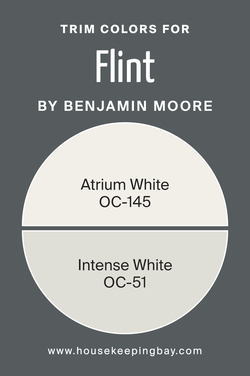
What are the Trim colors of Flint AF-560 by Benjamin Moore?
Trim colors refer to the hues used for the architectural details and accents of a room, such as baseboards, moldings, window frames, and door frames. Their role is critical in defining the spaces, highlighting the structural features, and complementing the overall color scheme of a room. For instance, when using Flint AF-560 by Benjamin Moore, a deep and sophisticated shade, choosing the right trim colors can offset its intensity and add a refined contrast that accentuates the room’s features.
The recommended trim colors like OC-145 – Atrium White and OC-51 – Intense White by Benjamin Moore serve this purpose excellently, ensuring that the depth of Flint AF-560 does not overwhelm the space.
OC-145 – Atrium White is a classic, soft white color that provides a crisp, clean look to any trim. It has the versatility to blend seamlessly with darker shades like Flint AF-560, creating a fresh and tidy border that makes the wall color pop without clashing.
Meanwhile, OC-51 – Intense White, a slightly warmer and more nuanced shade than Atrium White, offers a subtle contrast that softens transitions between the wall and the trim, enhancing the overall aesthetic without overpowering the main color theme. Each option offers a unique way to refine and define the visual appeal of a room, ensuring the walls and trim coexist harmoniously.
You can see recommended paint colors below:
- OC-145 Atrium White
- OC-51 Intense White
housekeepingbay.com
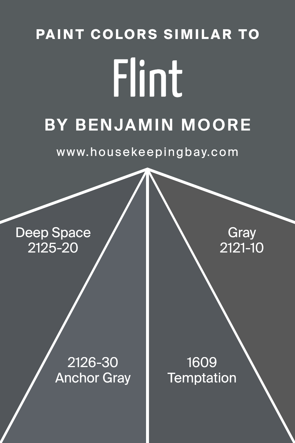
Colors Similar to Flint AF-560 by Benjamin Moore
Similar colors play a critical role in interior design by creating a harmonious atmosphere and ensuring visual continuity. Choosing colors like Flint AF-560 and its related hues ensures a cohesive palette that can make spaces feel more connected and seamlessly integrated.
When shades such as Deep Space, Anchor Gray, Temptation, and Gray are used together, they provide a subtle variation that adds depth and interest without the stark contrasts that can arise from more disparate colors. This gentle transition from one color to the next can be soothing to the eye, making rooms appear more sophisticated and thoughtfully designed.
Deep Space is a profound charcoal that offers a strong sense of sophistication due to its depth. It pairs well with lighter shades for a striking contrast that still retains harmony within a space. Anchor Gray leans more toward a deep blue, providing a subtle maritime feel that works well in spaces intended to have a calming effect.
Temptation strikes a balance between gray and purple, giving it a unique appeal that is both warm and inviting. Lastly, simply named Gray is a true, balanced gray that acts as an excellent neutral backdrop, supporting a wide range of design choices and allowing other colors to stand out without overwhelming. Using these similar colors makes it easier to achieve a refined and inviting atmosphere in any home or office.
You can see recommended paint colors below:
- 2125-20 Deep Space
- 2126-30 Anchor Gray
- 1609 Temptation
- 2121-10 Gray
housekeepingbay.com
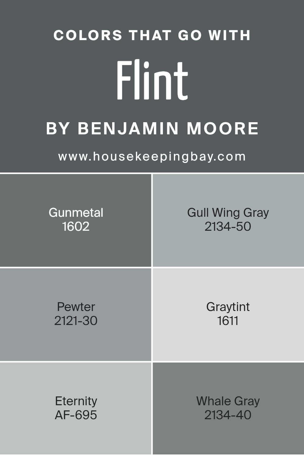
Colors that Go With Flint AF-560 by Benjamin Moore
Choosing complementary colors for Flint AF-560 by Benjamin Moore is an important aspect of design, as it helps to create a harmonious and appealing space. Flint AF-560 is a robust charcoal gray that provides a solid foundation for any room. When paired with other colors, it can either stand out prominently or blend in subtly, depending on the look you are aiming for. Colors like Gunmetal and Gull Wing Gray are softer versions of gray that create a gentle contrast with Flint AF-560, making the space feel more layered and nuanced without overwhelming the senses.
Gunmetal is a slightly lighter gray that can lighten the mood of a room while still keeping the sophistication intact. It works well in spaces that need a bit of brightness without deviating from a modern aesthetic. Gull Wing Gray, on the other hand, leans towards a silver-gray that brings a light, airy quality to the interiors, ideal for spaces that benefit from a subtle lift.
Pewter is a warmer tone that adds a cozy feel, perfect for creating a welcoming environment. Graytint offers a hint of blue, injecting a fresh, calm atmosphere into any room. Eternity is a deeper gray that adds depth and richness, ideal for accenting features. Whale Gray, darker yet, can define spaces and highlight architectural details, making it perfect for focal points. Together, these colors complement Flint AF-560 by offering a range of options that allow for various design moods and themes, from the subtle to the dramatic.
You can see recommended paint colors below:
- 1602 Gunmetal
- 2134-50 Gull Wing Gray
- 2121-30 Pewter
- 1611 Graytint
- AF-695 Eternity
- 2134-40 Whale Gray
housekeepingbay.com
How to Use Flint AF-560 by Benjamin Moore In Your Home?
Flint AF-560 by Benjamin Moore is a deep, rich gray that exudes sophistication and class. This versatile color works well in many areas of a home, offering a solid choice for those seeking a strong but neutral backdrop.
It’s particularly effective in living rooms or bedrooms, providing a calming, understated elegance that pairs well with both bright colors and other neutrals. Flint AF-560 can also make small spaces appear larger when applied to walls, while creating a cozy, intimate feel in larger rooms. In the kitchen, this shade can be used on cabinets for a modern twist or to add visual depth.
For the exterior, applying Flint AF-560 to trim or shutters can enhance your home’s curb appeal without overwhelming the primary color scheme. This paint color is a practical choice for anyone wanting to refresh their space with a touch of modernity while keeping things simple and stylish.
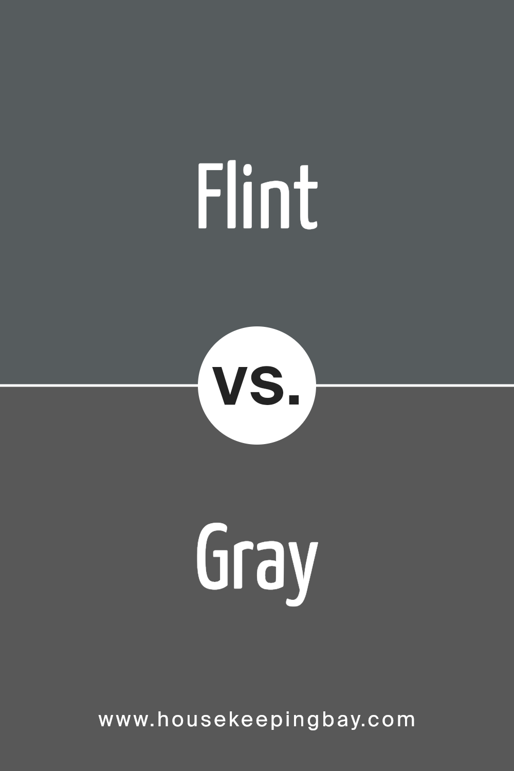
Flint AF-560 by Benjamin Moore vs Gray 2121-10 by Benjamin Moore
Flint AF-560 and Gray 2121-10 by Benjamin Moore are both shades of gray, yet they have distinctive tones. Flint AF-560 leans toward a soft, subtle gray with hints of blue, offering a calming atmosphere to any space.
This color can make rooms feel serene and expansive, ideal for bedrooms or living areas seeking a peaceful vibe. In contrast, Gray 2121-10 is a much deeper and bold gray, almost bordering on black. This darker tone provides a dramatic flair, making it well-suited for accent walls or furniture pieces that are meant to stand out.
It’s especially effective in modern designs where a strong visual impact is desired. Both colors work well in contemporary settings, but Flint AF-560 is generally better for a lighter, more airy feel while Gray 2121-10 is key for creating rich, deep contrasts.
You can see recommended paint color below:
- 2121-10 Gray
housekeepingbay.com
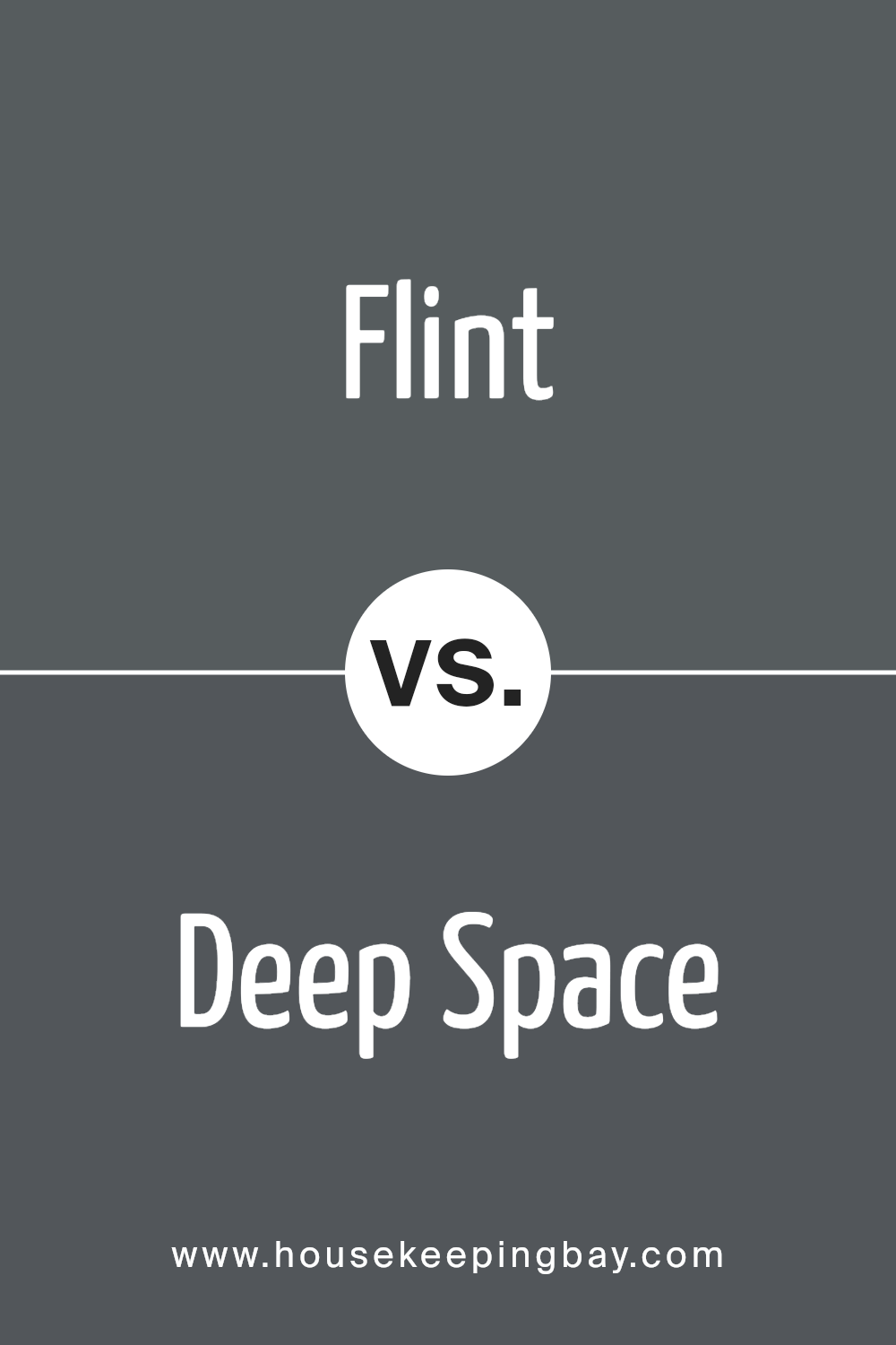
Flint AF-560 by Benjamin Moore vs Deep Space 2125-20 by Benjamin Moore
Flint AF-560 and Deep Space 2125-20 are both dark hues by Benjamin Moore. Flint AF-560 leans towards a subtle gray with a hint of brown, giving it a warm, neutral base that’s versatile for many spaces. This color is excellent for rooms where you want a cozy yet sophisticated ambiance.
It pairs well with soft whites and rich woods, enhancing other elements of decor without overpowering them. In contrast, Deep Space 2125-20 is a much darker, almost black shade that veers closer to the navy spectrum. It’s ideal if you’re aiming for a bold and dramatic effect.
This color works well in spaces designed for impact or as accent walls to contrast with lighter tones. Despite its depth, it can make a room feel anchored and very chic, especially when used with metallic accents or light-colored furniture to break up the intensity.Both colors add character and mood to spaces but cater to different aesthetic needs and atmospheres.
You can see recommended paint color below:
- 2125-20 Deep Space
housekeepingbay.com
Flint AF-560 by Benjamin Moore vs Anchor Gray 2126-30 by Benjamin Moore
Flint AF-560 by Benjamin Moore is a sophisticated dark gray with hints of deep blue, giving it a subtle yet rich depth that creates a chic and cozy atmosphere in a space. This color works well in intimate, personal areas like bedrooms or studies where you want a touch of elegance without the room feeling too dark.
In contrast, Anchor Gray 2126-30, also by Benjamin Moore, is a more classic gray shade that leans towards the traditional side. It’s slightly lighter than Flint AF-560, making it versatile for both small and large spaces. Anchor Gray carries a neutral tone that pairs efficiently with a wide array of color schemes and decor styles, making it ideal for living rooms or kitchens where a balance between warmth and formality is desired.
Both colors provide a sense of sophistication, but Flint AF-560 offers a deeper, more enveloping feel, whereas Anchor Gray serves as a lighter, more adaptable option suitable for broader applications.
You can see recommended paint color below:
- 2126-30 Anchor Gray
housekeepingbay.com
Flint AF-560 by Benjamin Moore vs Temptation 1609 by Benjamin Moore
Flint AF-560 and Temptation 1609, both by Benjamin Moore, offer unique shades that can greatly affect the feel of a room. Flint AF-560 has a deep, rich gray tone with slight blue undertones, giving it a calm and subtle look that’s versatile for many spaces. This color works well in areas needing a touch of sophistication without overwhelming the senses.
Temptation 1609, on the contrary, is a bolder shade of gray with more pronounced blue undertones. This makes it eye-catching and ideal for spaces intended to have a more pronounced style statement. It pairs well with brighter accents and can serve as a dramatic backdrop for decor items.
Both colors are part of Benjamin Moore’s extensive palette but serve different purposes according to the vibe one wishes to achieve in a space. Flint AF-560 is more understated and classic, while Temptation 1609 leans towards a more vivid and dynamic feel.
You can see recommended paint color below:
- 1609 Temptation
housekeepingbay.com
Conclusion
Concluding my review on AF-560 Flint by Benjamin Moore, I find it a versatile shade perfect for anyone looking to add a touch of sophistication without compromising the warmth of their space. Its unique ability to shift under different lighting conditions makes it a practical choice for various rooms, whether in a bustling kitchen or a peaceful bedroom.
Painting with Flint has shown me that it pairs well with both bold and muted accents, allowing for flexible decor choices. After using it extensively, I can confidently say that Flint stands out as a reliable and impactful color that can effortlessly enhance the aesthetic of any home.
For those considering a new paint project, AF-560 Flint by Benjamin Moore should definitely be on your list of options. It offers a profound depth that enriches surroundings, making it not just a color, but a worthwhile investment into the ambiance of your living or work space.
housekeepingbay.com
