Eastlake Gold SW 0009 by Sherwin Williams
Unearth the Warmth Golden Shades Redefined
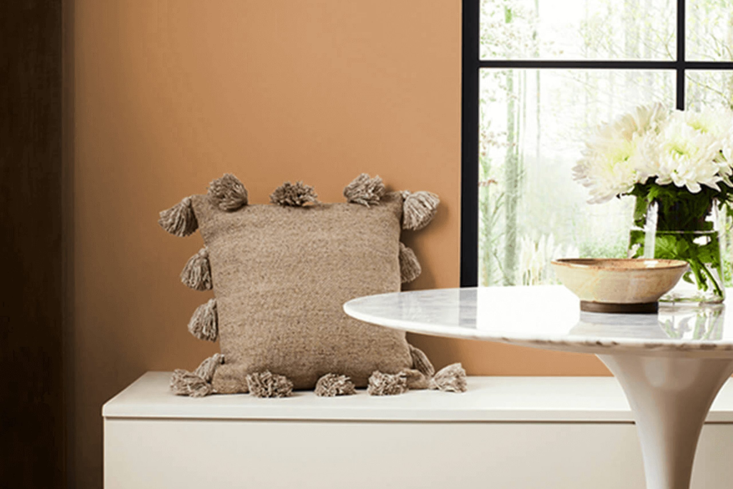
Are you thinking about giving your space a fresh, inviting look? Consider SW 0009 Eastlake Gold by Sherwin Williams for your next paint color. This warm and rich hue brings a cozy glow to any room, making it feel more welcoming and homely.
Whether you’re revamping your living room, bedroom, or kitchen, Eastlake Gold can create a comforting ambiance that feels both refined and accessible.
The color pairs beautifully with a wide range of decor styles, from classic to modern, adding a touch of timeless elegance. It also complements various furnishings and textiles, enabling you to create a harmonious space without much effort. If you’re unsure about committing to a new color, you can start with a small area or accent wall to see how it transforms your room.
Remember, the right paint can significantly affect the mood and style of your home, and SW 0009 Eastlake Gold is a choice that you can feel good about.
via sherwin-williams.com
What Color Is Eastlake Gold SW 0009 by Sherwin Williams?
Eastlake Gold SW 0009 by Sherwin Williams is a warm, muted gold hue with a sophisticated and versatile appeal. This color has a soft, welcoming presence, making it perfect for creating a cozy atmosphere in any room. It reflects light subtly, giving spaces a gentle glow.
This shade of gold works exceptionally well in traditional, rustic, or shabby chic interior styles. For a classic look, pair it with rich wood finishes like mahogany or walnut which will highlight its depth. In rustic settings, Eastlake Gold complements natural materials such as stone or aged metals, adding a hint of warmth to the organic textures.
Eastlake Gold also pairs beautifully with soft fabrics like velvet or silk, enhancing the luxurious feel of the color. In rooms with ample natural light, this color can create a soothing backdrop, while in dimmer spaces, it adds a touch of brightness.
Incorporating Eastlake Gold into your home can be as simple as painting a focal wall or as detailed as using it in intricate patterns on upholstery or curtains. It is also an excellent choice for accent pieces like throw pillows or decorative vases, lending a subtle richness to the decor.
Whether used in large areas or small details, Eastlake Gold adds warmth and elegance to any setting.

housekeepingbay.com
Is Eastlake Gold SW 0009 by Sherwin Williams Warm or Cool color?
Eastlake Gold SW 0009 by Sherwin Williams is a warm, welcoming shade that leans towards a soft mustard tone. It brings a cozy yet sophisticated vibe to any room. This color pairs beautifully with natural elements like wood and stone, enhancing a room’s organic feel.
It works well in living areas and kitchens, where it adds warmth and a sense of comfort. You can also use it in smaller spaces like a bathroom or an entryway to make them feel more inviting without overwhelming the senses.
When combined with dark furniture or accents, Eastlake Gold offers a striking contrast, making the space more dynamic and visually interesting. In rooms with plenty of sunlight, this color glows beautifully, creating an uplifting atmosphere. Suitable for various home styles, from modern to rustic, it helps create a personalized, cozy setting that feels like a true retreat from the outside world.
What is the Masstone of the Eastlake Gold SW 0009 by Sherwin Williams?
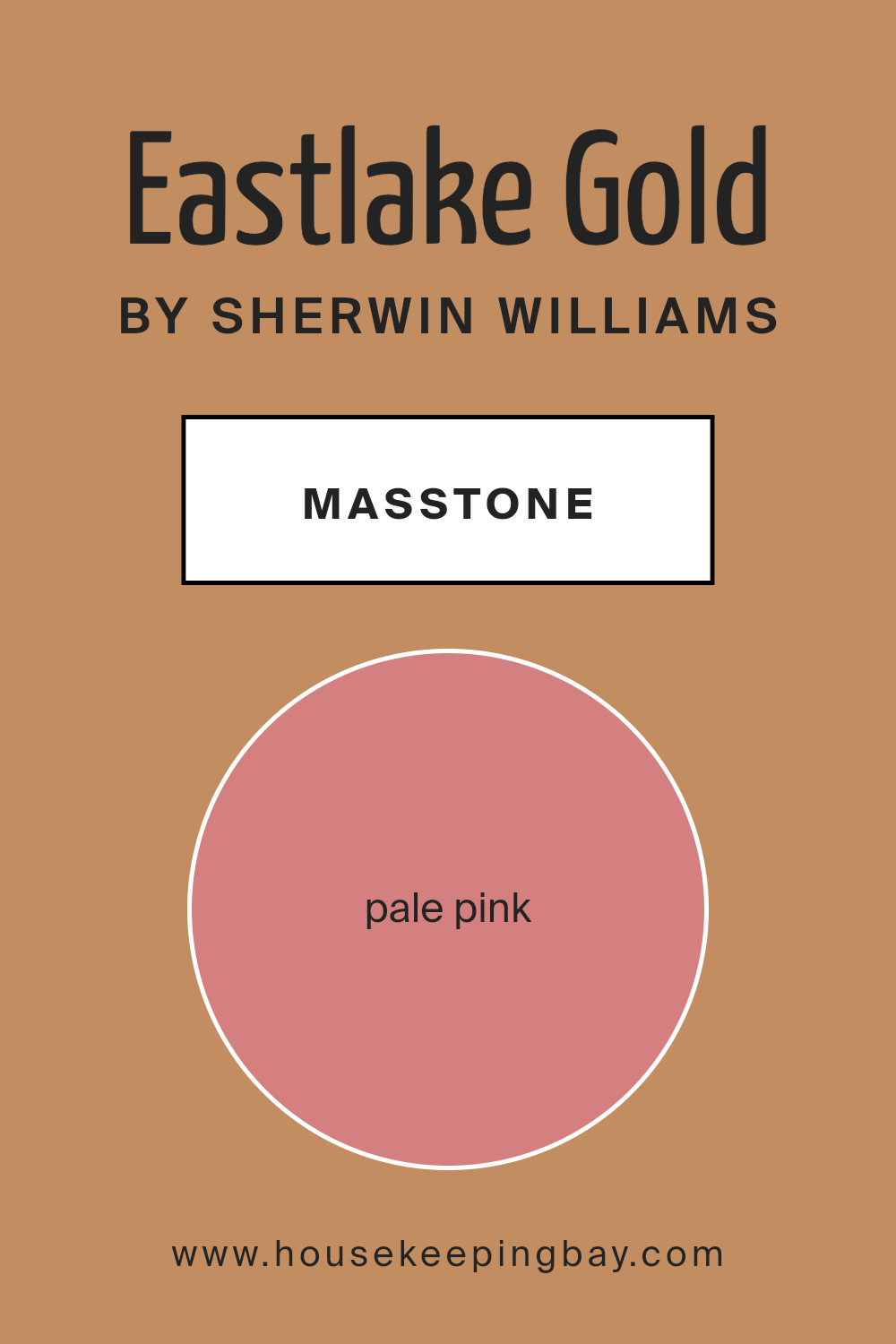
Eastlake Gold SW 0009 by Sherwin Williams has a masstone of Pale Pink (#D58080), which offers a soft, inviting glow ideal for creating a warm and cozy ambiance in homes. This gentle color is versatile and works beautifully in various settings, from bedrooms to living rooms.
Its mellow, subdued shade helps calm the senses, making it perfect for spaces where relaxation is key, such as bedrooms or reading nooks. Additionally, the pale pink tone coordinates well with other colors, allowing homeowners to pair it with both light and dark hues to adjust the room’s mood according to their preference.
Whether aiming for a classic, subtle look or wanting to add a touch of soft romance, Eastlake Gold SW 0009 provides a reliable base that enhances interior spaces without overwhelming them.
This color is particularly effective in rooms that benefit from soft natural light, enhancing its warm qualities.
housekeepingbay.com
Undertones of Eastlake Gold SW 0009 by Sherwin Williams
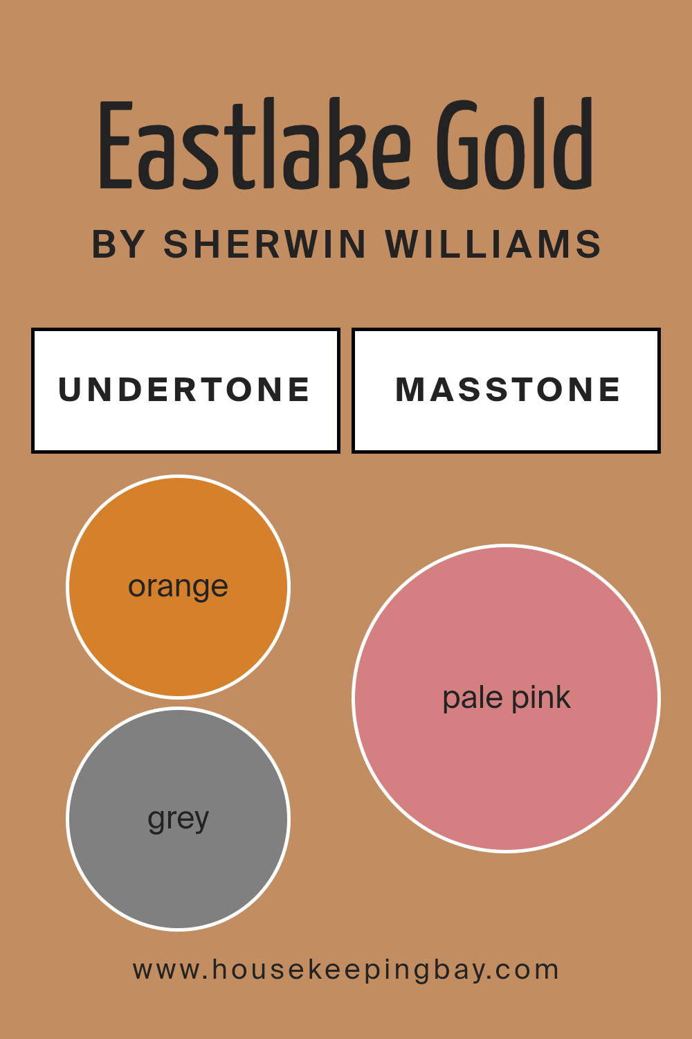
Eastlake Gold SW 0009 by Sherwin Williams is a rich, warm hue that can subtly affect the mood and appearance of a room due to its complex mix of undertones. The main undertones in this paint color are orange, grey, pale yellow, olive, and yellow. These subtle shades play a crucial role in how the color is perceived under different lighting conditions.
For instance, the orange undertone adds a cozy warmth, making it ideal for living rooms or bedrooms where a soothing, welcoming atmosphere is desired. In natural light, the pale yellow and yellow undertones become more apparent, giving the walls a bright, cheerful look.
In spaces with less natural light, the grey and olive undertones may become more dominant, lending the color a more muted, sophisticated feel. This makes Eastlake Gold SW 0009 versatile for various spaces, adapting subtly to changes in lighting and decor.
Additionally, the complex undertones can affect how the color coordinates with furniture and decor. For example, with its undertones, Eastlake Gold SW 0009 can complement wood furniture beautifully, enhancing the natural tones of the wood, while also providing a harmonious backdrop for a wide range of other colors.
Using this paint color on interior walls offers a dynamic palette that interacts intriguingly with different elements in a room.
housekeepingbay.com
Coordinating Colors of Eastlake Gold SW 0009 by Sherwin Williams
Coordinating colors are those that harmonize well with a primary color, enhancing the overall aesthetic of a space without overwhelming it. When used effectively, coordinating colors can create a balanced and visually appealing environment.
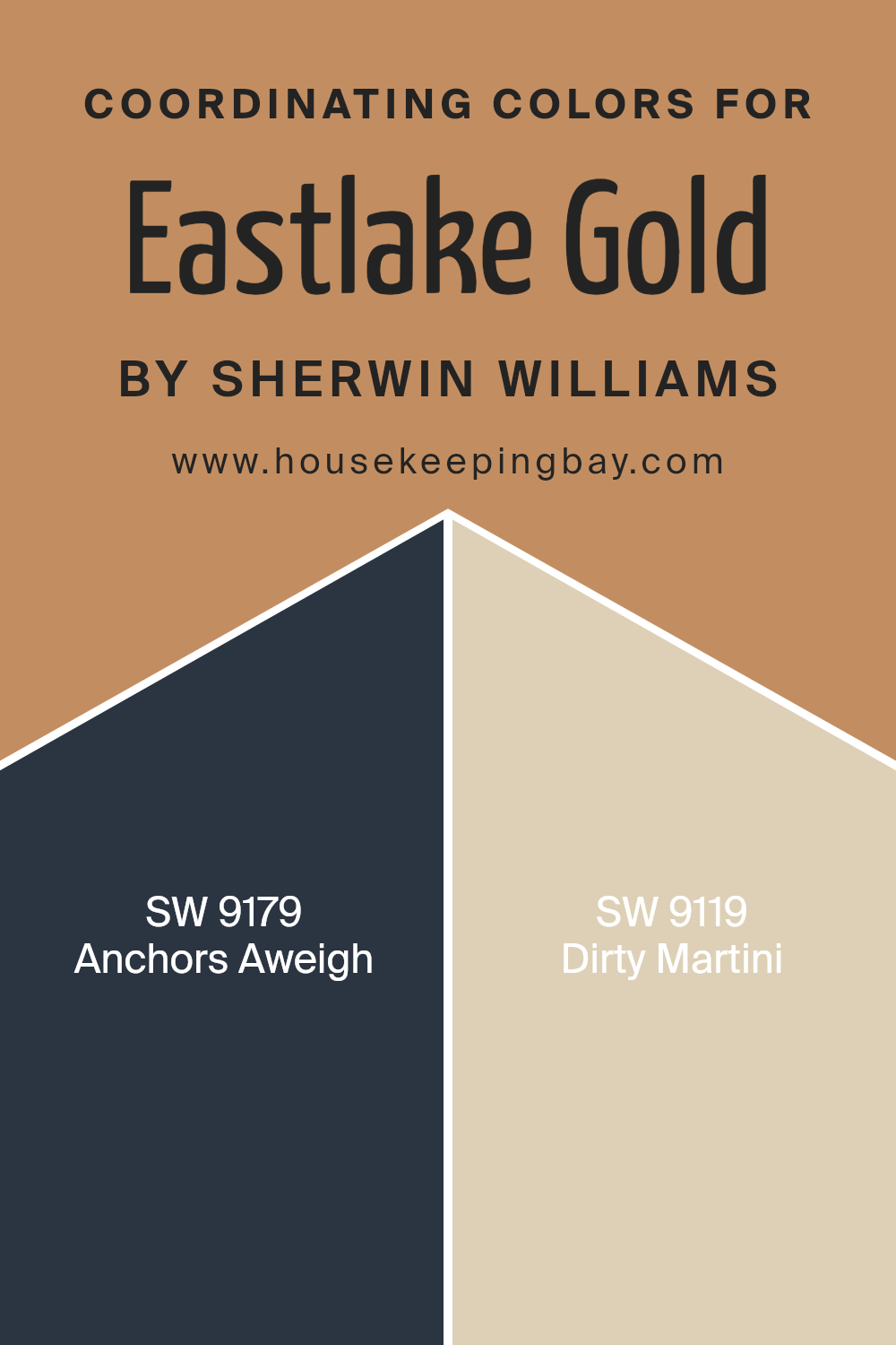
For example, Eastlake Gold SW 0009 by Sherwin Williams can be paired with colors like SW 9179 – Anchors Aweigh and SW 9119 – Dirty Martini to achieve a sophisticated and cohesive look. These color combinations work by balancing the warmth of Eastlake Gold with more muted or contrasting hues, ensuring that the space feels neither too monotone nor excessively vibrant.
Anchors Aweigh SW 9179 is a deep, navy blue that offers a strong contrast to the softer, golden tones of Eastlake Gold, providing a rich backdrop that can make lighter colors pop. This shade is ideal for creating a focal point or accentuating key architectural features in a room.
On the other hand, Dirty Martini SW 9119 is an olive green that complements the golden hues with its earthy undercurrents. This shade brings a natural, calming effect to a space, seamlessly integrating with the warmth of Eastlake Gold without overshadowing it.
Together, these colors work harmoniously to enhance the ambiance of any room.
You can see recommended paint colors below:
- SW 9179 Anchors Aweigh
- SW 9119 Dirty Martini
housekeepingbay.com
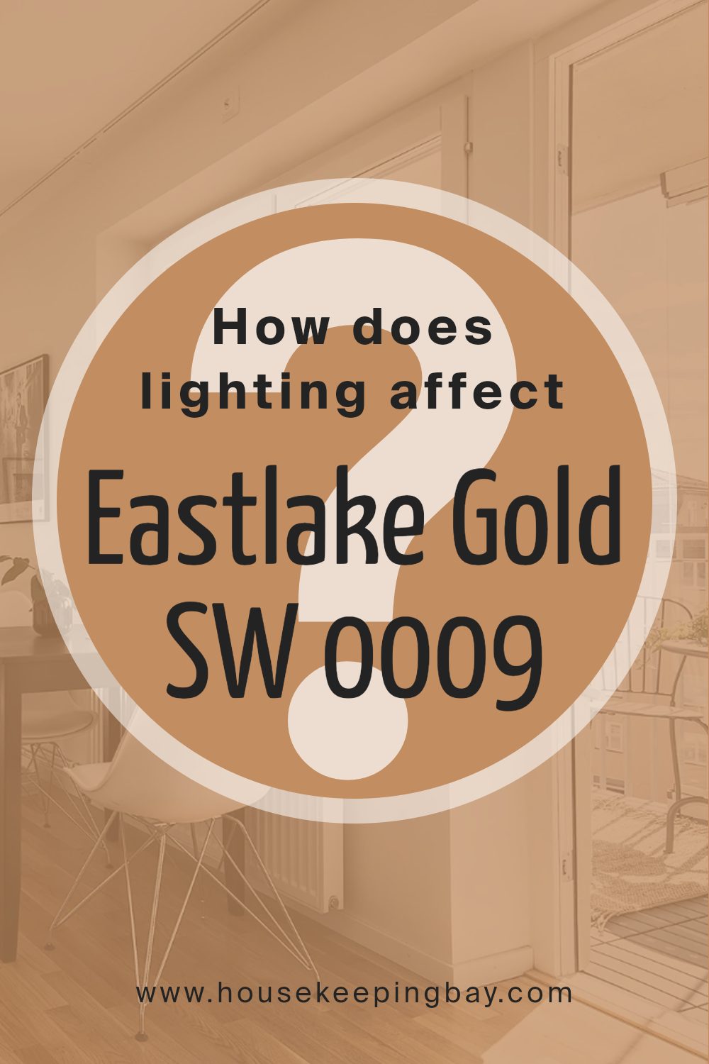
How Does Lighting Affect Eastlake Gold SW 0009 by Sherwin Williams?
Lighting plays a crucial role in how we perceive colors. Each type of light can change how a color looks. Eastlake Gold SW 0009 by Sherwin Williams is a vivid example. This shade can appear warm and inviting or muted and soft, depending on the light setting.
Artificial Light: In artificial lighting, Eastlake Gold tends to show its warmer, richer tones. Incandescent bulbs, which emit a yellowish light, enhance the golden hues, making the color feel cozy and welcoming. Fluorescent lighting, cooler in tone, might draw out more muted yellow tones, reducing the warmth slightly but maintaining the color’s vibrancy.
Natural Light: Natural lighting brings out the truest form of Eastlake Gold. During the daytime, when sunlight is abundant, the color glows with a bright, warm cheerfulness.
As the day progresses and the quality of sunlight changes, Eastlake Gold shifts subtly, reflecting the natural dynamic quality of daylight.
Room Orientation:
- -North-Faced Rooms: These rooms get less direct sunlight, which can make Eastlake Gold appear more subdued and less vibrant. The color maintains its warmth but with a softer, more shadowed quality.
- -South-Faced Rooms: Here, Eastlake Gold shines vividly due to ample sunlight throughout the day. The color looks brighter and more pronounced, enhancing the room’s overall warmth and liveliness.
- -East-Faced Rooms: Morning light in these rooms is bright and warm, making Eastlake Gold look lively and vibrant in the mornings while turning softer and cooler as the day proceeds.
- -West-Faced Rooms: Evening light in west-facing rooms highlights the warm tones of Eastlake Gold, making the room feel rich and cozy as the sun sets.
Understanding how Eastlake Gold behaves in different lighting can help you decide where to use this color effectively in your home or any space to achieve the desired mood and effect.
housekeepingbay.com
What is the LRV of Eastlake Gold SW 0009 by Sherwin Williams?
LRV stands for Light Reflectance Value, which is a measure of the percentage of light a paint color reflects back into a room. It ranges from 0% (absorbing all light, giving absolute black) to 100% (reflecting all light, appearing pure white). LRV is crucial in determining how light or dark a color will look on your walls once applied.
When choosing paint, considering LRV helps predict how the color will respond under different lighting conditions, altering the perception of space and size in any given room.
For Eastlake Gold SW 0009 by Sherwin Williams, with an LRV of 31.597, the color falls into the lower-medium range of the LRV scale. This means it tends to absorb more light than it reflects, making it appear somewhat darker.
In rooms with less natural sunlight or smaller spaces, it might make the area feel cozier and slightly smaller, while in well-lit or larger spaces, the color can add a warm, inviting tone. Understanding this LRV can guide homeowners or designers in choosing where to apply this color effectively, ensuring it complements the room’s natural attributes.

housekeepingbay.com
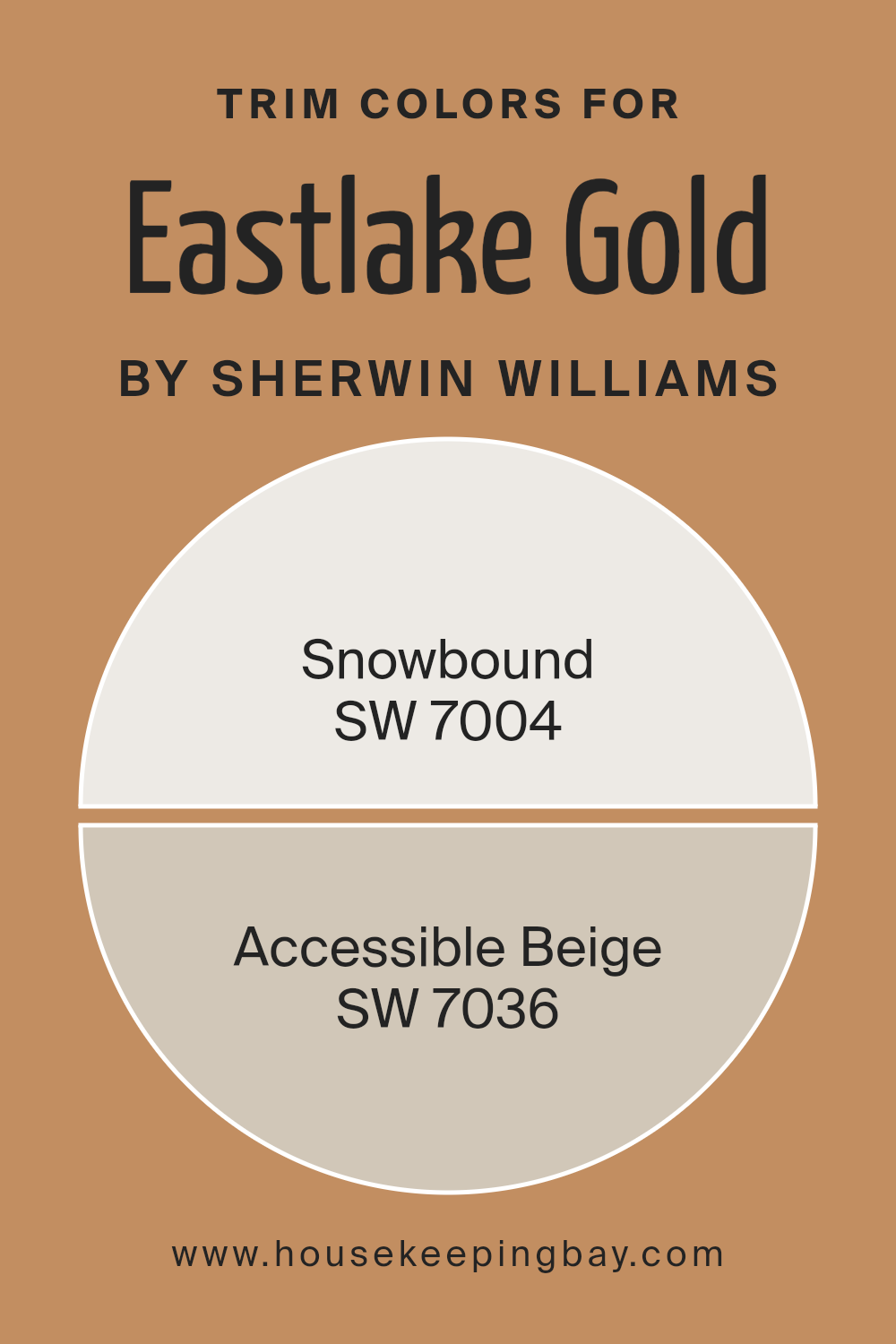
What are the Trim colors of Eastlake Gold SW 0009 by Sherwin Williams?
Trim colors are the shades used for painting architectural elements like door frames, window frames, skirtings, and moldings that accentuate and highlight these features against broader wall colors. For a color like Eastlake Gold SW 0009 by Sherwin Williams, choosing the right trim color is crucial because it can either subtly enhance the warm, inviting feel of the gold hue or provide a pleasing contrast that sharpens and defines the edges of a room.
SW 7004 – Snowbound and SW 7036 – Accessible Beige are two potential trim colors that work well with Eastlake Gold SW 0009.
Snowbound SW 7004 by Sherwin Williams is a clean and bright off-white with a subtle gray undertone, providing a fresh and crisp boundary that can give a clear definition to the golden walls. This color is effective in making Eastlake Gold pop, enhancing the warmth and richness of the primary color.
On the other hand, Accessible Beige SW 7036 offers a warmer, lighter approach as a trim color. It’s a soft beige that blends seamlessly with Eastlake Gold, fostering a gentle transition from the walls to the trims, which adds softness and continuity to the overall look of the space.
Using either of these colors as a trim can gently boost the aesthetics, reinforcing the depth and character of the room without overwhelming the primary color.
You can see recommended paint colors below:
- SW 7004 Snowbound
- SW 7036 Accessible Beige
housekeepingbay.com
Colors Similar to Eastlake Gold SW 0009 by Sherwin Williams
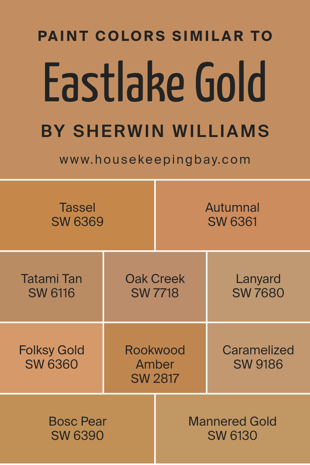
Similar colors work well together because they share common hues, allowing for a cohesive and harmonious look. Using shades like those similar to Eastlake Gold by Sherwin Williams helps to create a gradient or ombre effect, softly transitioning from one color to the next.
This technique is useful in design to create a soothing and seamless color flow that enhances the aesthetic continuity of a space.
SW 6369 – Tassel is a gentle mustard yellow that adds warmth to any area, reminiscent of sunlit fields. SW 6361 – Autumnal, in contrast, has a deep, burnt orange hue that invokes the cozy feel of fall leaves. SW 6116 – Tatami Tan offers a muted, beige tone that provides a subtle backdrop for richer colors.
SW 7718 – Oak Creek is a robust terra-cotta shade, perfect for adding a touch of earthiness to your decor. SW 7680 – Lanyard appears as a muted gold that works well with natural light, giving a room a soft glow.
SW 6360 – Folksy Gold has a lively, vibrant feel that energizes a space without overpowering it. SW 2817 – Rookwood Amber is a rich, deep amber that is both warm and inviting. SW 9186 – Caramelized features a golden caramel tone that offers a sweet, welcoming ambiance. SW 6390 – Bosc Pear is a subdued yellow with a hint of green, resembling the color of its namesake fruit. Finally, SW 6130 – Mannered Gold has a sophisticated, antique gold shade that lends an elegant touch to interiors.
Each of these colors can be used together or individually to achieve a balanced and visually interesting space.
You can see recommended paint colors below:
- SW 6369 Tassel
- SW 6361 Autumnal
- SW 6116 Tatami Tan
- SW 7718 Oak Creek
- SW 7680 Lanyard
- SW 6360 Folksy Gold
- SW 2817 Rookwood Amber
- SW 9186 Caramelized
- SW 6390 Bosc Pear
- SW 6130 Mannered Gold
housekeepingbay.com
How to Use Eastlake Gold SW 0009 by Sherwin Williams In Your Home?
Eastlake Gold SW 0009 by Sherwin Williams is a warm, inviting shade of yellow that brings a cozy and upbeat atmosphere to any room. This versatile color works beautifully in spaces where you want to add a touch of brightness without overwhelming the senses. It pairs well with neutral tones like whites, grays, and tans, which helps to create a balanced look.
In the kitchen, Eastlake Gold can make the space feel more welcoming and cheerful—perfect for a room where families often gather. For living rooms, applying this color on one accent wall can add warmth and serve as an excellent backdrop for artwork or shelves.
In bedrooms, using Eastlake Gold on the walls can help wake the space up, giving it a sunny, pleasant ambiance that’s ideal for starting the day.
Eastlake Gold is also a great choice for bathrooms or small nooks, as it visually expands the space and reflects light, making the area appear larger and more open.
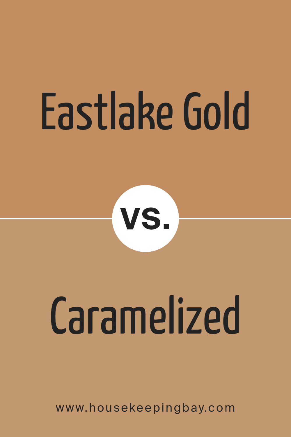
Eastlake Gold SW 0009 by Sherwin Williams vs Caramelized SW 9186 by Sherwin Williams
Sherwin Williams’ Eastlake Gold SW 0009 and Caramelized SW 9186 are both warm, inviting hues perfect for creating cozy spaces. Eastlake Gold has a deep, rich golden tone that brings a vibrant yet sophisticated warmth to a room; it reflects light beautifully and can make a space feel more open and cheerful.
In contrast, Caramelized is a bit softer and has more of an understated elegance with its muted caramel tone. This color is great for areas where you want a hint of warmth without overwhelming the space with brightness. Both colors work well with a variety of decor styles and can complement wood finishes and rustic elements nicely.
Eastlake Gold could be the better choice for larger areas or spaces needing a bolder impact, while Caramelized suits smaller rooms or environments where a gentle, soothing presence is desired.
You can see recommended paint color below:
- SW 9186 Caramelized
housekeepingbay.com
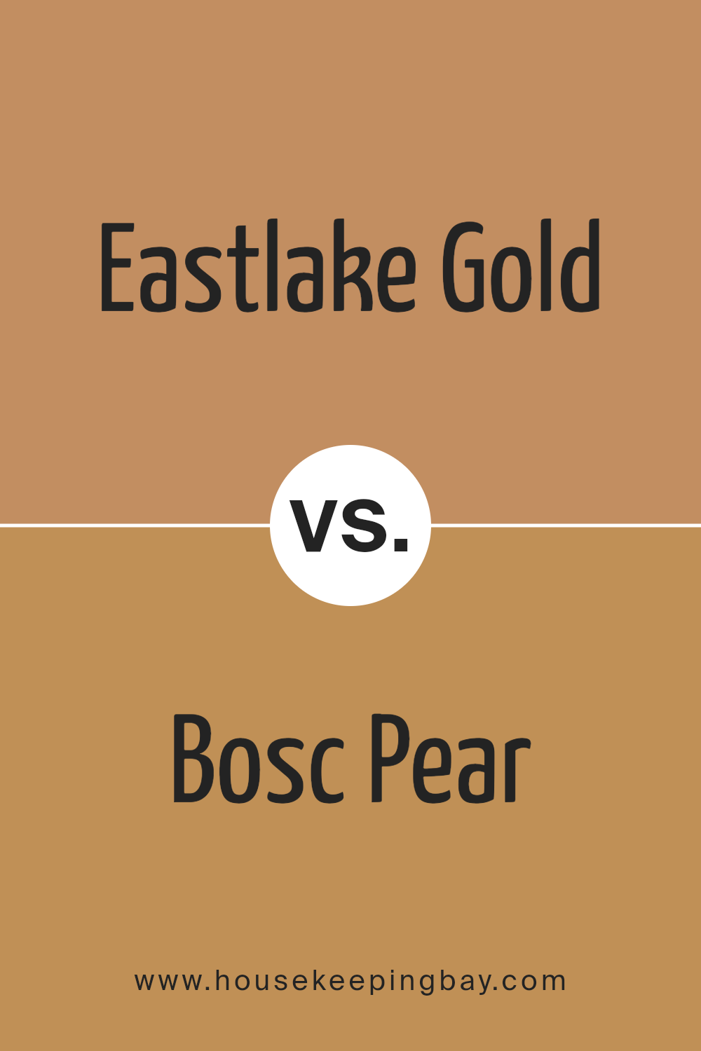
Eastlake Gold SW 0009 by Sherwin Williams vs Bosc Pear SW 6390 by Sherwin Williams
Eastlake Gold SW 0009 by Sherwin Williams is a warm, muted yellow with a subtle sophistication that gives a cozy and welcoming feel to any space. It reflects light gently, making it ideal for living rooms or bedrooms where a soft ambiance is desired. This color pairs well with dark woods and traditional decor, enhancing the classic aesthetic of an interior.
In contrast, Bosc Pear SW 6390 is a bolder, more saturated shade that leans towards a rich mustard. It has a lively vibe that can inject energy into a room. This color is perfect for creating a focal point in a space, suitable for accent walls or in dining areas where you want to add a touch of warmth.
Bosc Pear works well with more contemporary settings and can be balanced with neutral tones for a modern look.
Both colors offer unique possibilities for interior decorating, depending on the mood and style you aim to achieve.
You can see recommended paint color below:
housekeepingbay.com
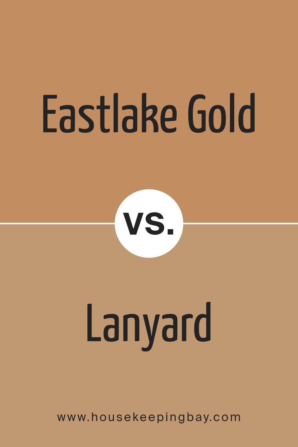
Eastlake Gold SW 0009 by Sherwin Williams vs Lanyard SW 7680 by Sherwin Williams
Eastlake Gold SW 0009 by Sherwin Williams is a warm, muted gold hue that provides a cozy and inviting atmosphere. This color has an earthy base that makes it great for traditional settings or spaces where a touch of classic charm is desired. It pairs well with rich wood finishes, deep greens, or navy blues.
Lanyard SW 7680 is a deep, robust navy blue. This shade is versatile and sophisticated, suitable for both modern and traditional décor. It contrasts crisply with white trim for a nautical look or can be used to create a bold statement wall in an otherwise neutral room.
Both colors, Eastlake Gold and Lanyard, offer unique opportunities to create distinct moods in any space. While Eastlake Gold warms up a room, Lanyard adds a touch of drama and depth. These colors can also complement each other well when used in the same room, providing a rich, layered aesthetic.
You can see recommended paint color below:
- SW 7680 Lanyard
housekeepingbay.com
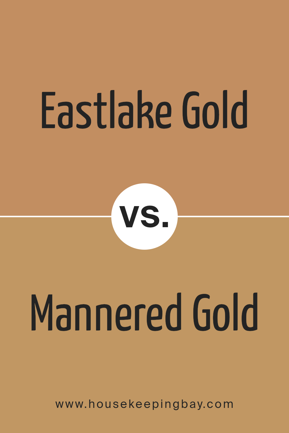
Eastlake Gold SW 0009 by Sherwin Williams vs Mannered Gold SW 6130 by Sherwin Williams
Eastlake Gold SW 0009 by Sherwin Williams is a soft, muted gold with a touch of warmth that brings a subtle coziness to any space. This color leans towards a classic aesthetic, perfect for creating a timeless environment. It pairs well with both dark and light accents, making it versatile for various decor styles.
Mannered Gold SW 6130, by comparison, is a richer, more pronounced gold. This shade offers a bolder approach, imparting a stronger statement in a room. It tends to draw the eye and can dominate a space if not balanced correctly. Mannered Gold works well in areas where you want to add a touch of sophistication or to highlight architectural features.
While both colors share a golden hue, Eastlake Gold is lighter and more subdued, making it easier to integrate into numerous color schemes. Mannered Gold, being deeper and more intense, is ideal for making a more dramatic impact.
You can see recommended paint color below:
- SW 6130 Mannered Gold
housekeepingbay.com
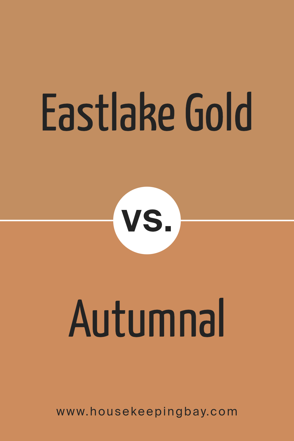
Eastlake Gold SW 0009 by Sherwin Williams vs Autumnal SW 6361 by Sherwin Williams
Eastlake Gold SW 0009 by Sherwin Williams is a warm, muted gold shade that can give a cozy and inviting feel to any space. This color offers a harmonious blend of yellow and brown, making it versatile for living rooms, dining areas, or any room that benefits from a comforting touch. It pairs well with a wide range of decor styles, from traditional to modern, and complements dark woods and rich textiles.
Autumnal SW 6361 by Sherwin Williams, in contrast, is a vibrant, rusty red that evokes the warmth of fall foliage. This color has a dynamic presence and works beautifully as an accent wall or in a room that could use a splash of energy. It’s particularly striking in spaces that receive plenty of natural light, where the color can truly glow.
Both colors bring warmth but in distinctly different ways—Eastlake Gold with a subtle, earthy coziness, and Autumnal with a bold, energetic flair.
You can see recommended paint color below:
- SW 6361 Autumnal
housekeepingbay.com
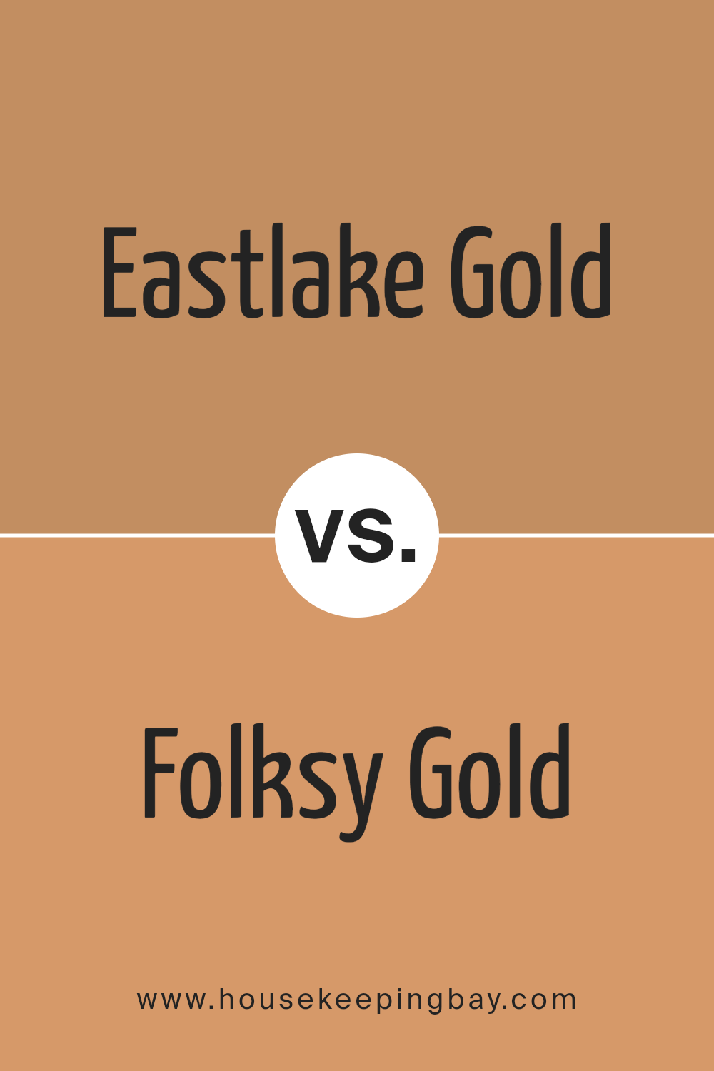
Eastlake Gold SW 0009 by Sherwin Williams vs Folksy Gold SW 6360 by Sherwin Williams
Eastlake Gold SW 0009 by Sherwin Williams is a soft, muted gold with a beige undertone, giving it a classic and versatile appearance that works well in many settings, from traditional to contemporary. It subtly reflects light, creating a warm ambiance without being overly dramatic.
Folksy Gold SW 6360, also by Sherwin Williams, is a brighter, more vivid shade of gold. This color leans more towards a sunlit yellow, making it a vibrant choice that can energize a space. It’s particularly effective in areas that benefit from a cheerful, inviting atmosphere, such as kitchens and living rooms.
Both colors bring their unique attributes to a space. Eastlake Gold is more understated and can serve as a neutral backdrop, while Folksy Gold is livelier and better suited for making a bold statement. Depending on the desired mood and function of the room, either color could be the ideal choice.
You can see recommended paint color below:
- SW 6360 Folksy Gold
housekeepingbay.com
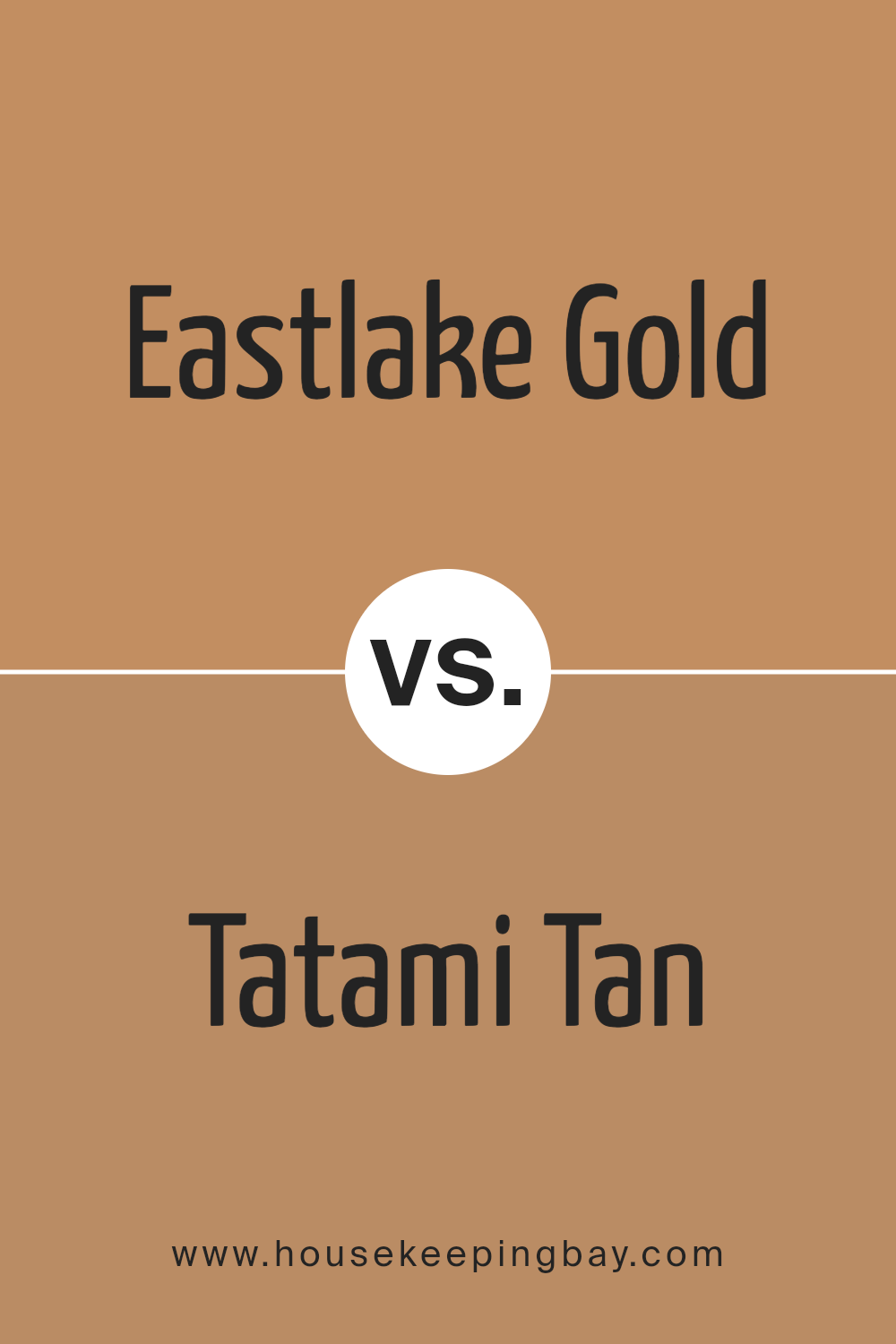
Eastlake Gold SW 0009 by Sherwin Williams vs Tatami Tan SW 6116 by Sherwin Williams
Eastlake Gold SW 0009 by Sherwin Williams is a rich, muted yellow with a subtle, vintage vibe, perfect for creating a cozy and inviting atmosphere in any room. This color casts a warm glow, making spaces feel more intimate and welcoming. It pairs well with darker woods and traditional decor, giving a classic and timeless look.
In contrast, Tatami Tan SW 6116 is a softer, light brown shade with warm undertones, reminiscent of natural clay or soft earth. It’s a versatile color that works well in various settings, providing a neutral backdrop that complements both bold and subdued color schemes. Tatami Tan brings a sense of calm and simplicity, making it ideal for minimalist or contemporary interiors.
Both colors offer warmth, but Eastlake Gold adds a bit more brightness and energy, while Tatami Tan offers a more subdued, grounding effect.
You can see recommended paint color below:
housekeepingbay.com
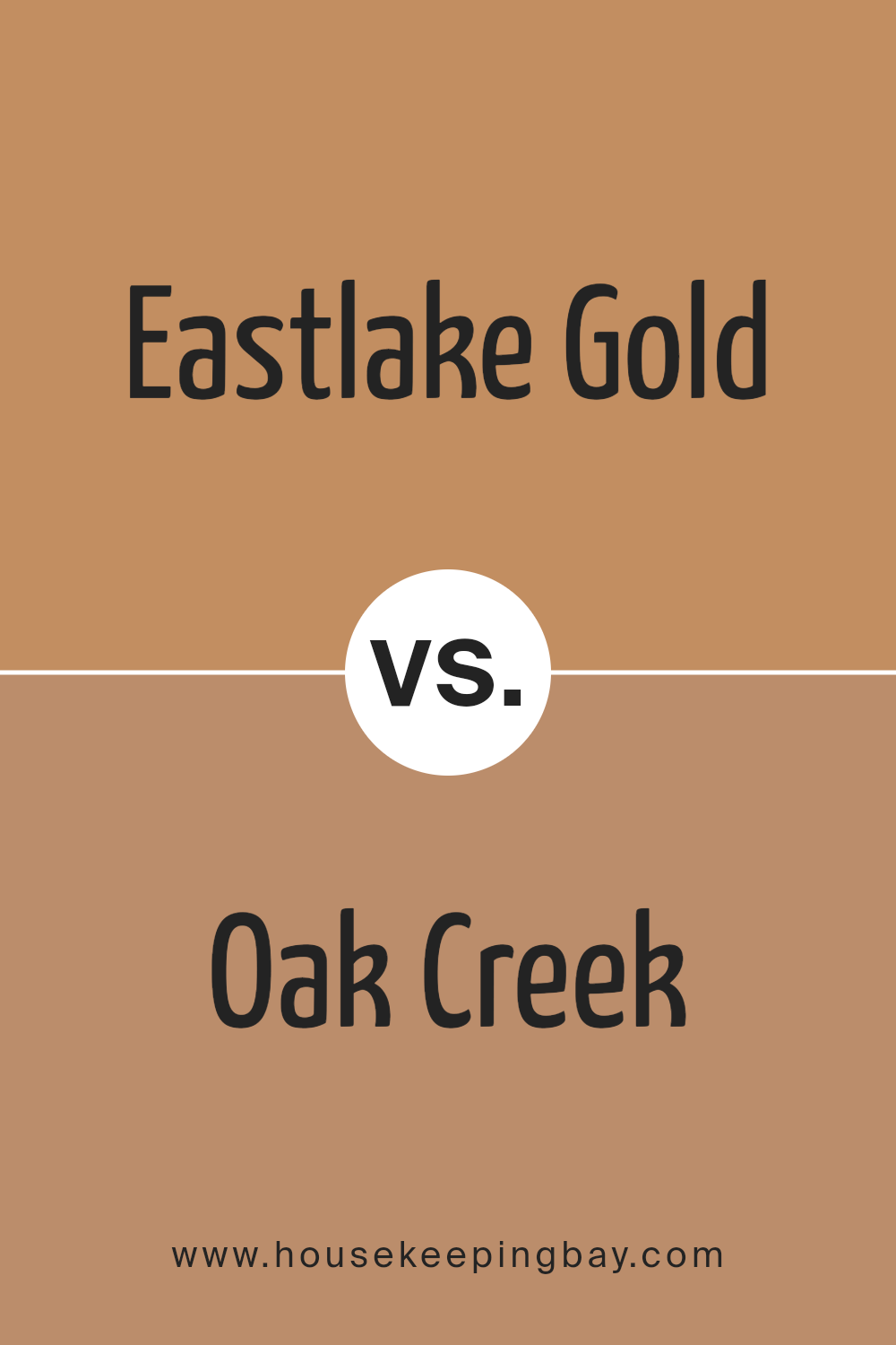
Eastlake Gold SW 0009 by Sherwin Williams vs Oak Creek SW 7718 by Sherwin Williams
Eastlake Gold SW 0009 by Sherwin Williams is a warm, muted gold that brings a cozy and inviting feel to any space. Its rich, golden hue blends seamlessly with a variety of color schemes, making it versatile for any room. It pairs well with dark woods and other warm tones, enhancing a traditional décor style.
Oak Creek SW 7718 by Sherwin Williams, on the contrary, is a darker, earthy brown with reddish undertones. This color lends a sense of grounding and stability to a space. It works particularly well in areas where a more robust, soothing atmosphere is desired, such as studies or dens. Oak Creek stands out when combined with lighter, neutral colors, providing a bold contrast.
Both colors offer distinct moods and can dramatically affect the feel of a room. While Eastlake Gold brightens and warms, Oak Creek offers depth and richness.
You can see recommended paint color below:
- SW 7718 Oak Creek
housekeepingbay.com
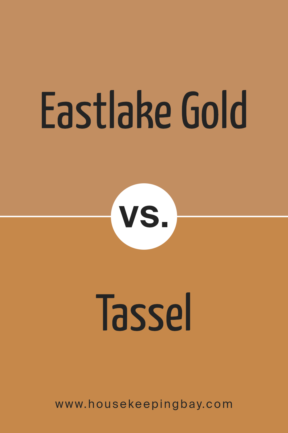
Eastlake Gold SW 0009 by Sherwin Williams vs Tassel SW 6369 by Sherwin Williams
Eastlake Gold SW 0009 and Tassel SW 6369 by Sherwin Williams are both warm, inviting colors, but they have distinct tones and moods. Eastlake Gold features a deep, rich mustard yellow that adds a cozy, antique feel to any space.
It’s great for creating a classic, timeless look, particularly in traditional or vintage-themed settings. This color pairs well with dark woods and rich textiles, enhancing the warmth in a room.
Tassel SW 6369, however, is a vibrant, golden yellow. It’s lighter and brighter than Eastlake Gold, bringing a cheerful and energetic vibe to spaces. Tassel is perfect for areas like kitchens or children’s playrooms where you want to inject playfulness and brightness. It works well with white trim or teal accents for a fresh, lively palette.
Both colors are ideal for adding warmth but cater to different aesthetic preferences and room functionalities. Eastlake Gold suits a more subdued, classic environment, while Tassel favors a dynamic, spirited atmosphere.
You can see recommended paint color below:
housekeepingbay.com
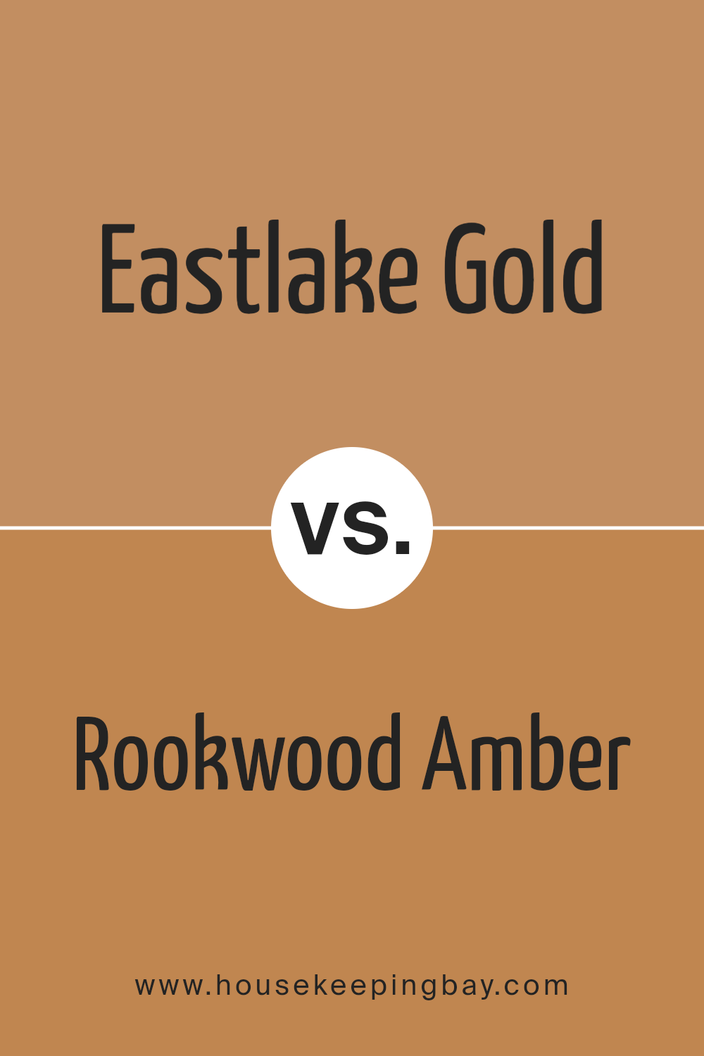
Eastlake Gold SW 0009 by Sherwin Williams vs Rookwood Amber SW 2817 by Sherwin Williams
Eastlake Gold SW 0009 by Sherwin Williams is a warm, muted gold with soft yellow undertones. It creates a cozy and inviting atmosphere, ideal for living rooms or spaces where a comfortable ambiance is desired. This color pairs well with earth tones and dark woods, enhancing a traditional decor style.
Rookwood Amber SW 2817, on the contrary, is a deeper, richer amber color with a hint of brown. It offers a more robust and somewhat rustic feel, suitable for spaces that aim for a grounded, nature-inspired look. Rookwood Amber works well with rich greens, deep blues, and other natural colors to create a harmonious palette.
Both colors bring warmth to any space but differ in intensity and mood. Eastlake Gold is softer and lighter, making it versatile for various applications, while Rookwood Amber is bolder and can serve as a strong focal point in a room.
You can see recommended paint color below:
housekeepingbay.com
Conclusion
After reviewing SW 0009 Eastlake Gold by Sherwin Williams, I found it to be an exceptional choice for anyone looking to bring a warm and inviting ambiance into their space. The color displays a classic charm that pairs beautifully with a variety of decor styles, from modern to traditional.
It particularly shines in living areas and bedrooms, where its golden tones create a cozy, welcoming atmosphere.
I would highly recommend this shade to those who wish to add a touch of warmth to their home without overwhelming it with too bold a color. It’s versatile enough to be paired with other hues, making it a great foundation for anyone looking to refresh their decor. The paint’s quality itself ensures a smooth application and a durable finish, ensuring that the beautiful color remains consistent and vibrant over time.
Overall, Eastlake Gold offers a perfect balance of sophistication and warmth, making it a top choice for homeowners and decorators aiming to enrich their living spaces subtly yet effectively. Whether you’re aiming to repaint a single room or looking for an inviting color for an entire property, Eastlake Gold by Sherwin Williams certainly merits consideration.

housekeepingbay.com
Ever wished paint sampling was as easy as sticking a sticker? Guess what? Now it is! Discover Samplize's unique Peel & Stick samples. Get started now and say goodbye to the old messy way!
Get paint samples
