Dragon’s Breath 1547 by Benjamin Moore
Ignite Your Space with Bold Warmth
When you paint a room, it can change how you feel when you walk in. One color that does this well is Benjamin Moore’s Dragon’s Breath 1547. It’s a deep, rich shade that can add warmth and coziness to any space. Imagine a color that wraps you up like a comforting blanket; that’s what you get with Dragon’s Breath. It isn’t just any ordinary brown; it carries hints of gray and green, making it unique and sophisticated.
You might think dark colors make a room feel small, but this one adds depth. Picture a small bedroom or an office; now imagine it with this color on the walls. It feels intimate and inviting.
Pair it with lighter shades, and you’ll see how it stands out even more, creating a balanced look.
Choosing the right wall color can be tricky, but with Dragon’s Breath, you can’t go wrong. It’s suitable for living rooms, bedrooms, and even kitchens. Whether you use it on all the walls or as an accent, it brings character to your home.
Consider how such a shade might change your space.
via benjaminmoore.com
What Color Is Dragon’s Breath 1547 by Benjamin Moore?
Table of Contents
Dragon’s Breath 1547 by Benjamin Moore is a deep, rich charcoal brown with a sophisticated feel. This color adds depth and warmth to any room, bringing a touch of modern elegance. It works beautifully in spaces with a neutral or minimalist design, where its depth can create an intimate, cozy atmosphere.
In a modern rustic setting, Dragon’s Breath pairs well with natural materials like reclaimed wood and stone. These textures complement the color’s earthy tones, creating a balanced and inviting space.
For a mid-century modern look, this color works well with sleek lines and simple forms, adding contrast to light woods and metals such as brass or copper. In industrial-style interiors, Dragon’s Breath enhances exposed brick, concrete, and metal, offering a grounding effect. It also pairs seamlessly with lush fabrics like velvet and leather, adding a layer of luxury.
When used as an accent wall, this color can make art and furnishings stand out, adding visual interest. It pairs well with warm whites and earthy tones, allowing these colors to pop.
Whether in a living room, bedroom, or study, Dragon’s Breath adds a sense of depth and sophistication without overwhelming the space.
housekeepingbay.com
Is Dragon’s Breath 1547 by Benjamin Moore Warm or Cool color?
Dragon’s Breath 1547 by Benjamin Moore is a rich, deep brown with gray undertones. It creates a cozy and inviting atmosphere in homes. Not too dark, this color can make a room feel intimate and warm without overpowering it. It works well in spaces like living rooms, libraries, or study areas where you want a sense of comfort and relaxation.
When used on walls, Dragon’s Breath pairs beautifully with lighter trim and accessories, making furnishings stand out. It also serves as a sophisticated backdrop for artwork or decorative pieces. In larger spaces, it provides depth and interest without feeling cramped.
This versatile shade complements neutral palettes and matches well with natural materials. Wooden floors, leather furniture, and stone elements perform nicely with Dragon’s Breath. It’s a choice that can give any room a grounded feel, making it both timeless and modern. Whether used in a single accent wall or throughout a space, this color adds elegance and harmony.
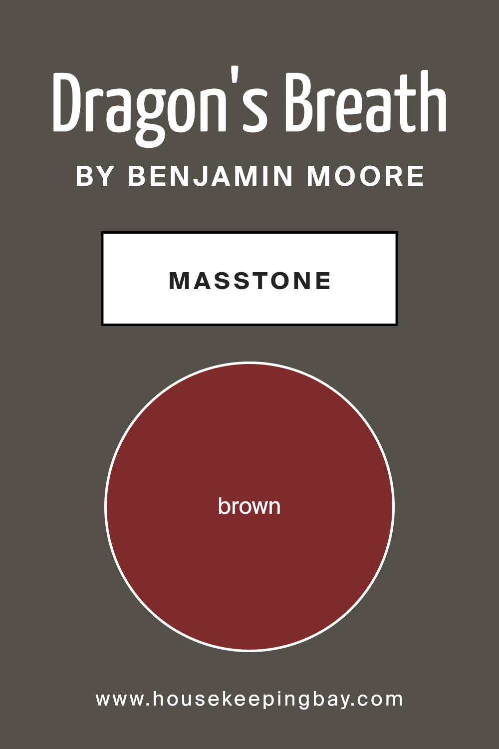
What is the Masstone of the Dragon’s Breath 1547 by Benjamin Moore?
Dragon’s Breath 1547 by Benjamin Moore is a rich, warm brown color that can create a cozy and inviting atmosphere in any room. The masstone of this color, which is a deep brown (#802B2B), gives it a bold, earthy feel. In homes, this shade works well because it adds a sense of warmth and stability.
When used on walls, Dragon’s Breath can make a room feel more intimate and comfortable, making it perfect for living areas or bedrooms where relaxation is key. This color pairs beautifully with neutral tones like cream, beige, and soft whites, enhancing its earthy nature.
Dragon’s Breath also looks great with natural materials like wood and stone, which can bring out its warm undertones even more. The color’s rich brown hue adds depth to any space, making it an excellent choice for feature walls or accent pieces like furniture or cabinetry. Overall, its versatile nature makes it a favorite for creating a soothing home environment.
housekeepingbay.com
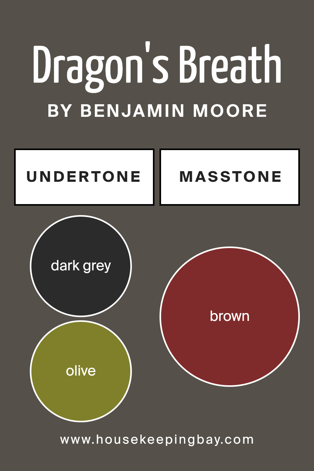
Undertones of Dragon’s Breath 1547 by Benjamin Moore
Dragon’s Breath 1547 by Benjamin Moore stands as a rich, deep hue with a blend of unique undertones that influence its appearance. The main color, a warm and inviting shade, shifts subtly based on its surroundings due to the interaction of various undertones.
Dark grey brings a grounding, sophisticated feel, while olive and dark green introduce earthy, natural vibes. These undertones help connect the paint to nature, making it perfect for creating cozy, inviting spaces.
Purple and navy nuances add depth and an unexpected twist, giving the paint a slightly regal and mysterious aura. The dark turquoise undertone provides a peek into refreshing calmness. Grey tones add neutrality, allowing the color to harmonize with various design elements.
The red and orange undertones infuse warmth and a touch of energy, softening the deeper shades and creating an inviting atmosphere. Hints of pink and pale pink contribute subtle warmth, adding a touch of softness and lightness.
These complex undertones influence how we perceive Dragon’s Breath on walls. Depending on lighting and other room colors, these undertones can make Dragon’s Breath appear more earthy, warm, or even moody, creating versatile, rich backgrounds that complement a variety of decor styles.
housekeepingbay.com
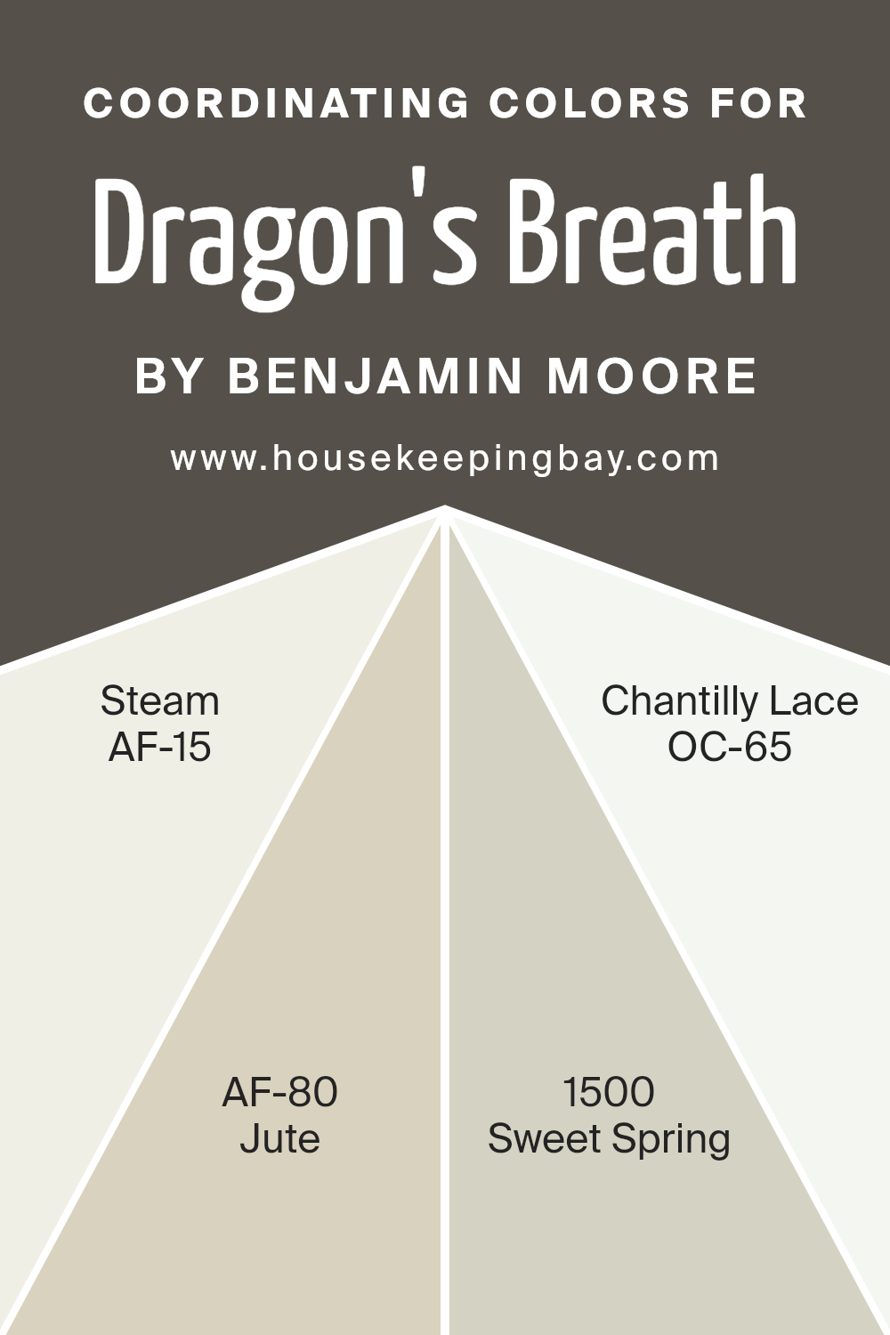
Coordinating Colors of Dragon’s Breath 1547 by Benjamin Moore
Coordinating colors are hues that complement and enhance each other when used together in a space. They are selected to create harmony and balance within a room’s color scheme. Dragon’s Breath by Benjamin Moore is a bold, deep color, and choosing the right coordinating colors can help soften or accentuate its impact.
AF-15, known as Steam, offers a soft, warm white that acts as a perfect neutral backdrop, creating a peaceful setting without overshadowing the darker tones. Its subtle warmth makes it an excellent partner to the richness of Dragon’s Breath, adding a gentle glow to the room.
AF-80, or Jute, is another ideal companion. This earthy neutral has a grounded quality, bringing a sense of warmth and calm that pairs gracefully with deeper colors. Meanwhile, 1500, called Sweet Spring, introduces a whisper of light green, adding a hint of freshness to the palette. This soft, airy color brings a touch of nature indoors.
Finally, OC-65, Chantilly Lace, is a crisp, clean white that offers brightness and contrast. Its pure tone can highlight the depth of darker shades without competing for attention.
Together, these coordinating colors create a balanced, inviting atmosphere, each enhancing the other’s presence in the space.
You can see recommended paint colors below:
- AF-15 Steam
- AF-80 Jute
- 1500 Sweet Spring
- OC-65 Chantilly Lace
housekeepingbay.com
How Does Lighting Affect Dragon’s Breath 1547 by Benjamin Moore?
Lighting plays a crucial role in how we perceive colors. Different types of light can change the way a color looks to our eyes. Dragon’s Breath 1547 by Benjamin Moore, a rich, warm brown with hints of both gray and green, offers a great example of this.
In natural light, Dragon’s Breath can show its full complexity. If you put this color in a north-facing room, which gets cooler light, the color might appear more bluish-gray. It can look a bit darker and cooler as the room receives less direct sunlight. This might make the color look moodier or more subdued.
In a south-facing room, which receives warm, consistent sunlight throughout the day, Dragon’s Breath will appear warmer and more inviting. The brown and green tones may become more pronounced, making the room feel cozier and more welcoming.
In east-facing rooms, mornings bring bright, clear light, giving Dragon’s Breath a lively appearance, with its warmer tones showing more vividly. As the day progresses, the light will become more neutral, softening the color by afternoon.
West-facing rooms experience the opposite. Mornings may give a cooler impression of Dragon’s Breath, while afternoon and evening light will enhance its warmth, making it appear richer and more intense as the sun sets.
Artificial lighting also dramatically affects how Dragon’s Breath appears. Under incandescent lighting, which is warmer, the color can seem deeper and more inviting, enhancing its brown and green undertones.
Fluorescent lighting, which is cooler, might bring out more of the gray tones, making it seem a bit duller or muted.
Overall, understanding how lighting affects the color can help in choosing where and how to use it in your home. It’s important to see it in various lighting conditions to know how it will look throughout the day and night.

housekeepingbay.com
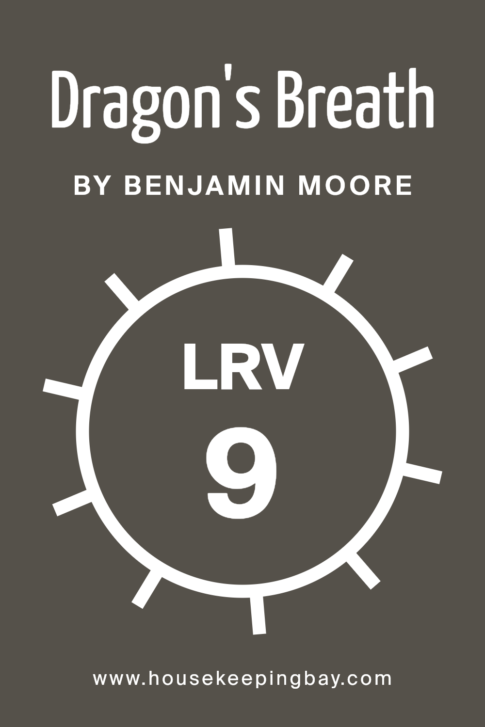
What is the LRV of Dragon’s Breath 1547 by Benjamin Moore?
LRV stands for Light Reflectance Value. It measures the percentage of light a color reflects. Values range from 0 to 100, where 0 means no light is reflected (pure black) and 100 means all light is reflected (pure white). The higher the LRV, the lighter the color appears as it reflects more light.
Conversely, lower LRV values indicate darker colors that absorb more light, making a room feel more enclosed. Understanding LRV helps when selecting paints since it dictates how a color will look under different lighting conditions.
Dragon’s Breath by Benjamin Moore has an LRV of 9.18, which means it’s quite a dark color. It reflects very little light and absorbs most of it. Because of its low LRV, Dragon’s Breath creates a cozy, intimate atmosphere when used on walls. It can make large spaces feel more grounded and small spaces feel more enveloped.
When used in a room with limited natural light, the color can make the room feel even darker. This color works well in well-lit spaces or as an accent to add depth without overwhelming a room. It’s a bold choice that provides a rich, dramatic backdrop.
housekeepingbay.com
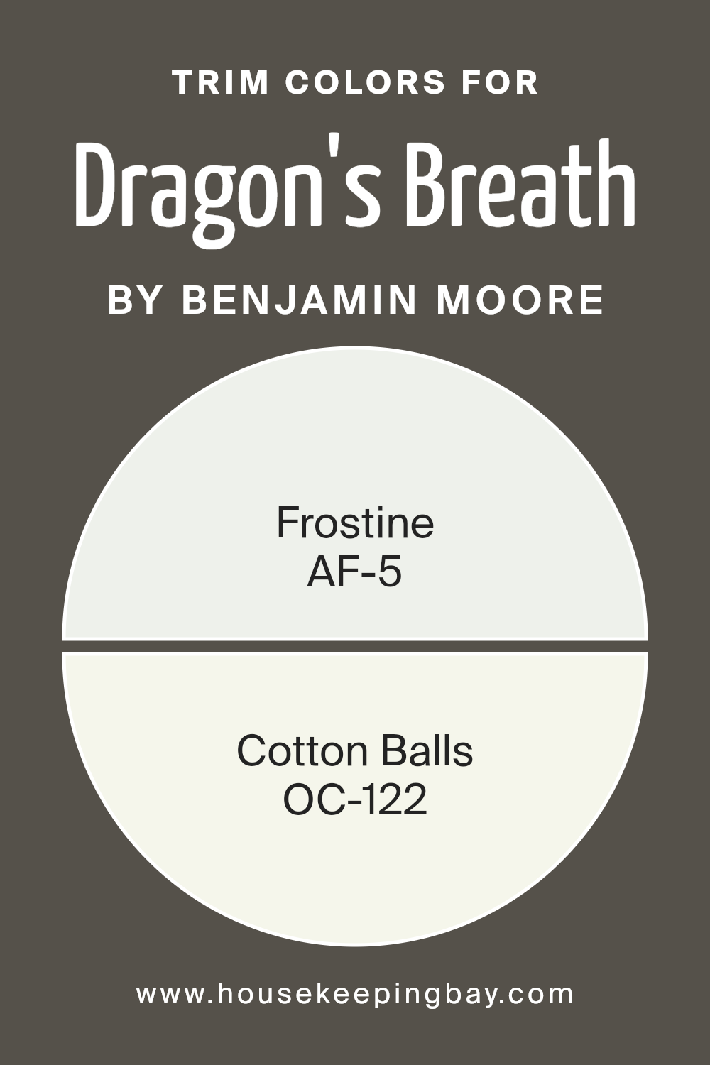
What are the Trim colors of Dragon’s Breath 1547 by Benjamin Moore?
Trim colors are the shades used on the edges of walls, doors, and windows. They help define spaces, add contrast, and highlight the main wall color. For a rich and warm color like Dragon’s Breath 1547 by Benjamin Moore, selecting the right trim color is crucial.
Using a shade like AF-5 Frostine, a soft, cool gray, you can achieve a crisp and modern finish that balances the depth of Dragon’s Breath without overshadowing it. Frostine’s subtle coolness complements the strong undertone of Dragon’s Breath, providing a seamless transition that enhances the room’s overall harmony.
Alternatively, OC-122 Cotton Balls, a fresh and clean white, can be an excellent trim option. Known for its brightness and neutrality, this color brings out a classic and timeless feel. It contrasts beautifully with the deep, moody tones of Dragon’s Breath by highlighting architectural details.
Choosing trim colors like Frostine or Cotton Balls creates an aesthetically pleasing environment by either balancing or contrasting with Dragon’s Breath, enhancing its impact while adding depth and character to the space.
You can see recommended paint colors below:
- AF-5 Frostine
- OC-122 Cotton Balls
housekeepingbay.com
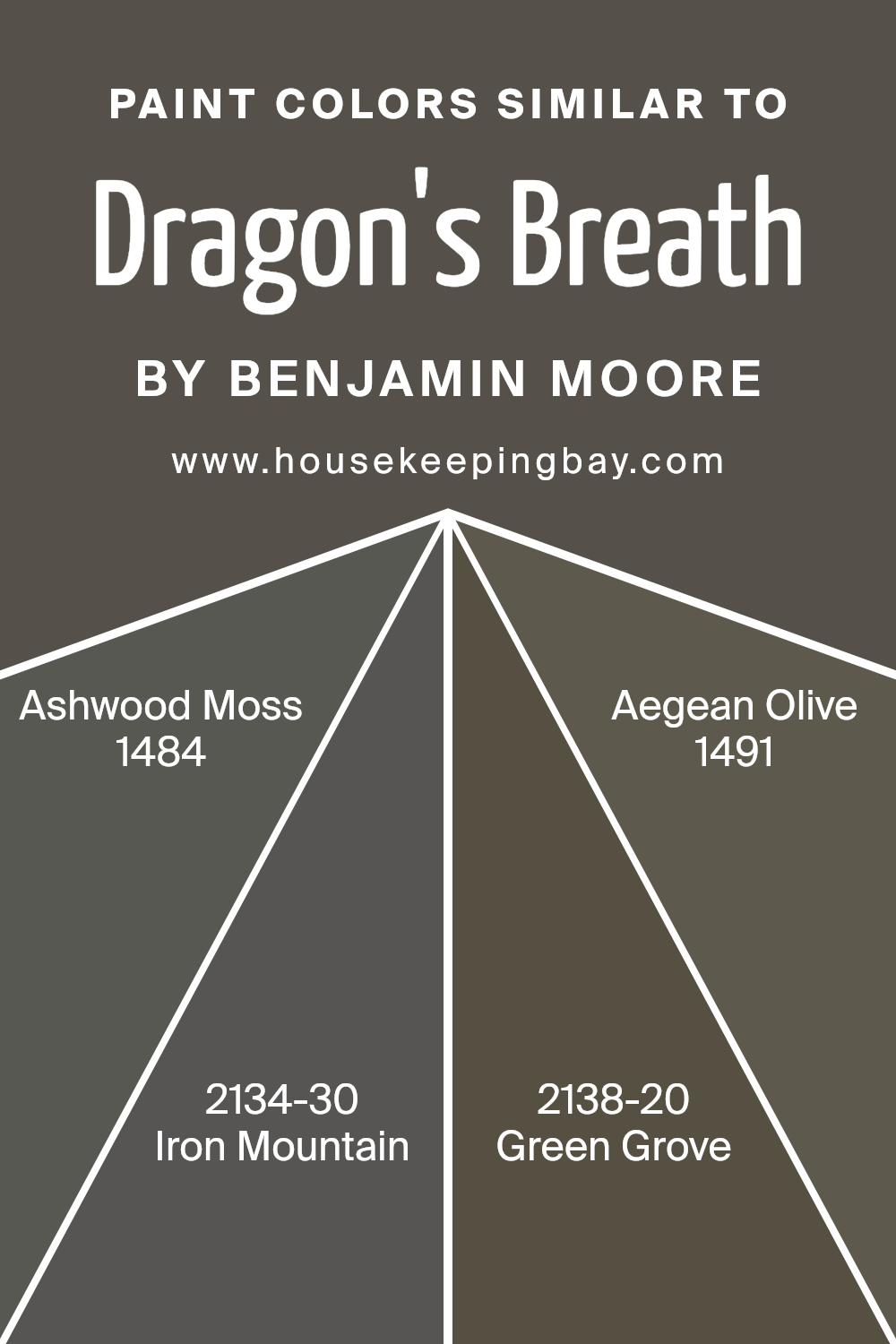
Colors Similar to Dragon’s Breath 1547 by Benjamin Moore
Similar colors play a vital role in achieving a harmonious and cohesive look in any space. When using colors like Dragon’s Breath 1547 by Benjamin Moore, incorporating similar shades can create depth and interest while maintaining a unified appearance.
Shades such as Ashwood Moss 1484 and Iron Mountain 2134-30 offer complementary earth tones, enhancing the richness of Dragon’s Breath. Ashwood Moss is a deep, muted green with earthy undertones, lending a grounded and calming feel.
On the other hand, Iron Mountain, a dark charcoal with a hint of warmth, delivers a bold yet sophisticated contrast, highlighting the warmth in Dragon’s Breath.
Green Grove 2138-20 and Aegean Olive 1491 contribute to the palette by adding layers of green that harmonize with Dragon’s Breath. Green Grove, with its medium green hue and subtle gray undertone, brings a natural freshness that pairs well with the deeper tones.
Aegean Olive, a rich olive green with hints of warmth, enriches the palette, evoking a sense of serene connectivity to nature. These colors work together, enhancing the mood and ambiance of any space.
Using similar colors across a room or an entire home creates a seamless flow that ties different areas together, ensuring that the color scheme feels intentional and well-balanced.
You can see recommended paint colors below:
- 1484 Ashwood Moss
- 2134-30 Iron Mountain
- 2138-20 Green Grove
- 1491 Aegean Olive
housekeepingbay.com
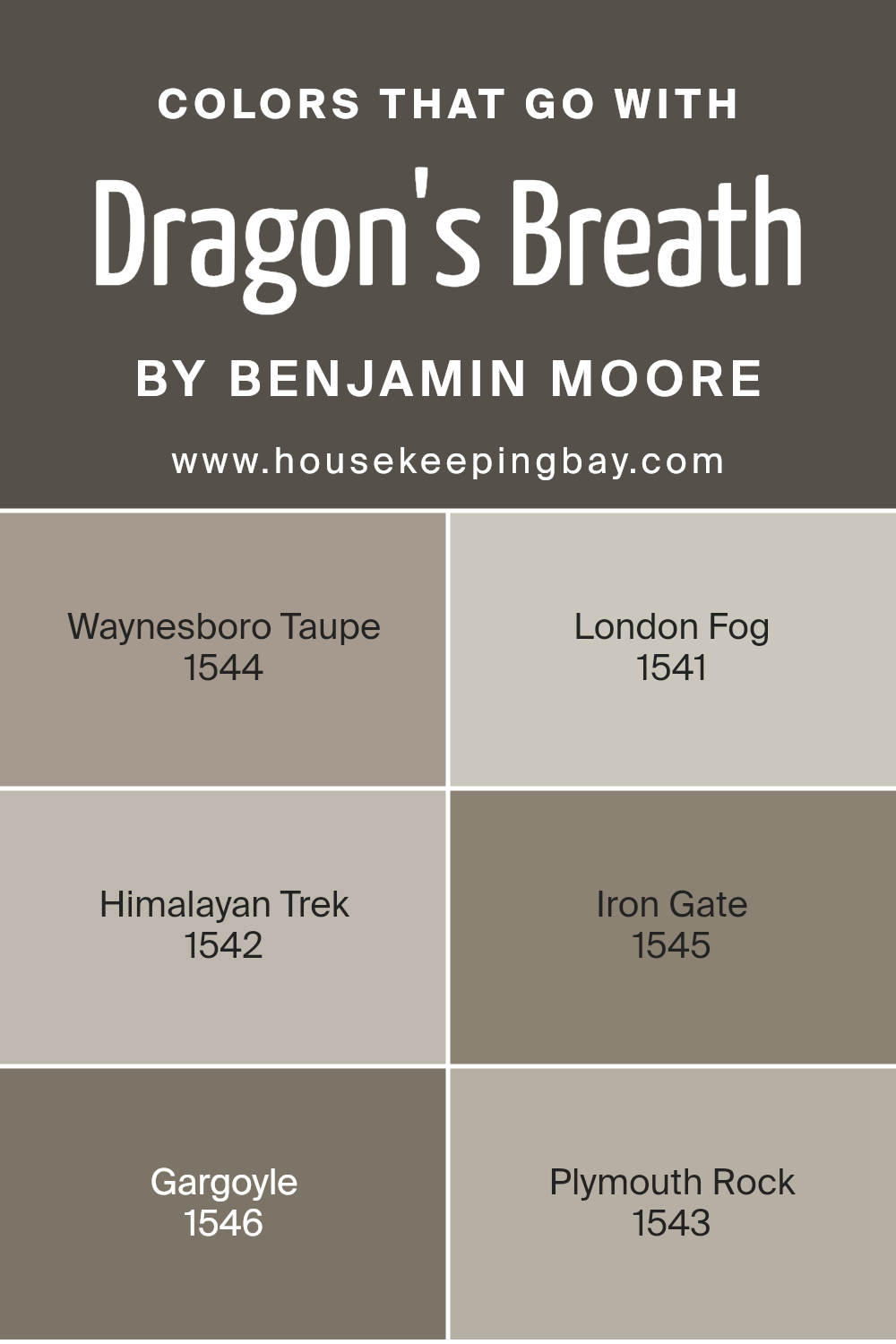
Colors that Go With Dragon’s Breath 1547 by Benjamin Moore
Dragon’s Breath 1547 by Benjamin Moore is a deep, rich color that brings warmth and sophistication to any space. When choosing colors to pair with it, it’s essential to consider tones that complement its intensity. Waynesboro Taupe 1544, with its soft, earthy brown, gently balances Dragon’s Breath, creating a timeless, grounded look.
London Fog 1541 offers a misty, grayish tone that lightens the atmosphere and adds a touch of elegance without overpowering the main shade. Himalayan Trek 1542, a deeper taupe, pairs effortlessly, providing depth and a sense of coziness.
Continuing with coordinating colors, Iron Gate 1545 is a dark, rugged shade that enhances the boldness of Dragon’s Breath, adding a refined, dramatic contrast. Gargoyle 1546 has subtle undertones that echo the muted aspect of Dragon’s Breath, ensuring a harmonious transition between spaces.
Lastly, Plymouth Rock 1543 is a lighter, warm gray that mirrors natural stone hues, subtly enhancing the classic appeal of this palette. Together, these colors create a cohesive and inviting environment, perfect for expressing a rich and layered interior without overwhelming the senses.
Each color contributes its unique flavor, allowing for a nuanced and balanced aesthetic.
You can see recommended paint colors below:
- 1544 Waynesboro Taupe
- 1541 London Fog
- 1542 Himalayan Trek
- 1545 Iron Gate
- 1546 Gargoyle
- 1543 Plymouth Rock
housekeepingbay.com
How to Use Dragon’s Breath 1547 by Benjamin Moore In Your Home?
Dragon’s Breath 1547 by Benjamin Moore offers a rich and versatile dark brown color that can bring warmth to any room. Its deep, earthy tone creates a cozy and inviting atmosphere, making it perfect for living rooms or bedrooms.
In a living room, pairing Dragon’s Breath with light, neutral furniture creates a striking contrast, adding depth to the space. In a bedroom, it acts as a grounding color, making it ideal for an accent wall behind the bed. Its warm undertones blend beautifully with both traditional and modern decor styles.
For those looking to add a touch of drama to their home, Dragon’s Breath can be used in a dining room or home office. It pairs well with metallic accents and natural materials like wood and stone. Accessories in softer shades or even bold colors stand out when used alongside this rich hue, creating a well-balanced and visually appealing environment.
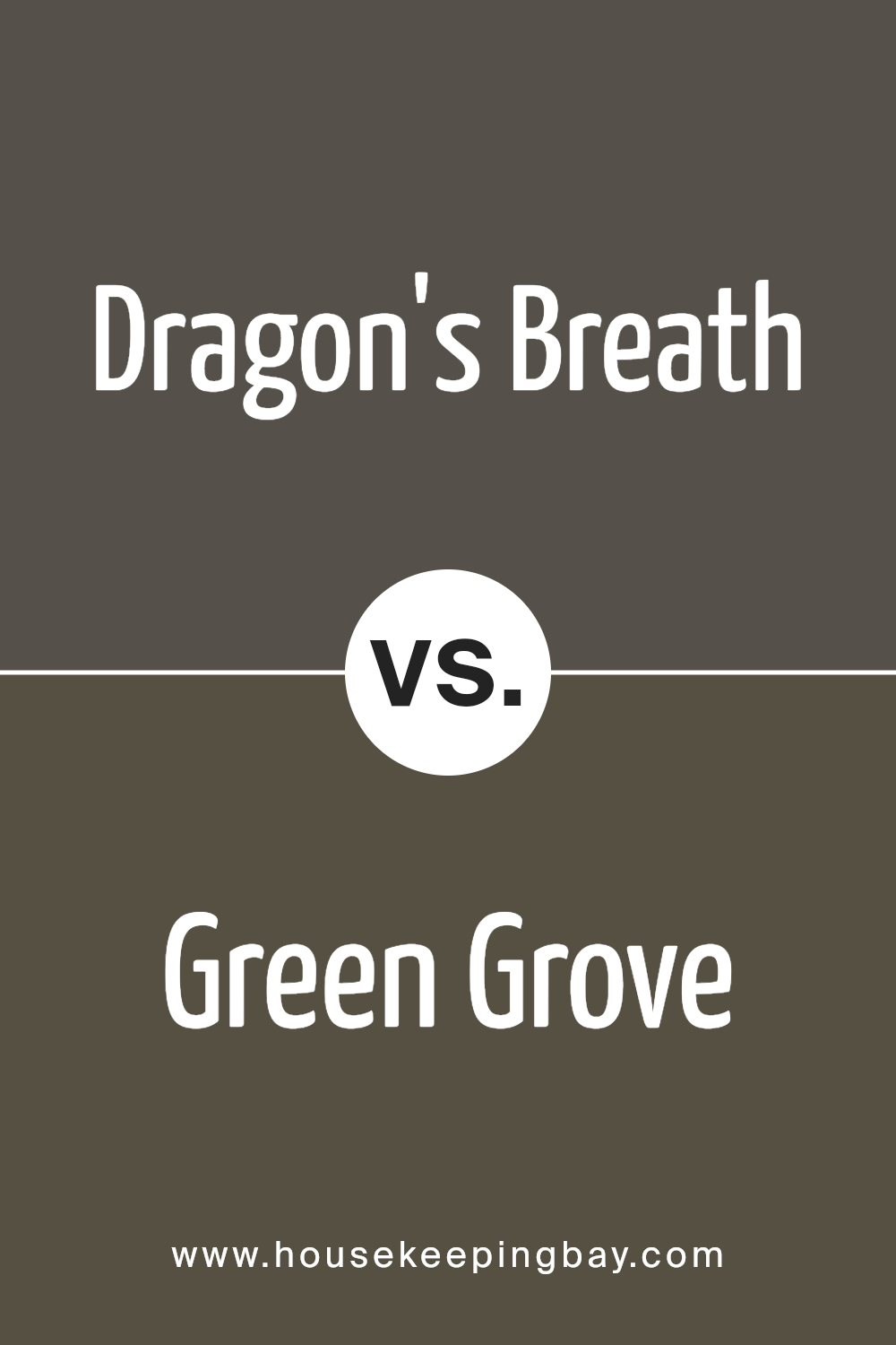
Dragon’s Breath 1547 by Benjamin Moore vs Green Grove 2138-20 by Benjamin Moore
Dragon’s Breath 1547 by Benjamin Moore is a rich, deep hue. It combines warm brown tones with a hint of gray, creating a sophisticated and cozy atmosphere. It’s perfect for adding depth to a room, making spaces feel intimate and inviting. Dragon’s Breath works well in living rooms or studies where warmth and elegance are desired.
Green Grove 2138-20 by Benjamin Moore offers a completely different feel. This shade of green is vibrant and lush, reminiscent of a dense forest. It brings energy and a sense of nature into a space. Green Grove is great for areas where freshness and vitality are wanted, like kitchens or sunrooms.
Both colors are bold in their own right. Dragon’s Breath is more subdued and grounding, while Green Grove adds brightness and life. Choosing between them depends on whether one prefers the warmth of deep brown or the lively feel of green.
You can see recommended paint color below:
- 2138-20 Green Grove
housekeepingbay.com
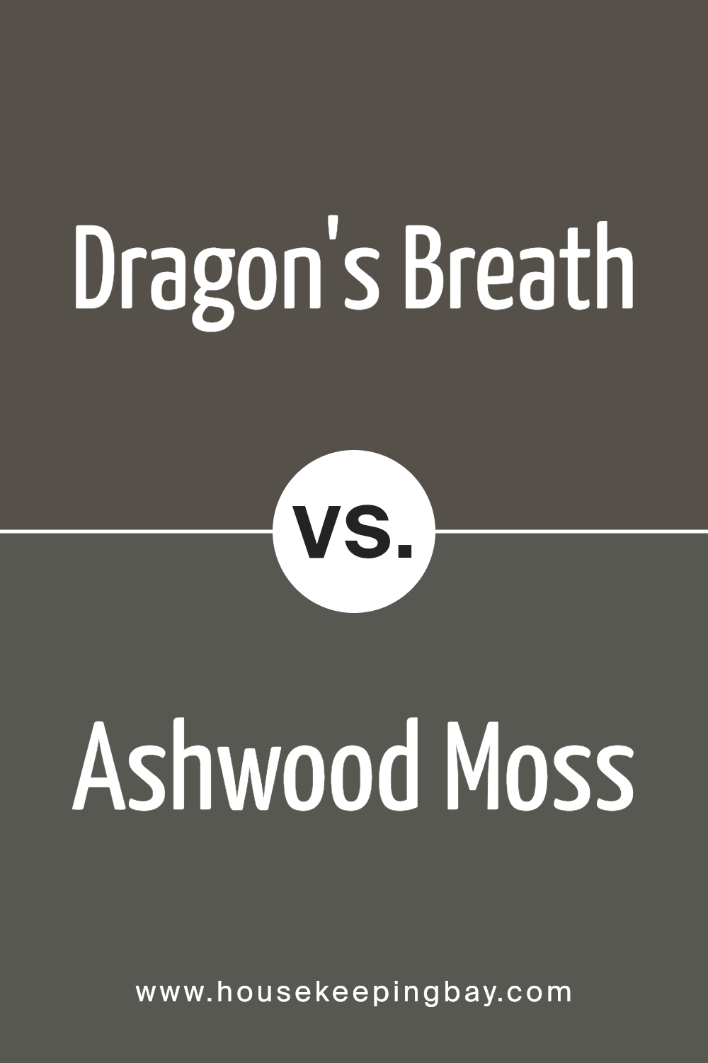
Dragon’s Breath 1547 by Benjamin Moore vs Ashwood Moss 1484 by Benjamin Moore
Dragon’s Breath 1547 by Benjamin Moore and Ashwood Moss 1484 by Benjamin Moore both offer rich, deep hues, yet each brings its own character to a space. Dragon’s Breath is a warm, earthy brown with hints of gray, creating a cozy, inviting atmosphere. It works well in living areas or any room where you want a touch of warmth and comfort.
Ashwood Moss leans more toward a deep green with gray undertones, providing a natural and calming feel. This color fits perfectly in spaces that aim for a serene, nature-inspired look, such as a study or bedroom. While Dragon’s Breath exudes warmth, Ashwood Moss offers a grounded, earthy vibe.
Choosing between these colors depends on the mood you wish to set. Dragon’s Breath warms a room, adding coziness, while Ashwood Moss provides peace and a connection with nature. Both shades complement earthy palettes but suit different atmospheres.
You can see recommended paint color below:
- 1484 Ashwood Moss
housekeepingbay.com
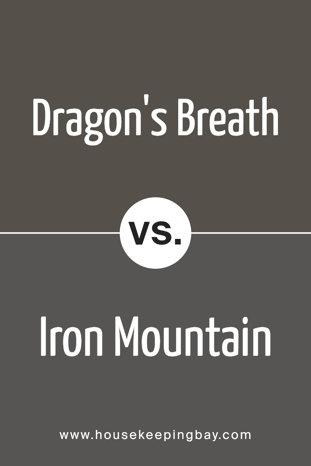
Dragon’s Breath 1547 by Benjamin Moore vs Iron Mountain 2134-30 by Benjamin Moore
Dragon’s Breath 1547 by Benjamin Moore offers a rich, warm brown. It resembles a well-worn leather, and is cozy and inviting. This earthy hue feels grounded, making it suitable for living rooms or libraries. It pairs well with lighter neutrals and warm metallics, creating a welcoming atmosphere.
Iron Mountain 2134-30, also from Benjamin Moore, presents a dark, cool gray. It embodies strength and sophistication, ideal for modern or industrial spaces. While Dragon’s Breath conveys warmth, Iron Mountain leans toward a sleek, polished vibe.
This gray complements bright accents or deep blues and greens, making it versatile for various settings.
Both colors exude depth, but Dragon’s Breath tends to create a warmer, intimate feel compared to the chic, urban essence of Iron Mountain. Choosing between the two depends largely on the mood you want: cozy and grounded or modern and refined.
You can see recommended paint color below:
- 2134-30 Iron Mountain
housekeepingbay.com
Dragon’s Breath 1547 by Benjamin Moore vs Aegean Olive 1491 by Benjamin Moore
Dragon’s Breath 1547 by Benjamin Moore is a rich, deep brown with hints of gray and black. It provides a strong, grounding effect, and its boldness makes a real statement in any space. This color works beautifully in cozy dens or as an accent wall, adding depth and warmth. It pairs well with lighter neutrals or crisp whites for contrast, creating a balanced, yet dramatic look.
Aegean Olive 1491, also by Benjamin Moore, brings a natural, earthy tone. This warm green has hints of gray, resembling an olive’s subtle, muted hue. Aegean Olive feels calming and welcoming, making it perfect for spaces where serenity is key, like living rooms or bedrooms.
It pairs well with soft, neutral tones or off-whites, resulting in a harmonious and relaxed atmosphere.
Both colors offer unique vibes: Dragon’s Breath is bold and grounding, while Aegean Olive is soothing and earthy. Each transforms spaces in distinct yet complementary ways.
You can see recommended paint color below:
- 1491 Aegean Olive
housekeepingbay.com
Conclusion
Its deep, warm hues provide a sense of depth and sophistication, making any room feel more intimate and welcoming. Using Dragon’s Breath in a space can add a unique and bold character that draws the eye and grounds the room.
Its rich color can serve as an ideal backdrop for artwork, furniture, or other decor elements, enhancing their appearance.
What strikes me most about Dragon’s Breath is its versatility. Whether I’m aiming for a modern, sleek look or something more traditional and cozy, this color delivers. It pairs well with a variety of shades, from soft neutrals to vibrant accents, allowing me to easily experiment with different design choices.
I appreciate how Dragon’s Breath encourages creativity while also giving a room a sense of completeness. By choosing this color, I feel I can define the atmosphere of a space, enriching it with both elegance and boldness.
It’s a testament to how a well-chosen paint color can significantly impact the look and feel of a home. Overall, embracing Dragon’s Breath isn’t just about changing a color; it’s about redefining a space.
housekeepingbay.com
Ever wished paint sampling was as easy as sticking a sticker? Guess what? Now it is! Discover Samplize's unique Peel & Stick samples. Get started now and say goodbye to the old messy way!
Get paint samples


