Cushing Green HC-125 by Benjamin Moore
Fresh Green Sophistication for Modern Homes
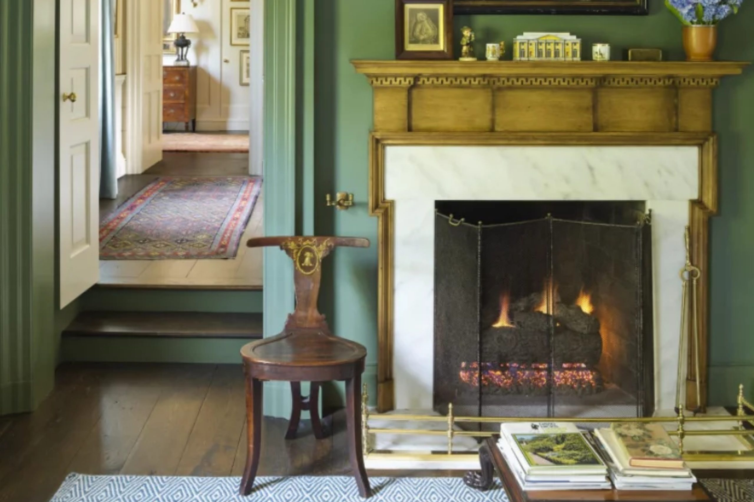
Choosing the right paint color can change the feel of a room. One color that stands out is HC-125 Cushing Green by Benjamin Moore. When you see it, it feels like bringing a bit of nature indoors. It’s that perfect shade of green that combines a hint of depth and calmness, making it a favorite for many.
Cushing Green is versatile and works well in various settings. Whether you’re sprucing up a cozy bedroom or refreshing a living room, it fits in effortlessly. It’s not just the color’s beauty that resonates but also how it harmonizes with other colors.
Pair it with natural wood or crisp whites, and you’ll have a space that feels balanced and welcoming.
More than just a color, Cushing Green has the knack of making a space feel lively yet soothing.
It’s perfect for ensuring that your home reflects a balance of style and comfort. If you’re considering a change, Cushing Green might just be the shade you need to refresh your surroundings.
via interiorsbycolor.com
What Color Is Cushing Green HC-125 by Benjamin Moore?
Cushing Green HC-125 by Benjamin Moore is a versatile shade that brings a touch of nature indoors. This color is a deep green, reminiscent of lush forests and fresh greenery. It’s rich and calming, without being overpowering, making it an excellent choice for various spaces.
Cushing Green works well in classic and traditional interiors. It complements dark wood furnishings, creating a cozy and inviting atmosphere in a living room or study. Pairing it with white trim or molding enhances its depth and adds a touch of elegance.
In modern or contemporary spaces, Cushing Green can be a bold accent wall, adding an earthiness to sleek lines and metallic finishes. It pairs beautifully with natural materials such as stone or marble, providing a striking contrast that feels balanced and serene.
Additionally, this color works well in farmhouse or rustic styles, harmonizing with aged woods, leather, and natural fibers. It offers a backdrop that enhances warm tones and textures, creating a sense of warmth and comfort.
Cushing Green also pairs nicely with textiles like wool or linen, which add softness to the room. Overall, this green hue can add charm and depth to any space, complementing both classic and modern aesthetics.
housekeepingbay.com
Is Cushing Green HC-125 by Benjamin Moore Warm or Cool color?
Cushing Green HC-125 by Benjamin Moore is a timeless, versatile shade that brings a touch of nature indoors. This soft green is calming, reminiscent of peaceful forest scenes, which makes it a great choice for creating a soothing atmosphere in any room. The color works well in living spaces, bedrooms, or even kitchens, offering a look that is both classic and fresh.
In terms of design, Cushing Green pairs beautifully with natural wood tones, whites, and soft grays, adding a layer of warmth and elegance without overwhelming the space.
It has a gentle presence, which can help smaller rooms feel more open and airy, while adding character and depth to larger areas.
The green undertones in Cushing Green satisfy the need for natural elements in the home, especially in urban environments lacking greenery.
This subtle color can make a home feel cozy and inviting, a perfect backdrop for both modern and traditional decor styles.
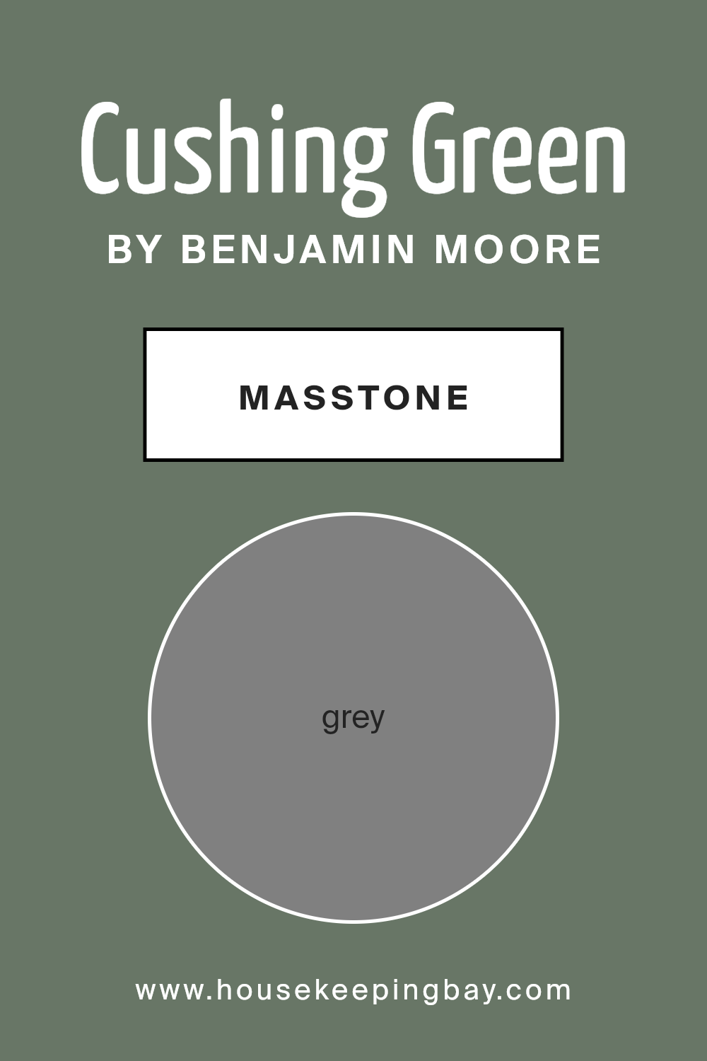
What is the Masstone of the Cushing Green HC-125 by Benjamin Moore?
Cushing Green HC-125 by Benjamin Moore is a sophisticated shade that blends green tones with a hint of grey. The masstone, which is grey (#808080), influences how this color interacts with different spaces in a home. The grey undertone gives Cushing Green a subtle, calming effect, making it versatile for various settings.
In living rooms, this color can create a cozy and inviting atmosphere. It provides a neutral backdrop that works well with both modern and traditional decor. The grey aspects help soften the green, making it easier to match with furniture and accessories.
In kitchens, Cushing Green adds a fresh and clean feel, especially when paired with white accents or light wood finishes. The grey component balances out the green, preventing it from feeling too bold or overwhelming.
For bedrooms, this color offers a soothing ambiance, perfect for relaxation. The grey undertone lends a calming effect, creating peaceful spaces for rest.
housekeepingbay.com
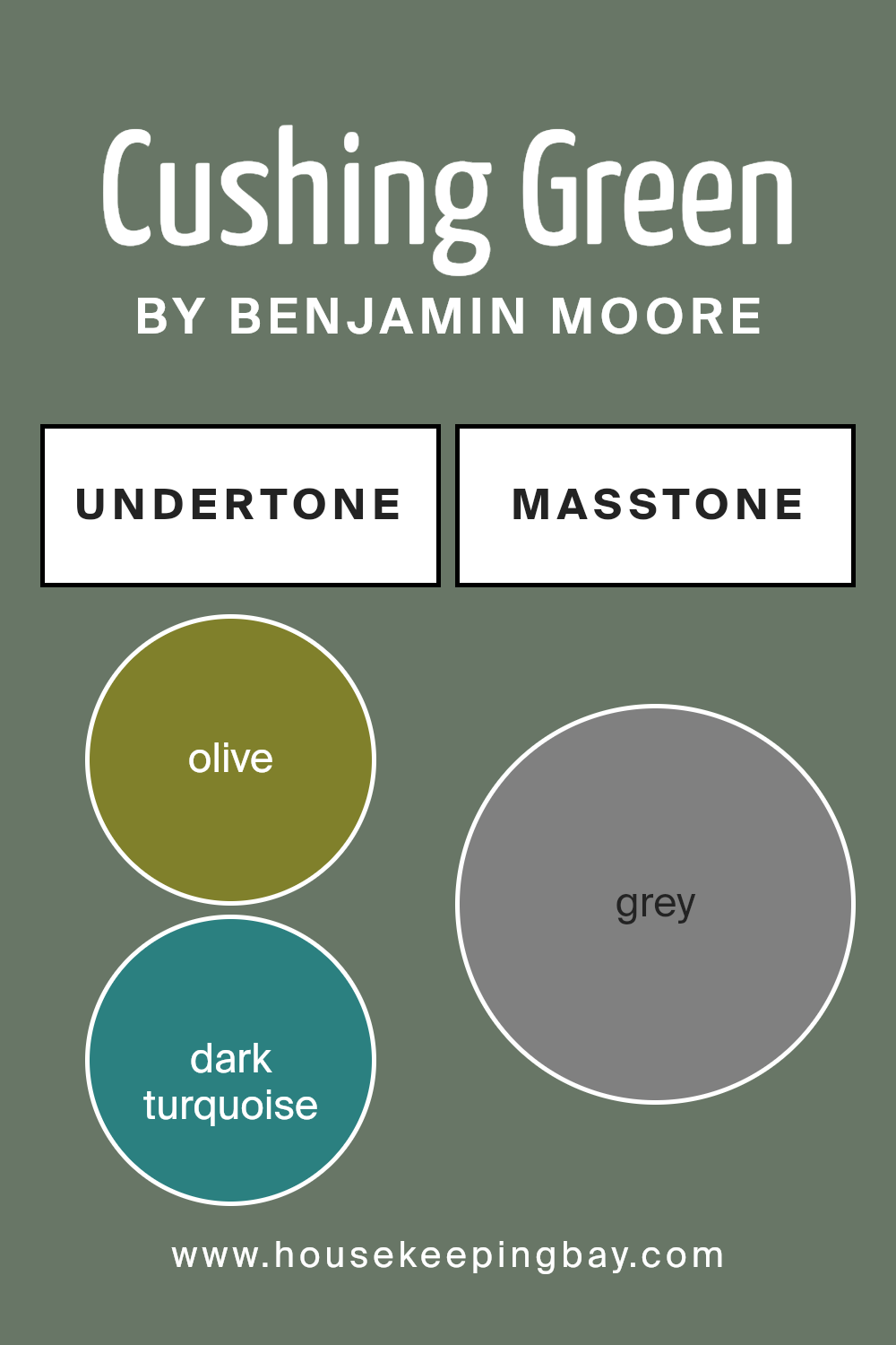
Undertones of Cushing Green HC-125 by Benjamin Moore
Cushing Green HC-125 by Benjamin Moore is a complex color that changes based on its undertones. Undertones make a paint more than what it seems at first glance. They can add depth, warmth, or coolness to the main color. Cushing Green has undertones like olive, dark turquoise, and dark green. These give it an earthy and natural feel, making it comforting and grounding.
On interior walls, these undertones can create a calming and welcoming space. The olive and dark green tones add a touch of nature, reminding you of foliage or the forest. The dark turquoise and navy hint at the ocean or a cool breeze, adding freshness to the room.
Sometimes, you might notice purple or lilac, giving the room a subtle elegance.
When light hits the wall, other undertones might pop up, like mint or pale pink. Light affects how you see these underlying colors, changing the mood throughout the day. For a living room, Cushing Green can feel cozy and inviting. In a bedroom, it promotes restfulness.
Colors like brown and dark grey in the undertones add richness, making the paint feel sophisticated and timeless. It’s a choice that works well with natural wood and neutral decor, balancing simplicity with understated style.
housekeepingbay.com
Coordinating Colors of Cushing Green HC-125 by Benjamin Moore
Coordinating colors are those that complement and harmonize with a primary shade, enhancing its presence and creating a balanced palette. For Cushing Green HC-125 by Benjamin Moore, this soothing green finds perfect partners in colors like Bennington Gray, Crystalline, Edgecomb Gray, and White Heron.
Each of these complements Cushing Green by setting a harmonious stage, allowing the green’s unique personality to shine.
Bennington Gray HC-82 is a warm and inviting taupe that adds depth and sophistication. It works seamlessly with Cushing Green, offering a cozy backdrop. Crystalline AF-485, on the other hand, is a soft and airy blue-green that brings a gentle brightness, creating a refreshing contrast.
Edgecomb Gray HC-173, a light greige, offers versatility and softness, perfect for a modern and sleek look. Finally, White Heron OC-57 is a clean, crisp white that provides a pristine contrast, allowing each of the coordinated colors to pop without overwhelming.
Together, these shades form a serene and inviting palette, enriching any space with subtle elegance and cohesion.
You can see recommended paint colors below:
- HC-82 Bennington Gray
- AF-485 Crystalline
- HC-173 Edgecomb Gray
- OC-57 White Heron

housekeepingbay.com
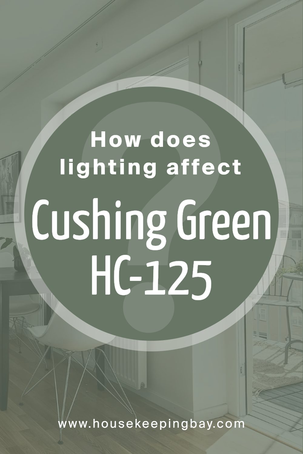
How Does Lighting Affect Cushing Green HC-125 by Benjamin Moore?
Lighting plays a big role in how we see colors. The same color can look different depending on the type of light hitting it. This is true for Cushing Green HC-125 by Benjamin Moore. This medium green color has certain qualities that change with lighting.
In natural light, Cushing Green tends to show its true hue. Natural light allows you to see the depth of the color. If you have a room with large windows, this green will likely appear rich and full.
In artificial light, things can look different. Some light bulbs give off a warm yellow glow, while others are cooler and bluish. If your lighting is warmer, Cushing Green might look a bit yellower. With cooler lights, it might appear grayer. The color can change throughout the day as sunlight gives way to lamps and ceiling lights.
In north-facing rooms, natural light is often cooler and dimmer. Cushing Green is likely to look darker and maybe a bit more muted. The green will feel cooler and might pick up some gray tones.
South-facing rooms get lots of direct sunlight, making colors seem brighter and warmer. In these rooms, Cushing Green can look more vibrant and balanced. The strong sunlight helps bring out the more lively aspects of the color.
East-facing rooms get morning sunlight, which is bright and warm. Here, the color will look lively and crisp in the morning but may tone down later in the day as the light changes.
West-facing rooms receive warm afternoon and evening light. During these times, Cushing Green can appear richer and warmer, with the green becoming more intense.
Understanding how Cushing Green HC-125 changes in different lighting can help you decide if it’s the right color for your space.
housekeepingbay.com
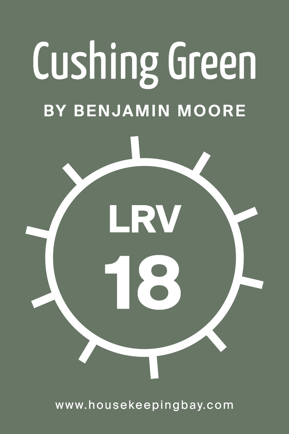
What is the LRV of Cushing Green HC-125 by Benjamin Moore?
Light Reflectance Value (LRV) is a measurement used to express how much light a color will reflect. It is a percentage on a scale from 0 to 100. A value of 0 means the color absorbs all light and reflects none, resulting in a very dark appearance.
Conversely, a value of 100 represents a color that reflects all light, appearing very bright or white. LRV helps predict how a color will appear under different lighting conditions, as colors with higher LRVs will reflect more light and will generally make a room feel brighter and more open.
In contrast, colors with lower LRVs absorb more light, making spaces feel cozier or more intimate.
Cushing Green HC-125 by Benjamin Moore has an LRV of 17.98. This means it is a darker color, as it reflects only a small portion of light. In a room with ample natural or artificial light, this green will add depth and create a sense of warmth. It will not make the room feel large or airy, but it will provide a rich, cozy atmosphere.
When using a color like Cushing Green with low LRV, it’s important to consider the size and lighting of the space, as it may make smaller or dimly lit rooms feel even smaller. On the other hand, in larger rooms with good lighting, it can add a sophisticated and inviting feel.
housekeepingbay.com
What are the Trim colors of Cushing Green HC-125 by Benjamin Moore?
Trim colors play a crucial role in interior and exterior design by adding depth and contrast to the main wall color, helping to define the structure and features of a space. For Cushing Green HC-125 by Benjamin Moore, trim colors are particularly important because they can either highlight or subtly complement this rich, deep hue.
Cushing Green is a dark, earthy green that brings a sense of sophistication and calmness to a room. Choosing the right trim color can either emphasize the boldness of Cushing Green or soften it, adding harmony to the overall environment.
Distant Gray OC-68 is a clean, crisp white with a subtle cool undertone, perfect for creating a sharp and modern contrast against Cushing Green. Its purity allows it to highlight architectural details without drawing attention away from the main wall color.
Atrium White OC-145 offers a warmer, soft white that introduces a gentle balance to the deep tones of Cushing Green. Its warm undertone slightly softens the overall look, providing a welcoming and cohesive feel.
Both Distant Gray and Atrium White can enhance the elegance of Cushing Green by framing it beautifully, allowing each space to feel fresh and inviting.
You can see recommended paint colors below:
- OC-68 Distant Gray
- OC-145 Atrium White

housekeepingbay.com
Colors Similar to Cushing Green HC-125 by Benjamin Moore
Similar colors play a vital role in design, helping to create harmony and cohesion within a space. When you use colors that are closely related, like those similar to Cushing Green HC-125 by Benjamin Moore, it brings a sense of balance and unity.
These colors naturally complement each other, enhancing the overall aesthetic without clashing. For instance, Caldwell Green HC-124 is a rich, muted shade that brings depth, making it an excellent partner for Cushing Green. It captures a classic elegance that pairs well in both traditional and modern settings.
Similarly, Enchanted Forest 700 offers a deep, natural tone reminiscent of lush woods, providing a serene feeling. Cambridge Green 468, with its soft undertones, creates a welcoming, warm atmosphere. This shade can add a touch of gentleness to a room.
Lastly, Rosepine 461 leans towards a balanced, earthy green, offering versatility that can ground more vibrant designs or stand strong on its own. Each of these colors adds its unique character while maintaining a consistent theme, demonstrating how similar tones work together to create a seamless and inviting environment.
By choosing analogous colors, you help to create a setting that feels thoughtfully composed and naturally pleasing.
You can see recommended paint colors below:
- HC-124 Caldwell Green
- 700 Enchanted Forest
- 468 Cambridge Green
- 461 Rosepine

housekeepingbay.com
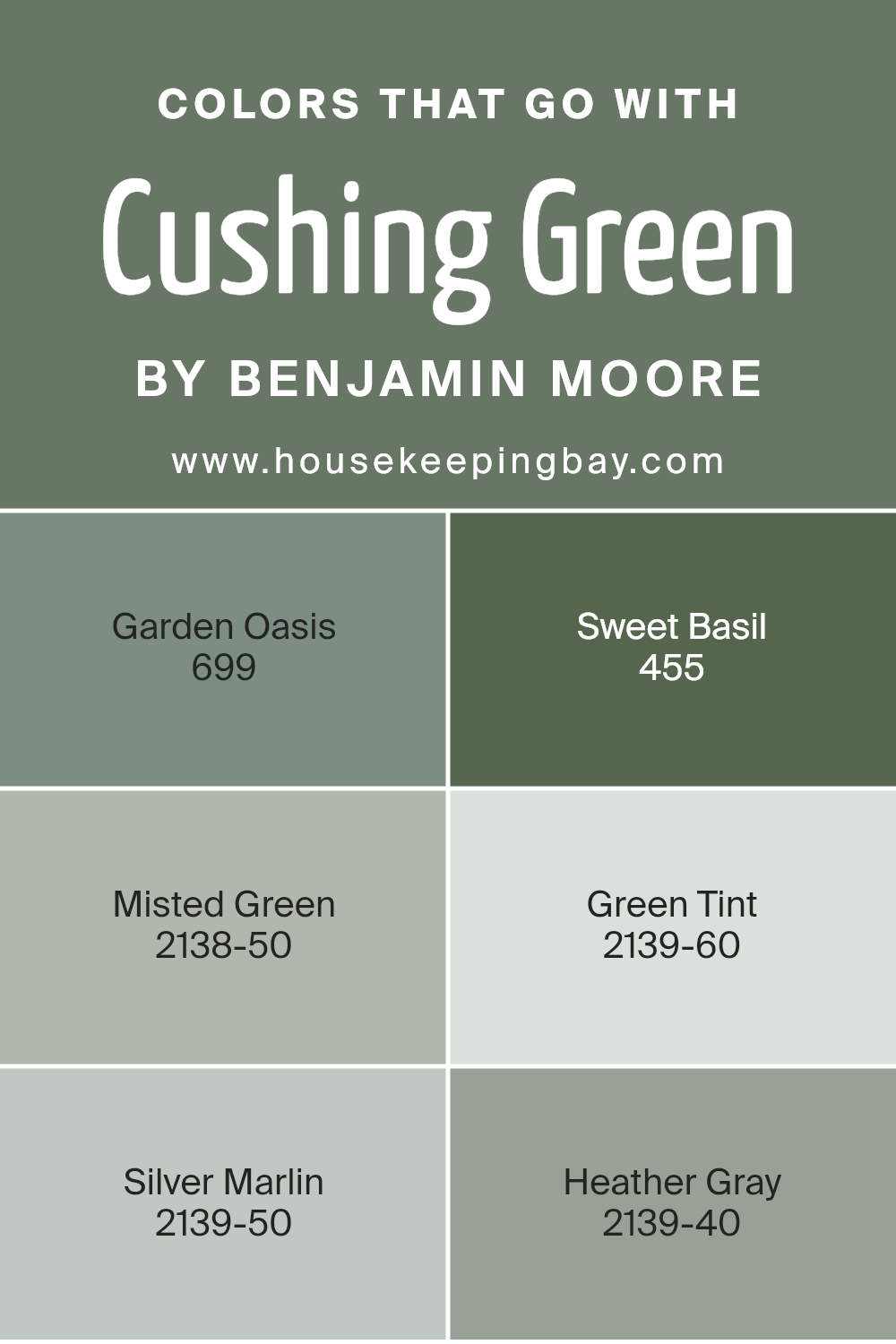
Colors that Go With Cushing Green HC-125 by Benjamin Moore
Choosing the right colors to pair with Cushing Green HC-125 by Benjamin Moore can enhance any space, making it feel balanced and cohesive. The importance of complementary colors lies in their ability to create harmony and set the mood, whether it’s for a home or a commercial setting.
For instance, 699 – Garden Oasis provides a gentle contrast with its warm, earthy tone, bringing a sense of freshness and connection to nature that suits the deep richness of Cushing Green.
On the other hand, 455 – Sweet Basil, with its deeper, herbal notes, can add depth and sophistication when paired, offering a refined and elegant look.
Both these colors play with the earthiness and warmth that align well with Cushing Green’s natural feel.
In contrast, softer shades like 2138-50 – Misted Green and 2139-60 – Green Tint offer a light and airy effect. Misted Green is a subtle, silvery hue that quietly uplifts a room by adding a touch of lightness, while Green Tint provides a gentle whisper of color, keeping the space serene and inviting.
Meanwhile, 2139-50 – Silver Marlin and 2139-40 – Heather Gray bring in cooler tones that balance the warmth of Cushing Green. Silver Marlin’s soft, watery gray adds a modern touch, and Heather Gray offers a neutral, sophisticated backdrop that complements all other shades beautifully.
Together, these colors work with Cushing Green, creating a rich and versatile color palette perfect for any design project.
You can see recommended paint colors below:
- 699 Garden Oasis
- 455 Sweet Basil
- 2138-50 Misted Green
- 2139-60 Green Tint
- 2139-50 Silver Marlin
- 2139-40 Heather Gray
housekeepingbay.com
How to Use Cushing Green HC-125 by Benjamin Moore In Your Home?
Cushing Green HC-125 by Benjamin Moore is a timeless and elegant color that brings a touch of nature indoors. With its muted green shade, it’s perfect for creating a cozy atmosphere in any home. In the living room, Cushing Green can enhance the warmth and make the space feel inviting.
Pair it with cream or beige furniture for a classic look. In the kitchen, this green can provide a fresh and clean feeling. It complements wooden cabinets and stainless steel appliances beautifully.
For bedrooms, Cushing Green offers a soothing environment, ideal for relaxation. Combine it with soft, neutral bedding to create a peaceful retreat. Even in bathrooms, this shade works well, adding a hint of color while keeping the space calm and serene. Overall, Cushing Green HC-125 is versatile and can be used in different rooms to create a harmonious and welcoming home. It’s a choice that won’t go out of style quickly.
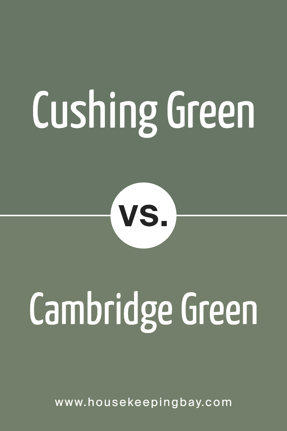
Cushing Green HC-125 by Benjamin Moore vs Cambridge Green 468 by Benjamin Moore
Cushing Green HC-125 by Benjamin Moore is a deep, rich green with hints of gray. It has a classic and elegant feel, often used to bring a sense of nature into a room. This color works well in both traditional and modern settings, adding depth and interest without overpowering other elements in the space.
Cambridge Green 468 by Benjamin Moore, however, is a lighter, more muted green. It carries a softer tone, which gives it a calming and peaceful vibe. It is an inviting and versatile color suitable for living areas or bedrooms, where a soothing atmosphere may be desired.
While Cushing Green feels more intense and full-bodied, Cambridge Green offers a more gentle and understated look. Both colors can enhance interiors, but Cushing Green leans towards boldness, while Cambridge Green brings a subtle elegance. The choice between these greens depends on whether you prefer the drama of a darker shade or the serenity of a lighter hue.
You can see recommended paint color below:
- 468 Cambridge Green
housekeepingbay.com
Cushing Green HC-125 by Benjamin Moore vs Rosepine 461 by Benjamin Moore
Cushing Green HC-125 by Benjamin Moore is a serene and classic shade of green. It brings to mind the calming nature of a forest, offering a sense of peace and stability. This color works well in both traditional and modern spaces, providing a backdrop that feels connected to nature without being overwhelming. It’s a versatile green that can complement wood tones beautifully.
On the contrast, Rosepine 461 by Benjamin Moore is a deep, rich plum color. It feels warm and inviting with a touch of drama. This hue can add depth to any room, creating a cozy and intimate atmosphere. Rosepine pairs well with neutral tones and can be used to create a luxurious and sophisticated look.
While Cushing Green brings a fresh and earthy feel, Rosepine brings warmth and richness, turning any space into an elegant retreat. Both colors offer unique charm, but evoke very different moods.
You can see recommended paint color below:
- 461 Rosepine

housekeepingbay.com
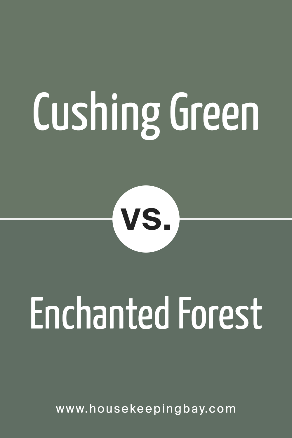
Cushing Green HC-125 by Benjamin Moore vs Enchanted Forest 700 by Benjamin Moore
Cushing Green HC-125 by Benjamin Moore presents a muted, calming green that evokes a sense of comfort and warmth. This color is ideal for creating a cozy, inviting atmosphere in any room. Its subtle nature allows it to blend well with various decor styles, offering flexibility in design choices. The hue mirrors nature, making it an excellent choice for spaces aiming to reflect serenity and natural beauty.
In contrast, Enchanted Forest 700 offers a deeper, richer shade of green that feels bold and dramatic. This color works wonderfully as an accent wall or in rooms where you want to make a statement. Its intensity adds depth and can make spaces feel more dynamic and energetic.
Enchanted Forest pairs beautifully with lighter tones for balance, highlighting its lush, vibrant character.
Both colors bring unique qualities, with Cushing Green offering a softer touch, while Enchanted Forest delivers a bolder impact.
You can see recommended paint color below:
- 700 Enchanted Forest
housekeepingbay.com
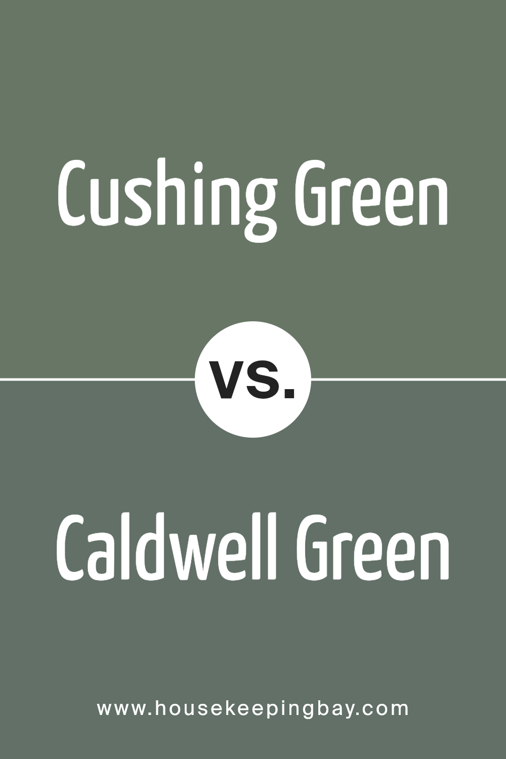
Cushing Green HC-125 by Benjamin Moore vs Caldwell Green HC-124 by Benjamin Moore
Cushing Green HC-125 and Caldwell Green HC-124 by Benjamin Moore are both rich and earthy green hues. Cushing Green is a muted, medium-toned green that evokes a sense of nature and timelessness. It feels warm and welcoming, ideal for spaces needing a cozy touch. Its softness makes it adaptable to a variety of decor styles, from traditional to modern.
Caldwell Green, while somewhat similar, presents a deeper and more intense green. This shade feels more grounded and dramatic, with a stronger presence. It lends itself well to statement walls or accent rooms where you want a bold yet soothing atmosphere.
When comparing these two, Cushing Green offers a lighter and friendlier vibe suitable for larger or well-lit areas.
Caldwell Green’s deeper tone creates an intimate setting, often working well in spaces aiming for a cozier, more intimate ambiance. Both colors carry an elegant, natural feel, yet suit slightly different design purposes.
You can see recommended paint color below:
- HC-124 Caldwell Green
housekeepingbay.com
Conclusion
As I think about HC-125 Cushing Green by Benjamin Moore, it’s clear that this color offers a unique, earthy charm. It’s a shade that brings a sense of calm and sophistication, making it a versatile choice for many spaces.
Whether used on walls or as an accent, Cushing Green can bring a room to life with its rich, natural tones. It’s a color that balances beautifully with both traditional and modern decor, offering a gentle yet striking backdrop.
I’ve found that this green works well in living rooms, kitchens, or even offices, adding warmth and depth without overwhelming the space. It pairs wonderfully with neutral tones, creating a harmonious atmosphere that feels both inviting and grounded. When combined with natural materials like wood or stone, it can create a serene environment that connects you to the outdoors.
Overall, HC-125 Cushing Green is a color that carries timeless appeal. It offers both elegance and comfort, making it an excellent choice for those looking to refresh their space with a touch of nature’s influence.
Whether you’re enhancing a single room or considering a broader design shift, this shade holds the potential to transform any area into a warm, welcoming haven.
housekeepingbay.com
Ever wished paint sampling was as easy as sticking a sticker? Guess what? Now it is! Discover Samplize's unique Peel & Stick samples. Get started now and say goodbye to the old messy way!
Get paint samples


