Creamy White OC-7 by Benjamin Moore
Cozy Elegance for Any Room
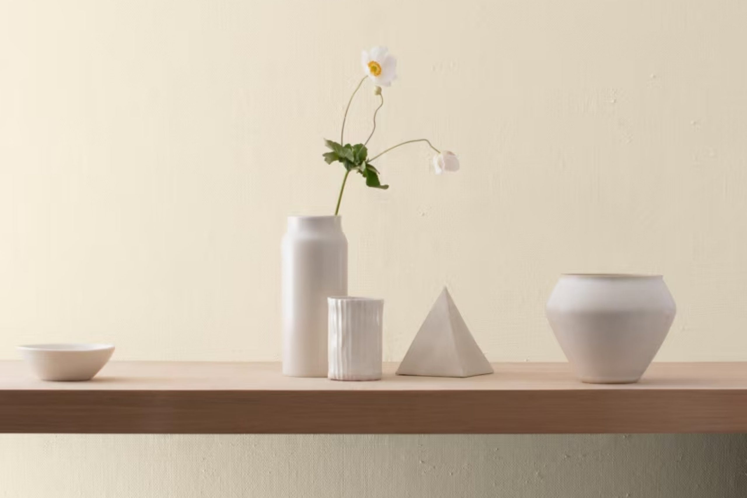
When choosing colors to refresh your home, OC-7 Creamy White by Benjamin Moore is a shade worth considering. It’s a soft, warm white that brings a subtle touch of elegance to any space. You can use it in both modern and traditional settings, as it’s a great neutral that pairs well with a variety of colors. In rooms with lots of natural light, OC-7 Creamy White creates a welcoming and open feel without being too stark.
If you have smaller spaces, painting the walls in this shade can help make the room feel larger and brighter. It works well with natural elements like wood and stone, enhancing their textures without overwhelming them.
You might find it an excellent choice for kitchens, living rooms, or bedrooms if you want to create a cozy and sophisticated atmosphere.
Whether you’re considering a full makeover or just want to make small changes, OC-7 Creamy White can subtly refresh any room. It’s a popular choice for trim and moldings too, helping to frame and highlight the other colors you choose.
With its timeless appeal, OC-7 Creamy White is a reliable option that makes coordinating the rest of your decor much easier.
via benjaminmoore.com
What Color Is Creamy White OC-7 by Benjamin Moore?
Creamy White OC-7 by Benjamin Moore is a warm, soft white with a hint of yellow, giving it a creamy feel. This delicate hue is ideal for creating inviting and cozy spaces. It provides a subtle backdrop that enhances the warmth of any room without being overpowering or sterile. The color adapts well to natural light, making interiors feel bright and spacious.
Creamy White OC-7 works wonderfully with traditional and farmhouse styles, where warmth and comfort are key. It pairs well with natural materials such as wood and stone, accentuating their earthy tones. In a modern setting, it adds a touch of elegance, complementing sleek lines and minimalistic designs without clashing.
Soft textures like linen, wool, and cotton fabric enhance the cozy feel of Creamy White OC-7. Metal accents, whether brushed brass or polished silver, add a layer of sophistication. Darker woods like walnut or mahogany contrast beautifully, highlighting the creamy undertone.
This color finds its place in living rooms, bedrooms, and even kitchens, providing a unified look throughout a home. Whether used on walls, trim, or ceilings, Creamy White OC-7 offers a timeless appeal that suits a variety of interior aesthetics.
housekeepingbay.com
Is Creamy White OC-7 by Benjamin Moore Warm or Cool color?
Creamy White OC-7 by Benjamin Moore is a soft, warm white that adds a gentle touch to any room. This color works well in various spaces because of its welcoming and calm feel. Its creamy undertones create a cozy atmosphere, making it perfect for living rooms, bedrooms, or kitchens.
Creamy White OC-7 has a lovely way of reflecting light, which can help brighten up darker areas without feeling too stark or cold.
In smaller rooms, it can open up the space, making it feel bigger and airier. It pairs beautifully with other neutral tones and vibrant colors, allowing for versatile design choices. In homes with natural wood or stone elements, Creamy White OC-7 complements these features, enhancing their appeal.
Additionally, it provides a soft backdrop for artwork and furnishings, helping them stand out. Its adaptability and warmth make it a favorite choice for many homeowners seeking a timeless look.
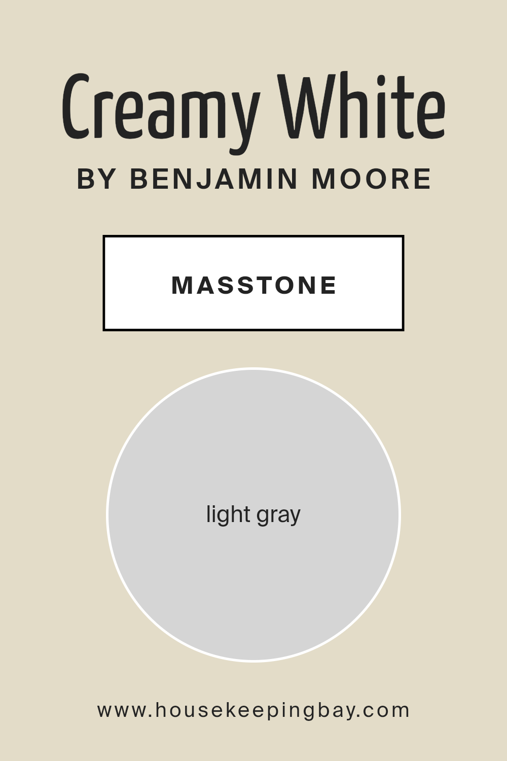
What is the Masstone of the Creamy White OC-7 by Benjamin Moore?
Creamy White OC-7 by Benjamin Moore is a beautiful light gray shade with a masstone of light gray (#D5D5D5). This gentle hue works wonderfully in homes, bringing a sense of calm and relaxation. Its soft nature makes it perfect for any room, whether it’s the living room, bedroom, or even a cozy office space.
This color is versatile, complementing a wide range of other colors and materials. In a room with lots of natural light, Creamy White OC-7 appears brighter, maintaining a fresh and airy feel. In dimmer settings, it adds warmth and comfort, making spaces feel inviting.
Because of its neutral tone, it’s a great background color. It allows furniture and decor to shine, without competing for attention. This can help make a space feel more cohesive and well-put-together. Whether paired with bold accents or subtle details, Creamy White OC-7 adds a touch of elegance to any room.
housekeepingbay.com
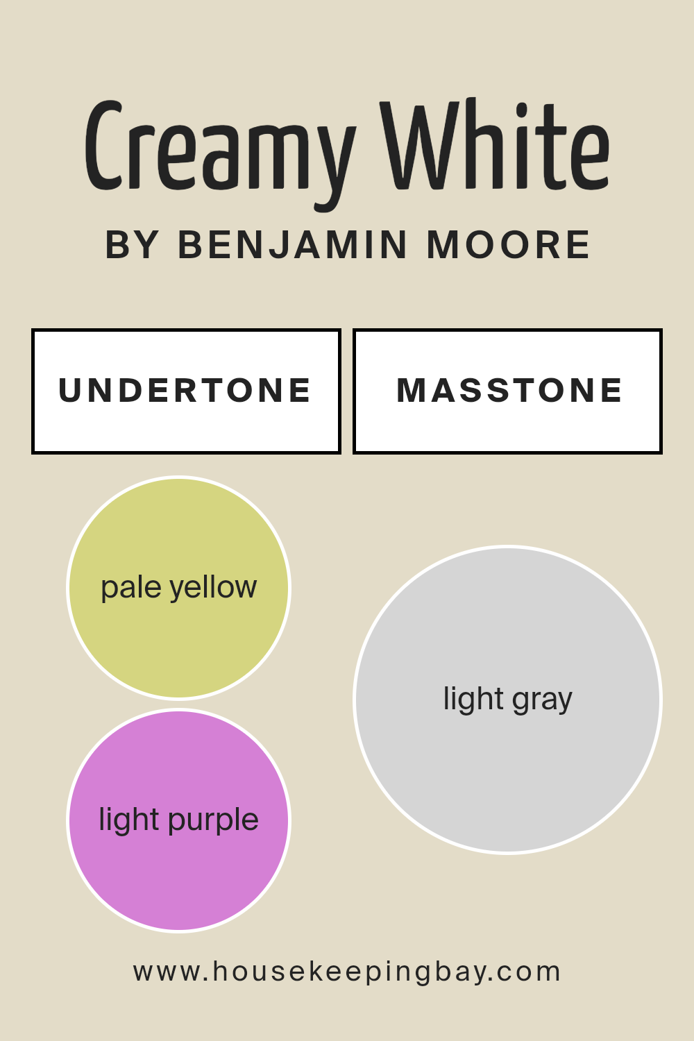
Undertones of Creamy White OC-7 by Benjamin Moore
Creamy White OC-7 by Benjamin Moore is a versatile and warm off-white. The undertones hidden in any paint color influence how it appears in different lighting conditions. In this case, Creamy White OC-7 has several undertones—pale yellow, light purple, light blue, pale pink, mint, lilac, and grey.
These undertones subtly impact the color’s appearance. For instance, pale yellow adds warmth, giving spaces a cozy and inviting feel. Light purple and lilac introduce a hint of softness and elegance, while light blue and mint bring a fresh, calming vibe.
Pale pink contributes a touch of delicacy and charm, and grey adds depth and neutrality.
When applied to interior walls, these undertones can interact with natural and artificial lighting, changing the room’s mood throughout the day. In bright, sunny spaces, the yellow and mint undertones may become more pronounced, creating a cheerful and lively environment.
In dimmer or cooler light, the grey and lilac nuances may stand out, offering a more subdued and refined atmosphere.
Due to these complexities, Creamy White OC-7 can adapt well to various design styles, functioning as a creamy and adaptable backdrop that complements different color schemes and furnishings.
housekeepingbay.com
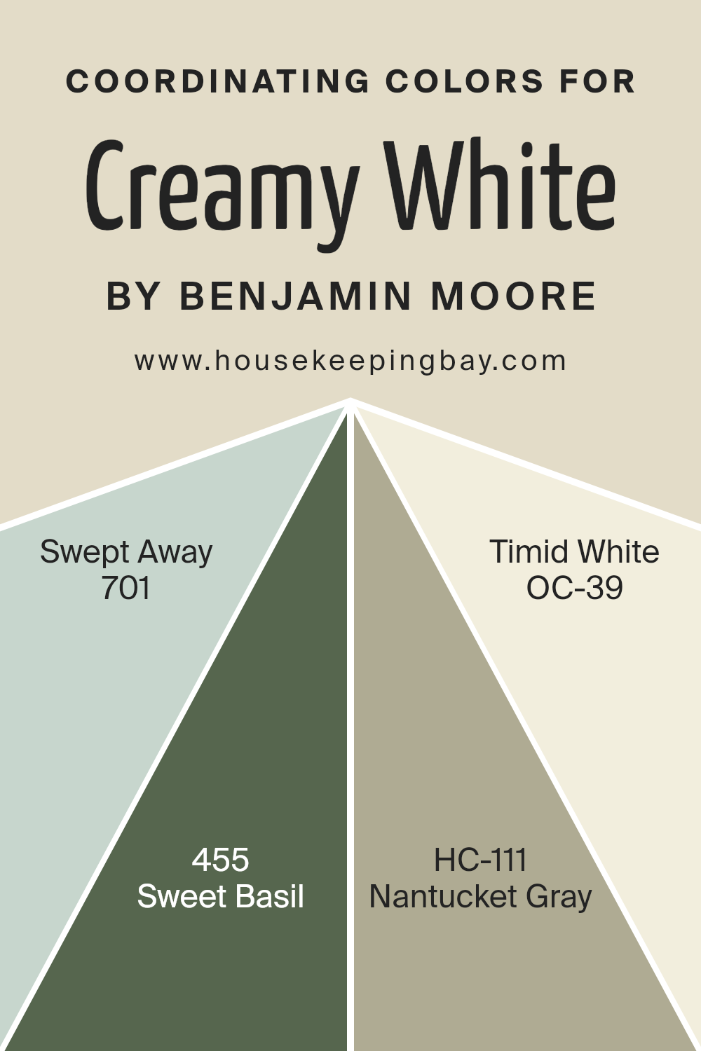
Coordinating Colors of Creamy White OC-7 by Benjamin Moore
Coordinating colors are a set of hues that work well together within a space, creating a harmonious look. They complement each other by sharing undertones or contrasts that blend well without clashing. The key is to select colors that can either softly blend or effectively highlight one another based on their undertone and intensity.
For Creamy White OC-7 by Benjamin Moore, coordination takes into account the warm, subtle notes in this cozy hue. This provides a neutral backdrop while allowing the coordinated colors to shine without overwhelming.
A great match for this creamy shade might include 701 – Swept Away, a refreshing light blue that provides a breezy, airy feel, reminiscent of a gentle coastal breeze. Additionally, 455 – Sweet Basil offers a rich, earthy green that introduces a hint of nature and freshness, perfect for a tranquil retreat.
HC-111 – Nantucket Gray balances elegance with grounding undertones of green, providing a subtle sophistication.
Meanwhile, OC-39 – Timid White presents a slightly warmer, softened white, suited for an airy space needing a gentle, brightening touch. When these colors are used together with Creamy White OC-7, they bring depth and character, allowing each area to feel connected yet unique.
You can see recommended paint colors below:
- 701 Swept Away
- 455 Sweet Basil
- HC-111 Nantucket Gray
- OC-39 Timid White
housekeepingbay.com
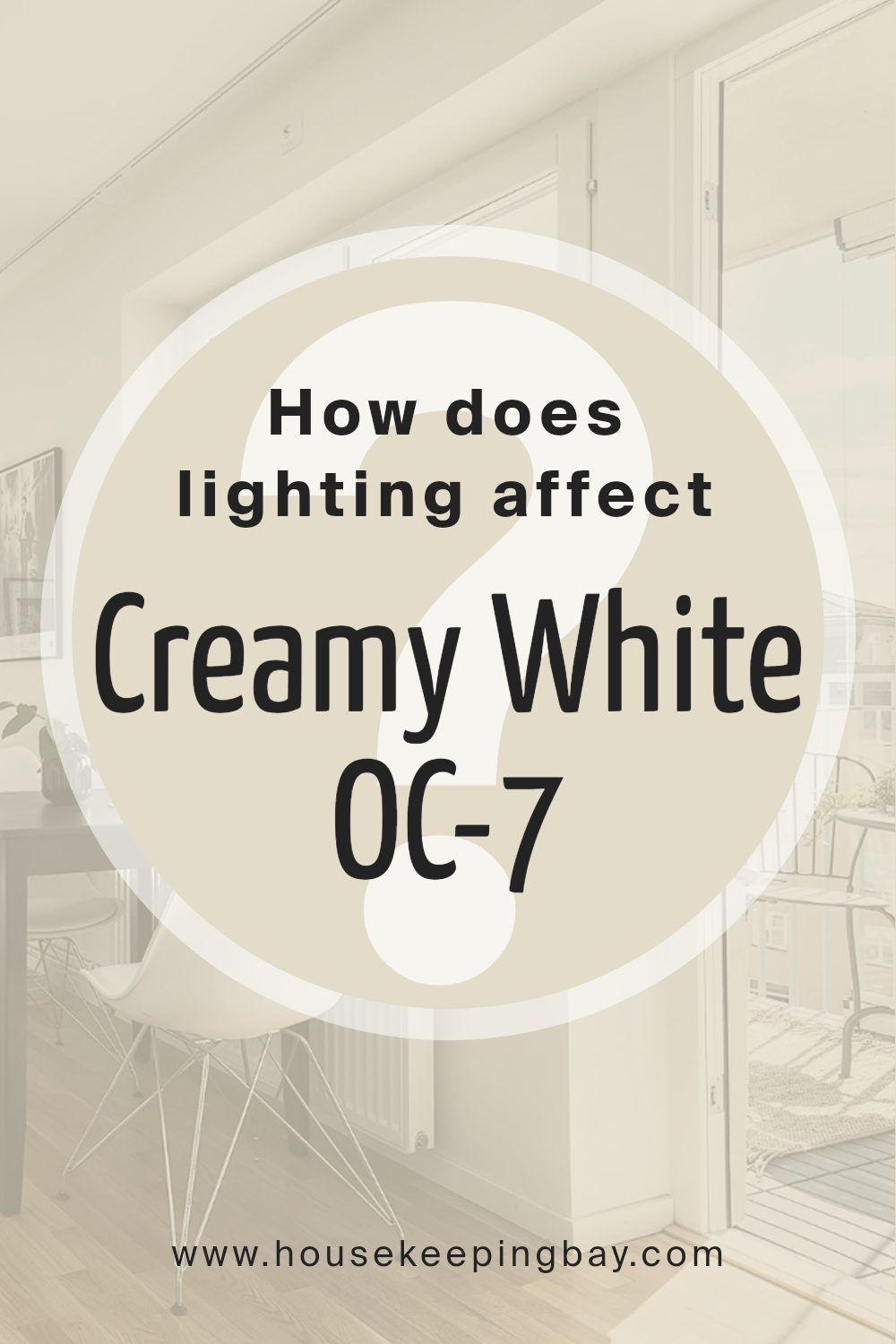
How Does Lighting Affect Creamy White OC-7 by Benjamin Moore?
Lighting plays a key role in how we perceive color. The color of an object can look different depending on the lighting conditions. This is important when choosing paint colors for a room. Let’s take Benjamin Moore’s Creamy White OC-7 as an example.
In natural light, Creamy White OC-7 appears soft and warm. The presence of daylight, which has a full spectrum, brings out the warm undertones of the color. However, artificial light can change how we see this color.
Under warm incandescent or LED bulbs, Creamy White may appear slightly yellower or even warmer. Under cool white LED or fluorescent lights, it might look crisper or more subdued.
Now, let’s see how this color performs in rooms with different light exposures:
- North-facing rooms: These rooms generally have cool and consistent light throughout the day. Creamy White OC-7 might appear a bit more muted here. The natural coolness of the light can make the color appear more neutral and less warm than in other rooms.
- South-facing rooms: These spaces get abundant warm light, especially in the afternoon. Creamy White will reveal its warmth here, possibly showing more of its creamy undertones.
- East-facing rooms: These rooms get bright, warm light in the morning and a cooler light later in the day. In the morning, Creamy White OC-7 will look warm and inviting, while in the afternoon, it may seem softer and cooler.
- West-facing rooms: These have cooler light in the morning and warm light in the afternoon. In the afternoon, Creamy White will appear warmer and cozier, while it might look more subdued in the morning.
Understanding the impact of lighting helps in selecting the right paint color for any room.
housekeepingbay.com
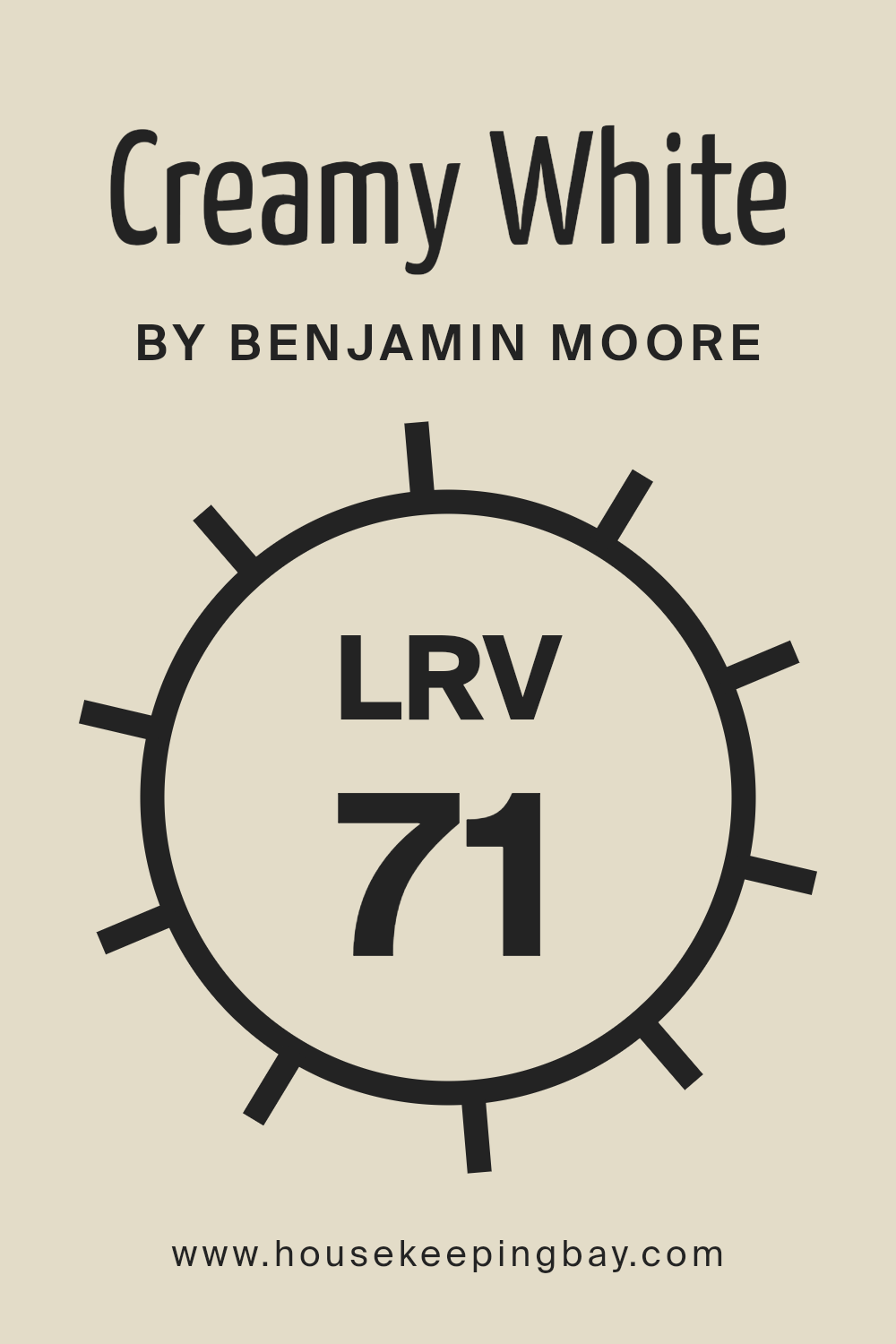
What is the LRV of Creamy White OC-7 by Benjamin Moore?
LRV stands for Light Reflectance Value, which measures how much light a color reflects. The scale ranges from 0 (absorbing all light) to 100 (reflecting all light). When a color has a high LRV, it reflects more light, making spaces appear brighter and more open.
In contrast, colors with a lower LRV absorb more light, resulting in a cozier and sometimes more intimate feel. The LRV of a paint can affect how light or dark a room appears, depending on how much natural or artificial light it receives.
It’s an important factor to consider when choosing paint colors, as it influences not only the brightness of a room but also how other colors and textures in the space are perceived.
Creamy White OC-7 by Benjamin Moore has an LRV of 70.95, which means it reflects a significant amount of light. This high LRV makes Creamy White an excellent choice for spaces where you want to enhance natural light and create a fresh, airy atmosphere.
Because it reflects a lot of light, this color can help rooms feel more spacious. In dimly lit rooms, Creamy White can add warmth and lift the overall brightness, while in well-lit areas, it maintains a clean and soft look. The balance between warmth from its creamy undertones and its high reflectance makes it a versatile choice for various rooms, seamlessly complementing other colors or design elements.
housekeepingbay.com
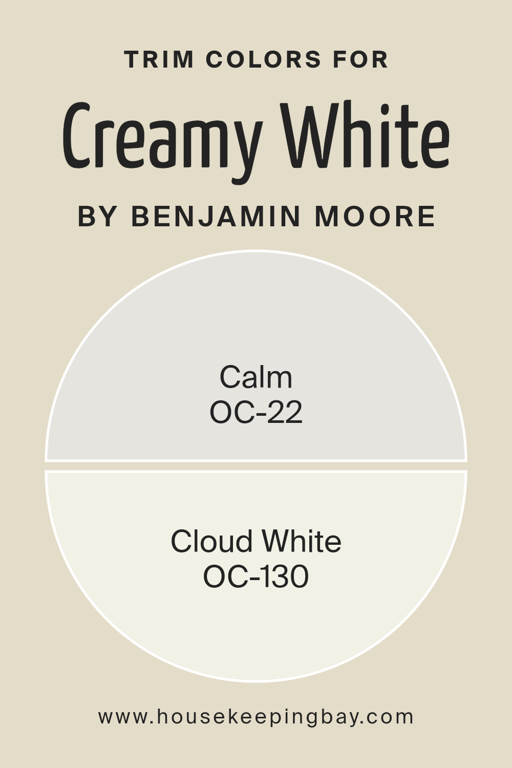
What are the Trim colors of Creamy White OC-7 by Benjamin Moore?
Trim colors refer to the paint colors used on the moldings, baseboards, window casings, and other architectural details within a space. They play an important role in highlighting the room’s features, offering contrast or harmony with the walls.
For Creamy White OC-7 by Benjamin Moore, which is a soft, warm white, choosing the right trim color can enhance the overall look and feel of a room.
A well-chosen trim color like OC-22 Calm or OC-130 Cloud White can provide a pleasing visual transition between the walls and woodwork, adding depth and interest to a room.
Calm OC-22 gives a subtle hint of gray, which can soften the look and meld seamlessly with Creamy White’s warmth, offering a gentle contrast. Cloud White OC-130, on the other hand, is a warm, bright white that can create a crisp, clean look next to Creamy White, adding a classic touch that is both fresh and inviting.
Calm OC-22 offers a quiet, understated greige that complements rooms wanting a muted, peaceful atmosphere. Its slight gray undertone brings a modern touch to the traditional warmth of Creamy White. Cloud White OC-130 offers a more traditional, versatile option, bringing extra brightness to spaces with its warm, clean white tone.
Both colors serve to frame the Creamy White perfectly, each providing its unique feel.
Whether you aim for subtlety or a sharp definition in your decor, these trim colors provide excellent choices, enhancing Creamy White OC-7 by adding the right finishing touches to the overall design.
You can see recommended paint colors below:
- OC-22 Calm
- OC-130 Cloud White
housekeepingbay.com
Colors Similar to Creamy White OC-7 by Benjamin Moore
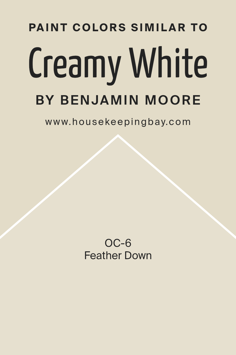
Similar colors are vital because they create harmony and balance in a space. When you use colors that are close to each other on the color wheel, it helps to maintain a unified and cohesive look. For instance, if Creamy White OC-7 by Benjamin Moore is the base, using colors like Feather Down OC-6 can add depth and warmth without clashing or overwhelming the space.
Feather Down OC-6 is a warm, soft beige that gently brings a cozy and inviting feel. It complements Creamy White by adding a hint of warmth and subtle contrast, making both colors stand out yet blend smoothly together.
Using these similar colors can enhance the calming atmosphere of a room. Creamy White, known for its versatility and soft presence, pairs naturally with Feather Down, which has a slightly darker and richer tone. This pairing can subtly enhance walls and create a serene backdrop for any room.
Together, these colors form a gentle palette perfect for any setting where tranquility and a touch of elegance are desired.
By choosing colors that are in close proximity on the color wheel, like Creamy White and Feather Down, you create a seamless flow that makes spaces feel more connected and cohesive.
You can see recommended paint color below:
- OC-6 Feather Down
housekeepingbay.com
How to Use Creamy White OC-7 by Benjamin Moore In Your Home?
Creamy White OC-7 by Benjamin Moore offers a warm, inviting hue for any home. Its soft, subtle tone makes it versatile, easily fitting into various spaces and styles. In living rooms, it creates a cozy atmosphere, making it ideal for family gatherings or relaxation. Using it in a bedroom can offer a sense of comfort and peace, promoting restful sleep.
In kitchens, Creamy White provides a clean, fresh backdrop, allowing colorful dishes and vibrant appliances to stand out. Its gentle warmth complements natural wood, making it a great choice for cabinets or trim. In small spaces, this color can enhance brightness, helping rooms appear larger and airier.
With its adaptable nature, Creamy White works well with both contemporary and traditional designs. It pairs beautifully with both bold and muted color accents, offering flexibility in decor choices. Whether in a full room or as an accent, this color brings softness and elegance to any home.
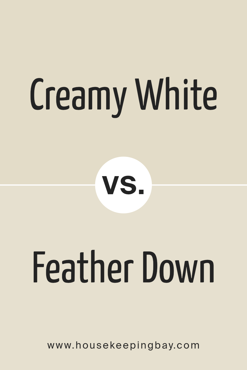
Creamy White OC-7 by Benjamin Moore vs Feather Down OC-6 by Benjamin Moore
Creamy White OC-7 by Benjamin Moore and Feather Down OC-6 by Benjamin Moore both belong to a soft, neutral palette. Creamy White OC-7 is a light, warm off-white shade. It provides a delicate, comforting glow, perfect for creating a cozy and inviting atmosphere. This versatile color works well in any room, providing a clean backdrop that highlights furnishings and decor.
Feather Down OC-6, slightly darker, offers a gentle greige tone. It combines beige and gray, resulting in a subtle warmth. Feather Down adds depth without overwhelming, making it an excellent choice for larger spaces where you want a hint of complexity.
While both colors blend harmoniously, Creamy White leans towards brighter spaces, enhancing light and making rooms feel airy. Feather Down, slightly subdued, offers a bit more depth, ideal for creating a calm, serene environment. They both serve as great backdrops, yet each brings its unique touch to a space.
You can see recommended paint color below:
- OC-6 Feather Down
housekeepingbay.com
Conclusion
OC-7 Creamy White by Benjamin Moore has left quite an impression on me. This shade is a versatile and warm color that feels both timeless and inviting. Its soft undertones bring a gentle warmth that can complement almost any space. I found that it’s perfect for those looking to create a calm and welcoming environment in their home.
As I considered its uses, I realized that OC-7 works well in a variety of rooms, from living areas to kitchens and bedrooms. It’s remarkable how well it pairs with both modern and traditional decor.
Whether using it on walls, cabinetry, or trim, Creamy White offers a soft backdrop that enhances other design elements without overwhelming them.
One of the key points that stood out to me is its ability to work beautifully under different lighting conditions. Natural light highlights its warm tones, while artificial lighting keeps it inviting in the evening. This flexibility makes it a go-to choice for many homeowners and designers alike.
After diving into all the possibilities, I truly appreciate OC-7 Creamy White for its understated elegance and adaptability. It’s more than just a paint color; it’s a way to make any space feel more cohesive and harmonious. With its subtle charm and versatility, it’s easy to see why so many people choose this color for their homes.
housekeepingbay.com
Ever wished paint sampling was as easy as sticking a sticker? Guess what? Now it is! Discover Samplize's unique Peel & Stick samples. Get started now and say goodbye to the old messy way!
Get paint samples


