Barely Teal 2048-70 by Benjamin Moore
A Soft Splash of Color for Any Space
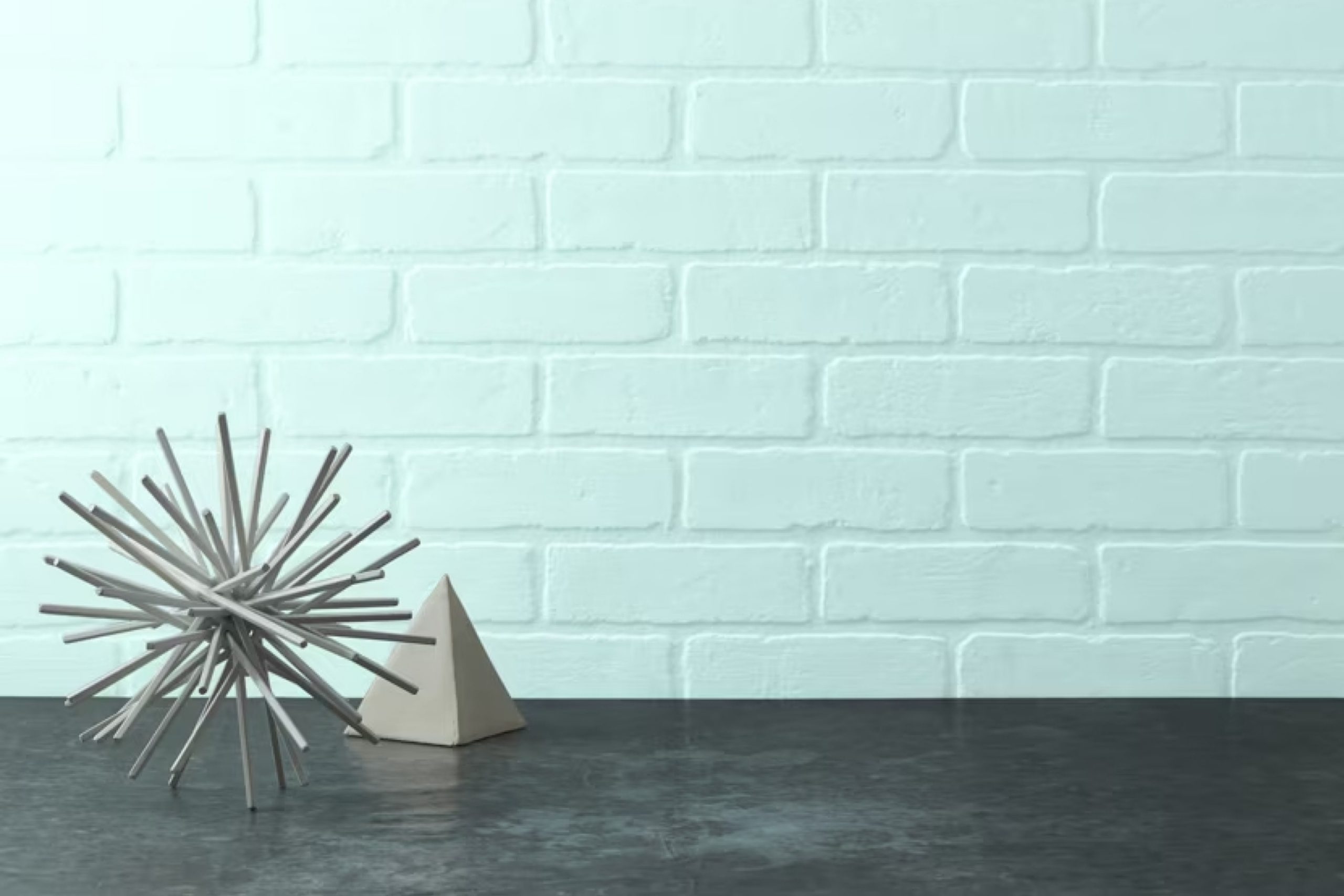
Are you thinking about changing up your space with a fresh coat of paint? You might want to consider the color 2048-70 Barely Teal by Benjamin Moore. This soothing shade of teal has a gentle brightness that can lighten up any room without being too overwhelming.
Whether you’re updating your living room, bedroom, or even a bathroom, Barely Teal offers a splash of color that is both subtle and beautiful. It’s a great choice if you’re after a look that’s refreshing yet calming. Imagine winding down in a room that feels airy and relaxed; that’s the kind of mood Barely Teal can help you create.
Plus, it pairs wonderfully with a variety of decor styles and other colors, from neutrals like white and gray to more vibrant hues.
So, if you’re aiming to refresh your walls, Barely Teal by Benjamin Moore could be the perfect pick for you.
via benjaminmoore.com
What Color Is Barely Teal 2048-70 by Benjamin Moore?
Table of Contents
Barely Teal 2048-70 by Benjamin Moore is a soft, pale teal color with subtle blue and green hues that impart a serene and gentle ambiance to any space. This color is airy enough to enhance small or large rooms without overwhelming them. It works exceptionally well in various lighting conditions, reflecting more of its blue or green undertones depending on the natural light it receives.
Barely Teal is highly versatile and fits seamlessly into several interior design styles. It suits modern minimalist designs, offering a clean and crisp look, but also complements coastal styles where its watery hues echo the sea and sky. Additionally, this color is excellent for Scandinavian interiors, which favor light, muted tones to create a sense of space and lightness.
When pairing materials with Barely Teal, natural wood, from pale beech to richer walnut, creates a striking contrast and brings warmth to the cool tone of the paint. Linen and cotton fabrics in white or soft neutral tones work well in soft furnishings, enhancing the color’s freshness. For a more sophisticated texture contrast, incorporating brushed brass or matte black metal finishes can add a touch of modern elegance to the soothing base of Barely Teal.
housekeepingbay.com
Is Barely Teal 2048-70 by Benjamin Moore Warm or Cool color?
Barely Teal 2048-70 by Benjamin Moore is a versatile color that brings a fresh, calm look to any room. Its light teal hue offers a hint of color without overwhelming spaces, making it ideal for small or large areas needing a touch of brightness. Barely Teal works well in a variety of settings, from modern to traditional, adapting easily to different styles and furnishings.
When used in homes, this color primarily enhances relaxation. Its subtle vibrancy calms the mind and makes rooms feel more spacious. It pairs well with both neutral tones like whites and grays, and with darker colors that emphasize contrast. Adding Barely Teal to a bedroom or bathroom can create a refreshing sanctuary, while in living rooms, it sets a gentle, welcoming tone.
For those wanting a soft yet noticeable backdrop that supports various decor elements, Barely Teal provides flexibility and beauty. It checks all boxes for anyone looking to gently incorporate color into their home without significant commitment or change.
What is the Masstone of the Barely Teal 2048-70 by Benjamin Moore?
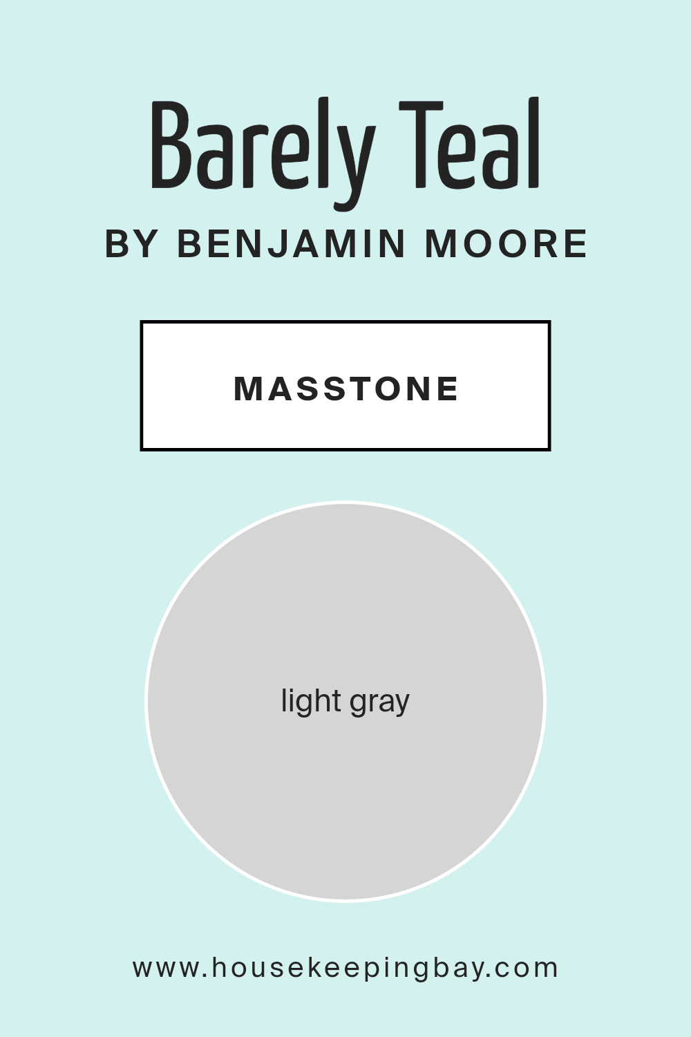
Barely Teal 2048-70 by Benjamin Moore is a soft and subtle color with a masstone of Light Gray (#D5D5D5). Its gentle tone provides a clean and airy feel, making it ideal for creating a calm, serene environment in homes. This color works well in various rooms, from bedrooms to living spaces, because its neutrality helps balance bolder colors or act as a soothing backdrop for lighter, minimalist decor.
In spaces like kitchens or bathrooms, Barely Teal offers a hint of color without overwhelming the senses. It pairs beautifully with white trim or cabinets, enhancing the room’s freshness and spaciousness. Its versatility also means it can complement both contemporary and traditional styles, making it a great choice for painting walls, ceilings, or even furniture.
Overall, Barely Teal’s light gray masstone makes it a practical yet beautiful option for anyone looking to refresh their home with a touch of softness and sophistication. Its ability to act as a neutral with a twist offers endless possibilities for design.
housekeepingbay.com
Undertones of Barely Teal 2048-70 by Benjamin Moore
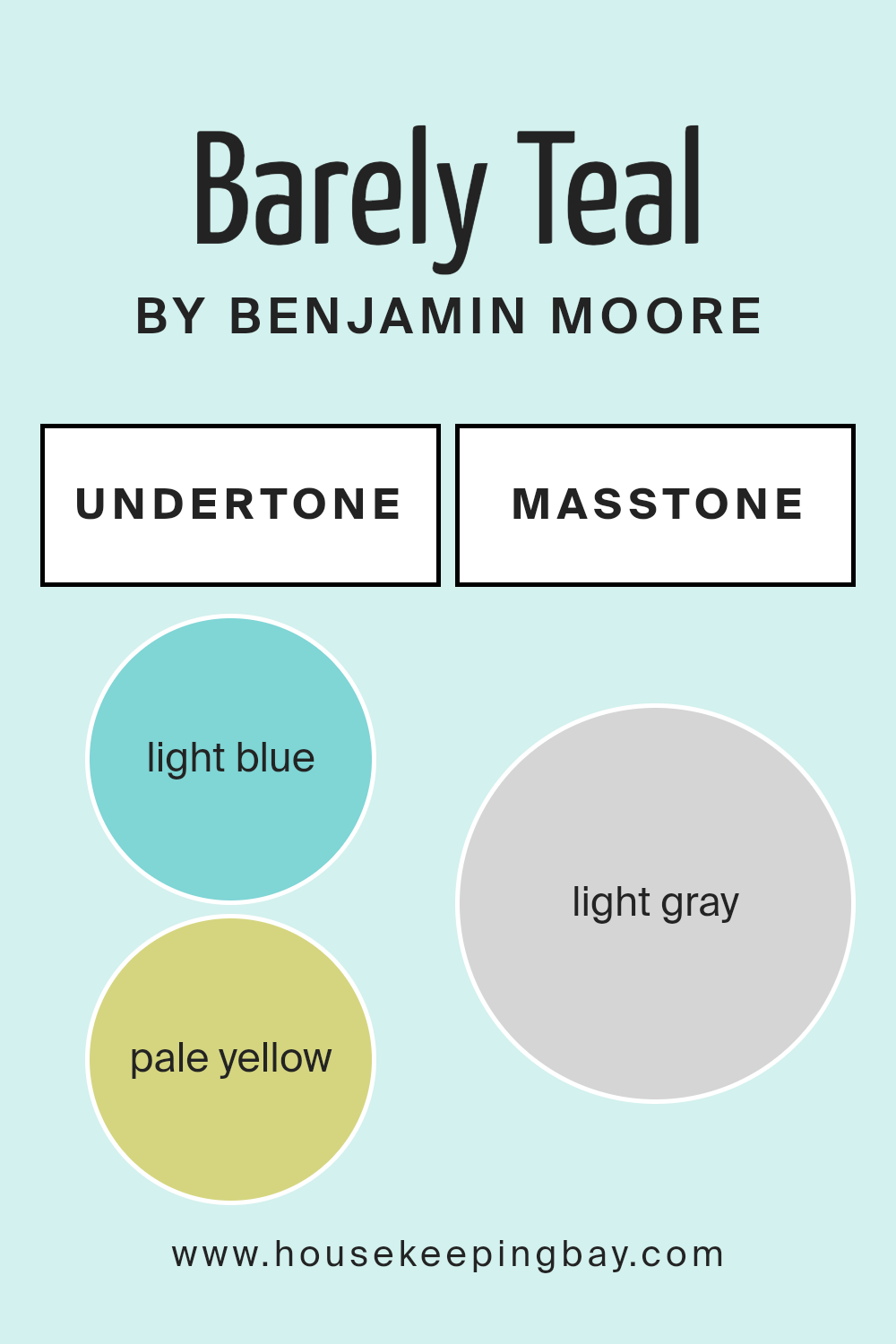
Barely Teal 2048-70 by Benjamin Moore is a unique paint color with a multitude of undertones that influence its appearance subtly. Undertones are slight hints of other colors that can be seen when the primary color is affected by various lighting conditions or surrounding elements. This complexity is what gives Barely Teal its versatility and appeal.
The undertones in Barely Teal 2048-70 include light blue, pale yellow, light purple, mint, lilac, pale pink, and grey. Each of these undertones contributes differently to the overall look of the color. For instance, light blue and mint bring a fresh, cool quality to the color, making it feel more vibrant and airy. On the other hand, lilac and light purple add a touch of softness, which can make the color appear more soothing.
Pale yellow undertones can impart a subtle warmth, making the color more welcoming, while pale pink can add a hint of rosiness, enhancing the feeling of comfort. Grey undertones help in grounding the color, ensuring it doesn’t feel too overwhelmingly colorful or vibrant.
When used on interior walls, Barely Teal 2048-70 adapts exceptionally well to various lighting situations. The richness of the undertones helps the color maintain its beauty and depth under different lighting conditions, whether natural or artificial.
This adaptability makes it ideal for any room, creating different moods at different times of the day based on the interaction of light with its diverse undertones. Thus, the room painted in this color can appear dynamic and ever-evolving, reflecting subtle changes throughout the day.
housekeepingbay.com
Coordinating Colors of Barely Teal 2048-70 by Benjamin Moore
Coordinating colors are selected to complement a primary color, enhancing the overall aesthetic of a space while creating a balanced and harmonious look. When choosing coordinating colors, such as those paired with Barely Teal 2048-70 by Benjamin Moore, it’s important to consider how these hues will work together to achieve the desired ambiance. Colors are typically chosen for their ability to support the main color and each other, ensuring a cohesive and visually appealing result.
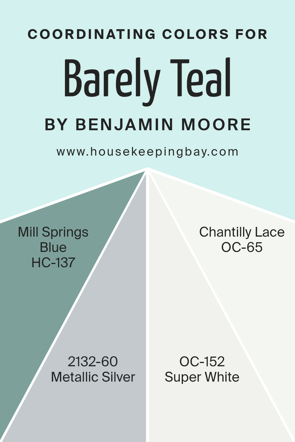
For Barely Teal 2048-70, a serene and gentle teal shade, coordinating colors include HC-137 Mill Springs Blue, a deep and calming blue that adds depth and sophistication. Another coordinating color is 2132-60 Metallic Silver, a sleek and modern hue that offers a light-reflective quality, lending a contemporary edge.
OC-152 Super White provides a crisp, clean backdrop that allows more intense colors to stand out without overwhelming the space. Lastly, OC-65 Chantilly Lace is an off-white with subtle warm undertones, perfect for softening the overall look and tying all the elements together seamlessly. Each of these shades helps to create a well-rounded look that complements the soothing nature of Barely Teal.
You can see recommended paint colors below:
- HC-137 Mill Springs Blue
- 2132-60 Metallic Silver
- OC-152 Super White
- OC-65 Chantilly Lace
housekeepingbay.com
How Does Lighting Affect Barely Teal 2048-70 by Benjamin Moore?
Lighting plays a crucial role in how we perceive colors. The type of light and the direction it comes from can significantly alter the appearance of a color. Barely Teal 2048-70 by Benjamin Moore, a gentle teal hue, illustrates this perfectly.
In artificial light, Barely Teal tends to look warmer and more subdued. Depending on the type of bulb used—whether it’s LED, fluorescent, or incandescent—the color may shift slightly. LEDs, for example, often enhance the green tones in the teal, making it appear fresher and brighter. In contrast, incandescent bulbs, which produce a warmer, yellower light, might make the color seem softer and more muted.
Natural light brings out the truest form of Barely Teal, especially in its vibrancy and depth. Under sunlight, this color can look lively and vibrant, enhancing its soothing qualities. However, the amount and angle of sunlight vary with the direction a room faces, impacting how Barely Teal looks throughout the day.
In north-faced rooms, which receive less direct sunlight, Barely Teal might appear cooler and more shadowed, potentially bringing out more of its blue undertones. This cooler light can sometimes make the color appear crisp yet slightly darker than it would in more direct light.
South-faced rooms benefit from abundant sunlight, brightening Barely Teal tremendously. Here, the color will look its most vibrant and true-to-sample, reflecting the light beautifully and maintaining its balance between blue and green shades throughout the day.
East-faced rooms see the most change in how Barely Teal appears, with morning light making the color bright and lively, and then growing gradually cooler as the day progresses. This shift can display the dynamic range of tones within Barely Teal, from brisk morning teal to a softer, more relaxed hue by evening.
West-faced rooms offer a reverse scenario, with the color starting cooler in the morning and warming up in the evening light. The late afternoon and sunset can cast a golden glow, making Barely Teal appear warmer and more welcoming.
Thus, Barely Teal’s appearance can vary significantly depending on the lighting conditions, shifting its character and mood throughout the day and in different settings.
housekeepingbay.com
What is the LRV of Barely Teal 2048-70 by Benjamin Moore?
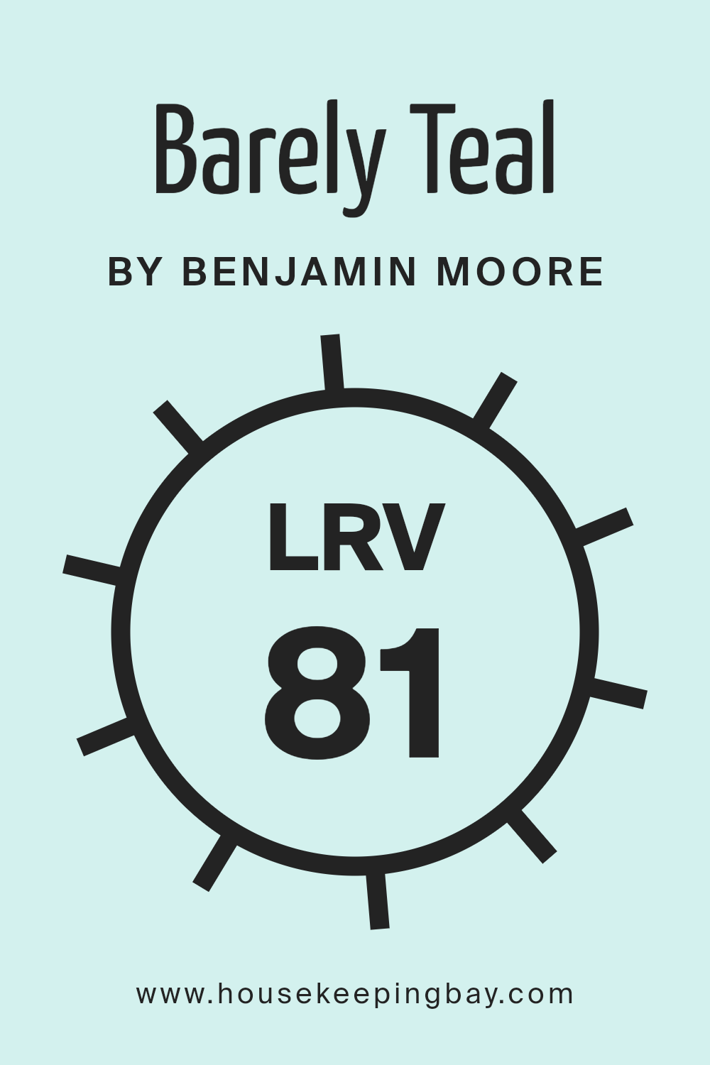
LRV stands for Light Reflectance Value, which measures the amount of light a paint color reflects or absorbs. This number runs on a scale from 0 to 100, where 0 means the surface absorbs all light (black), and 100 reflects all light (white). Knowing the LRV helps in selecting the right paint color for your space based on how bright or dark you want the room to feel.
Higher LRV values make rooms appear lighter, as more light bounces back into the room, while lower LRV paints can make spaces appear cozier or smaller by absorbing more light. The LRV of Barely Teal (2048-70) by Benjamin Moore is 81.12, which is quite high. This means it’s a color that will reflect a lot of light, making spaces look airy and more open.
Such a high LRV makes this color a good choice for darker rooms to help brighten them up or small spaces to make them appear larger. The light teal shade adds a subtle touch of color while keeping the overall feel of the room light and fresh, not overwhelming the senses with too much brightness or color saturation.
housekeepingbay.com
What are the Trim colors of Barely Teal 2048-70 by Benjamin Moore?
Trim colors are specific shades used to highlight or accentuate the architectural features of a room, such as baseboards, moldings, door frames, and window frames. When paired with wall colors like Barely Teal 2048-70 by Benjamin Moore, the right trim color can enhance the overall look by creating a beautiful contrast or a softly blended boundary.
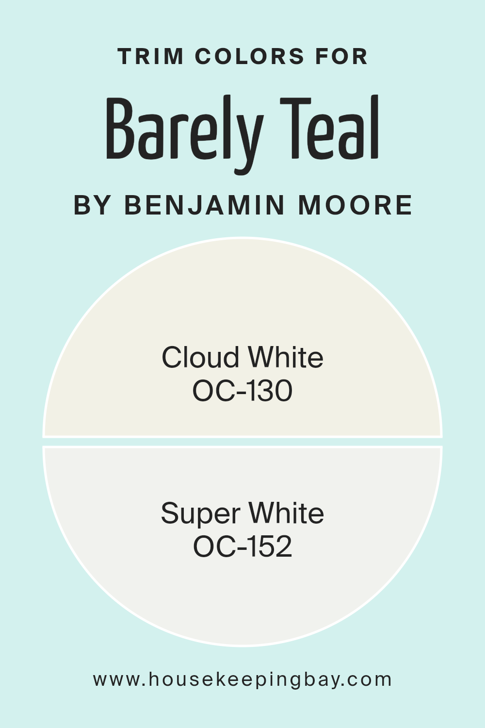
Using trim colors like OC-130 – Cloud White or OC-152 – Super White from Benjamin Moore can give a clean and finished look to the space, making the wall color stand out more strikingly or adding a crisp finish to the room’s aesthetic. OC-130 – Cloud White is a gentle off-white with a warm undertone that gives a soothing feel to any space. It softly underscores the subtle teal of Barely Teal 2048-70, adding a light and airy touch without overwhelming the primary hue.
On the other hand, OC-152 – Super White is a brighter, more stark white that offers a sharp contrast, making it an excellent choice for those looking to delineate features clearly against a colored wall. This color brings a fresh and clean sharpness to the edges, perfectly complementing a more vibrant wall shade like Barely Teal.
You can see recommended paint colors below:
- OC-130 Cloud White
- OC-152 Super White
housekeepingbay.com
Colors Similar to Barely Teal 2048-70 by Benjamin Moore
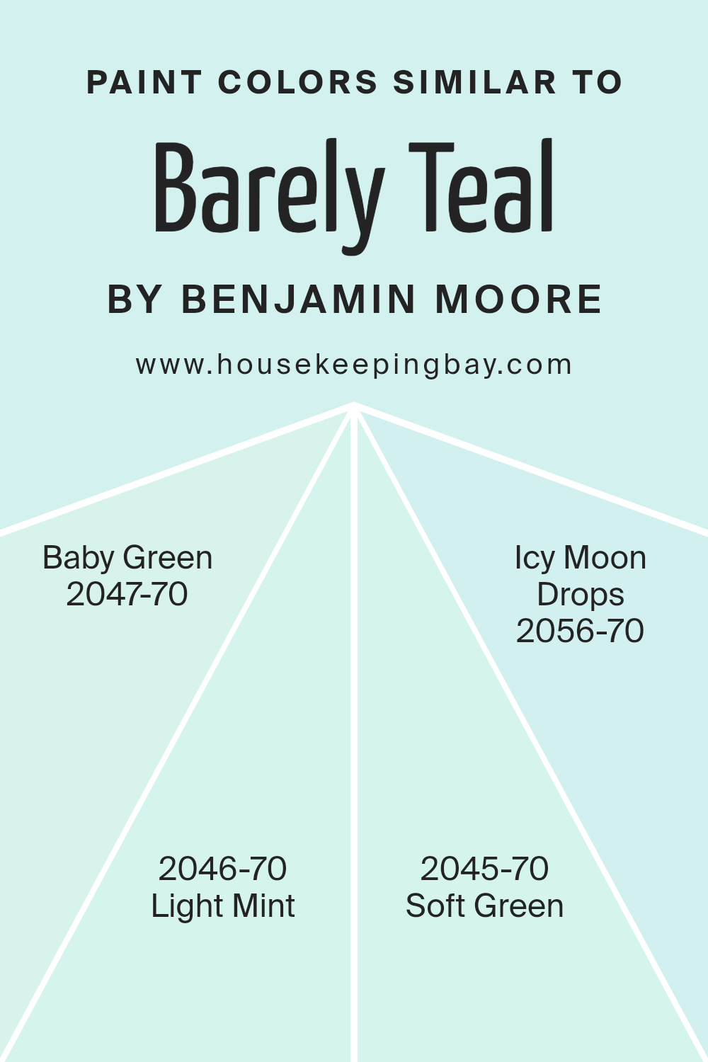
When decorating a space, the choice of color palette can significantly affect the overall feel and aesthetics. Choosing similar colors, such as the variations around Barely Teal 2048-70 by Benjamin Moore, helps create a cohesive and soothing atmosphere.
These colors blend seamlessly because they share similar undertones, making it easier to create a unified look without harsh contrasts. This harmonious effect can be particularly beneficial in spaces meant for relaxation or concentration, where a gentle visual flow helps in maintaining a tranquil environment.
Consider the subtle differences among similar colors like Baby Green 2047-70, which has a fresh and light feel, ideal for brightening up small spaces or adding a touch of youthfulness. Light Mint 2046-70, with its hint of mint, offers a refreshing touch, making it perfect for bathrooms or as an accent in a neutral kitchen. Soft Green 2045-70 leans towards a mild, earthy vibe, excellent for creating a natural, grounded feeling in living areas.
Lastly, Icy Moon Drops 2056-70 provides a cooler, almost ethereal quality, fantastic for bedrooms or quiet study areas where a calm, focused atmosphere is desired. Each of these hues, while distinct, works wonderfully alongside Barely Teal for an aesthetic that is fluid and visually coordinated.
You can see recommended paint colors below:
- 2047-70 Baby Green
- 2046-70 Light Mint
- 2045-70 Soft Green
- 2056-70 Icy Moon Drops
housekeepingbay.com
Colors that Go With Barely Teal 2048-70 by Benjamin Moore
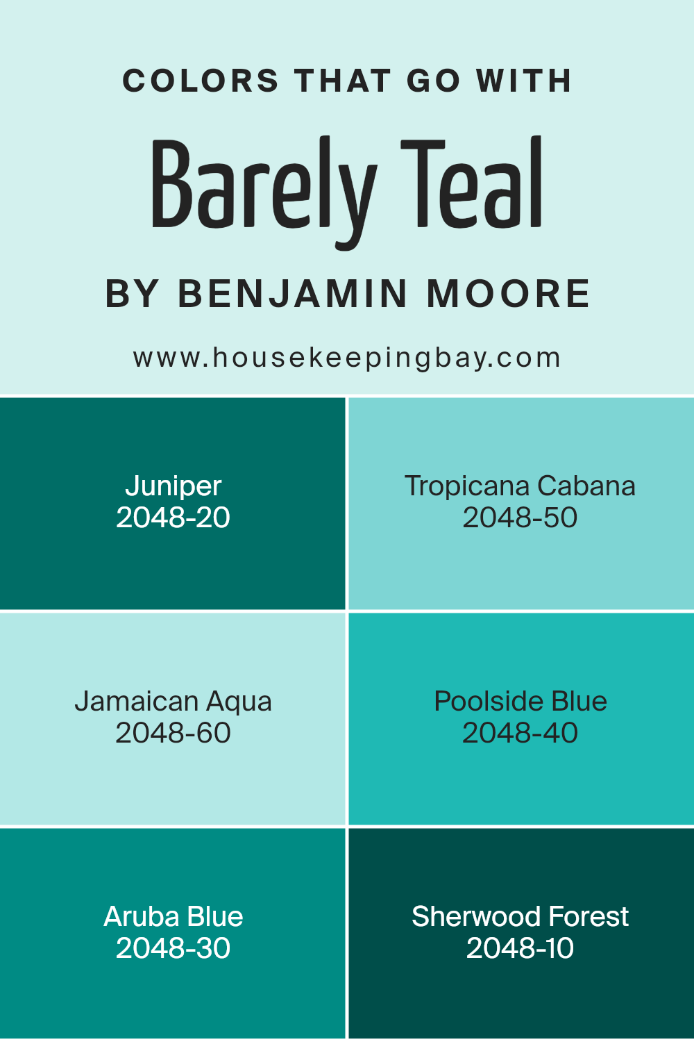
Choosing the right colors that harmonize with Barely Teal 2048-70 by Benjamin Moore plays a crucial role in creating a coherent and visually appealing space. Colors like Juniper 2048-20, Tropicana Cabana 2048-50, and others in this range work seamlessly with Barely Teal to offer a variety of design options that cater to different tastes and themes. These complementary colors add depth and contrast, enhancing the room’s overall aesthetic without overwhelming the senses.
Juniper 2048-20 is a deep, green shade that conveys a sense of richness and grounding, perfect for accentuating areas or for use on trim to frame Barely Teal walls. Tropicana Cabana 2048-50, a vibrant, energetic hue, brings a lively pop of color that injects personality and brightness into the space. Jamaican Aqua 2048-60, slightly lighter and more subdued, offers a soft, soothing presence that pairs beautifully with the soothing nature of Barely Teal.
Poolside Blue 2048-40, as its name suggests, is reminiscent of clear skies and water, adding a fresh and invigorating touch. Aruba Blue 2048-30 is bolder and more pronounced, ideal for creating a focal point or for furniture pieces. Lastly, Sherwood Forest 2048-10 is a dark, rich green that provides an elegant contrast, perfect for those looking to introduce a more formal or traditional element into their environment. Together, these colors enhance the versatility of Barely Teal, making it possible to achieve a range of styles from serene to dynamic.
You can see recommended paint colors below:
- 2048-20 Juniper
- 2048-50 Tropicana Cabana
- 2048-60 Jamaican Aqua
- 2048-40 Poolside Blue
- 2048-30 Aruba Blue
- 2048-10 Sherwood Forest
housekeepingbay.com
How to Use Barely Teal 2048-70 by Benjamin Moore In Your Home?
Barely Teal 2048-70 by Benjamin Moore is a soft, light teal color that is both soothing and refreshing. Its subtle hint of blue-green blends well with a variety of decor styles, making it a versatile choice for any room.
You can use Barely Teal in your bathroom to create a serene, spa-like space. In the living room or bedroom, this shade adds a gentle touch of color without overwhelming the senses. Pair it with neutral furniture and accents to maintain a calm atmosphere or with darker blues and greens for a more dynamic look.
In the kitchen, Barely Teal on cabinets or walls can freshen up the space, making it feel clean and inviting. It’s also ideal for a nursery or child’s room, providing a soft backdrop that can grow with your child. Barely Teal can help you create a peaceful and pleasant environment in your home, perfect for relaxing and enjoying your space.
Barely Teal 2048-70 by Benjamin Moore vs Baby Green 2047-70 by Benjamin Moore
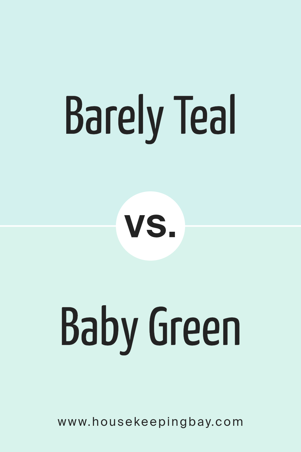
Barely Teal 2048-70 by Benjamin Moore is a soft, muted shade of teal. It has a gentle blue-green hue that suggests an airy, light feeling in a room. This color is ideal for creating a soothing atmosphere, perfect for spaces where you want to relax.
In contrast, Baby Green 2047-70, also by Benjamin Moore, leans more towards a light, fresh green without the noticeable blue undertone found in Barely Teal. It imparts a feeling of freshness and springtime, making it a great choice for lively, yet calming environments.
Both colors are quite pale and subdued, making them excellent choices for small spaces as they help make rooms feel larger and more open. Barely Teal might be best suited for bedrooms or bathrooms where a touch of calm is desired. Baby Green is great for kitchens or playrooms where its vibrancy can stimulate a sense of energy and growth. They can even be used together in a home to maintain a flowing, cohesive look while subtly distinguishing different areas.
You can see recommended paint color below:
- 2047-70 Baby Green
housekeepingbay.com
Barely Teal 2048-70 by Benjamin Moore vs Soft Green 2045-70 by Benjamin Moore
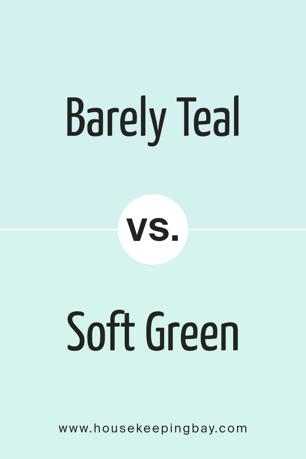
Barely Teal 2048-70 by Benjamin Moore is a gentle, soft teal color that gives a subtle touch of freshness and calm to any space. It has a hint of blue that makes it cool and comforting, ideal for creating a serene environment in rooms like bedrooms or bathrooms.
Soft Green 2045-70, also by Benjamin Moore, leans more towards a light, airy green. This color is reminiscent of early spring foliage. It’s soothing and natural, perfect for spaces where you want to bring in a sense of the outdoors and freshness without overwhelming the senses.
Both colors are very light and pastel, making them excellent choices for small spaces or areas with limited natural light, as they help make the space appear brighter and larger. However, Barely Teal offers a cooler vibe due to its blue undertones, while Soft Green provides a warmer feel, courtesy of its yellowish-green undertones. Each color supports a calm and relaxing atmosphere in its unique way.
You can see recommended paint color below:
- 2045-70 Soft Green
housekeepingbay.com
Barely Teal 2048-70 by Benjamin Moore vs Light Mint 2046-70 by Benjamin Moore
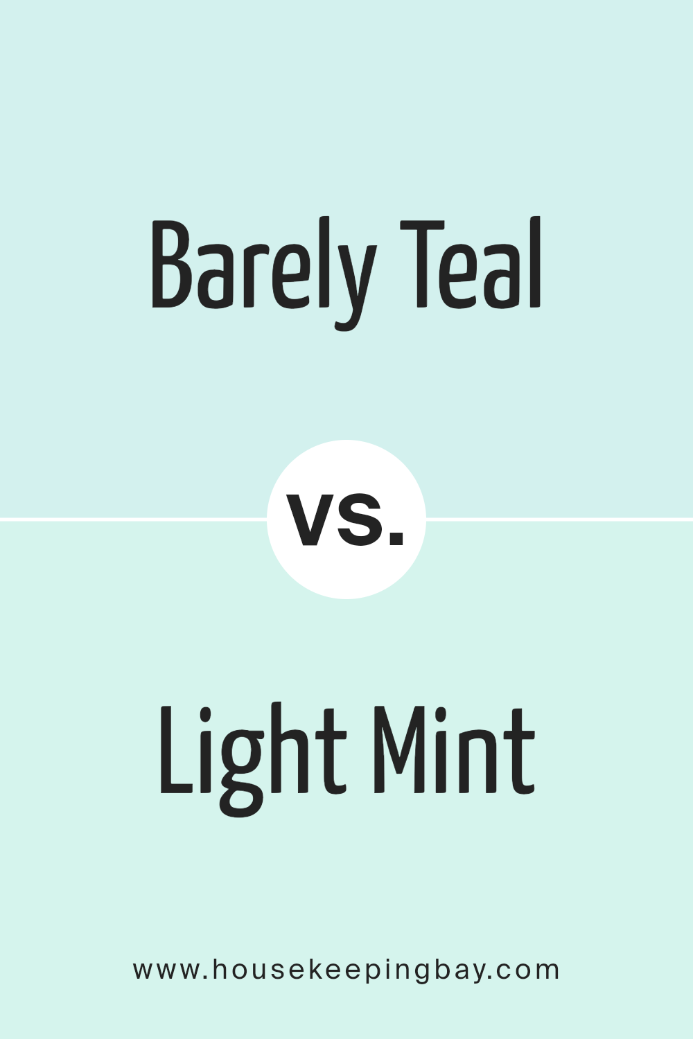
Barely Teal 2048-70 and Light Mint 2046-70, both by Benjamin Moore, are soft and subtle colors that can significantly lighten up a room. Barely Teal offers a hint of teal that gives a fresh and airy feel, which is perfect for a calming atmosphere. It leans slightly towards a blue tint, making it a cool and serene choice for interior spaces.
Light Mint, contrastingly, has a fresher, crisper green hue, suggesting a youthful and revitalizing vibe, which can help brighten spaces and add a touch of nature-inspired freshness. While both colors are pale and have a soothing effect, Barely Teal is more subdued and might appeal to those seeking a gentle hint of color, reflecting a more reserved style.
In contrast, Light Mint is slightly more vibrant due to its clearer green base, making it ideal for creating a lively, yet soothing environment. The choice between them would depend largely on individual preference for hues that either lean towards blue or green, affecting the mood and feel of the space.
You can see recommended paint color below:
- 2046-70 Light Mint
housekeepingbay.com
Barely Teal 2048-70 by Benjamin Moore vs Icy Moon Drops 2056-70 by Benjamin Moore
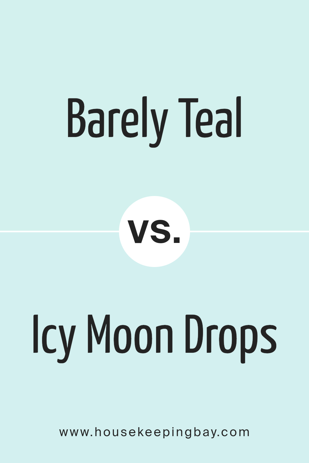
Barely Teal 2048-70 and Icy Moon Drops 2056-70 by Benjamin Moore are both light, soft hues that create a peaceful atmosphere. Barely Teal offers a subtle hint of green, reminiscent of a gentle sea breeze, making it suitable for spaces intended for relaxation and calm. It pairs well with soft neutrals or darker woods, bringing a touch of nature indoors without overwhelming the senses.
Icy Moon Drops, by contrast, steers closer to a pale blue, evoking a serene, wintry sky. It has a cooling effect, making it ideal for rooms that receive a lot of sunlight, as it helps balance the warmth. This color works beautifully in smaller spaces too, as its brightness enlarges the perception of the area.
Both colors offer versatility and are neutral enough to support a variety of decor styles and preferences. They can be used in any room aiming for a fresh, airy feel. While Barely Teal leans toward a natural vibe, Icy Moon Drops reflects a more crisp and open ambiance.
You can see recommended paint color below:
- 2056-70 Icy Moon Drops
housekeepingbay.com
Conclusion
Choosing 2048-70 Barely Teal by Benjamin Moore has been an unexpectedly pleasant experience. When I first decided to give my room a fresh coat of paint, I was looking for a color that would soothe the eyes yet provide a hint of brightness. Barely Teal proved absolutely perfect. Its subtle tones offer just the right amount of lightness without overwhelming the space, creating a peaceful and refreshing aura.
While painting, I was impressed with the quality of the paint. The application was smooth, and the coverage was excellent, helping me complete the job efficiently. As the days go on, I appreciate how the color interacts differently with natural and artificial light, showcasing varied but always gentle aspects of teal.
Furthermore, the color has proven versatile, matching well with different decor styles and furniture colors. It serves as a sophisticated backdrop that complements both modern gadgets and classic wood finishes in my home.
Selecting 2048-70 Barely Teal has genuinely uplifted my living space, making it more inviting and pleasant to live in. For anyone considering a makeover or a new painting project, Barely Teal is a choice worth considering for its beauty and adaptability. It certainly made a positive difference in my home environment.
housekeepingbay.com
