Antique Pewter 1560 by Benjamin Moore
Classic Beauty in Every Hue
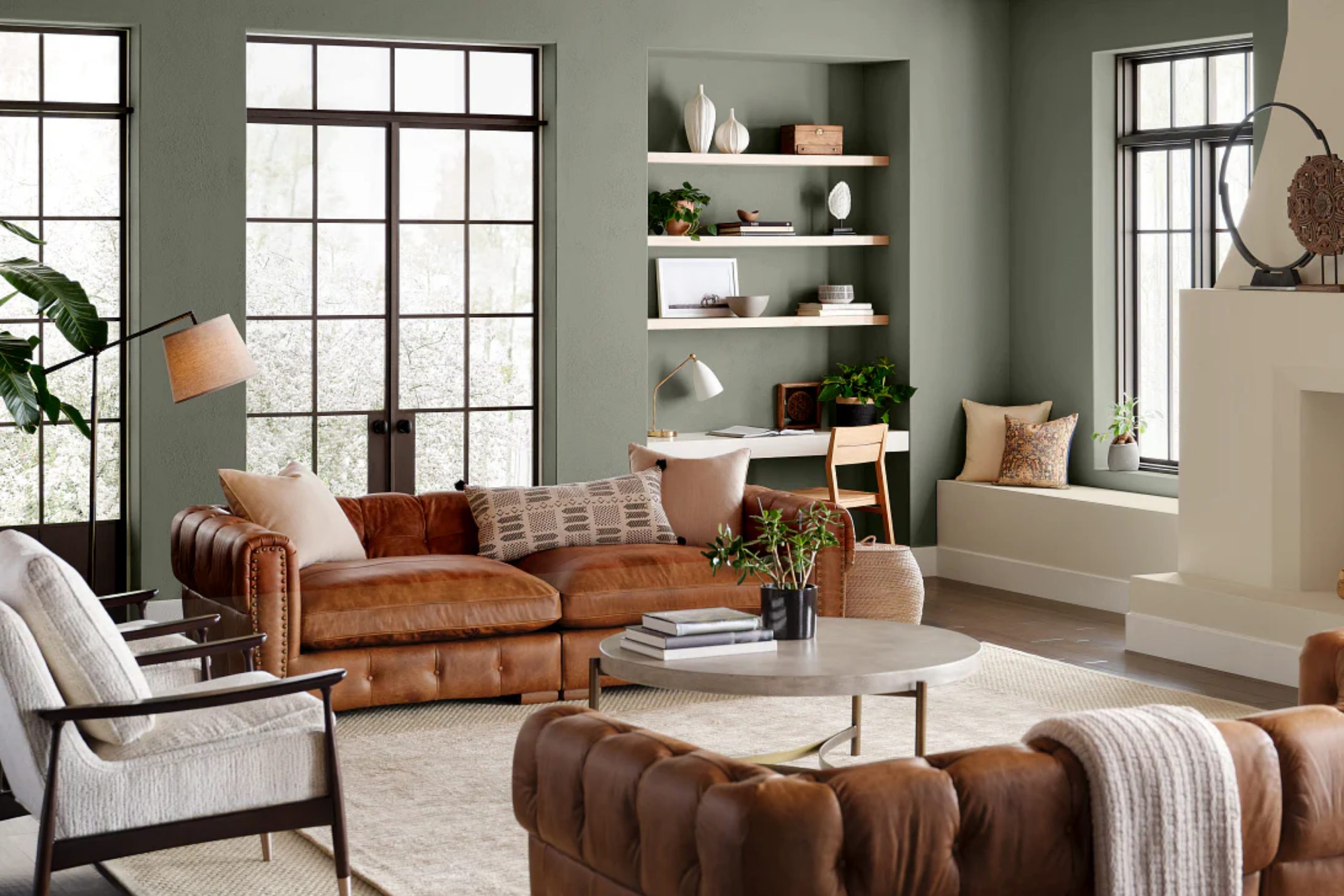
When choosing the right paint color, it’s important to find a shade that feels both timeless and comfortable. Antique Pewter by Benjamin Moore might be just the color you’re looking for. This classic hue strikes a balance between warm and cool tones, making it adaptable to various styles and spaces. It’s a soft, muted gray with subtle green undertones that add a touch of sophistication to any room.
Imagine walking into a room painted in Antique Pewter. The walls carry a gentle elegance, making the space feel inviting and calm. Natural light plays beautifully with the color, enhancing its depth throughout different parts of the day.
Whether you’re painting a cozy living room or a modern kitchen, Antique Pewter serves as a perfect backdrop for your furniture and decor.
What’s appealing about this color is its ability to complement both contemporary and traditional designs.
It pairs well with bold colors if you want a contrast or with other neutrals for a more understated look. You can easily see how Antique Pewter transforms your space into a haven of comfort and style.
If you’re considering a color that offers both versatility and charm, Antique Pewter deserves your attention.
via jclicht.com
What Color Is Antique Pewter 1560 by Benjamin Moore?
Antique Pewter 1560 by Benjamin Moore presents itself as a nuanced and sophisticated shade. This color rests between gray and brown and carries a warm, muted undertone. Its softness allows it to anchor a room without overwhelming space. Antique Pewter brings a calming, neutral backdrop, making it ideal for various interior styles.
In contemporary spaces, this hue complements clean lines and modern furnishings. It balances minimalistic decor, adding warmth and depth to sleek environments. Mid-century modern interiors also benefit from its neutral palette.
Its versatility pairs effortlessly with bold accent colors typical in mid-century designs, like mustard or teal.
For rustic or farmhouse styles, Antique Pewter harmonizes beautifully with natural materials. Think raw wood, leather, and stone accents. It provides a serene backdrop that enhances the organic feel of such spaces.
In traditional settings, the color’s warmth merges seamlessly with classic furniture pieces and rich textiles like velvet or heavy drapes.
Antique Pewter also pairs well with varied textures—combine it with woven fabrics, linen, or metals like brass and iron. This shade adapts gracefully, enhancing spaces with understated elegance while remaining practical and timeless. Its adaptability makes it a favorite for those seeking a foundational yet engaging color scheme.
housekeepingbay.com
Is Antique Pewter 1560 by Benjamin Moore Warm or Cool color?
Antique Pewter 1560 by Benjamin Moore is a versatile and timeless gray paint color that adds elegance to any home. Its warm undertones make it a perfect choice for creating a cozy and inviting atmosphere. This gray is neither too dark nor too light, which allows it to work well in various spaces, including living rooms, bedrooms, and kitchens.
In living rooms, Antique Pewter provides a sophisticated backdrop that complements both traditional and modern furnishings. It pairs nicely with rich wood tones and soft fabrics, adding a sense of calm to the space.
In bedrooms, this shade brings a soothing and restful feel, ideal for creating a peaceful retreat.
For kitchens, Antique Pewter works beautifully with white cabinets or stainless-steel appliances, providing a balanced look. It’s a color that adapts well to different lighting conditions, maintaining its charm throughout the day.
Overall, Antique Pewter by Benjamin Moore enhances the home’s aesthetic with its warm and cozy undertones.
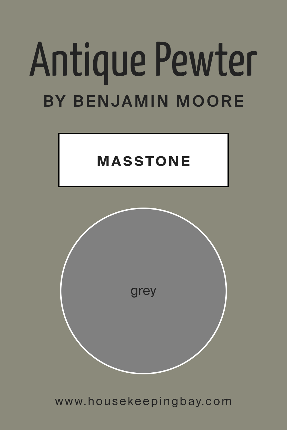
What is the Masstone of the Antique Pewter 1560 by Benjamin Moore?
Antique Pewter 1560 by Benjamin Moore is a beautiful, soft gray that adds a timeless touch to any home. This color is versatile, making it a popular choice for many interior styles. Because its masstone is a true, neutral gray (#808080), it feels balanced and calm, neither too warm nor too cool. This allows it to blend seamlessly with different palettes, making it an excellent backdrop for both colorful and neutral furnishings.
In living rooms, Antique Pewter creates a cozy and inviting atmosphere, helping other elements in the room like furniture and artwork stand out. In bedrooms, its calm tone fosters a peaceful environment, perfect for relaxation.
Kitchens painted in Antique Pewter feel modern yet welcoming, providing a clean canvas for pops of color in accessories or appliances. Overall, the neutral quality of this gray ensures it complements a variety of textures and styles, enhancing the overall look of any space without overpowering it.
housekeepingbay.com
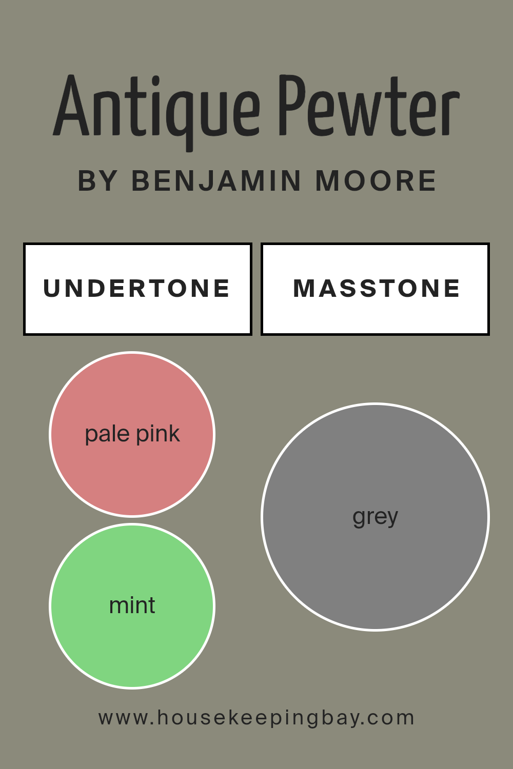
Undertones of Antique Pewter 1560 by Benjamin Moore
Antique Pewter 1560 by Benjamin Moore presents a unique blend of subtle undertones that enhance its presence in any room. This color isn’t just a simple shade but a mix of several underlying hues like pale pink, mint, olive, lilac, dark turquoise, and more. These undertones influence how Antique Pewter appears in different lighting conditions.
For example, the soft touch of pale pink or the hint of mint can make the color feel warm and inviting when natural light floods a room. On a cloudy day or under artificial light, the deeper shades like navy and dark gray might make the color seem cooler and more subdued.
This mutable nature makes Antique Pewter versatile, allowing it to fit both cozy living spaces and sleek, modern interiors.
On walls, Antique Pewter provides a neutral backdrop with character. The olive and pale yellow undertones add a touch of nature-inspired calmness, while elements of lilac and light purple bring a whisper of sophistication. When surrounded by different furnishings, these undertones create a dynamic interaction, setting different moods.
The color provides enough depth to be interesting, yet is subtle enough not to overwhelm. It’s all about balance and adaptability, making Antique Pewter a favorite for those seeking something enduring and versatile.
housekeepingbay.com
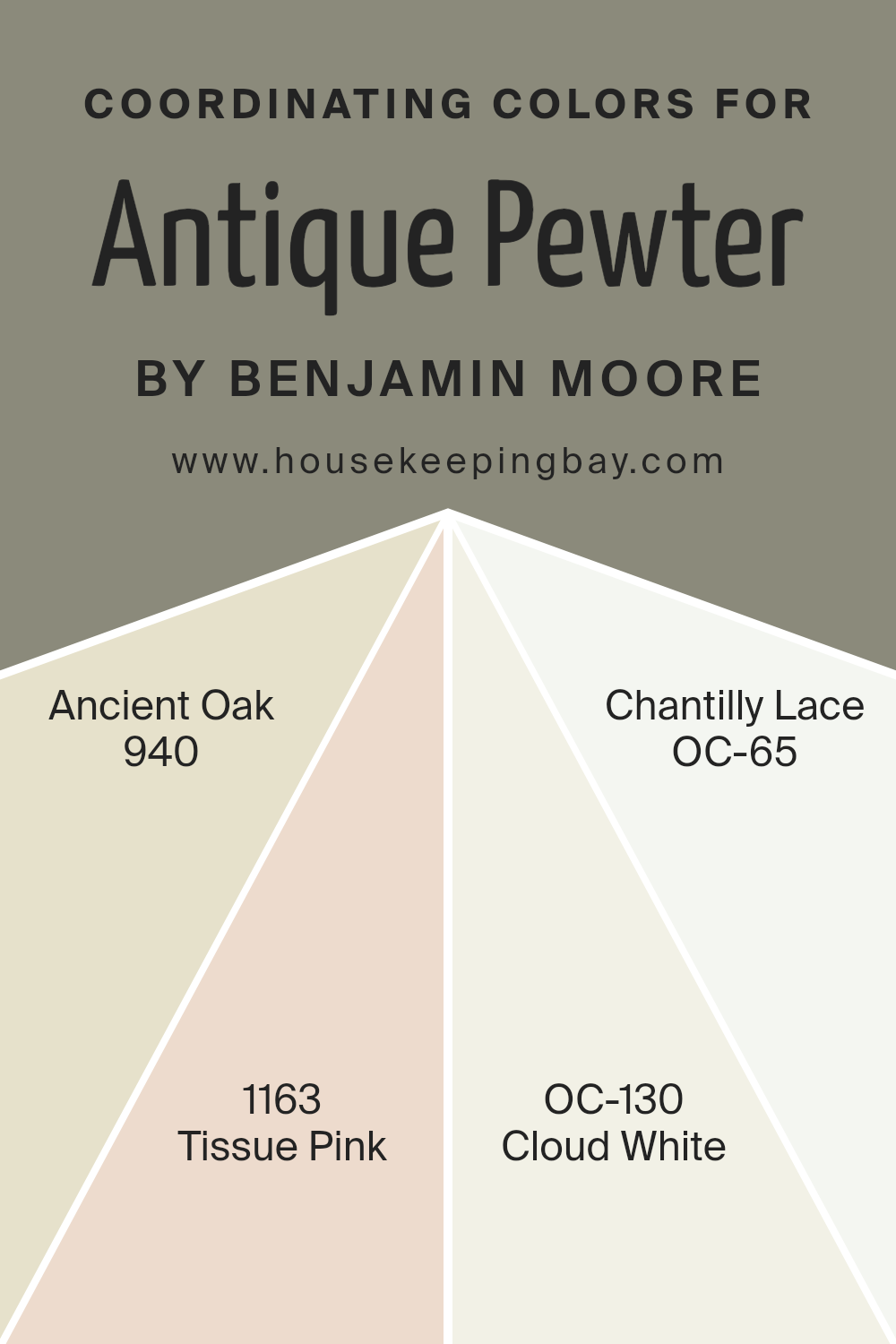
Coordinating Colors of Antique Pewter 1560 by Benjamin Moore
Coordinating colors are shades that are chosen to work harmoniously with a main color to create a balanced and pleasing look. When dealing with intricate shades like Antique Pewter 1560 by Benjamin Moore, selecting the right set of coordinating colors can highlight its features and bring depth to the space.
Antique Pewter, being a muted, soothing gray, finds its companions in colors that either complement its calm demeanor or add a gentle contrast. The art of coordinating is about finding colors that blend seamlessly without clashing, while each maintaining its unique presence to enhance the overall ambiance.
Consider the warm, wood-like tones of 940 – Ancient Oak, which brings a cozy, earthy warmth that pairs beautifully with the coolness of Antique Pewter. On the softer side, 1163 – Tissue Pink introduces a delicate blush that subtly enhances a room’s warmth and sophistication.
For those seeking a clean backdrop, OC-130 – Cloud White offers a soft, creamy white that adds an airy feel without overshadowing other elements. Meanwhile, OC-65 – Chantilly Lace, known for its pure and crisp white profile, can provide a striking contrast for a fresh, modern look.
Together, these colors create a palette that is both inviting and visually interesting, making any space feel cohesive and well-designed.
You can see recommended paint colors below:
- 940 Ancient Oak
- 1163 Tissue Pink
- OC-130 Cloud White
- OC-65 Chantilly Lace
housekeepingbay.com
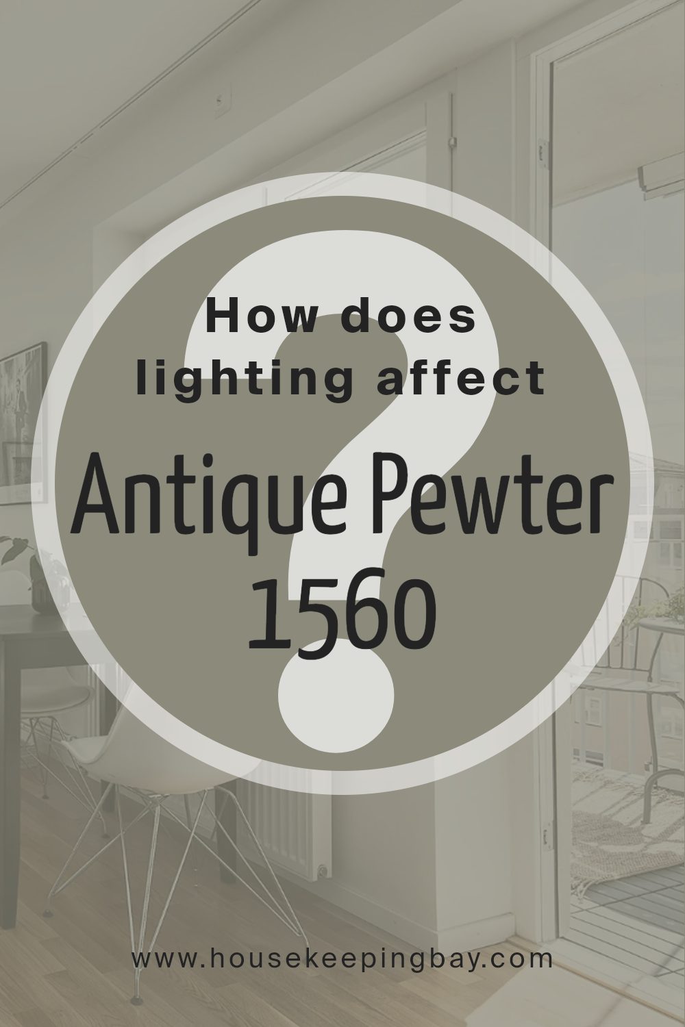
How Does Lighting Affect Antique Pewter 1560 by Benjamin Moore?
Lighting plays a crucial role in how we perceive colors. The same color can look different under varying lighting conditions. Antique Pewter 1560 by Benjamin Moore is a versatile paint color that can appear different depending on the lighting and direction of a room.
In artificial light, such as incandescent or LED lighting, Antique Pewter may look warmer or cooler based on the bulb’s color temperature. Warm LED lights might bring out earthy tones in the color, making it look cozier. In contrast, cool white lights can make it appear more muted and gray.
In natural light, the color’s appearance changes throughout the day. Natural light shifts as the sun moves, affecting how the color looks on your walls. The direction your windows face also plays a big role.
In north-facing rooms, light is soft and tends to bring out cooler tones in colors. Antique Pewter may appear more muted, with its gray undertones more pronounced. This means it might lean more towards a soft gray with less warmth.
South-facing rooms receive more direct sunlight during the day, usually resulting in warm light. This type of light can highlight the warmer, earthy undertones of Antique Pewter, making it feel more inviting and lively.
East-facing rooms get bright, crisp light in the morning and softer, shadowy light in the afternoon. In the morning light, Antique Pewter might look brighter and slightly warmer. However, as the day goes on, it could shift towards a more neutral or cool gray.
West-facing rooms, on the other hand, receive warm, golden light in the afternoon and evening. Here, Antique Pewter can appear richer and warmer as the day progresses, with its warmer tones coming to the forefront.
Overall, Antique Pewter 1560 is a chameleon-like color that can shift beautifully based on different lighting conditions and room orientations.
housekeepingbay.com
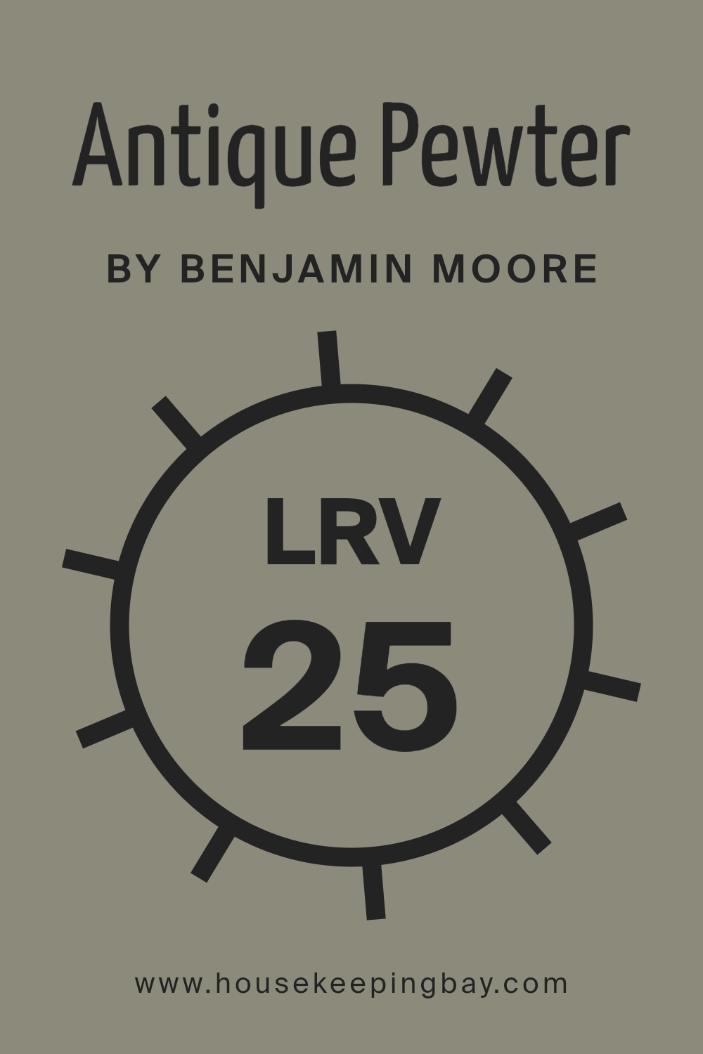
What is the LRV of Antique Pewter 1560 by Benjamin Moore?
LRV, or Light Reflectance Value, is a measure that helps us understand how much light a color reflects or absorbs. It ranges from 0 to 100, with 0 being the darkest black that absorbs all light, and 100 being the brightest white that reflects all light.
Essentially, the higher the LRV, the more light a color will reflect, making a room feel brighter and more open. Conversely, colors with lower LRV will absorb more light, creating a cozy or intimate atmosphere.
When you choose a paint color, LRV is important because it impacts how the color might look once it’s on your walls, depending on the natural and artificial lighting in a room.
Antique Pewter by Benjamin Moore has an LRV of 25.4, which means it is on the darker side of the spectrum. This lower LRV results in the color absorbing more light than it reflects, giving a sense of warmth and coziness to a space.
In rooms with ample natural light, Antique Pewter can appear softer and slightly lighter, but in dimly-lit spaces, it can feel deeper and more enveloping.
This particular shade can add a sense of depth and sophistication without overpowering a room, making it a versatile choice for creating a comfortable and welcoming environment.
housekeepingbay.com
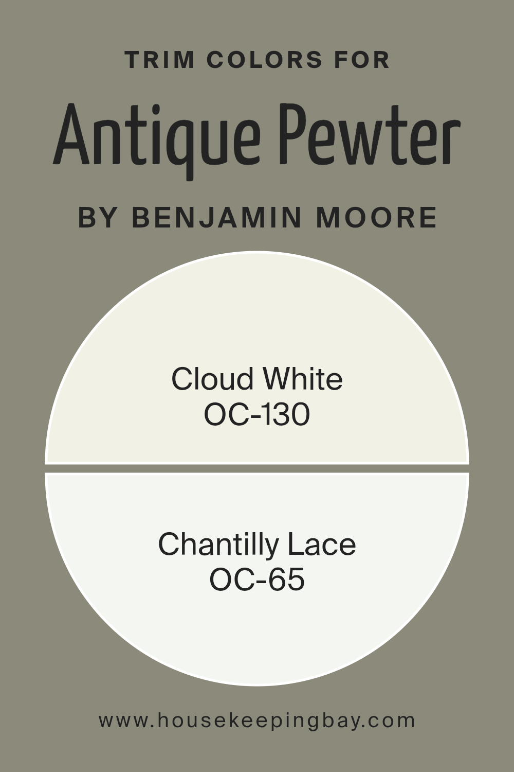
What are the Trim colors of Antique Pewter 1560 by Benjamin Moore?
Trim colors are the shades used to highlight the edges and borders of walls, doors, and windows in a room. They provide a clean boundary that can enhance the main wall color and make the space feel more finished.
Antique Pewter 1560 by Benjamin Moore is a warm, medium gray tone that can be enriched or balanced depending on the trim color choice. Using the right trim color is essential because it frames the room, making the primary color stand out and harmonizing the overall color palette.
The trim also affects the room’s light and depth, either making spaces appear larger or cozier.
For Antique Pewter, using OC-130, Cloud White, as a trim color adds a soft yet crisp complement to the more grounded hue of pewter. Cloud White is a gentle, warm white that creates a fresh but slightly subdued contrast, making it perfect for softening and illuminating a room.
On the other hand, OC-65, Chantilly Lace, offers a brighter, stronger white that will provide a sharp, clean contrast to the gray walls. This bright white can highlight architectural details and give the room an elegant and modern touch, pairing beautifully with Antique Pewter for a balanced and sophisticated look.
You can see recommended paint colors below:
housekeepingbay.com
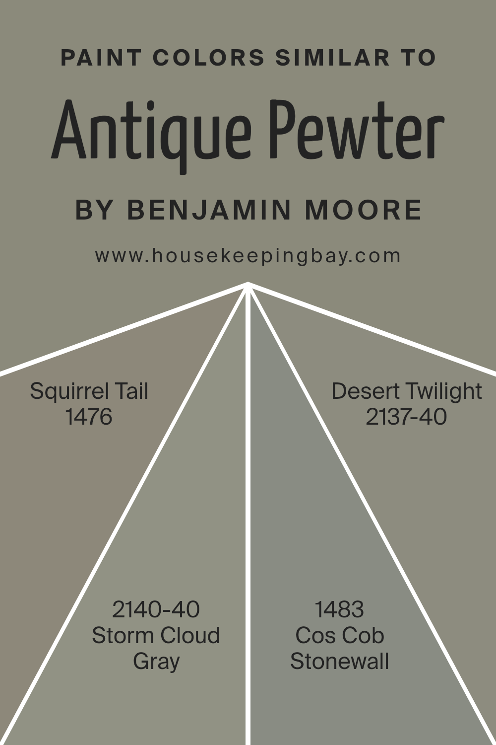
Colors Similar to Antique Pewter 1560 by Benjamin Moore
Similar colors play an essential role in design because they create a harmonious and cohesive look. When you choose colors that are close to each other, like those related to Antique Pewter 1560 by Benjamin Moore, you establish a subtle yet effective palette that can make a space feel balanced and well-coordinated.
These colors, such as 1476 – Squirrel Tail, 2140-40 – Storm Cloud Gray, 1483 – Cos Cob Stonewall, and 2137-40 – Desert Twilight, can enhance the main color without overpowering it. Each of these hues complements Antique Pewter by adding nuances and depth to the overall decor.
This ensemble can be perfect for rooms where you want a calm and unified atmosphere.
Squirrel Tail, with its soft gray undertones, provides warmth and comfort, making it perfect for cozy living spaces. Storm Cloud Gray adds a bit of mystery with its slightly darker shade and gentle blue hints, which can offer a touch of sophistication.
Cos Cob Stonewall brings a hint of earthiness that grounds the color palette, creating a serene and natural vibe. Desert Twilight, with its slight green and gray mix, offers an enigmatic contrast that can add character. Together, these colors ensure a space is cohesive and inviting.
You can see recommended paint colors below:
- 1476 Squirrel Tail
- 2140-40 Storm Cloud Gray
- 1483 Cos Cob Stonewall
- 2137-40 Desert Twilight
housekeepingbay.com
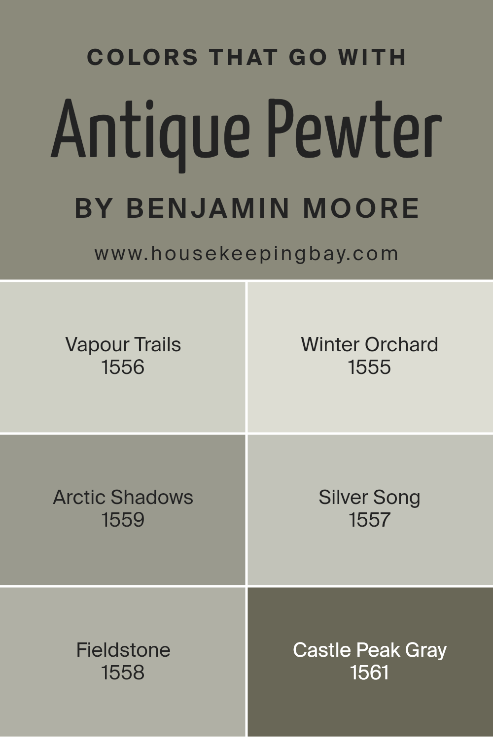
Colors that Go With Antique Pewter 1560 by Benjamin Moore
Antique Pewter 1560 by Benjamin Moore is a versatile gray that brings a sense of calm and sophistication to any space. Pairing it with complementary colors can enhance its beauty and create a harmonious environment. For instance, Vapour Trails 1556 is a soft, pale gray that adds a touch of lightness, making spaces feel airy and open.
Winter Orchard 1555, with its gentle, frosty tint, infuses a subtle feeling of warmth while maintaining a neutral palette. Arctic Shadows 1559, a deeper shade with a hint of blue, offers a cool contrast to Antique Pewter, adding depth and interest.
Silver Song 1557 is a light gray with silvery undertones that brings a modern, polished look to any setting. Fieldstone 1558, on the other hand, is an earthy gray with hints of green, offering a down-to-earth and cozy vibe when used alongside Antique Pewter.
Castle Peak Gray 1561, with its robust, grounded tones, complements Antique Pewter by offering a sense of stability and richness. Together, these colors create a palette that balances light and dark, warmth and coolness, and provides a versatile backdrop perfect for various design styles.
Combining these hues can result in a beautifully cohesive space that feels both sophisticated and inviting.
You can see recommended paint colors below:
- 1556 Vapour Trails
- 1555 Winter Orchard
- 1559 Arctic Shadows
- 1557 Silver Song
- 1558 Fieldstone
- 1561 Castle Peak Gray
housekeepingbay.com
How to Use Antique Pewter 1560 by Benjamin Moore In Your Home?
Antique Pewter 1560 by Benjamin Moore is a versatile paint color that offers a warm, inviting feel to any room. It is a soft gray with a hint of warmth, making it perfect for creating a cozy atmosphere. Homeowners can use Antique Pewter as a main wall color in living rooms to ensure a welcoming space for guests and family.
Its neutral tone pairs well with various accent colors like deep blues or rich greens, allowing for easy decoration adjustments.
For a sophisticated look in a dining area, consider using Antique Pewter on walls paired with crisp white trim to add contrast. In bedrooms, it provides a calming effect that promotes relaxation.
Kitchen cabinets painted in Antique Pewter can give a classic yet modern feel, complementing stainless steel appliances or wooden countertops. Its understated elegance makes it suitable for traditional and contemporary homes, ensuring a timeless and adaptable choice for interior design.
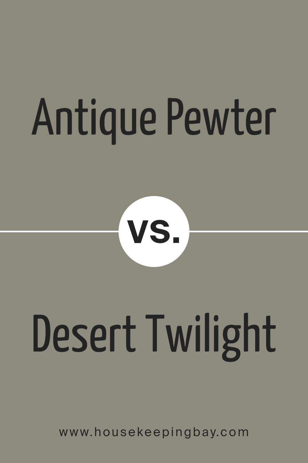
Antique Pewter 1560 by Benjamin Moore vs Desert Twilight 2137-40 by Benjamin Moore
Antique Pewter 1560 by Benjamin Moore is a versatile gray with warm undertones, making it suitable for various spaces. It offers a calm and sophisticated feel, ideal for living rooms or bedrooms where a neutral yet cozy atmosphere is desired. The gray has subtle hints of beige, adding warmth and depth without overpowering.
Desert Twilight 2137-40, also by Benjamin Moore, leans more toward a deeper gray with green undertones. This color exudes a rich and moody feel, perfect for creating a dramatic effect in spaces like dining rooms or accent walls. Its darker tone makes it feel more intimate and can add a touch of elegance.
While both colors belong to the gray family, Antique Pewter provides a lighter, softer look suited for openness, whereas Desert Twilight offers intensity and coziness. Choosing between them depends on whether you prefer a more inviting or a more dramatic setting.
You can see recommended paint color below:
- 2137-40 Desert Twilight
housekeepingbay.com
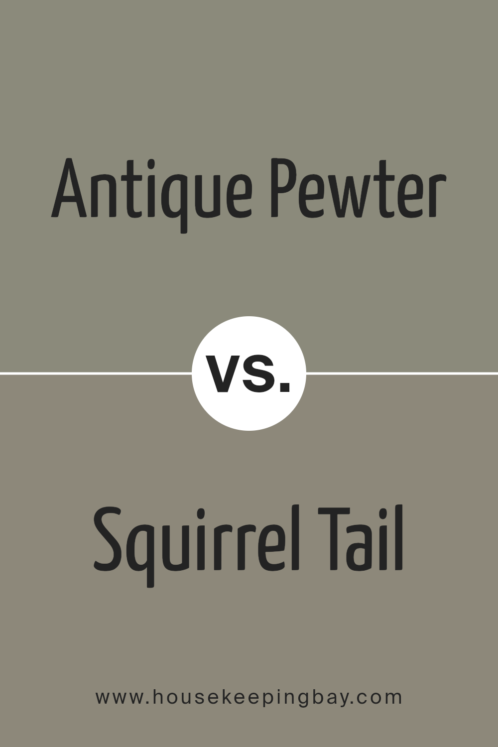
Antique Pewter 1560 by Benjamin Moore vs Squirrel Tail 1476 by Benjamin Moore
Antique Pewter 1560 and Squirrel Tail 1476, both by Benjamin Moore, share a timeless and sophisticated appeal. Antique Pewter is a medium gray with a warm undertone, offering a balanced, neutral feel. It’s versatile, fitting nicely in various design styles, from contemporary to traditional. Its warmth creates a cozy atmosphere without being overwhelming.
Squirrel Tail, however, leans slightly towards a greige, blending gray and beige. This color gives a softer, more muted appearance, lending itself well to creating a gentle and inviting space. It works wonderfully in rooms where a subtle, calming tone is desired.
While Antique Pewter presents a stronger, more defined presence, Squirrel Tail offers a softer, more understated look. Both colors can adapt well to different settings, but Antique Pewter might be favored for a bolder statement. Squirrel Tail might be selected for its subtle elegance, making it ideal for peaceful retreats.
You can see recommended paint color below:
- 1476 Squirrel Tail
housekeepingbay.com
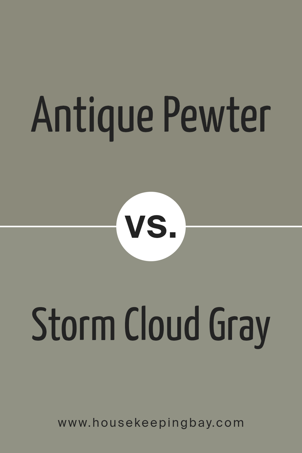
Antique Pewter 1560 by Benjamin Moore vs Storm Cloud Gray 2140-40 by Benjamin Moore
Antique Pewter 1560 by Benjamin Moore is a warm gray with subtle earthy tones. It often feels cozy and comforting, making it a popular choice for living rooms and bedrooms. This color works well with both modern and traditional decor due to its timeless appeal. It pairs beautifully with soft whites and warm wood accents, creating a balanced, inviting atmosphere.
Storm Cloud Gray 2140-40, also by Benjamin Moore, has a cooler tone compared to Antique Pewter. This shade leans more towards a true gray without significant undertones. It feels clean and sophisticated, ideal for a minimalist aesthetic.
Storm Cloud Gray can suit spaces like bathrooms or kitchens where a crisp, fresh look is desired. It matches well with both bold colors and metallic accents, allowing for versatile styling.
Overall, Antique Pewter offers warmth and coziness, while Storm Cloud Gray provides a cooler, more refined look. Both colors are versatile but create different moods in a space.
You can see recommended paint color below:
- 2140-40 Storm Cloud Gray
housekeepingbay.com
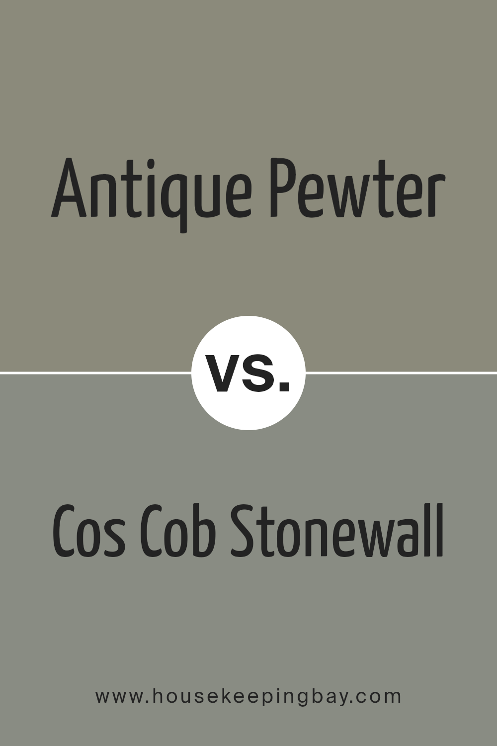
Antique Pewter 1560 by Benjamin Moore vs Cos Cob Stonewall 1483 by Benjamin Moore
Antique Pewter 1560 and Cos Cob Stonewall 1483 by Benjamin Moore offer unique gray tones. Antique Pewter, a warm gray, carries subtle green undertones. It brings a cozy, inviting feel, making spaces feel more intimate and relaxed. Excellent for living rooms or bedrooms, this color pairs well with warm whites, deep plums, or rich browns.
Cos Cob Stonewall, a cooler gray, has slight blue undertones. It imparts a more modern, refreshing atmosphere, making it suitable for kitchens or bathrooms. This color complements crisp whites, soft blues, or charcoal accents.
Both colors serve gray lovers but with differing vibes. Antique Pewter suits those seeking warmth and comfort, while Cos Cob Stonewall appeals to those preferring a clean, contemporary look. Depending on the desired mood, these colors can either cozy up a space or freshen it, each offering a distinct style contribution.
You can see recommended paint color below:
- 1483 Cos Cob Stonewall
housekeepingbay.com
Antique Pewter by Benjamin Moore remains a favorite choice for various interior spaces. I’ve found its versatility makes it suitable for living rooms, kitchens, and bedrooms alike. The color’s balance between gray and beige allows it to fit into different design styles, whether modern or traditional.
What I truly appreciate about it is the way it maintains a cozy feel without compromising on elegance. Light plays an important role here — in bright spaces, the color offers a soft, inviting atmosphere, while in dimmer areas, it provides a warm, enveloping mood.
Pairing Antique Pewter with different textures and colors presents endless possibilities. Whether one opts for bold accents or subtle tones, the shade accommodates both easily. I’ve noticed it works beautifully with natural elements like wood and stone, further enhancing its appeal.
The consistency of this color instills confidence for anyone looking to update their space. Its timeless quality means that it will not only serve well in the present but also continue to please as trends change.
Overall, choosing Antique Pewter signifies a commitment to understated charm and enduring style. It’s not just a color; it’s an experience of comfort and sophistication that satisfies every time.

housekeepingbay.com
Ever wished paint sampling was as easy as sticking a sticker? Guess what? Now it is! Discover Samplize's unique Peel & Stick samples. Get started now and say goodbye to the old messy way!
Get paint samples


