Tyler Taupe HC-43 by Benjamin Moore
Warm Hues for Cozy Spaces
When you’re thinking about giving your space a fresh, new look, choosing the right paint color can make all the difference. HC-43 Tyler Taupe by Benjamin Moore is a color that might catch your eye. It belongs to the Historical Collection, which has shades inspired by America’s historic landmarks. Tyler Taupe is a warm, neutral taupe that effortlessly complements various decor styles and settings.
It’s a fantastic choice if you want a color that provides a sophisticated backdrop while staying subtle and cozy. Whether you’re updating your living room, bedroom, or even the kitchen, Tyler Taupe has a timeless appeal that blends beautifully with furniture and accessories, enhancing other colors in your room.
Plus, it’s muted enough to work well in both bright and lower light conditions, giving you flexibility no matter your home’s lighting situation.
If you’re considering a new look for your home or a particular room, you might want to check out Tyler Taupe. It could be just what you need to freshen up your space with a balanced and inviting feel.

via benjaminmoore.com
What Color Is Tyler Taupe HC-43 by Benjamin Moore?
Tyler Taupe HC-43 by Benjamin Moore is a versatile and warm neutral paint color that fits seamlessly into various interior design styles. Its subtle blend of brown and gray provides a soothing backdrop that complements a range of furnishing and décor choices. Tyler Taupe is adept at creating a cozy, inviting atmosphere without overwhelming a space, making it a popular choice for those looking to add a touch of elegance without the starkness of brighter whites or the heaviness of darker hues.
This color works exceptionally well in traditional, modern, and rustic interior designs due to its understated yet sophisticated nature. It is particularly effective in spaces like living rooms, bedrooms, and kitchens where a calming influence is beneficial. Pairing Tyler Taupe with materials like natural wood, leather, and soft textiles enhances its warmth, while using it with metal accents and glass adds a touch of contemporary flair.
For textures, Tyler Taupe harmonizes well with plush fabrics like velvet or wool, contributing to a layered, textured look that feels inviting. It similarly matches well with sleek surfaces, such as glossy kitchen cabinets or satin-finished metals, balancing rustic charm and modern aesthetics.
This makes it an adaptable choice for a variety of spaces needing a neutral base that supports both comfort and style.
housekeepingbay.com
Is Tyler Taupe HC-43 by Benjamin Moore Warm or Cool color?
Tyler Taupe HC-43 by Benjamin Moore is a warm, earthy color that can make rooms feel cozy and inviting. This shade combines hints of brown with soft gray, creating a neutral backdrop that works well with various decor styles and other colors.
Because it is not too dark or too light, Tyler Taupe is versatile, fitting nicely in many areas of a home, from living rooms and kitchens to bedrooms and bathrooms. This taupe hue helps smaller spaces appear larger and more open, while also giving bigger rooms a more connected and cohesive look. It pairs well with bright colors like blues and greens, adding a subtle contrast without overpowering the space.
Tyler Taupe is also excellent for rooms with natural wood elements or white trim, as it complements these features beautifully. Overall, using Tyler Taupe in your home can create a warm, welcoming atmosphere that’s both stylish and comforting.
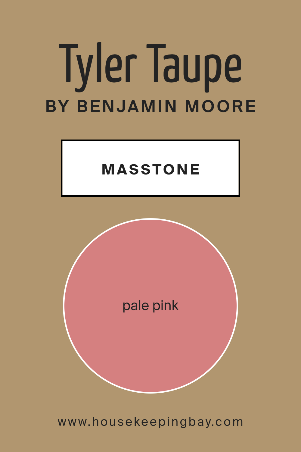
What is the Masstone of the Tyler Taupe HC-43 by Benjamin Moore?
Tyler Taupe HC-43 by Benjamin Moore has a masstone of Pale Pink, characterized by its warm, gentle shade (#D58080). This color provides a soft, welcoming atmosphere to any room, making it a versatile choice for homeowners.
The Pale Pink hue works particularly well in spaces intended for relaxation and calm, such as bedrooms and living rooms. It pairs beautifully with soft whites and light grays to create a serene space, or can be matched with bolder colors for a refreshing contrast that adds visual interest without being overpowering.
Because Tyler Taupe is not too saturated, it’s easy on the eyes and can help small rooms appear more spacious and open. Its subtlety also appeals to a wide range of tastes, which is perfect for homeowners who prefer a less dramatic but equally tasteful wall color.
This makes Tyler Taupe HC-43 an excellent choice for anyone looking to bring a warm, soft touch to their home.
housekeepingbay.com
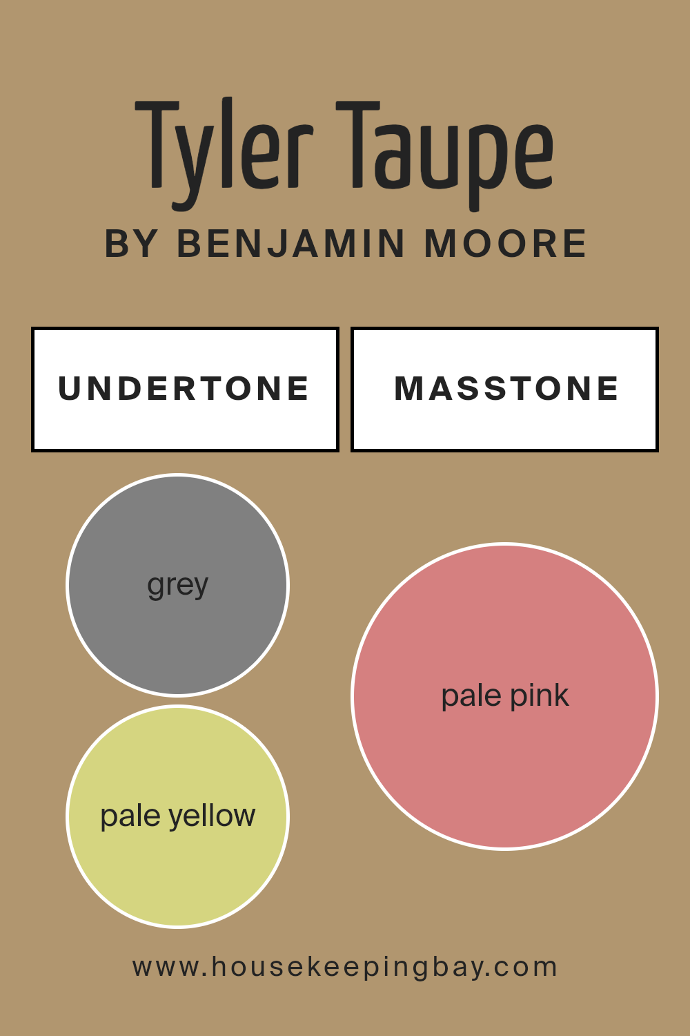
Undertones of Tyler Taupe HC-43 by Benjamin Moore
Tyler Taupe HC-43 by Benjamin Moore is a versatile paint color known for its soothing and warm presence. The undertones in a paint color are subtle hues mixed into the main color that affect how it is perceived under various lighting conditions. For Tyler Taupe, the mix includes shades like grey, pale yellow, and orange, which give it a neutral yet warm feel. This color also contains hints of mint, olive, and yellow, adding a touch of freshness and vibrancy.
When used on interior walls, Tyler Taupe’s complex mix of undertones can create different visual effects in a room. In natural light, the pale yellow and light green undertones can make the space feel light and airy.
In contrast, in artificial lighting, the grey and light gray undertones might dominate, giving the room a more grounded and subdued look.
This adaptability makes Tyler Taupe HC-43 an excellent choice for various rooms and styles, from modern to classic. Its ability to harmonize with other colors and design elements makes it highly effective for creating a cohesive look.
The olive and brown undertones help in achieving a more traditional or rustic feel, while the hints of orange and pink can add warmth, making a room feel more welcoming.
Overall, the undertones of Tyler Taupe are what give it its unique character and usability, influencing the mood and ambiance of any interior space it adorns.
housekeepingbay.com
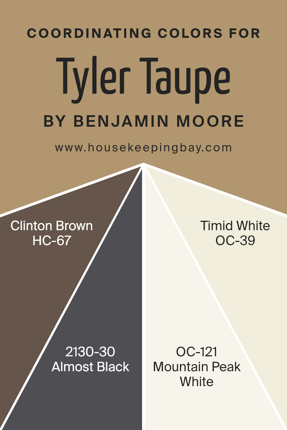
Coordinating Colors of Tyler Taupe HC-43 by Benjamin Moore
Coordinating colors are a set of hues that complement each other well, creating a harmonious color scheme that enhances the aesthetic of any space. When choosing coordinating colors, the goal is to select shades that balance or enhance the main color.
For example, the coordinating colors for Tyler Taupe HC-43 by Benjamin Moore include Clinton Brown, Almost Black, Mountain Peak White, and Timid White, each contributing uniquely to the palette.
Clinton Brown HC-67 is a deep, rich color, reminiscent of dark chocolate. Its earthy tone brings warmth to spaces, making it a great match for the more restrained Tyler Taupe. Almost Black 2130-30, as the name suggests, is a very dark shade, almost but not quite black. This color adds a dramatic flair, providing stark contrast and drawing attention.
Mountain Peak White OC-121 offers a crisp, clean look. It’s a bright white that helps to lighten up spaces and can serve as an excellent backdrop for offsetting darker hues. Lastly, Timid White OC-39 has a softer tone, slightly warmer than Mountain Peak White, making it ideal for creating a more subtle contrast and maintaining a cozy atmosphere when used alongside Tyler Taupe.
You can see recommended paint colors below:
- HC-67 Clinton Brown
- 2130-30 Almost Black
- OC-121 Mountain Peak White
- OC-39 Timid White
housekeepingbay.com
How Does Lighting Affect Tyler Taupe HC-43 by Benjamin Moore?
Lighting plays a crucial role in how we perceive colors. Under different light sources, the same color can appear differently. For example, Tyler Taupe HC-43 by Benjamin Moore is a versatile color strongly influenced by its lighting environment.
In artificial light, such as incandescent bulbs, Tyler Taupe tends to show a warmer, more inviting hue, bringing out its brownish undertones. This warming effect makes spaces feel cozy and comfortable. Fluorescent lighting, on the other hand, could cast a cooler, slightly greenish tint on Tyler Taupe, making it appear more subdued and neutral.
Natural light impacts Tyler Taupe HC-43 differently throughout the day and depending on the direction of the room. In north-facing rooms, light is cooler and more consistent throughout the day. Here, Tyler Taupe might look more muted and almost gray, maintaining a steady appearance without dramatic changes. This consistent look is perfect for creating a steady, neutral backdrop in spaces.
South-facing rooms benefit from abundant, warm light for most of the day. This light can amplify the warmer tones of Tyler Taupe, making the space feel brighter and more welcoming. The color becomes richer and slightly more intense under this lighting condition, ideal for living areas where a warm and inviting atmosphere is desired.
East-facing rooms see the most change in Tyler Taupe HC-43 as the light transitions from the warm tones of morning sunlight to the cooler daylight later in the day. In the morning, the paint will appear softer and warmer, creating a soothing, welcoming vibe, which gradually shifts to a true neutral by midday.
Lastly, in west-facing rooms, Tyler Taupe experiences the reverse of east-facing rooms. The color starts off neutral during the day and transitions to a warmer, cozier hue by the evening due to the warmer, golden light during sunset times.
Understanding how lighting affects colors like Tyler Taupe HC-43 can help in selecting the right paint for the intended mood and function of each room.
housekeepingbay.com
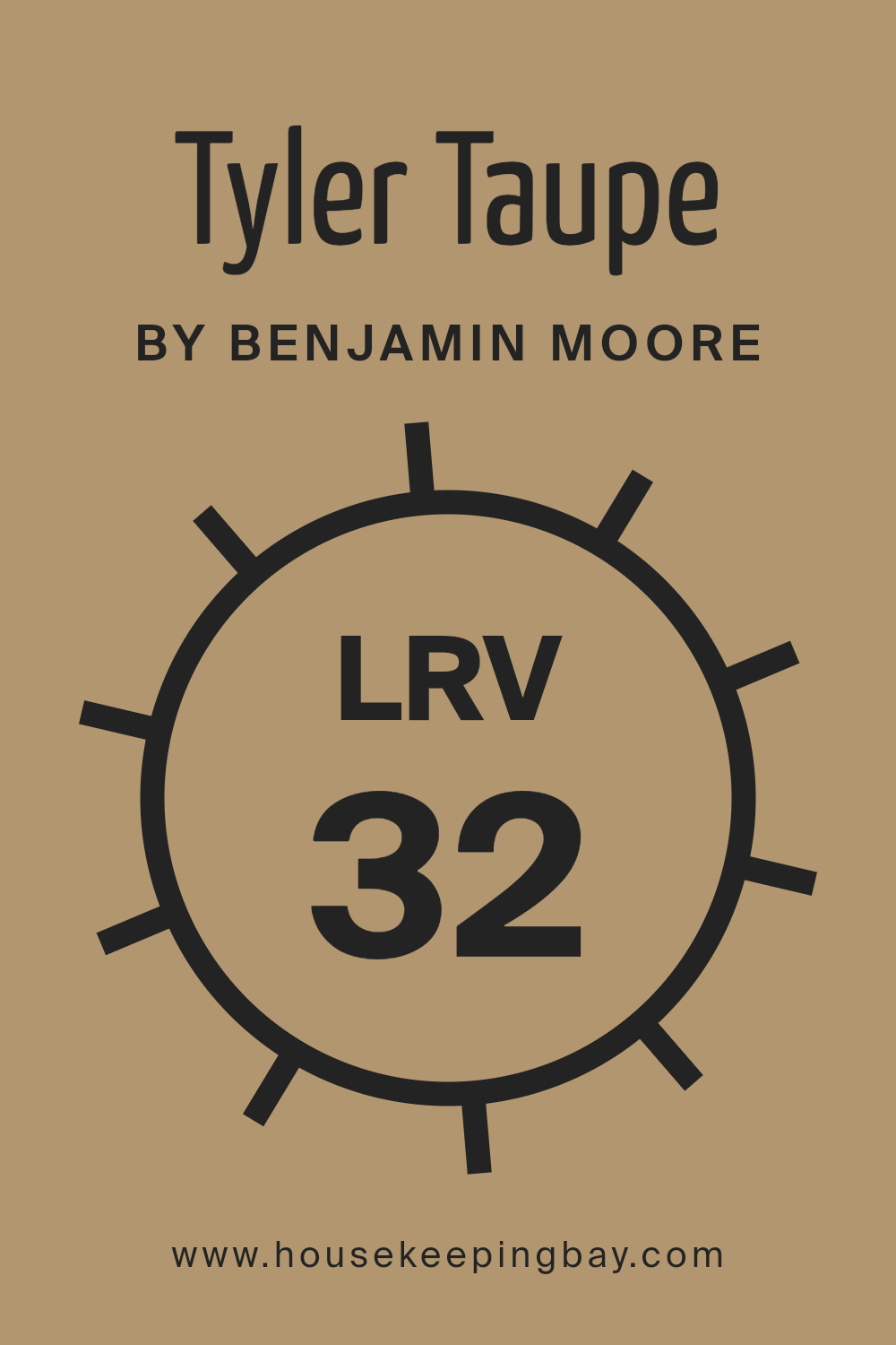
What is the LRV of Tyler Taupe HC-43 by Benjamin Moore?
LRV stands for Light Reflectance Value, a measurement that indicates how much light a paint color reflects or absorbs. Measured on a scale from 0 to 100, where 0 means pure black and 100 signifies pure white, this value helps predict how light or dark a color will appear once applied to a surface.
Lower values mean the color reflects less light, making it appear darker, while higher values suggest it reflects more light, making it appear brighter. Choosing the right LRV can affect both the aesthetics and functionality of a room, as it influences the amount of artificial light needed and the overall atmosphere.
The LRV of Tyler Taupe HC-43 is 31.85, placing it on the darker side of the spectrum. This moderate LRV means that Tyler Taupe will absorb more light than it reflects, resulting in a deeper, richer appearance on walls. In rooms with limited natural light, this color might make the space feel more enclosed but decidedly cozy.
In well-lit areas, however, its warmth and depth can add a sophisticated touch, enhancing the room’s character without making it feel too stark or overwhelming. Therefore, the specific LRV of Tyler Taupe should be considered carefully when deciding which room and lighting conditions are most suitable for using this color.
housekeepingbay.com
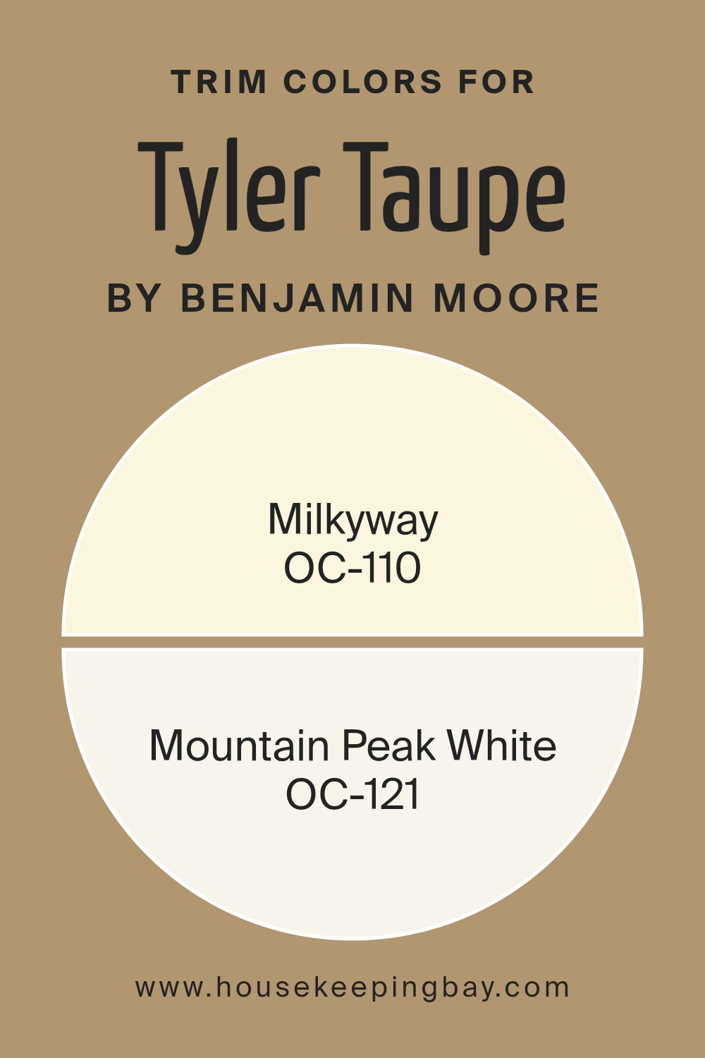
What are the Trim colors of Tyler Taupe HC-43 by Benjamin Moore?
Trim colors are specifically chosen paint hues used to accent or highlight the other dominant colors in the room, such as those on the walls or on large furniture items. For Tyler Taupe HC-43 by Benjamin Moore, subtle and complementary trim colors can enhance the wall’s soothing and neutral tone without overpowering it.
Using trim colors like OC-110 Milkyway and OC-121 Mountain Peak White from Benjamin Moore provides a clean and crisp contrast, subtly highlighting the architectural features of a room. These choices ensure that Tyler Taupe stands out in a balanced, appealing way.
Milkyway OC-110 by Benjamin Moore is a gentle off-white with a hint of warmth, making it an ideal trim color as it softly borders the richer hue of Tyler Taupe, providing a seamless yet defined boundary around doors and windows.
Mountain Peak White OC-121, another excellent trim choice, leans more towards a pure white, offering a bright and fresh frame for the walls. This color not only contrasts beautifully with Tyler Taupe but also brings a rejuvenating freshness to the space that complements contemporary or traditional styles effectively.
You can see recommended paint colors below:
- OC-110 Milkyway
- OC-121 Mountain Peak White
housekeepingbay.com
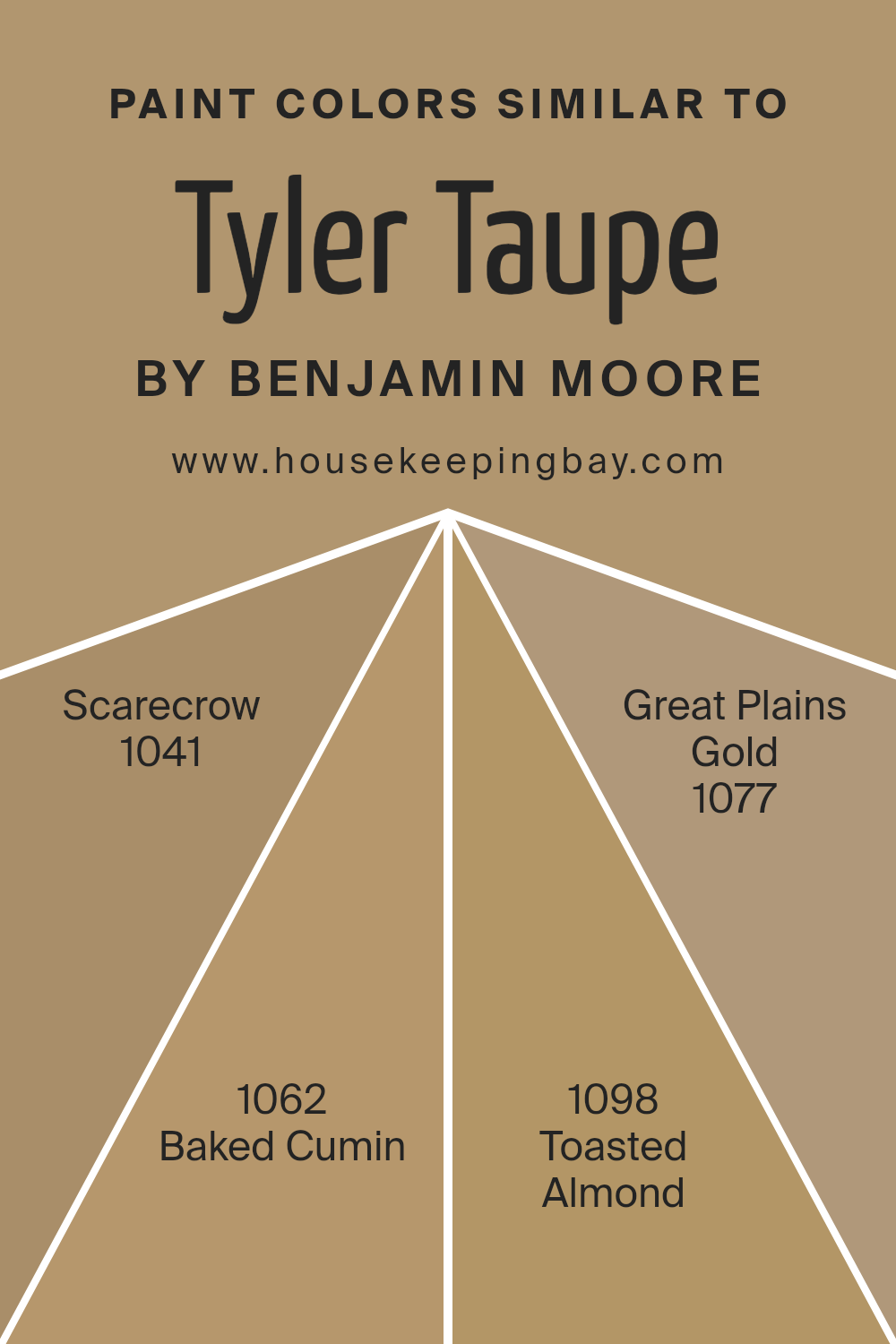
Colors Similar to Tyler Taupe HC-43 by Benjamin Moore
Choosing similar colors in a design palette is crucial for creating a harmonious and visually coherent space. Similar colors, like those akin to Tyler Taupe HC-43 by Benjamin Moore, blend well together, offering a seamless transition between hues that enhances the overall aesthetic without overwhelming the senses. These hues, thanks to their shared undertones and intensities, work together to build a unified and comforting environment.
Colors such as 1041 – Scarecrow, 1062 – Baked Cumin, 1098 – Toasted Almond, and 1077 – Great Plains Gold, are all examples of shades that share a warmth and earthiness, making them ideal companions in any space seeking a touch of natural elegance.
Scarecrow is a soft, sun-washed shade that offers a gentle echo of golden fields, providing a light and airy feel to any room. Baked Cumin, on the other hand, has a deeper, more robust presence, invoking the warmth of spices and earth under a midday sun. Toasted Almond presents a muted, nutty color that recalls the mellow smoothness of almond butter spread across a warm toast, ideal for creating a cozy and welcoming atmosphere.
Lastly, Great Plains Gold captures the subtle richness of sunlit wheat fields, perfect for adding a hint of rustic charm to a space. Together, these colors support and enhance one another, making any decorating endeavor naturally cohesive and inviting.
You can see recommended paint colors below:
- 1041 Scarecrow
- 1062 Baked Cumin
- 1098 Toasted Almond
- 1077 Great Plains Gold
housekeepingbay.com
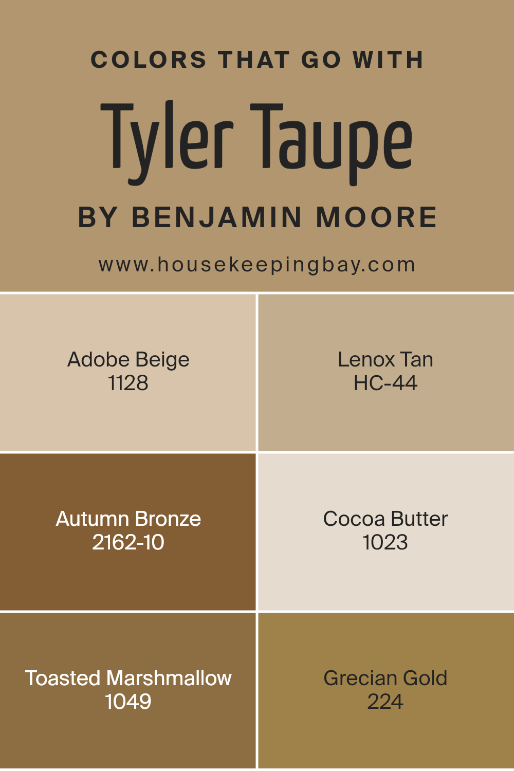
Colors that Go With Tyler Taupe HC-43 by Benjamin Moore
Selecting the right colors to complement Tyler Taupe HC-43 by Benjamin Moore is essential for achieving a balanced and harmonious look in your space. Tyler Taupe is a versatile neutral shade that serves as a perfect backdrop for a range of complementary colors, creating a cohesive and inviting atmosphere. When paired thoughtfully, these colors enhance the warmth and depth of Tyler Taupe, providing a refined aesthetic without overpowering the space.
Adobe Beige 1128 is a gentle, creamy beige that lends a soft, soothing feel when used alongside Tyler Taupe, making the space feel more open and light. Lenox Tan HC-44, on the other hand, is a richer, earthier tone that adds a sense of solidity and groundedness to rooms, perfect for areas that require a bit more warmth.
Autumn Bronze 2162-10 introduces a deep, rich bronze that works well to add a touch of sophistication and luxury, ideal for creating focal points through accents or furniture pieces. Cocoa Butter 1023 offers a muted, pale yellow that brings a subtle brightness, enhancing the warmth of Tyler Taupe without overwhelming it. Toasted Marshmallow 1049 has a light, airy quality that prevents the room from feeling too heavy, helping to maintain a relaxed and comfortable atmosphere.
Finally, Grecian Gold 224 provides a vibrant, radiant hue that injects energy and vivacity, perfect for accessories or wall accents that need to stand out against the calm backdrop of Tyler Taupe. Each of these colors contributes to creating a space that feels thoughtfully designed and visually appealing.
You can see recommended paint colors below:
- 1128 Adobe Beige
- HC-44 Lenox Tan
- 2162-10 Autumn Bronze
- 1023 Cocoa Butter
- 1049 Toasted Marshmallow
- 224 Grecian Gold
housekeepingbay.com
How to Use Tyler Taupe HC-43 by Benjamin Moore In Your Home?
Tyler Taupe HC-43 by Benjamin Moore is a versatile paint color that provides a warm, cozy feel to any room. Its earthy hue helps create a soothing atmosphere, making it perfect for areas where relaxation is key, such as living rooms and bedrooms. This shade can act as a neutral backdrop, allowing furniture and decor to stand out or blend in, depending on the desired effect.
You can use Tyler Taupe in different ways around your home. For a seamless look, paint all walls in a room; this enhances the feeling of space and continuity. Alternatively, use it on an accent wall to highlight a particular area, drawing attention to artwork or a special furniture piece. In smaller spaces, like bathrooms or hallways, Tyler Taupe adds depth without overwhelming the senses.
Additionally, Tyler Taupe works well with various textures and materials. Pair it with wooden elements, metals, or glass to create a balanced and inviting environment. Whether you’re redoing a single room or updating your entire house, Tyler Taupe provides a solid foundation for your decorating plans.
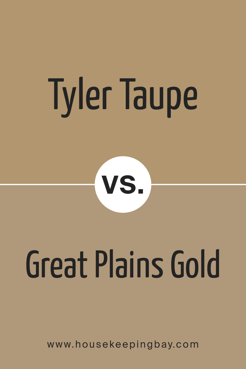
Tyler Taupe HC-43 by Benjamin Moore vs Great Plains Gold 1077 by Benjamin Moore
Tyler Taupe HC-43 by Benjamin Moore is a warm, muted taupe with a balanced blend of beige and gray, making it a versatile choice for many spaces. It has a calming effect that suits nearly any environment, from living rooms to bedrooms. Its neutrality allows it to pair well with a variety of other hues, from bright accents to darker furniture.
On a different note, Great Plains Gold 1077 by Benjamin Moore is a muted gold shade that leans towards a rich mustard with earthy undertones. This color adds a cozy warmth to any room, ideal for creating a welcoming atmosphere. While it’s striking, it’s still soft enough not to overwhelm a space. It pairs nicely with other warm colors and natural materials like wood or leather.
Though both colors come from neutral palettes, Tyler Taupe is more subdued and versatile, while Great Plains Gold adds a noticeable warmth, potentially serving as a focal point or complementing an earthy, rustic decor. Both paints offer opportunities to create comforting and stylish interiors.
You can see recommended paint color below:
- 1077 Great Plains Gold
housekeepingbay.com
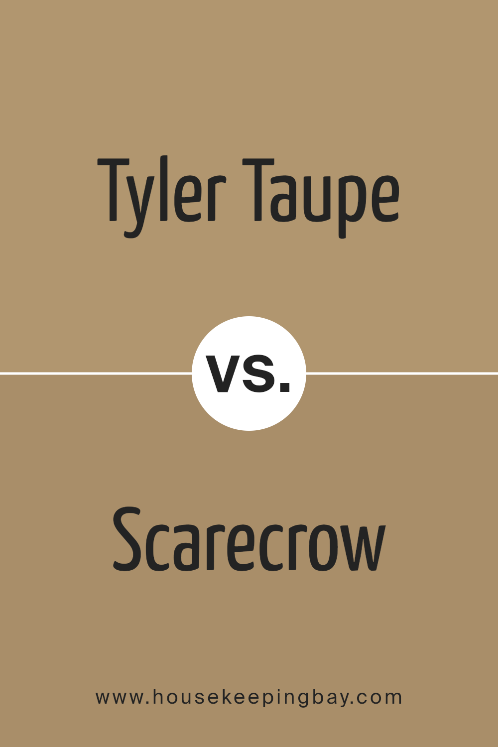
Tyler Taupe HC-43 by Benjamin Moore vs Scarecrow 1041 by Benjamin Moore
Tyler Taupe HC-43 by Benjamin Moore is a warm neutral that has a soft, earthy tone. It gently complements various decor styles and brings a cozy feel to rooms. This color is versatile, great for living areas or bedrooms, providing a soothing backdrop.
Scarecrow 1041 by Benjamin Moore is slightly more vibrant than Tyler Taupe. It exudes a richer, more golden hue that adds a touch of warmth and brightness to spaces. Scarecrow works well in rooms that benefit from a little extra warmth, like north-facing rooms that receive less natural light.
Both colors offer a welcoming atmosphere, yet Scarecrow tends to feel warmer due to its golden undertones. Tyler Taupe, with its subtler, grayer base, feels more understated and might blend more seamlessly with a wider range of color schemes. While both can create a warm environment, your choice might depend on how much warmth and brightness you want to introduce into your space.
You can see recommended paint color below:
- 1041 Scarecrow
housekeepingbay.com
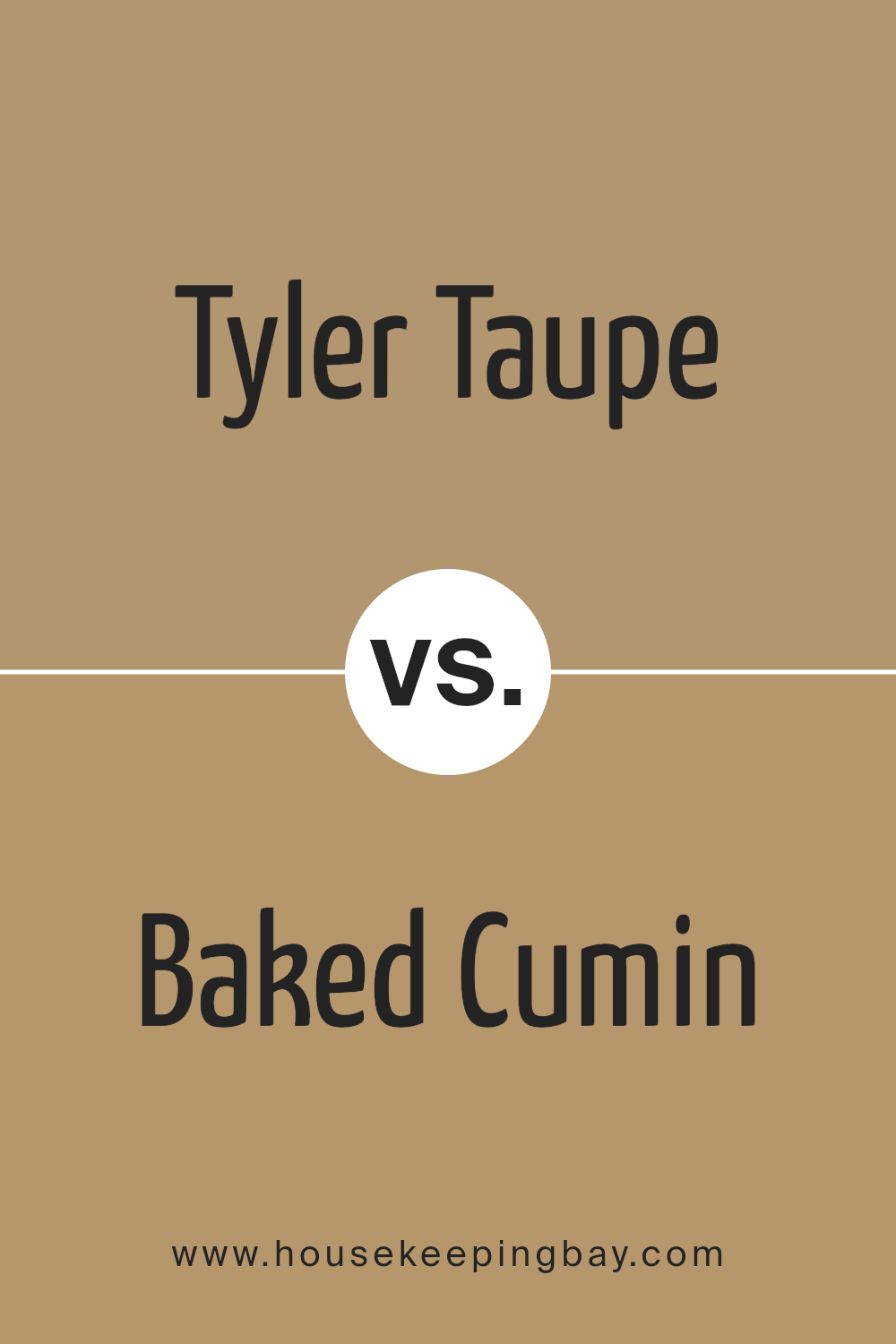
Tyler Taupe HC-43 by Benjamin Moore vs Baked Cumin 1062 by Benjamin Moore
Tyler Taupe HC-43 and Baked Cumin 1062, both by Benjamin Moore, present two distinct takes on neutral tones. Tyler Taupe is a soft, warm gray that offers a versatile backdrop for various decor styles. Its subtle earthy undertones make it a cozy choice for living areas and bedrooms. The color pairs effortlessly with both bright accents and muted designs.
Baked Cumin 1062 is a deeper, richer hue with a definite amber-like warmth that resembles the spice it’s named after. This color is particularly suited for spaces where you want to add a sense of warmth and welcoming, such as dining rooms or kitchens. The intensity of Baked Cumin lends itself well to being a focal point in a room or used in accents to enrich a space.
When comparing both, Tyler Taupe is lighter and easier to match with a diverse palette, while Baked Cumin stands out with its boldness and depth, offering a stronger character to interior spaces.
You can see recommended paint color below:
- 1062 Baked Cumin
housekeepingbay.com
Tyler Taupe HC-43 by Benjamin Moore vs Toasted Almond 1098 by Benjamin Moore
Tyler Taupe HC-43 and Toasted Almond 1098, both by Benjamin Moore, offer subtle yet distinct tones for interior spaces. Tyler Taupe is a warm, medium taupe that provides a cozy, inviting feel. Its versatile shade can serve as a neutral backdrop in various room settings, complementing both dark and light accents.
Toasted Almond 1098 is slightly lighter, leaning towards a soft beige with undertones that can appear peachy or pink in certain lighting. This color is ideal for creating a light, airy feel in a space, making rooms look more spacious and open.
While both colors are excellent for achieving a serene environment, Tyler Taupe’s deeper hue adds richness and depth, making it suitable for larger rooms or as an accent wall. Toasted Almond, with its lighter tone, is particularly effective in smaller spaces or areas with less natural light, giving a bright and uplifting effect. Each color offers unique qualities that can enhance the aesthetic of your home, depending on your specific needs and tastes.
You can see recommended paint color below:
- 1098 Toasted Almond
housekeepingbay.com
It particularly stands out for its ability to soothe without being dull and injects a balanced warmth into spaces that might otherwise feel cold or impersonal. From my experience, using Tyler Taupe in various rooms has shown me just how adaptive and forgiving it can be under different lighting conditions.
Whether paired with soft whites for a gentle contrast or bold accents to make it pop, this shade supports numerous design fantasies while maintaining an air of refined sophistication.
For anyone considering a new paint color that offers both beauty and flexibility, Tyler Taupe could be the perfect candidate.
housekeepingbay.com
