Peppermint 1359 by Benjamin Moore
Fresh and Minty Vibes for Every Space
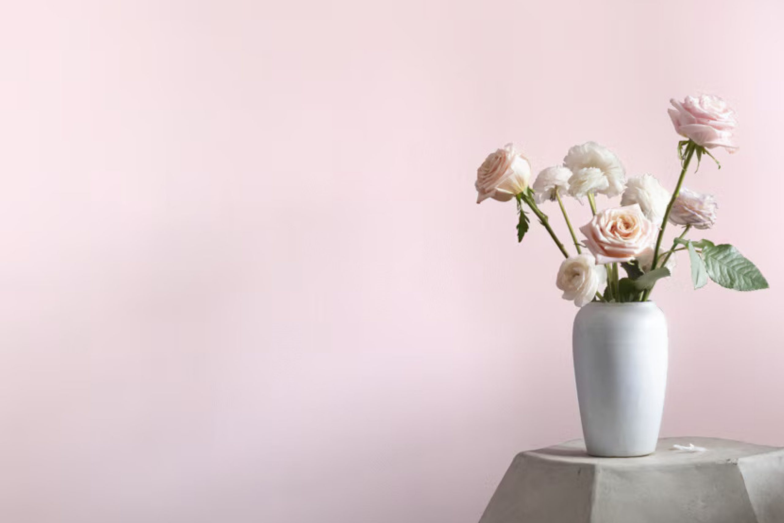
When decorating your home, picking the right paint color is crucial, and Benjamin Moore’s 1359 Peppermint might just be the shade you’re searching for. It’s a light, refreshing color that adds a breath of fresh air to any room without overwhelming it. This particular shade has a cool undertone, reminiscent of a mint leaf, making it perfect for creating a soothing atmosphere in spaces like kitchens or bathrooms where you want a clean, fresh vibe.
Peppermint 1359 works well when paired with both bold and neutral colors, allowing you flexibility in your decorating scheme. Whether you wish to pair it with dark woods for a striking contrast or soft linens for a gentler look, this color holds its own beautifully. Plus, its subtle vibrancy can help brighten rooms that don’t get a lot of natural light.
If you’re considering a new look for your interior spaces, Peppermint by Benjamin Moore deserves your attention.
It offers a unique charm that can rejuvenate your home and reflect a sense of calm and cleanliness.
via benjaminmoore.com
What Color Is Peppermint 1359 by Benjamin Moore?
Peppermint 1359 by Benjamin Moore is a soft, muted shade of green with a subtle hint of gray, making it a versatile color choice for home interiors. Its calming tones can create a relaxing atmosphere in any room, suggesting freshness and serenity similar to a gentle mint leaf. This color works wonderfully in Scandinavian and minimalist designs due to its understated elegance. It also fits well in coastal and shabby chic themes, offering a light, airy feel that complements natural light and spacious layouts.
Peppermint 1359 pairs excellently with natural materials such as light wood, wicker, and linen, enhancing its organic vibes. Textures like wool throws or cotton rugs can soften spaces, making the environment feel cozy and welcoming while maintaining a clean aesthetic. Additionally, this shade coordinates beautifully with white or beige, which helps to maintain a light and open feel in the room.
Metallic accents in silver or brushed nickel can also complement this color, adding a touch of sophistication without overwhelming its quiet charm. Overall, Peppermint 1359 by Benjamin Moore offers a flexible palette that supports a range of styling options, making it ideal for creating peaceful, inviting spaces in the home.
housekeepingbay.com
Is Peppermint 1359 by Benjamin Moore Warm or Cool color?
Peppermint1359 by Benjamin Moore is a fresh, vibrant color that brings a cheerful and bright ambiance to any room. This particular shade of green has a lively, minty vibe that can instantly refresh and revive a space. It’s ideal for creating a light, airy feel, particularly in smaller or darker rooms that could use a touch of brightness. Peppermint1359 works well in various areas of the home, including kitchens and bathrooms, where it complements natural light and enhances a clean, crisp look.
In living rooms or bedrooms, this color pairs beautifully with neutral tones like whites, grays, and beiges, adding a burst of energy without overwhelming the senses. It’s also versatile enough to match with darker colors, like navy or charcoal, creating a balanced and harmonious contrast.
Applying Peppermint1359 on an accent wall or in decorative touches, such as throw pillows or vases, can liven up the space without requiring a complete decor overhaul. The uplifting nature of this color makes it a popular choice for anyone wanting to freshen up their home with a modern and youthful touch.
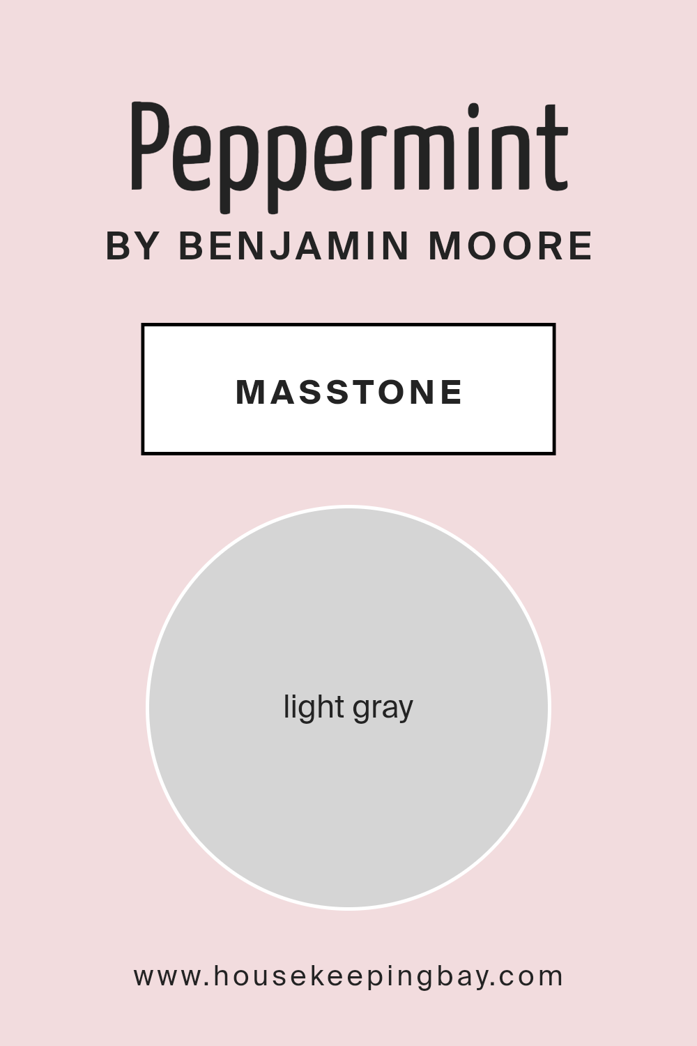
What is the Masstone of the Peppermint 1359 by Benjamin Moore?
Peppermint1359 by Benjamin Moore is characterized by its masstone, light gray, which sports a hex color code of #D5D5D5. This shade is incredibly versatile for home decoration due to its understated and gentle hue. Light gray serves as a neutral backdrop in any room, making it easy to pair with a myriad of other colors, whether bold or subdued.
In home settings, Peppermint1359 can help create a calm and inviting atmosphere. It’s particularly useful in spaces where you want to promote a sense of relaxation and calmness, such as bedrooms and living rooms. This gray doesn’t overwhelm the senses, making it an ideal choice for larger areas, like walls or big pieces of furniture. It helps other colors in the décor stand out and complements various materials like wood, metal, and glass.
Moreover, its lightness helps in reflecting natural light, making spaces appear brighter and more spacious. This quality is valuable in smaller or darker rooms where you want to enhance the feeling of openness.
housekeepingbay.com
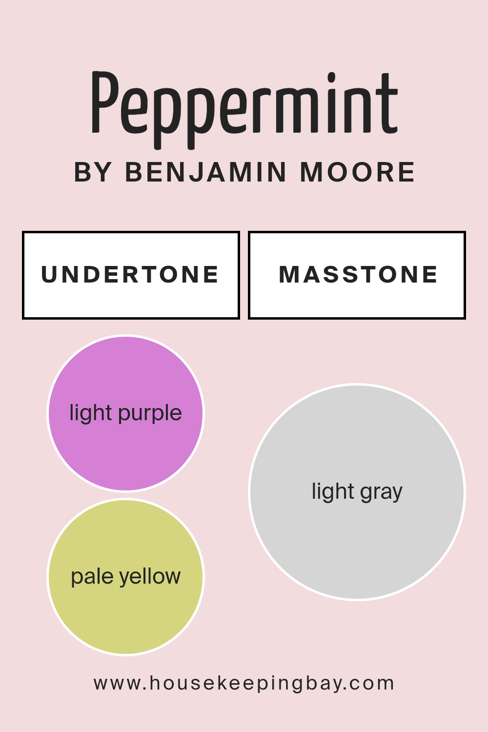
Undertones of Peppermint 1359 by Benjamin Moore
Peppermint1359 by Benjamin Moore is a versatile shade enriched with a complex palette of undertones that subtly influence its appearance under different lighting conditions. These undertones, which include light purple, pale yellow, light blue, pale pink, lilac, mint, and grey, give the color depth and flexibility, impacting how the color is perceived in various environments.
In interior spaces, the presence of these undertones can cause Peppermint1359 to look slightly different depending on the lighting and surrounding colors. For instance, in a room with ample natural light, the pale yellow and light blue undertones might make the color appear brighter and more airy. In contrast, in a space with warmer, dim lighting, the light purple and pale pink undertones could give a softer, more soothing effect.
The grey undertone helps stabilize the color, ensuring that it doesn’t overwhelm the space while providing a neutral backdrop that complements a wide range of décor themes and color palettes. This makes Peppermint1359 an excellent choice for walls as it provides a subtle, nuanced background that works well with both vibrant and muted furnishing colors.
Moreover, while some undertones might highlight specific features of a room or change mood, the overall effect of Peppermint1359 supports a harmonious and balanced visual experience, thereby enhancing the aesthetic appeal of any interior space. This paint color, due to its complex undertone structure, offers an adaptable solution that seamlessly integrates with different styles and preferences.
housekeepingbay.com
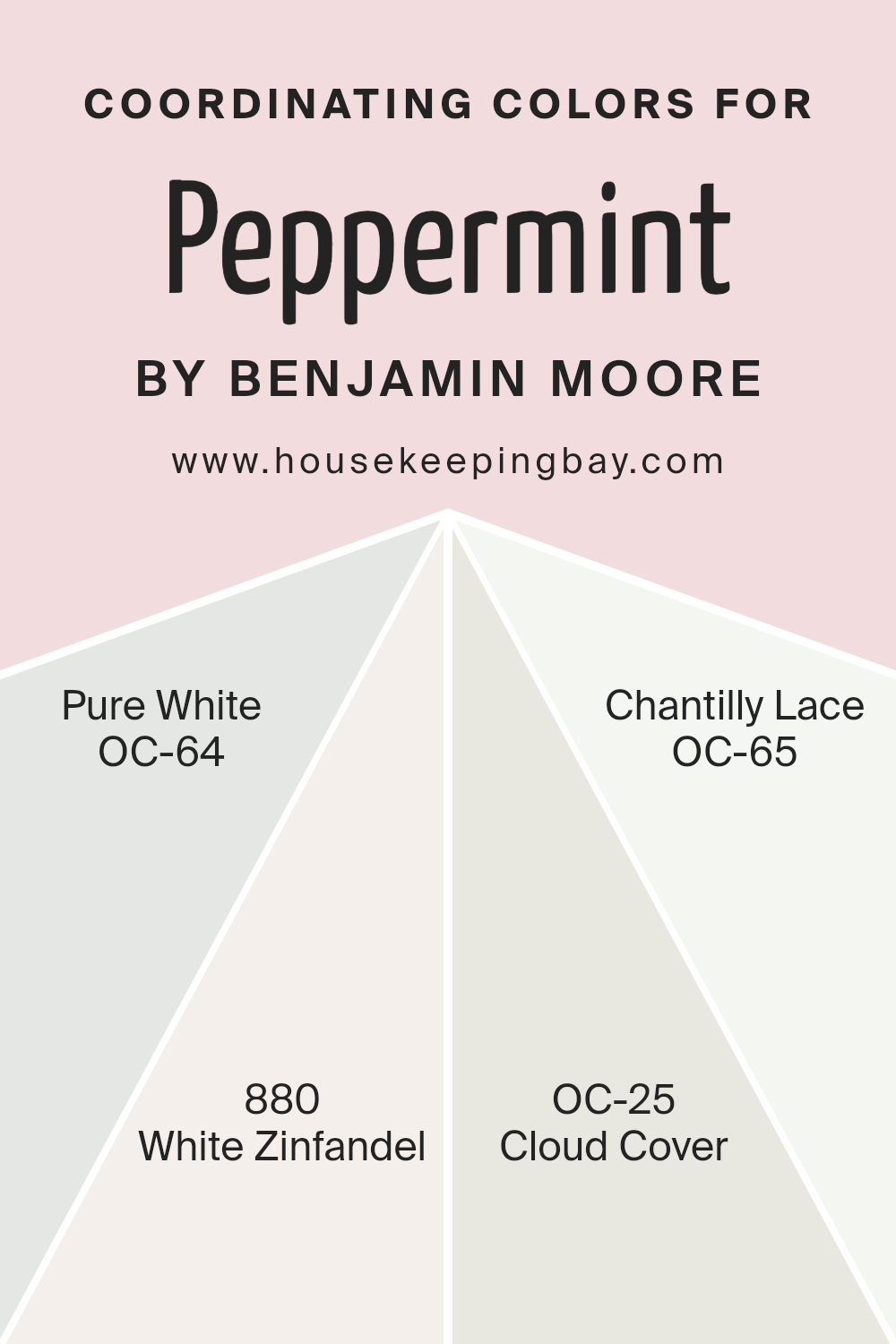
Coordinating Colors of Peppermint 1359 by Benjamin Moore
Coordinating colors are schemes that work harmoniously together to create a visually pleasing effect in any space. When choosing coordinating colors, it’s important to consider how each shade will complement and enhance the others in the palette. For instance, Benjamin Moore’s Peppermint1359 pairs well with a thoughtful selection of whites and neutrals to create a cohesive and appealing look.
Peppermint1359 can be paired with OC-64, known as Pure White, which is a clean and crisp white that provides a solid base for the soft mint, allowing it to truly pop. Another choice, 880 or White Zinfandel, is a soft blush tone that adds a subtle hint of warmth, working well to soften the coolness of Peppermint1359 without overpowering it.
OC-25, called Cloud Cover, is a gentle off-white with gray undertones, offering a neutral backdrop that supports bolder hues gently. Finally, OC-65 or Chantilly Lace is a bright, airy white with a subtle luminosity, enhancing the freshness of Peppermint1359, giving a room a fresh and open feel. Together, these colors contribute to a balanced and inviting space.
You can see recommended paint colors below:
- OC-64 Pure White
- 880 White Zinfandel
- OC-25 Cloud Cover
- OC-65 Chantilly Lace
housekeepingbay.com
How Does Lighting Affect Peppermint 1359 by Benjamin Moore?
Lighting plays a crucial role in how we perceive colors. Under different lighting conditions, the same color can appear varied. Each light source has its own color temperature, which can shift the appearance of colors in a space.
Peppermint1359 by Benjamin Moore is an interesting case study. In natural light, which is full-spectrum, this color appears true to its palette—a fresh and vibrant shade. In artificial light, the type of bulb used influences its appearance. Fluorescent lights, cooler in tone, may enhance its crispness, making it appear slightly bluer. Incandescent bulbs, which give off a warmer glow, can soften this color, making it seem milder and more subdued.
Room orientation also affects how Peppermint1359 is viewed:
- North-facing rooms: These rooms receive less direct sunlight, often resulting in cooler, softer light throughout the day. Here, Peppermint1359 may appear slightly muted, losing some of its vibrancy. It might look more shadowy and less lively.
- South-facing rooms: Abundant in direct sunlight, these rooms are bright for most of the day. Peppermint1359 thrives under these conditions, displaying its true, vibrant self. The ample natural light highlights the color’s freshness and can make the space feel energetic and lively.
- East-facing rooms: Here, the color receives strong sunlight in the morning, followed by a gradual reduction in light intensity. In the morning, Peppermint1359 looks particularly vivid and cheerful. As the day progresses and the natural light diminishes, the color can take on a softer and more tranquil appearance.
- West-facing rooms: These rooms get a lot of sunlight in the afternoon and evening. Peppermint1359 can glow warmly during this time, creating a cozy and inviting atmosphere as the sun sets.
Understanding the interaction between light and color can significantly impact design choices, ensuring that colors like Peppermint1359 are used effectively in decor to achieve the desired ambiance and mood.
housekeepingbay.com
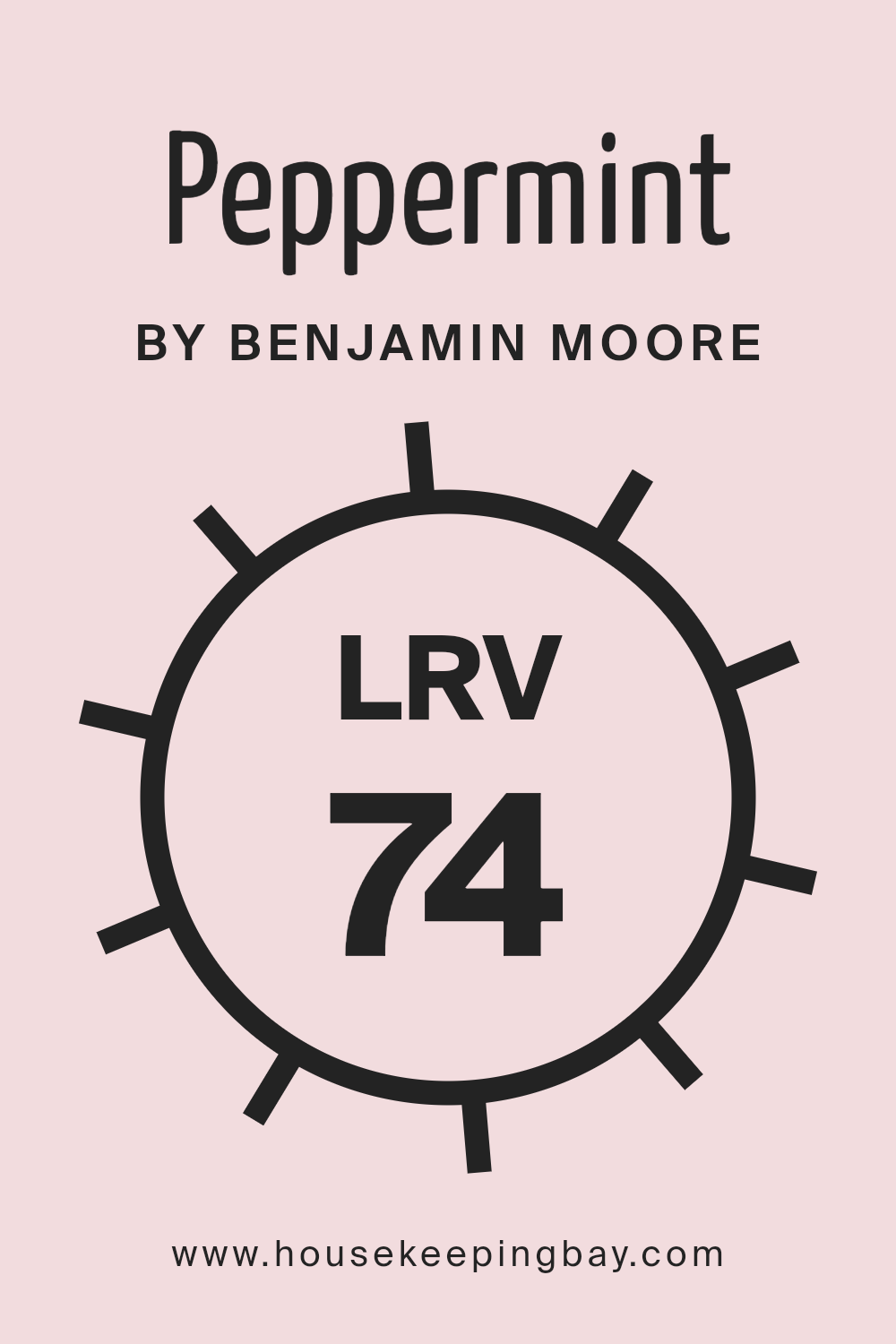
What is the LRV of Peppermint 1359 by Benjamin Moore?
LRV, or Light Reflectance Value, measures the percentage of light a paint color reflects from or absorbs into a painted surface. It is calculated on a scale from 0 to 100, with 0 being completely black and absorbing all light, and 100 being pure white and reflecting all light.
This value is crucial when choosing paint colors because it helps predict how light or dark a color will look on the walls of a room. The level of natural and artificial light in a room, combined with the LRV, significantly impacts the appearance of the color on the walls.
Peppermint1359 by Benjamin Moore has an LRV of 74.19, which means it is a light color that reflects quite a bit of light. This high LRV suggests that Peppermint1359 will help make a space feel brighter and more open, as it reflects a considerable amount of light back into the room.
Colors with higher LRV values are often used in smaller or darker spaces to make them appear larger and more inviting. This particular shade of light mint will likely create a fresh and airy feel in any space, making it an excellent choice for living areas, kitchens, or any room looking to achieve a light, refreshing atmosphere.
housekeepingbay.com
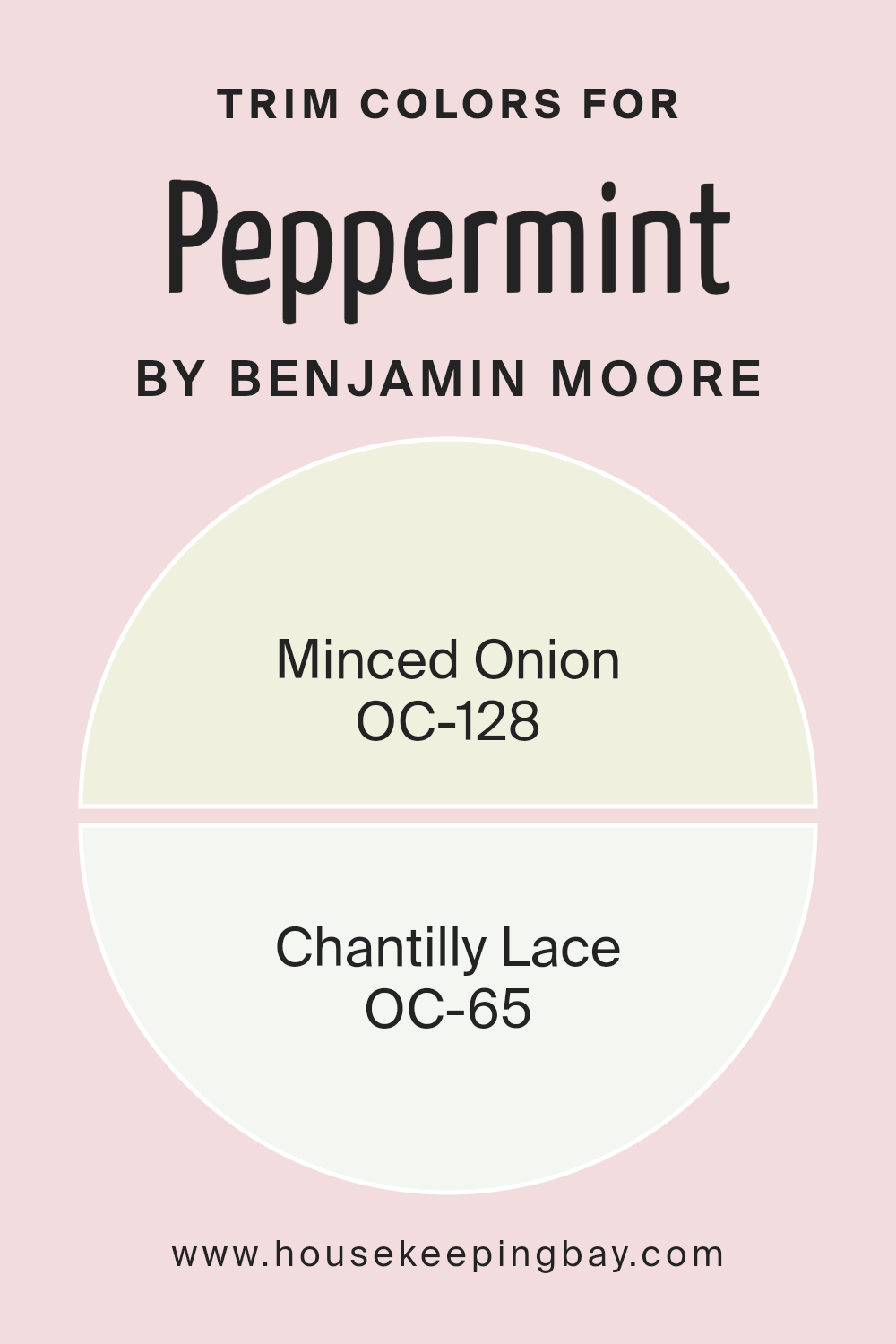
What are the Trim colors of Peppermint 1359 by Benjamin Moore?
Trim colors are the accents applied on architectural features like door frames, moldings, and window sills to define and highlight the structural elements of a room or building’s exterior. The use of trim colors can bring a subtle yet significant enhancement to how colors interact in a space, giving edges and corners a more pronounced look that helps in accentuating the overall aesthetic appeal. By selecting the right trim color, you can achieve a refined finish that complements the main wall colors, delivering a cohesive and harmonious look throughout the space.
Peppermint1359 by Benjamin Moore is a distinct shade that pairs wonderfully with certain trim colors such as OC-128 – Minced Onion and OC-65 – Chantilly Lace. Minced Onion is a gentle off-white with warm undertones that offers a soft, soothing contrast against the vibrant Peppermint1359, bringing a calm and collected feel to the space.
On the other hand, Chantilly Lace is a clean, bright white that provides a sharp, crisp border to the more lively Peppermint1359, which can make the main color pop and draw more attention to the architectural contours of the room. Both colors support the main hue without overwhelming it, ensuring the visual focus remains balanced and pleasant.
You can see recommended paint colors below:
- OC-128 Minced Onion
- OC-65 Chantilly Lace
housekeepingbay.com
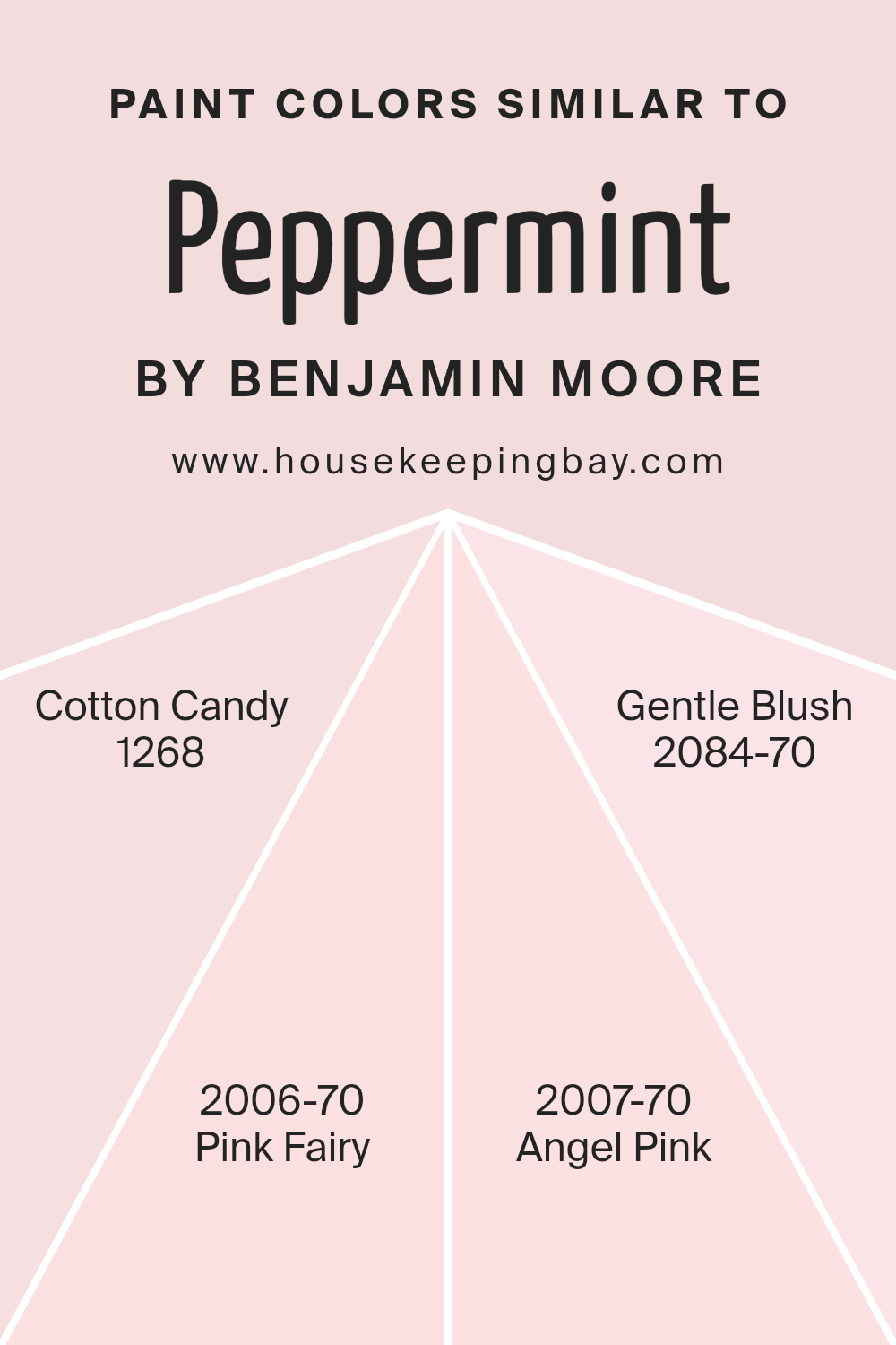
Colors Similar to Peppermint 1359 by Benjamin Moore
Choosing similar colors for a room or a project is crucial because it creates a cohesive and harmonious look. Colors that are close in hue complement each other, allowing for a smooth visual flow that is pleasing to the eye. Similar colors, such as those akin to Peppermint1359 by Benjamin Moore, work together by subtly varying in tone and intensity, which can enhance the overall aesthetic without causing visual jarring. This gentle gradation of colors can soften the environment and provide a serene atmosphere, which is especially important in spaces designed for relaxation or concentration.
Benjamin Moore’s Cotton Candy 1268 is a soft, whimsical pink that brings a light, joyful touch to any space, perfect for creating a playful yet subtle ambiance. Pink Fairy 2006-70 offers a slightly brighter, more spirited pink that injects a dash of cheerfulness into interiors.
Angel Pink 2007-70 is a very pale pink with a hint of warmth, ideal for adding a soft glow to a room, creating an inviting and gentle space. Gentle Blush 2084-70, the faintest blush pink, provides a nearly neutral backdrop that complements more vivid colors or serves beautifully on its own for a minimalist look. Together, these colors allow for a layered approach to design that can suit various aesthetic preferences while maintaining visual coherence.
You can see recommended paint colors below:
- 1268 Cotton Candy
- 2006-70 Pink Fairy
- 2007-70 Angel Pink
- 2084-70 Gentle Blush
housekeepingbay.com
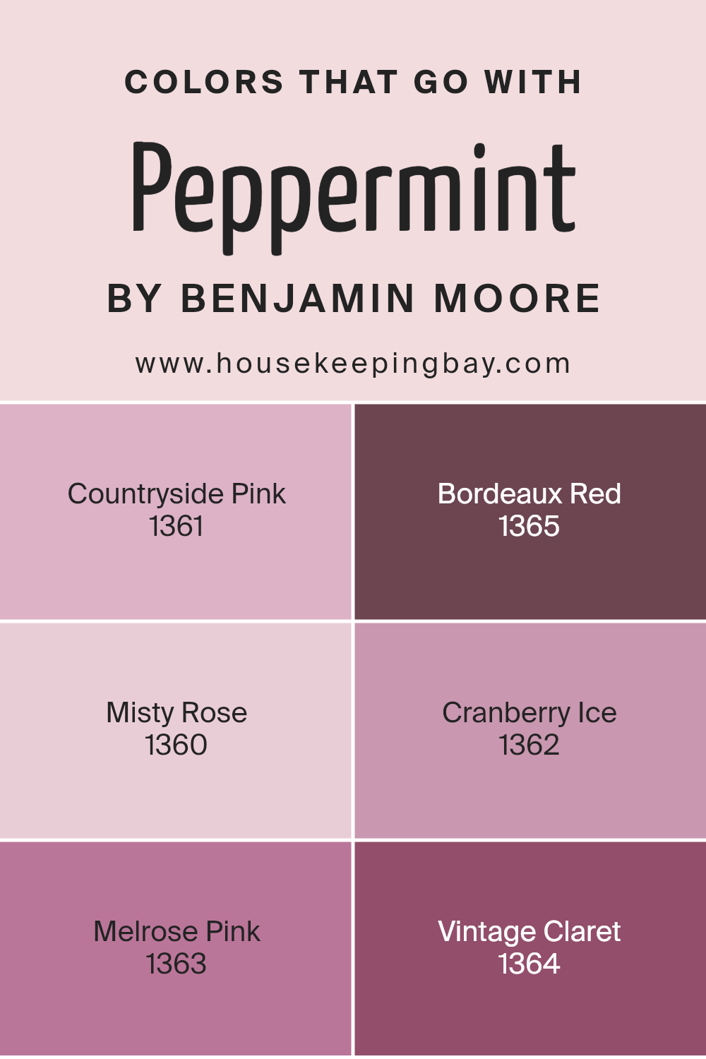
Colors that Go With Peppermint 1359 by Benjamin Moore
Colors that complement Peppermint 1359 by Benjamin Moore play a crucial role in creating a cohesive and appealing space, as they help balance the atmosphere by bringing warmth or coolness, depending on the room’s needs. For instance, Countryside Pink 1361 offers a gentle warmth with its soft, subdued pink hue that adds a touch of gentle cheer to the minty freshness of Peppermint.
This harmony creates a welcoming effect, suitable for relaxing spaces like bedrooms and living rooms. Bordeaux Red 1365, with its rich, deep tone, provides a bold contrast, perfect for adding a touch of drama and luxury that enriches the serene base provided by Peppermint 1359.
Moving to lighter tones, Misty Rose 1360 is a dusty rose color that softly blends with Peppermint, offering a seamless visual transition that’s easy on the eyes, ideal for creating a space that feels unified and peaceful. Cranberry Ice 1362 presents a lively, vibrant pink that injects a playful spirit into the environment, making it a fantastic choice for more dynamic, creative spaces.
Melrose Pink 1363 whispers elegance with its muted, sophisticated pink, fostering a refined backdrop that complements the freshness of Peppermint. Lastly, Vintage Claret 1364 rounds out the palette with its wine-inspired depth, setting a tone of mature grace that pairs beautifully with the more youthful vibe of Peppermint, perfect for dining areas or study rooms where a touch of seriousness is balanced with inviting warmth.
You can see recommended paint colors below:
- 1361 Countryside Pink
- 1365 Bordeaux Red
- 1360 Misty Rose
- 1362 Cranberry Ice
- 1363 Melrose Pink
- 1364 Vintage Claret
housekeepingbay.com
How to Use Peppermint 1359 by Benjamin Moore In Your Home?
Peppermint 1359 by Benjamin Moore is a refreshing shade that brings a light, airy feel to any space. This subtle hint of green works beautifully in rooms that need a touch of softness without overwhelming the senses.
It’s ideal for creating a serene atmosphere in bedrooms or bathrooms where calm is key. Peppermint 1359 also enhances living spaces like living rooms or kitchens by adding a gentle pop of color that’s easy on the eyes.
You can use Peppermint 1359 to paint all walls in a small room to make it seem larger and more open. Alternatively, consider it as an accent color on one wall or within nooks for a delicate contrast against neutrals like whites or grays. Pair it with wooden furniture or elements for a natural, grounded look or match it with lighter pastels for a soft, harmonious palette. This color also works well with indoor plants, highlighting green foliage and creating a fresh, inviting indoor environment.
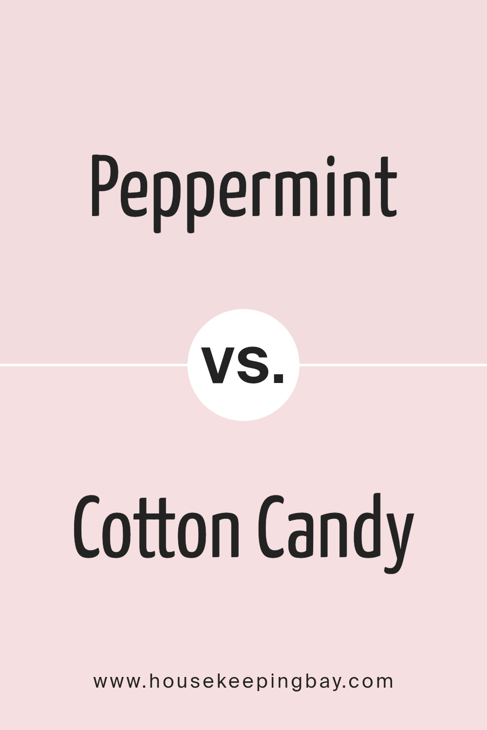
Peppermint 1359 by Benjamin Moore vs Cotton Candy 1268 by Benjamin Moore
Peppermint 1359 by Benjamin Moore is a fresh, vibrant green with a touch of crisp brightness that energetically lightens a space. This hue is perfect for creating a lively atmosphere in areas like kitchens or playrooms. Its cool undertone provides a clean and refreshing backdrop, which can make small spaces appear larger and more illuminated.
Conversely, Cotton Candy 1268 by Benjamin Moore is a soft, delicate pink that offers a gentle and soothing feel. This color works well in bedrooms or spaces where a calming influence is desired. The warm undertones of Cotton Candy evoke a sense of comfort and nurture, making it ideal for creating a cozy environment.
Both colors bring distinct moods and visual impacts to interior spaces. While Peppermint injects a dash of energy and freshness, Cotton Candy envelops a room in soft warmth. These characteristics make them suitable for different purposes and decor styles based on the atmosphere you aim to achieve.
You can see recommended paint color below:
- 1268 Cotton Candy
housekeepingbay.com
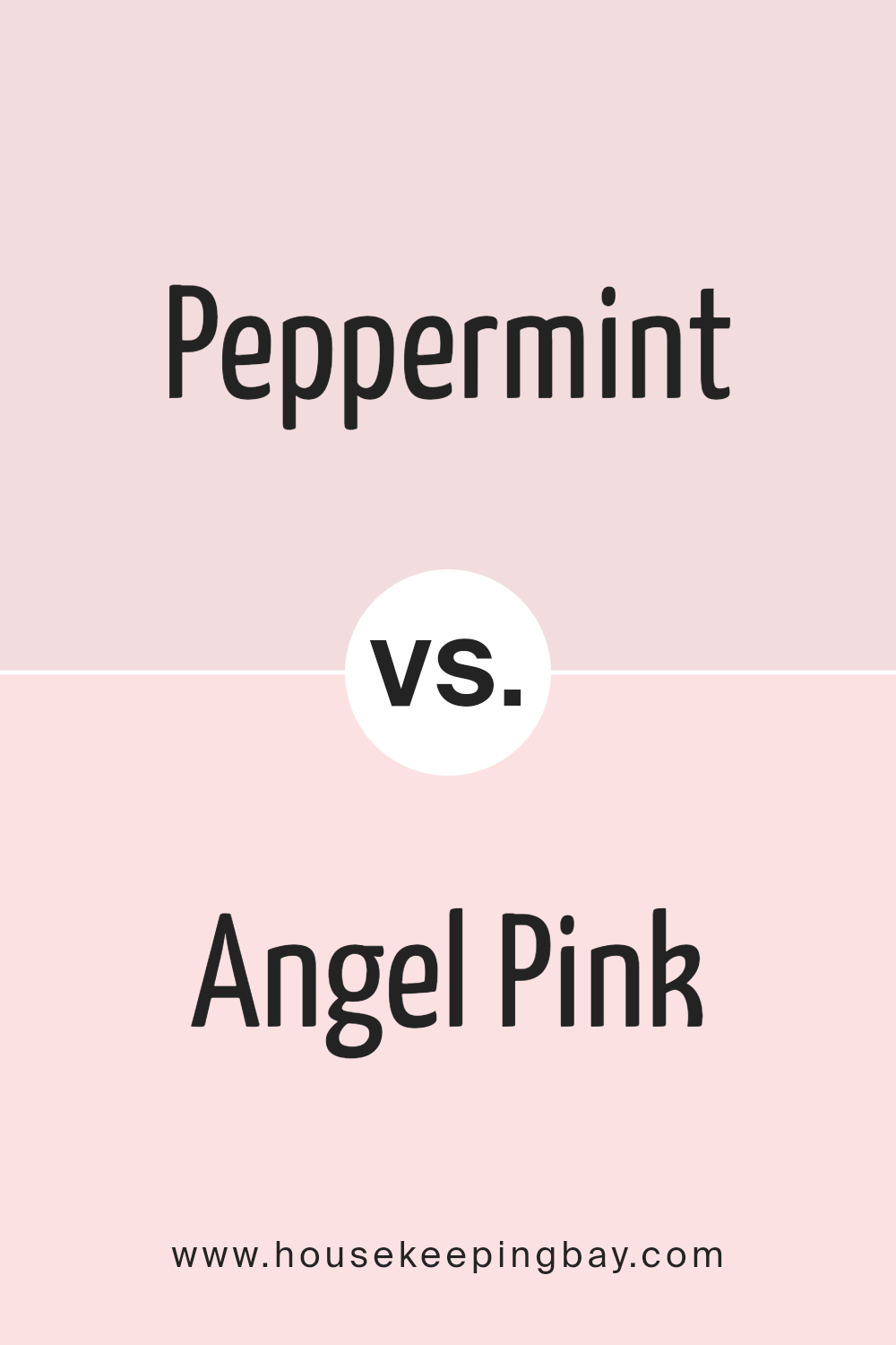
Peppermint 1359 by Benjamin Moore vs Angel Pink 2007-70 by Benjamin Moore
Peppermint 1359 by Benjamin Moore is a fresh, vibrant green that brings to mind the lively essence of its namesake. This color injects a sense of energy and liveliness into a space, making it perfect for areas where you want to stimulate activity and creativity, like kitchens or playrooms.
Angel Pink 2007-70, also by Benjamin Moore, is a soft, gentle pink that offers a soothing quality. It’s ideal for creating a calm and relaxing environment, suitable for bedrooms or quiet sitting areas where you seek peace and a gentle ambiance.
Both Peppermint and Angel Pink carry distinct vibes. Peppermint is more about vitality and brightness, while Angel Pink aims for softness and serenity. When choosing between them, consider the mood you want to set in your space: energizing with Peppermint’s green or calming with Angel Pink’s subtle warmth.
You can see recommended paint color below:
- 2007-70 Angel Pink
housekeepingbay.com
Peppermint 1359 by Benjamin Moore vs Gentle Blush 2084-70 by Benjamin Moore
Peppermint 1359 by Benjamin Moore is a vibrant, fresh green that brings to mind the crisp, invigorating scent of its namesake candy. This lively shade is ideal for energizing a space and adding a touch of nature’s vitality to any room. It creates a bright and cheerful atmosphere, making it perfect for areas like kitchens, playrooms, or any space requiring a dash of freshness.
Gentle Blush 2084-70, in contrast, is a soft, pale pink that suggests a serene, soothing vibe. This delicate color offers a sense of calm and soft warmth, making it well-suited for bedrooms or spaces where relaxation is a priority. Gentle Blush communicates a subtle elegance and can work beautifully in a minimalist or a romantically styled decor.
While both colors are from Benjamin Moore and promise high quality, their uses and effects differ. Peppermint energizes, Gentle Blush calms; one enlivens, while the other softens, supporting various moods and styles in home decorating.
You can see recommended paint color below:
- 2084-70 Gentle Blush
housekeepingbay.com
Peppermint 1359 by Benjamin Moore vs Pink Fairy 2006-70 by Benjamin Moore
Peppermint 1359 by Benjamin Moore is a fresh, minty green that gives off a crisp and clean vibe. It’s a light color that can make a space feel more open and airy. This color works well in rooms that need a touch of brightness without being overwhelming. It pairs nicely with whites and grays for a modern look.
Pink Fairy 2006-70, also by Benjamin Moore, is a soft, pale pink that adds a gentle and soothing touch to any room. It’s more subtle than Peppermint 1359 and can create a peaceful atmosphere. Ideal for nurseries or calming spaces, it matches well with other pastels and neutrals for a cohesive look.
While Peppermint 1359 injects a lively, refreshing energy, Pink Fairy 2006-70 leans towards a tender, calming effect. Both colors can beautifully enhance a room but serve different moods and purposes, depending on the feeling you want to achieve.
You can see recommended paint color below:
- 2006-70 Pink Fairy
housekeepingbay.com
In wrapping things up, the paint color 1359 Peppermint by Benjamin Moore offers a fresh perspective for anyone looking to refresh their space. This shade of light, vibrant green not only brightens a room but also provides a sense of freshness and renewal. It pairs well with a variety of decor styles, from modern to rustic, making it a versatile choice for any home. Whether applied to an accent wall, a full room, or even used for exterior purposes, Peppermint has the ability to instantly lift the mood and add a splash of cheerful energy to an environment.
What I appreciate the most about this color is how it maintains a delicate balance between being lively and soothing. This makes it particularly useful for spaces where you want to promote both creativity and relaxation such as home offices or bedrooms. The fact that it works well with both natural light and artificial lighting adds to its adaptability, ensuring that it looks great at all times of the day.
Ultimately, Peppermint by Benjamin Moore could be a fantastic choice for anyone wanting to inject some vibrancy into their surroundings without overwhelming the senses.
It’s a color that I personally find inviting and refreshing, perfect for creating a bright and airy atmosphere in any setting.
housekeepingbay.com
