Malibu Peach 2169-50 by Benjamin Moore
Brighten Your Space with a Splash of Sunshine
You might be wondering about the perfect peach paint color for your next decorating project. Let me introduce you to Malibu Peach from Benjamin Moore. This vibrant shade has a cheerful glow that can instantly warm up your space. It’s not just another peach; there’s a refreshing vibrancy that makes it unique, ideal for adding a pop of color that’s both playful and sophisticated.
Whether you’re thinking about revamping your living room, kitchen, or a cozy nook, Malibu Peach provides a lovely burst of color that’s dynamic yet not overwhelming. It pairs beautifully with soft whites or deep greens, offering a variety of styling options. Plus, it works exceptionally well in spaces that could use a touch of brightness to enhance natural light.
So, if you’re ready to freshen up your home with a color that’s both fun and refined, Malibu Peach could be the perfect choice.
It’s a color that will bring a smile to your face every time you walk into the room.
via benjaminmoore.com
What Color Is Malibu Peach 2169-50 by Benjamin Moore?
Table of Contents
Malibu Peach 2169-50 by Benjamin Moore is a vibrant, light peach hue that projects warmth and cheerfulness, making it a perfect choice to brighten up any space. The color is soft yet carries enough brightness to make walls pop, especially in spaces that aim for a playful or inviting atmosphere. It pairs well with naturals like soft beige, clean whites, and gentle grays, which help balance its warmth without overshadowing its liveliness.
Malibu Peach works exceptionally well in interior styles that lean towards contemporary, coastal, or Scandinavian due to its light-hearted and fresh vibe. It’s especially appealing in rooms that receive plenty of natural light, where the color can interact dynamically with the changing sunlight, altering the mood and feel of the room throughout the day.
When it comes to materials, Malibu Peach coordinates beautifully with light woods such as oak and maple, adding to a room’s airy feel. It also complements well with matte finishes on furniture and fixtures, providing a subtle yet cheerful contrast. Textures such as linen, cotton, and light wool in furnishings or window treatments enhance its softness, creating an environment that feels cozy and welcoming.
Whether used as an accent wall or throughout a space, Malibu Peach offers a fresh, youthful glow that revives and personalizes any interior.
housekeepingbay.com
Is Malibu Peach 2169-50 by Benjamin Moore Warm or Cool color?
Malibu Peach 2169-50 by Benjamin Moore is a vibrant peach shade that adds a warm, welcoming feel to any room. This color works well in spaces that need a cheerful boost, such as kitchens or living areas. Its bright yet soft quality can make smaller rooms seem larger and more open. Malibu Peach pairs nicely with light neutrals like whites or tans, enhancing the inviting nature of a space. It also works beautifully with greens and blues for a fresh, lively palette.
The subtle energy of Malibu Peach makes it a versatile choice for home decor, offering a balance between calmness and vitality.
In bedrooms, it provides a soothing backdrop that’s not too bold, aiding in relaxation. For busier areas like a family room, this shade keeps the mood upbeat and dynamic. Sunlight enhances its peachy tones, while artificial lighting brings out its depth, demonstrating its adaptability in various lighting conditions. Whether aiming for a cozy ambiance or a cheerful nook, Malibu Peach is an excellent choice.
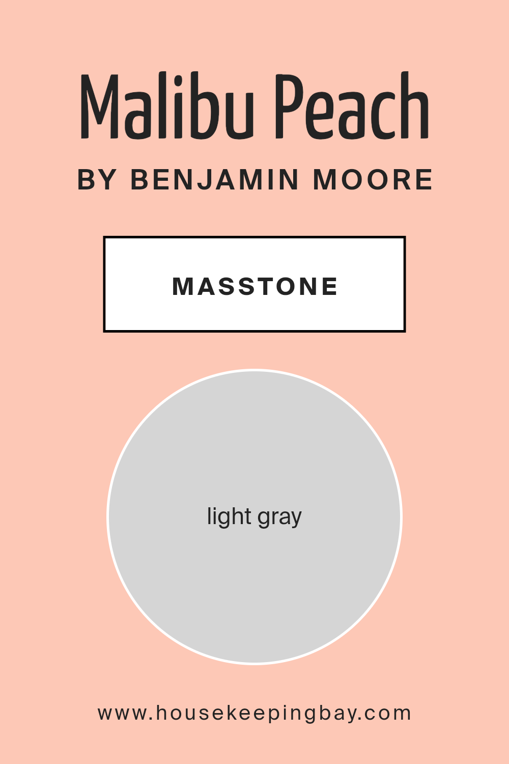
What is the Masstone of the Malibu Peach 2169-50 by Benjamin Moore?
The color Malibu Peach 2169-50 by Benjamin Moore, despite its name, appears as a light gray (#D5D5D5) in its masstone. This shade of gray brings a subtle, soft quality to rooms where it’s used, making it ideal for creating a soothing and peaceful environment.
Malibu Peach is very versatile, fitting well in various areas of a home, including living rooms, bedrooms, and kitchens. Because it is a neutral color, it pairs effortlessly with a wide range of other colors, from vibrant hues to other neutral tones. This makes it easy for homeowners to incorporate it into existing décor or to use it as a foundation for a new design scheme.
The lightness of the gray helps to make spaces feel more open and airy, which is particularly beneficial in smaller rooms or areas with limited natural light. Overall, Malibu Peach2169-50 is a practical and adaptable choice that can help create a comfortable and inviting home environment.
housekeepingbay.com
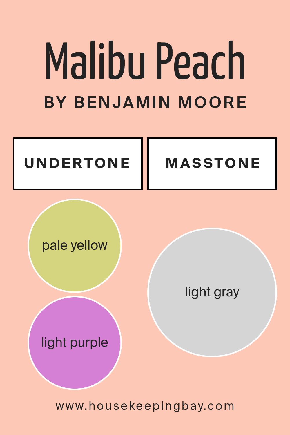
Undertones of Malibu Peach 2169-50 by Benjamin Moore
Malibu Peach 2169-50 by Benjamin Moore is a vibrant shade that has a complexity created by its rich undertones. Undertones are secondary colors that influence the main hue. They can shift the perception of the primary color based on lighting and surrounding elements.
The undertones in Malibu Peach include pale yellow, which adds a brightness and warmth, making the space feel sunny and welcoming. Light purple and pale pink introduce a subtle softness that lends a gentle, soothing feel to the color. These pinkish hues can make rooms feel more intimate and cozy. Light blue and mint undertones bring a fresh, airy quality to Malibu Peach, making it feel more spacious and open. The lilac undertone adds a hint of playfulness and creativity, perfect for stimulating spaces or creative corners.
Grey as an undertone gives Malibu Peach a grounded, balanced look, preventing the color from being overly vibrant and helping it maintain a sophisticated neutrality.
In interior walls, these undertones mean that Malibu Peach will change appearance under different lighting conditions. Natural light will enhance its warmth, making the room feel vibrant and energetic, while artificial lighting might highlight its cooler undertones, bringing a calm, serene feel to the environment.
This dynamic appearance makes Malibu Peach a versatile choice for various rooms, adapting uniquely to each space’s lighting and decor.
housekeepingbay.com
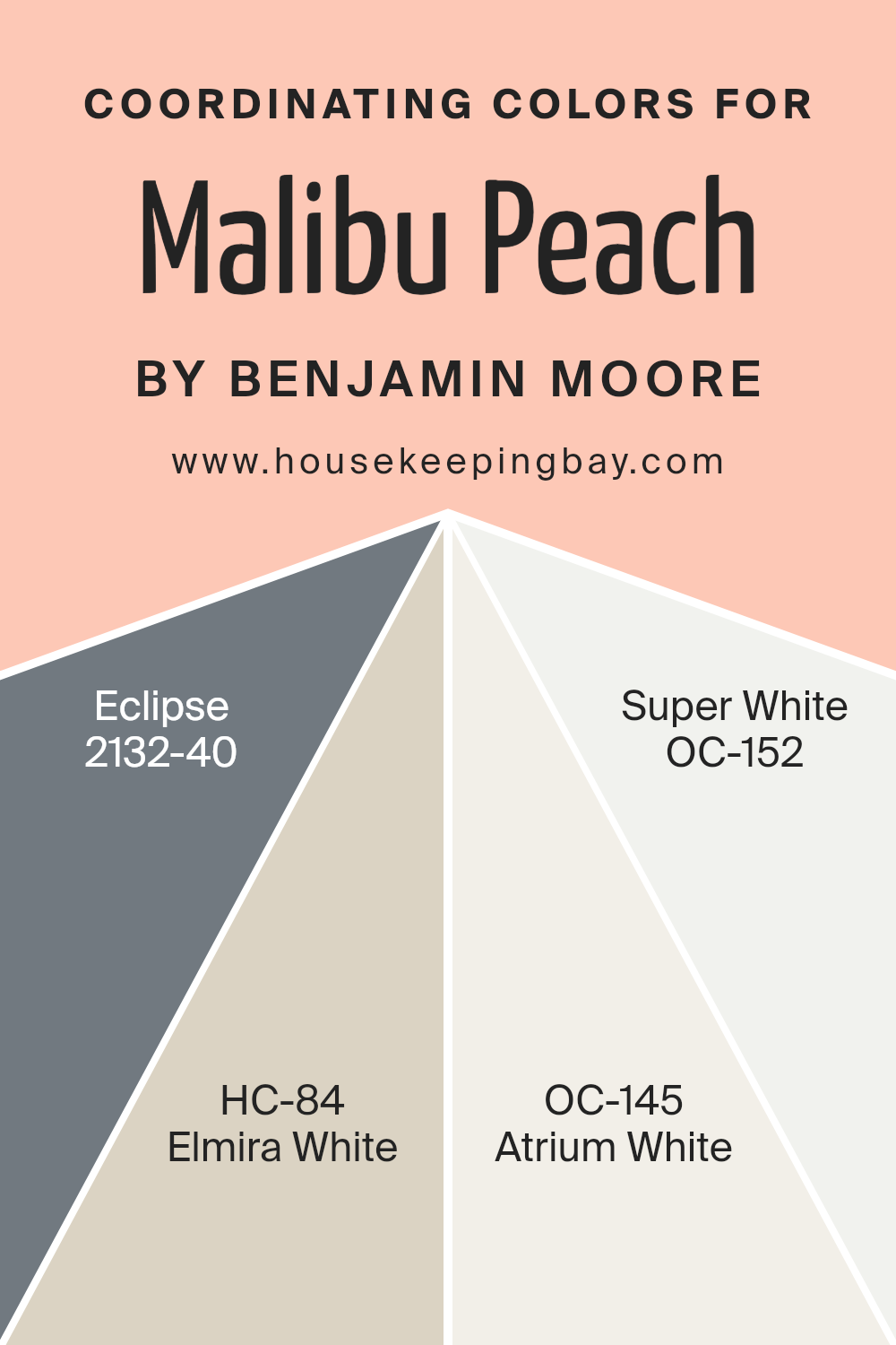
Coordinating Colors of Malibu Peach 2169-50 by Benjamin Moore
Coordinating colors are chosen to complement the main color in a palette, enhancing the overall aesthetic of a room by creating balance and harmony. These colors are selected based on their ability to support and accentuate the primary hue without overpowering it. Coordinating colors can vary in shades and tones, ranging from lighter or darker variations of the main color to contrasting colors that offer a visually appealing combination. When used thoughtfully, coordinating colors can bring a cohesive look to any space, highlighting architectural features or creating desired moods.
For instance, Malibu Peach 2169-50 by Benjamin Moore can be beautifully enhanced by using colors like Eclipse 2132-40, a deep, rich navy that offers a bold contrast to the peach’s soft warmth.
Elmira White HC-84, on the other hand, is a gentle off-white with subtle undertones that complement without stark contrasts, ensuring the peach hue stands out without clashing. Atrium White OC-145 offers a clean, crisp backdrop, helping to make the room feel open and airy while still supporting the warmth of Malibu Peach.
Lastly, Super White OC-152 provides a bright, pure white that acts as a fresh canvas to highlight and lift the peach tones of the main color. Together, these coordinating colors work to enhance the beauty of Malibu Peach, allowing it to shine in various design settings.
You can see recommended paint colors below:
- 2132-40 Eclipse
- HC-84 Elmira White
- OC-145 Atrium White
- OC-152 Super White
housekeepingbay.com
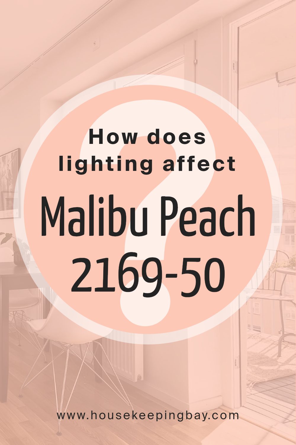
How Does Lighting Affect Malibu Peach 2169-50 by Benjamin Moore?
Lighting plays a crucial role in how colors appear in different environments. The color Malibu Peach 2169-50 by Benjamin Moore can look quite different under various lighting conditions due to this interplay.
In artificial light, Malibu Peach 2169-50 tends to display a warmer and more vibrant hue. This is because most artificial lighting, like incandescent bulbs, enhances the warmer tones in paint colors. The peach shade becomes cozy and inviting, making it a great choice for living spaces where artificial light is used in the evenings.
In natural light, the appearance of Malibu Peach 2169-50 can vary significantly throughout the day. Natural light generally provides a truer representation of color, but the specific characteristics of the light depending on the time of day and weather conditions can alter how it’s perceived.
In rooms facing north, Malibu Peach 2169-50 might appear slightly muted and cooler because north-facing rooms receive less direct sunlight. The color will look soft and subtle in these settings, providing a gentle backdrop rather than a bold statement.
South-facing rooms, however, bathe in abundant sunlight, enhancing the warmth and liveliness of Malibu Peach 2169-50. Here, the color feels bright and cheerful, making the room feel welcoming and warm throughout the day.
East-facing rooms receive strong light in the morning when the sun rises, making Malibu Peach 2169-50 look particularly vivid and bright in the mornings but softer as the day progresses and the natural light diminishes. This offers a dynamic quality to the room, varying the mood from morning to evening.
West-facing rooms experience the opposite effect; the color looks softer during the morning and becomes increasingly warmer and richer towards the evening as the sunlight intensifies. This quality makes Malibu Peach 2169-50 a perfect backdrop for rooms used more frequently in the afternoons and evenings.
Overall, the changing light throughout the day and the orientation of the room significantly affect how Malibu Peach 2169-50 is perceived, making it a versatile color choice for various spaces and functionalities.
housekeepingbay.com
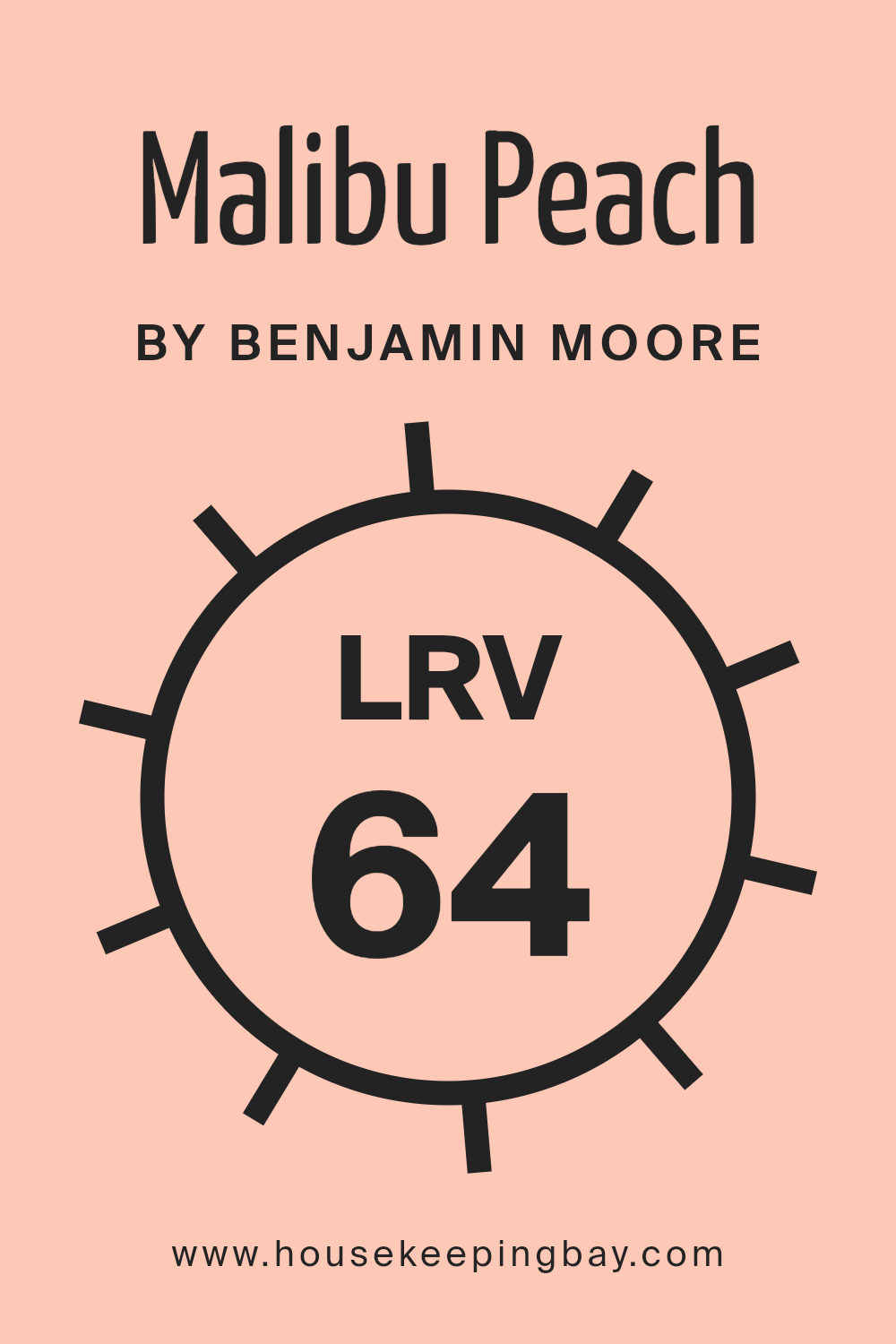
What is the LRV of Malibu Peach 2169-50 by Benjamin Moore?
LRV stands for Light Reflectance Value, a measurement that quantifies how much light a paint color reflects back into a room. It is represented on a scale from 0, which is completely black, absorbing all light, to 100, which is pure white, reflecting all light back. This value can greatly impact how a color appears once it’s applied to your walls.
A higher LRV can make a room feel brighter and more open, as more light is reflected around the room. In contrast, colors with lower LRVs may make a space feel more cozy or smaller because they absorb more light.
Considering Malibu Peach 2169-50 by Benjamin Moore with an LRV of 64.4, this places the color in the medium-to-high reflectance category. This means the color is fairly light and will reflect a good amount of light, contributing to a brighter appearance in a room. The peach hue will provide a warm and welcoming feel while helping to keep the space feel light and airy. This makes it a good choice for areas where you want to enhance natural light or make a space appear larger without resorting to very pale or neutral colors.
housekeepingbay.com
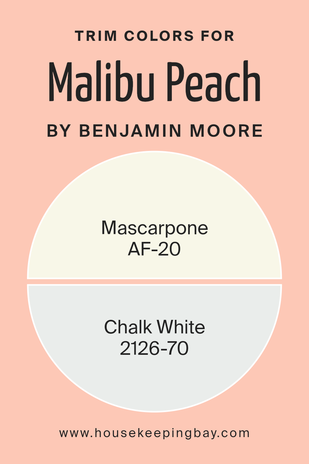
What are the Trim colors of Malibu Peach 2169-50 by Benjamin Moore?
Trim colors are specific hues selected to complement or contrast with the main color on walls or other surfaces, used primarily on moldings, window frames, doors, and other architectural features. For a color like Malibu Peach 2169-50 by Benjamin Moore, trim colors play a crucial role in enhancing the overall appearance by defining and accentuating the architectural details of a room.
AF-20 – Mascarpone and 2126-70 – Chalk White are excellent choices as trim colors for Malibu Peach 2169-50 because they can soften or highlight the peach shade, ensuring that the walls are the focal point while the trim neatly frames and supports the color scheme.
AF-20 – Mascarpone by Benjamin Moore is a warm, creamy white that offers a soft edge without overwhelming the primary color. Its understated ivory tone pairs beautifully with warmer hues, making it a perfect trim color for the cozy yet lively Malibu Peach. On the other hand, 2126-70 – Chalk White is a cleaner, brighter white that provides a crisp contrast.
This sharper white can make the peach pop more distinctly, providing a fresh and clean boundary that clearly defines the transition between wall and trim. Both colors support the peach in their unique ways, either by blending smoothly or by offering a striking boundary, and their use can significantly enhance the look and feel of a room.
You can see recommended paint colors below:
- AF-20 Mascarpone
- 2126-70 Chalk White
housekeepingbay.com
Colors Similar to Malibu Peach 2169-50 by Benjamin Moore
Choosing similar colors for your space is essential in creating a cohesive and harmonious look. Similar colors, like hues that can be found around Malibu Peach 2169-50 by Benjamin Moore, work beautifully together because they share a common intensity and saturation.
These shades belong to the same color family and therefore naturally complement each other, offering a seamless visual experience. For instance, melding colors like Coral Buff 024 and Phoenix Sand 017, which are close relatives in the color spectrum, can generate a warm and inviting ambiance. This is because the subtle differences among these colors add depth without creating visual discord.
Coral Buff 024 is a light, warm peach hue that radiates a gentle and soothing feel, making it perfect for a comforting space like a bedroom or living area. Not far from it on the color wheel, Phoenix Sand 017 adds a touch of earthiness with its slightly more muted peach tone, enhancing rooms with a natural, grounded effect. Teacup Rose 2170-50 offers a slightly different take with its soft rosy pink, providing a whimsical yet subtle flair that pairs effortlessly with Malibu Peach.
Lastly, Salmon Peach 2013-50 brings in a brighter and more energetic vibe, injecting a fresh and lively mood into settings. Utilizing these similar shades contributes to a design that is not only cohesive but also versatile, enabling the mixing and matching of decor elements effortlessly.
You can see recommended paint colors below:
- 024 Coral Buff
- 017 Phoenix Sand
- 2170-50 Teacup Rose
- 2013-50 Salmon Peach

housekeepingbay.com
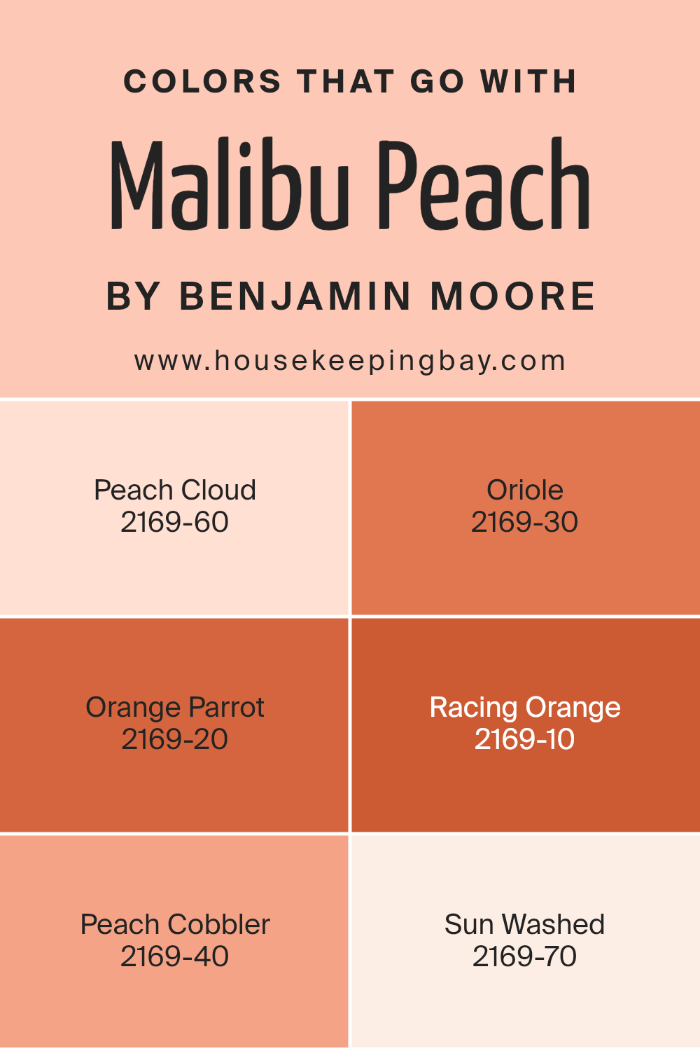
Colors that Go With Malibu Peach 2169-50 by Benjamin Moore
Choosing the right colors to pair with Malibu Peach 2169-50 by Benjamin Moore can significantly enhance the visual appeal and overall mood of a space. Pairing colors effectively can create a cohesive look, balancing and complementing the dominant hue. Malibu Peach is a vibrant yet soothing paint color that acts as a fantastic base for a variety of complementary shades, each adding its own character while supporting the primary color’s warmth.
Peach Cloud 2169-60 is a lighter, airier version of Malibu Peach, offering a subtle contrast that is perfect for creating a gentle, soothing atmosphere in spaces like bedrooms or nurseries. Oriole 2169-30, on the other hand, is a deeper, more intense shade that brings a dynamic energy to the room, ideal for areas of the home where a bit of drama is desired.
Orange Parrot 2169-20 offers a bold, fiery hue that demands attention, making it great for accent walls or decorative details that need to stand out. Racing Orange 2169-10 is even deeper and more vivid, suitable for vibrant, energetic spaces. Peach Cobbler 2169-40 provides a sweeter, more subdued complement to Malibu Peach, excellent for crafting a welcoming and warm environment.
Lastly, Sun Washed 2169-70 is the softest in the palette, offering a nearly neutral backdrop that allows other colors to shine, ideal for more minimalist or serene designs. By combining these colors thoughtfully, one can achieve a beautifully harmonious space.
You can see recommended paint colors below:
- 2169-60 Peach Cloud
- 2169-30 Oriole
- 2169-20 Orange Parrot
- 2169-10 Racing Orange
- 2169-40 Peach Cobbler
- 2169-70 Sun Washed
housekeepingbay.com
How to Use Malibu Peach 2169-50 by Benjamin Moore In Your Home?
Malibu Peach 2169-50 by Benjamin Moore is a lively, peachy paint color that brings warmth and cheer to any room. This shade is perfect for those looking to add a soft, inviting glow to their living space. You can use Malibu Peach in various areas of your home.
In the kitchen, it pairs beautifully with white cabinets or dark countertops, creating a fresh and cozy atmosphere. This color also works well in a bedroom, where it offers a soothing backdrop that’s not too bold but still adds a touch of personality.
For those who have smaller spaces such as a bathroom or an entryway, Malibu Peach can make the area feel more open and welcoming. This color also coordinates nicely with light woods and natural materials, enhancing the sense of warmth. Whether you choose to paint an accent wall, a full room, or even just a piece of furniture, Malibu Peach 2169-50 can help make your home feel more personalized and lively.
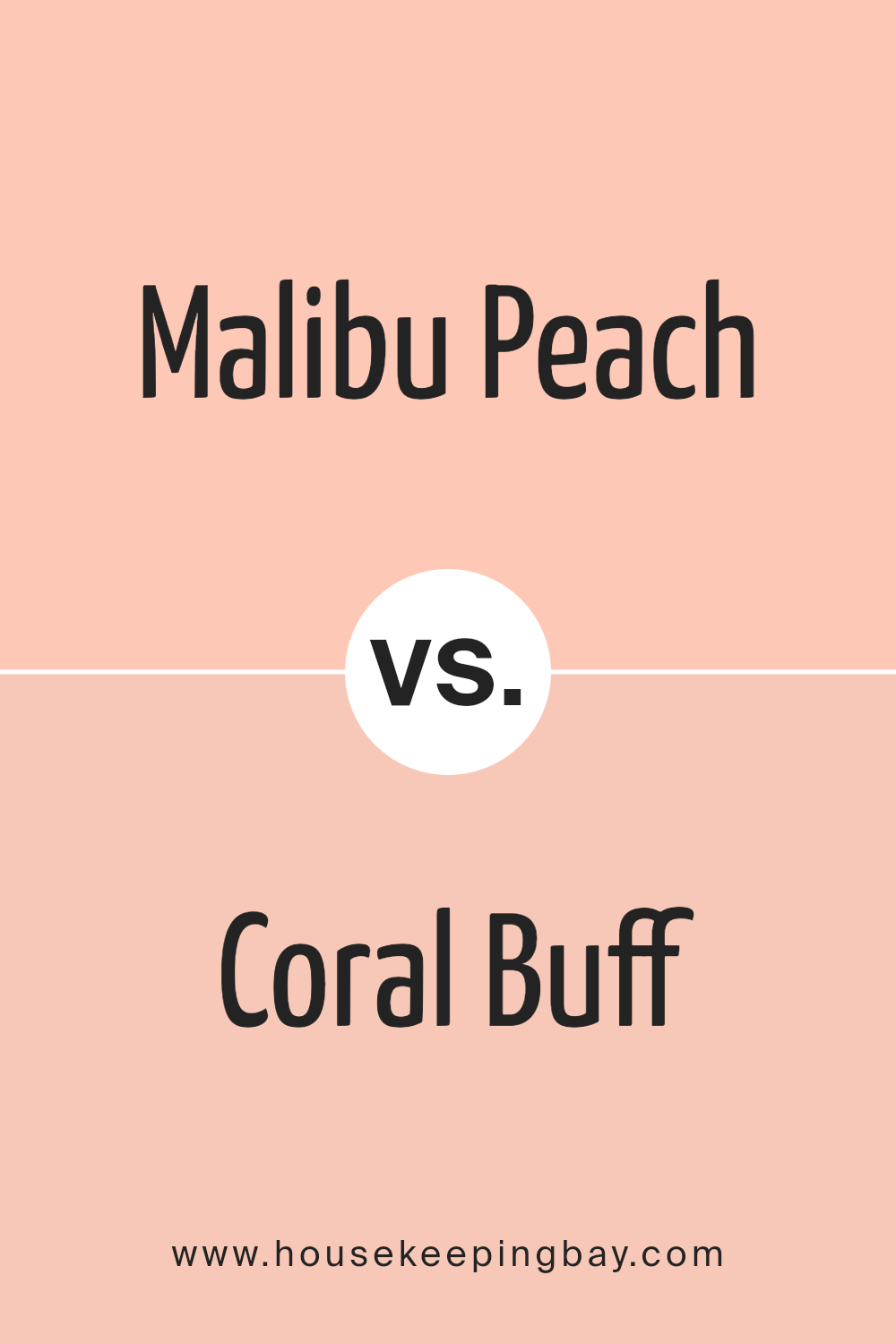
Malibu Peach 2169-50 by Benjamin Moore vs Coral Buff 024 by Benjamin Moore
Malibu Peach 2169-50 by Benjamin Moore is a soft, gentle peach shade that radiates warmth and coziness. Its light, airy quality makes it a perfect choice to make small spaces feel larger and more inviting. Malibu Peach delivers a subtle vibrancy, which enables it to blend seamlessly with both light neutrals and darker hues, offering flexibility in home decor schemes.
In contrast, Coral Buff 024 by Benjamin Moore leans towards a slightly more saturated hue. This color has a richer, more pronounced coral tone that adds an energizing spark to any room. It’s ideal for creating focal points in spaces, or for pairing with deep greens and blues to establish a refreshing, yet warm atmosphere.
Both colors bring their own unique charm to interiors, with Malibu Peach providing a delicate, soothing presence, and Coral Buff offering a dash of cheerfulness and warmth. They can effectively enhance different moods and styles, whether aiming for subtlety or vibrancy in your decor.
You can see recommended paint color below:
housekeepingbay.com
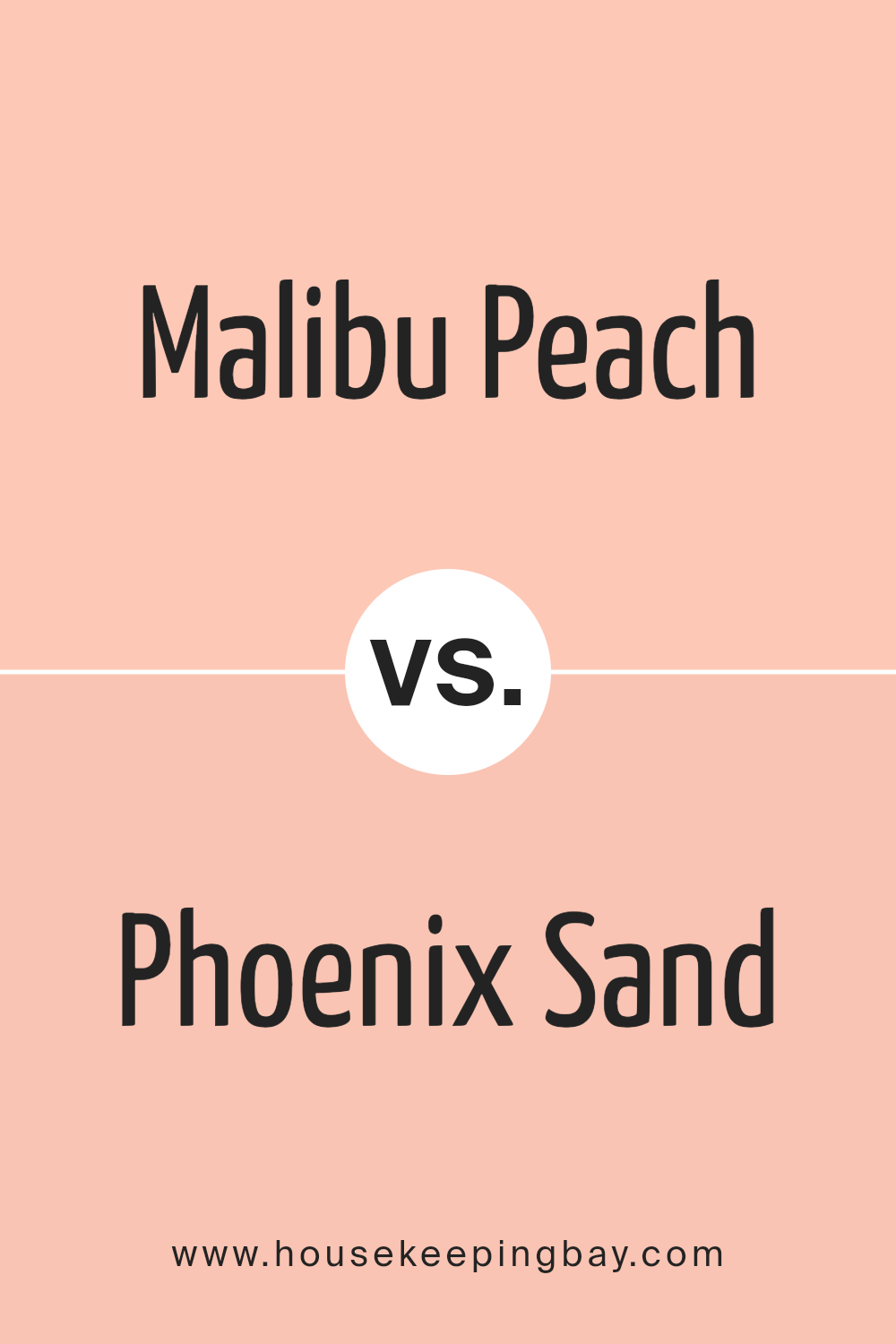
Malibu Peach 2169-50 by Benjamin Moore vs Phoenix Sand 017 by Benjamin Moore
Main color, Malibu Peach 2169-50 by Benjamin Moore, is a soft and gentle hue, similar to the inside of a peach. It gives a warm, soothing vibe, ideal for creating a cozy and inviting atmosphere in spaces like living rooms or bedrooms. This color pairs well with light woods and other warm tones to enhance a relaxed and comfortable setting.
In contrast, Phoenix Sand 017 by Benjamin Moore is a neutral shade, reminiscent of the natural color of sand. It’s versatile and unobtrusive, making it an excellent background for bolder colors or as a standalone color for a minimalist design. Phoenix Sand works well in any room, providing a clean, calm base that complements a wide range of décor styles and other colors.
Both colors offer unique qualities: Malibu Peach adds warmth and cheer to a room, while Phoenix Sand offers a subtle, calming presence. They can be used together to create a balanced and harmonious look.
You can see recommended paint color below:
- 017 Phoenix Sand
housekeepingbay.com
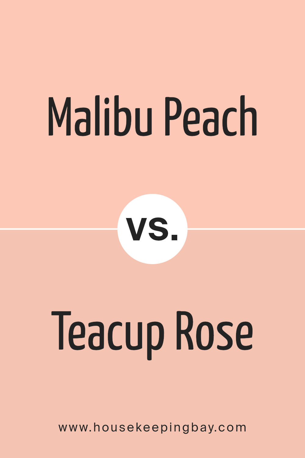
Malibu Peach 2169-50 by Benjamin Moore vs Teacup Rose 2170-50 by Benjamin Moore
Malibu Peach 2169-50 by Benjamin Moore is a warm, soft peach shade that gives a sunny, inviting feel to any space. It’s great for adding a touch of cheerfulness and coziness, making it perfect for living areas and kitchens where you want a friendly atmosphere. This color tends to brighten rooms, reflecting light in a subtle way that can make small spaces seem larger and more open.
Teacup Rose 2170-50, also by Benjamin Moore, is a gentle pink hue with a soft, soothing quality. It’s more subdued compared to Malibu Peach, lending a more reserved and delicate feel. This color is ideal for spaces where you want a hint of color without overwhelming the senses. It works well in bedrooms or bathrooms, providing a soft backdrop that complements a relaxing environment.
Both colors can enhance a variety of decorating styles and are versatile, but while Malibu Peach adds warmth, Teacup Rose offers a cooler, understated elegance.
You can see recommended paint color below:
- 2170-50 Teacup Rose
housekeepingbay.com
Malibu Peach 2169-50 by Benjamin Moore vs Salmon Peach 2013-50 by Benjamin Moore
Malibu Peach 2169-50 and Salmon Peach 2013-50, both by Benjamin Moore, show subtle differences in their undertones and vibes. Malibu Peach leans towards lighter, more pastel hues, offering a gentle, airy feel perfect for spaces needing a calming, soft touch. This color works well in rooms with plenty of sunlight, where it can appear almost ethereal.
Salmon Peach, meanwhile, has a richer, deeper tone, comparable to the flesh of its namesake fruit. This color provides a warm and welcoming ambience, making it ideal for lively areas such as living rooms or kitchens. It can add a sense of coziness and comfort, especially in spaces that aim to foster relaxation and warmth.
Both colors are versatile and can create inviting environments, but their differences in depth and intensity might make Malibu Peach a better match for someone seeking a subtle backdrop, while Salmon Peach suits those looking for a bit more vibrancy.
You can see recommended paint color below:
- 2013-50 Salmon Peach
housekeepingbay.com
After reading about 2169-50 Malibu Peach by Benjamin Moore, I am eager to share my thoughts on how this color could impact home decor. This shade of peach offers a warm, inviting tone that seems perfect for creating a cozy, yet vibrant atmosphere in any room. Its softness has a soothing quality which could work beautifully in bedrooms and living spaces where comfort is key.
I think what makes Malibu Peach unique is its versatility. It pairs well with both light and dark furnishings, making it a practical choice for those looking to refresh their interiors without a complete overhaul. Additionally, it could be a great backdrop for a variety of decor styles, from modern minimalist to bohemian chic.
Utilizing Malibu Peach could be a clever way to add a touch of warmth to a space without the intensity of a bolder orange or a deeper red. This subtle yet lively shade could also be accentuated by various textures and complementary colors to create a more dynamic environment.
Overall, 2169-50 Malibu Peach by Benjamin Moore strikes me as a fantastic option for anyone interested in giving their home a warm, fresh look. It inspires ideas for creating spaces that feel both energized and relaxing, suitable for various personal styles and preferences.
housekeepingbay.com
