Ecru 2014-70 by Benjamin Moore
Soft Touch, Warm Vibes
When you choose a paint color for your home, you want something that feels just right. Benjamin Moore’s 2014-70 Ecru is a color you might want to consider. It has a warm, inviting tone that goes well in almost any room. This particular shade offers a soft backdrop that compliments a variety of decor styles, from modern to traditional.
If you’re thinking about refreshing your living space, Ecru provides a gentle nudge into a cozy atmosphere without overwhelming the senses. You’ll find it easy to match with furniture and accessories because of its neutral, yet warm hue.
Whether you’re redoing a bedroom, kitchen, or just adding a touch of new color to your living room, Ecru can help you create a peaceful, welcoming environment.
This guide will tell you everything you need to know about this beautiful color, how it interacts with light, and ways to incorporate it into your decorating plans.
via benjaminmoore.com
What Color Is Ecru 2014-70 by Benjamin Moore?
Ecru 2014-70 by Benjamin Moore is a warm, soothing beige color with a creamy, almost off-white base that imparts a gentle, welcoming ambiance to any space. This versatile hue blends subtly with a natural light, enhancing the room with a soft, airy feel.
Ecru 2014-70 offers a neutral backdrop that can adapt to various decorating styles, working particularly well in traditional, modern farmhouse, or Scandinavian interiors. Its understated elegance makes it an excellent choice for living rooms, bedrooms, and kitchens where a calm, cohesive look is desired.
This color pairs well with natural materials like wood, enhancing its warm tones, and with textures such as linen, wool, or cotton, which reinforce a sense of comfort and softness. Metallic elements in silver or brushed gold create a gentle contrast, giving a refined touch to the room. Ecru 2014-70 also complements stone textures, like marble or granite, adding depth and interest to the design.
It matches perfectly with pastels, other neutrals, or even darker shades, allowing for flexibility in decor elements like furniture, curtains, and accessories. Easy to maintain and versatile, Ecru 2014-70 helps create an inviting interior that feels harmonious and thoughtfully designed.
housekeepingbay.com
Is Ecru 2014-70 by Benjamin Moore Warm or Cool color?
Ecru2014-70 by Benjamin Moore is a warm, subtle off-white shade with a slight touch of beige, offering a soothing and cozy atmosphere to any room. This color pairs well with a variety of decorating styles, making it highly versatile for use in homes.
Whether aiming for a modern, minimalist look or a more traditional setting, Ecru2014-70 provides a neutral backdrop that complements a wide range of furniture and decor items. Its understated elegance allows for easy blending with bolder colors or can stand on its own for a clean, serene look.
Ideal for spaces where you want to add warmth without overwhelming the senses, Ecru2014-70 works particularly well in living rooms, bedrooms, and kitchens. It enhances natural light, making spaces appear brighter and more inviting during the day. In rooms with less natural light, it helps create a soft, welcoming glow. This shade is also a practical choice for walls, as it tends to hide imperfections better than stark whites.
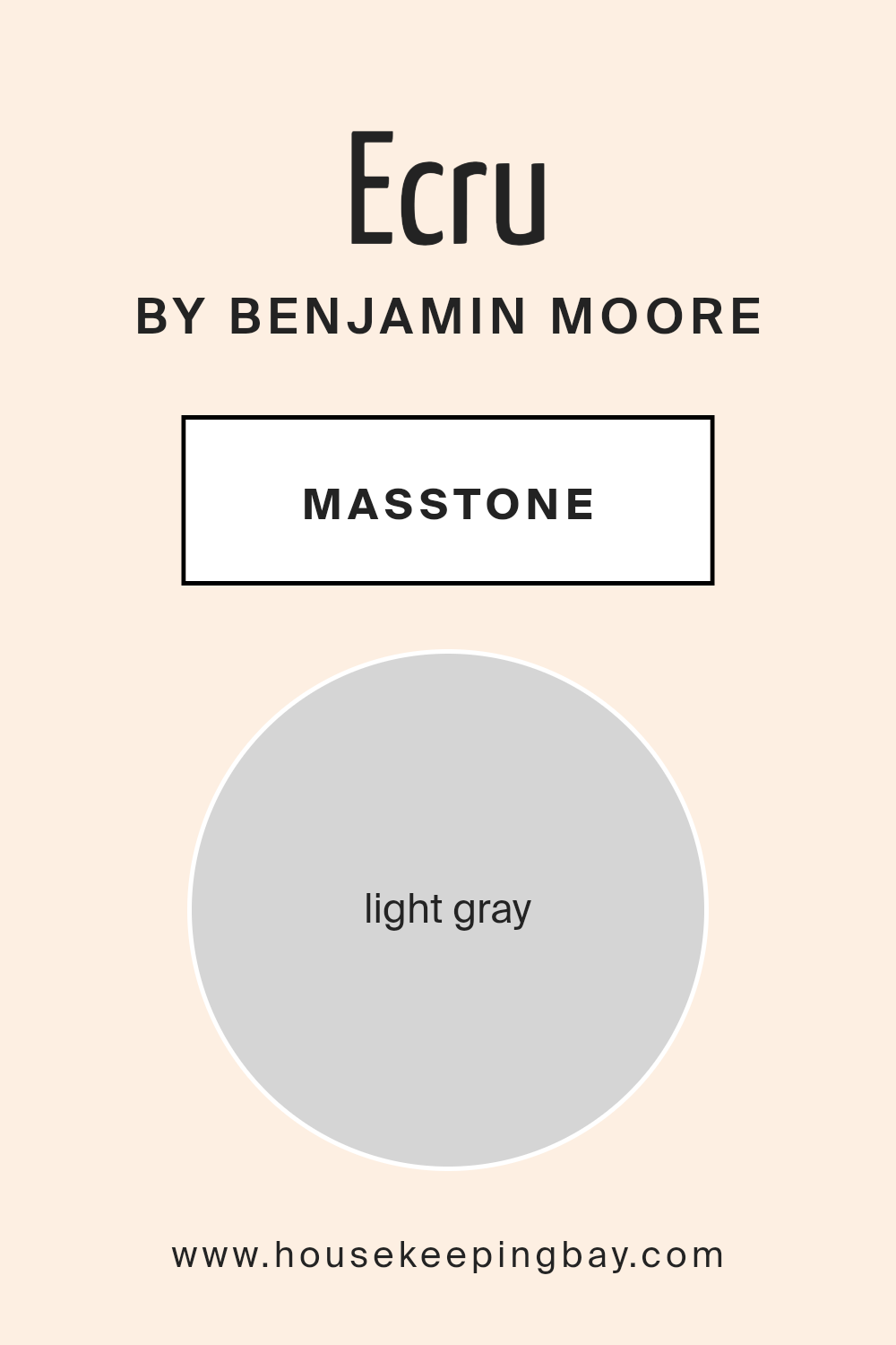
What is the Masstone of the Ecru 2014-70 by Benjamin Moore?
Ecru2014-70 by Benjamin Moore features a masstone of Light gray (#D5D5D5), a versatile shade that serves as a neutral backdrop in many homes. This particular light gray is soft and subtle, making it an excellent choice for walls as it doesn’t overwhelm the senses. It works well in rooms that need a calm and quiet atmosphere, such as bedrooms and living areas, helping to create a peaceful environment.
Since Ecru2014-70 is a light color, it can make small rooms appear larger and more open. Its neutrality means it pairs easily with many other colors, allowing for flexibility in decor choices.
Whether you’re adding bright art, colorful furniture, or keeping a more monochrome palette, this light gray provides a steady base that supports various design styles from modern to traditional. The adaptability of Ecru2014-70 makes it a favorite among homeowners who want a color that can evolve with their changing tastes and decor over time without repainting frequently.
housekeepingbay.com
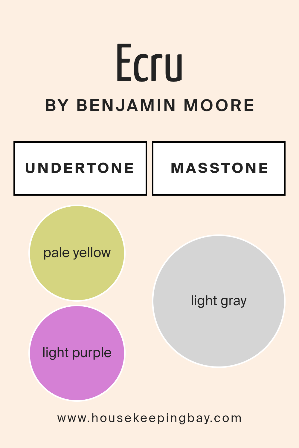
Undertones of Ecru 2014-70 by Benjamin Moore
Ecru2014-70 by Benjamin Moore is a nuanced paint color that incorporates a variety of subtle undertones, making it versatile for interior walls. The undertones present in this shade—including pale yellow, light purple, light blue, pale pink, mint, lilac, and grey—play a key role in how the color appears under different lighting conditions and when paired with other colors in room décor.
Undertones are the underlying hues that influence a color’s overall appearance. Even though Ecru2014-70 might look like a straightforward off-white or beige at first glance, its subtleties come to life depending on the surrounding elements. For example, pale yellow undertones can make a room feel warmer and more welcoming, while light blue undertones might give a cooler, calmer feel.
In an interior setting, these undertones affect how Ecru2014-70 interacts with both natural and artificial light. During daylight hours, natural light can enhance the yellow and mint undertones, making the walls seem brighter and more airy. In contrast, artificial lighting in the evening might draw out the lilac and grey undertones, lending a softer and more serene atmosphere to the space.
Furthermore, when coordinating furniture and decorations, the varied undertones in Ecru2014-70 offer a backdrop that can complement a wide range of colors from bold and vivid to soft and subtle, providing flexibility in interior design choices. This adaptability makes Ecru2014-70 an excellent choice for anyone looking to use a single wall color throughout different rooms, each with its unique character.
housekeepingbay.com
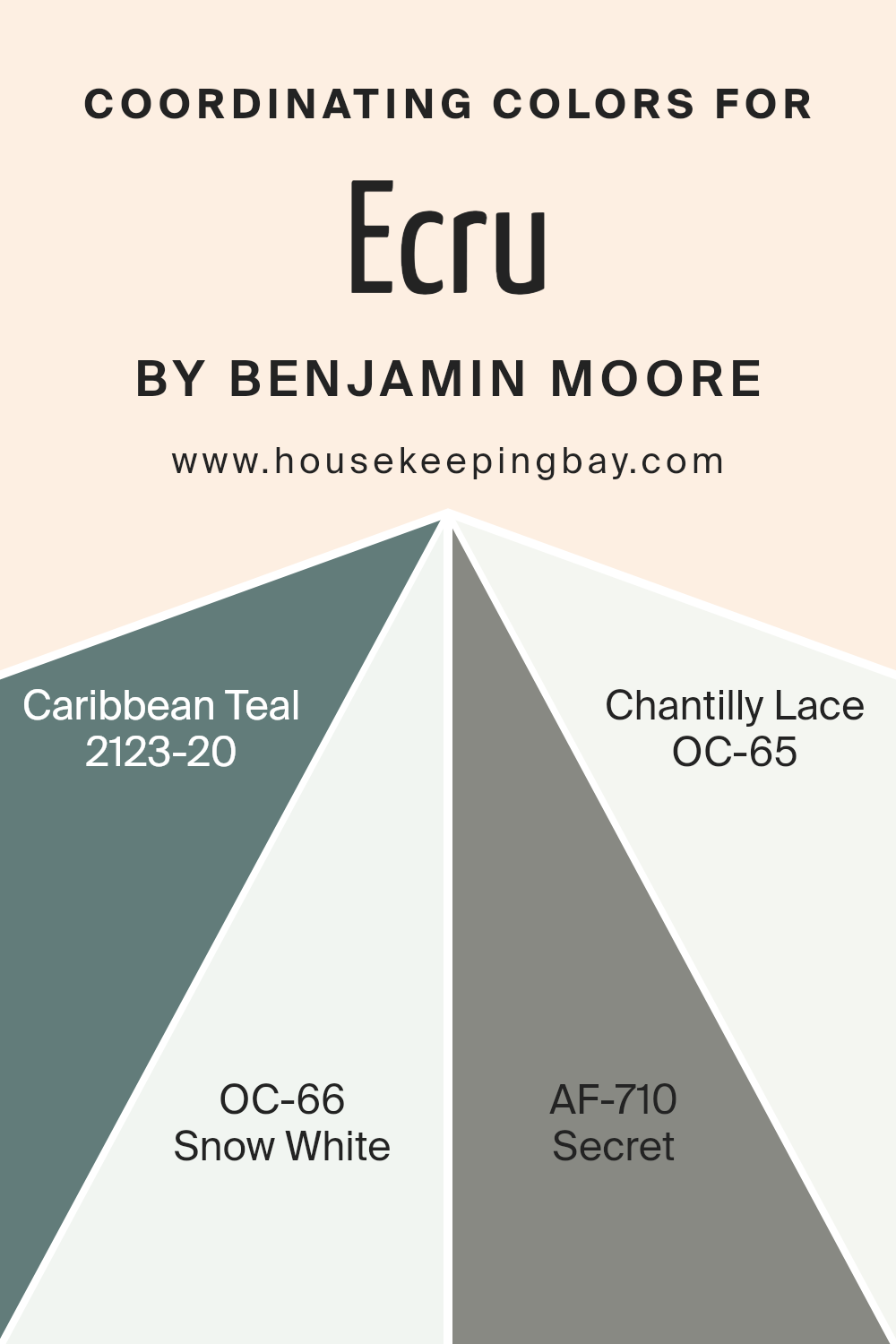
Coordinating Colors of Ecru 2014-70 by Benjamin Moore
Coordinating colors are shades that complement each other, bringing harmony and balance to a space when used together. For example, Ecru by Benjamin Moore, a soft, neutral beige, pairs well with an array of colors to create inviting atmospheres without overwhelming the senses. Selecting the right combinations can enhance the natural charm and character of your rooms, allowing for personal expression while maintaining a cohesive look.
Caribbean Teal, or 2123-20, provides a rich contrast with its deep, green-blue hue, perfect for adding depth and a hint of sophistication. Snow White, known as OC-66, serves as a crisp, clean backdrop that can brighten any space and virtually works with any palette, amplifying light and space. Secret, or AF-710, brings an air of mysterious elegance with its deep, muted gray tone, ideal for creating a serene yet impressive ambiance.
Chantilly Lace, described as OC-65, is a pure, bright white with a subtle warmth; it effortlessly highlights any color it accompanies, ensuring a fresh and inviting environment. Together, these shades from Benjamin Moore help achieve a well-rounded and enjoyable color scheme that enriches the feel and appearance of any room.
You can see recommended paint colors below:
- 2123-20 Caribbean Teal
- OC-66 Snow White
- AF-710 Secret
- OC-65 Chantilly Lace
housekeepingbay.com
How Does Lighting Affect Ecru 2014-70 by Benjamin Moore?
Lighting has a profound impact on how colors are perceived. Different light sources can change the appearance of a color, making it look more vibrant or muted. The color Ecru2014-70 by Benjamin Moore is a neutral shade that can appear differently depending on the lighting conditions it is subjected to.
In artificial light, Ecru2014-70 tends to warm up. Typical indoor lights, like incandescent or warm LED bulbs, enhance the yellow and beige undertones of this neutral color, making it appear cozier and softer.
It’s ideal for spaces meant to feel inviting and comfortable.
Under natural light, Ecru2014-70 reflects more faithfully its true color.
During the daylight, this color can appear lighter and more airy, providing a clean and subtle background that complements natural elements and brighter colors. The quality and angle of sunlight can also influence its appearance.
In north-faced rooms, Ecru2014-70 might look slightly cooler and more muted. North-facing light is often softer, which can subdue the warm tones of this color, making it appear more neutral and consistent throughout the day.
South-faced rooms, on the other hand, receive more intense light, especially in the afternoons. Here, Ecru2014-70 can appear warmer and brighter, bringing out its creamy undertones. The color can help make these rooms feel more lively and cheerful due to the abundance of natural light.
In east-faced rooms, Ecru2014-70 benefits from the warm, gentle morning light. This early day sunlight can make the color appear softer and slightly warm, ideal for bedrooms or breakfast nooks where a gentle, refreshing color is beneficial.
West-faced rooms encounter the most dramatic changes. As the sun sets, the warm and sometimes golden afternoon light can intensify the warm undertones of Ecru2014-70, making it appear richer and more vibrant toward the evening.
Understanding these nuances helps in deciding where to apply the color Ecru2014-70 to utilize its versatility depending on room orientation and lighting.
housekeepingbay.com
What is the LRV of Ecru 2014-70 by Benjamin Moore?
LRV stands for Light Reflectance Value, a measurement indicating the percentage of light a paint color reflects. This scale ranges from 0 (absolute black, absorbing all light) to 100 (pure white, reflecting all light). LRV helps in understanding how light or dark a color will look once applied to a space.
It’s particularly useful when choosing paint colors for interior or exterior use, as the amount of natural light a room receives can significantly influence the appearance of the color. Higher LRV values mean the color will appear lighter and can make a small room feel more spacious by reflecting more light around the space.
Considering Ecru 2014-70 by Benjamin Moore, which has an LRV of 84.76, this color is very light, reflecting a considerable amount of light. It’s a good choice for spaces that might not get a lot of sunlight or for making a room feel airy and open. Because it’s so close to white, it acts as a neutral backdrop, giving the room a calm and light feel without the starkness of pure white.
This light reflectance also means it can help in reducing the need for artificial lighting during the day, potentially lowering energy usage. Its high LRV makes it versatile for use in many areas and styles, enhancing natural light’s effect and contributing to a welcoming atmosphere.

housekeepingbay.com
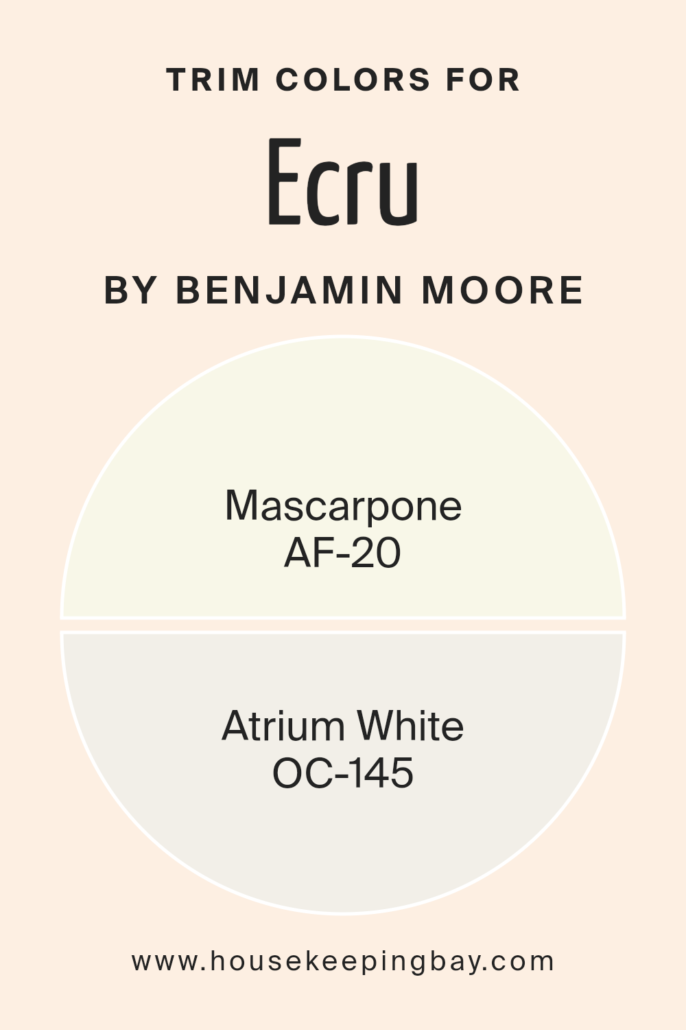
What are the Trim colors of Ecru 2014-70 by Benjamin Moore?
Trim colors are the shades used on the architectural elements of a room such as door frames, window frames, and moldings that outline and define the spaces. When paired with main wall colors, trim colors help to accentuate and bring a crisp finish to the look of walls. For example, Ecru 2014-70 by Benjamin Moore can benefit greatly from well-chosen trim colors like AF-20 – Mascarpone and OC-145 – Atrium White.
These colors provide a subtle yet noticeable contrast that enhances the overall appearance, ensuring that the boundaries in a room are neatly detailed and that they complement the broader design scheme.
AF-20 – Mascarpone by Benjamin Moore is a soft, creamy white that offers a touch of warmth, making it an ideal choice as a trim color. This warm tone complements richer and darker colors by softening the overall feel of the room without creating a stark contrast. OC-145 – Atrium White, on the other hand, is a brighter, pure white with a clean and refreshing look.
It’s perfect for use as a trim color to create a clear boundary that naturally draws the eye, making it especially effective in spaces that aim for a fresh, cohesive look. Together, these trim colors work beautifully with Ecru 2014-70 to achieve a harmonious and refined interior aesthetic.
You can see recommended paint colors below:
- AF-20 Mascarpone
- OC-145 Atrium White
housekeepingbay.com
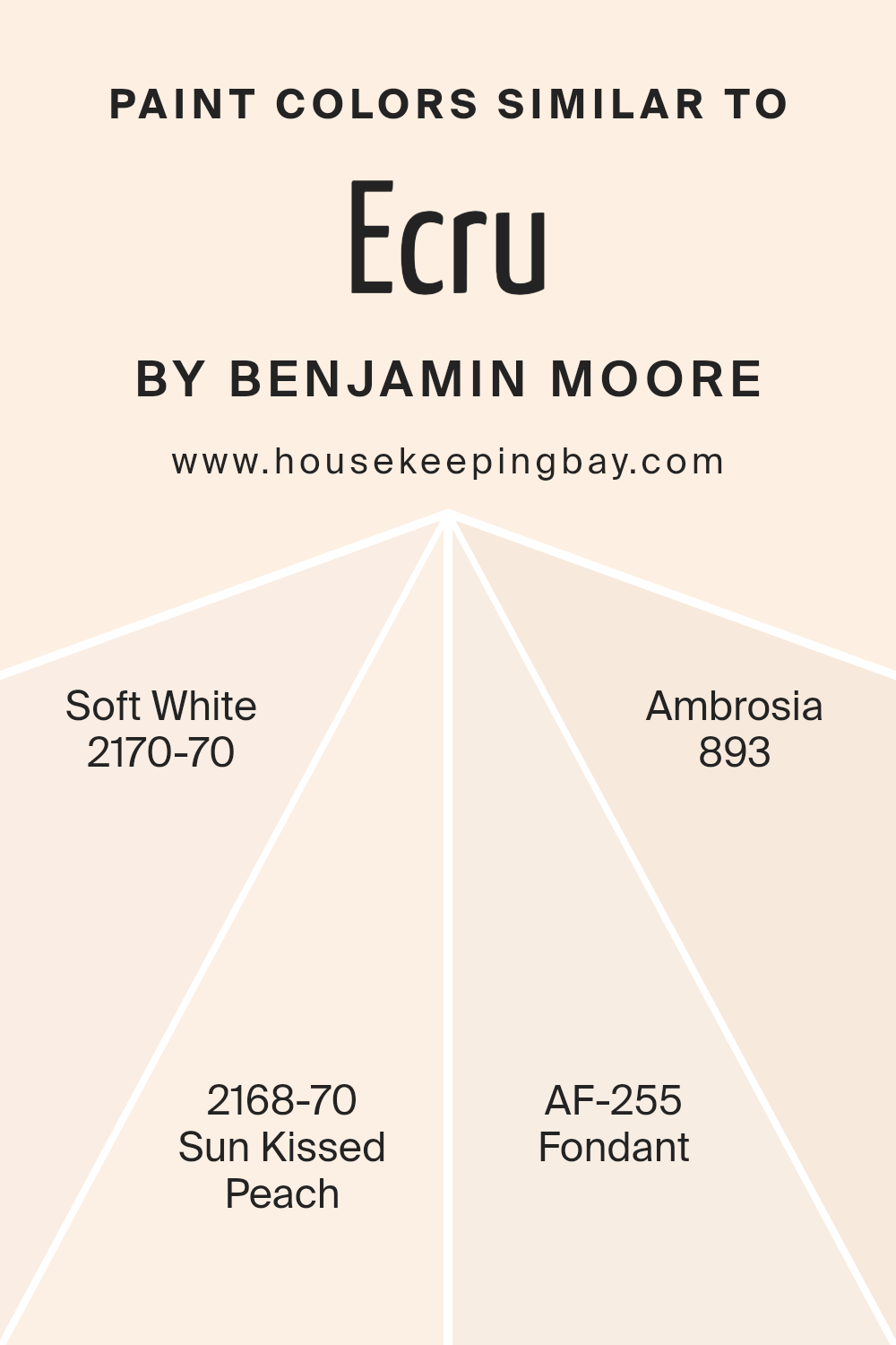
Colors Similar to Ecru 2014-70 by Benjamin Moore
Similar colors play a crucial role in creating a cohesive and harmonious aesthetic in any interior space. When colors like Ecru2014-70 by Benjamin Moore and its allied shades such as Soft White, Sun Kissed Peach, Fondant, and Ambrosia are used together, they help to achieve a seamless transition between spaces, giving a room a well-rounded and complete look.
These similar tones can also amplify the sense of light and space, making smaller rooms feel larger and more inviting. Additionally, using shades that closely relate to one another allows for a sophisticated and subtle design palette that can maintain interest without overwhelming the senses. This approach is extremely beneficial in achieving design continuity and fluency throughout a home or a single room.
2170-70 – Soft White offers a gentle off-white tone that gives a clean and airy feel to the space, perfect for making other colors stand out or soothing the overall ambiance. On the other hand, 2168-70 – Sun Kissed Peach provides a light, peachy flush that adds a soft, warm glow, ideal for adding a touch of freshness without overpowering with color. AF-255 – Fondant is a richer, deeper tone that resembles soft clay, providing depth and warmth, perfect for creating a cozy and inviting atmosphere.
Lastly, 893 – Ambrosia is a pale, almost mythically gentle green that can refresh and soothe any space, offering a subtle hint of natural elements and softness to a room’s decor. Using these similar colors allows designers and homeowners to craft spaces that not only look good but also feel cohesive and thoughtfully calibrated.
You can see recommended paint colors below:
- 2170-70 Soft White
- 2168-70 Sun Kissed Peach
- AF-255 Fondant
- 893 Ambrosia
housekeepingbay.com
Colors that Go With Ecru 2014-70 by Benjamin Moore
Choosing colors that harmonize with Ecru 2014-70 by Benjamin Moore is key to achieving a cohesive and pleasant aesthetic in any space. Ecru 2014-70, a soft, creamy neutral, serves as an excellent backdrop for a range of complementary colors. When paired with shades like Springtime Peach 2014-50 and Whispering Peach 2014-60, the environment gains a gentle warmth.
Springtime Peach brings a fresh, light peach tone that infuses a subtle vibrancy, ideal for creating a soothing yet cheerful ambiance. Whispering Peach is slightly quieter, offering a delicate whisper of peach that enhances spaces with a soft, almost ethereal quality.
For those interested in adding a bit of zest, Rumba Orange 2014-20 and Festive Orange 2014-10 provide bolder options that still maintain harmony with Ecru. Rumba Orange is a lively, bright hue that injects energy and personality into a room, perfect for accent walls or decorative elements. Festive Orange, as the name suggests, is a vivid, cheerful orange that brings a festive spirit to any interior. Additionally, Peachy Keen 2014-40 and Tangy Orange 2014-30 round out the palette by offering a playful yet sophisticated look.
Peachy Keen has a muted, dusky peach tone that is versatile and understated, while Tangy Orange offers a zesty pop that can instantly brighten and refresh a space. Together, these colors complement Ecru 2014-70, ensuring a balanced, harmonious look that is both inviting and visually appealing.
You can see recommended paint colors below:
- 2014-50 Springtime Peach
- 2014-60 Whispering Peach
- 2014-20 Rumba Orange
- 2014-10 Festive Orange
- 2014-40 Peachy Keen
- 2014-30 Tangy Orange

housekeepingbay.com
How to Use Ecru 2014-70 by Benjamin Moore In Your Home?
Ecru 2014-70 by Benjamin Moore is a soft, warm beige paint color that adds a gentle, inviting touch to any room. Its neutral tone makes it highly versatile, perfect for blending with various decor styles, from classic to contemporary.
This shade can be used in multiple areas of a home, like living rooms or bedrooms, where a calm and soothing atmosphere is desired. It pairs well with both bright accents and darker furnishings, allowing for flexibility in interior design choices. In smaller spaces such as bathrooms or hallways, Ecru 2014-70 helps to create the illusion of more space, making these areas feel larger and more open.
Additionally, it works beautifully as a base for wall art, providing a subtle background that makes colors pop without overpowering them. Ecru 2014-70 is ideal for those looking to refresh their home with a look that is both simple and refined.
Ecru 2014-70 by Benjamin Moore vs Ambrosia 893 by Benjamin Moore
Ecru 2014-70 by Benjamin Moore is a soft, pale beige that brings a warm and inviting feel to any space. It’s almost like a gentle hug for your walls, giving a cozy atmosphere that’s perfect for living rooms or bedrooms where comfort is key. This color pairs well with various decor styles, from rustic to modern, making it highly versatile.
In contrast, Ambrosia 893 is a pale, muted sage green that has a calming effect, ideal for creating serene environments. It’s subtle enough to act as a neutral yet offers a hint of color to keep spaces interesting and fresh. Ambrosia 893 works beautifully in areas where you want to promote relaxation, such as bathrooms and reading nooks.
Both colors offer a delicate, understated charm, but while Ecru leans towards a classic warmth, Ambrosia introduces a cooler, gentle splash of color. Their light tones ensure that rooms feel larger and more open, but each brings its own unique mood to the environment.
You can see recommended paint color below:
- 893 Ambrosia
housekeepingbay.com
Ecru 2014-70 by Benjamin Moore vs Soft White 2170-70 by Benjamin Moore
Ecru 2014-70 by Benjamin Moore is a neutral, creamy hue, slightly warmer than typical whites. Its subtle yellow undertones provide a cozy and inviting feel, making it ideal for spaces where a touch of warmth is desired without straying too far from a classic white. This color works well in living rooms and bedrooms, adding a soft, soothing atmosphere.
Soft White 2170-70, also by Benjamin Moore, leans towards a purer, crisper white with a very slight hint of cream, giving it a clean and fresh appearance. This shade is excellent for creating a bright and airy feel, and is especially effective in smaller spaces or rooms with less natural light, as it helps to make the area appear larger and more open.
Both colors are versatile and can easily pair with various decor styles. However, Ecru, with its warmth, suits traditional and rustic designs, while Soft White is perfect for a modern or minimalist aesthetic.
You can see recommended paint color below:
- 2170-70 Soft White
housekeepingbay.com
Ecru 2014-70 by Benjamin Moore vs Sun Kissed Peach 2168-70 by Benjamin Moore
Ecru 2014-70 by Benjamin Moore is a soft, pale beige that has a warm and subtle undertone. It gives a room a soothing, neutral backdrop which pairs well with more colorful or bold accents. This shade is versatile and can make spaces feel open and airy. It’s great for living areas, bedrooms, and kitchens where you want a cozy but light atmosphere.
Sun Kissed Peach 2168-70, also by Benjamin Moore, offers a more vibrant feel. This color is a light peach that brings a cheerful and bright presence to a room. It’s especially fitting for spaces where you want to add a touch of warmth without overwhelming the room with intensity. Sun Kissed Peach works well in bathrooms and kitchens, adding a sunny vibe.
Both colors are muted and pale, but while Ecru leans towards a neutral and calming beige, Sun Kissed Peach leans towards a playful, warm peach, adding life and brightness to spaces.
You can see recommended paint color below:
- 2168-70 Sun Kissed Peach
housekeepingbay.com
Ecru 2014-70 by Benjamin Moore vs Fondant AF-255 by Benjamin Moore
Ecru 2014-70 by Benjamin Moore is a soft, creamy off-white color that creates a calm and cozy atmosphere in any room. It’s versatile, providing a subtle backdrop that pairs well with a wide range of decor styles and colors. This shade is ideal for those who prefer understated elegance and a timeless look.
Fondant AF-255, also by Benjamin Moore, is a richer, deeper tone with a hint of pink. It brings warmth and a sense of comfort to spaces, making it a great choice for areas where you want to add a touch of softness without overwhelming the overall design. This color works well in rooms that need a bit of coziness and are enhanced by warm lighting.
Both colors have their unique appeal. Ecru 2014-70 is perfect for creating a light, airy feel, while Fondant AF-255 offers a cozy warmth. Depending on the mood you want to set in your space, each color serves its purpose beautifully.
You can see recommended paint color below:
- AF-255 Fondant
housekeepingbay.com
Conclusion
After reviewing the nuances of 2014-70 Ecru by Benjamin Moore, I find that this paint offers a level of versatility and warmth that can enhance any living space. Its creamy hue brings a soft radiance to rooms, making them feel more inviting without overwhelming the senses. Whether applied in a bustling kitchen or a quiet study, Ecru adapts effortlessly, complementing various decor styles and color palettes.
The subtle elegance of Ecru also proves ideal for creating a cohesive look throughout a home. It pairs beautifully with bold colors, bridging gaps between striking decorations and understated elegance. Additionally, the quality of Benjamin Moore paints means that this color not only looks good but also provides durability that homeowners can rely on.
For anyone looking to refresh their home with a paint that supports a range of aesthetic and practical needs, Benjamin Moore’s 2014-70 Ecru is definitely worth considering. It confirms my belief that the right shade can truly enhance the overall feel and functionality of a space.
Therefore, I see Ecru as a smart choice for anyone aiming to achieve a refined and adaptable atmosphere in their home.
housekeepingbay.com
Ever wished paint sampling was as easy as sticking a sticker? Guess what? Now it is! Discover Samplize's unique Peel & Stick samples. Get started now and say goodbye to the old messy way!
Get paint samples


