Sea Salt CSP‑95 Paint Color by Benjamin Moore
Soft Coastal Vibes
I’m drawn to Sea Salt CSP‑95 by Benjamin Moore—it feels fresh and calm.
It brings a hint of coastal breeze into your space without feeling cold.
What Color Is Sea Salt CSP‑95 by Benjamin Moore?
Sea Salt CSP‑95 is a light gray with a whisper of pale yellow and soft purple undertones. It suits coastal, Scandinavian, and minimalist interiors. It works beautifully on natural wood, linen, stone, and matte finishes for a soft, airy look.
Is Sea Salt CSP‑95 by Benjamin Moore a Warm or Cool color?
Sea Salt leans cool overall but those pale yellow and light purple undertones add quiet warmth. That balance makes it cozy yet fresh, adapting well to different lighting and styles in your home.
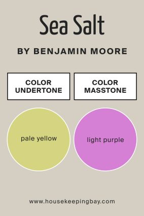
Undertones of Sea Salt CSP‑95 by Benjamin Moore
The undertones are pale yellow and light purple. The pale yellow brings a gentle warmth, while light purple adds a hint of softness. Together they prevent it from looking flat, giving walls depth in different rooms.
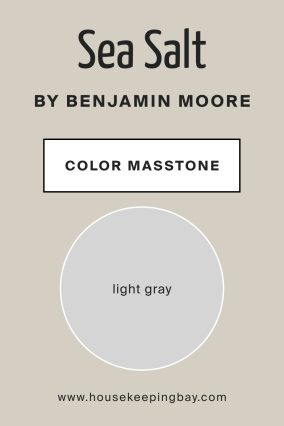
What Is the Masstone of Sea Salt CSP‑95 by Benjamin Moore?
The masstone is light gray. As a light neutral base, it’s versatile—it brightens spaces and pairs easily with bold accents or natural textures without overpowering them.
How Does Lighting Affect Sea Salt CSP‑95 by Benjamin Moore?
In natural light, Sea Salt looks crisp and subtly green-gray. In north‑facing rooms it feels cooler and serene, while south‑facing rooms bring out its pale yellow glow. East light gives it a soft morning warmth, and west light in the evening enhances its purple hint.
Under warm incandescent lights it feels cozy gray‑green, and under cooler bulbs it reads clearer gray.
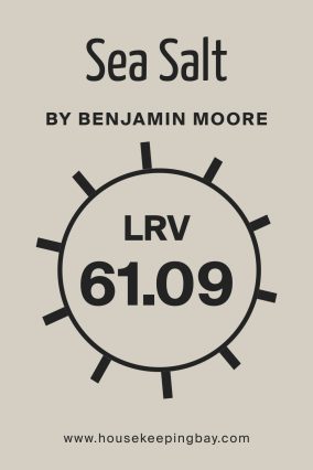
What Is the LRV of Sea Salt CSP‑95 by Benjamin Moore?
LRV stands for Light Reflectance Value, and it measures how much light a color reflects. A higher LRV means the color will make a room feel brighter and more open. A lower LRV absorbs more light, creating a cozier feel on walls.
Sea Salt’s LRV is moderate—it isn’t too dark or too bright.
That means it keeps rooms feeling light and airy but still grounded. It’s a safe choice if you want brightness without glare.
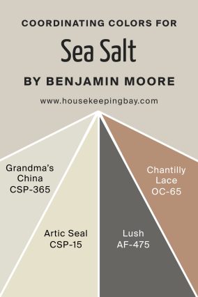
Coordinating Colors of Sea Salt CSP‑95 by Benjamin Moore
Coordinating colors like Grandma’s China CSP‑365, Arctic Seal CSP‑15, Lush AF‑475, and Chantilly Lace OC‑65 blend beautifully with Sea Salt. Grandma’s China adds soft blue-grey charm, Arctic Seal gives a cooler depth, Lush brings a gentle minty edge, and Chantilly Lace delivers crisp, clean brightness.
These hues work together to create a calm palette with subtle contrast and harmony.
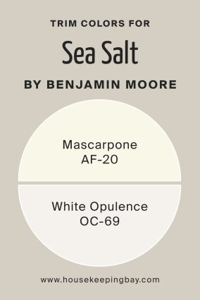
What are the Trim colors of Sea Salt CSP‑95 by Benjamin Moore?
Trim colors like Mascarpone AF‑20 and White Opulence OC‑69 pair nicely with Sea Salt. Mascarpone adds a warm white with a hint of creaminess to soften edges, while White Opulence brings a clean crisp white that accents details.
These trim colors highlight architectural features without competing with the wall color.
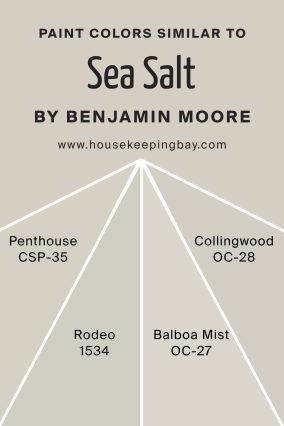
Colors Similar to Sea Salt CSP‑95 by Benjamin Moore
Similar shades like Penthouse CSP‑35, Rodeo 1534, Balboa Mist OC‑27, and Collingwood OC‑28 offer subtly different vibes. Penthouse is slightly greener, Rodeo leans more blue, Balboa Mist is softer gray, and Collingwood is warmer with beige tones.
They provide close alternatives depending on the mood you want.
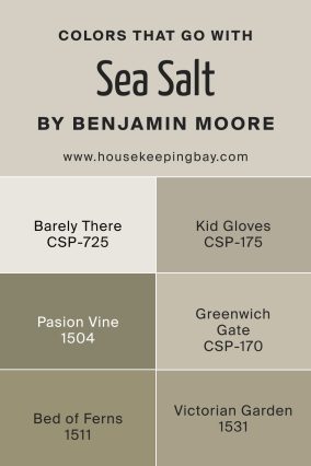
Colors That Go With Sea Salt CSP‑95 by Benjamin Moore
Colors that go well with Sea Salt include Barely There CSP‑725, Kid Gloves CSP‑175, Passion Vine 1504, Greenwich Gate CSP‑170, Bed of Ferns 1511, and Victorian Garden 1531. Barely There brings a light gray contrast, Kid Gloves adds soft sage, Passion Vine introduces a muted mauve, Greenwich Gate brings earthy green, Bed of Ferns adds deeper forest green, and Victorian Garden offers a warm, rich burgundy.
Together they bring balance and natural accents.
How to Use Sea Salt CSP‑95 by Benjamin Moore in Your Home
Use Sea Salt on walls in bathrooms, bedrooms, or living rooms for a calm and open feel. It works well as a backdrop for wooden furniture, green plants, or pastel art.
Pair it with white trim and natural fabrics for a fresh, welcoming space.
Main Color vs Similar Color
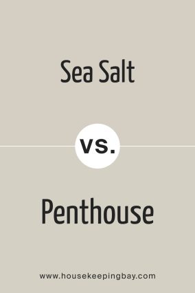
Sea Salt CSP‑95 by Benjamin Moore vs Penthouse CSP‑35 by Benjamin Moore
Penthouse is slightly greener than Sea Salt. Both are soft grays, but Penthouse leans into sage tones.
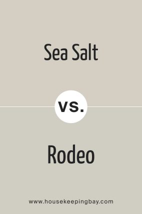
Sea Salt CSP‑95 by Benjamin Moore vs Rodeo 1534 by Benjamin Moore
Rodeo is more blue-gray. It feels cooler and moodier, while Sea Salt stays more neutral and light.
Sea Salt CSP‑95 by Benjamin Moore vs Balboa Mist OC‑27 by Benjamin Moore
Balboa Mist is softer and warmer. Sea Salt has a fresher gray-green tone compared to calm beige-green of Balboa Mist.
Sea Salt CSP‑95 by Benjamin Moore vs Collingwood OC‑28 by Benjamin Moore
Collingwood is warmer and greiger. Sea Salt’s subtle yellow-purple undertones make it feel lighter and airier.
Conclusion
I love how Sea Salt feels light and gentle—like a soft breeze in your room. It’s easy to live with and blends nicely with natural textures and clean whites. It’s simple, calm, and cheerful.