Rosepine 461 Paint Color by Benjamin Moore
A Gentle Touch of Nature
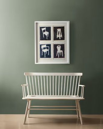
Imagine walking into your home, feeling instantly calm and welcomed by walls dressed in a quiet shade that blends the beauty of the outdoors with cozy interiors. Rosepine 461 by Benjamin Moore offers just that—a comforting and balanced hue that combines the ease of grey with the subtle charm of earthy greens. If you love a home that feels peaceful and connected to nature without being overly bold, this shade can quickly become your favorite. It’s versatile enough to make your living room feel cozy yet spacious, and gentle enough to create a restful mood in your bedroom or home office. When you spend time in a space painted this color, you’ll appreciate how naturally it fits into your daily life, giving a soft, reassuring backdrop to your activities.
What Color Is Rosepine 461 by Benjamin Moore?
Rosepine 461 by Benjamin Moore is a soft grey-green paint color, blending hints of olive and dark turquoise undertones. It has an organic feel, ideal for spaces seeking a soothing and grounded atmosphere. This color works exceptionally well in modern farmhouse styles, traditional interiors, and even contemporary spaces where simplicity and harmony are desired.
Rosepine pairs beautifully with natural wood, woven textiles, and stone accents, enhancing the comfort and warmth of any room.

Is Rosepine 461 by Benjamin Moore a Warm or Cool color?
Rosepine 461 leans toward being a cool paint color, thanks to its subtle grey base mixed with touches of green.
This cool undertone gives rooms a fresh and relaxing atmosphere, ideal for spaces needing tranquility. However, the subtle hints of olive also inject a slight warmth, making it flexible enough to feel inviting rather than chilly, perfect for bedrooms, living rooms, or even bathrooms that you want to feel calm and restful.
Undertones of Rosepine 461 by Benjamin Moore
Rosepine 461 has clear undertones of olive and dark turquoise, which significantly influence how the color is perceived. These undertones provide depth, giving walls a gentle complexity that changes subtly with lighting. Olive undertones add warmth, helping the color feel comforting and earthy, while the dark turquoise creates a cooler, refreshing effect. On interior walls, these undertones ensure Rosepine remains balanced—never too cold or flat, but always intriguing, harmonious, and relaxing.
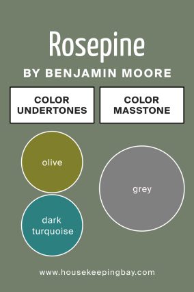
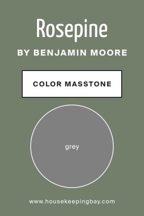
What Is the Masstone of Rosepine 461 by Benjamin Moore?
The masstone of Rosepine 461 is a soft and muted grey, giving the paint a calming and neutral quality. This grey masstone allows it to blend effortlessly into various interior styles, making it highly adaptable. The softness of this masstone ensures that Rosepine can create a serene and balanced atmosphere in your home, providing a soothing yet subtly vibrant presence that won’t overwhelm other decor elements.
How Does Lighting Affect Rosepine 461 by Benjamin Moore?
Lighting significantly influences how Rosepine 461 appears. Under natural daylight, this color reveals its soft green tones clearly, providing a fresh and airy feel. In north-facing rooms, where the light is cooler, it can appear slightly more grey and subdued, maintaining its soothing quality. South-facing rooms highlight its warmer olive undertones, adding a gentle earthiness. In east-facing rooms, the morning sunlight enhances its cooler turquoise undertones, making the space feel crisp and refreshing. West-facing rooms receive warmer, golden afternoon light, amplifying the olive hues and creating a cozy, inviting atmosphere.
Under artificial lighting, Rosepine maintains a balanced and neutral look, ideal for relaxing evening environments.
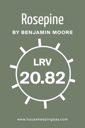
What Is the LRV of Rosepine 461 by Benjamin Moore?
The LRV of Rosepine 461 by Benjamin Moore is moderate, ensuring it reflects enough light to brighten spaces without being overly stark or too dark. LRV stands for Light Reflectance Value, indicating how much light a paint color reflects. Higher LRV means brighter, more reflective surfaces, while lower LRV absorbs more light, making colors appear deeper.
Rosepine’s mid-range LRV allows it to maintain a comforting depth and warmth, suitable for various lighting conditions, making your rooms feel well-balanced and inviting.
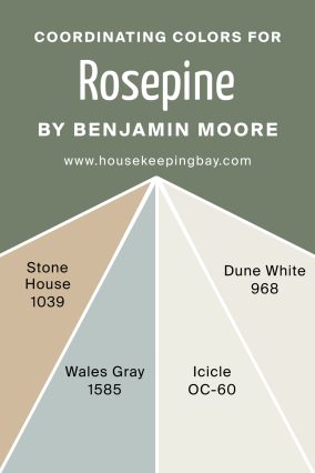
Coordinating Colors of Rosepine 461 by Benjamin Moore
Coordinating colors help enhance and balance the main shade, creating harmony in your decor. Rosepine 461 pairs beautifully with Stone House 1039, a warm beige that complements its earthy tones. Wales Gray 1585 provides a soothing, cooler counterbalance, ideal for contemporary spaces. Icicle OC-60 introduces brightness and freshness, working exceptionally well in smaller rooms. Dune White 968 adds softness, making interiors feel gentle and cozy.
Together, these colors create interiors that feel cohesive, comfortable, and balanced.
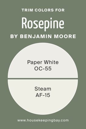
What are the Trim colors of Rosepine 461 by Benjamin Moore?
Trim colors frame your main wall color, highlighting architectural details and adding contrast. Paper White OC-55, with its subtle grey undertone, complements Rosepine by highlighting its cool, calm qualities. Steam AF-15 is a warmer option, bringing out the subtle olive undertones and making spaces feel cozy and inviting.
Both trim colors ensure a sophisticated yet approachable finish, helping your walls stand out beautifully without overwhelming the overall look.
Colors Similar to Rosepine 461 by Benjamin Moore
Similar colors give you alternative shades to consider, maintaining a cohesive theme. These colors expand your options while keeping a harmonious palette.
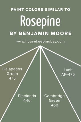
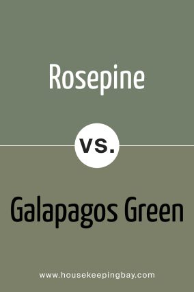
Rosepine 461 by Benjamin Moore vs Galapagos Green 475
Galápagos Green 475 is deeper with pronounced teal undertones, providing more drama and depth
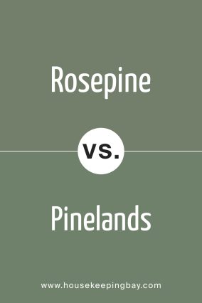
Rosepine 461 by Benjamin Moore vs Pinelands 446
Pinelands 446 offers a richer green, ideal for stronger nature-inspired designs.
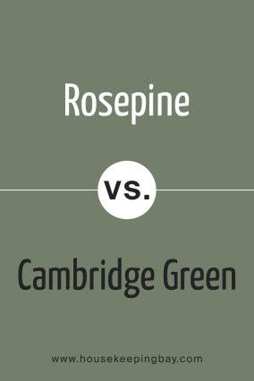
Rosepine 461 by Benjamin Moore vs Cambridge Green 468
Cambridge Green 468 has slightly brighter turquoise tones, perfect for livelier rooms.
Rosepine 461 by Benjamin Moore vs Lush AF-475
Lush AF-475 is darker and moodier, ideal for creating intimate, comfortable spaces.
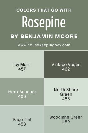
Colors That Go With Rosepine 461 by Benjamin Moore
Colors that complement Rosepine 461 bring out its best qualities.
Icy Morn 457, a pale blue-green, provides a fresh and airy contrast.
Herb Bouquet 460 deepens the earthy feel, perfect for cozy spaces.
Vintage Vogue 462 adds sophisticated richness, ideal for elegant designs.
North Shore Green 456 enhances a refreshing atmosphere.
Sage Tint 458 offers gentle brightness
Woodland Green 459 introduces depth and character, making your home feel balanced and inviting.
How to Use Rosepine 461 by Benjamin Moore in Your Home
Rosepine 461 fits beautifully in various areas of your home, including living rooms, bedrooms, and bathrooms. It’s versatile enough to pair with natural woods, plants, soft fabrics, and subtle patterns, creating a harmonious space.
Use it in rooms where you seek relaxation or a balanced, inviting atmosphere—its gentle depth makes it suitable for walls, accents, and even furniture.
Conclusion
Choosing Rosepine 461 made my home feel cozy, balanced, and refreshingly calm. It blends easily with natural materials, giving each room a gentle, comfortable atmosphere that I love spending time in.