Pacific Sea Teal 2049‑10 Paint Color by Benjamin Moore
Smooth seaside vibes
I enjoy the rich, deep vibes this paint brings—it adds character without overpowering a room’s feel. Pacific Sea Teal 2049‑10 feels both bold and soothing, giving spaces a sense of depth and ease.
There’s a certain confidence in this shade—it works in living rooms, bedrooms, or even an accent wall, and still feels welcoming. I’ve seen it warm up a coastal-style space with its green-blue mix, or bring drama to a modern study when paired with crisp whites. It’s striking yet gentle on the eyes. What I particularly like is how it reacts to the light: sometimes it leans toward navy green, other times almost charcoal.
It’s a color you can live with every day—it doesn’t feel heavy, yet it never fades into the background.
For anyone wanting a paint that’s strong but friendly, this one fits the bill.

What Color Is Pacific Sea Teal 2049‑10 by Benjamin Moore?
Pacific Sea Teal 2049‑10 is a rich, muted teal that blends deep grey, green, and blue tones. It works beautifully in modern, coastal, or traditional interiors.
Pair it with natural wood, leather, matte metals, or soft linens to bring out its depth.
Is Pacific Sea Teal 2049‑10 by Benjamin Moore a Warm or Cool color?
Pacific Sea Teal 2049‑10 is a cool color. Its blue-green base creates a soothing, calm vibe that feels fresh and collected. In homes, it adds relaxation without feeling chilly, making rooms feel balanced and intentional.
Undertones of Pacific Sea Teal 2049‑10 by Benjamin Moore
The undertones in Pacific Sea Teal 2049‑10 include navy and dark green. These adds richness and complexity. On walls, those undertones give depth and moodiness—especially in low light—making the room feel cozy and layered.
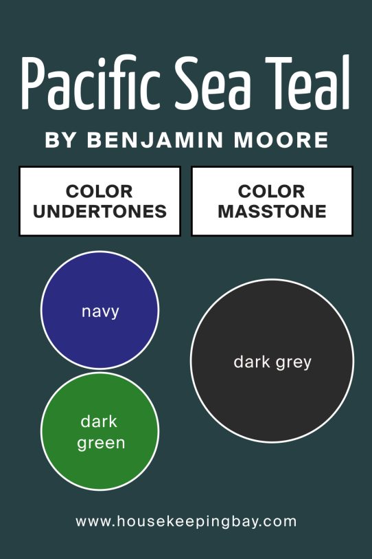
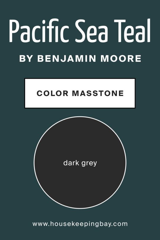
What Is the Masstone of Pacific Sea Teal 2049‑10 by Benjamin Moore?
The masstone is dark grey. That means the cold, deep base makes the color feel grounded and dramatic. In living rooms or bedrooms, it adds a moody elegance that feels both modern and calm—great for cozy spaces.
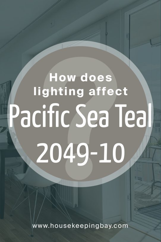
How Does Lighting Affect Pacific Sea Teal 2049‑10 by Benjamin Moore?
Lighting really shapes how this teal looks. In bright natural light, the navy and green come forward, giving a vibrant but deep hue. In soft or artificial light, it looks darker and more subdued.
-
North‑facing rooms will feel cooler and richer, ideal for reading nooks or home offices.
-
South‑facing spaces bring warmth and brightness, making the teal appear more lively.
-
East‑facing rooms show it softly in morning light, gentle and calm.
-
West‑facing rooms give a warm glow late in the day, adding moodiness and drama that works well for cozy evenings.
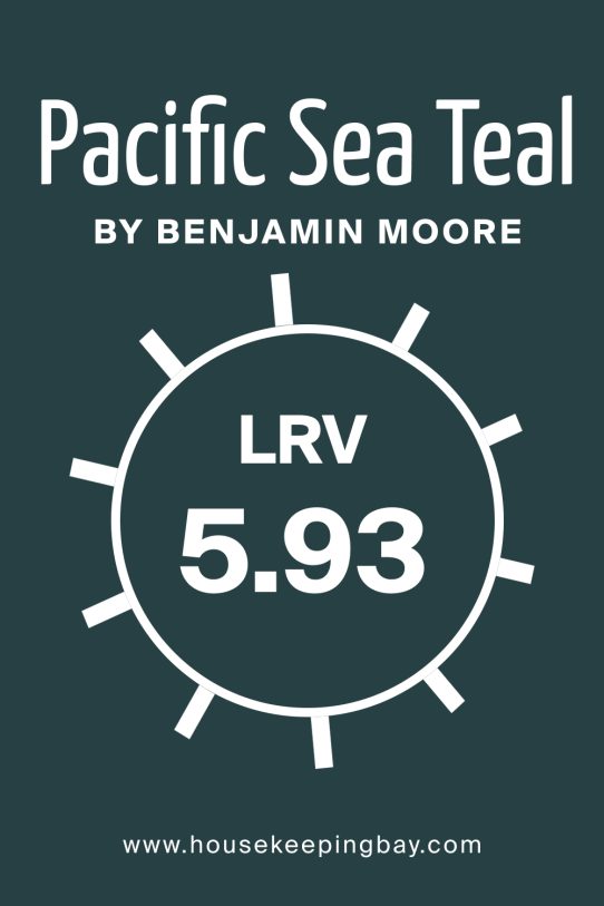
What Is the LRV of Pacific Sea Teal 2049‑10 by Benjamin Moore?
LRV (Light Reflectance Value) measures how much light a paint reflects versus absorbs. A lower LRV means the color appears richer, deeper, and more dramatic on walls.
With its lower LRV, Pacific Sea Teal 2049‑10 absorbs more light, giving rooms a cozy, enveloping feel.
It’s ideal for accent walls or spaces where you want a bold, moody touch.
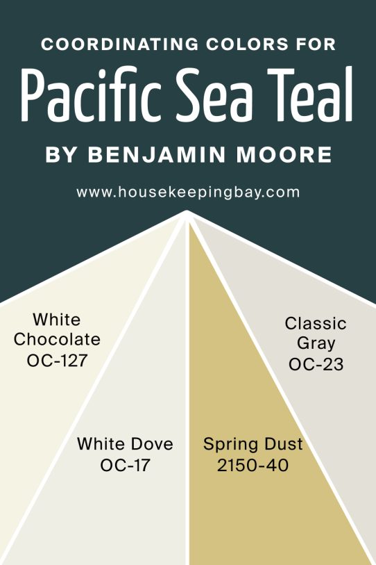
Coordinating Colors of Pacific Sea Teal 2049‑10 by Benjamin Moore
Coordinating colors help build harmony. For Pacific Sea Teal, choices like White Chocolate OC‑127, White Dove OC‑17, Spring Dust 2150‑40, and Classic Gray OC‑23 give contrast and balance. White Chocolate offers warmth and softness, while White Dove adds clean brightness. Spring Dust gives a delicate, muted green-tinged neutral, and Classic Gray brings a soft, cool backdrop that complements the teal without competing.
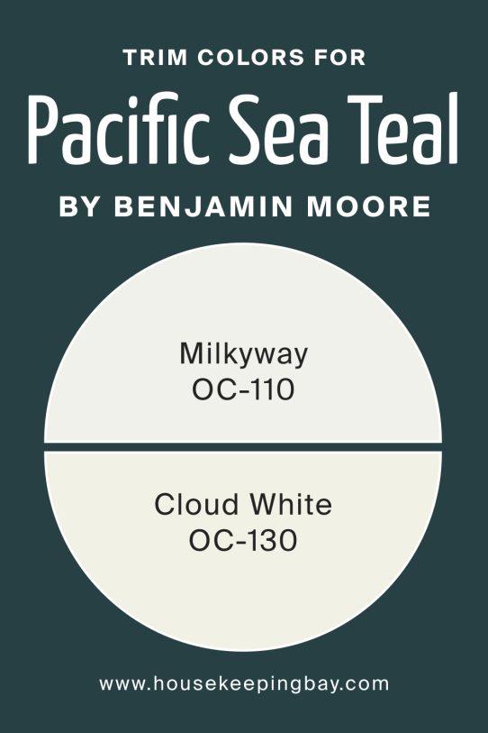
What are the Trim colors of Pacific Sea Teal 2049‑10 by Benjamin Moore?
Trim colors bring out crisp edges. Milkyway OC‑110 and Cloud White OC‑130 are great companions. Milkyway gives a gentle, warm highlight around windows and doors. Cloud White provides a brighter, cleaner finish that helps Pacific Sea Teal pop while maintaining elegance.
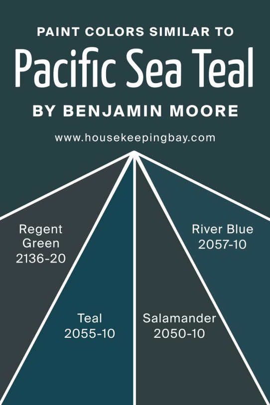
Colors Similar to Pacific Sea Teal 2049‑10 by Benjamin Moore
Similar colors help explore variations. Regent Green 2136‑20 is a deeper, subdued teal. Teal 2055‑10 brings more blue brightness. Salamander 2050‑10 has richer green notes, and River Blue 2057‑10 leans more blue‑gray.
These tones give options for adjacent rooms or accents that stay in the same visual family.
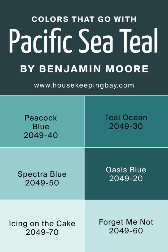
Shade Colors That Go With Pacific Sea Teal 2049‑10 by Benjamin Moore
Shade shades complement the main color. Peacock Blue OC‑2049‑40 is a deep, dramatic tone. Teal Ocean OC‑2049‑30 is a softer, water‑green. Spectra Blue OC‑2049‑50 is vibrant and bold. Oasis Blue OC‑2049‑20 is lighter and breezy. Icing on the Cake OC‑2049‑70 is a pale pastel highlight. Forget Me Not OC‑2049‑60 adds a bright, floral pop.
How to Use Pacific Sea Teal 2049‑10 by Benjamin Moore in Your Home
Use this teal on a feature wall in living rooms or bedrooms for depth and style. It works well with gold or brass accents and natural textures like wood or woven fabrics.
You can also use it in kitchens or bathrooms for a bold but soothing backdrop.
Pacific Sea Teal 2049‑10 by Benjamin Moore vs Similar Colors
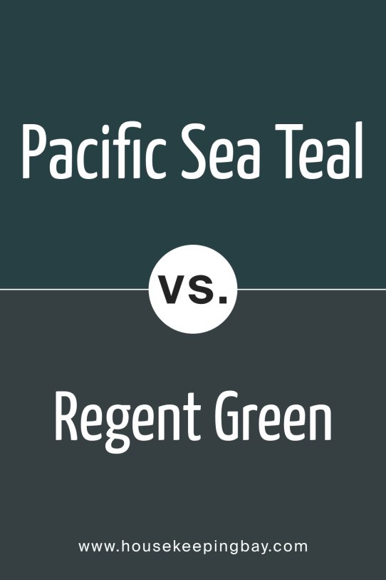
Pacific Sea Teal 2049-10 vs Regent Green 2136‑20
Regent Green is deeper and more muted—more grounded and moody than Pacific Sea Teal.
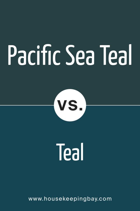
Pacific Sea Teal 2049-10 vs Teal 2055‑10
This version is a brighter, livelier blue‑leaning teal—more energetic.
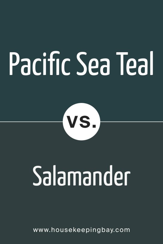
Pacific Sea Teal 2049-10 vs Salamander 2050‑10
Salamander leans green and feels richer and earthier than Pacific Sea Teal.
Pacific Sea Teal 2049-10 vs River Blue 2057‑10
River Blue shifts toward blue‑gray, offering a cooler, more serene feel than Pacific Sea Teal.
Conclusion
As a paint expert, I love Pacific Sea Teal 2049‑10 for its dramatic but balanced feel. It’s deep yet fresh, cozy yet stylish. If you want a room that feels both grounded and alive, this paint speaks clearly in tone and texture.