Icy Morn 457 Paint Color by Benjamin Moore
Soft touch for everyday rooms
I like how this color feels light without being plain. It has a calm look that works in many rooms, whether you use it on walls or accents.
It’s soft but still has enough depth to keep a space from feeling flat or cold.
What Color Is Icy Morn 457 by Benjamin Moore?
Icy Morn is a pale gray-green shade with a light, airy presence. It works well in homes that need a soft neutral with a hint of nature. This color pairs nicely with linen, natural wood, and matte finishes. It fits in modern, coastal, and traditional interiors because it adds freshness without looking too bold.
Its soft tone makes it ideal for open spaces, bedrooms, and even kitchens where you want a clean yet welcoming feel.
Is Icy Morn 457 by Benjamin Moore a Warm or Cool Color?
Icy Morn leans cool because of its gray and soft green mix. Cool tones like this create a relaxed backdrop that doesn’t overwhelm. In sunny rooms, it can look lighter and fresher, while in low light, it appears softer and more muted.
This makes it flexible for spaces where you want a quiet but not dull color.
Undertones of Icy Morn 457 by Benjamin Moore
The undertones in Icy Morn are soft green with a touch of gray. These undertones give it a gentle, muted look rather than a bright green feel.
The green influence keeps it from looking icy or flat, and the gray balances it for a natural, understated look on walls.
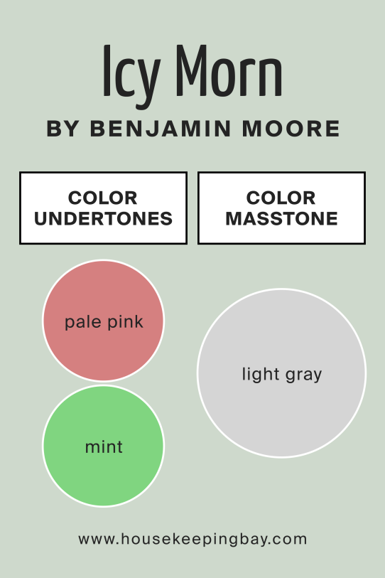
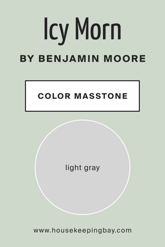
What Is the Masstone of Icy Morn 457 by Benjamin Moore?
The masstone of Icy Morn is light gray. This base makes it adaptable because gray is a natural neutral. The gray foundation softens the green undertone, so the color feels fresh but not sharp. It also pairs well with both warm and cool furnishings.
How Does Lighting Affect Icy Morn 457 by Benjamin Moore?
Lighting changes how Icy Morn reads in a space. In north-facing rooms, it shows more of its gray side, feeling cooler and softer. South-facing light brings out more green, making it appear slightly warmer and fresher. East-facing rooms highlight it in the morning, giving a pale, airy vibe, while west-facing spaces make it look richer in the evening.
Artificial light with warm bulbs can soften it, while cool LED lighting enhances its gray tones.
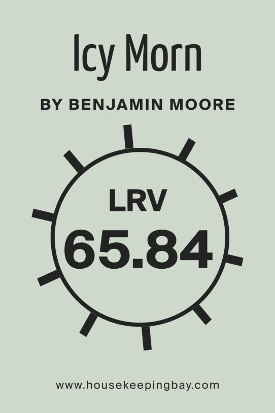
What Is the LRV of Icy Morn 457 by Benjamin Moore?
Icy Morn has a light LRV, which means it reflects a good amount of light but not as much as pure white. LRV measures how much light a color bounces around a room. In practical terms, this helps spaces feel open without being too stark.
The moderate LRV makes Icy Morn suitable for most rooms, as it won’t overpower but still brightens walls.
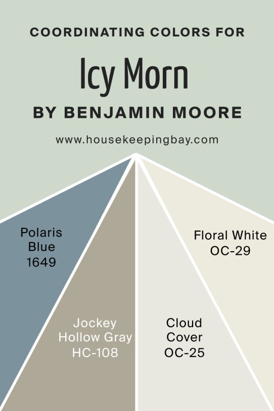
Coordinating Colors of Icy Morn 457 by Benjamin Moore
Polaris Blue adds depth and contrast, perfect for accents or nearby rooms. Jockey Hollow Gray brings an earthy balance that grounds the softness of Icy Morn. Cloud Cover works as a lighter companion, giving subtle transitions between spaces. Floral White adds warmth and brightness, making trims and ceilings feel soft without being stark.
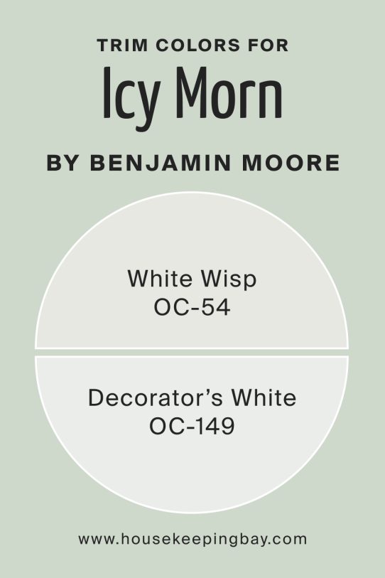
What Are the Trim Colors of Icy Morn 457 by Benjamin Moore?
White Wisp works well for a muted trim choice, keeping things soft and seamless. Decorator’s White adds crisp contrast if you prefer sharper edges. Both options highlight Icy Morn without overpowering it, letting the green-gray tone stay the focus on walls.
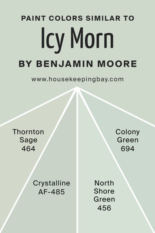
Colors Similar to Icy Morn 457 by Benjamin Moore
Thornton Sage feels slightly warmer and deeper, good for cozier rooms. Crystalline leans toward a fresher green, bringing more vibrance. North Shore Green is richer and darker, adding more presence. Colony Green is softer and more muted, perfect for subtle backdrops.
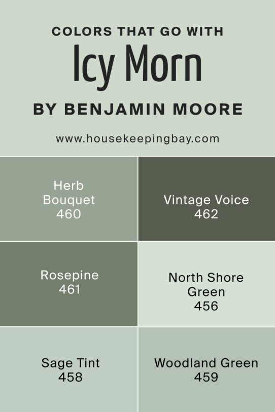
Shade Colors That Go With Icy Morn 457 by Benjamin Moore
Herb Bouquet offers a medium green for pairing in layered designs. Vintage Vogue adds deep drama, ideal for furniture or feature walls. Rosepine brings an earthy touch, while Sage Tint softens spaces with pale green. Woodland Green creates contrast and ties in natural textures.
How to Use Icy Morn 457 by Benjamin Moore in Your Home
Use Icy Morn on main walls for a gentle, fresh background. It’s great in bedrooms, living rooms, or kitchens where you want calm energy.
Pair it with wood, soft white trim, or darker greens for balance.
Icy Morn 457 by Benjamin Moore vs Similar Colors
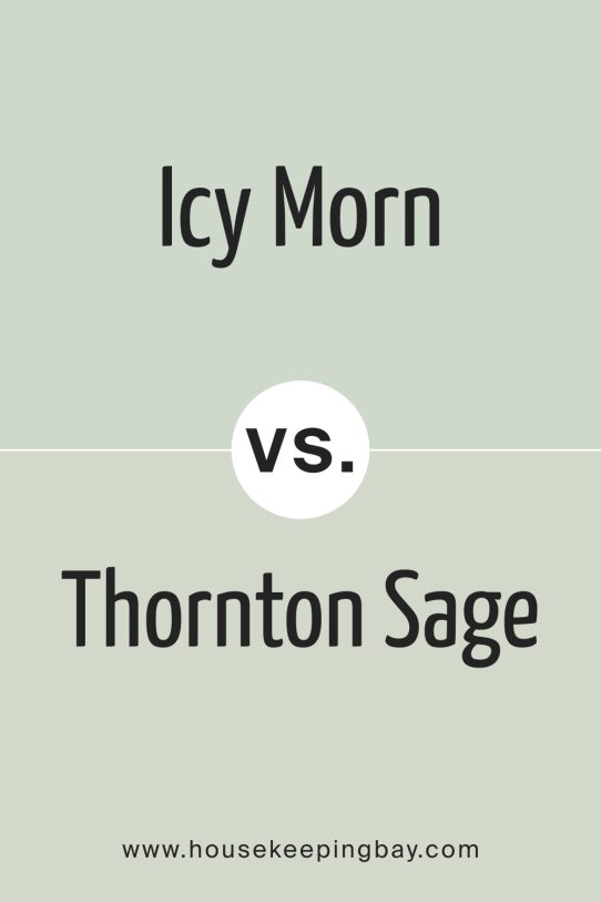
Icy Morn vs Thornton Sage
Thornton Sage is deeper and warmer, giving a stronger earthy feel, while Icy Morn stays softer and lighter.
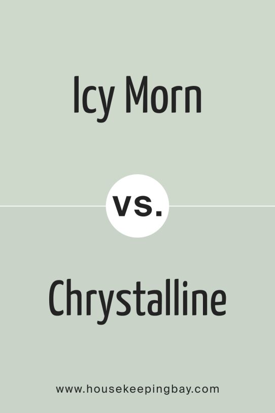
Icy Morn vs Crystalline
Crystalline has more green vibrance, making it livelier. Icy Morn feels more muted and subtle for quieter spaces.
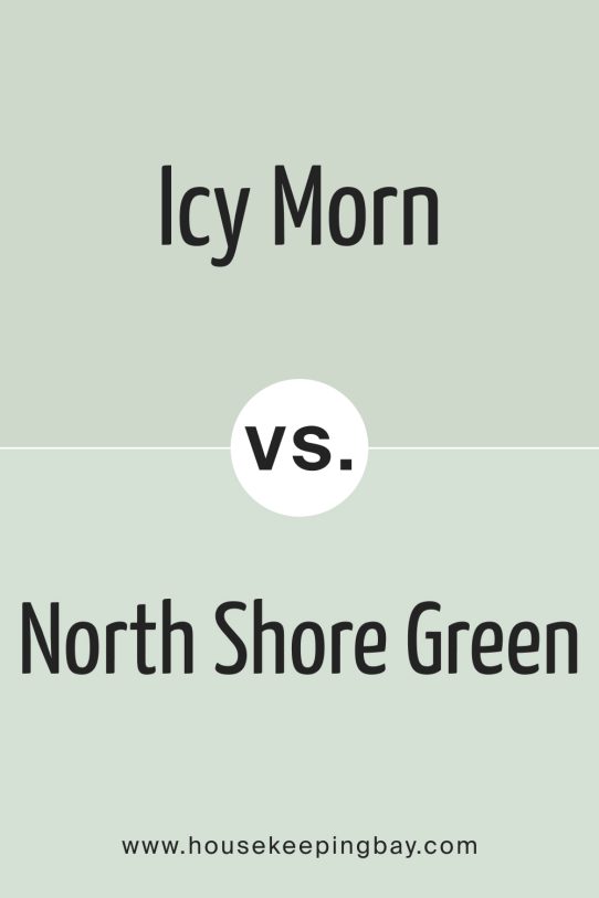
Icy Morn vs North Shore Green
North Shore Green is richer and leans darker, creating more contrast. Icy Morn is better for airy, light-filled rooms.
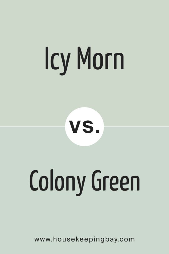
Icy Morn vs Colony Green
Colony Green is softer and more subdued, leaning toward beige-green. Icy Morn keeps a cooler gray tone for balance.
Conclusion
Icy Morn feels like a color you can count on for calm, balanced rooms. It’s soft enough for small spaces but still has enough color to stay interesting. I like how it works with both warm wood and cool accents, making it easy to use anywhere.