Fusion AF-675 Paint Color by Benjamin Moore
Calm gray with a soft twist
I like how this shade feels modern yet cozy at the same time. It’s not too heavy, and the little hints of color in it make rooms feel interesting without being overwhelming. It works for walls or accents when you want a soft backdrop.
What Color Is Fusion AF-675 by Benjamin Moore?
Fusion is a muted gray with a delicate balance of color that keeps it from feeling flat. It blends well with wood, metal, and soft textiles, making it great for modern, transitional, or minimal interiors.
It’s light enough for small rooms but has enough depth to hold its own in open spaces.
Is Fusion AF-675 by Benjamin Moore a Warm or Cool Color?
Fusion leans cool thanks to its gray base, but the pale pink and mint undertones give it a slight softness.
It doesn’t feel cold, which is why it works nicely in both sunny and shaded rooms.
Undertones of Fusion AF-675 by Benjamin Moore
This color carries subtle pale pink and mint undertones. These faint hints add quiet character, so walls feel calm without looking too plain. In brighter light, the mint side feels more noticeable; in dimmer light, the pink side softens the gray.
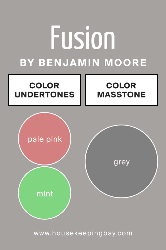
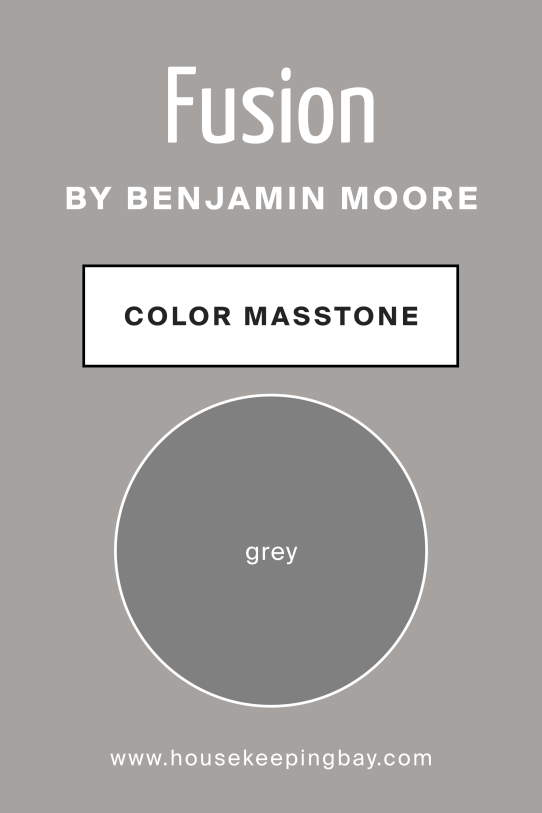
What Is the Masstone of Fusion AF-675 by Benjamin Moore?
The masstone of Fusion is gray. This gives it versatility and allows it to work with a variety of colors and finishes.
The base gray tone makes the undertones subtle rather than dominant, keeping the look neutral yet layered.
How Does Lighting Affect Fusion AF-675 by Benjamin Moore?
Lighting changes how Fusion looks throughout the day. In north-facing rooms, it reads as a clean, cool gray with just a whisper of color. South-facing light warms it slightly, making the pink undertones faintly visible. East-facing rooms highlight it softly in the morning, while west-facing rooms bring out its mint undertones in the evening. Under warm artificial light, it feels cozier, while cool LEDs make it look sharper and more modern.
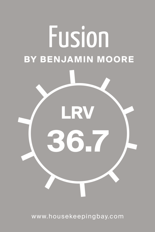
What Is the LRV of Fusion AF-675 by Benjamin Moore?
Fusion has a moderate LRV, meaning it reflects a fair amount of light but not as much as pale neutrals. LRV measures how light or dark a paint looks on walls. Because of this balance, Fusion works in both small and large rooms, staying soft without looking stark.
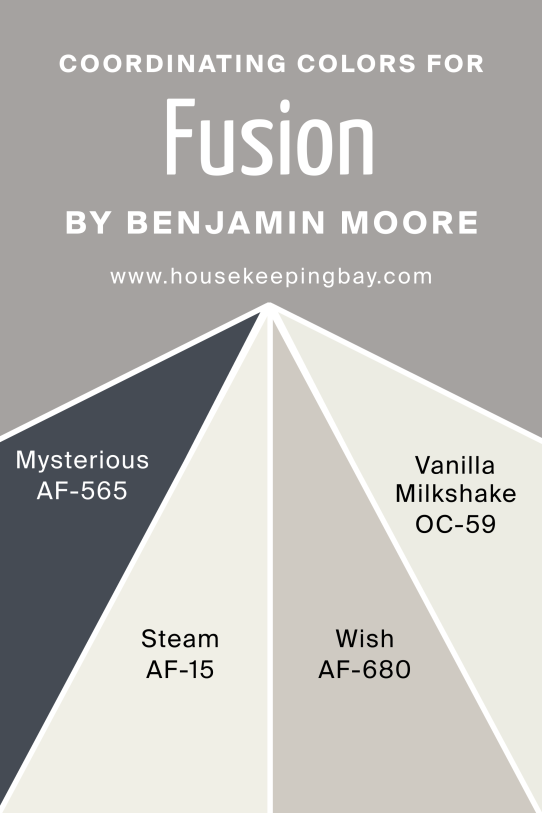
Coordinating Colors of Fusion AF-675 by Benjamin Moore
Fusion works beautifully with Mysterious AF-565, a deep blue-gray that adds contrast and depth. Steam AF-15 is a light neutral that pairs well for a clean, balanced look. Wish AF-680 brings a warm beige tone, while Vanilla Milkshake OC-59 adds creamy softness for trim or ceilings.
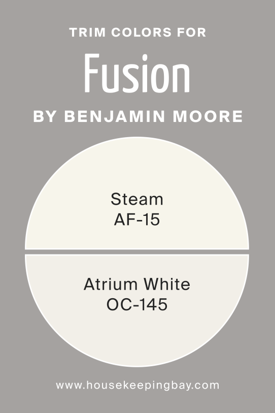
What Are the Trim Colors of Fusion AF-675 by Benjamin Moore?
For trim, Steam AF-15 gives a quiet, seamless finish, keeping the palette subtle. Atrium White OC-145 offers more crispness, giving a clean edge that highlights the walls without overpowering the soft gray tone of Fusion.
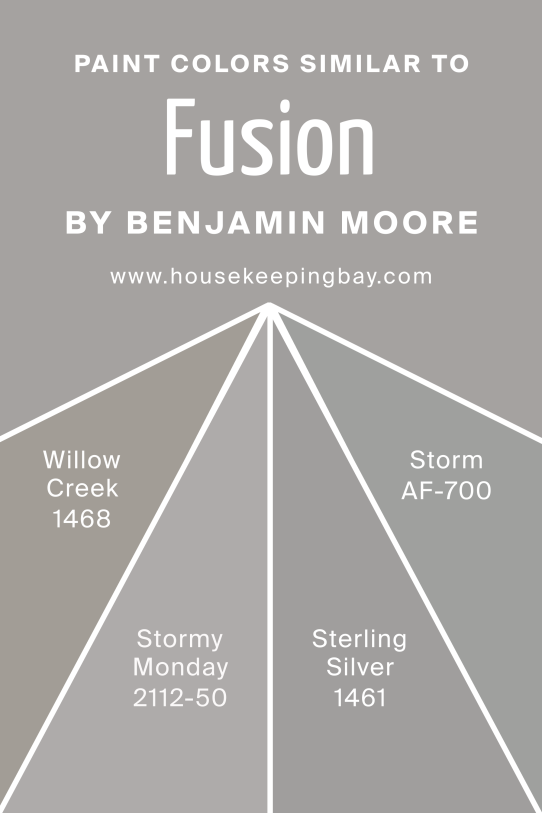
Colors Similar to Fusion AF-675 by Benjamin Moore
Willow Creek 1468 feels slightly earthier and deeper, while Stormy Monday 2112-50 leans cooler and moodier. Sterling Silver 1461 is lighter and brighter, good for airier spaces. Storm AF-700 is a richer gray that adds more depth and contrast.
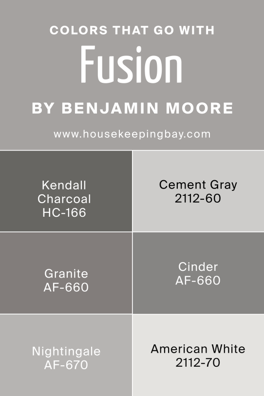
Shade Colors That Go With Fusion AF-675 by Benjamin Moore
Kendall Charcoal HC-166 adds drama and pairs beautifully with Fusion in modern designs. Cement Gray 2112-60 keeps things tonal and soft. Granite AF-660 introduces a grounded earthy gray, while Nightingale AF-670 and American White 2112-70 provide softer layering options for accents or furniture.
How to Use Fusion AF-675 by Benjamin Moore in Your Home
Fusion is versatile for living rooms, bedrooms, or even kitchens.
Use it on walls for a calm base, then add soft white trim or deeper accents for contrast. It works well with wood floors, stone counters, and cozy fabrics.
Fusion AF-675 by Benjamin Moore vs Similar Colors
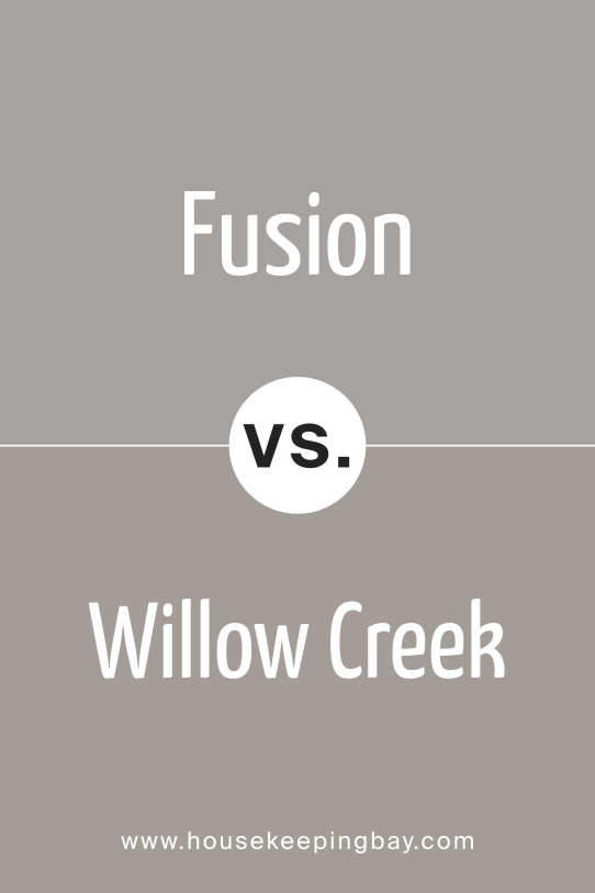
Fusion vs Willow Creek
Willow Creek is warmer and slightly earthier, while Fusion stays balanced with cooler undertones and feels lighter overall.
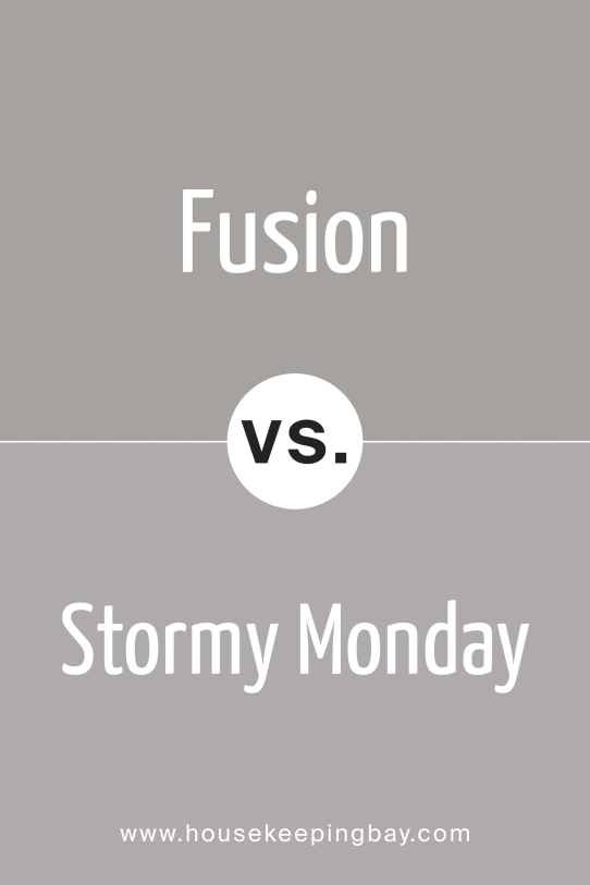
Fusion vs Stormy Monday
Stormy Monday is a moodier, darker gray that leans more purple. Fusion feels fresher and softer, making it better for brighter rooms.
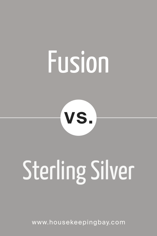
Fusion vs Sterling Silver
Sterling Silver is lighter and slightly cooler, great for airy spaces. Fusion offers more subtle color depth with its pale pink and mint undertones.
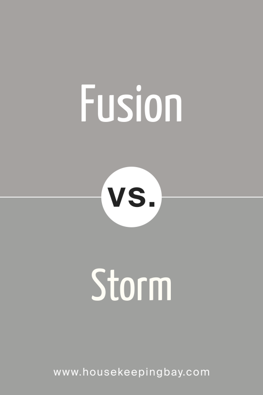
Fusion vs Storm
Storm AF-700 is deeper and more dramatic, perfect for bold accents. Fusion remains softer, giving a more relaxed and neutral feel.
Conclusion
Fusion is a gray that feels modern but never cold. It has tiny hints of color that keep it from looking flat, and it works in so many types of rooms. I like how easy it is to pair with both light and dark accents.