Fiji AF‑525 Paint Color by Benjamin Moore
Friendly Island Vibe
I feel drawn to calming shades that still bring energy—I picture walls whispering a gentle breeze or the soft sway of water. When I use a color that has both calm and brightness, the space feels alive yet easy.
Fiji AF‑525 feels like that—clear, fresh, and always welcoming.
What Color Is Fiji AF‑525 by Benjamin Moore?
Fiji AF‑525 is a deep turquoise with lively, ocean‑inspired depth.
It works great in coastal or eclectic rooms, pairing nicely with crisp whites and natural wood, and it feels especially good with linen, rattan, and brushed metal textures.
Is Fiji AF‑525 by Benjamin Moore a Warm or Cool Color?
Fiji AF‑525 leans cool, thanks to its blue and gray undertones. Cool tones often bring calm and balance to a space, and Fiji does that well. It can make a large or sunny room feel peaceful, or add fresh contrast in darker or warmer spaces.
Undertones of Fiji AF‑525 by Benjamin Moore
This turquoise hides soft hints of gray and blue underneath. Those undertones help Fiji stay grounded—it never feels too bright or overwhelming on walls. Rooms painted with it feel fresh, yet steady and calm.
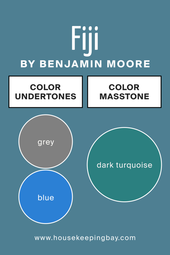
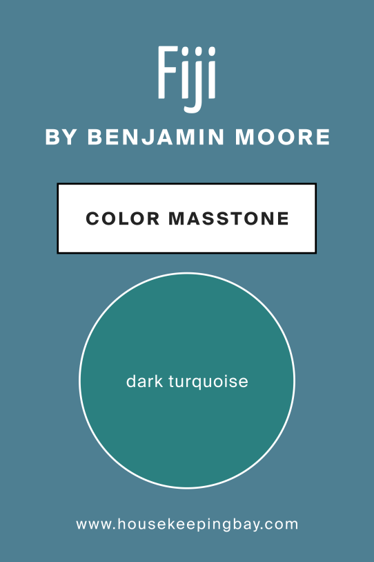
What Is the Masstone of Fiji AF‑525 by Benjamin Moore?
The masstone of Fiji AF‑525 is a rich, dark turquoise. Its depth gives walls a cozy, enveloping feel without being heavy. In homes, it adds personality—especially in areas where you want both color and calm.
How Does Lighting Affect Fiji AF‑525 by Benjamin Moore?
Lighting really changes how Fiji looks. In soft artificial lighting, it leans more muted—almost like gentle teal. In natural light, it wakes up and feels brighter, and you’ll notice its turquoise tone deepen.
-
North‑facing rooms make Fiji look cooler and more subdued.
-
South‑facing spots bring a bit more glow to the turquoise.
-
East light gives it a clear, crisp feel in the morning.
-
West afternoon light makes it richer, with more depth.
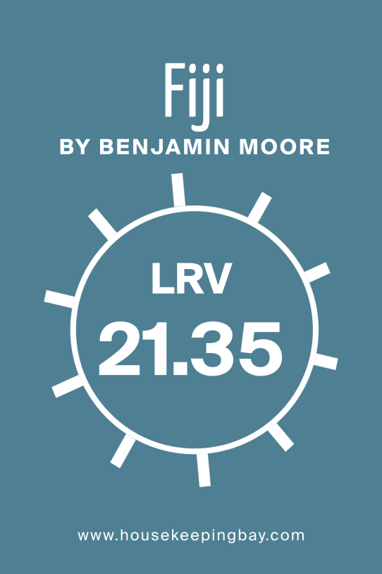
What Is the LRV of Fiji AF‑525 by Benjamin Moore?
LRV stands for light reflectance value, which tells how much light a paint can bounce off. A lower LRV means the color looks more rich and bold.
Because Fiji AF‑525 has a lower LRV, it appears deeper and more dramatic on walls, especially in rooms with less natural light.
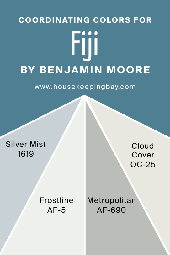
Coordinating Colors of Fiji AF‑525 by Benjamin Moore
Coordinating colors help make a color really sing in a room—and for Fiji, that includes Silver Mist, Frostine, Metropolitan, and Cloud Cover. Silver Mist and Frostine bring soft, silvery coolness that balances the richness. Metropolitan and Cloud Cover add light, gentle warmth and brightness that let Fiji take center stage. Together, they help the turquoise feel lively without clashing.
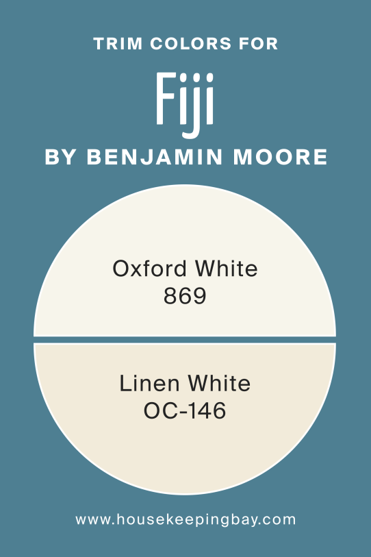
What Are the Trim Colors of Fiji AF‑525 by Benjamin Moore?
Trim colors frame a bold wall color and keep it looking clean. Oxford White and Linen White are perfect with Fiji. Both are warm, soft whites, so they don’t feel harsh beside deep turquoise—they help it stand out while keeping edges crisp and inviting.
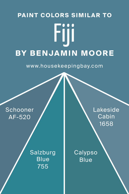
Colors Similar to Fiji AF‑525 by Benjamin Moore
Similar colors give you alternative shades that play in the same tonal family—like Schooner, Salzburg Blue, Calypso Blue, and Lakeside Cabin. Schooner feels a bit greener than Fiji, while Salzburg Blue leans more navy. Calypso Blue has brighter, tropical vibes, and Lakeside Cabin falls somewhere between blue and green with a wood‑lake feel. These cousins help if you want slight shifts in tone without leaving the turquoise family.
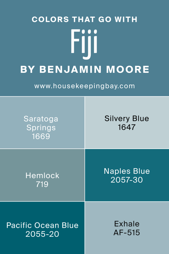
Shade Colors That Go With Fiji AF‑525 by Benjamin Moore
Shades that go with Fiji deepen or mute it in thoughtful ways—think Saratoga Springs, Silvery Blue, Hemlock, Naples Blue, Pacific Ocean Blue, and Exhale. Saratoga Springs and Pacific Ocean Blue deepen the mood for cozy spaces; Silvery Blue and Exhale add softness and softness contrast. Hemlock and Naples Blue still feel in the blue‑green spectrum, but more subtle and earthy, which can tone down the energy for more relaxed vibes.
How to Use Fiji AF‑525 in Your Home
Try Fiji on an accent wall for a splash of color in your living room or bedroom.
It also works beautifully in bathrooms or kitchens—paired with white or soft neutrals, it brings an energetic yet peaceful feel to the space.
Fiji AF‑525 vs Similar Colors
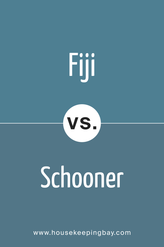
Schooner AF‑520 vs Fiji
Schooner leans a little greener and more muted than Fiji, giving a calmer, forest‑water feel.
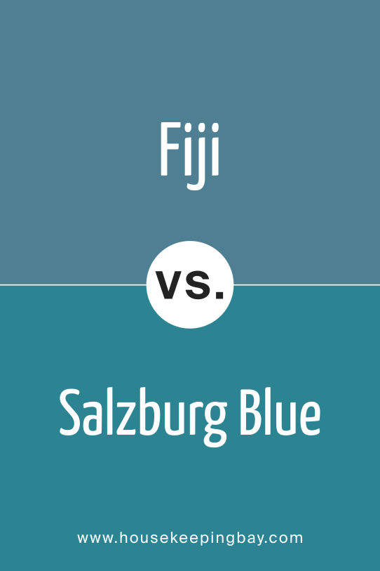
Salzburg Blue 755 vs Fiji
Salzburg Blue is richer and darker, leaning toward navy—it feels more dramatic than Fiji.
Calypso Blue 727 vs Fiji
Calypso Blue has brighter, tropical energy—it’s more vivid and playful than Fiji.
Lakeside Cabin 1658 vs Fiji
Lakeside Cabin brings in earthy greens—so it feels more grounded and rustic beside Fiji.
Conclusion
I love how Fiji AF‑525 brings fresh, cool energy that still feels friendly. It lets you play with turquoise without overwhelming the space, and it works with softer whites or warm neutrals to keep things balanced. It’s my go‑to when I want a bold color that feels both lively and calm.