Convivial Yellow SW 6393 Paint Color by Sherwin Williams
Sunny & Inviting
If you love warm, cheerful spaces, Convivial Yellow SW 6393 from Sherwin Williams could be your perfect match. It brings brightness without overwhelming the senses, making your room feel fresh and welcoming. Imagine walking into a room bathed in gentle sunlight—this is how Convivial Yellow feels. It’s not too bold, not too subtle—just the right level of cheerfulness for creating a comfortable atmosphere at home. Whether you’re redesigning a living room, bedroom, or kitchen, this color helps make your home feel cozy and positive, encouraging good vibes and easy conversation.
What Color Is Convivial Yellow SW 6393 by Sherwin Williams?
Convivial Yellow SW 6393 is a cheerful, muted yellow with subtle hints of light gray. It fits wonderfully in styles like cottage chic, farmhouse, and even traditional interiors. Paired with natural materials like wood and cotton textiles, or accents of stone and wicker, it creates a comfortable, balanced space.

Is Convivial Yellow SW 6393 by Sherwin Williams a Warm or Cool Color?
Convivial Yellow is definitely a warm color. Its cozy, sunny nature adds warmth to interiors, making rooms inviting and comfortable. This warmth helps create a relaxing and social atmosphere, great for spaces where family and friends gather.
Undertones of Convivial Yellow SW 6393 by Sherwin Williams
Convivial Yellow has pale yellow and slight hints of light purple undertones. These undertones affect how it looks in different lighting and surroundings. The yellow undertone maintains brightness, while the purple provides a gentle neutrality, preventing it from appearing overly vibrant. On walls, these undertones blend to give a balanced and calm appearance, ideal for spaces where gentle warmth is preferred.
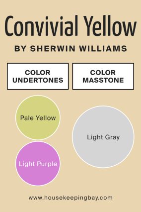
What is the Masstone of Convivial Yellow SW 6393 by Sherwin Williams?
The masstone of Convivial Yellow is a soft, light gray. This means the base color, without undertones, leans toward neutrality. The gray masstone helps the color blend smoothly with other hues in your home, offering a versatile and calm backdrop for a variety of decorative styles.
How Does Lighting Affect Convivial Yellow SW 6393 by Sherwin Williams?
Lighting significantly changes how colors appear, including Convivial Yellow. In natural daylight, especially in south-facing rooms, this color will appear brighter and warmer, amplifying its cheerful characteristics. In north-facing rooms, Convivial Yellow appears softer and cooler, emphasizing its neutral tones and providing subtle warmth without overwhelming brightness.
East-facing rooms experience warm morning sunlight, enhancing the cheerful quality of Convivial Yellow. As daylight shifts, the color softens, making it soothing and balanced. In west-facing rooms, where afternoon light can be intense, Convivial Yellow takes on a richer, golden appearance.
Under artificial lighting, warm bulbs intensify its yellow tones, creating a cozy evening ambiance, whereas cool bulbs highlight its gray and purple undertones, making it appear slightly subdued and sophisticated.
What is the LRV of Convivial Yellow SW 6393 by Sherwin Williams?
The Light Reflectance Value (LRV) of Convivial Yellow SW 6393 is moderately high. LRV measures how much light a color reflects. A higher LRV means the color is brighter and reflects more light, helping spaces appear larger and airier.
Convivial Yellow’s moderate LRV means it effectively brightens rooms without being overly luminous. This balance allows it to maintain a cozy atmosphere while enhancing spaciousness.

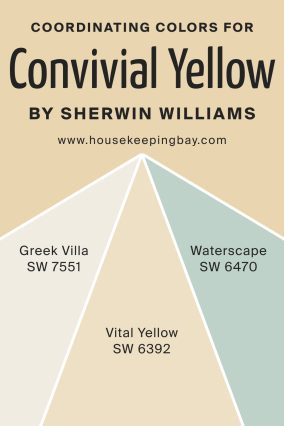
Coordinating Colors of Convivial Yellow SW 6393 by Sherwin Williams
Coordinating colors enhance the visual harmony of your interior. Greek Villa SW 7551 is a creamy white, ideal for ceilings or adjacent walls, creating clean, crisp contrasts. Vital Yellow SW 6392, slightly brighter, complements Convivial Yellow, enhancing vibrancy without clashing. Waterscape SW 6470 is a gentle blue-green, adding freshness and contrast, balancing warmth and coolness.
These coordinating colors collectively help build an appealing palette, ensuring your space looks unified and well-considered.
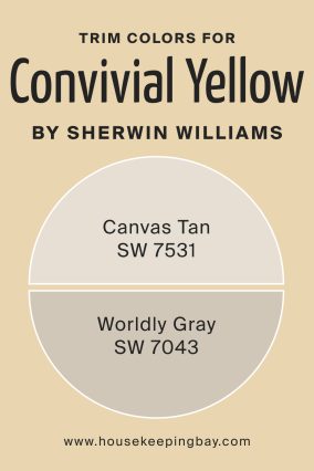
What are the Trim Colors of Convivial Yellow SW 6393 by Sherwin Williams?
Trim colors frame and highlight main walls, significantly affecting overall interior appearance. Canvas Tan SW 7531 is a soft neutral beige, harmonizing with the warmth of Convivial Yellow, enhancing its cozy feel. Worldly Gray SW 7043, a versatile neutral gray, provides gentle contrast without harshness, offering a more defined, elegant look.
Both trim options effectively balance warmth and neutrality, ensuring your interior remains sophisticated and welcoming.
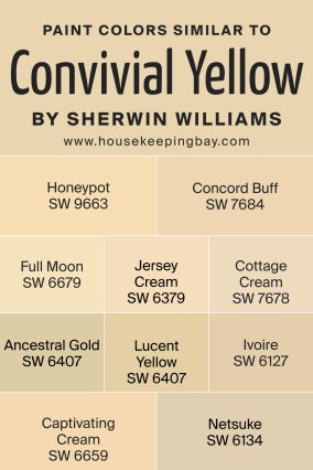
Colors Similar to Convivial Yellow SW 6393 by Sherwin Williams
Similar colors help achieve desired aesthetics with subtle variations. Honeypot SW 9663 has richer, deeper yellow tones, providing more warmth. Concord Buff SW 7684 is a bit earthier, offering a traditional appeal.
Full Moon SW 6679 is lighter, perfect for airy spaces. Jersey Cream SW 6379 offers slightly more vibrancy. Cottage Cream SW 7678 is soft, ideal for a cozy feeling. Ancestral Gold SW 6407 has golden depth, Lucent Yellow SW 6400 is bright and clear, Ivoire SW 6127 offers creamy neutrality, Captivating Cream SW 6659 brings gentle warmth, and Netsuke SW 6134 has a balanced beige-yellow softness.
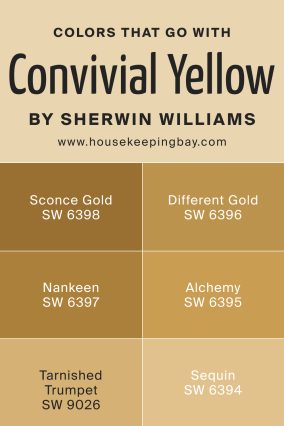
Colors That Go With Convivial Yellow SW 6393 by Sherwin Williams
Complementing colors enrich your decor, adding depth and contrast. Shades like Sconce Gold SW 6398 add golden richness, while Different Gold SW 6396 deepens the warmth significantly. Nankeen SW 6397 offers earthy balance, and Alchemy SW 6395 is sophisticated yet approachable.
Tarnished Trumpet SW 9026 introduces drama and intensity, while Sequin SW 6394 adds a subtle sparkle. Together, these shades create vibrant yet cohesive interiors.
How to Use Convivial Yellow SW 6393 by Sherwin Williams in Your Home
Use Convivial Yellow in rooms meant for relaxation or gathering, such as living rooms, dining areas, or cozy bedrooms. Pair it with soft neutrals, natural wood furnishings, or gentle accents of blue and green to create warm, comfortable spaces ideal for family and friends.
Convivial Yellow SW 6393 vs Honeypot SW 9663
Honeypot is richer and deeper, adding a more traditional, grounded warmth compared to Convivial Yellow’s brighter, softer presence.

Conclusion
Choosing Convivial Yellow has brought sunshine into my home. It’s cheerful without being overwhelming, perfect for making every day feel brighter and cozier. Give it a try!
