Adobe Beige 1128 Paint Color by Benjamin Moore
Cozy & Calm Vibe
I love how this color wraps a room in gentle warmth without being too bold. It feels friendly and calm, making spaces feel comfortable and easy to live in.
There’s something about Adobe Beige 1128 that instantly makes a space feel pulled together. I’ve used it in both busy family rooms and quiet bedrooms, and it always brings that same soft, cozy feel without taking over. It’s subtle but not plain, warm but not heavy. What I really enjoy is how easy it is to match with natural tones—light wood floors, soft woven fabrics, and white trims all sit perfectly with it. Even when the light changes throughout the day, it never looks out of place. It’s one of those shades that lets you relax without making the room feel too serious or too empty.
If you’re looking for a wall color that can carry a whole room gently, this one does it.
What Color Is Adobe Beige 1128 by Benjamin Moore?
Adobe Beige 1128 is a soft gray with a quiet warmth that blends nicely with natural wood and woven textures.
It suits modern, farmhouse, or coastal interiors and pairs beautifully with linen, rattan, and suede furniture.
Is Adobe Beige 1128 by Benjamin Moore a Warm or Cool color?
This shade leans warm thanks to its soft yellow undertone. It brings a cozy feel to rooms, making it perfect for living areas. Its warmth also helps it pair well with wood tones without feeling too beige.
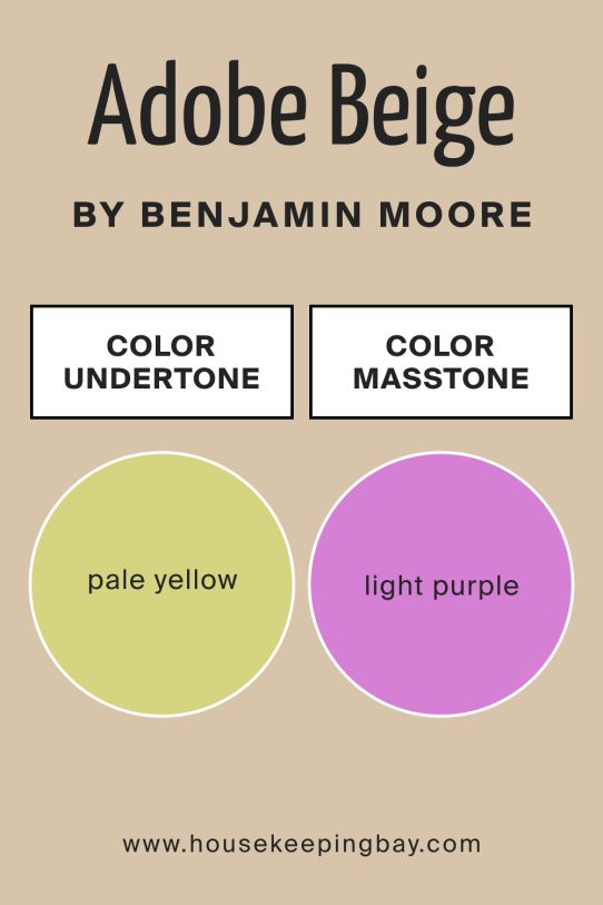
Undertones of Adobe Beige 1128 by Benjamin Moore
The undertones are pale yellow and light purple, giving the gray subtle warmth and depth. Those gentle hues keep it from looking flat on walls, and they shift a bit depending on the light, adding quiet interest.
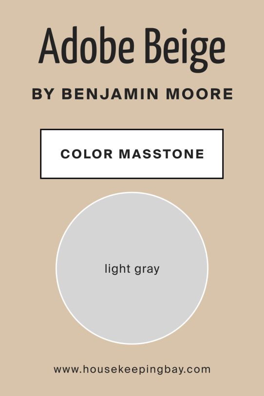
What Is the Masstone of Adobe Beige 1128 by Benjamin Moore?
The masstone is a light gray. That lightness helps spaces feel open and airy, while still adding a touch of softness. It makes rooms feel bright without washing them out.
How Does Lighting Affect Adobe Beige 1128 by Benjamin Moore?
Lighting can shift this color’s feel. In rooms with soft artificial light, it appears warmer and welcoming. Natural light from the north side softens it, keeping it neutral. In south-facing spaces, it looks brighter with gentle warmth. East light gives a cool start to the day, enhancing the gray tones, while west light in the afternoon brings out more of its yellow glow.
Across different lighting scenarios, this color stays calm and adaptable.
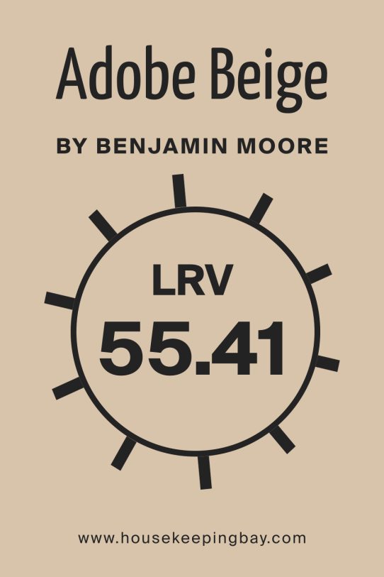
What Is the LRV of Adobe Beige 1128 by Benjamin Moore?
LRV stands for Light Reflectance Value, which shows how much light a paint reflects. Higher LRV means a brighter, more reflective color, while lower LRV gives a darker, richer look.
With Adobe Beige’s LRV, it balances lightness and warmth well.
It keeps rooms feeling bright but not stark. It also helps hide minor wall flaws, offering a friendly and forgiving look on interior walls.
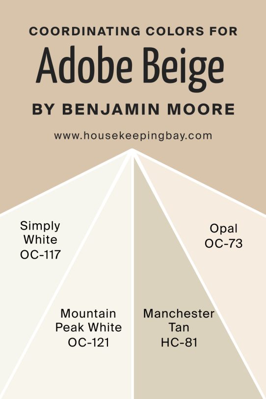
Coordinating Colors of Adobe Beige 1128 by Benjamin Moore
Coordinating colors are shades that work beautifully alongside your main wall color. With this hue, options like Simply White, Mountain Peak White, Manchester Tan, and Opal are solid companions. Simply White adds crisp, clean trim contrast. Mountain Peak White brings a soft, soothing backdrop. Manchester Tan adds richness and coziness. Opal offers a cool touch without clashing.
These colors create a balanced palette that feels complete—not too busy or too plain.
They help highlight the walls and create a peaceful harmony throughout your space.
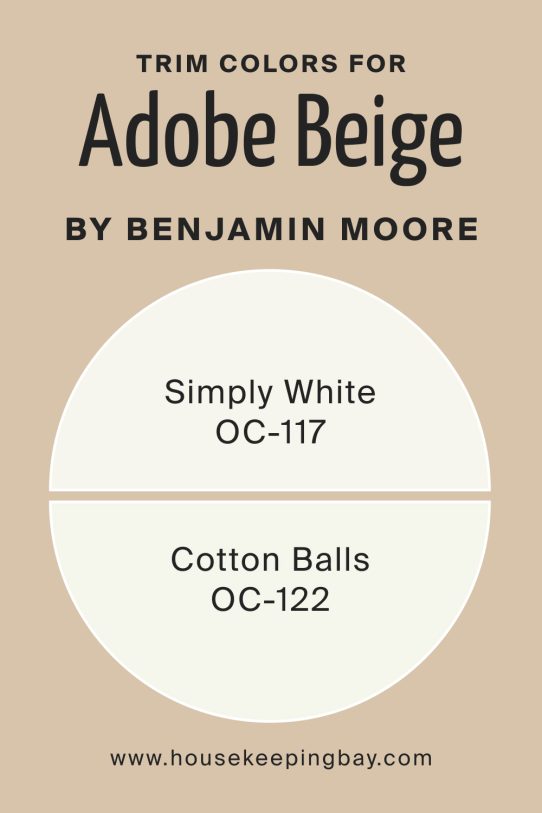
What are the Trim colors of Adobe Beige 1128 by Benjamin Moore?
Trim colors define edges and offer finishing touches. Simply White and Cotton Balls are great choices for trim here. Simply White creates crisp, clear edges that brighten the frame of the color. Cotton Balls gives a gentle off‑white tone, softening contrasts and adding elegance.
Using these trims will let walls pop subtly while keeping architectural details light and refined.
They enhance the soft gray base while giving your room a polished and cohesive look.
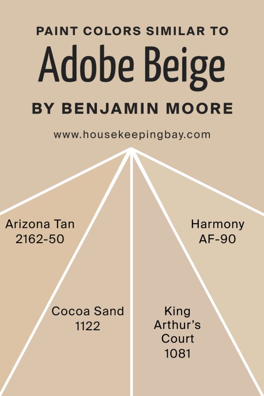
Colors Similar to Adobe Beige 1128 by Benjamin Moore
Similar colors help if you want subtle variation. Arizona Tan, Cocoa Sand, King Arthur’s Court, and Harmony are close matches. Arizona Tan adds a bit more warmth with creamy tones. Cocoa Sand brings a sandy richness without getting heavy. King Arthur’s Court is earthy with a hint of depth. Harmony offers a muted green-gray shift for a different mood.
These colors help you find the right balance of warmth and neutrality.
They offer flexibility if you want just a touch more color or a slight mood change, while staying in the same calm family.
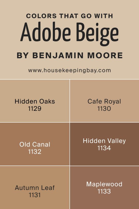
Shade Colors that Go With Adobe Beige 1128 by Benjamin Moore
Shade colors bring depth and visual interest. Hidden Oaks, Cafe Royal, Old Canal, Hidden Valley, Autumn Leaf, and Maplewood are great companions. Hidden Oaks adds a warm brown anchor. Cafe Royal brings rich cocoa depth. Old Canal introduces a cool gray-blue shade. Hidden Valley feels earthy and grounded. Autumn Leaf warms up the palette with soft terracotta. Maplewood brings a gentle rosy brown accent.
These shades enhance the main wall color by adding layers of richness and texture.
They let you highlight key features, furniture, or accents, creating a room that feels well-designed and dynamic.
How to Use Adobe Beige 1128 by Benjamin Moore In Your Home
Use this shade on living room walls to create a calm, inviting space. It’s perfect for open floor plans or bedrooms, where you want neutral comfort. Match it with natural wood floors, soft textiles, and off‑white accents to make rooms feel easygoing and styled.
Adobe Beige 1128 vs Similar Colors
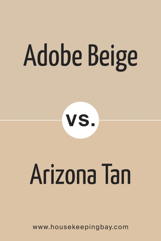
Adobe Beige 1128 vs Arizona Tan 2162‑50
Arizona Tan has a warmer, creamier finish. It leans more toward a classic tan, while Adobe Beige stays soft and muted. If you want a cozier or sunlit look, Arizona Tan works well.
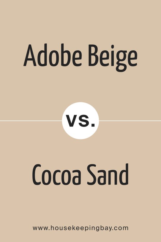
Adobe Beige 1128 vs Cocoa Sand 1122
Cocoa Sand brings in more richness and weight. It’s deeper and slightly more saturated, creating a grounded space. Adobe Beige feels lighter and works better in smaller rooms or brighter spaces.
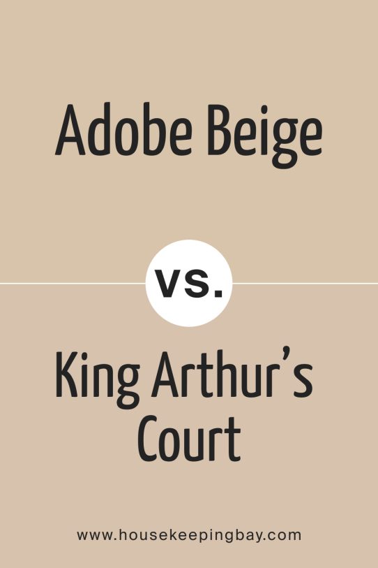
Adobe Beige 1128 vs King Arthur’s Court 1081
King Arthur’s Court adds stronger earth tones and gives off a traditional vibe. Adobe Beige is the subtler choice, keeping things more neutral while still feeling warm.
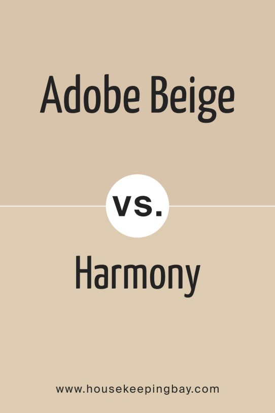
Adobe Beige 1128 vs Harmony AF‑90
Harmony brings in cooler green-gray undertones, which shift the mood of a space to a quieter, more modern feel. Adobe Beige, in contrast, feels cozier and more adaptable in family-oriented settings.
Conclusion
I’ve worked with a lot of neutral paint colors, and Adobe Beige 1128 has an ease to it that makes it stand out. It’s soft, warm, and light enough to brighten a room without ever looking stark. If you’re not sure where to start, this shade gives you room to try different styles and materials without clashing. You can build a whole palette around it—whether you lean cozy and traditional or want something cleaner and more modern. I’d say it’s a solid go-to if you want a calm, lived-in look that always feels just right.