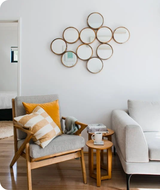
Living Room
 Bedroom
 Exterior
 Neutral
 White
 Gray
 Green
 Blue
 Yellow
 Pink
 Black
 Red
 Brown
 Orange
Steely Gray SW 7664 Paint Colors by Sherwin Williams
Unlock the Charm of Soft Gray in Your Home Decor
Choosing the right paint color can drastically change the feel and ambiance of a room. If you’re considering a new shade for your interior, you might want to check out SW 7664 Steely Gray by Sherwin Williams. This color exudes a gentle elegance and can significantly influence the mood and style of any room.
Steely Gray is a unique shade that balances between gray and blue, giving it a soothing yet refined presence. Whether you plan on painting a bedroom, a home office, or even a kitchen, Steely Gray offers a contemporary look that complements various decorative styles and settings. It pairs well with both bold and muted accents, allowing you to create an interior that reflects your personal taste while maintaining a chic and cohesive aesthetic.
Moreover, Steely Gray works beautifully in different lighting conditions, gently shifting in tone depending on natural and artificial light. This adaptability makes it a reliable choice for many homes and interiors.
So, if you’re thinking of refreshing a room or giving new life to an old interior, consider how Steely Gray might be the perfect fit for you.

via housekeepingbay.com
What Color Is Steely Gray SW 7664 by Sherwin Williams?
Table of Contents
Steely Gray SW 7664 by Sherwin-Williams is a flexible and refined shade of gray that offers a perfect balance between warmth and coolness, making it an ideal choice for various interior styles. This mid-tone gray exhibits gentle blue undertones, giving it a crisp and polished look. The neutrality of Steely Gray makes it highly adaptable, allowing it to work seamlessly in modern, minimalist, and even industrial decor settings.
In terms of interior design styles, Steely Gray shines in contemporary interiors where its clean and understated elegance can create a soothing yet stylish backdrop. It also pairs beautifully with Scandinavian themes, known for their use of cool hues and reliance on natural light. The adaptability of this shade allows it to enhance the chic simplicity of mid-century modern furniture, highlighting the natural beauty of wood, metal, and leather textures.
Materials like polished chrome, brushed nickel, and white marble look particularly striking against Steely Gray walls, as they complement the cool undertones of the paint. For textiles, consider soft fabrics like velvet or wool in light neutrals or vibrant colors to add depth and contrast while maintaining harmony in the room. Steely Gray works well in living rooms, bedrooms, and kitchens, offering a flexible palette that adapts to changing decor trends and personal tastes.

via housekeepingbay.com
Is Steely Gray SW 7664 by Sherwin Williams Warm or Cool color?
Steely Gray SW 7664 by Sherwin Williams is a flexible paint color that offers a balanced blend of blue and gray tones. This hue brings a gentle refinement to any room, making it a favorite for homeowners who prefer a neutral palette that still has some depth. The cool undertone of Steely Gray makes it ideal for creating a peaceful and relaxing atmosphere, which is perfect for bedrooms and bathrooms where a soothing ambience is desired.
In living areas, this color works well with both natural light and artificial lighting, maintaining its true color without skewing too dark or too light. It pairs beautifully with crisp whites or darker grays for a modern look, or with rich wood tones for a more traditional feel.
The adaptability of Steely Gray allows it to fit seamlessly into most home styles, from contemporary to classic, enhancing the aesthetic without overpowering the room. Its enduring nature ensures that it remains appealing over time, making it a smart choice for those looking to refresh their home’s look.
What is the Masstone of the Steely Gray SW 7664 by Sherwin Williams?
Steely Gray SW 7664 by Sherwin Williams is a robust medium gray shade with a masstone that is true gray, matching the hex code #808080 precisely. This specific shade of gray stays consistent and pure, avoiding any unwanted undertones that might emerge in different lighting.
Steely Gray provides a solid, neutral backdrop that fits seamlessly into a variety of home styles, from modern minimalism to cozy traditional. The neutrality of this gray makes it extremely adaptable, as it complements a wide range of other colors, enabling homeowners to pair it with bolder shades or keep things gentle with other neutrals.
Its medium depth ensures that despite being a strong color, it won’t overpower a room. It also works well in various lighting situations, maintaining its true gray appearance without leaning towards blue or green. This makes Steely Gray an ideal choice for walls in living rooms, bedrooms, or even kitchens, where consistency in color perception is crucial.

via housekeepingbay.com
Undertones of Steely Gray SW 7664 by Sherwin Williams
Steely Gray SW 7664 by Sherwin Williams is an adaptable gray shade that behaves differently depending on the lighting and surrounding colors due to its undertones. Undertones are gentle hints of color present within the main hue that emerge under certain conditions, affecting how we perceive the color overall.
In the context of Steely Gray, it incorporates a diverse range of undertones such as lilac, mint, pale pink, light blue, and many others, which add complexity to this seemingly straightforward gray paint. These undertones can make Steely Gray lean cooler or warmer, depending on the adjacent colors and lighting conditions.
For instance, in a room with plenty of natural light, the pale yellow or light blue undertones might become more pronounced, giving the walls a crisper, more vibrant feel. In artificial light, darker undertones like navy or dark turquoise could seem more dominant, making the room feel more enclosed and cozy.
When used on interior walls, Steely Gray’s mixture of undertones enables it to adapt to various decorating styles and themes. It can complement bold and vivid colors by balancing them with its cooler or neutral aspects. Alternatively, it can cooperate harmoniously with softer, muted tones, enhancing a gentle and refined aesthetic.
Understanding these undertones is crucial because they are key to achieving the desired ambiance in a room. By considering Steely Gray’s range of undertones, you can better predict how the color will behave in your specific environment and how it will complement your existing or planned decor.

via housekeepingbay.com
Coordinating Colors of Steely Gray SW 7664 by Sherwin Williams
Coordinating colors are shades that complement each other and work well together to create a visually appealing and harmonious look in any room. When paired thoughtfully, these colors can enhance the overall atmosphere of a room by balancing out tones and adding depth. For example, Steely Gray SW 7664 by Sherwin Williams is an adaptable and refined gray that serves as a great base for its coordinating colors: Pollen Powder SW 9014, Pure White SW 7005, and Ice Cube SW 6252.
Pollen Powder SW 9014 is a soft and gentle yellow that brings a delicate brightness to neutral interiors, making it ideal for adding a touch of warmth without overpowering the senses. It pairs especially well with Steely Gray, as the gray tones down the potential vibrancy of the yellow, creating a soft and inviting look.
Pure White SW 7005, on the other hand, is a crisp and clean white that provides a fresh contrast to Steely Gray, making the gray pop and giving the room a sharp, polished finish. Finally, Ice Cube SW 6252 offers a light blue that infuses a cool, peaceful feeling, balancing the warmth of Pollen Powder and the neutrality of Pure White, completing a palette that’s cohesive and visually appealing.
You can see recommended paint colors below:

via housekeepingbay.com
How Does Lighting Affect Steely Gray SW 7664 by Sherwin Williams?
Lighting has a significant impact on the perception of colors. The type of light under which a color is viewed can change how it appears. For instance, Steely Gray SW 7664 by Sherwin Williams can look quite different under various lighting conditions due to its complex undertones.
In artificial light, Steely Gray tends to appear warmer, reflecting more of its brown undertones. This makes the color cozier and richer, ideal for living rooms and bedrooms where soft artificial lighting is often used. The warmth of bulbs like incandescent or warm LEDs enhances the depth of the color, making it appear more inviting.
Under natural light, Steely Gray shows its true color balance. In a room with ample sunlight, the color can show a true gray, providing a neutral backdrop that complements a wide range of decor styles and colors. The clarity and brightness of natural light can make this shade appear lighter and more vibrant.
The orientation of the room also plays a role in how Steely Gray manifests:
- North-facing rooms: In these rooms, light is cooler and may cast a bluish tint, making Steely Gray appear slightly more muted and cooler. This can give a peaceful and sober effect, suitable for offices or study rooms.
- South-facing rooms: Here, the abundant sunlight can warm up the color, highlighting its underlying beige tones, and making the room feel more welcoming and warm throughout the day.
- East-facing rooms: Morning light in these rooms is bright and warm, so Steely Gray will appear lighter and more airy in the morning, turning cooler as the day goes on. This transition makes it adaptable for rooms used mostly in the morning.
- West-facing rooms: Evening light brings out the warmth in Steely Gray, making rooms cozy and inviting at the end of the day. This is ideal for dining rooms or areas used primarily in the evenings.
Understanding these effects can help in choosing the right paint color based on the room’s orientation and the type of light it receives, ensuring that Steely Gray SW 7664 achieves the desired effect in your interior.

via housekeepingbay.com
What is the LRV of Steely Gray SW 7664 by Sherwin Williams?
Steely Gray SW 7664 by Sherwin Williams, with an LRV of 30.355, falls on the darker side of the scale. This means it doesn’t reflect much light, capturing only about 30% of the light that hits it and absorbing the rest.
In rooms with limited natural light or in larger areas, using Steely Gray might make the interior appear more enclosed and shadowed.
However, in a well-lit area or when combined with lighter colors, Steely Gray can add depth and refinement without overpowering the room with darkness. Its LRV makes it adaptable for those wanting a balance between a cozy feel and maintaining some light reflection.

via housekeepingbay.com
What are the Trim colors of Steely Gray SW 7664 by Sherwin Williams?
Trim colors serve as an important accent in interior and exterior design, helping to define and frame architectural features and boundaries. When paired with a primary wall color like Steely Gray SW 7664 by Sherwin Williams, choosing the right trim colors can enhance the aesthetic coherence and visual appeal of a room.
Both Dover White SW 6385 and Canvas Tan SW 7531 are excellent choices for trim when using Steely Gray as the main color. These trim colors provide a soft but distinct contrast that can make the gray tones appear more vivid and refined, highlighting features like door frames, crown moldings, and baseboards effectively.
Dover White SW 6385 is a warm, creamy white that imparts a gentle, inviting feel to any room it adorns. This color works well with Steely Gray as it establishes a clean and bright border that can make the gray look sharper and more pronounced. On the other hand, Canvas Tan SW 7531 offers a slightly earthier tone, bringing a gentle warmth that complements the cooler hues of Steely Gray. The use of Canvas Tan as a trim color adds a natural, understated elegance, creating a harmonious transition between different color zones. Both choices help achieve a balanced and cohesive look that enhances the overall ambiance of the room.
You can see recommended paint colors below:

via housekeepingbay.com
Colors Similar to Steely Gray SW 7664 by Sherwin Williams
Similar colors work harmoniously together because they share a common hue base, which creates a visually cohesive atmosphere. For example, shades similar to Steely Gray SW 7664 by Sherwin Williams, such as Network Gray SW 7073 and Let it Rain SW 9152, blend effortlessly with the primary color to produce a gentle and pleasing aesthetic. These similar colors can enhance the mood of a room without overpowering it with high contrast. They help in achieving a balanced look that feels connected and fluid.
Network Gray SW 7073 offers a soft, almost ethereal feel, perfect for minimalistic or modern interiors, whereas Let it Rain SW 9152 brings a slightly deeper tone that suggests the soothing feel of a rainy day. Debonair SW 9139 leans towards a more refined look with its classy hue. Gray Shingle SW 7670 and Earl Grey SW 7660 both provide a sturdy, reliable vibe to any room.
Tin Lizzie SW 9163 and African Gray SW 9162 give off a hint of the industrial, yet maintain a warm undertone for balance. Dustblu SW 9161 adds a unique twist with its dusty blue influence. Cadet SW 9143 has a young and fresh appeal, and Castlegate SW 9558 rounds out the options with its earthy and solid character, making each a perfect companion to Steely Gray for different thematic and stylistic interior designs.
You can see recommended paint colors below:
- SW 7073 Network Gray
- SW 9152 Let it Rain
- SW 9139 Debonair
- SW 7670 Gray Shingle
- SW 7660 Earl Grey
- SW 9163 Tin Lizzie
- SW 9162 African Gray
- SW 9161 Dustblu
- SW 9143 Cadet
- SW 9558 Castlegate

via housekeepingbay.com
Colors that Go With Steely Gray SW 7664 by Sherwin Williams
Choosing complementary colors for Steely Gray SW 7664 by Sherwin Williams is crucial in creating a harmonious room. The right color combinations can enhance the refinement and appeal of the room while maintaining a cohesive look. Colors like Reflection, Slate Tile, Wall Street, Monorail Silver, Evening Shadow, and Smoky Blue are perfect accompaniments.
Reflection SW 7661 is a light gray that offers a soft, airy feeling, making it great for creating a peaceful and open atmosphere. It’s gentle enough to use across large areas without overpowering the senses. Slate Tile SW 7624, on the other hand, is a deeper blue-gray that adds a touch of seriousness and grounding, ideal for accent walls or furniture.
Wall Street SW 7665 is a bold, deep charcoal that provides a strong statement and works well in a balanced palette with lighter tones. Monorail Silver SW 7663 has a metallic tone that gives a slight industrial feel, suitable for modern interiors seeking a chic, urban touch. Evening Shadow SW 7662, being a cooler, more muted gray, complements Steely Gray by adding depth and variety without straying far from the base color. Lastly, Smoky Blue SW 7604 introduces a peaceful blue that brings a gentle splash of color, perfect for areas where you want a hint of softness and interest without dramatic contrast. Together, these colors round out the environment, making any room feel thoughtfully designed and visually coherent.
You can see recommended paint colors below:
- SW 7661 Reflection
- SW 7624 Slate Tile
- SW 7665 Wall Street
- SW 7663 Monorail Silver
- SW 7662 Evening Shadow
- SW 7604 Smoky Blue

via housekeepingbay.com
How to Use Steely Gray SW 7664 by Sherwin Williams In Your Home?
Steely Gray SW 7664 by Sherwin Williams is an adaptable paint color that can be used in various ways throughout a home. Its muted gray tone provides a soothing backdrop, making it an ideal choice for living rooms and bedrooms where a relaxed atmosphere is often appreciated. The color is neutral enough to complement a wide range of furniture and decor styles, from modern to traditional.
In smaller areas like bathrooms or hallways, Steely Gray can help create the illusion of a more open interior while adding a touch of refinement. For those who like a cohesive look, it can also be carried into the kitchen cabinets or used as an accent wall color to unify different areas of the home.
Additionally, because it’s such a balanced shade, it pairs beautifully with brighter or darker colors, allowing other elements to pop without overpowering the senses. Overall, Steely Gray is a practical choice for those looking to freshen up their interiors with an enduring and adaptable color.
Steely Gray SW 7664 by Sherwin Williams vs Let it Rain SW 9152 by Sherwin Williams
Steely Gray SW 7664 by Sherwin Williams is a robust, bold gray with a strong presence. It has a slight blue undertone that gives it a cool, industrial feel, making it a great choice for modern and contemporary interiors. This color works well in areas where you want to set a serious, yet inviting tone.
In contrast, Let it Rain SW 9152 is a softer, more muted gray. This color has a blue-green undertone, which imparts a more relaxed and gentle feel. It’s ideal for creating a soothing atmosphere in bedrooms or bathrooms, where a sense of relaxation is often desired.
Both colors offer unique vibes: Steely Gray brings strength and boldness, while Let it Rain offers a softer, soothing effect. Depending on the mood and style you want to achieve, each color has its special appeal.
You can see recommended paint color below:
- SW 9152 Let it Rain

via housekeepingbay.com
Steely Gray SW 7664 by Sherwin Williams vs Network Gray SW 7073 by Sherwin Williams
Steely Gray SW 7664 by Sherwin Williams is a deep, cool gray with blue undertones. This color provides a strong, soothing presence in a room and pairs well with bright or metallic accents to create a modern look. It works particularly well in areas needing a relaxing yet robust character, like home offices or bedrooms.
Network Gray SW 7073 is slightly lighter than Steely Gray and has more neutrality in its tone, veering away from the noticeable blue undertones of Steely Gray. This makes Network Gray an adaptable choice, fitting various decor styles and color schemes. It’s an excellent option for areas where you want a broader appeal, such as living rooms or entryways.
Overall, Steely Gray leans towards a more dramatic and cooler hue, suitable for creating a focal impact. Network Gray, meanwhile, offers a softer approach, which can effortlessly integrate with diverse settings and enhances the room without dominating it.
You can see recommended paint color below:

via housekeepingbay.com
Steely Gray SW 7664 by Sherwin Williams vs Gray Shingle SW 7670 by Sherwin Williams
Steely Gray SW 7664 by Sherwin Williams is a cool, gentle gray with blue undertones, giving it a relaxed and composed feel. This color fits well in modern and minimalist interiors, providing a sleek and refined backdrop. It pairs nicely with bright whites or vibrant colors for a bold contrast.
Gray Shingle SW 7670 by Sherwin Williams is a warmer shade of gray with hints of green, offering a soothing and welcoming vibe. This color works well in traditional or rustic settings, adding a sense of comfort and homeliness. It blends beautifully with natural woods and soft neutrals.
Overall, Steely Gray is cooler and sharper, making it ideal for contemporary interiors, while Gray Shingle is warmer and softer, suitable for creating a cozy and inviting environment. Both colors are adaptable, but the choice between them depends on the desired mood and style of the room.
You can see recommended paint color below:
- SW 7670 Gray Shingle

via housekeepingbay.com
Steely Gray SW 7664 by Sherwin Williams vs African Gray SW 9162 by Sherwin Williams
Steely Gray SW 7664 by Sherwin Williams is a cool, medium gray that gives a modern and refined feel to interiors. It often looks slightly blue, contributing to a sleek and contemporary atmosphere. This color works well in areas like living rooms and kitchens where its understated elegance can complement various decor styles.
African Gray SW 9162, another product from Sherwin Williams, is a warmer shade of gray. It has a softer, more inviting tone that leans towards beige, making it ideal for creating cozy environments. It’s particularly effective in bedrooms and living areas where a relaxing effect is desired.
While Steely Gray projects a cooler, more formal look, African Gray offers warmth and is more adaptable when blending with wood tones and natural materials. Both colors provide unique aesthetics, with Steely Gray favoring modern settings and African Gray suiting traditional and relaxed interiors.
You can see recommended paint color below:

via housekeepingbay.com
Steely Gray SW 7664 by Sherwin Williams vs Debonair SW 9139 by Sherwin Williams
Steely Gray SW 7664 by Sherwin Williams is a cool, muted gray that has a strong presence, giving off a sturdy and dependable vibe. It is adaptable and works well in various rooms, from modern kitchens to cozy bedrooms, harmonizing easily with both bright and subdued accents.
Debonair SW 9139, also by Sherwin Williams, is a lighter, softer gray with hints of blue. This color adds a gentle, refined touch to any room, creating a soothing atmosphere. It pairs beautifully with elegant decor and can help make small rooms appear larger and more open.
While both colors share a gray base, Steely Gray is darker and more pronounced, making it suitable for creating a bold statement or anchoring a room with its depth. In contrast, Debonair offers a breezier feel, perfect for creating a light, airy environment. Each brings its unique qualities to the table, making them suitable for different design objectives and preferences.
You can see recommended paint color below:
- SW 9139 Debonair

via housekeepingbay.com
Steely Gray SW 7664 by Sherwin Williams vs Cadet SW 9143 by Sherwin Williams
Steely Gray SW 7664 by Sherwin Williams is a deep, cool gray that has a strong presence and provides a solid, neutral foundation suitable for any room. It carries gentle blue undertones which give it a crisp, modern feel, making it particularly ideal for contemporary interiors. This color works well in well-lit areas or rooms where you want to create a more formal, refined atmosphere.
Cadet SW 9143, also by Sherwin Williams, is a lighter shade of gray compared to Steely Gray. It has a softer look with warm undertones, creating a cozy and welcoming environment. This color is adaptable and fits effortlessly in various settings, from casual living rooms to restful bedrooms. It pairs well with a broad range of decor styles and enhances the warmth of natural wood tones and textiles.
Both colors provide a neutral palette, but Steely Gray leans towards a sharper, more defined look while Cadet offers warmth and gentleness. This makes Cadet a better option for a relaxed aesthetic, whereas Steely Gray is ideal for achieving a more dramatic effect.
You can see recommended paint color below:

via housekeepingbay.com
Steely Gray SW 7664 by Sherwin Williams vs Tin Lizzie SW 9163 by Sherwin Williams
Steely Gray SW 7664 by Sherwin Williams is a cool gray that delivers a gentle, refined vibe to any room. This color features a balanced blend of blue and green undertones, making it both neutral and adaptable to various lighting conditions and styles. It is particularly effective in creating a professional, relaxed atmosphere in a room, making it suitable for offices and modern living areas.
Tin Lizzie SW 9163, also by Sherwin Williams, is another gray shade but with a noticeably different character. It leans toward a warmer tone, containing slight brown undertones which add a softer, more inviting feel. This warmth makes Tin Lizzie ideal for cozy areas like bedrooms or family rooms, where a welcoming ambiance is desired.
While both colors are grays, Steely Gray tends to feel more formal and crisp, whereas Tin Lizzie offers a warmer, more homey appeal. This difference in undertone influences their suitability for different environments and purposes, though both maintain a sleek and contemporary appearance.
You can see recommended paint color below:
- SW 9163 Tin Lizzie

via housekeepingbay.com
Steely Gray SW 7664 by Sherwin Williams vs Earl Grey SW 7660 by Sherwin Williams
Steely Gray SW 7664 by Sherwin Williams is a robust, medium-toned gray that exhibits a strong, metallic undertone, reminiscent of natural steel. This color can bring a sense of strength and modernity to a room, making it a great choice for areas where a contemporary, industrial vibe is desired. It pairs well with both bright and muted colors, providing flexibility in design.
Earl Grey SW 7660, also by Sherwin Williams, is slightly lighter than Steely Gray. It has a softer, warmer tone, suggesting the comforting aspect of its namesake tea. This color works well in rooms intended for relaxation and peacefulness, such as bedrooms and living rooms. Its warmth invites a more intimate atmosphere compared to the cooler and more formal impression given by Steely Gray.
Both colors provide unique aesthetics and can be used effectively according to the atmosphere one wishes to create. Steely Gray leans towards a modern, bold feel, while Earl Grey offers a gentler, more inviting presence.
You can see recommended paint color below:

via housekeepingbay.com
Steely Gray SW 7664 by Sherwin Williams vs Dustblu SW 9161 by Sherwin Williams
Steely Gray SW 7664 by Sherwin Williams is a deep, cool gray with a strong presence, making it a solid choice for those who prefer a bold yet neutral backdrop. Its strength lies in its adaptability, fitting well in modern living areas or offices that benefit from a more serious, grounded ambiance.
In contrast, Dustblu SW 9161 is a lighter, softer blue with gray undertones, offering a soothing and gentle feel. This color works beautifully in bedrooms or bathrooms where a relaxing atmosphere is desirable. Dustblu is ideal for creating a peaceful retreat in your home.
While both colors maintain neutrality, Steely Gray presents a more classic, austere look, whereas Dustblu leans towards creating a peaceful, inviting environment. You might choose Steely Gray in areas of high traffic or where focus is needed, while Dustblu is better suited for personal rooms aimed at relaxation. Each color supports different design goals and moods, making them useful for various decorating styles.
You can see recommended paint color below:
- SW 9161 Dustblu

via housekeepingbay.com
Steely Gray SW 7664 by Sherwin Williams vs Castlegate SW 9558 by Sherwin Williams
Steely Gray SW 7664 by Sherwin Williams is a cool, medium gray with gentle blue undertones, giving it a sleek and modern feel. It works well in rooms that require a neutral backdrop that still offers a touch of refinement and depth. This color can make rooms appear more spacious and is adaptable enough to be paired with a variety of decor styles and colors.
Castlegate SW 9558, from Sherwin Williams, contrasts Steely Gray as it is a much darker shade. This deep, brown-gray hue provides a strong and grounding presence, ideal for creating a cozy and inviting atmosphere. Its richness works well in areas where a sense of warmth is desired, such as living rooms or bedrooms.
While both colors share a neutral palette, Steely Gray leans towards a lighter, crisper feel suitable for modern aesthetics. In contrast, Castlegate offers warmth and depth, making it perfect for traditional interiors or areas where a comforting ambiance is key. Each color presents unique opportunities for creating distinct and appealing environments within a home or office.
You can see recommended paint color below:
- SW 9558 Castlegate

via housekeepingbay.com
In conclusion, my analysis of SW 7664 Steely Gray by Sherwin Williams highlights its adaptability and refined charm. This shade serves as a fantastic choice for anyone looking to add a touch of elegance to their interior without overpowering it with color. Steely Gray manages to strike a perfect balance, providing a neutral backdrop that pairs well with a wide range of decor styles and color palettes. Whether applied in a living room, bedroom, or even a kitchen, this color maintains a consistent allure, enhancing the aesthetics without demanding attention.
Furthermore, the soothing nature of Steely Gray makes it ideal for creating a peaceful atmosphere, conducive to relaxation and focus. Its ability to complement various textures and materials also makes it a practical choice in achieving a cohesive interior design scheme. I’ve noticed that when used thoughtfully, Steely Gray can contribute significantly to the overall mood and functionality of a room, making it a reliable option for both home owners and professional designers.
While personal taste in color can vary widely, my experience with Steely Gray confirms its suitability for those seeking a refined and adaptable color solution. Its enduring popularity is well-deserved, and I recommend considering it if you’re planning to refresh your home’s palette.

via housekeepingbay.com