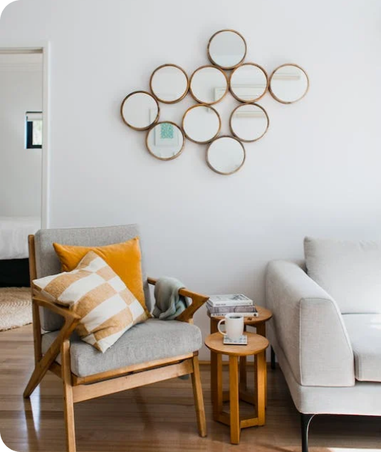
Living Room
 Bedroom
 Exterior
 Neutral
 White
 Gray
 Green
 Blue
 Yellow
 Pink
 Black
 Red
 Brown
 Orange
Status Bronze SW 7034 Paint Colors by Sherwin Williams
Warm Elegance in Every Stroke
Let me introduce you to Sherwin Williams’ SW 7034 Status Bronze. This particular shade is a warm, welcoming bronze that brings a subtle elegance to any space. Perfect for those who want a cozy yet sophisticated look, Status Bronze adapts beautifully to different lighting and complements various decor styles.
Whether you plan to refresh your living room, bedroom, or even the exterior of your home, Status Bronze offers a refined backdrop.
Its earthen hue harmonizes well with natural elements and materials, making it an excellent choice for those aiming for an organic, grounded aesthetic. This color can act as a striking statement or a muted companion to bolder colors, depending on how you style it.
Pairing it with the right accents and furnishings can truly make your space feel unique and tailored to your taste.
So, if a change is on your mind, considering SW 7034 Status Bronze could be the perfect start. Its rich tone provides a comforting sense of warmth that turns any house into a home.

via sherwin-williams.com
What Color Is Status Bronze SW 7034 by Sherwin Williams?
Table of Contents
Status Bronze SW 7034 by Sherwin Williams is a warm, rich shade of brown with subtle gray undertones. This color exudes a comforting, stable vibe, making it a perfect addition for areas in your home where you want to instill a sense of solidity and warmth. Due to its versatile nature, it harmonizes well with various design styles, particularly rustic, industrial, and contemporary themes.
In a rustic setting, Status Bronze can be paired with natural materials like wood, stone, and linen to enhance the earthy aesthetic of the space.
In an industrial decor, combining this color with elements like exposed steel, aged copper, or brushed nickel can create a visually interesting contrast while maintaining a cozy atmosphere. For those with a modern taste, incorporating sleek furniture and smooth surfaces such as polished marble or glass will complement the color’s depth and warmth.Status Bronze is potent in grounding brighter or bolder colors, balancing out spaces with vibrant art or decorative pieces. Its muted quality also works well with softer textures, adding a layer of sophistication.
Use it on walls, as an accent, or for cabinetry and furniture for a cohesive look that ties different materials and finishes together in your home’s design.

via housekeepingbay.com
Is Status Bronze SW 7034 by Sherwin Williams Warm or Cool color?
Status BronzeSW 7034 by Sherwin Williams is a versatile, rich beige paint color that brings a cozy warmth to any room. This shade is particularly effective in spaces aiming for a calm, inviting atmosphere. Its neutral tone makes it an excellent base that pairs well with a variety of decor styles and colors, whether you’re looking to complement bold accents or maintain a subtle, harmonious look.
In homes, Status Bronze can create a seamless flow from room to room. It works well in living areas, bedrooms, and even kitchens, offering a backdrop that enhances furniture and art without overpowering them.
Its light absorbing quality can also help in making small spaces appear bigger and more open.Additionally, Status Bronze adapts well to different lighting conditions, reflecting a gentle, warm glow under natural light, while maintaining its cozy feel under artificial lighting. This adaptability makes it a practical choice for nearly any living space.
What is the Masstone of the Status Bronze SW 7034 by Sherwin Williams?
Status BronzeSW 7034 by Sherwin Williams features a masstone of Brown (#802B2B), a rich, deep color with a warm and inviting undertone. This particular shade of brown provides a solid and grounding effect, making it an excellent choice for home interiors wanting to add a sense of warmth and coziness.In homes, Status BronzeSW 7034 can work exceptionally well in living areas, bedrooms, and even kitchens.
Its deep brown tone pairs beautifully with various textures and materials such as wood, leather, and fabric, enhancing the natural elements of a space.
This color can also serve as a robust backdrop, allowing art, furniture, and décor to stand out. Whether used as an accent wall or throughout a room, Status BronzeSW 7034 helps create a balanced and comfortable environment.Its versatility extends to various design styles, from rustic to modern homes, making it a popular choice among homeowners looking to add richness and warmth to their interiors.

via housekeepingbay.com
Undertones of Status Bronze SW 7034 by Sherwin Williams
Status Bronze SW 7034 by Sherwin Williams is a complex paint color with a rich mix of undertones that influence how it appears in different settings. These undertones include dark grey, olive, dark green, purple, navy, grey, dark turquoise, red, orange, pink, and pale pink. Undertones are subtle colors that lurk beneath the main color.
They can change the way we perceive the main color depending on the lighting and surrounding elements.
For example, in bright sunlight, orange and pink undertones might make Status Bronze look warmer, whereas in dim light, dark grey or navy might make it appear more reserved and cooler.When used on interior walls, the undertones in Status Bronze can affect the mood and style of a room. In a space with lots of natural light, the warmer undertones could make the room feel cozy and welcoming. In artificial light, cooler undertones like grey and navy might dominate, giving the space a more formal look. The versatility of Status Bronze due to its range of undertones makes it a suitable choice for various rooms, adapting subtly to changes in light and decor.
This dynamic nature of Status Bronze means it works well in many settings but also requires careful consideration of lighting and surrounding colors to achieve the desired effect.

via housekeepingbay.com
Coordinating Colors of Status Bronze SW 7034 by Sherwin Williams
Coordinating colors are shades that complement each other while sharing a specific harmony that ties them into a single visual theme. These colors, when paired or used together in a space, bring out each other’s qualities and create a balanced and visually appealing atmosphere.
For instance, when dealing with a primary hue like Status Bronze SW 7034 by Sherwin Williams, selecting the right coordinating colors is crucial to enhance the depth and warmth of the primary shade without overwhelming it.
In the case of Status Bronze, a warm, deep, earthy tone, suitable coordinating colors include SW 7028 – Incredible White, SW 9041 – Parisian Patina, and SW 7030 – Anew Gray. Incredible White is a soft, subtle white with a hint of gray undertone that pairs well with darker colors by providing a clean background that allows them to stand out.
Parisian Patina is a calm, mid-tone green with a slightly grayish tinge, giving a refreshing contrast to the richness of Status Bronze, adding a natural, soothing feel to the environment. Lastly, Anew Gray is a mid-tone gray that drifts between beige and gray, versatile enough to support both warm and cool hues, making it perfect for smoothing transitions between more intense colors.
Together, these colors complement Status Bronze by balancing its intensity with neutral, but harmonious alternatives, enhancing the overall aesthetic of any design scheme.
You can see recommended paint colors below:
- SW 7028 Incredible White
- SW 9041 Parisian Patina
- SW 7030 Anew Gray

via housekeepingbay.com
How Does Lighting Affect Status Bronze SW 7034 by Sherwin Williams?
Lighting plays a pivotal role in how colors appear in different settings. Colors can change drastically under various light sources due to a phenomenon known as metamerism. This means that colors might look different under artificial light compared to natural sunlight.For example, the color Status Bronze SW 7034 by Sherwin Williams is a complex shade that can appear differently in various lighting conditions. In artificial light, such as that from incandescent bulbs, Status Bronze may look warmer and more welcoming, highlighting its brown and orange undertones.
On the other hand, in natural light, especially in bright sunlight, the color might show more of its grey undertones, leading to a cooler appearance.
The appearance of Status Bronze also varies depending on the orientation of the room. North-facing rooms can make this color appear more muted and cooler, since the light from the north is typically softer and bluer.
This could make Status Bronze look more subdued and closer to a true neutral.In south-faced rooms, where sunlight is abundant and warmer for most of the day, Status Bronze is likely to appear warmer and more vibrant.
The warmer southern light enhances the color’s rusty undertones, making it feel cozier.East-facing rooms receive sunlight in the morning, which is generally cooler and can make Status Bronze look a bit softer and more balanced in the morning, gradually transitioning as the day progresses.West-facing rooms experience the evening light, which is warmer.
Here, Status Bronze will likely appear richer and deeper, especially during sunset when the orange and red wavelengths make the room glow warmer.Understanding how different types of light affect the perception of colors can help in making informed decisions about paint choices for various rooms based on their orientation and light exposure.

via housekeepingbay.com
What is the LRV of Status Bronze SW 7034 by Sherwin Williams?
Status Bronze SW 7034 by Sherwin Williams, with an LRV of 7.959, is a darker color that only reflects a small amount of light. With such a low LRV, Status Bronze will appear quite deep and rich, making it impactful in spaces seeking a bold or intimate feel. It can make small rooms feel smaller and cozier, absorbing most of the light rather than reflecting it. In large, well-lit spaces, however, Status Bronze can add a level of sophistication and depth, enhancing the room’s character without making it feel claustrophobic.
By understanding LRV and how it impacts the perception of color, one can better decide where and how to use different shades effectively.

via housekeepingbay.com
What are the Trim colors of Status Bronze SW 7034 by Sherwin Williams?
Trim colors, such as SW 7004 – Snowbound and SW 7036 – Accessible Beige by Sherwin Williams, play a crucial role in enhancing the appearance of a main color like Status Bronze SW 7034. These trim colors act as a frame, providing contrast or coherence to walls painted with the main shade, ultimately contributing to a more polished and appealing look.
When used effectively, they can highlight architectural features, create visual boundaries, and add a layer of complexity to the design that enriches the overall aesthetic of the space.
Snowbound SW 7004 is a light, almost white, color with subtle gray undertones, which offers a clean and bright contrast that can make the deeper tones of Status Bronze pop more vividly. On the other hand, Accessible Beige SW 7036 is a warm beige that blends beautifully, offering a softer transition that complements the earthy hues in Status Bronze. This option can enhance the room’s warmth, making it feel more inviting and coherent.
You can see recommended paint colors below:
- SW 7004 Snowbound
- SW 7036 Accessible Beige

via housekeepingbay.com
Colors Similar to Status Bronze SW 7034 by Sherwin Williams
Similar colors play a vital role in creating harmonious and cohesive color schemes in design. By implementing shades that are alike, such as those similar to Status Bronze SW 7034 by Sherwin Williams, designers can craft fluid and aesthetically pleasing spaces. Colors like Van Dyke Brown SW 7041 bring a deep, rich brown that offers a strong base or accent, complementing the milder bronze tones well.
Tungsten SW 9515 presents a cooler, grey shade that contrasts subtly with warmer bronzes for a balanced look. Pier SW 7545 delivers a grayish tan that softens spaces with a perfect neutral background, while Tea Leaf SW 9604 introduces a slight green undertone that adds an earthy touch to the overall palette.
Continuing with the theme, Best Bronze SW 6160 spikes the ensemble with a darker, more intense bronze, adding depth to any design.
Protege Bronze SW 6153 leans towards the lighter side of bronze, providing a gentle twinkle of warmth to interiors. Kaffee SW 6104 is a hearty, solid coffee brown that grounds environments with its robustness.
Half-Caff SW 9091 offers a lighter brown that mixes well with both pale and dark hues. Enduring Bronze SW 7055 reflects a hint of gray, making it versatile for blending with various decor elements. Lastly, Hickory Smoke SW 7027 integrates a smoky gray that works beautifully as a cool counterbalance to warm bronze tones, ensuring that spaces are visually engaging yet soothing.
These subtle nuances of similar colors help in crafting a space that feels unified and thoughtfully designed.
You can see recommended paint colors below:
- SW 7041 Van Dyke Brown
- SW 9515 Tungsten
- SW 7545 Pier
- SW 9604 Tea Leaf
- SW 6160 Best Bronze
- SW 6153 Protege Bronze
- SW 6104 Kaffee
- SW 9091 Half-Caff
- SW 7055 Enduring Bronze
- SW 7027 Hickory Smoke

via housekeepingbay.com
Colors that Go With Status Bronze SW 7034 by Sherwin Williams
Choosing complementary colors for Status Bronze SW 7034 by Sherwin-Williams is significant as it allows for a well-rounded and cohesive look in any space. The shades that pair well with it enhance the muted bronze tone, creating an inviting and balanced atmosphere. For example, Brainstorm Bronze SW 7033 has a darker, more intense feel, which works great for adding depth when used alongside the lighter Status Bronze.
Keystone Gray SW 7504 is another excellent companion; it introduces a subtler contrast that is sophisticated yet understated, perfect for a modern look.
Mega Greige SW 7031 and Anew Gray SW 7030 support Status Bronze with their warm gray hues, reinforcing a neutral palette that is calm and easy on the eyes. Agreeable Gray SW 7029, a lighter gray, broadens the room’s sense of space and brings a fresh, airy quality.
Lastly, Warm Stone SW 7032 offers a deeper, earthy base that contrasts nicely, providing warmth and a hint of nature.
Together, these colors create a rich tapestry that enhances the beauty of the central hue, Status Bronze, making any room feel more cohesive and harmonious.
You can see recommended paint colors below:
- SW 7033 Brainstorm Bronze
- SW 7504 Keystone Gray
- SW 7031 Mega Greige
- SW 7030 Anew Gray
- SW 7029 Agreeable Gray
- SW 7032 Warm Stone

via housekeepingbay.com
How to Use Status Bronze SW 7034 by Sherwin Williams In Your Home?
Status Bronze SW 7034 by Sherwin Williams is a warm, deep taupe that adds a subtle hint of sophistication to any room. Perfect for those looking to create a cozy yet refined atmosphere, this color works well in living rooms and bedrooms. Its earthy tones pair nicely with natural materials like wood or stone, enhancing the rustic vibe of a space.
This versatile shade can also be used in kitchens and bathrooms where it contrasts beautifully with white trim or cabinetry, providing a calm, welcoming feel.
For a modern look, combine Status Bronze with metallic accents such as brass or copper. This pairing brings a touch of elegance without overpowering the room.Moreover, Status Bronze serves as an excellent exterior color for doors and shutters. It complements a wide range of brick, siding, and stucco, ensuring that the outside of your home looks as inviting as the inside.
Whether you’re looking to update a single accent wall or repaint a larger area, Status Bronze SW 7034 is a reliable choice that works well in any setting.
Status Bronze SW 7034 by Sherwin Williams vs Enduring Bronze SW 7055 by Sherwin Williams
Status Bronze SW 7034 by Sherwin Williams is a warm, muted shade that offers a cozy and inviting feel. It’s a versatile color that can complement various interior styles, perfect for creating a relaxed atmosphere in living spaces or bedrooms. Its earthy tones give rooms a grounded, homely appearance, making it a great choice for those looking to add a touch of nature to their decor.
Enduring Bronze SW 7055, also by Sherwin Williams, is slightly darker and richer than Status Bronze. This color provides depth and sophistication to any space, making it ideal for accent walls or furniture pieces.
It can also help to make large rooms feel more intimate due to its darker hue, and works well in both modern and traditional settings.While both colors share a similar bronze base, the lighter touch of Status Bronze is contrasting with the deeper, more intense feel of Enduring Bronze. Each brings its unique flair to interior spaces, whether through a bright and airy feel or a more enclosed and cozy vibe.
You can see recommended paint color below:

via housekeepingbay.com
Status Bronze SW 7034 by Sherwin Williams vs Tungsten SW 9515 by Sherwin Williams
Status Bronze SW 7034 by Sherwin Williams is a warm, inviting shade that carries hints of earth and clay. This color brings a natural, grounded feeling to any space, making rooms feel cozy and welcoming. Its versatility allows it to work well in living areas, bedrooms, or places where you want a touch of understated elegance.
Tungsten SW 9515, also by Sherwin Williams, is a darker, cooler gray that projects a more modern and sleek look. It provides a neutral backdrop that can complement bold accent colors or support a minimalist aesthetic. Ideal for creating a contemporary vibe, Tungsten works well in kitchens, bathrooms, or any space that benefits from a clean, sharp appearance.
Both colors offer distinct atmospheres: Status Bronze exudes warmth and coziness, while Tungsten offers a chic, contemporary feel. Choosing between them depends on the room’s purpose and desired mood.
You can see recommended paint color below:
- SW 9515 Tungsten

via housekeepingbay.com
Status Bronze SW 7034 by Sherwin Williams vs Protege Bronze SW 6153 by Sherwin Williams
Status Bronze SW 7034 and Protege Bronze SW 6153 are both warm, inviting colors from Sherwin Williams, but they exhibit distinct tones and moods. Status Bronze leans more towards a muted, grayish tone, offering a subtle and sophisticated feel. This makes it ideal for creating a calm, understated look in spaces like living rooms or bedrooms.
Protege Bronze, in contrast, has a richer, more pronounced bronze quality that adds warmth and depth.
This color can bring a cozy and welcoming atmosphere, perfect for areas where a stronger, more comforting presence is desired, such as dining rooms or family rooms.Both colors provide versatility in décor, matching well with natural materials like wood and stone. Status Bronze works best for those seeking a modern, sleek aesthetic, while Protege Bronze suits environments where a traditional, hearty ambiance is preferred.
You can see recommended paint color below:
- SW 6153 Protege Bronze

via housekeepingbay.com
Status Bronze SW 7034 by Sherwin Williams vs Tea Leaf SW 9604 by Sherwin Williams
Status Bronze SW 7034 by Sherwin Williams is a warm, neutral shade that has a solid earthiness, resembling aged leather or an autumn forest floor. It’s versatile and offers a cozy, welcoming feel, ideal for living rooms or studies where you want a sense of comfort and stability.On a different note, Tea Leaf SW 9604 is a darker, more intense color.
This hue recalls the richness of wet soil or deep green foliage, adding depth and sophistication to any space.
It works well in areas that benefit from a touch of drama and formality, such as dining rooms or entryways.Both colors carry a naturalistic charm but bring distinct atmospheres to interiors. Status Bronze is softer and lighter, promoting a relaxed ambiance, while Tea Leaf is bolder and creates a more commanding presence. They can complement each other well in a color scheme, adding layers of natural beauty to the decor.
You can see recommended paint color below:

via housekeepingbay.com
Status Bronze SW 7034 by Sherwin Williams vs Kaffee SW 6104 by Sherwin Williams
The color Status Bronze SW 7034 by Sherwin Williams is a rich, medium-toned taupe with warm undertones. It offers a sophisticated vibe, suitable for creating cozy and inviting spaces. This color works well in living areas or bedrooms where a calm, grounded ambience is desired. It pairs nicely with natural materials like wood and stone.
Kaffee SW 6104, also by Sherwin Williams, is a much darker shade compared to Status Bronze. Kaffee is a deep, warm brown that exudes robustness and depth. This color can make large spaces feel more intimate and is ideal for accent walls or for adding gravity to a room.
While both colors share warm undertones, Status Bronze is lighter and more versatile, making spaces feel airy yet anchored. Kaffee, being darker, provides a strong statement and can serve as a focal point or background for lighter tones. Both are excellent choices for creating a warm, welcoming environment but serve different purposes based on their depth and intensity.
You can see recommended paint color below:
- SW 6104 Kaffee

via housekeepingbay.com
Status Bronze SW 7034 by Sherwin Williams vs Van Dyke Brown SW 7041 by Sherwin Williams
Status Bronze SW 7034 and Van Dyke Brown SW 7041 both come from Sherwin Williams, offering distinct shades for different vibes in interior design. Status Bronze is a lighter, warm gray-brown that provides a subtle, cozy feel to spaces. Its lighter tone makes it versatile for various rooms, working well as a neutral backdrop that complements a wide range of decor styles and colors.
Van Dyke Brown SW 7041 is a much darker, richer brown. This deep color adds a sense of sophistication and warmth, perfect for creating a strong statement in a room.
It is ideal for accent walls or in spaces where a more dramatic, intimate atmosphere is desired.While both colors share a base of brown, Status Bronze gives a lighter, more airy feeling, whereas Van Dyke Brown offers depth and boldness. Depending on the room’s purpose and size, either could enhance the aesthetic, with Status Bronze brightening spaces and Van Dyke Brown making them more grounded and cozy.
You can see recommended paint color below:
- SW 7041 Van Dyke Brown

via housekeepingbay.com
Status Bronze SW 7034 by Sherwin Williams vs Best Bronze SW 6160 by Sherwin Williams
Status Bronze SW 7034 and Best Bronze SW 6160 by Sherwin Williams are both bronze hues but differ in their nuances. Status Bronze has a muted, subtle gray undertone making it versatile for spaces that require a soft yet sophisticated look. It pairs well with natural materials like wood and stone and complements a wide range of decor styles from modern to rustic.
Best Bronze SW 6160, in contrast, has a warmer, richer feel with deeper earthy undertones. This color can create a cozy, inviting atmosphere in a room, ideal for living spaces or bedrooms where a sense of warmth is desired. It works beautifully alongside brighter colors and patterns, providing a solid grounding element.
While both colors share a bronze base, Status Bronze leans towards a neutral palette, providing a quieter backdrop, whereas Best Bronze offers a bolder statement with its depth and warmth. Each color would suit different design aesthetics and room functions depending on the desired mood and lighting conditions.
You can see recommended paint color below:
- SW 6160 Best Bronze

via housekeepingbay.com
Status Bronze SW 7034 by Sherwin Williams vs Hickory Smoke SW 7027 by Sherwin Williams
Status Bronze SW 7034 by Sherwin Williams is a warm, earthy bronze shade that imparts a cozy, welcoming feel to spaces. It’s a muted hue that pairs well with natural materials like wood or stone, making it a great choice for living rooms or dining areas where a relaxed atmosphere is desired.In contrast, Hickory Smoke SW 7027 is a bit cooler, offering a smoky grey that leans towards sophistication and neutrality.
This color works well in modern or minimalistic settings as it can act as a subtle backdrop that allows other elements in the room to stand out.Both colors provide different moods and aesthetics.
Status Bronze brings warmth and an inviting tone, which can make large spaces feel more intimate. Hickory Smoke provides a sleek and unobtrusive look, ideal for those seeking a contemporary or industrial vibe.
Choosing between them depends on the desired atmosphere and the existing decor of your space.
You can see recommended paint color below:
- SW 7027 Hickory Smoke

via housekeepingbay.com
Status Bronze SW 7034 by Sherwin Williams vs Pier SW 7545 by Sherwin Williams
Status Bronze SW 7034 by Sherwin Williams is a warm, earthy hue with rich brown undertones that give it a cozy and inviting feel. Its depth makes it perfect for creating a comfortable, soothing atmosphere in a room, ideal for spaces where relaxation is key, such as living rooms or bedrooms. Meanwhile, Pier SW 7545 offers a lighter, more neutral tone.
This soft beige color has subtle gray undertones, making it very versatile for various decorating styles and spaces, including kitchens and bathrooms where a brighter environment is often preferred.
The lighter nature of Pier contrasts with the deeper, more saturated look of Status Bronze, allowing it to enhance spaces by making them appear more open and airy. Together, these colors could complement each other well in a color scheme, with Pier acting as a gentle backdrop and Status Bronze serving as an accent for a warm, welcoming vibe.
You can see recommended paint color below:
- SW 7545 Pier

via housekeepingbay.com
Status Bronze SW 7034 by Sherwin Williams vs Half-Caff SW 9091 by Sherwin Williams
Status Bronze SW 7034 by Sherwin Williams is a rich, deep hue that closely resembles the classic, timeless look of bronze with its warm brown undertones. It gives off a sophisticated vibe and is quite versatile in adding a touch of elegance to any space. This color works particularly well in living areas and dining rooms where a regal, yet comforting atmosphere is desired.
In contrast, Half-Caff SW 9091 offers a softer, more muted approach. This shade is a gentle brown with subtle gray influences, making it ideal for creating a cozy and inviting environment without overwhelming the senses.
Half-Caff is perfect for bedrooms or studies where a peaceful, subtle backdrop is beneficial.Overall, while both colors share a brown base, Status Bronze leans towards a bolder, more dramatic tone, whereas Half-Caff is lighter and more subdued, promoting a relaxed and softer setting. Both colors provide unique aesthetic contributions depending on the mood and style you wish to achieve.
You can see recommended paint color below:
- SW 9091 Half-Caff

via housekeepingbay.com
Reflecting on the SW 7034 Status Bronze by Sherwin Williams, I’m struck by the versatile and sophisticated nature of this color. This deep, rich bronze hue brings a sense of warmth and grounding to any space, making it ideal for creating a cozy and inviting atmosphere. Whether applied in a living room, bedroom, or dining area, Status Bronze manages to make a statement without overwhelming the space.
What stands out most about this shade is its ability to blend seamlessly with various decor styles, from modern to traditional. Pairing it with light accents and furnishings can enhance its depth, while using it alongside darker elements can cultivate an intimately bold vibe.
Its adaptability also extends to different lighting situations; in natural light, the color reveals a soft glow, and under artificial lighting, it offers a robust and earthy presence.From a practical standpoint, the quality and coverage of Sherwin Williams paints mean applying SW 7034 Status Bronze is as straightforward as it is rewarding. It offers excellent durability and maintains its beauty over time, proving to be a wise choice for those looking to invest in their home’s aesthetics.Ultimately, incorporating Status Bronze into your home decor is not just about adding color—it’s about infusing your space with a timeless charm and warmth that enhances everyday living.
Whether you aim to refresh a single room or redefine your entire home, this shade is sure to impress with its elegant versatility.

via housekeepingbay.com