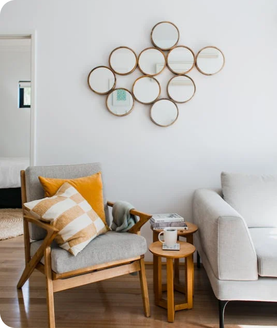
Living Room
 Bedroom
 Exterior
 Neutral
 White
 Gray
 Green
 Blue
 Yellow
 Pink
 Black
 Red
 Brown
 Orange
Peace of Mind SW 9510 Paint Colors by Sherwin Williams
Relax with Every Brushstroke
When you’re considering a fresh coat of paint for your interior, the color SW 9510 Peace of Mind by Sherwin Williams could be a perfect choice for you. As you plan your next painting project, let me tell you more about this unique shade.
Peace of Mind is a soothing and gentle color that brings an aura of calm to any room. It’s particularly great if you love a minimalistic and clean aesthetic. This tone works beautifully in a variety of settings, be it a bustling kitchen, a peaceful bedroom, or a home office that requires a relaxing vibe for focus and creativity.
The peacefulness of this color can help you create a relaxing environment, and it pairs well with many decor styles and color schemes.
Whether you’re redoing a single room or planning a larger renovation, Peace of Mind offers a fresh and calming foundation to build upon.

via housekeepingbay.com
What Color Is Peace of Mind SW 9510 by Sherwin Williams?
Table of Contents
Peace of Mind SW 9510 by Sherwin Williams is a peaceful shade that balances between blue and green. This soft, soothing hue brings a gentle calm to any room, evoking the feel of a quiet, clear sky or a gentle ocean breeze. Its muted coolness works exceptionally well in rooms designed for relaxation and contemplation.
This color fits seamlessly into various interior styles, particularly shining in Scandinavian-inspired rooms, coastal settings, and minimalist designs. The subdued quality of Peace of Mind makes it an excellent base or accent in interiors striving for a clutter-free, airy look.
When considering materials and textures, Peace of Mind pairs beautifully with light woods like beech and birch which enhance its natural calmness. Linen and soft cotton, in neutral whites or soft grays, complement this shade well, creating a refreshing and restful atmosphere. Additionally, elements of brushed nickel or matte silver can add a subtle sparkle to the calm induced by this color, maintaining a modern, fresh vibe.
Incorporating Peace of Mind into your living area means welcoming a breath of fresh air amidst the chaos of daily life. It creates an ideal backdrop for unwinding after long days, helping turn any room into a soothing escape.

via housekeepingbay.com
Is Peace of Mind SW 9510 by Sherwin Williams Warm or Cool color?
Peace of Mind SW 9510 by Sherwin Williams is a subtle yet appealing paint color that provides a peaceful backdrop for any room. With its soothing light blue tone, it creates a calming atmosphere, making it ideal for places in the home like bedrooms or bathrooms where you want to relax and unwind.
This color’s softness allows for flexibility in decorating, as it pairs well with various styles and accents, from traditional whites to more vibrant colors.
Using Peace of Mind on walls can make small rooms feel more open and airy, while in larger rooms, it can help maintain a cozy, welcoming vibe. This shade is also great for rooms with plenty of natural light, as it reflects the light beautifully, enhancing the overall brightness of the room without feeling overpowering. Whether you are looking to refresh your living area or give a peaceful touch to your bedroom, Peace of Mind SW 9510 offers a tasteful and adaptable option that works well in many different home environments.
What is the Masstone of the Peace of Mind SW 9510 by Sherwin Williams?
Peace of Mind SW 9510 by Sherwin Williams has a masstone of pale yellow, represented by the color code #D5D580. This light, soft hue gives any room a gentle and cheerful appearance. A pale yellow color like this one brings warmth to interiors, making them feel cozy and inviting.
The color works exceptionally well in homes because its subtle intensity doesn’t overpower the senses. This makes it an excellent choice for living areas, bedrooms, and kitchens where a touch of light without harsh brightness is desired.
Moreover, pale yellow can help in making small rooms appear bigger and brighter. The reflective quality of this shade enhances natural light, helping to brighten up interiors particularly in areas that do not receive a lot of sunlight. This soothing color also pairs effortlessly with a wide range of other colors, providing flexibility in decorating and styling homes. Whether combined with soft neutrals or contrasted with bold accents, Peace of Mind SW 9510 can adapt gracefully, creating a pleasing home environment.

via housekeepingbay.com
Undertones of Peace of Mind SW 9510 by Sherwin Williams
Peace of Mind SW 9510 by Sherwin Williams is an adaptable color with a complex mix of undertones that can subtly influence the overall appearance and feel of a room. This shade primarily exhibits undertones of light gray, pale pink, light purple, mint, light blue, grey, lilac, yellow, orange, light green, and olive. Each of these undertones can emerge based on the lighting and surrounding colors, making the paint seem different in various conditions.
Undertones are subtle colors that lie beneath the surface of the main color and can affect how we perceive the primary hue. For instance, in bright sunlight, the yellow or mint undertones of Peace of Mind might make the walls look more vibrant and lively. In contrast, in dimmer, artificial light, the grey or lilac undertones could give a more subdued and calm appearance.
When used on interior walls, the complexity of the undertones in Peace of Mind can offer a dynamic visual experience. For example, in a room with ample natural light and light-colored furniture, the pale pink or light blue undertones might be more noticeable, creating a soft and inviting atmosphere. However, in a darker room with richly colored decor, the deeper undertones like olive or orange could come forward, adding warmth and depth to the room. Understanding these undertones can help in making informed decisions about paint colors, ensuring that they complement your specific interior design goals and lighting conditions.

via housekeepingbay.com
How Does Lighting Affect Peace of Mind SW 9510 by Sherwin Williams?
Lighting plays a crucial role in how we perceive colors. The type of light and its intensity can alter the appearance of colors in various ways. It’s not just about brightness; the color temperature of the light (warm or cool) can shift how a color looks indoors.
Take the example of the color Peace of Mind SW 9510 by Sherwin Williams. This is a soft, gentle blue that brings a calm and peaceful feeling to a room. Under artificial light, such as LED or fluorescent lights, the perception of this color can vary. Fluorescent lighting tends to emit a cooler, blue-toned light, making Peace of Mind appear slightly more vibrant and cooler. In contrast, LED lights, depending on whether they are cool or warm, can either enhance the blue tones or make the color look more muted and soft.
In natural light, the color shifts throughout the day. Morning light, which is generally warmer, will make Peace of Mind look softer and slightly more muted. As the day progresses and the light becomes brighter and more neutral, the color will appear truer to its original hue.
In rooms that face different directions, the appearance of Peace of Mind also changes:
- North-facing rooms: These rooms receive less direct sunlight and have a cooler, bluer light. Therefore, Peace of Mind will look a bit more shadowed and subdued, enhancing its calming qualities.
- South-facing rooms: Here, the ample sunlight can make Peace of Mind glow and appear brighter and more vibrant throughout the day.
- East-facing rooms: Morning light will warm up Peace of Mind, making it feel more welcoming in the morning while turning cooler and more neutral toward the afternoon.
- West-facing rooms: Evening light, which tends to be warmer and golden, will warm up the color, giving the room a cozy and inviting feel towards the evening.
Thus, depending on your room’s exposure and lighting choice, Peace of Mind SW 9510 can bring different levels of warmth and freshness into your home. The perceived color and mood will shift, enhancing the flexibility and usability of this shade in various settings.

via housekeepingbay.com
What is the LRV of Peace of Mind SW 9510 by Sherwin Williams?
Regarding the color Peace of Mind SW 9510 by Sherwin Williams, with an LRV of 49.013, it sits in the middle of the scale. This mid-range reflection makes it adaptable.
In well-lit rooms, it will appear lighter and more vibrant, whereas in areas with less natural or artificial lighting, it can present as slightly deeper.
The neutrality of its LRV allows for flexibility in decorating, working well in various settings without becoming too dominating or receding too much into the background. This balanced LRV enables the color to maintain its unique hue under different lighting conditions.

via housekeepingbay.com
What are the Trim colors of Peace of Mind SW 9510 by Sherwin Williams?
Trim colors are hues used to accentuate details and edges on buildings and architectures like door frames, window trim, and baseboards. Sherwin-Williams’ Peace of Mind SW 9510 finds excellent companions in trim colors such as SW 7012 – Creamy and SW 7008 – Alabaster.
The use of trim colors not only enhances visual appeal but also defines spatial boundaries and adds depth to a room, creating a cohesive and inviting atmosphere. Opting for trim colors that complement the main wall color can create a subtle yet impactful visual coherence, making an interior feel more polished and professionally designed.
SW 7012 – Creamy is a soft and warm neutral that offers a smooth transition between colors in a room, providing a gentle contrast that helps features stand out without overpowering the eyes. On the other hand, SW 7008 – Alabaster is a clean and bright white, which brings a fresh and airy feel to any room, amplifying natural light and giving a room a more open and peaceful feel. Both colors support the soothing essence of Peace of Mind SW 9510, ensuring that the overall color palette maintains harmony and balance.
You can see recommended paint colors below:

via housekeepingbay.com
Colors Similar to Peace of Mind SW 9510 by Sherwin Williams
Similar colors play a crucial role in creating a cohesive and soothing atmosphere in any room. They share an underlying unity that helps in achieving a balanced look without the abrupt shifts that come with using contrasting colors. Colors like Peace of Mind SW 9510 by Sherwin Williams, and its similar hues, contribute to this harmonious effect.
For instance, the gentle beige of Downing Sand SW 2822 and the deeper, earthy tones of Windsor Greige SW 7528 offer a subtle variation that enriches the environment without overpowering the senses. The muted strength of Outrigger SW 9517 and the soft gray of Jogging Path SW 7638 provide a solid foundation for layering more detailed decor elements.
Further complementing this palette, Naturel SW 7542 introduces a touch of warmth, while Relaxed Khaki SW 6149 brings a light and airy feel to the mix. The hues continue with Loggia SW 7506 that leans into a dusky taupe, and Shiitake SW 9173 which showcases a mild, mushroom gray adding depth and interest. Avenue Tan SW 7543 offers a darker tan shade, perfect for grounding a room. Lastly, Threaded Loom SW 9512 subtly ties all these elements together with its understated elegance, proving that a palette of similar colors can impact the overall feel of a room beautifully and effectively. Together, these shades create a layered and engaging environment that is cohesive and visually appealing.
You can see recommended paint colors below:
- SW 2822 Downing Sand
- SW 7528 Windsor Greige
- SW 9517 Outrigger
- SW 7638 Jogging Path
- SW 7542 Naturel
- SW 6149 Relaxed Khaki
- SW 7506 Loggia
- SW 9173 Shiitake
- SW 7543 Avenue Tan
- SW 9512 Threaded Loom
-

via housekeepingbay.com

How to Use Peace of Mind SW 9510 by Sherwin Williams In Your Home?
Peace of Mind SW 9510 by Sherwin Williams is a unique shade of blue that brings a soothing and calm atmosphere to any room in your home. It’s perfect for areas where you want to relax, like bedrooms or bathrooms, because it has a gentle and soft vibe that helps reduce stress. You can use it on walls to create a peaceful backdrop, or on furniture like bookshelves and cabinets for a subtle touch of color.
This paint color is adaptable enough to blend with various styles and decor. It pairs well with whites and grays for a clean and modern look, or with warmer tones like beige and brown for a more cozy feel. In a home office, Peace of Mind can help keep you calm and focused, while in a living room, it can make the interior feel more inviting and comfortable.
Overall, Peace of Mind SW 9510 is an excellent choice if you’re looking to add a peaceful and refreshing color to your home that’s easy on the eyes and makes any room feel more relaxed.
Peace of Mind SW 9510 by Sherwin Williams vs Shiitake SW 9173 by Sherwin Williams
Peace of Mind SW 9510 by Sherwin Williams is a soft, soothing blue with hints of grey that can make rooms feel calm and peaceful. It reflects light well and is adaptable for various rooms, particularly beneficial in creating a peaceful atmosphere in bedrooms or bathrooms.
Shiitake SW 9173, by comparison, is a warm, neutral beige that leans towards earthy tones. This color provides a comforting and cozy vibe, making it a great choice for living rooms or entryways where a welcoming environment is desired.
Both colors are gentle and subdued, but Peace of Mind adds a cooler, more refreshing quality to interiors, whereas Shiitake offers warmth and grounding. Each color serves different moods and settings effectively, with Peace of Mind vibrant in airy, light-filled rooms and Shiitake ideal in areas where a touch of warmth is needed.
You can see recommended paint color below:

via housekeepingbay.com
Peace of Mind SW 9510 by Sherwin Williams vs Downing Sand SW 2822 by Sherwin Williams
Peace of Mind SW 9510 by Sherwin Williams is a gentle gray with cool undertones, conveying a peaceful and calming effect that is ideal for creating a restful environment. It works beautifully in rooms aimed for relaxation like bedrooms or bathrooms. Its subtle coolness pairs well with both soft pastels or more vibrant colors for contrast.
In contrast, Downing Sand SW 2822 is a warmer neutral shade. It leans towards a soft beige, offering a cozy and inviting feel. This color is adaptable, lending warmth to interiors predominantly filled with natural light and complementing a broad range of décor styles from modern to traditional.
While Peace of Mind gives off a more modern and airy vibe, Downing Sand surrounds a room with warmth and comfort, making it particularly good for living rooms and entryways. Choosing between them depends primarily on your personal style and the atmosphere you aim to create in your interior.
You can see recommended paint color below:
- SW 2822 Downing Sand

via housekeepingbay.com
Peace of Mind SW 9510 by Sherwin Williams vs Avenue Tan SW 7543 by Sherwin Williams
“Peace of Mind SW 9510” by Sherwin Williams is a gentle light blue that feels peaceful and calm. It’s perfect for rooms where you want to relax, like bedrooms or bathrooms. This color can make a room feel more open and airy, giving a sense of peace.
“Avenue Tan SW 7543,” on the contrary, is a warm tan shade. This color brings a cozy and welcoming vibe, making it great for living rooms or dining areas. It pairs well with a variety of furniture styles and can help create a comfortable ambiance.
While both colors are ideal for creating inviting interiors, “Peace of Mind” leans towards a cooler, refreshing look, and “Avenue Tan” offers a warm, earthy feel. Depending on the mood you want to set, either could be a perfect choice – “Peace of Mind” for a light, calming effect or “Avenue Tan” for a warm, snug atmosphere.
You can see recommended paint color below:
- SW 7543 Avenue Tan

via housekeepingbay.com
Peace of Mind SW 9510 by Sherwin Williams vs Windsor Greige SW 7528 by Sherwin Williams
Peace of Mind SW 9510 and Windsor Greige SW 7528 by Sherwin Williams are both neutral colors, but they convey different tones and atmospheres. Peace of Mind is a pale, soft blue that brings a calm and peaceful feel to interiors, making it ideal for bedrooms or bathrooms where you want to create a relaxing retreat. The lightness of this color makes it great for smaller rooms, as it can help them appear more spacious and airy.
Windsor Greige, on the other hand, is a deeper, taupe-like shade blending gray and beige. This color is adaptable and warm, suitable for areas where you wish to instill a sense of coziness and refinement. It’s perfect for living rooms, dining rooms, or any area where you want a neutral backdrop that still offers some warmth.
Both colors work well in a variety of decorating styles and can be easily paired with different furnishings and accents to achieve the desired effect.
You can see recommended paint color below:

via housekeepingbay.com
Peace of Mind SW 9510 by Sherwin Williams vs Outrigger SW 9517 by Sherwin Williams
Peace of Mind SW 9510 and Outrigger SW 9517, both from Sherwin Williams, offer distinct vibes for rooms. Peace of Mind SW 9510 is a soft blue that instills a calm, soothing atmosphere, perfect for areas where relaxation is key, such as bedrooms or bathrooms. It has a light, airy quality that makes small rooms appear larger and more open.
In contrast, Outrigger SW 9517 is a deeper, navy-inspired blue with a more pronounced presence. This color adds a strong, confident feel to interiors, suitable for areas like home offices or dining rooms where a touch of refinement is desired. It pairs well with bright whites or warm wood tones, providing a classic yet bold look.
Together, these colors cater to different tastes and needs, providing options for peaceful retreats or dynamic focal points in a home.
You can see recommended paint color below:

via housekeepingbay.com
Peace of Mind SW 9510 by Sherwin Williams vs Threaded Loom SW 9512 by Sherwin Williams
Peace of Mind SW 9510 and Threaded Loom SW 9512 by Sherwin Williams are two subtle and calming colors. Peace of Mind is a light and airy blue that gives off a peaceful and soothing vibe, ideal for creating a relaxing atmosphere in rooms like bedrooms or bathrooms. It reflects light well, making small rooms appear larger and more open.
In contrast, Threaded Loom is a slightly darker shade, blending blue with hints of gray. This color provides a sense of grounding and refinement, suitable for areas where a more muted, yet impactful, ambiance is desired, such as living rooms or offices.
Both colors complement each other beautifully, with Peace of Mind offering a breezier feel and Threaded Loom bringing depth and a touch of formality. They work particularly well together in a color scheme for a home, allowing for smooth transitions between energetic and calm moods in different rooms.
You can see recommended paint color below:

via housekeepingbay.com
Peace of Mind SW 9510 by Sherwin Williams vs Relaxed Khaki SW 6149 by Sherwin Williams
Peace of Mind SW 9510 by Sherwin Williams is a gentle, soft blue that brings a calm and soothing feel to any room. It resembles a clear sky on a sunny day, making it ideal for creating a peaceful and relaxing atmosphere. This color works well in bedrooms, bathrooms, or any area meant for relaxation.
In contrast, Relaxed Khaki SW 6149 by Sherwin Williams is a warm, earthy beige that offers a cozy and inviting feel. As a neutral shade, it provides a solid foundation that can easily blend with other colors and decor styles. It’s especially suitable for living rooms, entryways, or offices where a neutral, yet warm, palette can complement various furnishings and accessories.
Both colors are adaptable and can be coordinated in homes for a balanced and harmonious look. Peace of Mind gives a cooler tone, while Relaxed Khaki warms up a room. Each creates distinct moods and can suit different preferences or room functions.
You can see recommended paint color below:

via housekeepingbay.com
Peace of Mind SW 9510 by Sherwin Williams vs Loggia SW 7506 by Sherwin Williams
Peace of Mind SW 9510 by Sherwin Williams is a gentle blue that has a soft, calming effect. It’s reminiscent of a clear sky on a sunny day, creating a light and airy feel in any room. This color works well in areas where relaxation and peacefulness are desired, such as bedrooms and bathrooms.
Loggia SW 7506 from Sherwin Williams, however, is a warm, neutral beige with a cozy and inviting quality. It gives off a sense of groundedness and comfort, making it suitable for living rooms and entryways where a welcoming atmosphere is important.
While Peace of Mind adds a fresh and somewhat cool touch, Loggia brings warmth and a more solid presence. Peace of Mind lends itself to settings that need a calm and clean look, whereas Loggia is ideal for areas where a more traditional or rustic feel is desired. Both colors offer flexibility and can complement a variety of decor styles and preferences.
You can see recommended paint color below:
- SW 7506 Loggia

via housekeepingbay.com
Peace of Mind SW 9510 by Sherwin Williams vs Jogging Path SW 7638 by Sherwin Williams
Peace of Mind SW 9510 by Sherwin Williams is a light blue hue with a calming and peaceful feel, ideal for creating a relaxing atmosphere in any room. It has a softness that can make rooms seem more open and airy, perfect for bedrooms or bathrooms where a peaceful vibe is desired.
Jogging Path SW 7638, in contrast, is a subtle gray with brown undertones, giving it a warm and earthy quality. This color is adaptable and offers a neutral backdrop that pairs well with a variety of décor styles. Particularly suitable for living areas and entryways, Jogging Path brings a cozy and welcoming feel to any room.
Both colors are gentle and can blend well with various furnishings and textures, but they serve different moods and settings within a home. Peace of Mind leans towards a fresher, more peaceful feel, while Jogging Path leans towards a comforting, grounded atmosphere.
You can see recommended paint color below:

via housekeepingbay.com
Peace of Mind SW 9510 by Sherwin Williams vs Naturel SW 7542 by Sherwin Williams
Peace of Mind SW 9510 by Sherwin Williams is a soft, peaceful blue that brings a calming vibe to any room. It’s ideal for creating a relaxing escape in bedrooms or bathrooms. This color often acts as a gentle backdrop that pairs well with both bright and neutral tones, allowing for flexibility in decorating.
Naturel SW 7542, on the other hand, is a warm, earthy beige that offers a cozy and inviting atmosphere. It’s perfect for living rooms or any area where you want to foster a welcoming feeling. This neutral shade complements a wide range of colors and can serve as a foundation for various design styles.
Both colors provide unique ambiances: Peace of Mind leans towards a cool, calming retreat, while Naturel offers warmth and comfort, making each suitable for different preferences and room functionalities.
You can see recommended paint color below:

via housekeepingbay.com
The color SW 9510 Peace of Mind by Sherwin Williams has definitely made a lasting impression on me. This particular shade offers a soothing and peaceful atmosphere that is perfect for anyone looking to create a calm setting in their home or office. It’s gentle yet visually appealing, providing a subtle backdrop that complements a wide range of decor styles and personal tastes.
From my personal experience, incorporating SW 9510 into a room not only enhances the aesthetic appeal but also positively influences my mood and productivity. The gentle hue has a way of softening the overall look of an interior, making it feel more welcoming and comfortable. Whether used on all walls or as an accent, it provides flexibility in design while maintaining a sense of cohesion.
Additionally, the quality of the paint from Sherwin Williams ensures that the beauty of SW 9510 Peace of Mind is not just temporary. It holds up well over time, resisting common wear and tear while maintaining its vibrant color and smooth finish. This makes it a practical choice for busy areas and high-traffic rooms.
Overall, SW 9510 Peace of Mind is a color I highly recommend for anyone seeking to create a peaceful and aesthetic environment. It stands out as a reliable and effective choice for enhancing interiors with both beauty and functionality.

via housekeepingbay.com