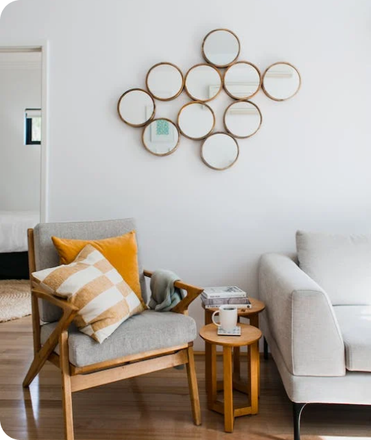
Living Room
 Bedroom
 Exterior
 Neutral
 White
 Gray
 Green
 Blue
 Yellow
 Pink
 Black
 Red
 Brown
 Orange
Mineral Deposit SW 7652 Paint Colors by Sherwin Williams
Unlocking the Charm of Your Space with a Fresh Hue
When you’re considering refreshing a room, the paint color you choose sets the tone for the entire interior. SW 7652 Mineral Deposit by Sherwin Williams is a subtle yet distinctive shade that might just be the perfect option for your next project.
This color has a cool, gray tone that is calm and soothing, making it an excellent choice for rooms where you want to promote a peaceful atmosphere. Whether it’s for a bedroom, bathroom, or a peaceful reading nook, Mineral Deposit offers a fresh and clean look.
The beauty of Mineral Deposit lies in its understated elegance and how it pairs wonderfully with various decor styles and colors. From modern furnishings to rustic accents, this color provides a harmonious backdrop. It also works well with both natural and artificial light, adapting subtly to different lighting conditions throughout the day.
If you’re ready to refresh your home’s look, consider how SW 7652 Mineral Deposit could enhance your living area.

via housekeepingbay.com
What Color Is Mineral Deposit SW 7652 by Sherwin Williams?
Table of Contents
Mineral Deposit SW 7652 by Sherwin Williams is a peaceful shade of gray with subtle blue undertones, presenting a fresh, cool feel that mimics the quiet peace of a misty morning. This adaptable color blends harmoniously with modern and traditional decor alike, making it an excellent choice for anyone looking to refresh their interior. Specifically, in modern and Scandinavian interior styles, Mineral Deposit shines as it complements minimalistic, clean lines and enhances the light, airy feel characteristic of these designs.
The color pairs beautifully with natural materials such as wood, enhancing its warm tones, and with metals like silver or brushed nickel, which reflect its cool undertones. Textiles like linen or cotton in white or light pastel colors work well to maintain the calmness of the palette, while adding plush textures through throws or rugs in these materials can introduce a sense of comfort and warmth.
Mineral Deposit also finds its place in coastal interiors, where its coolness mirrors the sea and sky. Here, pairing it with sandy tans or soft blues can create a soothing beach-inspired aesthetic. Whether used as a main wall color or as an accent, Mineral Deposit offers a refreshing backdrop that is flexible and easy to work with, enhancing the overall aesthetic of any room without overpowering it.

via housekeepingbay.com
Is Mineral Deposit SW 7652 by Sherwin Williams Warm or Cool color?
Mineral Deposit SW 7652 by Sherwin Williams is a soft, cool gray paint color with a touch of blue, giving it a unique and calming vibe. This color is adaptable, making it perfect for various rooms in a home, such as kitchens, bathrooms, and bedrooms. Its subtle blue hues can help create a peaceful atmosphere, which is ideal for rooms meant for relaxation.
The color pairs well with both light and dark furnishings, allowing homeowners to mix and match their decor with ease. Whether you have modern stainless steel appliances in the kitchen or dark wood furniture in the bedroom, Mineral Deposit can complement these elements beautifully. Also, because it’s a neutral shade, it can work as a background for brighter colors or act as the main color palette.
Additionally, Mineral Deposit proves practical because it hides minor wall imperfections better than lighter shades. Its ability to blend with other colors and materials makes it a smart choice for those looking to refresh their home’s look without overpowering changes.
What is the Masstone of the Mineral Deposit SW 7652 by Sherwin Williams?
Mineral Deposit SW 7652 by Sherwin Williams features a masstone of light gray, coded as #D5D5D5. This soft gray shade offers a neutral and calm backdrop for any room in a home, making it adaptable for various decorating styles. Light gray doesn’t overpower other colors, which means it can blend seamlessly with different hues and textures. This property allows homeowners to use Mineral Deposit as a base color that supports accent colors or furniture pieces without causing clashes.
The light gray masstone helps to create a sense of openness and light in a room, especially in smaller or less brightly lit areas. It reflects natural and artificial light well, contributing to a brighter, airier environment. This is particularly beneficial in areas like living rooms or bedrooms, where a feeling of openness can enhance comfort.
Moreover, its neutral nature ensures longevity in style; unlike more vibrant colors, light gray does not grow outdated quickly. Thus, using Mineral Deposit SW 7652 as a foundational color is both a practical and stylish choice for homes.

via housekeepingbay.com
Undertones of Mineral Deposit SW 7652 by Sherwin Williams
Mineral Deposit SW 7652 by Sherwin Williams is an adaptable gray paint color with a complex mix of undertones. Understanding these undertones is crucial for using this color effectively in interior design. Undertones are subtle colors that influence the main hue of the paint. They can make a color look cooler or warmer depending on the lighting and surrounding colors.
Mineral Deposit SW 7652 has light blue, pale yellow, mint, light purple, lilac, pale pink, and grey undertones. These undertones lead to different perceptions of the color in various settings:
- Light blue and mint undertones: These provide a cool, refreshing feel, making it suitable for bathrooms or bedrooms where a calm atmosphere is desired.
- Pale yellow and pale pink undertones: They add a touch of warmth, which can help the paint feel more inviting in living rooms or dining areas.
- Light purple and lilac undertones: These bring a subtle hint of refinement and can help soften the feel of the room, ideal for creating a relaxing environment.
- Grey undertone: It is dominant and bundles all other undertones together, ensuring that the color remains neutral and flexible for pairing with various decor elements.
On interior walls, these undertones interact with both natural and artificial light, shifting the perceived color throughout the day. For instance, during daylight, the blue and mint might become more apparent, giving a cooler impression, while at night, under warmer artificial lighting, the yellow and pink may stand out, softening the room’s look. This dynamic nature of Mineral Deposit makes it a fantastic option for those who want a neutral with a bit more depth and complexity. Always test a large patch on the wall to observe how these undertones play out in your specific environment.

via housekeepingbay.com
Coordinating Colors of Mineral Deposit SW 7652 by Sherwin Williams
Coordinating colors are shades and tints that effectively complement a primary color in a design or palette, enhancing the overall aesthetic without overpowering. When colors coordinate well, they create a seamless look that feels intentional and harmonious. For example, Mineral Deposit SW 7652 by Sherwin Williams can be paired with specific coordinating colors to achieve a balanced and appealing visual effect. These coordinating colors have been carefully selected to work well with the cool, subtle hue of Mineral Deposit, ensuring they contribute to a cohesive environment.
One of the coordinating colors, SW 7012 – Creamy, is a soft, warm white that offers a gentle contrast to the cooler tones of Mineral Deposit, creating a welcoming and soft atmosphere without clashing. Another complementing shade, SW 7014 – Eider White, presents a slightly grayish white tone that merges subtly with Mineral Deposit, enhancing a neutral color scheme that is soothing and refined.
Lastly, SW 7685 – White Raisin introduces a touch of warmth with its muted, creamy yellow, adding a dash of coziness that can brighten rooms and add depth when paired with the cooler Mineral Deposit. Together, these coordinating colors provide flexibility and elegance, making them ideal for creating visually appealing and polished interiors.
You can see recommended paint colors below:
- SW 7012 Creamy
- SW 7014 Eider White
- SW 7685 White Raisin

via housekeepingbay.com
How Does Lighting Affect Mineral Deposit SW 7652 by Sherwin Williams?
Lighting plays a crucial role in how colors are perceived in a room. Different lighting conditions can make the same color look different. The color Mineral Deposit SW 7652 by Sherwin Williams, a soft, muted shade of blue-gray, is a perfect example to discuss this phenomenon.
In artificial light, such as that from LED or incandescent bulbs, the nuances in Mineral Deposit can shift. LED lights, which often have a cooler tone, might enhance the blue undertones of this color, giving it a more peaceful and cool appearance. In contrast, incandescent lighting, which casts a warmer glow, could soften the color, making it appear more gray and muted, thus cozying up a room.
With natural light, Mineral Deposit reacts dynamically throughout the day based on the light’s angle and intensity. Natural light tends to show the truest color, but variations occur based on the direction the room faces:
- North-facing rooms: These rooms get less direct sunlight, which can make Mineral Deposit appear more consistent but slightly cooler and more shadowy. The blue undertones might seem more pronounced, giving the room a calm, consistent look.
- South-facing rooms: Here, the abundant light can warm up this color, muting the blue tones and making the gray more prominent. The room feels brighter and airier as the paint reflects the natural light.
- East-facing rooms: Morning light in these rooms can make Mineral Deposit look very soft and welcoming, with a gentle bluish tint that fades as the day progresses into a more neutral and even tone under the influence of the decreasing light.
- West-facing rooms: Evening light brings warmth, and the color could appear warmer and richer towards the end of the day, contrasting with how it looks during the morning when the light is cooler.
Understanding how Mineral Deposit SW 7652 interacts with light helps in making informed decisions about its application, ensuring that the desired atmosphere and aesthetic are achieved in a room.

via housekeepingbay.com
What is the LRV of Mineral Deposit SW 7652 by Sherwin Williams?
For the specific color of Sherwin Williams’ Mineral Deposit SW 7652, with an LRV of 42.629, it sits in the middle range. This means it neither reflects nor absorbs light excessively.
In practical terms, it is adaptable, working well in rooms that receive either a lot of natural light or limited light, without making the room feel too bright or too dark.
This neutral balance makes Mineral Deposit an excellent choice for many interior areas, adapting well to various lighting conditions and complementing different decor styles.

via housekeepingbay.com
What are the Trim colors of Mineral Deposit SW 7652 by Sherwin Williams?
Trim colors, such as SW 7003 – Toque White and SW 7035 – Aesthetic White, play an essential role in accentuating the aesthetics of Mineral Deposit SW 7652 by Sherwin Williams.
These trim colors provide a crisp, clean border that distinctly delineates the transition between walls and other architectural elements like doorways and windows, effectively highlighting the main wall color. Incorporating a well-chosen trim color can add definition and depth, enhancing the overall appearance of a room and pulling together the design theme seamlessly.
SW 7003 – Toque White is a soft white with a hint of gray, creating a subtle contrast that is gentle yet effective, making it ideal for softer wall colors. On the other hand, SW 7035 – Aesthetic White is a warmer hue with a touch of beige, providing a neutral background that works well with cooler tones, offering a peaceful and inviting warmth. Both colors act as flexible choices that pair harmoniously with Mineral Deposit SW 7652, ensuring a polished and coherent look that can adapt to various interiors and styles.
You can see recommended paint colors below:

via housekeepingbay.com
Colors Similar to Mineral Deposit SW 7652 by Sherwin Williams
Similar colors play a crucial role in creating a harmonious and visually appealing color scheme in any room. Colors like Mineral Deposit SW 7652 by Sherwin Williams offer a soothing palette that is easy on the eyes and provides a cohesive look when used across various elements of a design.
Using shades like Gray Matters SW 7066 and Uncertain Gray SW 6234 can subtly differ yet tie a room together by maintaining a steady flow of gentle grays. This balance achieves a seamless transition between areas or features within a room, making it appear larger and more fluid. Additionally, lighter tones such as Gris SW 7659 and Magnetic Gray SW 7058 lend a soft backdrop, ideal for highlighting art or furniture, setting a calm ambiance that allows other colors to stand out.
On the cooler side, Online SW 7072 and Mineral SW 9637 offer a slightly more distinct but still complementary shift in shades, enhancing depth and dimension without overpowering the senses. Shades like Breakwater SW 9638 and Silvermist SW 7621 provide a refreshing hint of color that can cool down rooms with lots of sunlight, keeping the environment peaceful. Meanwhile, Oyster Bay SW 6206 and Unusual Gray SW 7059 add a touch of refinement and flexibility, perfect for living areas or offices requiring a bit of elegance. Together, these similar colors create a palette that supports a variety of design styles and personal tastes, all while maintaining a unified and inviting atmosphere.
You can see recommended paint colors below:
- SW 7066 Gray Matters
- SW 6234 Uncertain Gray
- SW 7659 Gris
- SW 7058 Magnetic Gray
- SW 7072 Online
- SW 9637 Mineral
- SW 9638 Breakwater
- SW 7621 Silvermist
- SW 6206 Oyster Bay
- SW 7059 Unusual Gray

via housekeepingbay.com
Colors that Go With Mineral Deposit SW 7652 by Sherwin Williams
Choosing the right colors to complement Mineral Deposit SW 7652 by Sherwin Williams is crucial as it helps achieve a harmonious and balanced look in any room. Mineral Deposit is a subtle, muted shade that can serve as a flexible backdrop in various settings. By pairing it with the right accents, one can enhance the overall aesthetic appeal and create a cohesive atmosphere. Colors like Homburg Gray, Gossamer Veil, Gris, Drift of Mist, Earl Grey, and Gray Clouds each contribute uniquely to this palette.
Homburg Gray SW 7622 is a deep, warm gray that adds depth and refinement when paired with the lighter Mineral Deposit. It works well in areas needing contrast without overpowering the room. Gossamer Veil SW 9165 is a soft, warm gray that provides a gentle complement to Mineral Deposit, perfect for creating a seamless transition between areas.
Gris SW 7659 is another neutral option but with a slightly cooler tone, providing a crisp, clean look when used alongside Mineral Deposit. Drift of Mist SW 9166 offers a lighter, almost ethereal quality that can help to open up a room and enhance the feeling of lightness and airiness. Earl Grey SW 7660, with its richer hue, brings a touch of elegance and can be used in focal areas for added drama. Lastly, Gray Clouds SW 7658 leans towards a soothing gray that pairs effortlessly with Mineral Deposit, great for maintaining a calm and consistent palette throughout a home. Together, these colors create a refined and stylish scheme that enhances the peaceful quality of any interior.
You can see recommended paint colors below:
- SW 7622 Homburg Gray
- SW 9165 Gossamer Veil
- SW 7659 Gris
- SW 9166 Drift of Mist
- SW 7660 Earl Grey
- SW 7658 Gray Clouds

via housekeepingbay.com
How to Use Mineral Deposit SW 7652 by Sherwin Williams In Your Home?
Mineral Deposit SW 7652 by Sherwin Williams is an adaptable, soothing gray shade with cool blue undertones. This paint color is perfect for creating a calm and peaceful environment in your home. You can use Mineral Deposit in various rooms to achieve a modern and cohesive look.
For instance, painting your bathroom walls with this color can give a fresh, clean feel, making it a relaxing area. In the living room, Mineral Deposit works well on accent walls, pairing beautifully with lighter grays or vibrant colors for contrast. It’s also ideal for bedrooms, where a peaceful atmosphere is essential.
The subtle blue hints help promote restfulness, making it easier to unwind at the end of the day. Additionally, this color is great for kitchens, as it complements both white and wood cabinetry. Whether updating one room or repainting the entire house, Mineral Deposit SW 7652 offers a fresh and stylish look.
Mineral Deposit SW 7652 by Sherwin Williams vs Magnetic Gray SW 7058 by Sherwin Williams
Mineral Deposit SW 7652 by Sherwin Williams is a soft, muted shade of gray with subtle blue undertones. It gives a peaceful, calming feel that can be perfect for areas like bedrooms or bathrooms where relaxation is key. This color can make small rooms appear larger and brighter due to its light and airy quality.
In contrast, Magnetic Gray SW 7058 is a deeper, warm gray with more earthiness in its base. It is ideal for creating a cozy, inviting atmosphere and works well in living areas or dining rooms. Magnetic Gray’s rich hue can add depth and refinement to a room, pairing well with both bright and muted accents.
Both colors offer unique qualities and can adapt to various decorating styles, depending on the ambiance you aim to achieve in a room. Whether looking for peacefulness or warmth, both Mineral Deposit and Magnetic Gray are flexible choices from Sherwin Williams.
You can see recommended paint color below:

via housekeepingbay.com
Mineral Deposit SW 7652 by Sherwin Williams vs Mineral SW 9637 by Sherwin Williams
Mineral Deposit SW 7652 by Sherwin Williams is a mild, light gray color with subtle blue undertones, giving it a peaceful and airy feel. This color works well in rooms meant to feel open and calm, such as bedrooms and bathrooms. It pairs nicely with brighter whites and can also look elegant with darker grays or blues for contrast.
Mineral SW 9637, on the other hand, is darker and more nuanced. It carries a hint of green, lending it an almost earthy quality compared to Mineral Deposit. This color suits areas where a cozy, more enclosed feel is desired, like dens or small libraries. It’s flexible in terms of matching with natural materials like wood or stone, enhancing the richness of its hue.
Both colors share a name and natural inspiration, but they evoke quite different atmospheres due to their depth and undertone variations.
You can see recommended paint color below:

via housekeepingbay.com
Mineral Deposit SW 7652 by Sherwin Williams vs Uncertain Gray SW 6234 by Sherwin Williams
Mineral Deposit SW 7652 by Sherwin Williams is a soft, subtle cool gray with a touch of blue, giving it a fresh and calming vibe. This color can make small rooms appear larger and is flexible enough to work well in various rooms, such as bedrooms or bathrooms.
It pairs nicely with white trim or darker blues for a nautical feel. Uncertain Gray SW 6234, another Sherwin Williams color, leans more towards the green side of gray. This slightly darker shade offers a soothing, natural feel, reminiscent of a misty morning.
It’s ideal for creating a peaceful interior and works exceptionally well in areas that need a touch of nature’s influence. Both colors provide a peaceful atmosphere, but while Mineral Deposit has a crisp, cool presence, Uncertain Gray brings in a warmer, more earth-toned touch. This distinction makes Mineral Deposit better suited for a modern look, while Uncertain Gray is great for more traditional or rustic settings.You can see recommended paint color below:

via housekeepingbay.com
Mineral Deposit SW 7652 by Sherwin Williams vs Breakwater SW 9638 by Sherwin Williams
Mineral Deposit SW 7652 by Sherwin Williams is a light gray color with subtle blue undertones, offering a calming and neutral look. This color suits various rooms, from bedrooms to living areas, by providing a soft background that pairs well with both bright and muted furnishings.
In contrast, Breakwater SW 9638 is darker and leans more distinctly towards a blue-gray tone. This shade can give a room a more pronounced feeling of depth and refinement. It works exceptionally well in areas intended for relaxation and reflection, like studies or cozy corners.
Both colors share a cool base, but Mineral Deposit is lighter and more subdued, making it highly adaptable and easy to match with a wide range of decor styles. Breakwater, being deeper and more vibrant, creates a stronger statement and often serves as a focal point in a design scheme. Each color offers unique possibilities and can dramatically influence the ambiance of a room.
You can see recommended paint color below:
- SW 9638 Breakwater

via housekeepingbay.com
Mineral Deposit SW 7652 by Sherwin Williams vs Unusual Gray SW 7059 by Sherwin Williams
Mineral Deposit SW 7652 by Sherwin Williams is a soft, subtle shade that leans more towards a pale blue with hints of gray. It’s a light and airy color, making it perfect for creating a peaceful and gentle atmosphere in rooms like bedrooms or bathrooms. This color pairs well with white trim and natural wood elements, enhancing a clean and fresh look.
In contrast, Unusual Gray SW 7059 by Sherwin Williams has a distinctly different character. It is a darker gray with deep green undertones, giving it a richer and more earthy feel. This color works well in rooms that require a more grounded and cozy vibe, such as living rooms or dens. It goes nicely with darker furniture and can be a good backdrop for both modern and rustic designs.
Both colors offer unique aesthetics: Mineral Deposit is lighter and more refreshing, while Unusual Gray provides depth and warmth. Each has its own appeal depending on the mood and style you wish to achieve in a room.
You can see recommended paint color below:

via housekeepingbay.com
Mineral Deposit SW 7652 by Sherwin Williams vs Oyster Bay SW 6206 by Sherwin Williams
Mineral Deposit SW 7652 and Oyster Bay SW 6206 by Sherwin Williams are both soothing and adaptable colors, but they bring different vibes and undertones to a room. Mineral Deposit is a gentle gray that leans slightly towards blue, providing a cool and calm atmosphere ideal for creating a peaceful retreat in rooms like bedrooms or bathrooms. Its subtle undertones make it easy to pair with a wide array of decor styles, from modern to traditional.
Oyster Bay, on the contrary, is a greener shade, a bit deeper and richer, suggesting a connection to nature. This color works well in rooms where you want a touch of refinement without overpowering the room. It’s particularly effective in living areas or dining rooms where its depth adds character and a sense of coziness.
While both colors promote a peaceful environment, Mineral Deposit’s cooler tones suit minimalistic or contemporary aesthetics, whereas Oyster Bay’s warmth is perfect for more classic or earthy interiors.
You can see recommended paint color below:

via housekeepingbay.com
Mineral Deposit SW 7652 by Sherwin Williams vs Gray Matters SW 7066 by Sherwin Williams
Mineral Deposit SW 7652 by Sherwin Williams is a soft, light gray with subtle blue undertones. This color is ideal for creating a calm and peaceful atmosphere in any room, making it perfect for bedrooms and bathrooms where a gentle, soothing presence is desirable.
Gray Matters SW 7066, also by Sherwin Williams, is a medium gray shade. It has more neutral undertones compared to Mineral Deposit, giving it a more adaptable appearance. This color works well in areas that require a bit more depth and refinement, such as living rooms or home offices.
While both colors are shades of gray, Mineral Deposit provides a cooler, more refreshing look due to its blue undertones, whereas Gray Matters offers a stronger, more grounded feel with its neutral base. Each color could suit different rooms depending on the mood you want to achieve. Whether looking for something calming or more robust and flexible, these two grays provide excellent options.
You can see recommended paint color below:

via housekeepingbay.com
Mineral Deposit SW 7652 by Sherwin Williams vs Silvermist SW 7621 by Sherwin Williams
Mineral Deposit SW 7652 and Silvermist SW 7621 by Sherwin Williams are both soft, muted colors, though they present unique undertones and atmospheres. Mineral Deposit is a cooler gray with a noticeable blue undertone, giving it a fresh and slightly marine feel. This makes it suitable for rooms you want to feel clean and airy.
Silvermist, in contrast, leans more towards a greenish-gray hue. This subtle hint of green infuses a calming, natural quality, reminiscent of a peaceful, misty morning. It works well in rooms that aim for a soothing and nature-inspired atmosphere.
While both colors are adaptable and can work with various decor styles, Mineral Deposit typically pairs well with more modern or nautical themes due to its cooler, crisper tone. Silvermist, with its earthier feel, is ideal for rustic or traditional settings. Both provide a gentle backdrop that complements a wide range of accent colors and decor elements, allowing for a graceful and harmonious interior.
You can see recommended paint color below:
- SW 7621 Silvermist

via housekeepingbay.com
Mineral Deposit SW 7652 by Sherwin Williams vs Online SW 7072 by Sherwin Williams
Mineral Deposit SW 7652 and Online SW 7072 by Sherwin Williams are two distinct shades that can significantly impact the mood and style of a room. Mineral Deposit presents as a soft, pale gray with a hint of blue, giving it a calm and gentle feel. This hue works well in rooms aimed to promote relaxation and peacefulness.
In contrast, Online SW 7072 is a darker, bolder gray that leans slightly towards blue, providing a more pronounced and modern vibe. It suits areas where a more contemporary and refined look is desired.
Both colors pair well with whites and woods, yet Mineral Deposit is typically better for smaller, possibly dimmer rooms due to its lighter tone, while Online’s deeper tone makes it ideal for larger or well-lit areas. The overall effect of each color will depend on lighting and accompanying decor, but both can significantly enhance a room’s aesthetic.You can see recommended paint color below:

via housekeepingbay.com
Mineral Deposit SW 7652 by Sherwin Williams vs Gris SW 7659 by Sherwin Williams
Mineral Deposit SW 7652 by Sherwin Williams is a soft, muted gray with a subtle blue undertone, giving it a soothing and airy feel. This color is ideal for creating a peaceful and inviting atmosphere in rooms like bathrooms or bedrooms. It reflects light gently, making small rooms appear more spacious and open.
Gris SW 7659 by Sherwin Williams, meanwhile, is a deeper, warmer gray with a touch of taupe. This hue offers a cozy ambiance, making it perfect for living areas and dining rooms where a welcoming and comfortable environment is key. It absorbs more light, which enhances a snug and intimate vibe.
In summary, Mineral Deposit has a cooler, lighter tone suitable for enhancing the sense of openness and calm in a room, while Gris provides a warmer, cozier feel, ideal for areas where warmth and intimacy are desired. Both colors offer unique atmospheres and can suit different décor needs based on the mood you want to achieve.
You can see recommended paint color below:
- SW 7659 Gris

via housekeepingbay.com
As I reflect on SW 7652 Mineral Deposit by Sherwin Williams, it’s evident that this paint color reaches beyond a simple shade to become an adaptable and effective option for enhancing interiors. Not only does it provide a composed and subtle background, but it also introduces refinement to rooms seeking balance and a non-dominating color foundation.
Its adaptability ensures that whether applied in living areas, bedrooms, or even bathrooms, the result is consistently refined and muted, making other decor elements stand out without overpowering them. The gray-blue hues inherent in Mineral Deposit foster an atmosphere of calmness and order, promoting a peaceful environment ideal for relaxation and reflection.
With its ability to interact harmoniously with natural light and various decor styles, from modern minimalist to traditional, this color proves itself as a smart choice for those looking to subtly enhance the aesthetic continuity of their home or office interiors. My personal experience and observations solidify SW 7652 Mineral Deposit as a reliable and tasteful selection that achieves an effective balance between innovation and tradition in the realm of interior design.

via housekeepingbay.com