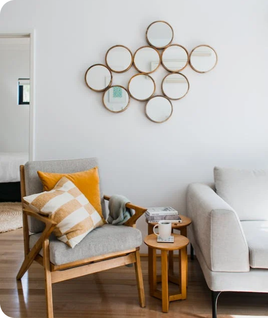
Living Room
 Bedroom
 Exterior
 Neutral
 White
 Gray
 Green
 Blue
 Yellow
 Pink
 Black
 Red
 Brown
 Orange
Green Trends For the Whole House 2027
Fresh Green Shades for Natural Style and Comfort
Green is one of my favorite colors for creating a home that feels fresh, natural, and welcoming. For 2027, I see green becoming an even stronger choice for bathrooms, living rooms, kitchens, cabinets, exteriors, and walls throughout the home. I like working with green because this color family gives me many different looks. Light greens can make a room feel brighter, while medium greens add character and darker shades create depth.
Deeper greens work beautifully with warm whites, natural wood, marble, stone, and brass details. Sage and gray-green shades are also useful when I want color that works easily with neutral furniture and finishes.
In this guide, I share the green paint colors I would consider for different areas of the home, including options from Sherwin-Williams and Benjamin Moore.
My goal is to help you compare light, medium, and dark greens and choose shades that fit your lighting, materials, and personal style.

via housekeepingbay.com
Green Color Palette for the Bathroom — Designers’ Picks
Table of Contents
For bathrooms, I like green because it creates a fresh connection with natural materials while giving the room more personality than basic white or gray. Green works especially well with white tile, marble, natural stone, pale wood, and warm metal details.
Green bathroom walls pair naturally with white or cream vanities, marble countertops, light wood cabinetry, brushed nickel, polished chrome, and warm brass.
Medium green and sage shades give me enough color to make the bathroom interesting while still leaving plenty of choices for tile and decor.
- Sea Salt SW 6204
- Evergreen Fog SW 9130
- Clary Sage SW 6178
- October Mist 1495
- Saybrook Sage HC-114
- Healing Aloe 1562
I like Sea Salt and Healing Aloe when I want a lighter green with a fresh finish, while Evergreen Fog gives me more depth. Clary Sage adds warmer earthy notes, and October Mist works beautifully when I want a gentle botanical green. Saybrook Sage is useful for a classic bathroom with wood and warm white finishes.
For this palette, I would pair these greens with white tile, marble, light oak, cream textiles, brushed nickel, or warm brass.

via housekeepingbay.com
Light Green Color Palette for the Bathroom
Light green is one of my favorite choices when I want a bathroom to look bright without relying only on white. These shades bring gentle color to the walls and work especially well in smaller bathrooms where I want the overall design to stay visually light.
Light green bathroom walls work beautifully with white tile, marble, pale stone, light oak vanities, brushed nickel, and warm brass.
I often use these colors with simple finishes because the combination feels fresh and easy to maintain.
- Liveable Green SW 6176
- Softened Green SW 6177
- Filmy Green SW 6190
- Healing Aloe 1562
- Hollingsworth Green HC-141
- Pale Smoke 1584
I like Liveable Green and Softened Green when I want a warmer light green, while Filmy Green gives me a lighter finish. Healing Aloe brings a gentle blue-green note, and Hollingsworth Green works beautifully with warm traditional finishes. Pale Smoke is useful when I want more gray and blue mixed into the green.
For a light green bathroom, I would add white or cream tile, pale wood, simple stone, and warm metal details.

via housekeepingbay.com
Darker Green Color Palette for the Bathroom
Darker green shades can give a bathroom much stronger definition and make white tile, mirrors, countertops, and metal fixtures stand out. I often use these colors when I want the bathroom to have a richer look with clear contrast.
Dark green works especially well with white marble, cream tile, warm wood vanities, brass hardware, and lighter countertops.
These shades can cover the walls, but I also like using them on vanity cabinets, paneled walls, or one main feature wall.
- Ripe Olive SW 6209
- Pewter Green SW 6208
- Retreat SW 6207
- Essex Green HC-188
- Vintage Vogue 462
- Salamander 2050-10
I like Retreat when I want a medium-dark green that is easier to use across larger surfaces, while Pewter Green and Ripe Olive give me more depth. Vintage Vogue adds a rich olive character, and Essex Green creates very strong contrast. Salamander is my choice when I want an especially deep green background.
For darker green bathrooms, I would balance these shades with lighter tile, countertops, mirrors, and warm metal finishes.

via housekeepingbay.com
Green Color Palette in the Living Room — 2027 Trends
For 2027 living rooms, I like green because it connects easily with wood, stone, neutral upholstery, and natural fabrics. Medium green and gray-green shades are especially useful when I want the walls to add character without competing with furniture and artwork.
Green living room walls work naturally with warm white trim, cream or beige sofas, oak or walnut furniture, stone fireplaces, brass details, and woven fabrics.
I use medium greens when I want more definition than a pale neutral can provide while keeping the room comfortable and welcoming.
- Evergreen Fog SW 9130
- Retreat SW 6207
- Dried Thyme SW 6186
- October Mist 1495
- Saybrook Sage HC-114
- Carolina Gull 2138-40
I like Evergreen Fog when I want a balanced gray-green foundation, while Retreat adds more depth. Dried Thyme gives me an earthy finish that works beautifully with wood, and October Mist creates a lighter botanical look. Saybrook Sage fits naturally with classic furniture, while Carolina Gull brings stronger definition.
For 2027, I would pair these greens with creamy whites, oak, walnut, beige upholstery, natural stone, and warm metal details.

via housekeepingbay.com
Light Green Color Palette in the Living Room
Light green can make a living room feel brighter while giving the walls more personality than plain white, cream, or pale gray. I often choose these shades for rooms with plenty of daylight, natural wood furniture, and light neutral upholstery.
Light green walls pair beautifully with cream sofas, warm white trim, oak furniture, linen, pale stone, and brass accents.
These shades work well when I want the walls to create a gentle background for furniture, artwork, plants, and decorative pieces.
- Liveable Green SW 6176
- Softened Green SW 6177
- Contented SW 6191
- October Mist 1495
- Hollingsworth Green HC-141
- Soft Fern 2144-40
I like Liveable Green and Softened Green when I want a warm sage direction, while Contented gives me more gray in the final result. October Mist adds a botanical character, and Hollingsworth Green works nicely with classic furniture. Soft Fern brings a little more warmth and looks beautiful beside natural wood.
For a light green living room, I would add cream fabrics, oak, woven textures, and a few darker accents for contrast.

via housekeepingbay.com
Darker Green Color Palette in the Living Room
Dark green can give a living room strong definition and make lighter furniture, artwork, molding, and architectural details stand out. I like using these shades in larger rooms, on feature walls, built-ins, or in living rooms where I want a richer background.
Dark green living room walls work especially well with cream upholstery, warm white trim, walnut furniture, stone fireplaces, brass details, and lighter rugs.
I usually balance these deeper greens with warm materials and lighter fabrics so the room still feels welcoming.
- Pewter Green SW 6208
- Ripe Olive SW 6209
- Dried Thyme SW 6186
- Vintage Vogue 462
- Salamander 2050-10
- Essex Green HC-188
I like Pewter Green and Dried Thyme when I want depth without going extremely dark, while Ripe Olive brings a stronger olive character. Vintage Vogue works beautifully with traditional furniture and walnut. Salamander and Essex Green create the deepest backgrounds in this group.
For darker green living rooms, I would use cream upholstery, warm white trim, natural wood, lighter flooring, and brass details to create clear contrast.

via housekeepingbay.com
Green Color Palette for the Kitchen and Kitchen Cabinets — Designers’ Opinion
Green kitchen cabinets are one of my favorite ways to add color to a kitchen while keeping the design connected to natural materials. Sage, olive, and deeper green shades work especially well with stone countertops, tile backsplashes, wood flooring, and metal hardware.
Green kitchen cabinets pair naturally with white or cream countertops, marble, warm wood, brass hardware, and simple neutral backsplashes.
I use medium greens when I want cabinetry that feels softer, while deeper olive shades make cabinets and islands a stronger part of the design.
- Pewter Green SW 6208
- Rosemary SW 6187
- Dried Thyme SW 6186
- Saybrook Sage HC-114
- Vintage Vogue 462
- Tate Olive HC-112
I like Saybrook Sage when I want a lighter traditional cabinet finish, while Dried Thyme and Rosemary provide more earthy depth. Pewter Green gives cabinetry a darker gray-green finish, and Vintage Vogue adds rich olive character. Tate Olive works beautifully with traditional kitchens and warm materials.
I would pair these greens with light countertops, warm wood, cream backsplashes, and brass or bronze hardware.

via housekeepingbay.com
Light Green Color Palette for the Kitchen and Kitchen Cabinets
Light green cabinetry can give a kitchen fresh color while keeping the overall design bright. I especially like these shades for smaller kitchens, full cabinet sets, kitchen islands, and rooms with light countertops.
Light green cabinets work beautifully with white quartz, marble, warm white backsplashes, pale oak, brushed nickel, and warm brass hardware.
These colors give me enough green to make the cabinetry noticeable without creating a heavy visual block.
- Liveable Green SW 6176
- Softened Green SW 6177
- Contented SW 6191
- October Mist 1495
- Hollingsworth Green HC-141
- Saybrook Sage HC-114
I like Liveable Green and Softened Green when I want warm light-green cabinetry, while Contented gives me a more muted gray-green finish. October Mist brings a fresh botanical character, and Hollingsworth Green fits beautifully into traditional kitchens. Saybrook Sage adds slightly more depth while remaining easy to use.
For light green cabinetry, I would use white or cream counters, warm wood flooring, simple backsplashes, and brass or brushed nickel hardware.

via housekeepingbay.com
Darker Green Color Palette for the Kitchen and Kitchen Cabinets
Dark green cabinets can give a kitchen a rich, defined look and create strong contrast against lighter countertops and backsplashes. I often use these shades on lower cabinets or kitchen islands when I want more depth without making every surface dark.
Dark green cabinetry works especially well with white marble, quartz, warm wood flooring, brass hardware, creamy white walls, and light tile.
Good lighting also helps darker cabinet colors show their green character clearly.
- Ripe Olive SW 6209
- Pewter Green SW 6208
- Rosemary SW 6187
- Vintage Vogue 462
- Tate Olive HC-112
- Essex Green HC-188
I like Rosemary and Pewter Green when I want dark cabinetry that still reads clearly as green, while Ripe Olive adds stronger earthy depth. Vintage Vogue and Tate Olive give me warmer olive options that work beautifully with wood. Essex Green creates the strongest dark contrast in this group.
For darker green kitchen cabinets, I would keep countertops and backsplashes lighter and add warm wood or brass details.

via housekeepingbay.com
Green Color Palette for the Exterior Use — 2027 Trends
For 2027 exteriors, I like green because it connects naturally with landscaping, stone, brick, and wood. Medium and deeper greens can give a home a clear identity while still working comfortably with materials already found outdoors.
Green exterior paint works naturally with warm white trim, stone, wood doors, brick, dark roofing, and bronze details.
I often choose muted greens for larger exterior surfaces because they respond well to changing daylight and surrounding greenery.
- Evergreen Fog SW 9130
- Dried Thyme SW 6186
- Rosemary SW 6187
- October Mist 1495
- Tate Olive HC-112
- Kennebunkport Green HC-123
I like Evergreen Fog and October Mist when I want a softer exterior green, while Dried Thyme and Rosemary add more earthy definition. Tate Olive works beautifully with traditional architecture, stone, and wood. Kennebunkport Green gives me a stronger classic green for siding or architectural details.
For 2027 exteriors, I would pair these shades with warm white trim, natural stone, wood doors, and bronze or black accents.

via housekeepingbay.com
Light Green Color Palette for the Exterior Use
Light green can make an exterior look fresh and welcoming while keeping the overall color scheme bright. I like these shades for siding, shutters, porch details, and homes where deeper green paint would create too much visual weight.
Light green exterior paint pairs beautifully with warm white trim, pale stone, natural wood doors, gray or brown roofing, brick, and simple dark accents.
I always test lighter greens outside because direct sunlight can make them look much lighter than they appear indoors.
- Liveable Green SW 6176
- Softened Green SW 6177
- Contented SW 6191
- October Mist 1495
- Saybrook Sage HC-114
- Hollingsworth Green HC-141
I like Liveable Green when I want a warm light exterior, while Softened Green adds slightly more sage character. Contented gives me more gray, and October Mist has a fresh botanical quality. Saybrook Sage and Hollingsworth Green work especially well with traditional architecture.
For light green exteriors, I would add warm white trim, natural wood, stone, and a few darker details to give the house enough definition from the street.

via housekeepingbay.com
Darker Green Color Palette for the Exterior Use
Dark green exterior paint can give a home strong definition and make trim, windows, doors, and architectural features much more noticeable. I often choose these shades when I want the exterior to feel richer and more connected to mature landscaping.
Dark green siding works especially well with warm white trim, natural stone, wood garage doors, brick, bronze fixtures, and lighter masonry.
These shades can cover the full exterior, but I also use them on shutters, doors, garages, and selected architectural details.
- Ripe Olive SW 6209
- Pewter Green SW 6208
- Rosemary SW 6187
- Essex Green HC-188
- Salamander 2050-10
- Vintage Vogue 462
I use Ripe Olive and Rosemary when I want a deep earthy green, while Pewter Green gives me more gray and a slightly softer finish. Vintage Vogue brings a warm olive quality, and Essex Green creates a very dark traditional look. Salamander gives the exterior an especially rich green finish.
For darker green exteriors, I would balance the main color with lighter trim, stone, and natural wood so architectural details remain clear.

via housekeepingbay.com
Green Color Palette for the Walls — Designers’ Picks
Green walls give me an easy way to bring natural color into an interior while still leaving many choices for furniture, flooring, and decor. I especially like medium sage and gray-green shades because they can work in bedrooms, living rooms, dining rooms, bathrooms, and home offices.
Green walls work naturally with creamy whites, beige upholstery, natural wood, stone, brass, and neutral fabrics.
I choose the exact depth based on the amount of daylight in the room and how much contrast I want between the walls, furniture, and trim.
- Evergreen Fog SW 9130
- Clary Sage SW 6178
- Dried Thyme SW 6186
- October Mist 1495
- Saybrook Sage HC-114
- Carolina Gull 2138-40
I like October Mist and Saybrook Sage when I want a softer wall treatment, while Evergreen Fog and Clary Sage give me more earthy definition. Dried Thyme brings stronger warmth, and Carolina Gull works well when I want the green to have more depth. Each shade can change as daylight moves through the room, so I always test samples on more than one wall.
I would combine these colors with warm whites, natural wood, cream or beige fabrics, and carefully chosen darker accents.

via housekeepingbay.com
Light Green Color Palette for the Walls
Light green walls can brighten a room while giving it more personality than plain white or pale gray. I like using these colors when I want a gentle background that still has enough green to be noticed.
Light green walls pair naturally with warm white trim, cream furniture, light oak, natural fabrics, pale stone, and brushed or warm metal details.
These shades work especially well in rooms with good daylight, but they can also help smaller rooms look visually lighter.
- Liveable Green SW 6176
- Softened Green SW 6177
- Filmy Green SW 6190
- Healing Aloe 1562
- Hollingsworth Green HC-141
- Soft Fern 2144-40
I like Liveable Green and Softened Green when I want a warmer sage background, while Filmy Green gives me a lighter finish. Healing Aloe brings a cooler blue-green note, and Hollingsworth Green works beautifully with classic interiors. Soft Fern adds more warmth and pairs naturally with wood.
For light green walls, I would use warm white trim, natural wood, cream fabrics, and a few deeper accents to create enough contrast.

via housekeepingbay.com
Darker Green Color Palette for the Walls
Dark green walls can make a room feel richer and give furniture, artwork, molding, and lighter textiles a strong background. I like using these colors when I want the walls to become an important part of the interior rather than simply sitting behind the furniture.
Dark green walls work beautifully with cream upholstery, warm white trim, walnut or oak furniture, natural stone, brass, and lighter flooring.
I often use deeper greens in rooms with good lighting or on selected walls where I want stronger visual definition.
- Ripe Olive SW 6209
- Pewter Green SW 6208
- Rosemary SW 6187
- Vintage Vogue 462
- Salamander 2050-10
- Essex Green HC-188
I like Pewter Green and Rosemary when I want a dark green background that still shows its color clearly, while Ripe Olive gives me more earthy depth.
Vintage Vogue works beautifully with walnut and warm neutral fabrics. Salamander and Essex Green create much deeper finishes when I want stronger contrast.
For darker green walls, I would balance the deeper color with lighter furniture, warm white trim, natural wood, and warm metal accents so the finished room feels rich and well balanced.

via housekeepingbay.com
Green is one of the colors I see playing a major role in whole-house design for 2027. From pale sage and gentle gray-green to rich olive and deep forest tones, there are options for nearly every room and design style.
I like lighter greens for bathrooms, bedrooms, kitchens, and walls where I want the interior to feel fresh and bright. Medium greens work beautifully in living rooms and on kitchen cabinets, while darker shades can give walls, cabinetry, and exteriors stronger definition and character.
When choosing green paint, I always look at natural light, flooring, furniture, countertops, and other permanent finishes before making the final decision. The same green can look very different from morning to evening, so testing samples in the actual room is an important part of my process.
For 2027, I would pair green with warm whites, cream, natural wood, stone, marble, beige fabrics, and brass or bronze details. These combinations help the green feel connected to the rest of the home while giving each room its own personality.
The best green is the one that works with your lighting, materials, and the feeling you want your home to have. Whether you choose a light sage, earthy olive, or deep forest shade, green can bring warmth, depth, and a fresh natural character to the whole house.